
Microsoft has revived its ugly Christmas sweater tradition with a brand new design inspired by its design history. Celebrating its 50th anniversary, the playful, retro-style design is suitably ugly (and admittedly a little adorable), but one detail is raising eyebrows.
From Clippy to creepers, Microsoft's new sweater flexes some of the best logos and icons across its legacy. A time capsule of the brand's best hits, the design is (almost) a perfect beacon of nostalgia – if it wasn't for that pesky Copilot logo.
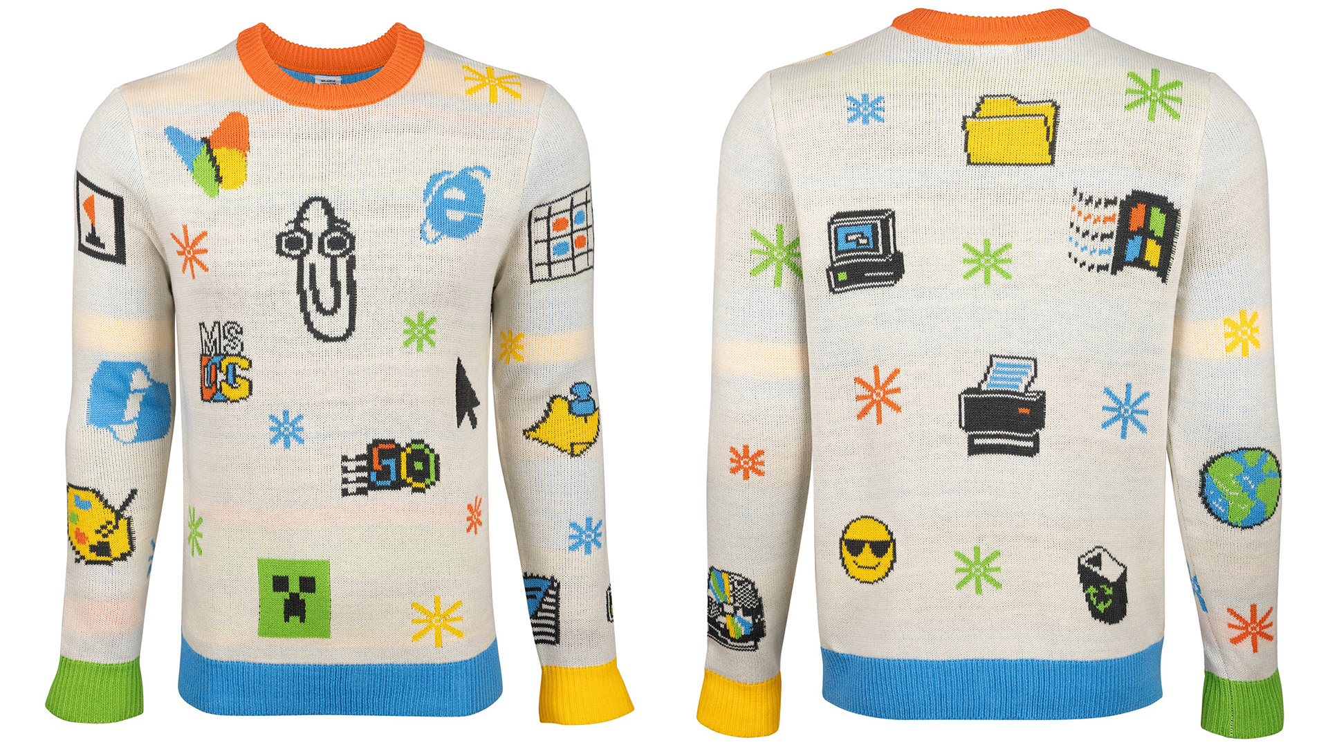
Sticking to Microsoft's signature palette of orange, green, blue and yellow, the 'Artifact' sweater features pixelated Microsoft icons on a plain white knit. With highlights such as this year's 50th anniversary logo created by Koto, and throwback icons such as Clippy and Paint, the sweater has a distinctly retro feel (mostly).
All was well until fans noticed the Copilot logo subtly hidden in the design. Understandably, many criticised its inclusion on the retro-style sweater, claiming that it didn't fit the throwback theme. With many Microsoft users unhappy with the way Copilot has been 'forced' on them via auto-install, it's understandable why many feel it's an unwelcome guest on this otherwise wholesome design.
For more creative inspiration, take a look at how Microsoft became one of the world's most successful brands, or for some festive fun, check out the best Christmas logos.