
Get all your news in one place.
100's of premium titles.
One app.
Start reading
Ideal Home
Ideal Home
Sara Hesikova

Sorry, Farrow & Ball! But this is the paint shade that so many stylish homes have in common – even Ideal Home editors have it in their homes

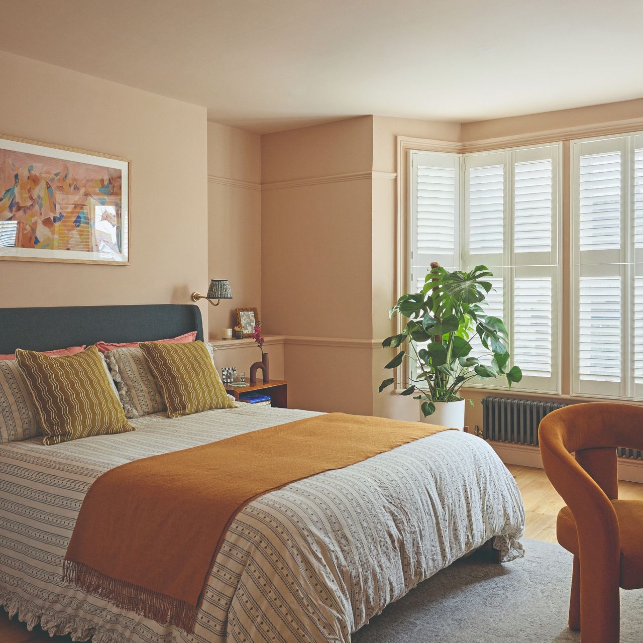
A pink bedroom painted in Little Greene's Masquerade with Masquerade Light on the ceiling and a bed with striped, ruffled bedding.

Even though there are hundreds and thousands of paint shades on the market for us to choose from, there are those few that are such crowd pleasers that they make their way into most homes. And I’ve been noticing one particular shade being used consistently across some of the most stylish homes – and that’s the Little Greene Masquerade paint colour.

Soft, plaster-style pinks have been one of the biggest paint and colour trends of this year, taking on the role of a slightly more interesting and earthy neutral. And while most people are familiar with Setting Plaster, Farrow & Ball’s most popular neutral shade and one of its bestselling colours, not everyone has heard of Little Greene’s Masquerade. And yet, it’s becoming just as popular and iconic.

‘With its delicate, powder-like hue, Masquerade has become a much-loved Little Greene shade because it has a rare ability to feel both timeless and contemporary,’ says Ruth Mottershead, creative director at Little Greene, of this incredibly versatile paint colour. ‘Its soft, natural undertones create a sense of warmth and comfort without becoming overly sweet.’

Get the look: Rebecca's armchair is the Habitat x Morris & Co. Merton sunflower armchair which she's paired with the Ruggable x Matthew Williamson Helios gold rug. (Image credit: Future / Rebecca Knight)

Even our Ideal Home editors couldn’t resist the charm of Masquerade. Our Digital Editor, Rebecca Knight painted her living room pink using this very shade, taking inspiration from Zoe Ball’s kitchen and living room painted in Masquerade. And she couldn’t be happier with the result.

‘I was hunting around for the perfect plaster pink that felt warm but not too girly. A lot of the plaster pinks I sampled felt too washed out in my south-facing living room. However, I decided to give Masquerade a try when I stumbled upon a picture of Zoe Ball's newly renovated living room.’

‘It instantly warmed up the living room, which now feels like a hug when you sit in it. I'd call it a bold neutral – it's a statement on its own, but it works with so many other colours and makes them really pop. It made the colours of my green sofa and yellow rug look so much richer. It's become one of the most complimented rooms in my house, everyone asks what the paint colour is,’ Rebecca says.

(Image credit: Little Greene)

What’s so special about Little Greene’s Masquerade

So why is everybody going crazy over this light pink paint colour? For starters, it’s a very versatile colour as already mentioned so it’s not only appealing to many different styles and aesthetics, but it’s also one of the best pink paints for pretty much any room – whether it’s north or south-facing or whether you’re painting your bedroom or are after a stylish pink living room idea like our Digital Editor, Rebecca.

‘It feels just as at home creating a calm and restful bedroom as it does adding elegance and atmosphere to more decorative spaces. This versatility reflects a wider shift we are seeing towards warmer, more soothing mid tones and neutrals. Today’s neutrals extend far beyond traditional off-whites and beiges; people are embracing colours with depth and personality - softer greens, rich browns and delicate muted pinks - shades that create a sense of calm while adding character to interiors,’ Ruth at Little Greene explains.

But in addition to that, Masquerade is part of a colour palette of three different colours - Masquerade, Masquerade Mid and Masquerade Light - each just a shade away from the other. ‘Masquerade Light and Masquerade - Mid are created using the same pigments in different strengths, allowing you to build a harmonious scheme with subtle variation and movement,’ Ruth says.

Rebecca adds, ‘I tried Masquerade and Masquerade - Mid, a slightly lighter variation. We decided to be brave and go for the bolder true colour. I think those mid shades are the best part about masquerade – if I was to redo the white parts of my living room I'd use one of the mid shades.’

Get the look: Create a dressing table set up similar to this one with the La Redoute Miji desk and George Home organic-shape wood frame mirror. (Image credit: Future PLC/Kristy Noble)

This is beautifully demonstrated in the bedroom of this Enfield family home which Ideal Home’s toured. As pictured above, the bedroom’s walls are painted in Little Greene’s Masquerade, while the low ceiling is covered in Masquerade Light to visually lift it up.

How to use Little Greene’s Masquerade in your home

Since Masquerade is such a versatile shade that works in pretty much any space, the world is truly your oyster when decorating with it. But if you’re wondering what other shades pair well with it - other than the softer shades of the colour - then Ruth from Little Greene has some tips.

Create drama

Get the look: In addition to the striking wall colours, th standout piece of Heather's home office is her table lamp, similar to this one from Next. (Image credit: Future/Heather Young)

For maximum impact, you can pair Masquerade with a bolder colour like deep, dark red or burgundy. That’s exactly what Ideal Home’s Editor-in-Chief, Heather Young opted for in her home office (pictured above). She paired Masquerade - Mid on the walls with a bookcase feature covered in Little Greene’s Arras shade.

‘For a bolder approach, Masquerade works beautifully alongside deeper, more dramatic tones. Shades such as Tuscan Red or Bronze Red create striking contrast and bring depth and richness to a space,’ Ruth says.

Go for a tonal scheme

(Image credit: Little Greene)

Little Greene has been a pioneer of the double drenching paint technique, which is an evolved take on the colour drenching trend. And Masquerade lends itself perfectly to a double drenched colour scheme.

‘Using varying strengths of the same colour through a double drenching approach creates a cohesive yet engaging interior. Pair the delicate, powder-like hue of Masquerade on walls with the softer rosy tones of Blush on the ceiling to create a layered and enveloping feel,’ Ruth explains.

Ruth concludes, ‘Masquerade works particularly well where you want to create a sense of comfort and tranquillity.’

Little Greene Masquerade Intelligent Matt Emulsion Paint 2.5L Little Greene Masquerade - Mid Intelligent Matt Emulsion Paint 2.5L Little Greene Masquerade - Light Intelligent Matt Emulsion Paint 2.5L
Sign up to read this article
Read news from 100's of titles, curated specifically for you.
Already a member? Sign in here
Related Stories
Top stories on inkl right now
One subscription that gives you access to news from hundreds of sites
Already a member? Sign in here
Our Picks
Fourteen days free
Download the app
One app. One membership.
100+ trusted global sources.