I love a good color-drenched room; it's been the ideal in interiors for quite some time now. Is it time to ditch it altogether in 2026? No, but the trends might be starting to turn in a new direction. A bolder, more layered approach to paint that mixes colors, and more importantly, contrast.
Where slapping the same color on every surface is a safe way to get it right, being able to carefully combine high color contrasts is far more technical. The result, though? A space filled with chromatic tension and plenty of visual interest. Think deep burgundies cut with a yellow-toned cream or calming blues paired with rich chocolate browns.
Pulling off a high-contrast color pairing in your interior requires nuance and plenty of balance, but the result is a space dripping in colorful, contemporary beauty. So, before you jump straight to color-drenching, take a second to discover why high-contrast rooms should be on your radar in 2026.
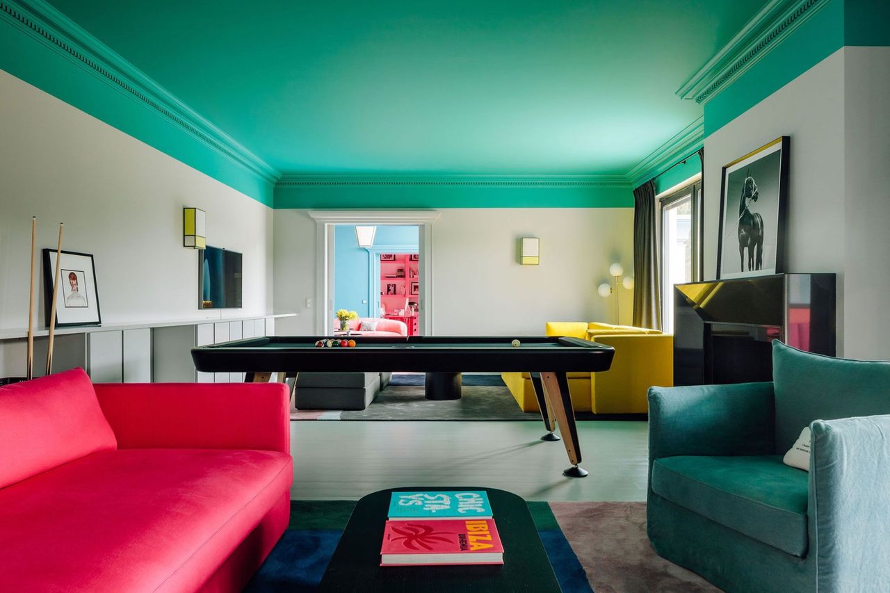
Painted ceilings stand out as a unique and characterful way to introduce high-contrast palettes in an interior. Part of the appeal of the drenching technique is its cocooning effect, but painting the ceiling, especially in a darker shade, can have a similar feel.
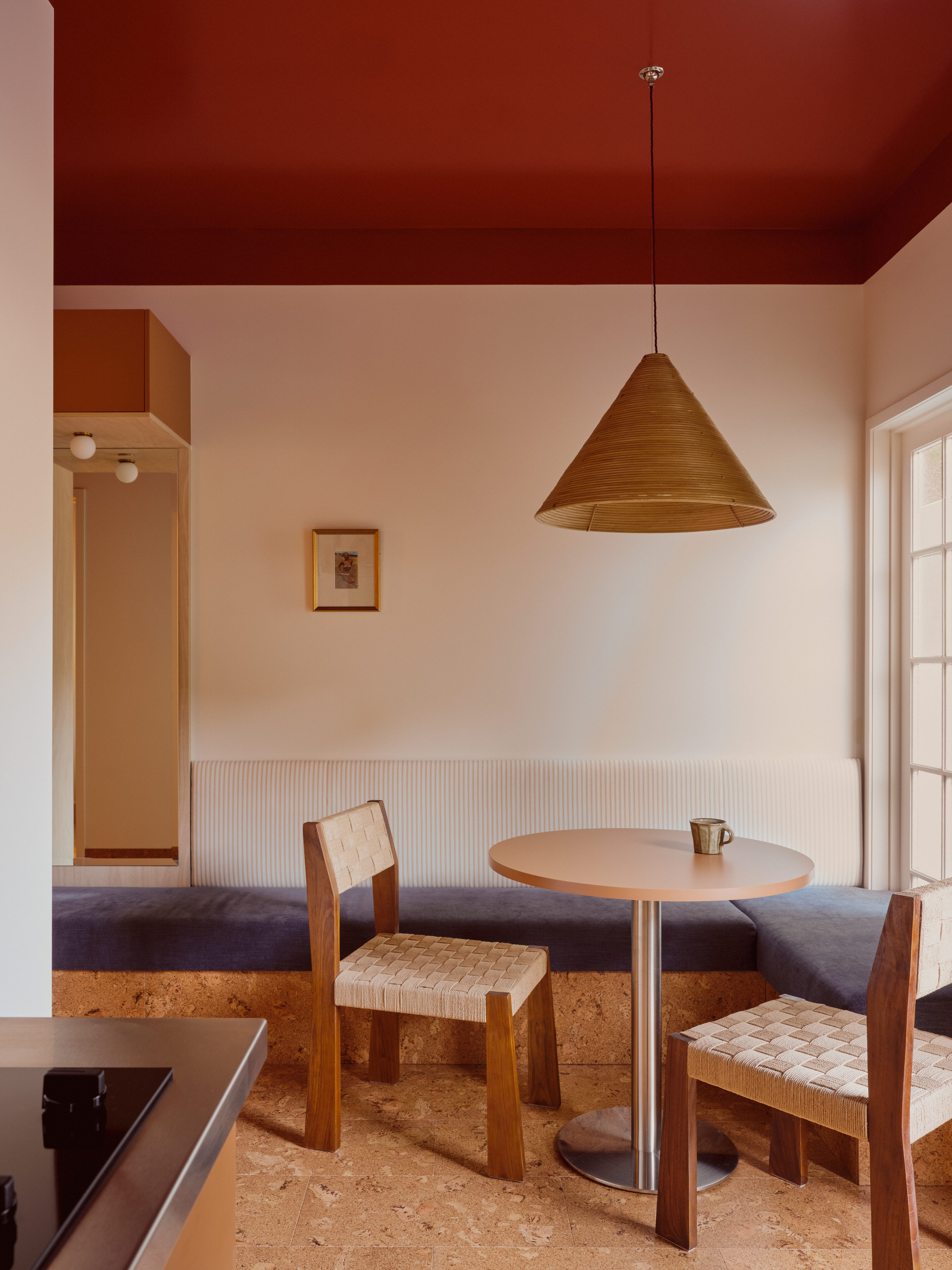
For example, the deep, wine-red ceiling in this dining nook envelops the space in bold color without overwhelming it. When contrasted with the cream walls and soft blue seating, it creates a comfortable balance within the design.
"Color contrast allows different elements — architecture, joinery, furnishings, artworks — to hold their own rather than dissolving into a single tonal field," adds interior designer Lucy Barlow.
Accent walls have a bit of a bad reputation amongst contemporary interior design trends. But when the focus is on contrast rather than stark saturations and out-of-place patterns, accent moments can emphasize (or zone) specific areas within a space.
"Where color drenching can be immersive and calming, contrast creates dialogue: between light and shadow, warmth and coolness, structure and softness," says Lucy Barlow. Contrast in design gives a room movement and makes it feel layered and lived-in rather than resolved all at once.
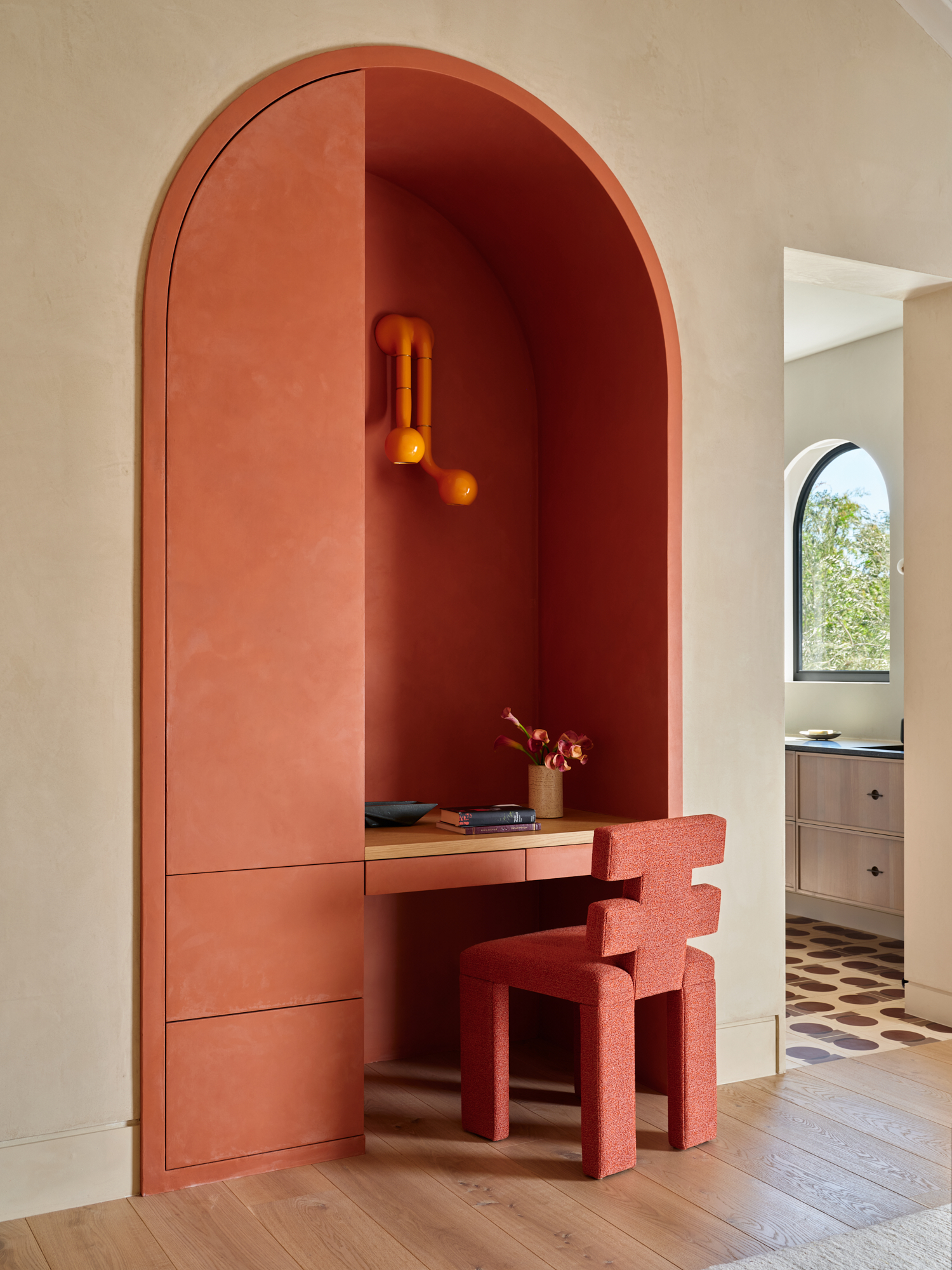
The home office idea pictured above is set within a bedroom, but the contrasting paint color against the soft, limewashed walls helps to make it feel more intentional.
If bold, energetic color is what you're after, then you don't need to shy away from a high-contrast palette. Don't default to a base color in a neutral color scheme.
Chloe Tozer, an Australian-based interior designer, says, "Design should be about 'play,' as there is no true right or wrong. Be free and be guided by your eye when using color."
If you want to experiment with colors, try a modernized take on color blocking by placing two high-contrast colors next to each other to create a striking moment in a room.
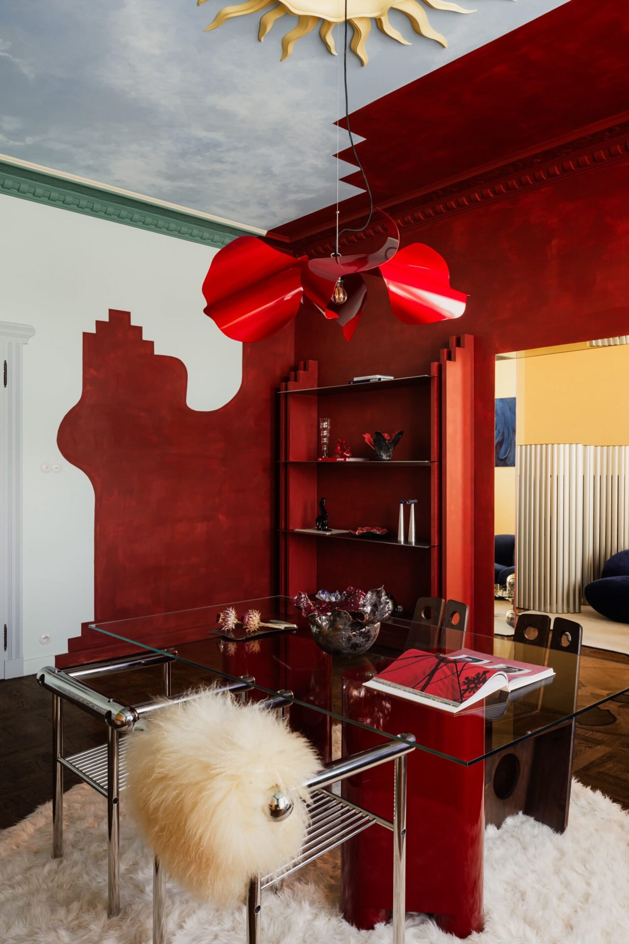
Take the dining room above, for example. The lines of the color blocking are more organic and hand-painted than traditional blocking techniques. Breaking away from strict design rules can be rewarding as long as you follow your eye, personal style, and the color wheel.
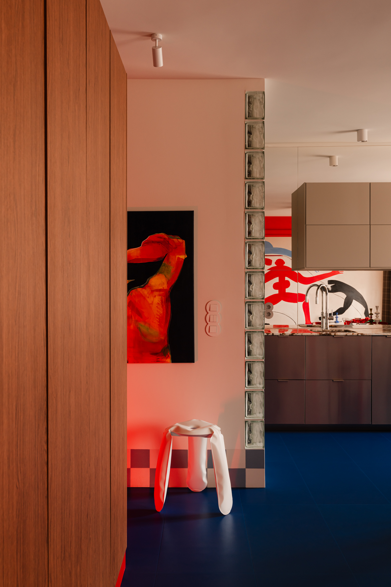
Lastly, painted and colored flooring, in contrast to the walls, has officially convinced me against color-drenching. Floors are often a forgotten surface for making a statement through color.
In this space pictured above, the deep blue floor has a grounding and moody effect. The space becomes anchored rather than feeling too stark or random. Dark paint colors are the ideal shade to achieve this, but earth neutrals (especially in minimalist spaces) can also mimic high contrast.
Design often begins with this natural contrast, mirroring our biggest teacher, Mother Nature. "My favorite pairings come from what I see with my eyes in the physical world," says Chloe. "Watching the sunrise over the ocean inspired the palette for our living room, and every time I sit on our orange sofa and have my feet grounded on our deep blue rug, I think of this glorious moment."
This accent chair would look stunning against earth neutrals for a high-reward contrast.
Sour greens have been hot lately, and a rug is the perfect alternative base if you don't want to paint your floors.
Unexpected reds will especially pop against neutrals or complementary colors.
Contrasting colors introduce energy, rhythm, and clarity into a space. 2026 just might be the time to try the new color trend on the block.