‘Pure white’, ‘absolute white’, ‘brilliant white’ — the paint industry has given endless aliases to this one shade, often becoming more lyrical as the price per gallon increases. Conventional wisdom might dictate that white paint transforms petite powder rooms and proportionally-challenged home offices into something lighter, brighter, and bigger, but here’s the truth: painting a small room white actually makes it look worse.
As interior designers embrace color trends in rooms regardless of their square footage, our decorating instincts are finally being challenged (and I'm happy about it — can you tell?) It’s not that white walls no longer make sense in a small space; it’s that avoiding color can make them look generic. I feel like painting small rooms white does them a disservice. “A space with a tight footprint is a design opportunity, not a problem to solve with a gallon of anonymous white paint,” agrees Rebekah Zaveloff from Imparfait Design Studio.
Even in the smallest space, going beyond simple, safe, and ultimately basic white paint is becoming a big deal in the design world. So, get ready to color outside the lines…
Why Shouldn't You Paint Small Rooms White?

What’s the first thing you notice when you walk into a small space? Most likely, it’s the walls — and painting them white does little to disguise a room’s true proportions. “It’s a fallacy to think that white walls magically trick the eye into thinking you’re in a larger space,” says Ali Childs, a London-based interior designer and founder of Studio Alexandra. “All they do is make small rooms feel box-like, clinical, and unfinished.”
White paint also changes the perception of architectural quirks (and the odd corner of uneven plaster) from a vague nuisance into a negative fixation. Every accidental scuff, inexplicable scrape, and mystery mark immediately becomes more obvious. When you spot one, you can’t unsee it, and the smaller the room is, the closer each blemish confronts you.
While performance paints and scrubbable solutions exist, white versions of these miracle formulas will actually find camouflaging more of a challenge than their colorful counterparts. “White walls create a harsh backdrop for everyday life,” says interior designer Sam Grigg. “Every imperfection becomes amplified, so any other color is going to be far more forgiving.”

As small rooms usually have only one or two windows, white paint is often chosen for its reflective qualities. However, this means that every shadow and subtle nuance gets picked up on as the light shifts and changes.
In west-facing rooms, a basic shade of white can veer from frigid, cold, and gray in the morning to bright, glaring, and stark in the afternoon. In north-facing rooms (often plagued by a lack of natural light), it can read as simply drab and unwelcoming all day long.
“A shade of pure white might feel like the safest choice for a small space, but in practice it often reads as clinical and impersonal, gray and gloomy,” agrees Benjamin Moore’s Helen Shaw.
Why It's Better to Use Color in a Small Room?

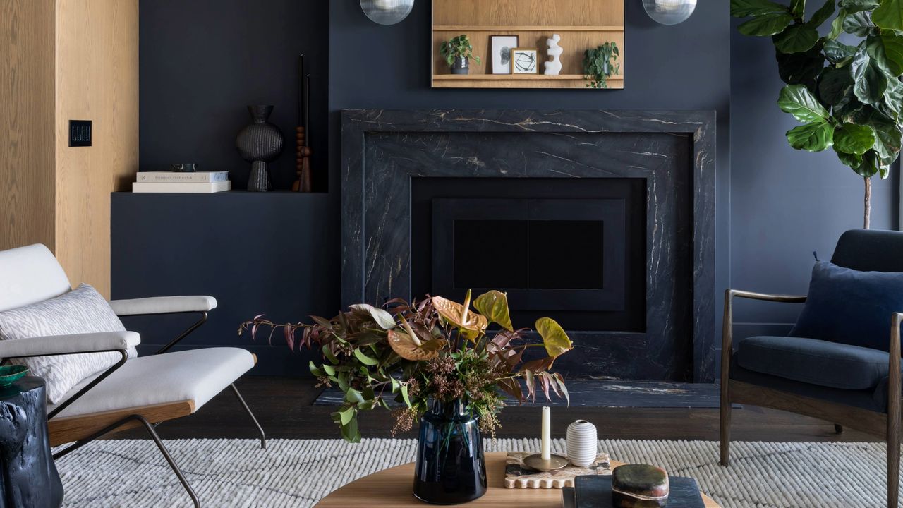
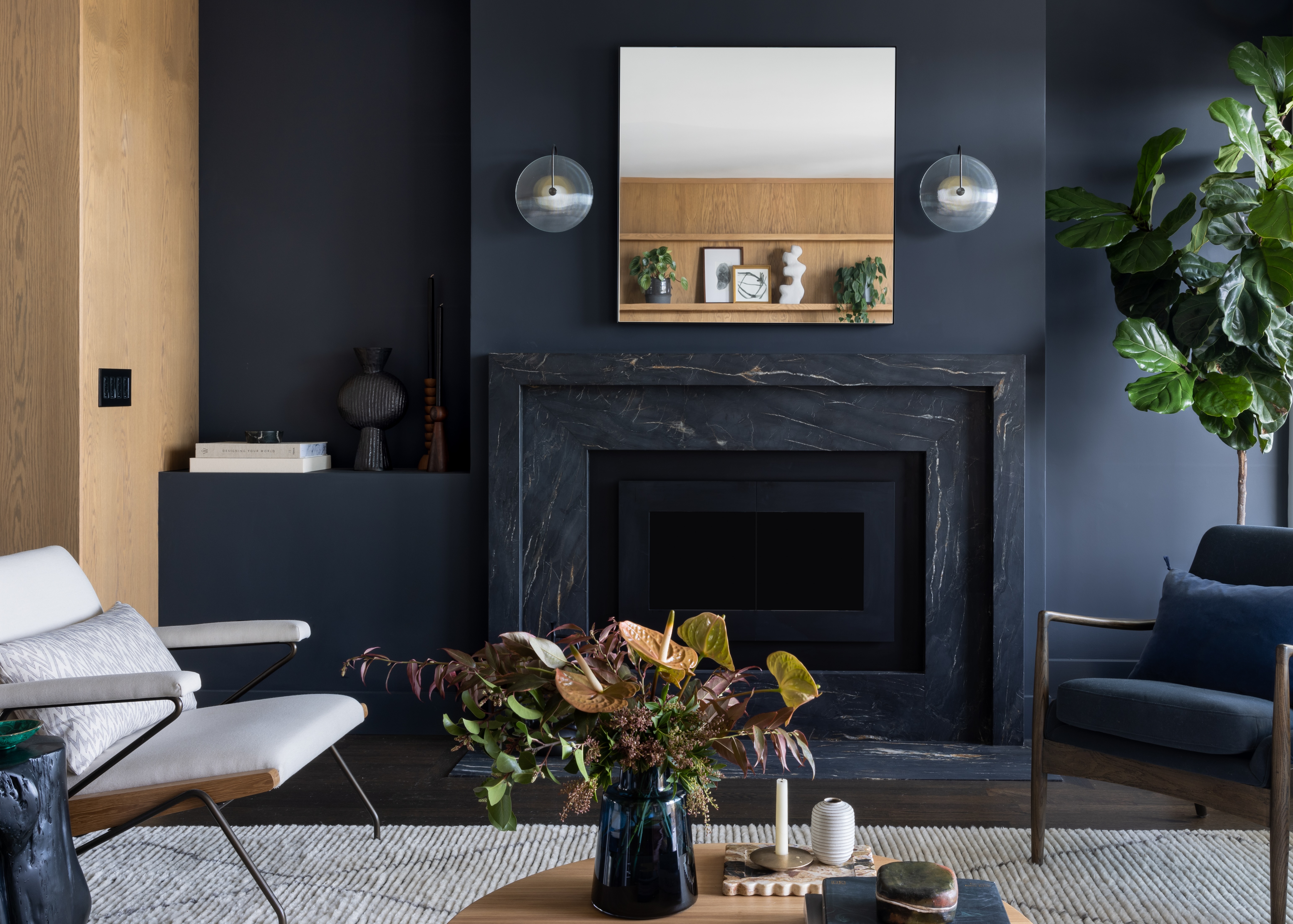
Choosing color rather than white often makes rooms appear just that little bit larger. “When you saturate [or color-drench] a small room with color, boundaries appear to dissolve, and the walls begin to recede,” believes Imparfait Design Studio’s Rebekah Zaveloff. “White often creates a feeling of boxiness, making you hyper-aware of a room’s limitations, whereas color draws your eye away from the edges and makes a smaller room seem enveloping rather than confining.”
Maximalists might think that artwork, sculpture, or even books will look all the bolder against a simple white backdrop, but that’s not necessarily true. “Color creates more of a story, making art, furniture, and lighting pop,” says Rebekah. Without this sense of atmosphere and personalization, small rooms inevitably become defined simply by their size or general function rather than their decorative form. “You want these spaces to feel like a destination, and color transforms them into jewel boxes you want to open again and again.”

Of course, there’s a lot to be said for the simple fact that painting a small room white is just, well, boring. “White walls read as ‘builder’s default’ rather than any kind of thoughtful design decision,” agrees Sam Grigg.
Painting in practically any other color is a shortcut to making them feel at least somewhat more interesting, but that’s not all. Color can impact our mood, productivity, and attitude — shades including dusky pink and sooty blue have been proven to be mood-stabilizing colors, while color psychology has shown that we feel uplifted by more positive colors, including yellow and orange.
Which Colors Work Best in Small Rooms?
Now, don't get me wrong. Bright, poppy hues aren't the only option if you're avoiding white. For inspiration, look to 2026’s Color of the Year announcements. Only one of the eleven brands on our shortlist crowned white as its go-to shade, with the others overwhelmingly choosing more dramatic tones and richly pigmented neutrals.
These colors work well in small spaces, as they create a cosseting, cocooning feel. “Deeper tones wrap a room like a hug, making you forget about square footage,” says Rebekah Zaveloff.
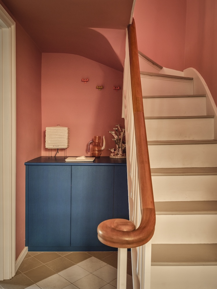
Somewhat paler colors, too, give a sense of lightness — nature, as ever, provides a useful palette in rooms with a tight footprint. “We like to use soft pinks, sage greens, and powder blues in compact rooms,” explains interior designer Cath Beckett, co-founder of Yellow London. “They add warmth while still feeling calm and balanced. The key is to keep the palette cohesive and use three or four shades across walls, textiles, and furniture.”
Feeling a little braver? Don’t be afraid to go bold — use ultra-saturated hues all over on walls, as paint highlights on decorative trims, or across the ceiling. “Small rooms deserve just as much drama as large ones,” agrees Sam Grigg. “Good design and thoughtful color choice make these spaces intentional rather than apologetic.”
White paint has a tendency to make small rooms look stark and feel unwelcoming, while color can unlock their individuality and personality.
Need somewhere to start? Livingetc has discovered the most expensive-looking colors in interiors and asked top interior designers which neutral paint colors are most regularly on their moodboards. Hopefully that helps!