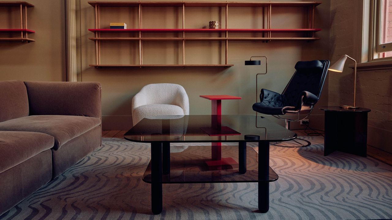
In the interior design world, what goes around always comes back again — trends, prints, and especially color. That said, when colors re-emerge, it's usually in a way that feels more contemporary than previous iterations. Case in point: warm neutrals are regaining popularity, but instead of beige, designers are looking to a slightly more characterful color: a warm, milk-chocolatey taupe.
Browns have been big in color trends of the last year or two. And while rich, moody shades are still here to stay, adding a warm, chocolatey taupe to your neutral palette seems to be the new way to ground a modern scheme. There is more lived-in warmth in this mole brown than beiges of the past, but it's still neutral enough not to overpower a space.

So, neutral-lovers rejoice; just because bold colors are currently dominating doesn't mean you have to shy away from decorating with neutrals altogether. Warm, chocolatey taupes bring just as much personality to a room — here's how to do it.
Why Is Taupe Trending Right Now?
By definition, taupe is a neutral shade that sits somewhere between gray and brown. I think the key to making this new-age taupe feel right for 2026's interior design trends is that it's much warmer and brown-leaning than the lighter, more gray-adjacent taupes of the past.
In fact, many of the hues that interior designers shared are a mix of taupe, mole brown, and milk chocolate — including Benjamin Moore's Taupetone and Farrow & Ball's Broccoli Brown.
"I love all shades of taupe and brown right now," shares interior designer Sarah Tract. "Basically, anything that's a touch warmer than the classic creams and beiges we have been seeing for the last couple of years. That warmth helps speak to the 'now' without being too trendy," she adds.
With elevated taupes, you get the grounding gray undertone and the rich brown warmth — it's like an 'everything' neutral.


But the true secret ingredient is a touch of pink. "People still want calm spaces, but they don't want them to feel cold or stark," shares Sabrina Soto, interior designer, podcast and television host, and Behr paint ambassador.
Adding a touch of an earthy, sun-baked or dusty pink to a taupe brown brings just enough warmth and personality while still feeling natural and liveable.
"Warm neutrals feel contemporary now because they're softer and more layered than the beige tones people remember from years ago," says Sabrina. They're not flat or builder-basic. The newer warm taupe-browns have more depth, "so they work beautifully across a range of materials and styles," she adds.
How to Style Warm Taupe in Interiors
The best way to decorate with brown and warm taupes is by "thinking of these warm neutrals as the foundation, not the whole story," says Sabrina. "They create the backdrop that lets everything else in the room feel more collected and elevated."
You can start with a taupe wall or color drench for an instantly enveloping effect. "A mudroom drenched in a dark, cool taupe like Broccoli Brown is rich and inviting," says Sarah. "And an entire limewashed living room in something a bit lighter is warm and inviting." It depends on what space you are working with and other factors like light and material.
"One of my favorite ways to use taupe-browns is tonal drenching a smaller space, like a home office, hallway, powder room, or bedroom, so the room feels really intentional," adds Sarah. "I love using warm taupe-browns on walls, ceilings, cabinetry, and trim," she adds.
But don't feel limited to a tonal space. Even though these more nuanced neutrals may have more saturation or color, "They still read as neutrals, so you can tie in a bunch more layers of other colors — like robin's egg blues and mint greens," Sarah explains.
Warm taupe-browns pair beautifully with high-contrast colors like deep charcoal gray or a rich navy blue. "They also work well with softer greens like soft moss green or a more subtle calming shade like a tranquil gray," says Sabrina.
For something richer, try pairing a warm taupe-brown with rich rust reds or terracotta colors. This will bring out the warmth and "give the space another layer of depth while allowing the overall palette to remain timeless," adds Sabrina.
As for materials, taupe-browns work best when paired with other natural materials like wood, stone, linen, plaster, and unlacquered brass. Or, of course, you can always start with a few taupe-brown accents. Decor and upholstery are such an easy and stunning way to introduce color without committing to a full-on paint job.


"People are craving homes that feel comforting and personal. Warm taupe brown gives you that calm foundation, but it still leaves room for texture, art, color, and personality," says Sabrina.
There are so many 'new' neutrals to experiment with in 2026 — it's about taking the basics and making them feel personal and unique, whether that's through saturation, application, or color pairings.
For endless color inspiration, be sure to subscribe to the Livingetc newsletter.