This month, we are taking the seasonal phrase seriously: April showers bring May flowers. But there can be something quite beautiful in those serene afternoon storms — the soft blue of the sky, the periwinkle haze after the rain has gone, or even the icy blue of the raindrops themselves. It's in these moments that Livingetc's April Color Crush, Soft Celeste, exists.
Soft Celeste is a powdery, chalky blue sitting on the color wheel near cyan, true blue, and nudged a little towards violet. I like to think of it as a go-to light blue, but with more depth. And it's that depth that makes it feel more contemporary. The nuances in the undertones and hue make these spring color palettes more visually interesting in 2026.
So, if you are looking for a new-wave pastel, then I believe I have just the color for you. More on our monthly color muse, Soft Celeste, plus how to style this shade in interiors, below.
What Is Soft Celeste?
So what makes Soft Celeste so special in the world of decorating with light blues? Livingetc's color expert, Amy Moorea Wong, says, "It's the under-the-radar sprinkling of purple that gives Soft Celeste an aura of the periwinkle and creates a sense of the whimsical." It has a moodier edge than the typical Cyan blue (which leans more yellow), while still feeling airy.
"It's a color to float away on, gentle, powdery, and ever so slightly ethereal, like the hazy shade that veils a dream or a fairy tale," she adds. "You want Soft Celeste to envelop you in a cloud of pale blue mist, which you know would feel warm, supportive, and easy — yet quietly sparkling with something a little mischievous."
In terms of the color wheel, this almost-powder-blue creates an airy, restful, sink-into-me-soft atmosphere, slightly contrasted by the violet's underlying sense of energy. "It's like there's a power hiding just beneath the surface, like someone who usually meditates but suddenly wants to go out dancing," adds Amy. This makes Soft Celeste the perfect tone for restful bedroom color ideas or listening rooms; it's multifunctional.
But it's also one of those color trends that blends timeless color palettes with new wave design. Part of Soft Celeste feels almost digital, crisp and futuristic, but its dustiness tempers it and brings a muted, human softness. "It's this push and pull, this tension, which gives the color its layered character, which in the home can shift as your mood changes," explains Amy.
I think this vase perfectly captures the nuanced undertones of Soft Celeste. It's light blue upon first glance, but there are definitely some purple notes hidden in there.
How to Use Soft Celeste in Interiors
Soft Celeste is a relatively easy color to bring into interiors (not nearly as challenging as high contrast colors, like February's color crush, Obsidian Heart). Think of using Soft Celeste just as you would when decorating with blue of any hue.
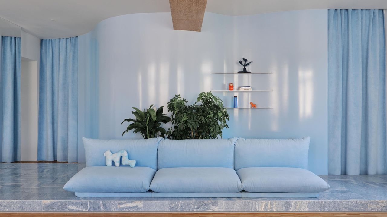
But it pays to remember, "This is inherently a cold color," warns Amy, "which means that textures and soft materials need to be involved." Whether that's in the surrounding decor or in the Soft Celeste accents themselves. Velvet is an easy way to make this color feel elevated and cozy.
The way that light hits velvet makes it feel lighter or darker depending on how you view it. Plus, a piece like this Soft Celeste velvet floor lamp creates a nice tactile moment in the room.
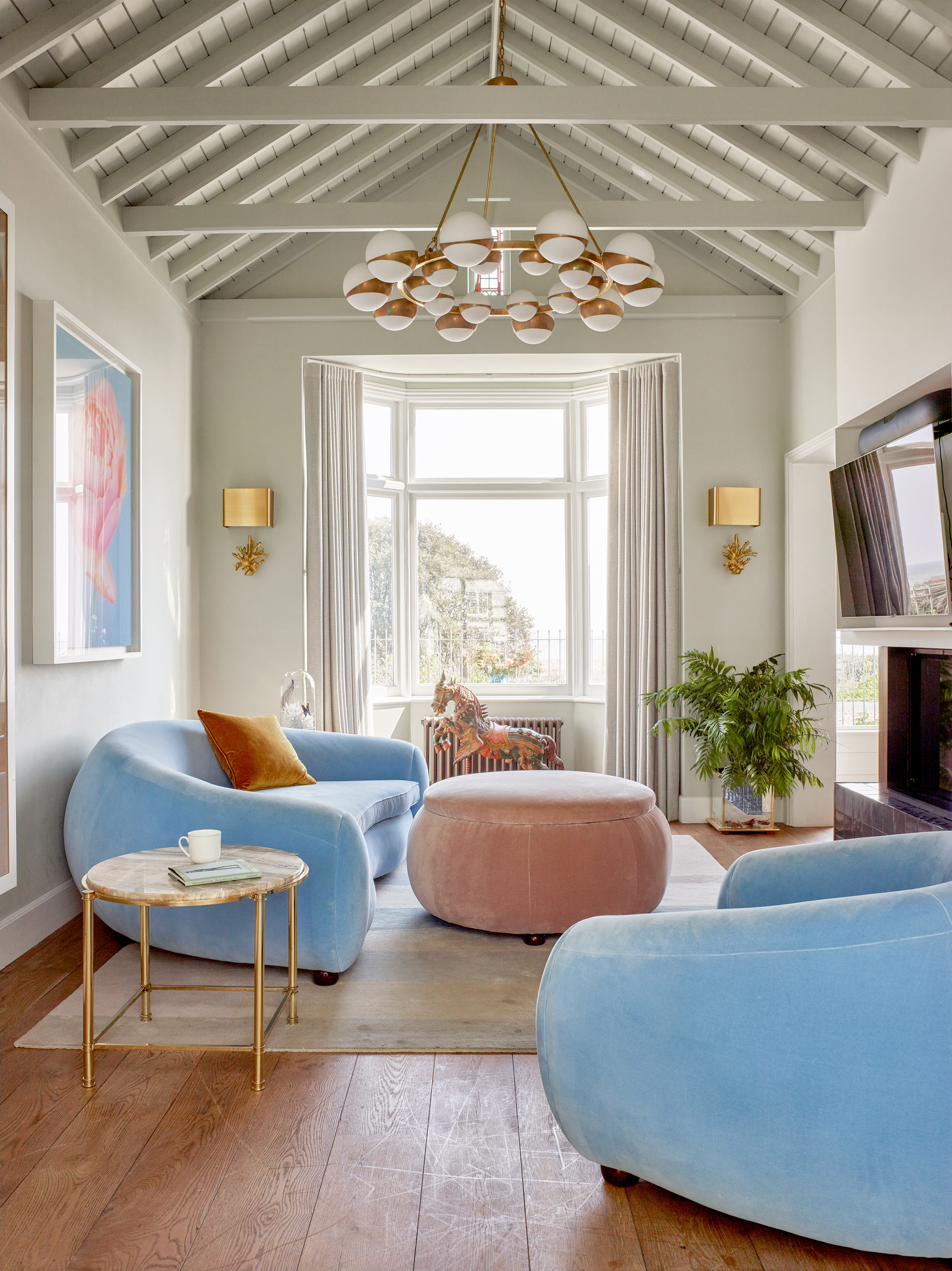
Or you can pair Soft Celeste with cozy throws, more natural materials, and wooden accents to make it feel warmer and more grounded. "Just be wary of ultra-hard materials and sharp angles," adds Amy.
While chrome decor or glossy finishes could make a striking design statement, too much can quickly turn cold. "Rounded edges are your friend, too. We're aiming for a welcoming embrace, not stressful shards of ice," says Amy.
This Soft Celeste accent chair has both texture and curved edges, and I love the way it is shown styled amongst other natural and tactile materials.
Planning on painting the wall? Soft Celeste makes a great addition to color palettes as it acts as a soft but striking base. You notice it, but it doesn't overwhelm. "Bring in some coordinating cushions, upholstery, or curtains to turn harsh Soft Celeste into homeliness here," adds Amy.
Then you have the freedom to get creative with other colors. Lean into the purple persona with pops of lavender or true violet to enhance Soft Celeste's understated, effervescent energy. To calm it all down, "off-whites, cream, or stone hues accentuate its organic quality." Then, strong colors like navy or chocolate brown bring layered contrast. Plus, "you can always fold in more blues for depth and tonal rhythm," she adds. Start with finding the colors that go with light blue that speak to your home, and go from there.
The best way to stay tuned for more monthly color crushes is by subscribing to the Livingetc newsletter; that way, you can get your dose of color sent straight to your inbox.