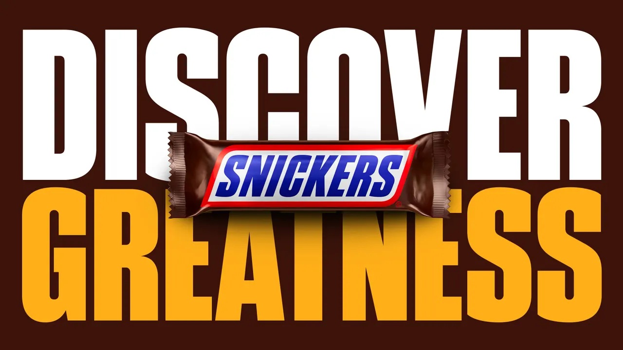
Snickers (or Marathon, as my elders like to remind me) has become a staple among the glossy chocolate-packed supermarket shelves. Launched in 1930, it boasts almost a century of confectionery goodness, which is why its latest project feels like a long time coming. We finally have a custom Snickers typeface.
A refined take on the classic American Gothic font family, Snickers Sans is an instantly recognisable typeface that captures the bold energy of the iconic chocolate treat. As one of the best logos in the confectionery sphere, Snickers' enduring logotype proves how effective a simple yet striking design can be in creating an identity that spans generations.