
Photo book rating: ★★★☆☆
Photo card rating: ★★★★☆
Photo calendar rating: ★★★☆☆
We really wanted to like Snapfish more than we did mainly because it was so well-organized and easy to use. Creating photo books, calendars and cards with Snapfish’s software was a snap but its finished products left us underwhelmed. Both its photo book and calendar came in last place of the services we tested. On the other hand, its holiday photo cards tied with Shutterfly for first place.
So, if the best photo cards are what you want to make, we wouldn’t hesitate to recommend Snapfish. Our test cards came out great with colors that popped and balanced exposure. The standard cardstock also felt good. For photo books and calendars, however, the opposite was true. Colors looked washed out both on the covers and the interior pages. This was mainly because the exposure looked off, with highlight areas losing much detail, particularly in portraits of people with pale skin. The pages of our books and calendars were thin and reminded us of something made at home on an inkjet printer — there are much better options to pick for the best photo books. Read more of our mixed feelings in the rest of this Snapfish review.
Snapfish review: Prices
Snapfish photo books
Snapfish’s 8 x 8-inch square hardcover books start at $32.99 for 20 pages, while lay flat versions start at $42.99. You can get a standard hardcover at up to 11 x 14-inches for $74.99, while a premium layflat hardcover in that size goes for $114.99. Softcover books range in price from $15.99 (7 x 5-inch portrait or 5 x 7-inch landscape) to $22.99 (8 x 8-inch).
Snapfish calendars
An 8 x 11-inch, 12-month centerfold wall calendar starts at $24.99, or $32.99 for a 12 x 12-inch version. A traditional “flip-over” desktop calendar starts as low as $9.99, while a wood block desk calendar, which consists of twelve 6 x 8-inch monthly cards and a small wooden block to slot them in, starts at $24.99.
Snapfish photo cards
Like Shutterfly, Snapfish offers a vast array of card types and styles with a variety of frequent discounts depending on the number you order. We ordered a set of 20 5 x 7-inch stationery flat cards with standard cardstock for $44.00, which translated to $2.20 per card. The list price was actually $4.64 each but there was a special discount at the time we ordered. (And there are always Snapfish discounts, which you’ll notice by the somewhat distracting digital coupons that frequently pop up on the right hand of the screen.) The price also decreases dramatically the more cards you order, with up to 500 per set as the maximum amount (if you have a lot of friends and family).
Snapfish review: Software
We wish all of the photo printing brands would emulate Snapfish’s snazzy software. It’s not only simple to use and logically laid out, it turns the process of creating a photo book, calendar or card into a pleasure rather than like pulling teeth.
When creating a book, you can scroll through an authentic looking visual representation of the entire book to see all of the pages more easily. This might seem like a no-brainer, but you’d be surprised how much book-making software doesn’t do this, instead choosing a dated page flipping simulation that is not only slower, it doesn’t give you a sense of the whole project.
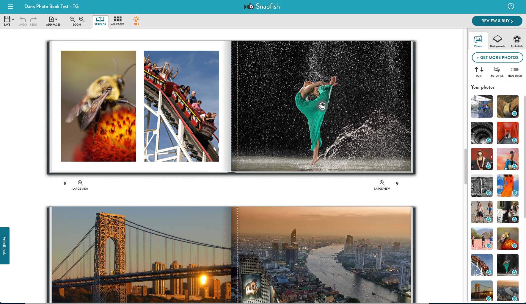
Photos, backgrounds and embellishments are on the right side of the screen, which is another good choice because it gets them out of the way but still makes them easily accessible. Meanwhile, layouts and designs are found next to each page, so you can quickly experiment with how you want your images displayed.
Once you’ve selected a layout, such as a side-by-side photo spread, just drag and drop your images onto your page. You can then zoom in and center an image by grabbing and holding the hand icon. If you want to move the actual frame in the layout, grab the photo outside of the hand icon and drag the image to where you want it.
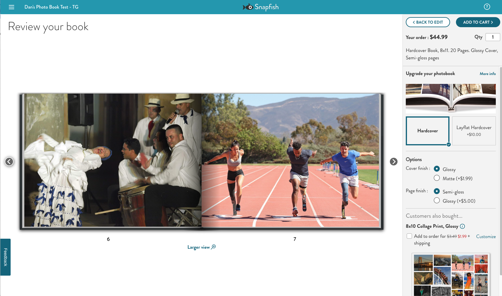
If you like what you’ve created, you can duplicate a page with the same design elements to use somewhere else in the book. Best of all, you can scroll through your entire book without loading a new page. Speaking of loading, Snapfish’s book builder had the fastest load times of the various companies we tested, with virtually no lag when dragging and dropping images or scrolling through layouts.
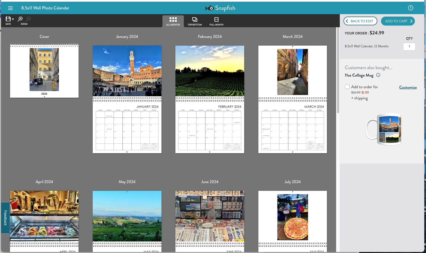
The calendar software is similar to books, but it’s a bit trickier picking layouts and inserting photos. Layout templates are on the left side for calendars and they’re a jumble of options, from one photo per page to four or more. There’s also an “Instagram Layout,” option, which tries to mimic the small square format of Instagram images. We thought it was a poor representation of Instagram, which reduced the impact of the images by making them significantly smaller.
We also weren’t crazy about Snapfish’s Autofill choice, which automatically places images in the calendar for you. It ended up cutting off a lot of our shots through strange cropping. For our calendar, we chose a simple layout that let us place one photo above each monthly grid and liked the results fine, although it was a little boring.
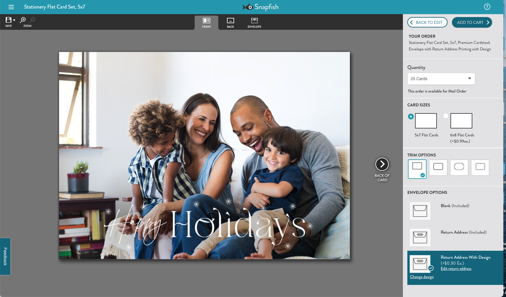
Selecting and designing photo cards was also a breeze despite Snapfish’s extensive selection of thousands upon thousands of options. While we felt overwhelmed picking a card design with some competing services because of confusing organization, Snapfish does a good job of helping you narrow down the choices thanks to filters that let you quickly sort between, for instance, landscape vs portrait photo orientation, card type, colors and other options. As with all of our testing, we chose a simple holiday card design that emphasized the family photo vs something more ornate. But unlike some other services which forced us to weed through many designs that didn’t suit our needs, Snapfish’s smart filtering got us right to what we wanted.
Snapfish review: Print quality
Snapfish photo books
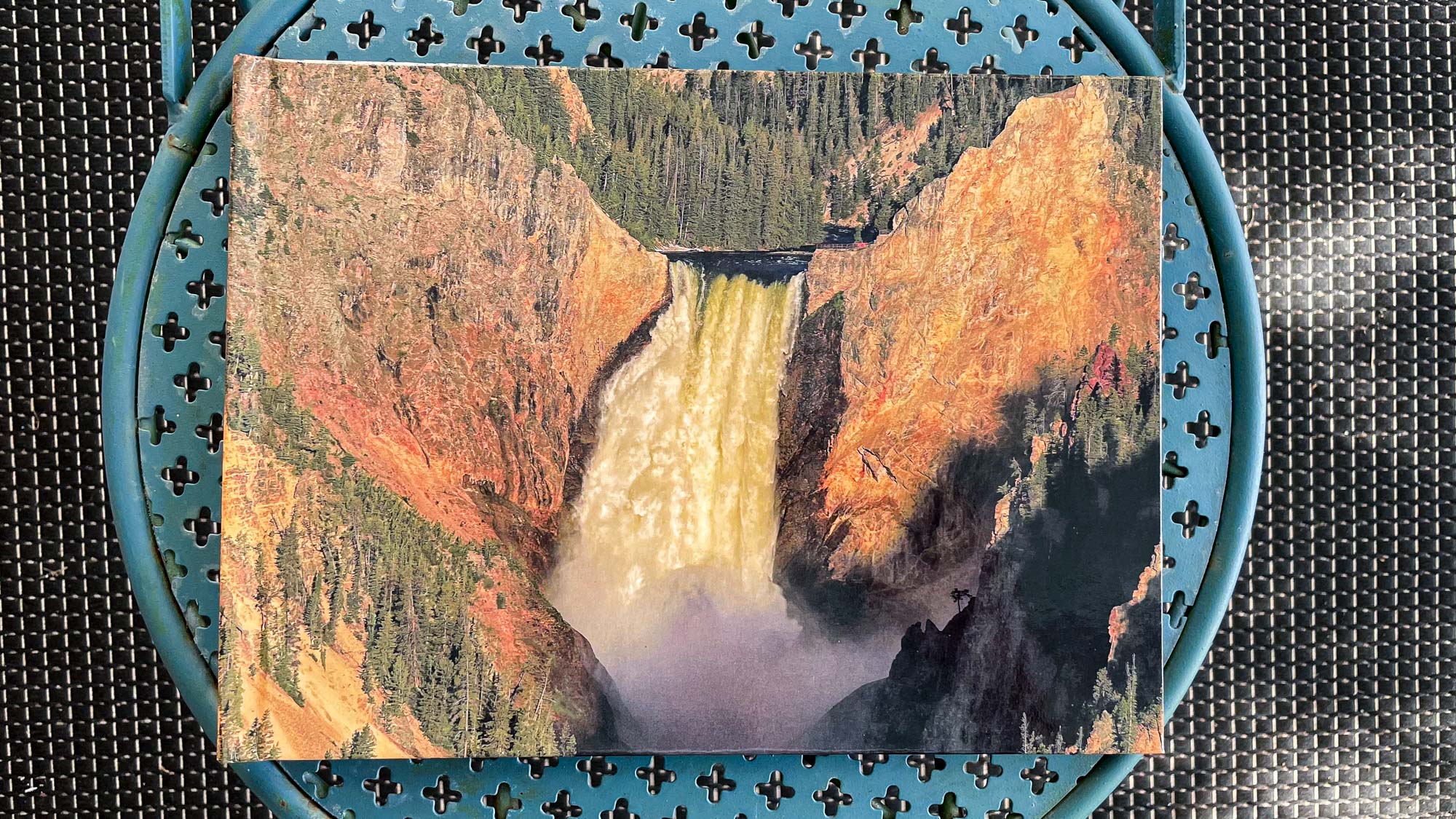
As mentioned previously in this review, Snapfish’s print quality was disappointing for photo books and calendars. The bright glossy hardcover of our book didn’t look bad from a distance, but when inspected closer it lacked detail in the flowing waterfall shot. The limbs of the pine trees at the top of the image also blended together. Not awful but not great either.
The print quality of the inside pages is where Snapfish really stumbles. The floppy pages in our standard 8 x 11-inch book were the thinnest of all we created from the various companies. On the other hand, while the stitched perfect binding of the book looked cheap, the crease between pages cut off only a small portion of the images. Comparatively, most of the other books in our testing obscured noticeable portions of photos in the binding.
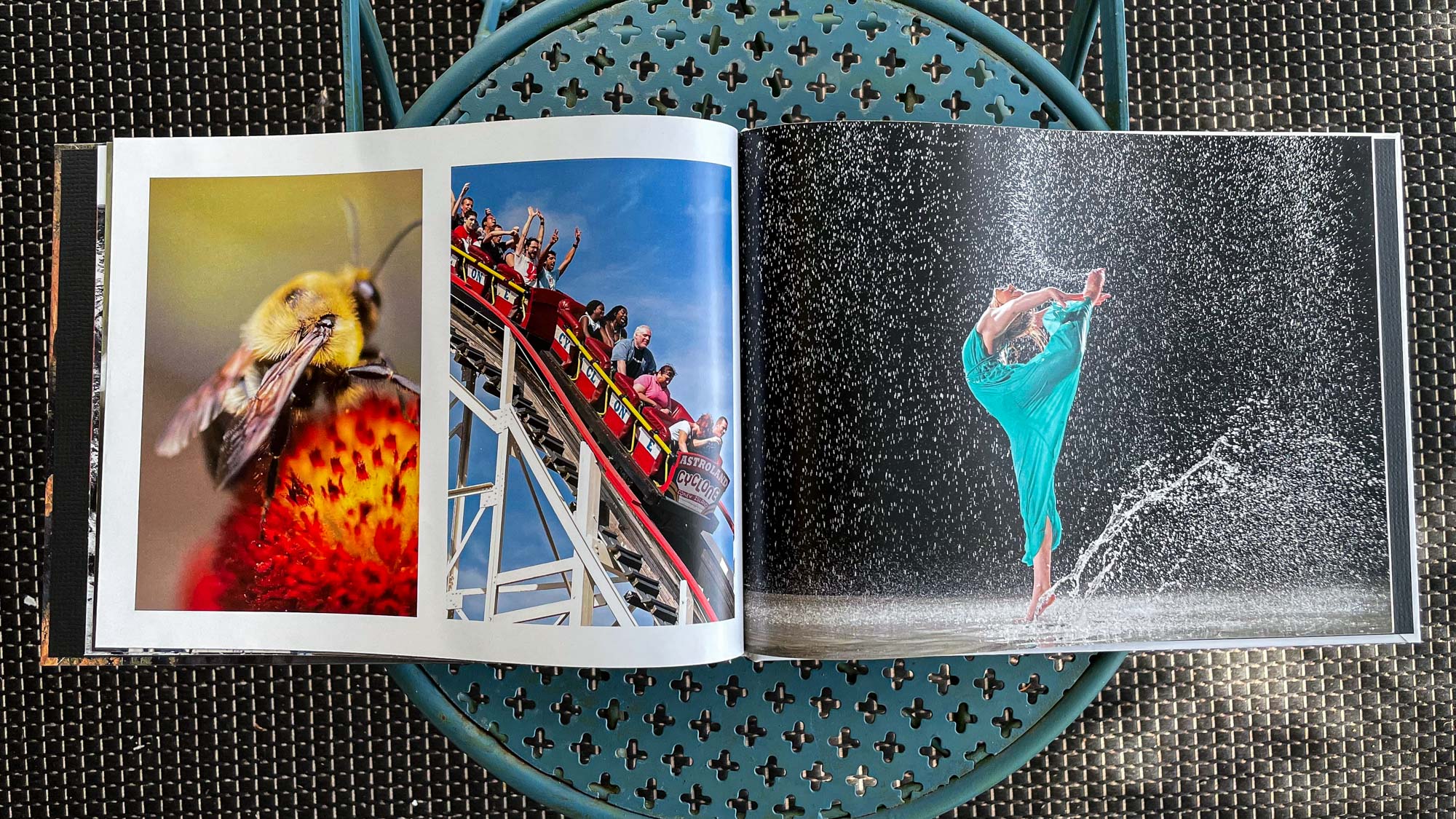
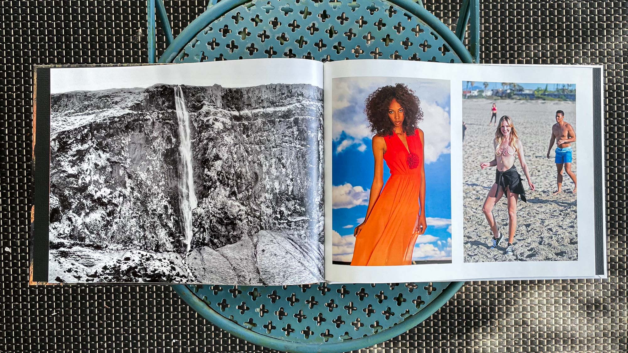
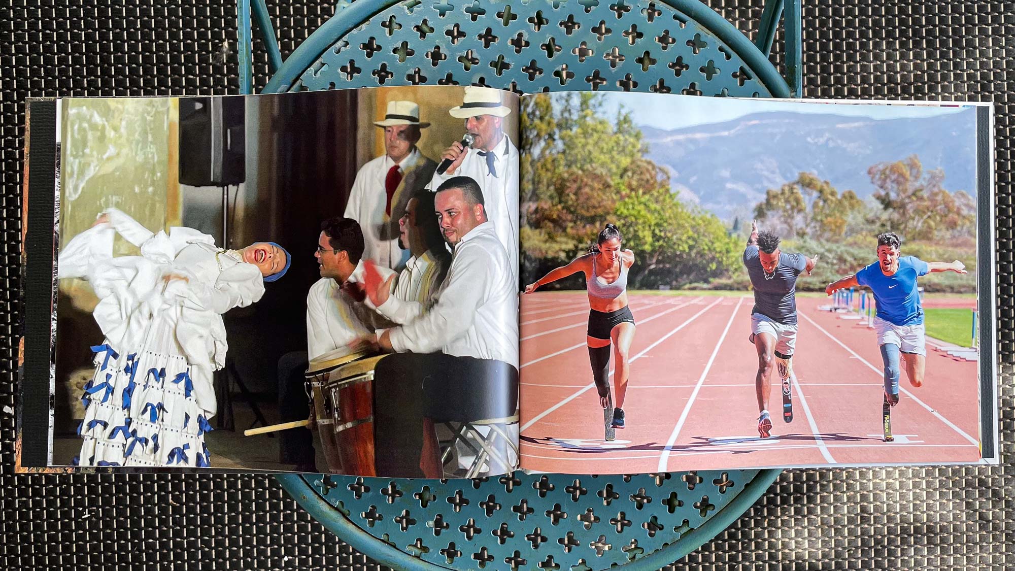
Snapfish’s printing overexposed much of the detail in the highlight areas of images while making darker regions, such as shadows, look muddy. Color was also inconsistent with reds and oranges appearing oversaturated, while blues and greens had a slightly washed out appearance. Darker skin portraits weren’t bad but subjects with pale skin looked blown out. And finally, the textured black end papers inside the front and back covers felt low-end and in distracting contrast to the cleanness of the rest of the book.
Snapfish calendars
Snapfish’s calendar came in last for print quality out of the five services we tested. As with the photo book, colors were somewhat muted overall. We used images we shot during a summer trip to Italy for our calendar and there was a disappointing lack of vibrancy on the calendar pages.
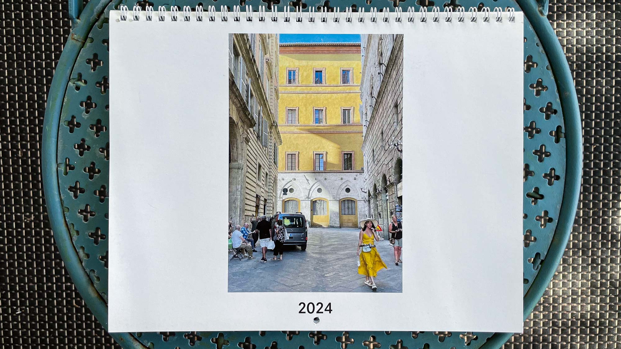
This was particularly true for the cover shot, which was of a street scene in Siena. The bright yellow of the girl’s dress and the building behind her came across as a pale pastel, which lacked pop. The same was true for the dull treatment of the various Tuscan streetscapes and landscapes throughout the calendar.
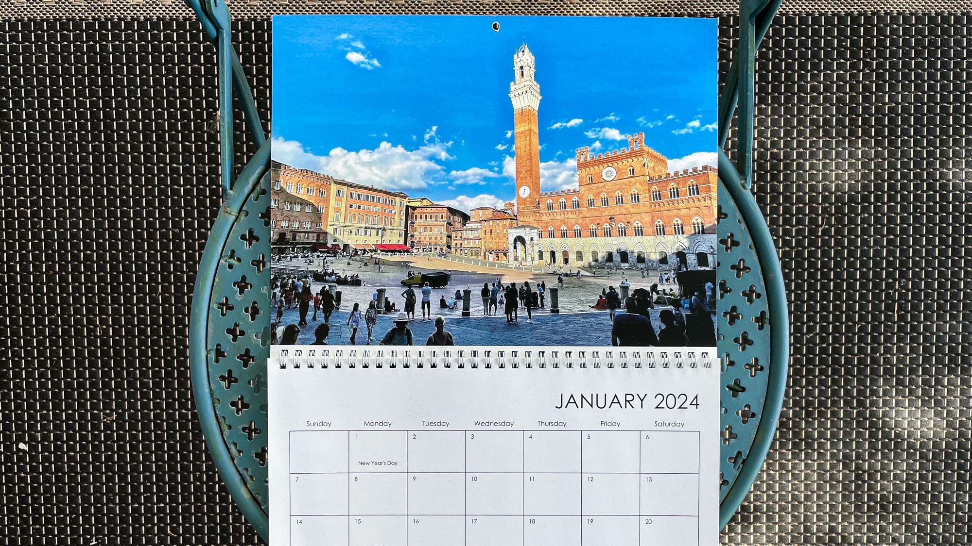
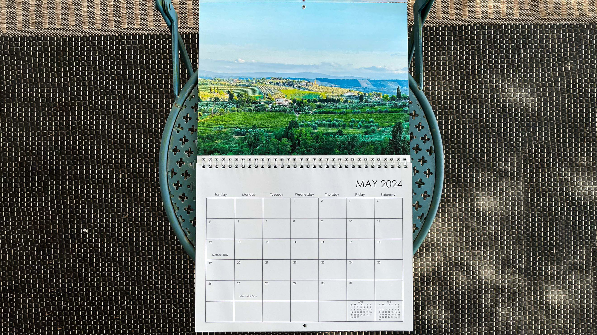
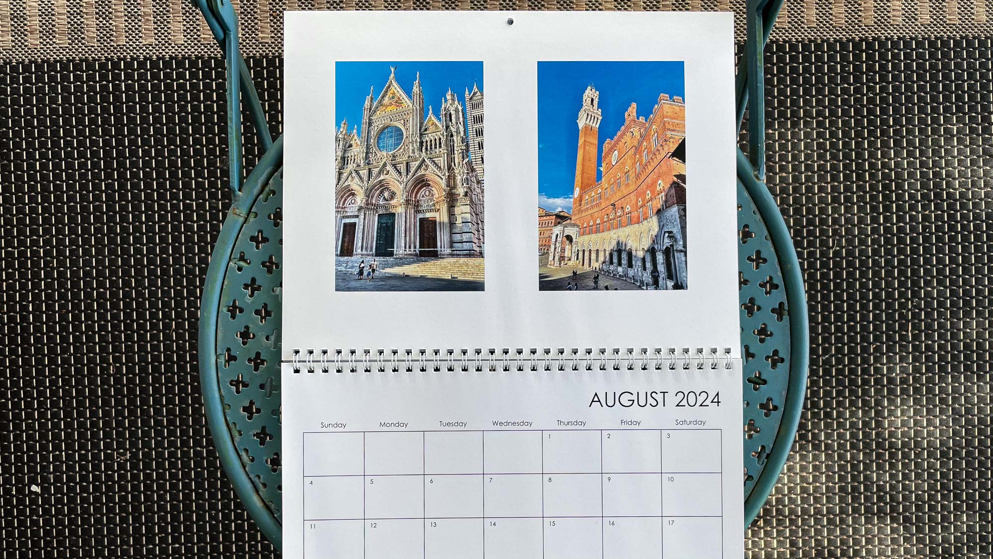
The build quality of the 8.5 x 11-inch, 12-month wall calendar itself was ok if unremarkable. Pages were on the thin side and the spiral bound construction, while better than the rickety one from Shutterfly, didn’t seem durable. Overall, the calendar reminded us of something you might get for free from a dentist’s office – functional if not particularly attractive or impressive.
Snapfish photo cards
As with its sister brand, Shutterfly, Snapfish’s photo cards were excellent. In our testing, they actually finished a close second to Shutterfly and we’d enthusiastically recommend either company if photo cards are the only thing you are making.

Snapfish had no trouble producing accurate color and exposure for the family image on the front of our card, which featured a range of skin tones. There was also good detail in their facial features and clothing. While the "Happy Holidays" text got a bit buried by the family portrait, that was mainly our fault. If we had positioned it above their heads instead of at the bottom of the card, it might have looked better.
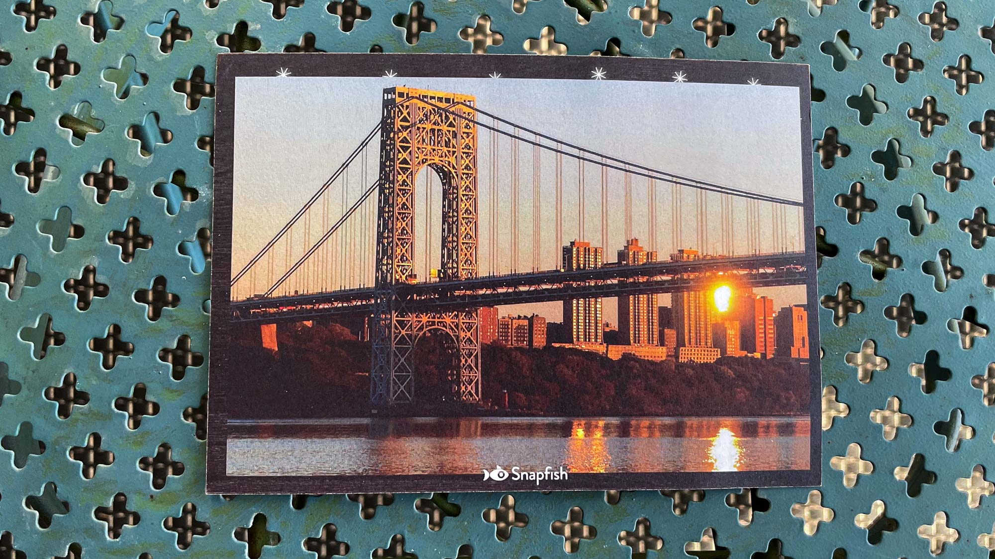
The rear of the card, which features an image we shot of the George Washington Bridge at sunset, looked crisp and inviting with good detail in both the bright and shadow areas. The standard cardstock of our flat 5 x-7-inch card was weighty and felt good in our hand. Overall, it’s a professional-level card at a budget price.
Snapfish review: Verdict
Overall, Snapfish was a mixed bag. On the one hand, the company’s user-friendly software was the best of all the companies we tested, which will appeal to those who are new to having their photo products printed with an online service. On the other hand, the finished results were uneven. Snapfish’s photo books and calendars were the worst of the five companies we tested with washed out color, overexposure, and flimsy construction.
Surprisingly though, its photo cards came out on top in our testing. Print quality was excellent, particularly for the family portrait on the front of our holiday card, while the standard card stock had a high-end feel. If ease of use and photo cards are most important to your printing needs, Snapfish is the one for you. Those seeking first-rate photo books and calendars should look to Mixbook, which is tops among the best photo books we tested.


