It's not hard to make a splash in smaller bathrooms, and if social media has taught us anything, it's one area that can really benefit from going bold and beautiful with your design. But it still needs to be functional, and focussing too much on the aesthetics while forgetting the practicalities is one of the most common small bathroom design mistakes.
The design experts I spoke with are all in support of going big when it comes to your small bathroom ideas, but they also advised to proceed with caution. After all, no one wants to end up flushing money down the drain when it comes to designing a space.
Below, design experts have shared some of the most common (and even surprising) design mistakes that homeowners make too often when beautifying their bathrooms. These are the things to watch out for, and, more importantly, how to fix these faux pas if you find one.
1. Choosing a Vanity Purely for Aesthetics

Small bathroom storage needs to be not just sleek, but also sufficient. Any tiny room can quickly feel cluttered and chaotic if there isn't a designated place for everything. For that reason, choosing a bathroom vanity with multiple compartments, drawers, and units is essential.
"More often than not, people tend to ignore functionality in vanity design," say Hardesh Chawla and Monica Chawla of Essentia Environments. "Overlooking functional elements like integrated dustbins or laundry hampers within the vanity can cause inconvenience. It's important to blend aesthetics with practical design elements to ensure ease of use and to maintain a tidy space."
A vanity that looks beautiful but doesn't offer somewhere to store things is most likely going to be a mistake. If your bathroom is particularly small and it's hard to find a standalone unit that fits your needs, the experts I spoke with suggested it would be worth getting one designed specifically for the space. This way you can even get one made from your material of choice.
2. Having a Separate Bath and Shower

Everyone wants a modern bathroom that feels indulgent and offers multiple functions, but in smaller spaces, it's important to be realistic about the square footage and how to maximize it without making the room feel cramped.
Instead of opting for a separate bath and shower, consider positioning the shower over a bath. "Shower baths provide the versatility of a quick, efficient shower while also allowing for the luxury of a relaxing soak in the tub, making it perfect for both busy mornings and leisurely evenings," says Marie Flanigan, founder of Marie Flanigan Interiors.
A shower bathtub design can also become a focal feature in the room, especially if you consider a tiled shower with a built-in tub, or those constructed with uniquely-veined marble slabs.
3. Choosing the Wrong Tile

Bathroom tiles can make or break the look of the room, as they not only provide aesthetics but also ensure safety and ease of use. A common small bathroom design mistake people make when choosing tiles is picking ones that look aesthetic, without considering their durability and maintenance needs.
It's also crucial to ensure that the tiles are resistant to moisture. Experts caution against glass and glazed ceramic tiles, as these can crack and also become quite slippery. You also want to ensure your tiles are uniform in size, as even the smallest sizing mistake will be immediately noticeable in a small bathroom.
Furthermore, the size of tile and grout you choose are both important considerations. "The scale of the tile affects the amount of grout and therefore the amount of cleaning, so larger format tiles might be better," says Stephanie Dale of Studio Webster Dale.
4. Forgetting Shower Storage

It's understandable that you may want to keep things minimalistic in order to save space in a small bathroom, but forgetting to include some kind of storage in the shower can be counterproductive, as shower gels, shampoos, and soaps will require a designated spot, otherwise you'll be left with a messy bathroom — a far cry from minimalism.
Every area needs its own storage, especially a walk in shower. "Carving out space within the thickness of the walls with niches can provide additional room to tuck away these items, reducing clutter in limited wall and floor areas in tight spaces," says Aejie Rhyu of ARA-La Studio. "Surface-mounted cabinets or shelves should also be thoughtfully considered."
A small niche is a great shower storage idea that ensures everything is tucked away, but still within arm's reach. If you have an existing space that you're looking to add additional storage too, there are a range of shower shelves on the market that can also help make your small bathroom stylish.
5. Not Providing Adequate Lighting

It's certainly not a crime to go 'big' in a small space; in fact, experts say it's the best way to create drama and interest in a tight room. Well, the same goes for lighting. It's an all too common small bathroom design mistake to think that less space needs less light.
It's crucial to ensure your small bathroom layout is well-lit with the right sconces and overhead lights. A layered bathroom lighting scheme will make the space feel elevated and even transform the feel of the space.
Add sconces, flush lights, and even pendants, and remember to add a dimmer setting to all. Also, natural light enhancers like mirrors will help you expand the room's illumination, and make it feel more roomy and breezy.
6. Positioning the Mirror Incorrectly

It's often an overlooked detail, but where you choose to position your bathroom mirror is significant to the way a space not only looks but also functions, especially when it's a smaller space. Ideally you don't want it to reflect plumbing, cabinet clutter, or the toilet.
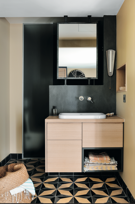
In the bathroom shown above, designer Aejie Rhyu explains that "the vanity faces the toilet so we positioned the mirror to ensure it was high enough that the shelf niche and any art over the toilet would be visible while minimizing the reflection of the fixture."
There are mistakes interior designers always notice in bathrooms, and to avoid making common small bathroom design mistakes, it's important to balance aesthetics with practicality. When there is less room to move, there is less room for mistakes.
Yes, it often pays to go 'big' with your design, but not when it comes to oversized vanities, showers, toilets, and sinks that will end up making the space feel cramped. Instead, focus that energy on your choice of color, lighting, or styling, and try to stay practical when it comes to the more functional aspects of the room.


