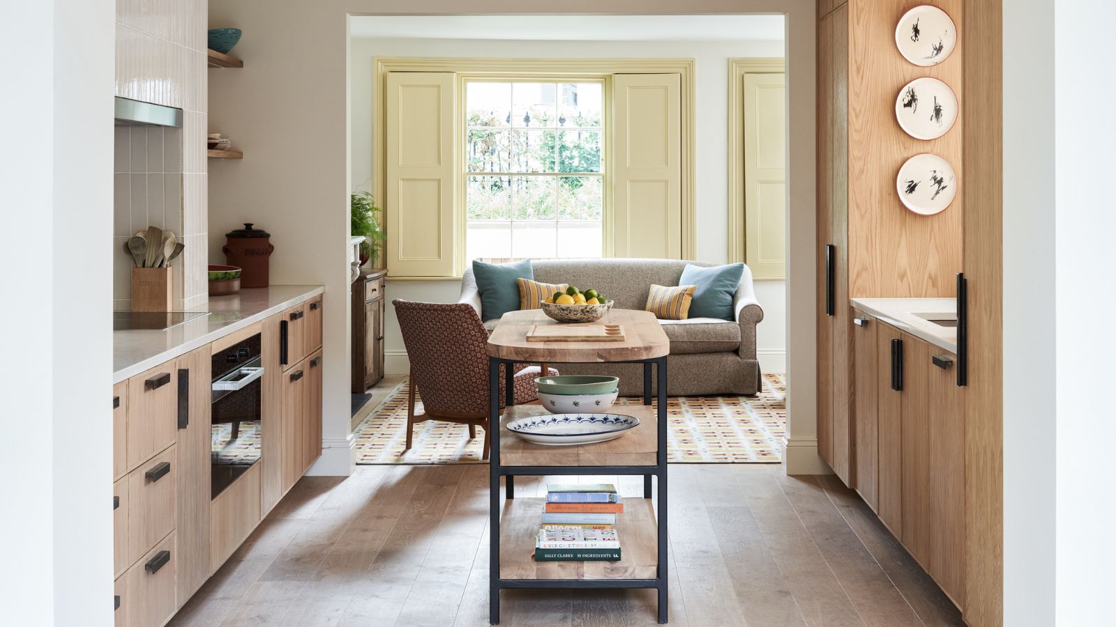
Simple, elegant, and as much storage as possible was the mantra for this kitchen designed by our team at Studio Atkinson. It was quite the challenge given we couldn’t expand the space. As it’s on the lower-ground floor of a Victorian home in west London, I was also keen to avoid a gloomy “basement” atmosphere.
The owners fell in love with this pretty house in an ideal location for them, but the proportions were a little tricky. Pitched between the conservatory and a small family room, the kitchen was a bit of a thoroughfare, and the original white units were rather blank and unremarkable.
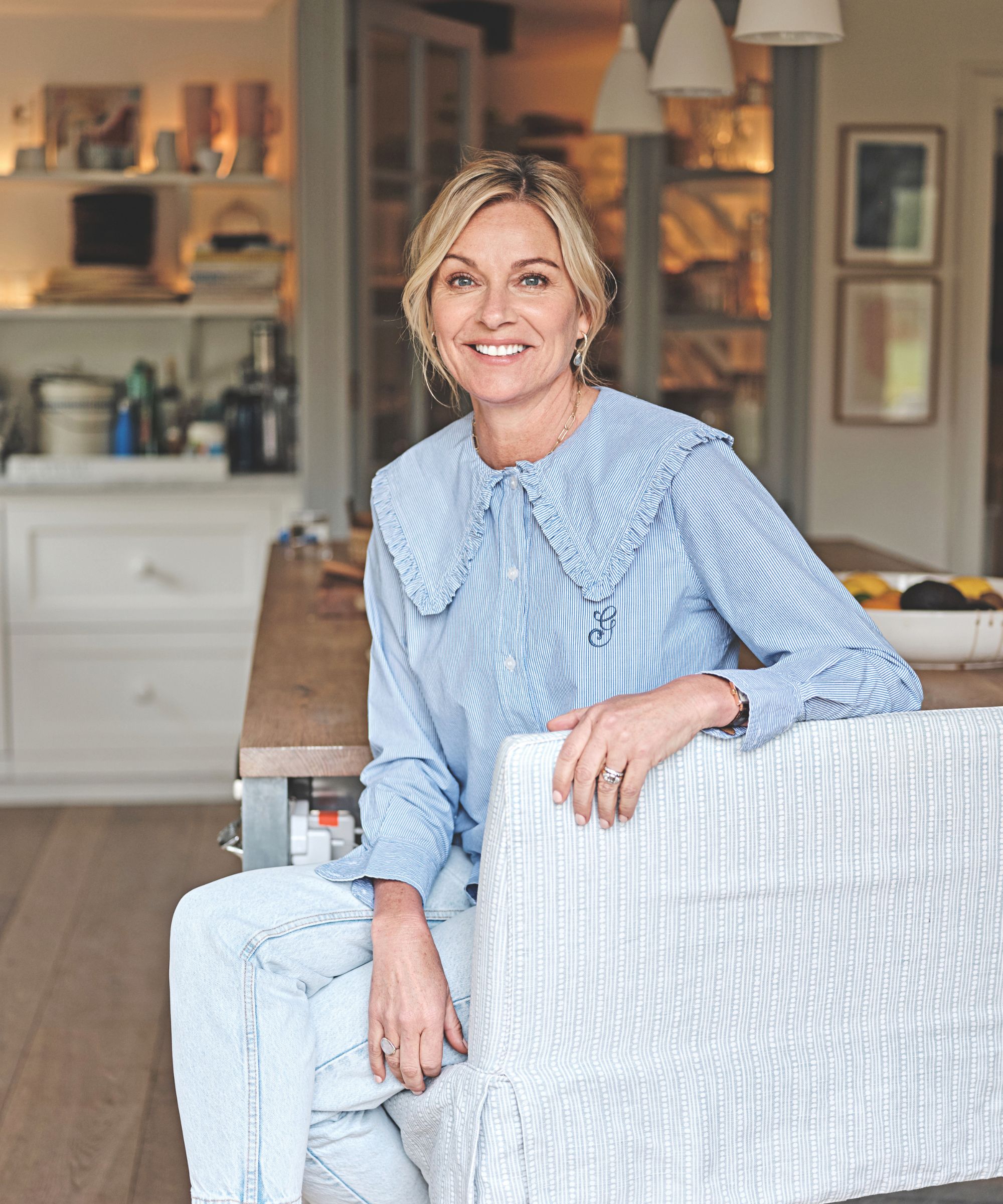
To start, we sought out kitchen storage opportunities, and in fact went beyond, commandeering some space under the stairs for anything not required daily and designing a large dresser-like cabinet in the conservatory/dining room for china, glassware, and a breakfast station. Keeping the cabinet door design very simple with just a thin edge detail allows the natural pale oak finish to shine.
We also went for oak on the flooring, which creates a subtle cocooning effect. Some people don’t think wood is very practical in the kitchen, but as long as it’s well sealed, it’s fine, and so much better for the acoustics than stone or tile.
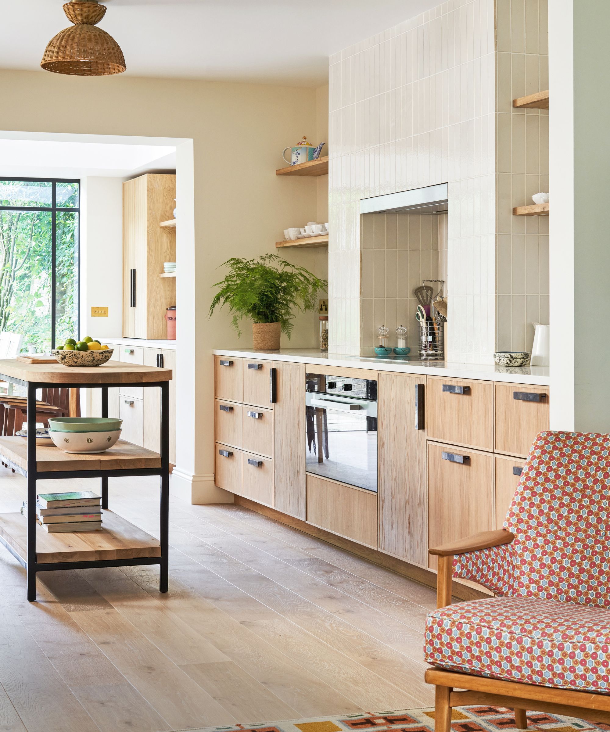
In any kitchen, there’s a fine line between help and hindrance when it comes to planning kitchen islands, but the issue is amplified in small spaces. Here, the island was made to our bespoke design so that we could achieve the maximum prep space without creating an obstacle.
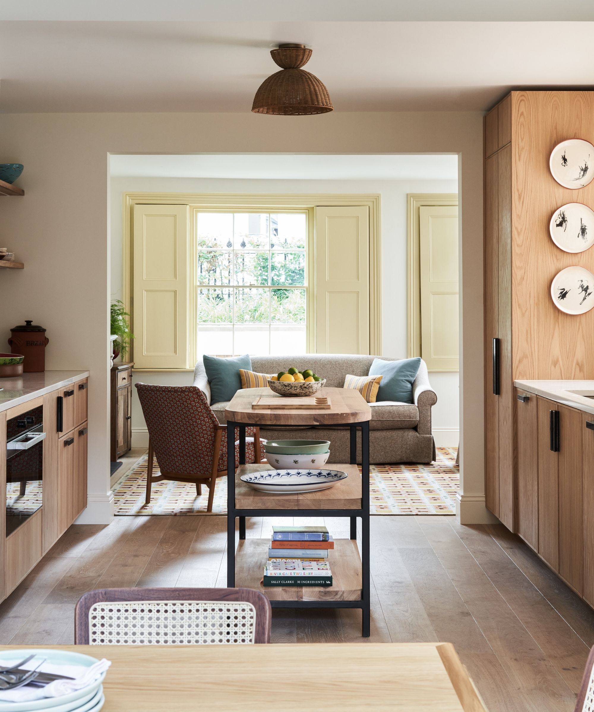
The open kitchen shelving lets the light through but also ensures it is physically light enough to move into the dining area when entertaining. We also opted for open shelving instead of using wall cabinets, despite the storage demands. Closing in the alcoves on either side of the chimney breast would have seriously compromised the sense of space.
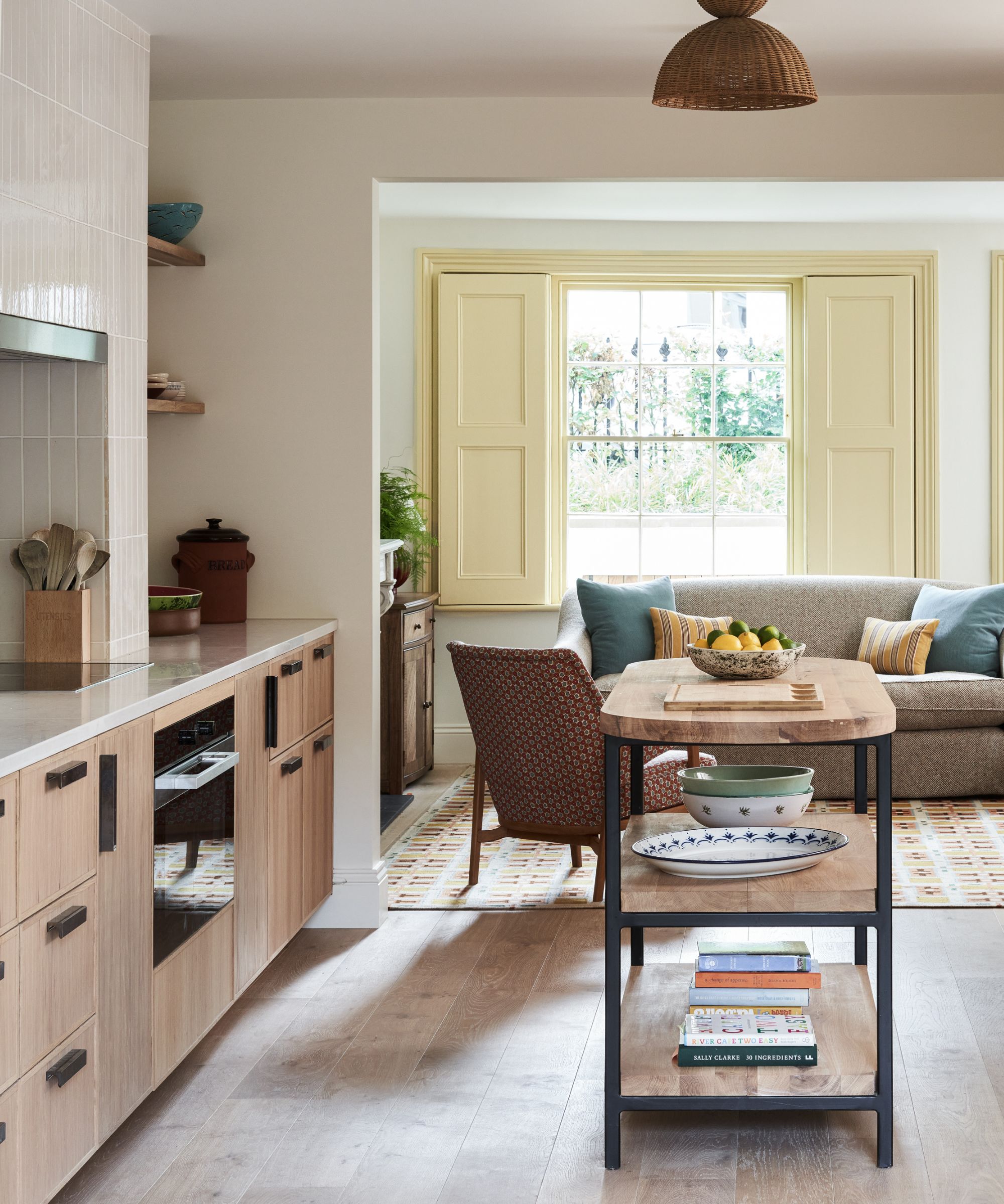
When dressing the space, I was seeking comfort without losing the integral simplicity. The raffia ceiling shade brings in a nice moment of texture. The rug is another textural moment, with a slight midcentury air. It pairs well with the owner’s vintage chair, which we had reupholstered in complementary tones.
Shop the look
To recreate the calm and minimalist style of this kitchen, pair natural wooden elements with warm beige tiling and paint. Introduce a touch of industrial style to keep it contemporary, but ensure the space still feels homely by welcoming upholstered furniture and a woven rug.
These Maiolica floor tiles from Wayfair have a stylish concrete effect and will create a fresh, streamlined surface in a kitchen.
Handpainted ceramics will create an inviting atmosphere in a kitchen. These ones by Johanna Ortiz are made in Antioquia, Colombia.
This pretty pale green enamel skimmer is a practical addition whilst adding character and charm with its vintage-style.
The Havonplane server from Ashley Furniture is a great way to introduce wood into your kitchen space to make it feel more calming, while providing extra storage.
This handwoven rattan pendant light introduces a touch of charm and playfulness.
Introducing a rug in your kitchen area is a great way to soften the space and make it feel more cozy. This handcrafted beauty is designed by Élan Byrd, a Miami-based artist
Adding an upholstered accent chair near your kitchen is a great way to add personality. This stylish option from Anthropology is made from natural caning and hardwood.


