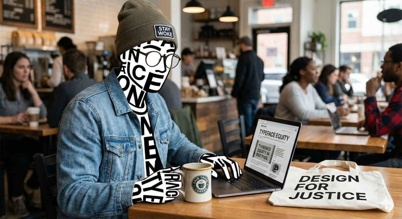
The U.S. State Department’s font feud, Secretary of State Marco Rubio ditching Calibri in favor of Times New Roman, quickly became a surprisingly charged typographic story. What might seem like a minor design choice turned into a symbolic stand against so-called ‘woke’ fonts, as not for the first time this year, innocent things we love – Superman, Jaguar cars, New Zealand – have become a target.
The debate itself, whether a modern sans-serif like Calibri, adopted under a Biden-era accessibility policy, counted as a DEI initiative taken too far, sounds absurd outside design circles. Heck, it sounds absurd just writing that sentence. But it shows just how much people project values, identity, and even politics onto the shapes of letters.