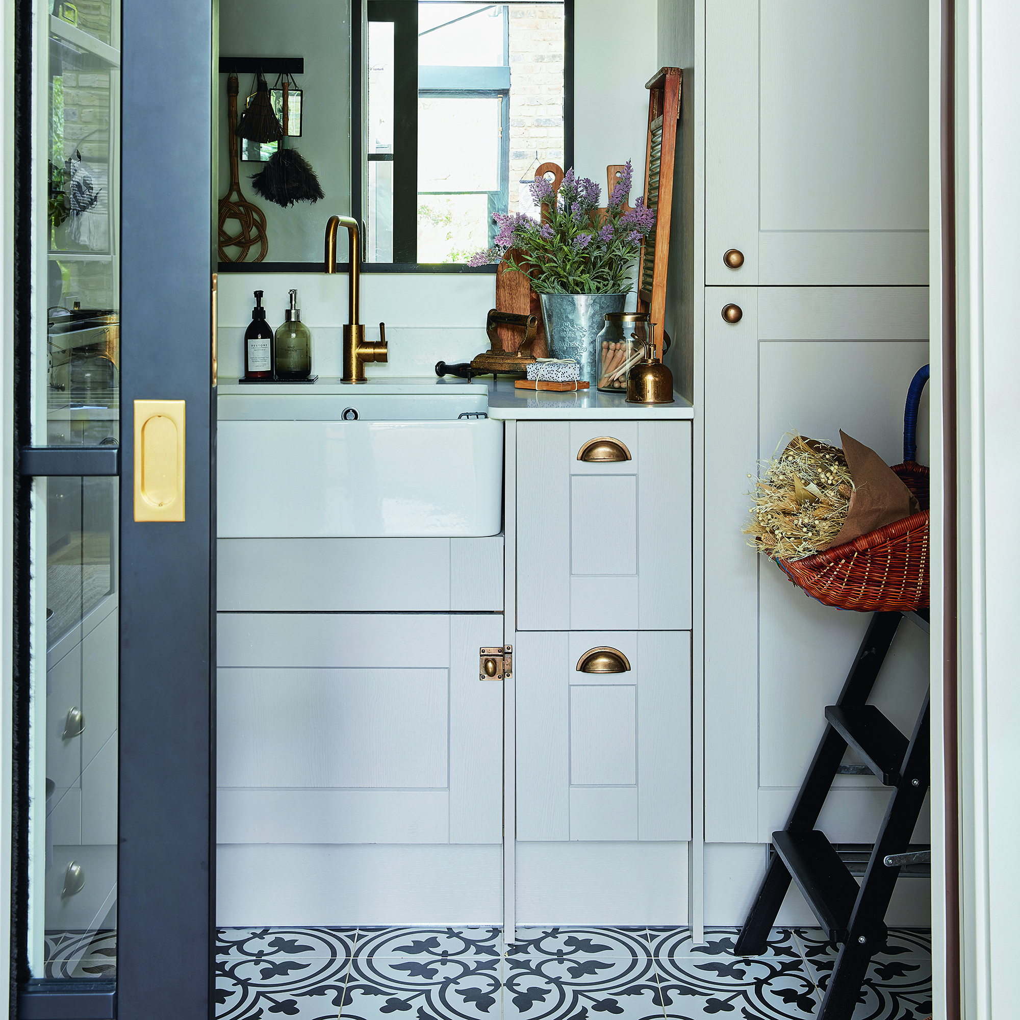
If you're lucky enough to have a utility room, or you're considering adding one to your home, then you'll also want to make sure it's your dream design. Regardless of whether it's an add-on to your existing kitchen scheme or not, understanding the answer to 'Should a utility room match your kitchen?' will make the decision-making process significantly easier.
Although a utility room is often a separate room closed off by a door, close proximity to the kitchen can leave it feeling like an extension of a cooking space. It's likely that the room will often be left with the door open and used for kitchen-adjacent tasks, so creating a bridge between the two in terms of design will be key to taking your interior decor to the next level.
However, a utility room is a practicality-first space that won't be front and centre for guests to see, so if you're looking for ways to cut costs, cabinetry and materials that match your kitchen might not be the best idea. But what should you be doing? We asked kitchen experts whether you should be matching a utility room to your kitchen so that you can plan your new design properly.
Should a utility room match a kitchen?
If you're planning a utility room renovation at the same time as doing your kitchen, it might make sense to go for a matchy-matchy scheme. If you're buying extra materials from the same retailer then you might be able to save some money and it will help to ensure that extra resources don't go to waste.
However, no rule says you can't make a design statement by choosing a contrasting look.
'There is no right or wrong answer when it comes to whether your utility should match your kitchen, though we tend to find that homeowners generally want the space to flow, with the same style of cabinets,' explains Richard Davonport, managing director at Davonport.
Giverny Simm, lead designer at Studio Howes, adds, 'A small utility room is a great opportunity to experiment with colour and personality. Like a w.c., it’s the perfect space to introduce a statement wallpaper or a bold feature ceiling. While it’s important to connect the utility room to the kitchen’s colour palette, it’s definitely a place where you can afford to get more creative and fun.'
In short, there is no right or wrong decision, but we do recommend forming at least one connection from the utility room to the kitchen. Whether it's through colour, materials or the style of units, these ideas will inspire an uninterrupted design.
1. Form a foundation with the cabinetry style
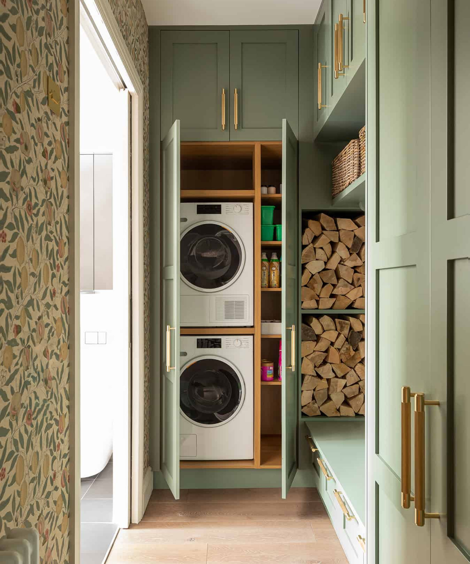
If you want to be playful with your utility room colour ideas then there is no harm in picking a more 'out-there' shade. A smaller space is the ideal spot to experiment and as it's often only seen by those living in the house, it will feel like your own secret zone to go to town with colour and pattern.
However, if you're going to choose a different colour scheme but still want to blend the two rooms together, then go for the same cabinet door style. Shaker kitchen doors create a classic look that won't date and look on-trend with almost any colour. It also means you'll be able to update the look over time by repainting.
2. Bridge the gap with a similar colour

'Colour also plays a crucial role if you do wish the two rooms to feel connected. It can be used to connect rooms without erasing their individual character and functionality,' explains William from Davonport.
This doesn't mean that you have to pick the exact same colour of cabinets for your utility room, you can instead pepper one shade throughout the design to subtly connect the schemes.
'For example, we often see kitchen islands painted in a secondary shade to the rest of the kitchen to create a focal point. This colour could then be used in a utility or boot room to connect the two. There is also the option of using different shades of the same colour to create a similar effect, depending on how closely you’d like the two spaces to feel,' William adds.
3. Paint in the same shade
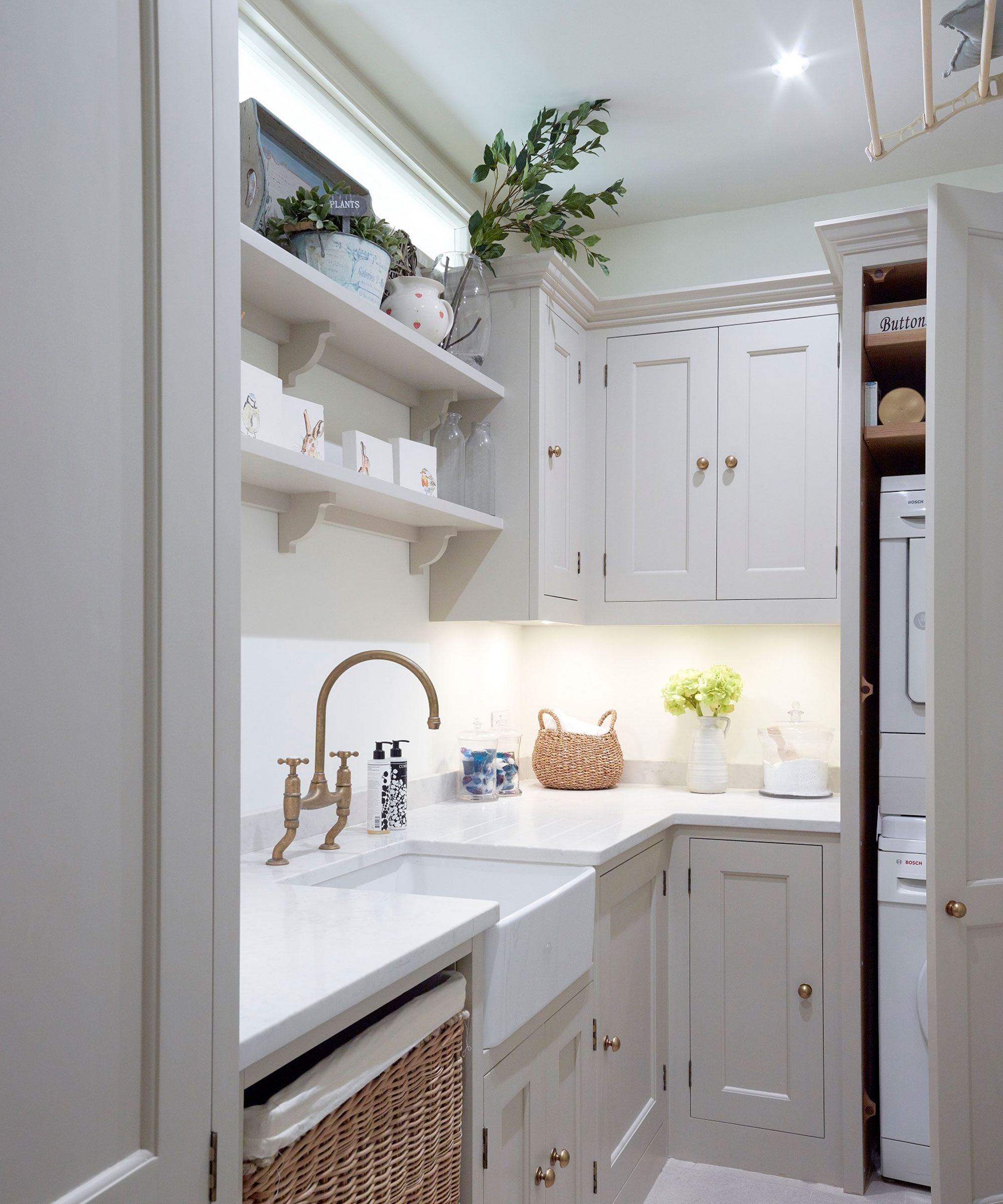
There is no denying the elegant effect of a matching utility room that extends seamlessly from the kitchen. If your utility feeds on from the main cooking area quite openly, without a door to close it off, then choosing a light tonal look will keep it feeling bright and spacious.
This is also a great way to make a kitchen feel bigger too. Matching the cupboards and colour palette will minimise visual clutter - so if there is any actual clutter (which is guaranteed in a utility), it will look much more streamlined. We love Little Greene 'French Grey' for a super chic farmhouse-inspired look.
4. Completely contrast with a bold hue
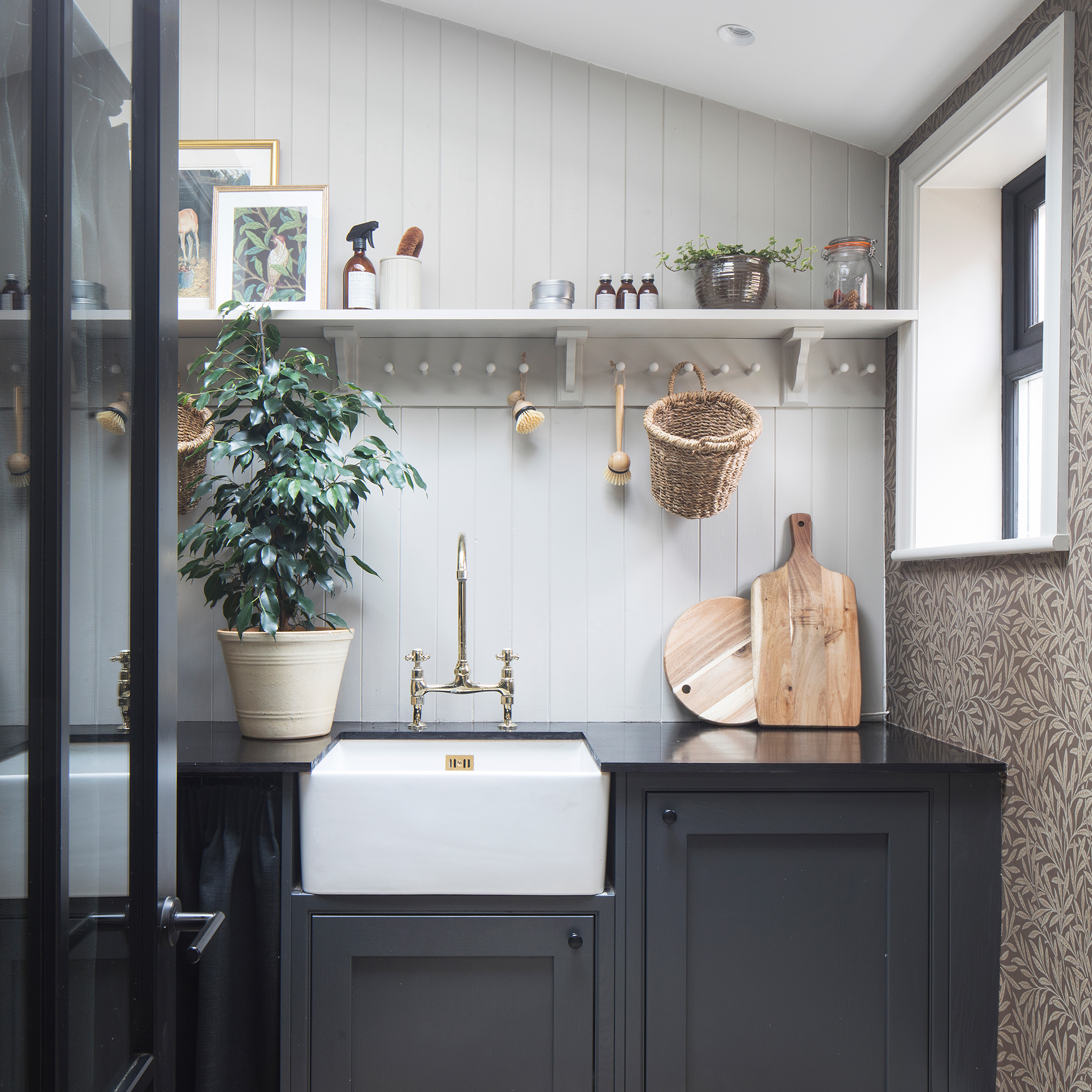
If you're going to mismatch your utility room from your kitchen, it's worth doing it right. Choosing a colour with a slight tonal difference to your kitchen, for example grey and beige, will create a confusing look that isn't quite obvious enough. Instead, opt for two shades with an obvious contrast.
It's common to choose a lighter colour palette for your kitchen to make the space feel larger and make it more timeless, so a smaller utility room is the perfect place to go for that bold colour your heart is set on. Complete with a glass connecting door to get a taste of the dramatic hue from your cooking space. 'Downpipe' by Farrow & Ball is one of our favourite charcoal tones that will look premium in any setting.
5. Create a continuous flow with flooring
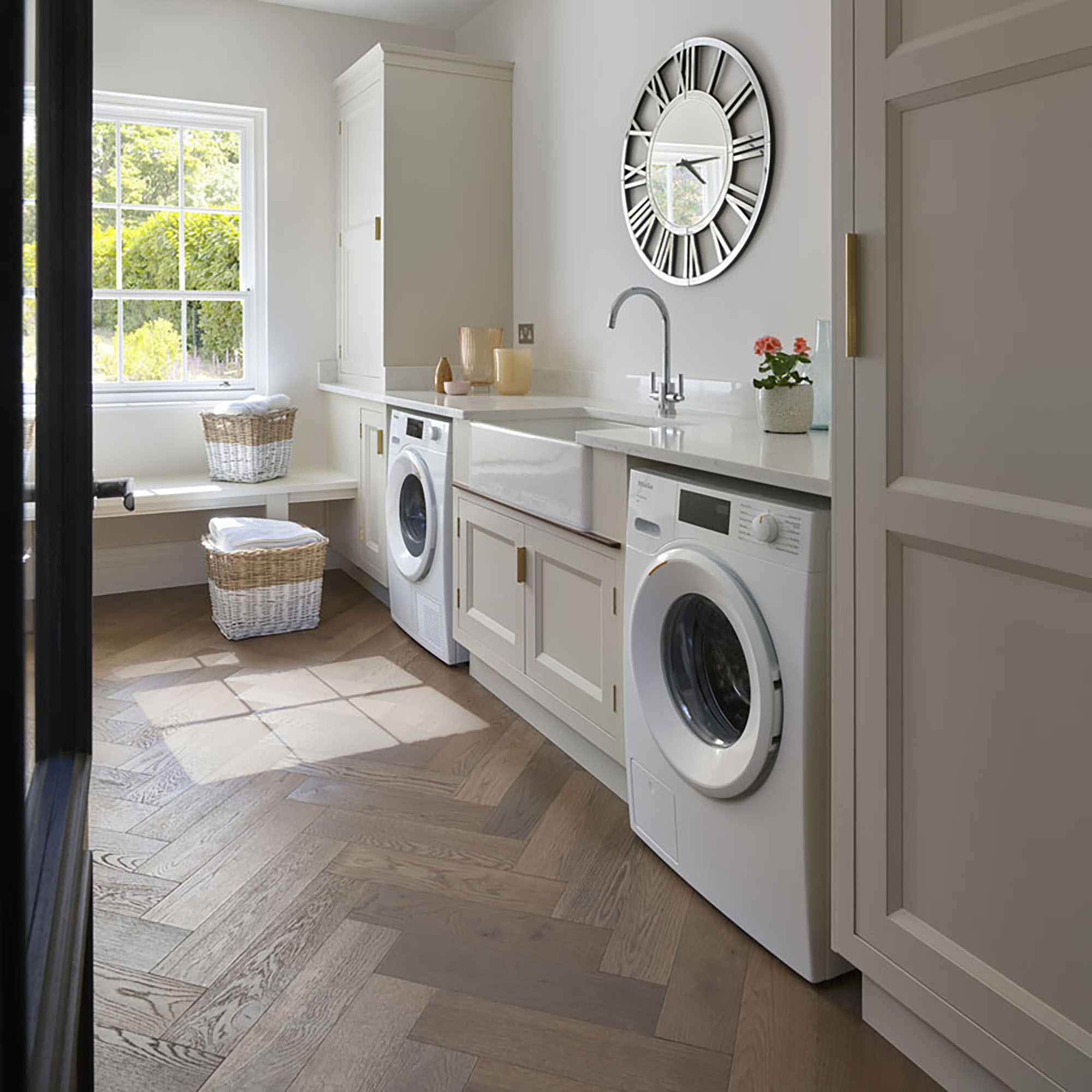
Utility room flooring is one of the most important decisions you will make for your space. In a practical area where there are likely to be messy paws, cleaning product spillages and wet laundry, it needs to be moisture-resistant and non-slip.
But aside from practicality, flooring is a great design tool to merge your utility room and kitchen. If you've opted for different styles of cabinetry or a different colour scheme then picking the same flooring and laying it in a continuous pattern will subtly lead the eye into the next room.
Are you tempted to go matchy-matchy or not? We love the idea of choosing one feature, whether that's a material, colour or cabinet style, to tie the two rooms together then having a bit of fun with the rest of the design.


