As with the rest of design right now, 2026’s color trends are drifting toward the earthy, the warm, the genuinely natural. And, call it a sign of the times, but the palette is darkening too. Those sunshiney, attention-seeking shades like 'Brat Green' were already feeling passé; 2026 is simply sealing the chromatic coffin.
What people want now is something truer on their walls, hues with honesty and weight. So unlike the trending colors of years past, in which fleeting, very 'trendy' colors dominated, 2026 is looking to be full of warm, welcoming, liveable colors. And that makes them very easy to bring into your home. So below, find the five colors designers say will define 2026, and our favorite buys in each shade to help steer your next decorating chapter.
1. Chocolate Brown
Chocolate brown made our 2026 color roundup with ease, and according to 1stdibs’ ninth annual Interior Designer Trends Survey – taken by 468 design professionals worldwide – the decadent hue isn’t fudging. ‘Chocolate brown prevails again as the top color designers anticipate using in 2026, with 33% of survey respondents selecting it this year, a percentage that has almost doubled over the four-year period beginning 2022, when it stood at 17%,’ the report notes. In other words, the appetite is only growing.
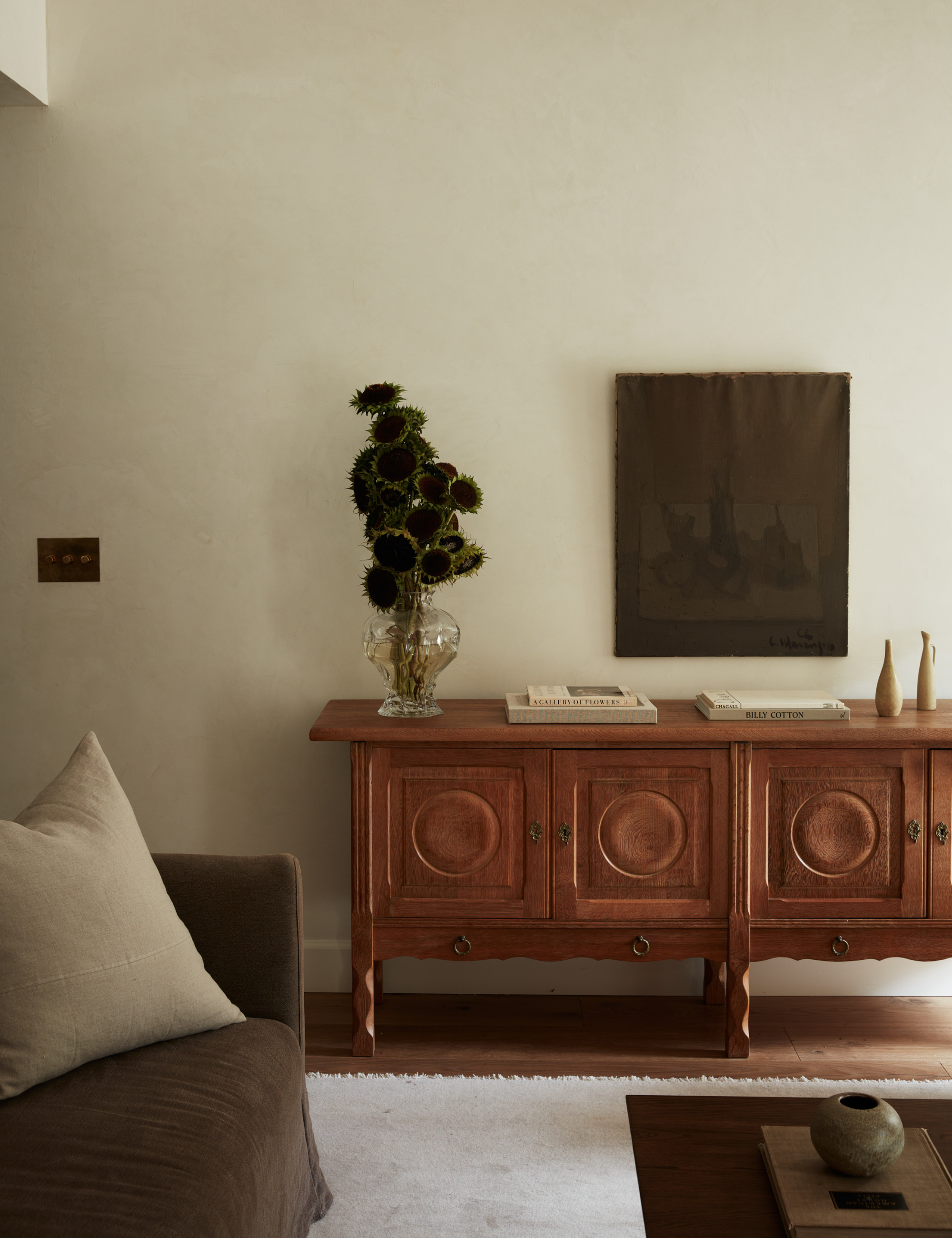
With that kind of ubiquity, you don’t have to search hard to find chocolatey decor, but some sources are really cooking up something sweet. Curatorially minded Nickey Kehoe and the vintage-adjacent Joon Loloi are leading the pack at retail. On the project side, look to designers like Molly Kidd, whose Oregon living room pairs a tonal chocolate still life with a midcentury Danish oak sideboard – demonstrating that the shade’s richness plays beautifully with both rustic and modern influences. Chocolate isn’t just trending; it’s becoming a new-classic neutral.
The only thing better than one chocolate tone is two. This doubly delectable rug uses tonal layers to deepen your whole living room color scheme.
Chocolate brown meets bouclé in this subtly conical accent stool from TOV Furniture. It’s an easy dose of richness beside an armchair or a quick way to warm up a lonely corner.
Tired table? Swap the taper. These hand-dipped candles from coastal Maine play well with candlesticks, new and old, somehow making everything around them feel markedly more current.
2. Burgundy
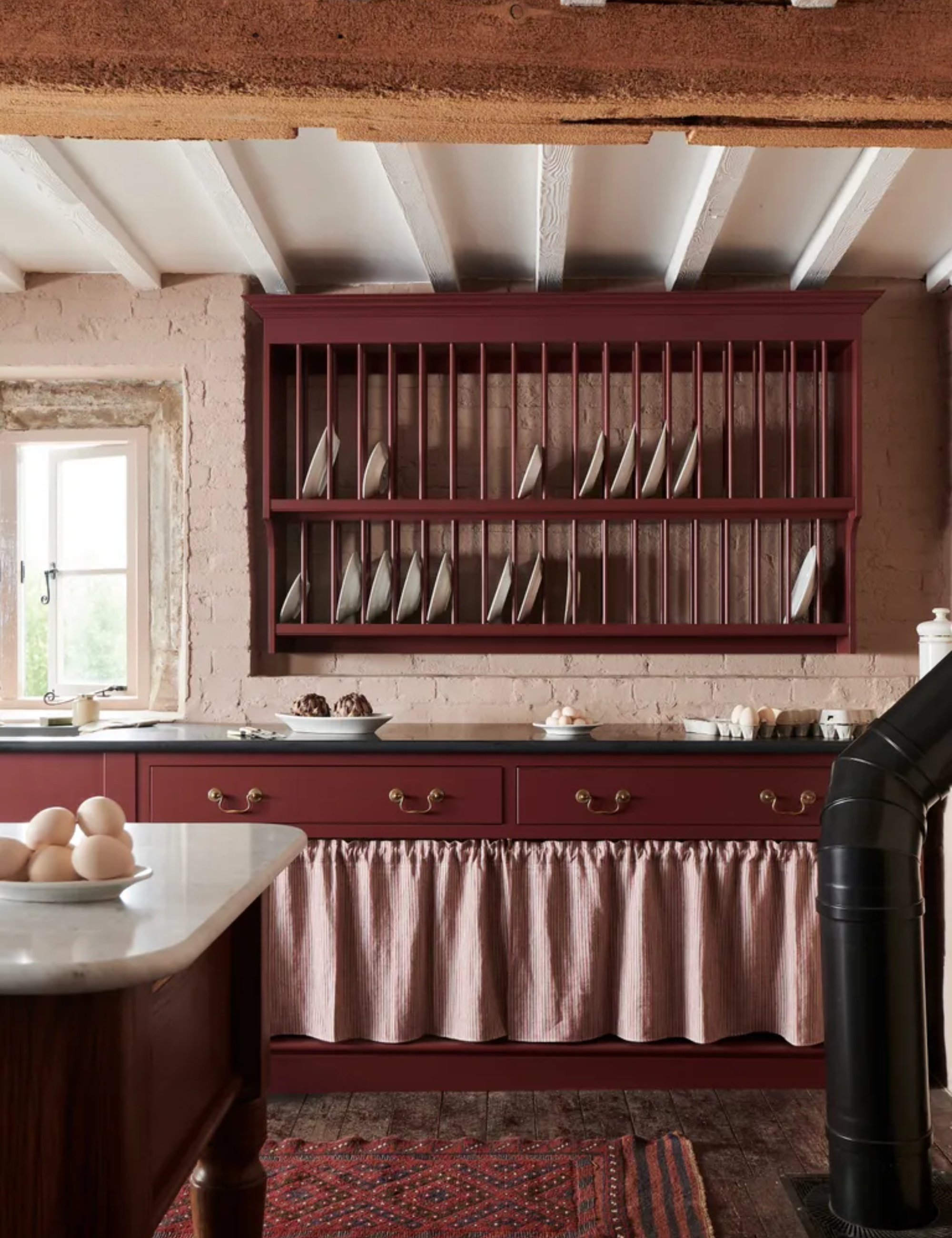
Whether your moniker of choice is oxblood, bordeaux, black cherry, or simply burgundy – the deeper, darker end of the red spectrum is having a real moment. According to 1stdibs’ global designer survey, the hue jumped from 7% in 2025 to 21% for 2026, a seismic leap echoed by Little Greene’s Color of the Year announcement: Adventurer, a posh plum aubergine.
This is a slight shift from the racetrack-ish reds we're used to. It’s moodier, more aged – almost cross-pollinated with the chocolate-brown obsession shaping so much of design right now, as if the color itself has developed a patina. Even taste-shapers like Shea McGee have made the pivot, coating her pantry and powder room in Benjamin Moore’s Barista AF-175, a deep maroon we’ve been lusting after for months. If you’re craving drama without diving off the deep end, this is the red to watch.
Almost brown but not quite, Shea McGee has officially mastered the art of deep, deep burgundy. Set chrome, glass, or brass barware on top ahead of any entertaining.
This moody Quince set is an elegant way to add this on-trend hue to your bedroom. It pairs beautifully with solid or striped duvets in oxblood or, if you want something warmer, a burnt terracotta.
If the palette is starting to feel a little too demure, Chris Loves Julia adds a playful counterpoint to their ongoing Loloi collaboration with this ruffled–border throw pillow.
3. Khaki
Paint brand Sherwin–Williams crowned Universal Khaki SW 6150 its Color of the Year 2026, and for once – a small handful of 'boring' accusations aside – the consensus feels pretty unanimous. Khaki stands as a versatile, timeless classic. As anyone who has spent time eyeing the neutral-obsessed worlds of Banana Republic or The Row can confirm, not all beiges are created equal – and this is one of the good ones.
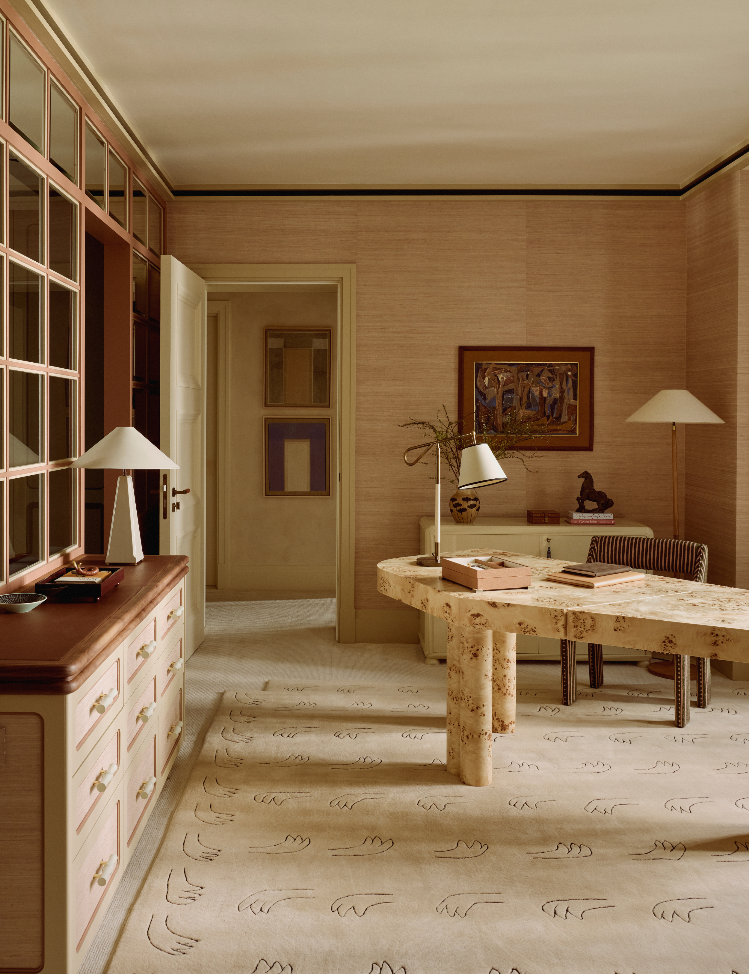
Universal Khaki is a mid-tone tan evoking archival workwear, a little nostalgic for the days when people actually dressed for the office. Expect other paint brands to follow suit and retailers like CB2, Lulu and Georgia, and McGee and Co. to accelerate the renaissance. It's worth noting that the tone has also blanketed one of the most well-appointed closet-meets-home-office spaces we’ve ever published, just in case you were doubting its range.
Whether it lands on your walls or your overcoat, khaki is shaping up to be 2026’s elevated essential.
Color trend of 2026, meet our favorite pillow trend of 2025 (and almost certainly 2026): the unipillow. This minimalist shape and mid–tan tone make a lovely pairing on a bench or bedscape.
Perfectly imperfect – and better because of it – this whispering hue gets its depth from hand–hewn dimples in cotton mache, each one pressed and painted by skilled artisans.
Beige is anything but boring when it shows up in this sculptural ceramic mirror frame, inspired by the maker’s travels to Ravello – a place defined by palazzi, Renaissance villas, and hidden gardens. It looks as wanderlust in a bathroom as it does on a hallway wall or styled into a bookshelf vignette.
4. Powdery Pastels
It’s not all doom and gloom. While in-your-face brights like 'Barbie Pink' and 'Brat Green' are well behind us, their softer, more wearable counterparts are very much still in play. The Diet Coke versions. A whisper, if you will.
According to 1stDibs’ Interior Designer Trends Survey, designers are leaning hard into these gentler shades. ‘Soft pastels have also experienced a sizable shift among designers, reflecting rising popularity across fashion and home decor this year. Butter yellow more than doubled in popularity, from being cited by 14% in 2024 to 30% in 2025, with cornflower blue, powder pink, and pistachio also emerging as popular choices,’ the 2025 report notes.
When fashion and interiors start speaking the same chromatic language, you can consider the prediction basically carved in stone. Pastel pinks floated through the Resort 2026 runways at Max Mara, Chanel, and Isabel Marant, while pistachio took a starring role at Ferragamo, Victoria Beckham, and Valentino under Alessandro Michele’s new, more whimsical eye.
It begs the question: has design slipped into a collective dream state? Possibly. Swap these softened shades in for your usual whites and see how quickly the room exhales.
One word: darling. This lighting idea blends periwinkle and the softest pink, a cotton-candy gradient we suddenly need at arm’s reach – deskside or bedside, preferably both.
Clean lines and a quietly upbeat hue turn the act of reaching for a tissue into something unseasonable chic. An easy way to add a hit of color to a powder room.
For anyone who prefers their stemware as subtle as their palette, this borosilicate martini glass from Anthropologie checks both barely-there boxes.
5. Blue-Greens
Behr’s 2026 Color of the Year, N430-6A Hidden Gem, is described by the brand as ‘a smoky jade that is both gentle and mysterious,’ while WGSN landed on an almost identical shade with its own pick, Transformative Teal – a hue the trend-forecasting giant says reflects a cultural moment of shift and reorientation. According to their reports, blue brings steadiness and familiarity; green evokes water, fluid and unpredictable. Together, they form a serene middle shade.
Backstory aside, this blue–green family is an approachable entry point into pigment for the color-averse. And because it’s so inherently calm, it can take a hit of its chromatic opposite – orange, terracotta, rust – without losing its cool. An invitation to peacock, if there ever was one.
Give guests a taste of blues of the best kind with this ceramic dinner set, inspired by the raw textures of nature. Pair with gold or brass cutlery to dial up the opulence, or keep it in the silver family for a cooler, more restrained table.
Bold linear forms meet baroque curves in this Sicilian-night candlestick by Fratelli Bevilacqua. It’s moody, a little romantic, and compelling even before you add the wax.
Add a playful note to the day’s most mundane task with this kitchen floor-ready mini mat from Target. It’s a low-lift, high-impact foray into what’s shaping up to be the moody colorway du jour.
Mauve is also a new entry that deserves an honorable mention. The 80s tonal revival is having a resurgence, and designers are reworking this so-called ‘grandma’ hue into something surprisingly current for 2026.