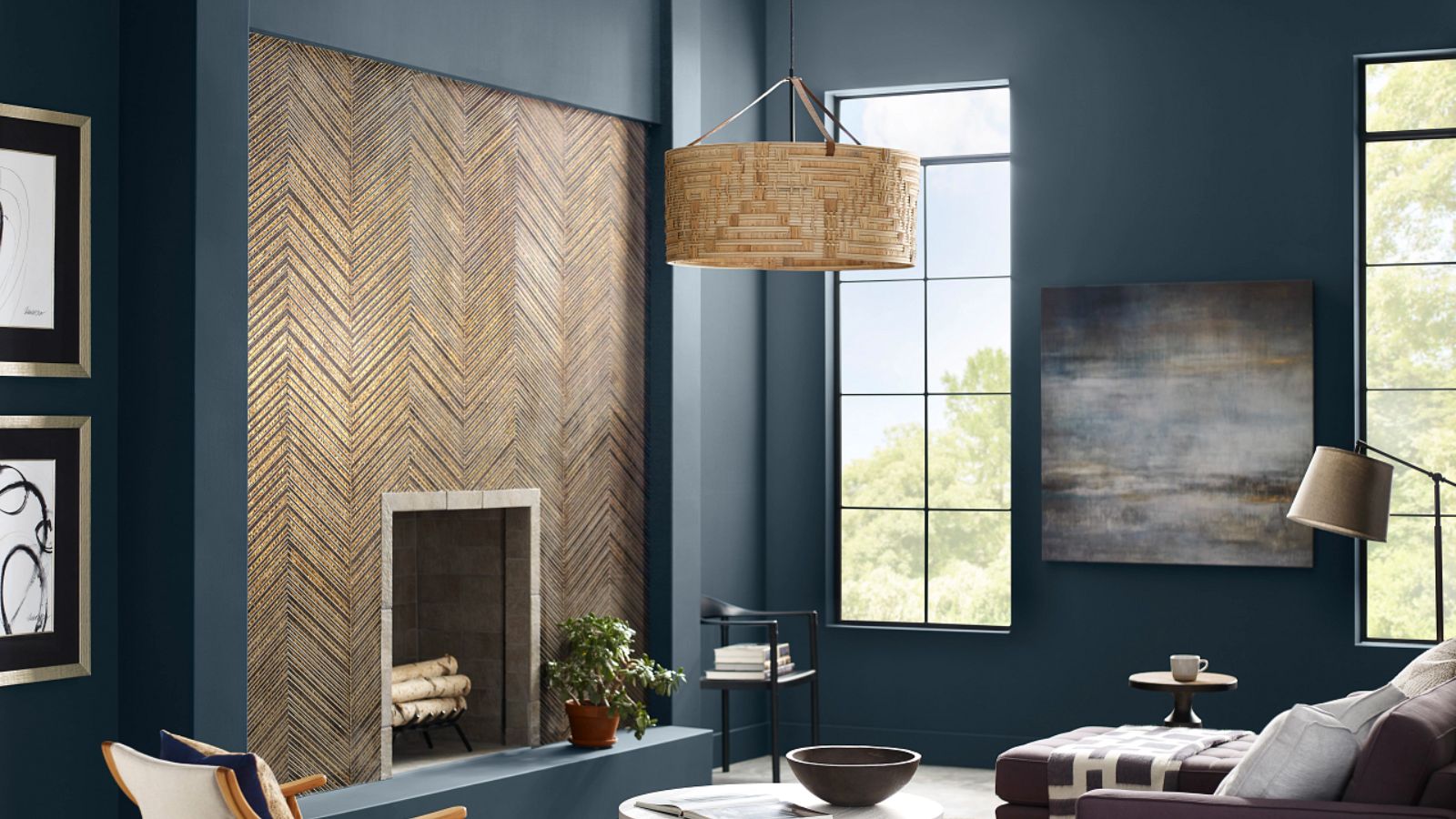
Iconic paint brand Sherwin-Williams has launched its 2024 color trend report, Anthology: Volume One, compromising 48 hand-selected hues for the year ahead and beyond.
The newly-launched color trend report marks a new biennial approach to the renowned paint company’s annual Colomix Forecast, defined by its organization by color family which explores the directional shift of each color palette and its impact on defining modern aesthetics.
Marking the first Anthology collection, the 2024 report comprises four chromatic color families: blues and greens, reds and purples, deeps and darks, and delicate tints.
‘Through the launch of Anthology, we are thrilled to diversify our yearly color forecasting report to show the depth behind each color trend for the coming year,’ explains Sue Wadden, director of color marketing at Sherwin-Williams.
‘In releasing a new volume of the Anthology collection every other year, we hope to bring new color insight to the distinct chromatic families that our designers, industry pros, and savvy DIYers have come to know and love. These palettes – organized by color family for ease of use – will represent the beautiful shifts we are seeing within the world of color here at Sherwin-Williams.’
Below, we take a closer look at each of the four color families, exploring the deeper meaning behind the colors and how best you can incorporate these inspiring shades into your home.
1. The convergence of blues & greens
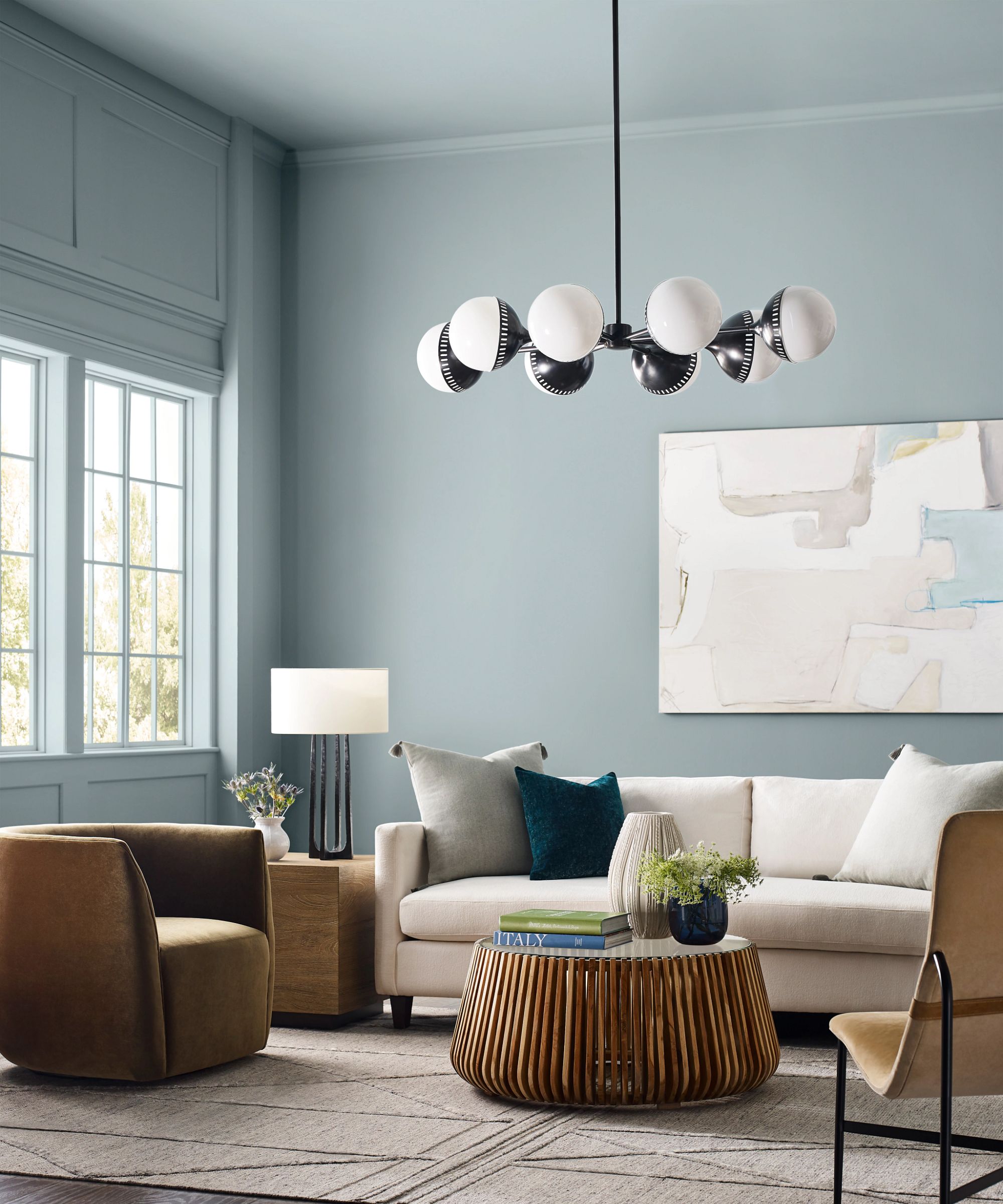
The first color family is centered around blues and greens, comprising a wide range of shades from soft and subtle to bright and bold. With a focus on the synergy between the organic origins of green room ideas and the calmness associated with blue room ideas, this color story has been carefully crafted to inspire a relaxing atmosphere in the home.
With clear nods to organic and nature-inspired shades, the color story balances the wellness-boosting qualities of muted green tones with the daring and invigorating deep blues.
Pictured above, the shade Stardew has been used in a living room, mirroring the color onto the ceilings for the ultimate cocoon-like feel. Pared with beige and cream-colored furniture, this muted blue promotes a modern take on traditional interiors.
2. The poetry of reds and purples
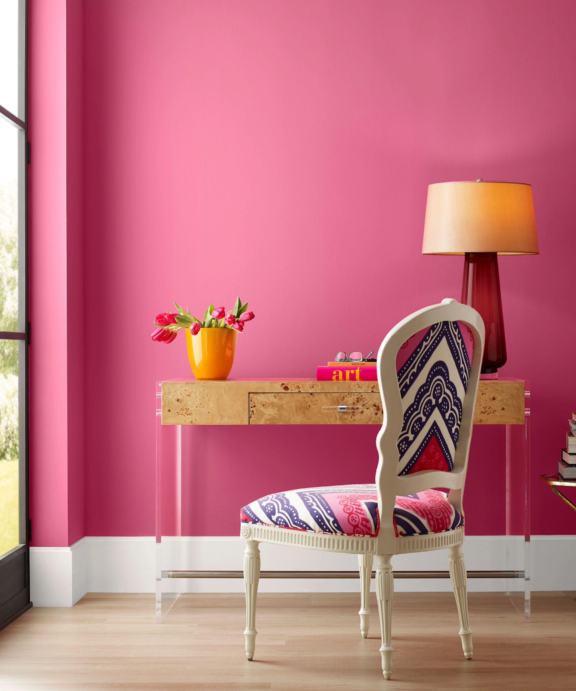
A celebration of experimental and warm color schemes, the red and purple color story ranges from deep reds to soft and feminine pinks. Brought together by underlying earthy undertones, this palette predicts a new take on reds and purples for 2024 and beyond, upgrading millennial pink with nostalgic and muted hues.
With clear nods to 2023’s iconic Barbiecore trend, the shade Dragon Fruit is modeled in the above image, injecting a playful and bold take on an otherwise understated interior.
3. A gathering of deeps and darks
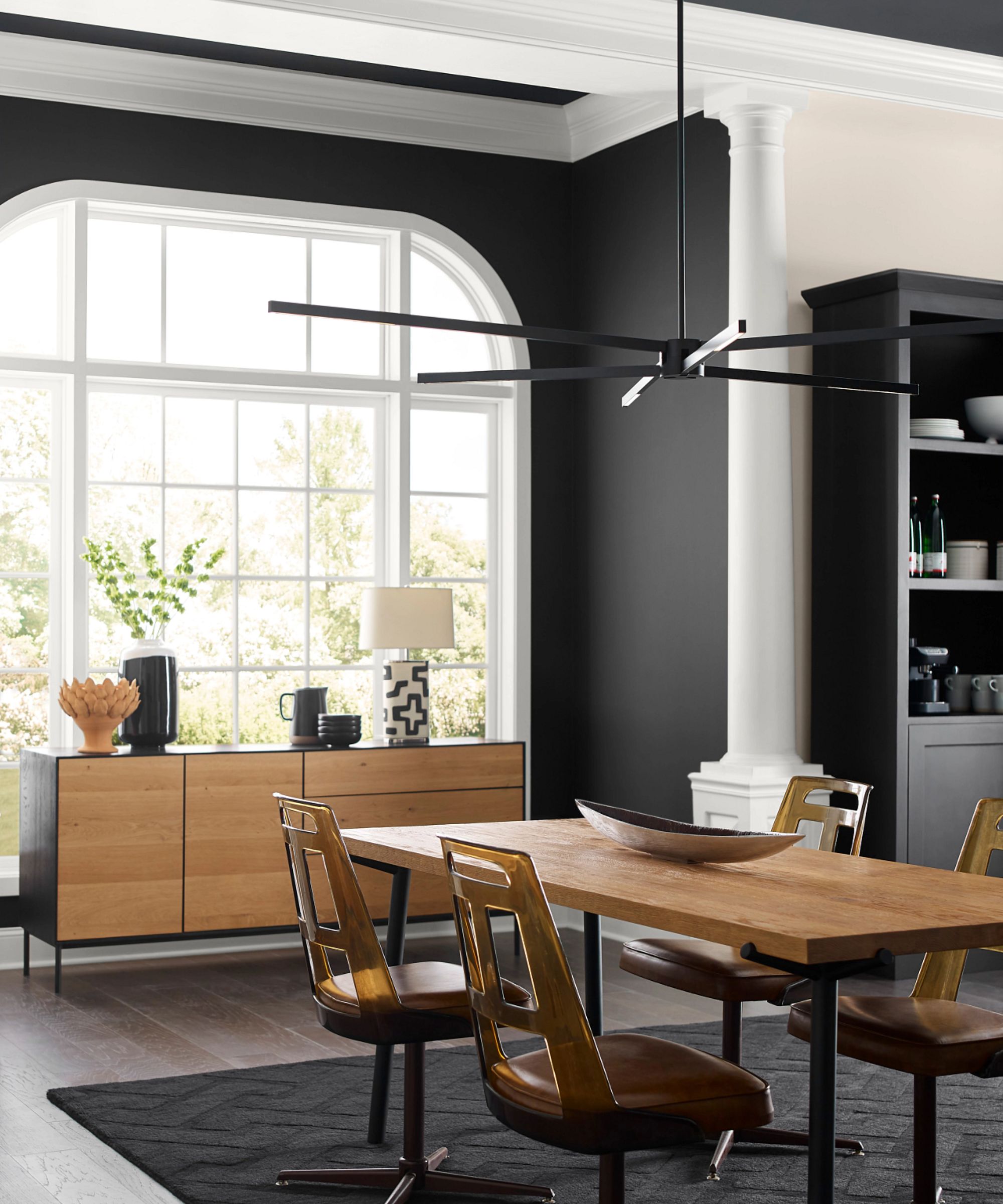
The third color story included in the 2024 trend report is all about deep tones and black room ideas. Signifying power and mystery, this color palette is a collection of deeply saturated tones guaranteed to bring the drama. Whilst it may seem a stark choice for the home, dark colors remain a popular choice in the world of design thanks to their ability to create an atmospheric and comforting space.
'In an era where well-being is increasingly important,' says Wadden, 'dark colors can offer solace and soothe anxieties. Since 2020, deep-value tones have become synonymous with sanctuary, nurturing, and artisanal touches.'
Shown above, the shade Tricorn Black has been used in a dining room; offset against the bright whites the deep-colored walls create a sophisticated and timeless space that nods to the quiet luxury trend.
4. A study of delicate tints
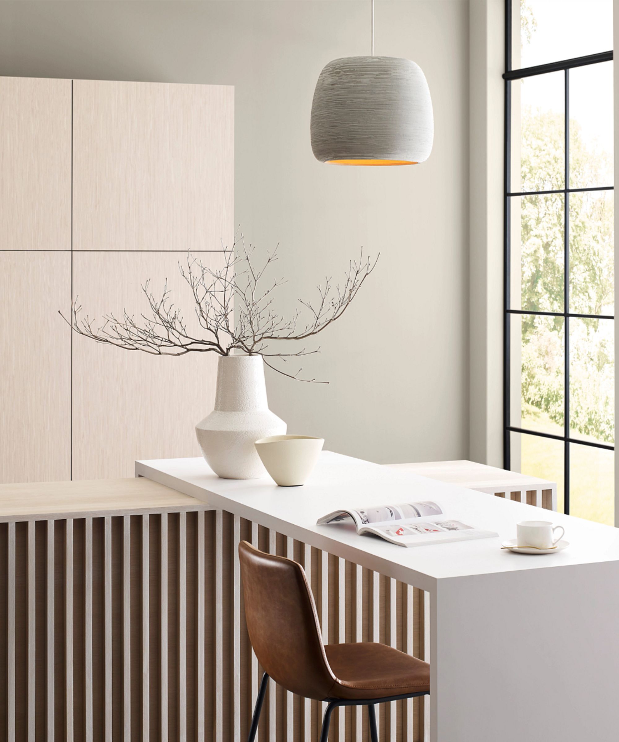
Elevating classic whites with an exploration of hushed and neutral tones, the 'delicate tints' palette lends itself to modern and minimalist decor. ‘White is widely utilized as a clean and calming wellness color; however, moving into 2024 and 2025, it will become linked to sustainability, conservation, and slow living,’ Wadden predicts.
Comprising soft shades, this palette celebrates the art of subtly and enforces the importance of neutral tones in a home to create a serene and uplifting atmosphere. The shade Skyline Steel has been used in the kitchen above, demonstrating the understated elegance of decorating with neutrals.
FAQs
What is the Sherwin Williams color of 2024?
Whilst the 2024 color of the year has not yet been revealed, we are keeping a watchful eye over the much-anticipated announcement which we imagine will be as equally as inspiring as the Sherwin-Williams color of the year 2023.


