
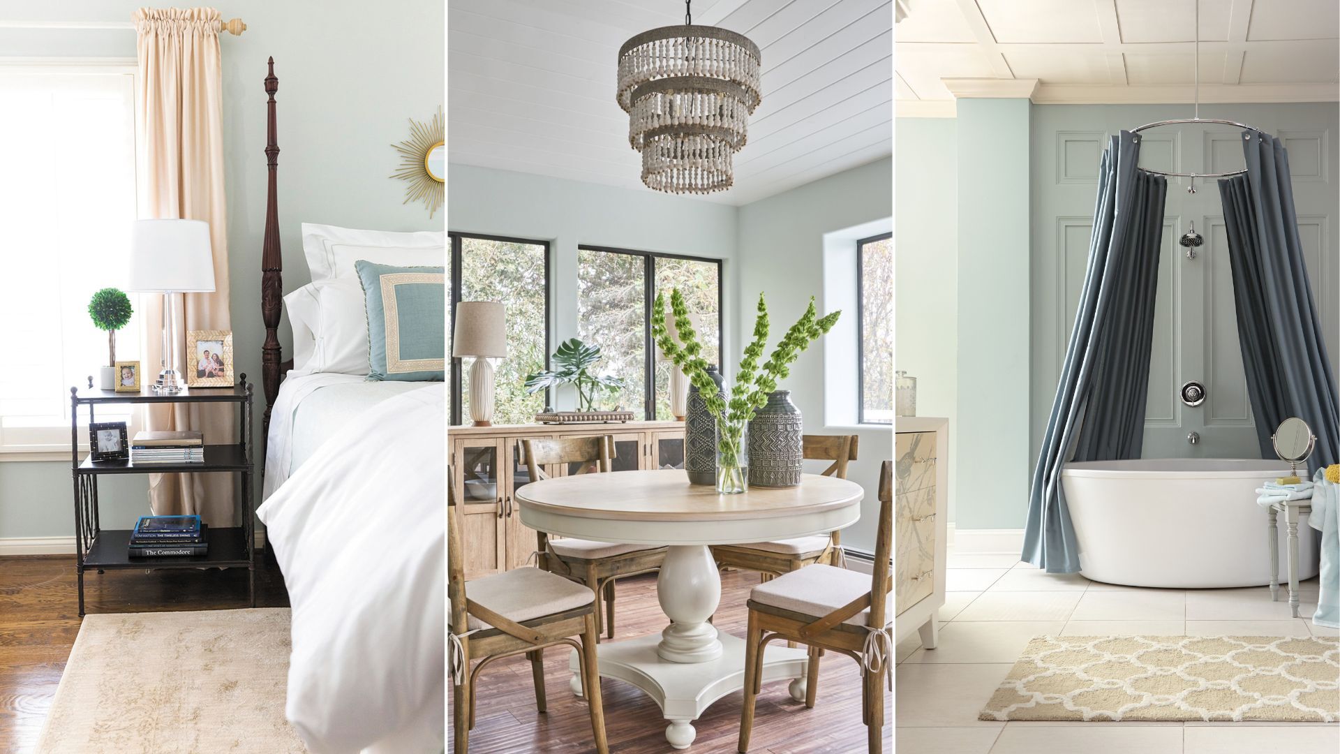
Choosing a paint color can feel like one of the most deceptively nuanced parts of home design. Even subtle variations in tone can have a dramatic impact depending on the direction of a room’s light, the materials it’s paired with, or even the time of day. Sea Salt by Sherwin-Williams is a prime example of this.
While often described as a green paint, its composition reveals far more complexity – a muted blend of green, blue, and gray that reacts sensitively to its environment.