We can always rely on the color inspiration provided by Sherwin-Williams, and their latest seasonal color palette is no different. Named the Modern Brit paint palette and spanning eight rich neutral paint colors, there's much to love about this latest curation of colors which is perfect for transitional decor as we approach fall.
While this time of year can come with challenges when choosing the best colors to decorate with: it's too late for summer brights but too soon for the rich hues of winter, the Modern Brit palette offers a happy medium. These paint colors are timeless and versatile; a move away from light neutrals toward richer, earthy tones that work to add subtle warmth to our homes.
To find out more about this sophisticated color palette, we spoke to Emily Kantz, Color Marketing Manager at Sherwin-Williams. Read on to find out how to make the most of this transitional palette as you refresh your fall color schemes.
'The inspiration behind this palette is traditional, British style but with a twist,' Emily tells us. 'The palette contains deep, anchoring earth tones blended with muted, mid-tone neutrals to bring a fun and fresh feel to classic elegance.'
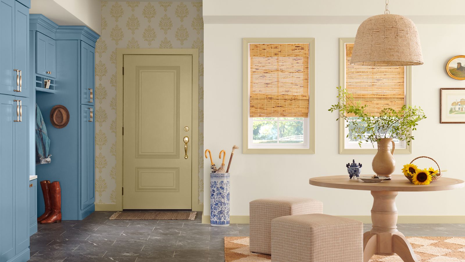
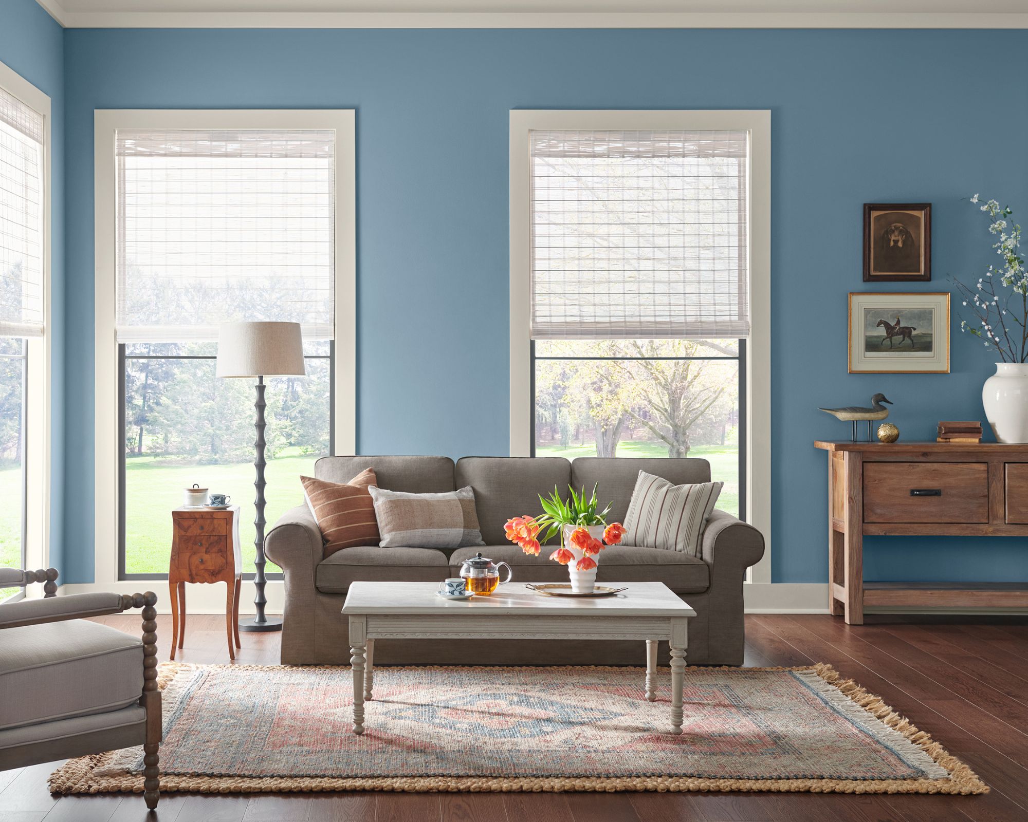
Starting with Sherwin-Williams' August Color of the Month, Smoky Azurite SW 9148 is a muted blue paint color included within the palette. The lighter neutrals comprise Arrowroote SW 9502, a taupe-toned white paint; and Earthy Ochre SW 9532, a warm beige color.
The darkest shade within the palette is Black Fox SW 7020, a warm-toned off-black, followed by Brevity Brown SW 6068, a warm chocolate brown. The mid-tones within the palette comprise Dutch Cocoa SW 6032, a muted purple-red; Studio Clay SW 9172, a greige paint color; and lastly, Crooked River SW 9524, a muddy green hue.
Each of these shades boasts a timeless appeal, and are ideal colors for an elevated take on decorating with neutrals. Far from feeling flat, these grounding, neutral hues will create a gentle color scheme with plenty of depth as we approach fall.
'This collection of uncomplicated and approachable shades is great for the end of summer as these bring timeless, comfortable style easily within reach for the transitional period between summer and fall,' adds Emily. 'The end of summer feels like the warm and familiar charm of the home, which is what we were aiming for with this palette.'
How to decorate with the Modern Brit palette

Since this palette is all about timeless neutral colors, it's one that's versatile to use across many different decorating styles. That said, farmhouse decor and country decorating ideas go hand and hand with the paint colors, thanks to their slightly muted, rustic appeal.
'This palette works best for countryside and farmhouse aesthetics,' says Emily. 'It’s fresh, welcoming, and relaxing, which is what this aesthetic is all about. These colors also pair well with design elements such as patterned rugs, ceramics, framed artwork, and walnut tones – all of which work well with this design style.'
'This palette is great for all rooms given its versatility, but I especially love it in kitchens and living rooms where homeowners host guests and want them to feel relaxed and comfortable.'
If you're looking to refresh plain white walls as we near fall, consider decorating with mid-tones such as Studio Clay or Dutch Cocoa. These rich yet liveable paint colors would make wonderful backdrop colors throughout the home. With their warm undertones, these colors will create comfortable and snug living spaces that feel more elevated than standard whites or grays.
Alternatively, this color palette can also suit more colorful schemes. Emily recommends decorating with Smokey Azurite for a subtle pop of color: 'I recommend using our August Color of the Month, Smokey Azurite, a welcoming cornflower blue that adds a hint of sky-like softness, as the main color when applying this palette in a home.'
'When combined with grounding neutrals, this color comes alive, adding a touch of depth wherever applied, so I recommend pairing it with colors like Arrowroote and Earthy Ochre,' continues Emily.
Looking for more room color ideas? Take a look at Sherwin-Williams' 2025 color forecast. Spanning four different color palettes, there's a whole range of paint colors set to inspire our home decor projects as we edge toward 2025.


