If you feel like a January refresh is in order (and let's face it, who doesn't?) look no further than Sherwin-Williams' latest color palette. The household paint brand has given a whole new meaning to the term 'January Blues' with its curated selection of shades, ones that transport us to a cool, calm, coastal setting.
Centered around their color of the year for 2024, Upward, the new palette - dubbed Beachcomber - encourages us to embrace a beachy bohemian space inspired by the popular shade. Complemented by a selection of seven other hues comprising sandy warm neutrals, marine blues, and sunkissed whites, the collection is reminiscent of a breezy and blissful seaside setting.
'Each of these colors was chosen due to their ability to create a relaxing yet timeless escape, inspired by serene beach mornings and the gentle caress of sea breezes,' says Sue Wadden, Director of Color Marketing at Sherwin-Williams. 'For example, when you pair a cool white with a light blue, it creates a look that reminds us of pearly seashells and the light blue ocean. Add a moody dark blue to the mix and it reflects the wider horizon of the ocean.' So, how should you use these colors to inspire your paint ideas, and does this new palette signify the return of the coastal chic trend? We caught up with Sue to find out.
1. Create a beachy kitchen

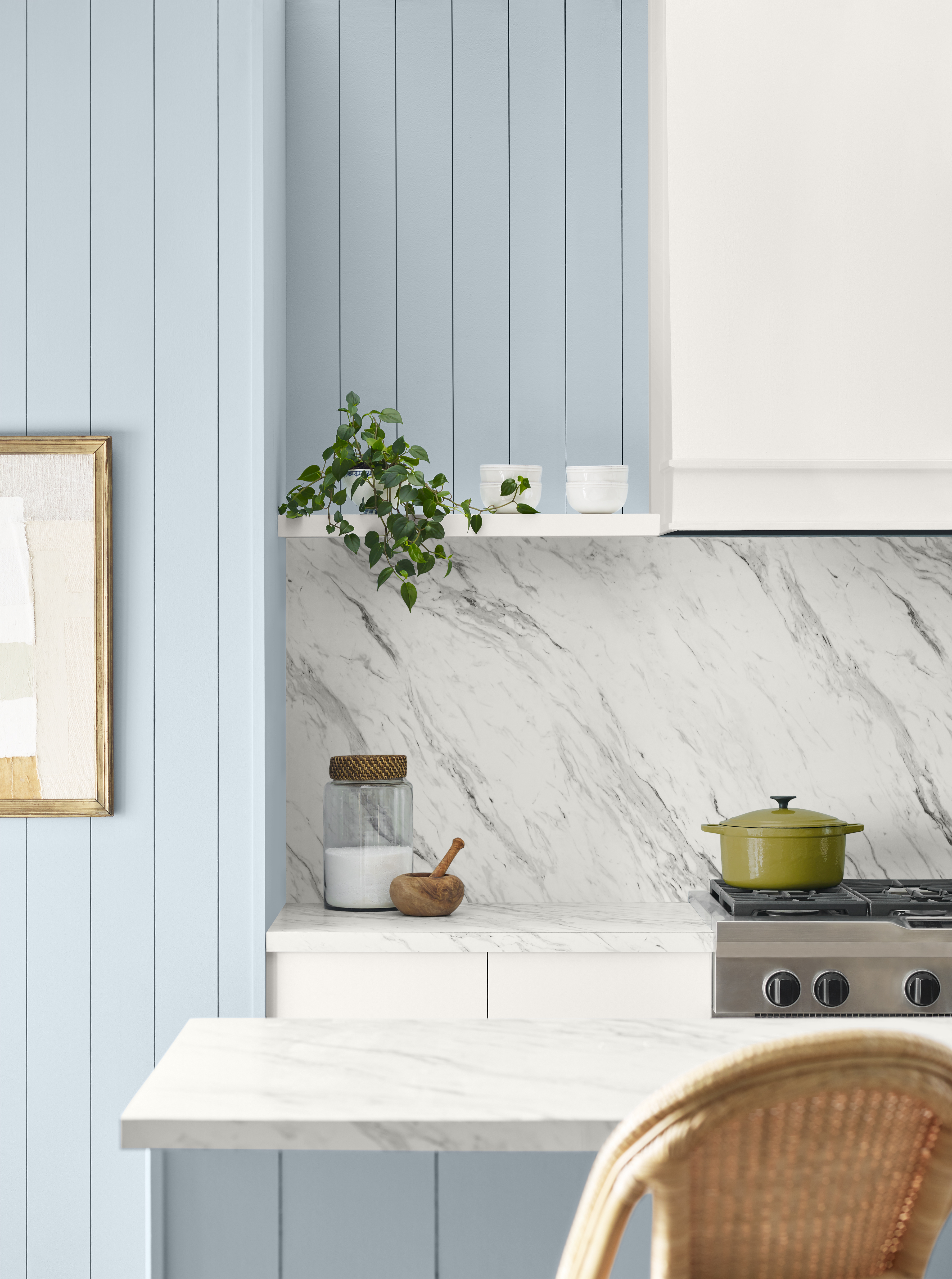
If you want a super accessible way to use these colors in tandem, Sherwin-Williams' color expert Sue Wadden suggests embracing them in a kitchen for an airy, beachy feel. 'One of my favorite rooms for this palette is a kitchen because you can easily incorporate most colors,' she says. 'You can start by adding Upward SW 6239 to kitchen cabinets and painting the majority of the walls in Drift of Mist SW 9166 on any trims.'
If you want to add some depth with some darker tones, Sue suggests colors like Tricorn Black SW 6258 and Antiquarian Brown SW 0045. 'These can be translated into furniture or accent details,' she notes. 'Think kitchen stools in the timeless warm brown and trendy black kitchen utensils to tie in the look.' This will create a very 'liveable' look that strikes the right balance between cool blues and darker moody tones.
2. Contrast lights and darks for a more sophisticated space

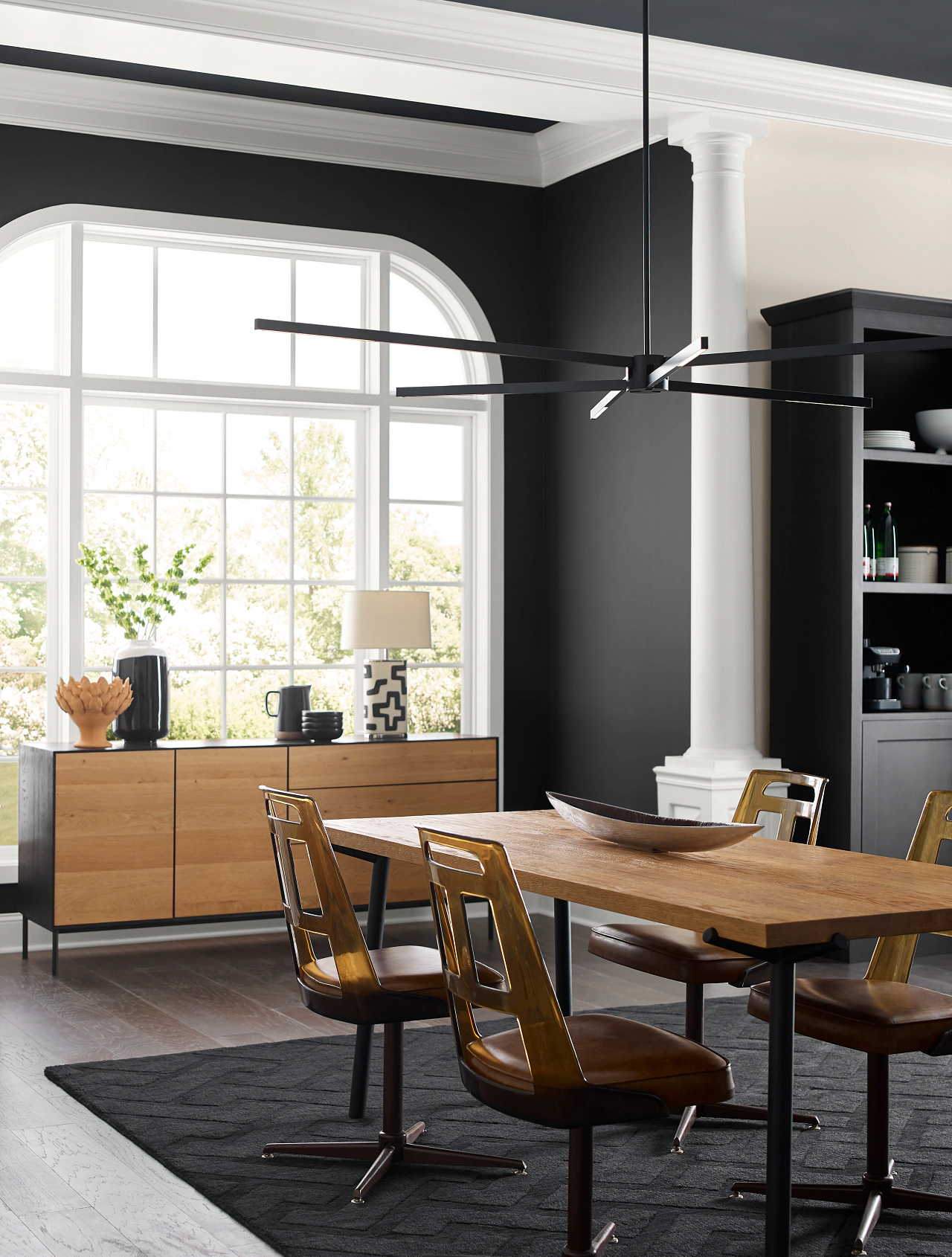
Generally, the Beachcomber color palette feels bright and bouncy, especially when Upward is used as the dominant shade. 'While it is a happier looking color, Upward is also great for a sophisticated and luxurious feel when used right,' says Sue.
To achieve a more mature, sophisticated look, she recommends using the lights and darks together for a contrastive look. 'I'd recommend using Upwrd as an accent color, with cool whites and airy grays taking the center stage,' she says. 'A great way to make any room feel more sophisticated is by adding black accents, and Tricorn Black SW 6258 is an excellent choice for furniture, accent walls, and more.'
3. Choose blue hues for a calming bedroom

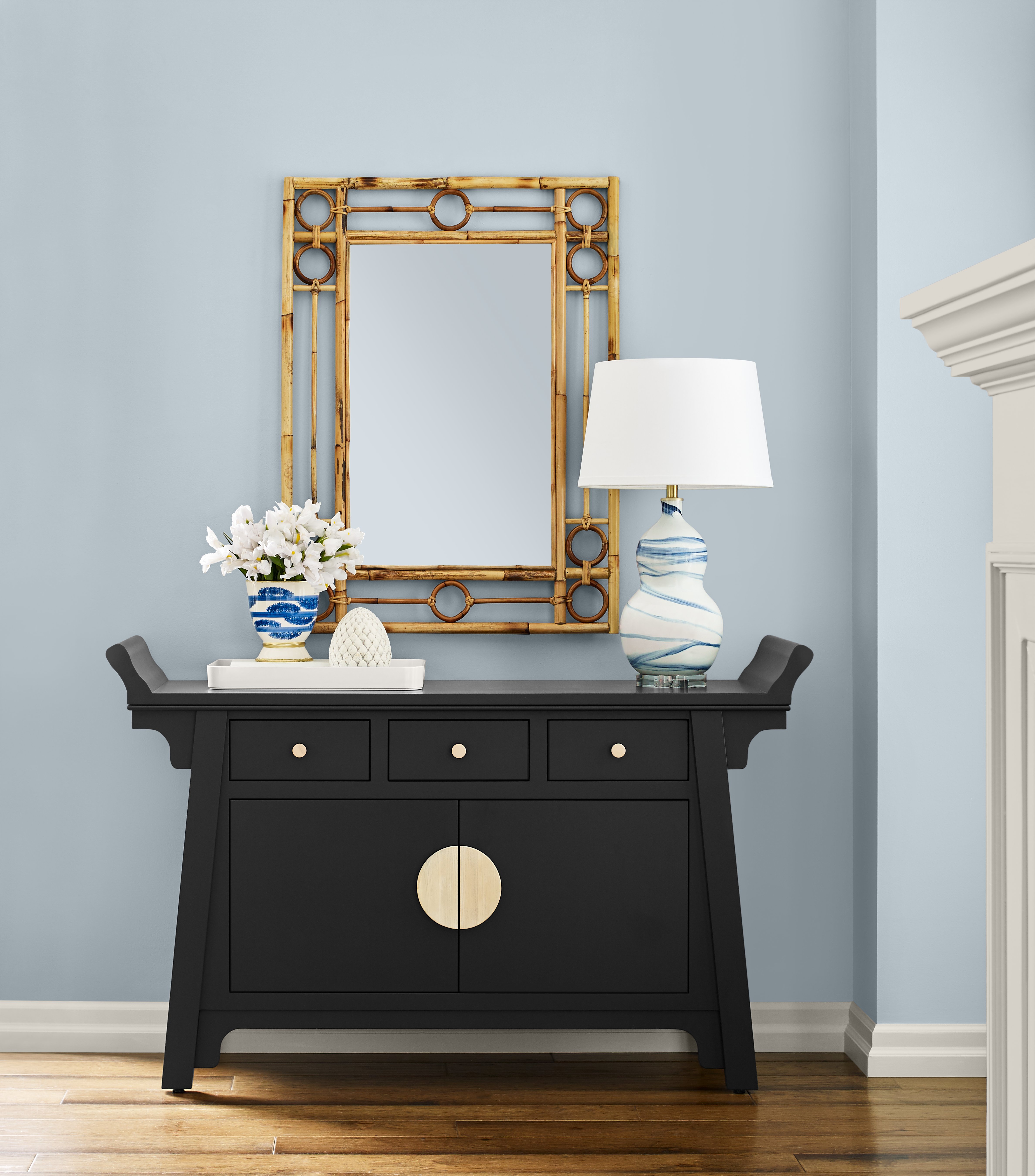
Being coastal-inspired, cooler tones tend to dominate this palette. While most of us tend to shy away from using cooler shades on our walls, especially in relaxing sanctuary spaces, Sue actually suggests embracing steely blues in a bedroom alongside bright whites for a fresh and airy feel.
'One of the best things about blue, especially a light blue, is its versatility! It's a great color all around to use in the home because people tend to have positive connections with the color,' she says. 'Since it's such a relaxing and happy color, we recommend painting bedroom walls in this shade, adding in cool white accents on places like trim and wooden furniture or floors.' If you want to tone down your blue bedroom, you could choose warmer sandy neutral in place of brilliant whites.
Is coastal chic trending in 2024?
Keeping on top of color trends at the start of the new year can be tricky. It's hard to know what shades will truly define our next circle around the sun without knowing what the year ahead holds, but these predictions from Sherwin-Williams seem to suggest a resurgence of a wider coastal chic interior design trend or Hamptons-style decor.
Despite this beachy look dropping off the radar in 2023, Sue even goes as far as saying that it's likely to replace the long-standing farmhouse trend. 'This is one of the reasons why we chose Upward as our Color of the Year since it’s the ideal paint color to incorporate in the home to achieve this look – especially when paired with the rest of the palette,' she says.
Will you be embracing blue during 2024? If you want to bring the best of the beach indoors, look no further than this coastal-themed color palette from Sherwin-Williams.


