Nowadays, kitchens are multi-functional rooms, so creating a balance of function, style, and a sense of coziness is essential – although not always the easiest. And, if you're designing a kitchen within an open-plan space, you'll also need to create cohesion between the different zones. There's certainly a lot to consider.
But in Studio McGee's Tahoe Pines project, a thoughtful blend of materials, finishes, and a thread of color throughout spaces has created a beautiful kitchen scheme filled with warm hues and natural wood finishes – plus a cozy dining nook that creates the visual bridge between areas.
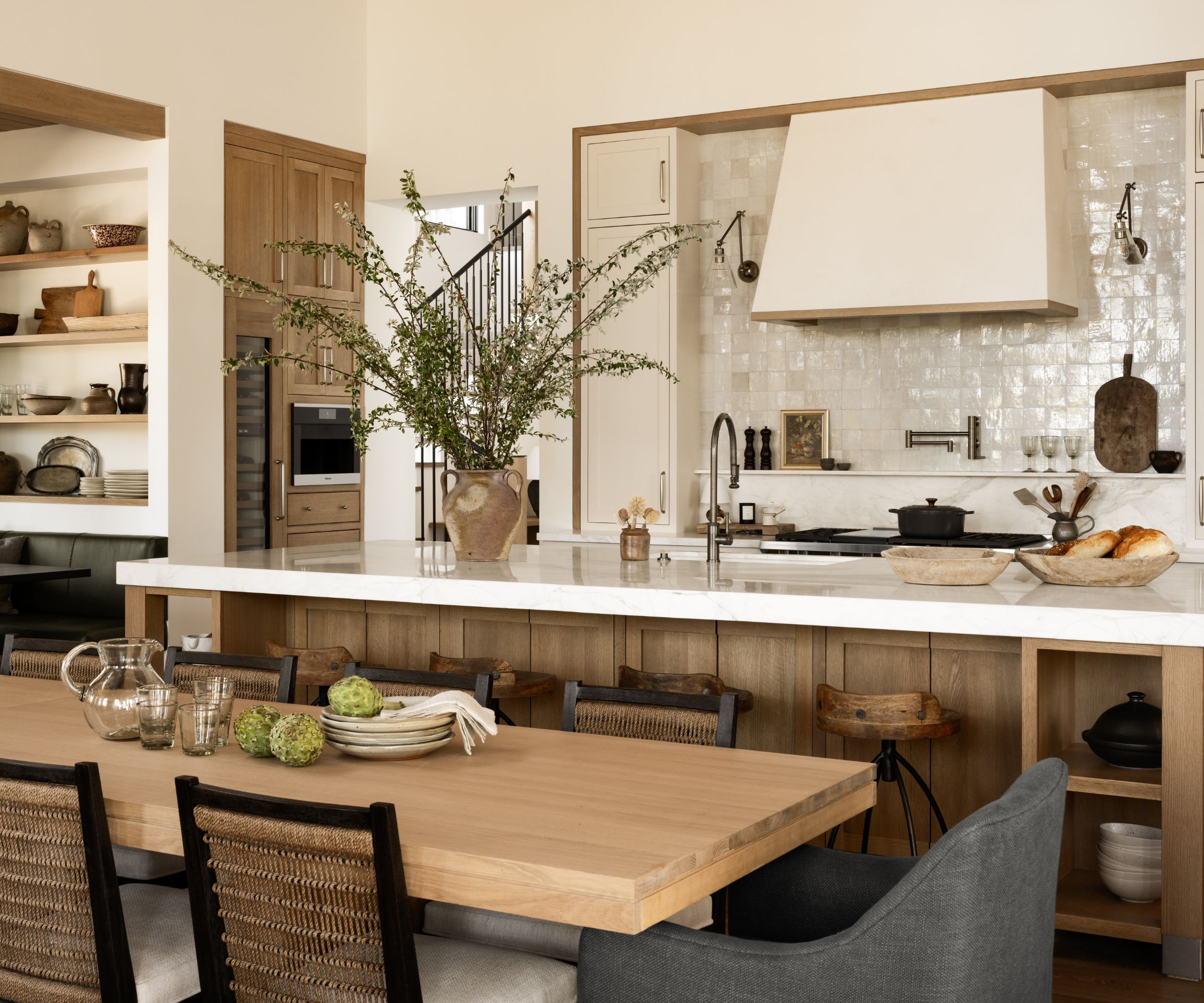
The kitchen is part of the open-plan living and dining space, so it was important that while the kitchen – described as 'the star of the home' – required its own identity, it had to feel connected to these other zones. But with 'dozens of custom details throughout' the scheme, the completed kitchen is 'charming in all the right ways.'
Take a look inside the Tahoe Pines kitchen
'Our clients had their hearts set on a warm gray and wood kitchen. It is a combination we have seen before, so when we hear that we look for the details and how to differentiate and make each kitchen feel unique and special to the home and the homeowner,' says Shea, in a YouTube video touring the completed project.
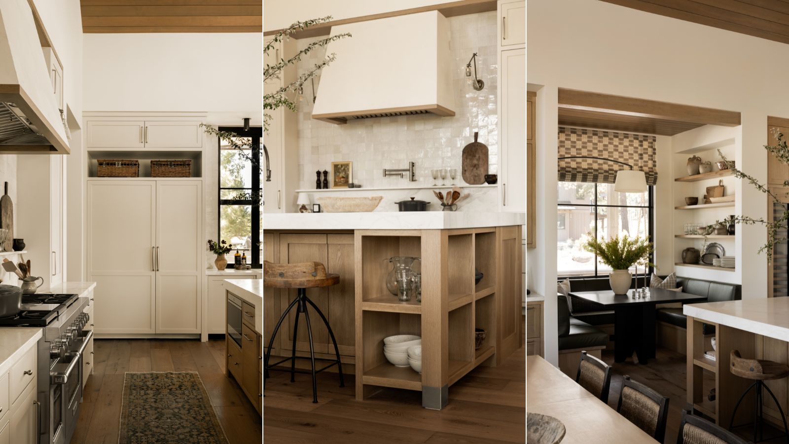
The first step of the remodel was to rework the back wall. 'We were able to create one flush moment with symmetrical spaces on either side of the range wall and then trim out the range area with a wood trim,' she says.
'I love this detail because it's unusual but a very simple detail that goes a long way. Those subtle little details then tie into what we're doing on the tone of the island, so there's some continuity between the areas.'

One of the main details is the zellige tile, which has been used for more than just a backsplash and taken up to the ceiling. 'We carried the backsplash up with a tiny little ledge and did these really pretty pewter sconces. Those things help fill out the space and allow you to put things. Things add character and interest and help you fill out a space so it feels more lived-in, and that shelf goes a long way,' says Shea.
The kitchen island was inspired by the one in Shea's kitchen, but it was important that it felt different and unique to this space. 'We opted to make the shelves symmetrical on the sides of the island because their kitchen is already quite symmetrical with what's happening and so we decided to go for symmetry, which is the opposite of the reason behind what I did in my own kitchen.'
'Then we did a great integrated apron-front sink. The kitchen countertop material is carried across the front of the sink. It's a nice blend of modern and traditional because an apron-front sink is more traditional but we've done it in a really streamlined way to speak to the home's architecture,' she explains. Pewter cap details have also been added to the island's legs, tying in the finishes used throughout the kitchen and contrasting the warm wood.
Perhaps the stand-out feature of the kitchen remodel, the dining nook offers a cozy space that feels more informal than the dining table. A wood ceiling separates the nook from the rest of the kitchen, and ties in elements used elsewhere in the home. The banquette seating is a great way to maximize a small area, and the olive green leather offers a nod to the chairs in the living room.
'I love how this kitchen nook turned out for a few reasons. I love that we did a sconce – a huge sconce – instead of an overhead hanging fixture. I think it just adds a lot of interest and that asymmetry plays off of the niche on one side filled with beautifully collected pieces,' says Shea.
'The niche was a really big deal for me from the beginning. Every note when I was talking to the designers was like okay but make sure that this is all vintage because it's going to add the character that this architecture needed to feel a bit warmer,' she adds.
Two wet bars flank the nook, each with a vintage-inspired chicken wire detail. A modern take on a plate wall has been introduced, with textural plates rather than the traditional transferware. And, finally, the pantry offers a bolder detail in the mostly neutral kitchen scheme, which adds 'depth and saturation' to the smaller space.
Shop the look
The kitchen decor features a few cutting boards – in the main kitchen area and the dining nook. This option has a rustic feel and has the option to hang it.
No kitchen is complete without art. This floral design is very similar to the one featured on the backsplash shelf in the Tahoe Pines kitchen.
Sconces are a key feature in this kitchen remodel, and this single-arm light is a striking choice. It's available in polished nickel, antique brass, and bronze.
The kitchen model fits in perfectly with the Tahoe Pines project, yet it still holds its own identity. The warm hues and wood tones paired with a mix of modern and traditional elements have created a beautiful transitional kitchen – a design Studio McGee is known for.


