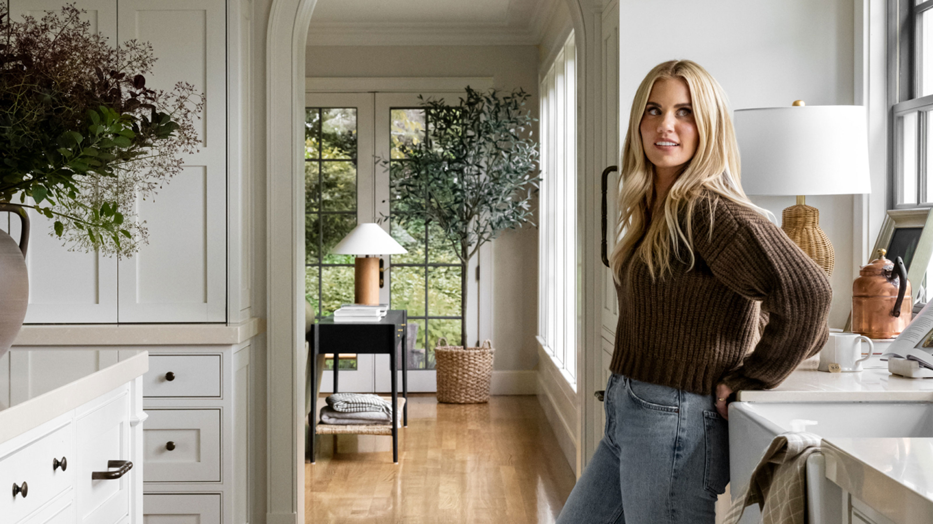
Studio McGee recently unveiled another gorgeous project, a moody mountainside home in Park City Utah. The 10,000-square-foot, luxurious retreat is awash in deep, earthy hues, departing slightly from the studio's iconic 'modern rustic' aesthetic. With bold greens and blues throughout, paired thoughtfully with textured neutrals and natural wood, the home is a masterclass in transitional style – and doesn't leave any character out.
If you're looking to introduce a bit of the Summit Estate project's look into your own home, you're not alone – we can't get enough of the home's color scheme either. Luckily, Shea has just shared the exact paint colors the design team used throughout the space, so you can get your hands on the hues in no time. Featuring loads of Benjamin Moore and a touch of charming wallpaper, this is the official list of earthy colors used in the Park City home.
All the paint shades used in Shea's latest project
From rich and moody to bright and white, these are all the specific paint shades that made it into the Park City project's final reveal. Plus, we show you where in the home each made its mark.
Dune White
No matter how moody a design scheme, every home benefits from a classic, pared-back neutral, and Dune White by Benjamin Moore fits the bill at Summit Estate. Found across many of the central living spaces, including the living room, guest lounge, and primary suite bathroom, this shade brings more depth than a to-the-point white.
With gray and green undertones, Dune White is perfect for a nature-inspired space that needs a bit more cheer. And when paired with plenty of natural light, it only gets better.
Barista and Stonecutter
One of Shea's favorite spots from the new project stands out, sporting two bold, dark shades from Benjamin Moore: Barista and Stonecutter. Featured in the upstairs home bar (yes, this home contains two), these two shades pair playfully together to produce a color-blocking impact.
Barista by Benjamin Moore is a 'sumptuous dark brown with a touch of violet,' used to coat the bar's brick backsplash and surrounding walls. On the other hand, Stonecutter by Benjamin Moore – a deep and calming blue – brings a bit of coolness to the cabinetry.
Deep River
The Summit Estate kitchen picks up on the bold choices made in the home bar, but dials it back just a notch. Decked out in Deep River by Benjamin Moore, the space's cabinetry makes quite the impact.
The 'saturated gray [with] a hint of green in its undertone' matches a dark green Lacanche range perfectly. Natural wood and stone materials throughout only make the accent shade pop more.
Coriander Seed
Coriander Seed by Benjamin Moore is the main shade in the junior suite bedroom, and its unique complexion stands out from the crowd. A 'sophisticated brown that conjures rich spices,' it remains neutral while adding some inviting, charming character to the space. Paired with a marble fireplace, vintage blue rug, and textured cream headboard, it provides the perfect cocooning feel for a home away from home.
Nightfall
The renovation's home office is another of Shea's favorites, featuring wood cladding on the walls, floor, and ceiling. To contrast with that earthy touch, Nightfall by Benjamin Moore was used on the built-in shelving and cabinetry.
The nearly black gray is moody and eye-catching, without going too bold or all-consuming. With mountainside views right out the floor-to-ceiling windows, this combination makes for a warm, welcoming retreat.
Dark Pewter
The bunk room, featuring three bunks and six beds and pictured in the last slide above, is painted with Dark Pewter by Benjamin Moore and accented with MORPH in Navy by Quercus & Co. The statement-making wallpaper (with geometric blue, gray, and white designs) plays beautifully against the deep blue-gray hue featured on the bedframes, as well as on the wood-clad walls and ceiling.
Bonus hues
A handful of other Benjamin Moore hues made it into the final reveal as well, and the smaller selection makes for a stunning whole-home color palette on its own. Cabbage Patch, a dark and deep green, pairs with clean white and gray shades in a bathroom design scheme, and Scala Wallpaper by Susan Connor complements Dune White in one of the guest bedrooms. There, the neutral patterned wallpaper takes center stage.
In the home's basement bar, the shelving takes on a slightly brighter blue-gray hue than the bar upstairs. The shade, Knoxville Gray by Benjamin Moore, makes for a fresh overall color palette that also includes blue tile and natural wood grain.
In the bathroom just off of the bunk room, a green and white space features the refreshing olive, gray, and brown neutral Desert Twilight by Benjamin Moore. And another of the home's bathrooms showcases a slightly darker green, Louisburg Green by Benjamin Moore, on the walls, trim, and cabinetry. Paired with gray brick and an industrial farmhouse-style sink, the room is rustic and serene.
Rattan by Benjamin Moore is on display in the mudroom, embodying a 'very fun pop,' according to the Studio McGee team. The 'casual, understated yellowish tan' covers the walls, trim, and cabinetry as well. And finally, Nicolson Red by Benjamin Moore is the red wine-reminiscent shade defining the mountainside home's wine room.
The Park City home's color palette is one to beat (or copy), and this guide has made it simple. With a considered mix of moody and light, it's a winning combination for a cozy, cocooning home.


