When you're embarking on a new creative project, typography design is one of the most important things to consider. But with so many fonts to choose from – even if you only stick to free fonts – it can sometimes feel overwhelming. If so, one good place to start is deciding between serif vs sans-serif fonts.
Serif and sans-serif fonts are the two major categories of typeface, each conveying distinct aesthetics and associations. And understanding the difference between them is crucial for any designer.
Why? Because the choice of serif or sans-serif is not just an aesthetic decision; it can have a profound impact on how a design is perceived and how it resonates with its target audience.
In this article, we'll explain the difference between serif vs sans-serif fonts, what kind of themes each font type typically conveys, and how to choose either serifs, sans-serifs, or a mix of the two for your project.
Serif vs. sans-serif: what's the difference?
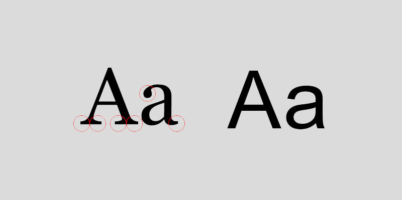
A serif is a delicate little point (aka flare or terminating flourish) at the end of a letter stroke. In the image above, we've circled the serifs around the 'A' and 'a' on the left.
Serif fonts, such as Times New Roman, Georgia and Garamond, are named as such because they feature these small but noticeable embellishments. In contrast sans-serif fonts, such as Arial, Helvetica and Futura, are simply fonts that don't have serifs' 'sans' being French for 'without'. (In the image above, the 'A' and 'a' on the right are sans-serifs.)
The origins of serif fonts can be traced back to the early days of typography, when they were designed to mimic the natural strokes of the human hand. For this reason, serifs were traditionally thought to help guide the eye across a line of text.
In contrast, sans-serif fonts emerged as a more modern, minimalist alternative, often associated with the clean aesthetic of 20th-century design movements.
When to use serif fonts
It's always dangerous to oversimplify these things. But in general, serifs lend a sense of traditionalism, elegance and authority to a design. That can help to convey an sense of refinement and sophistication, making serifs a good choice if you're seeking to project an image of stability, reliability and heritage.
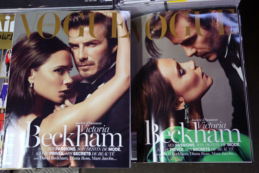
That's precisely why so many traditional newspapers, including The New York Times, the Washington Post and The Wall Street Journal, lean on serif typefaces in their branding and editorial design. So do long-running magazines such as National Geographic, The Atlantic and Smithsonian. These publications' use of serifs helps reinforce a sense of credibility, expertise and timelessness.
Serif fonts can also be effective in branding and logo design, when you wish to lend an air of prestige and authority. For instance, if you glance at most high-end and luxury brands, such as Tiffany & Co, Chanel and Rolex, you'll notice they generally default to serifs, to convey an atmosphere of exclusivity and quality.
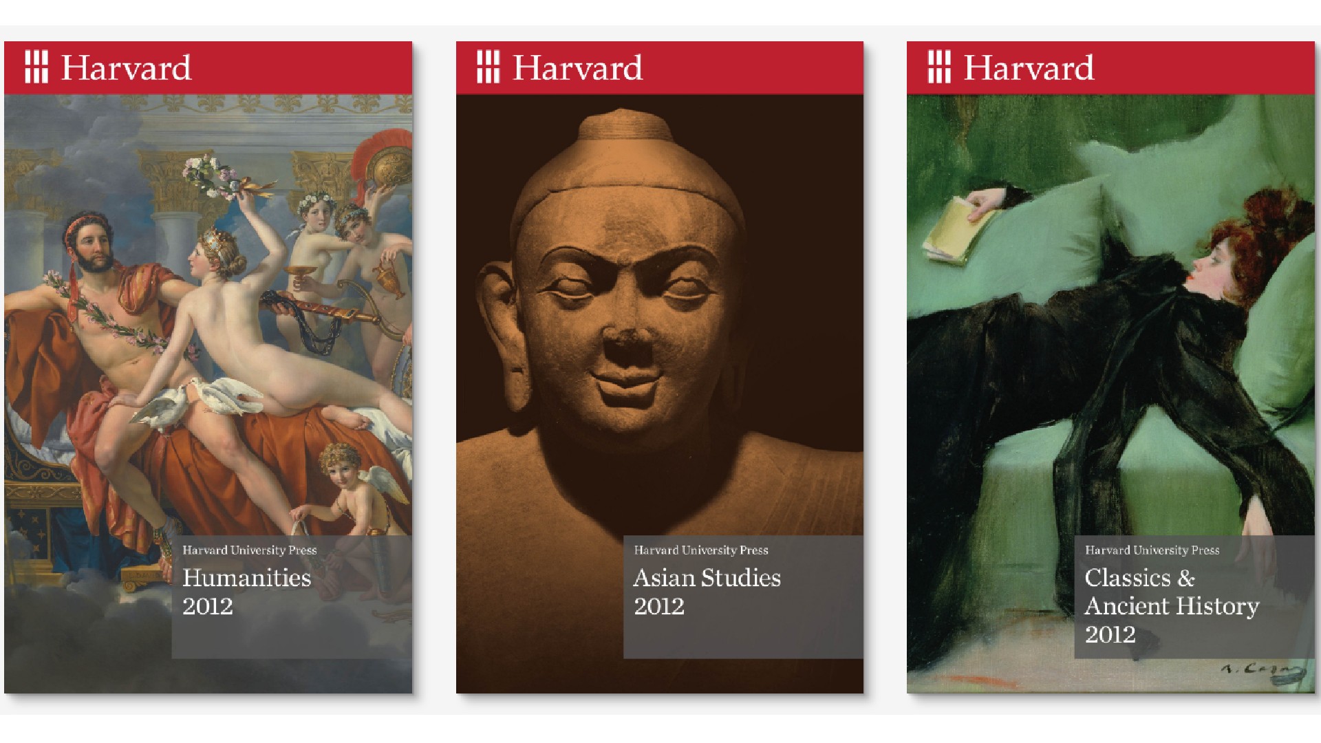
Other organisations that commonly use serifs for similar reasons include law firms, traditional universities and financial institutions. The short version is that if you want people to trust you, use a serif.
Examples of popular serifs include:
Times New Roman: Originally designed for The Times newspaper in 1931, Times New Roman is known for its readability and widespread use in print media.
Garamond: Named after the 16th-century Parisian engraver Claude Garamond, this group of multiple typefaces is popular in book printing.
Baskerville: Designed in 1750s England by John Baskerville, this transitional typeface has a distinctive contrast between thick and thin strokes, making the serifs sharper and more tapered.
Georgia: Designed in 1993 by Matthew Carter and hinted by Tom Rickner for Microsoft, this font was designed to feel elegant but legible when printed small or on low-resolution screens.
For more modern examples of the form, see our roundup of the best serif fonts.
When to use sans-serif fonts

Sans-serif fonts are known for being clean and straight-edged, and are thus associated with a more modern, friendly and approachable aesthetic. The absence of serifs gives them a minimalist and streamlined appearance, making them well-suited for brands seeking to convey a sense of simplicity, clarity and technological innovation.
Most obviously, the tech giants that have taken over the world across the last two decades have enthusiastically embraced sans-serifs. Examples include Spotify's use of Circular, Uber's development of Uber Sans, Google's choice of Roboto, and Apple's adoption of San Francisco. Such choices align with these brands' focus on modernity, forward-thinking, accessibility and user-friendliness.
Even outside the tech world, sans-serifs can be highly effective in branding and logo design, because they're generally felt to convey a sense of professionalism, openness and adaptability. That's why like IKEA, Target and Mastercard have all incorporated them into their visual identities, reflecting a focus on contemporary design and user-friendly experience.

Popular sans-serifs include:
Helvetica: Created by Swiss typeface designer Max Miedinger and Eduard Hoffmann in 1957, this neo-grotesque serif has spread around the world thanks to its legibility and clean aesthetic.
Futura: A geometric sans-serif that embodies the spirit of modernism and efficiency (it was notably the first typeface on the moon). Designed by Paul Renner in 1927, it's today commonly used in branding and advertising.
Avenir: Designed by Adrian Frutiger in 1987, this humanist sans-serif font combines a modern sensibility with a warm, approachable character.
Arial: This neo-grotesque sans-serif was designed in 1982 by Robin Nicholas and Patricia Saunders, and has featured in various versions of Windows and macOS.
How to combine serif and sans-serif fonts
While sticking to either serif and sans-serifs can send a clear message, there's no reason you have to. In fact, designers often consciously employ a strategic mix of both styles to create interesting, harmonious and visually engaging designs.
For example, many websites and publications will use a serif for main titles and a sans-serif for body copy, establishing a clear visual hierarchy and creating a cohesive and visually appealing layout overall.
This approach allows you to capitalise on the strengths of both font styles, with serifs lending an air of authority and sophistication, and sans-serifs providing a clean and modern look and feel. (For specific font ideas, see our roundup of the best header and display fonts.)
A more integrated approach, meanwhile, could mean using a single typeface family that includes both serif and sans-serif variants. This allows for a consistent typographic tone while still providing flexibility in how your fonts are applied across different elements of your design. For more on mixing typefaces, read our article on perfect font pairings for your next project.