Purple color schemes have been popular since Pantone announced ‘Very Peri’, a bold blue-violet, as its color of the year for 2022, and we’re seeing the shade popping up everywhere, even now.
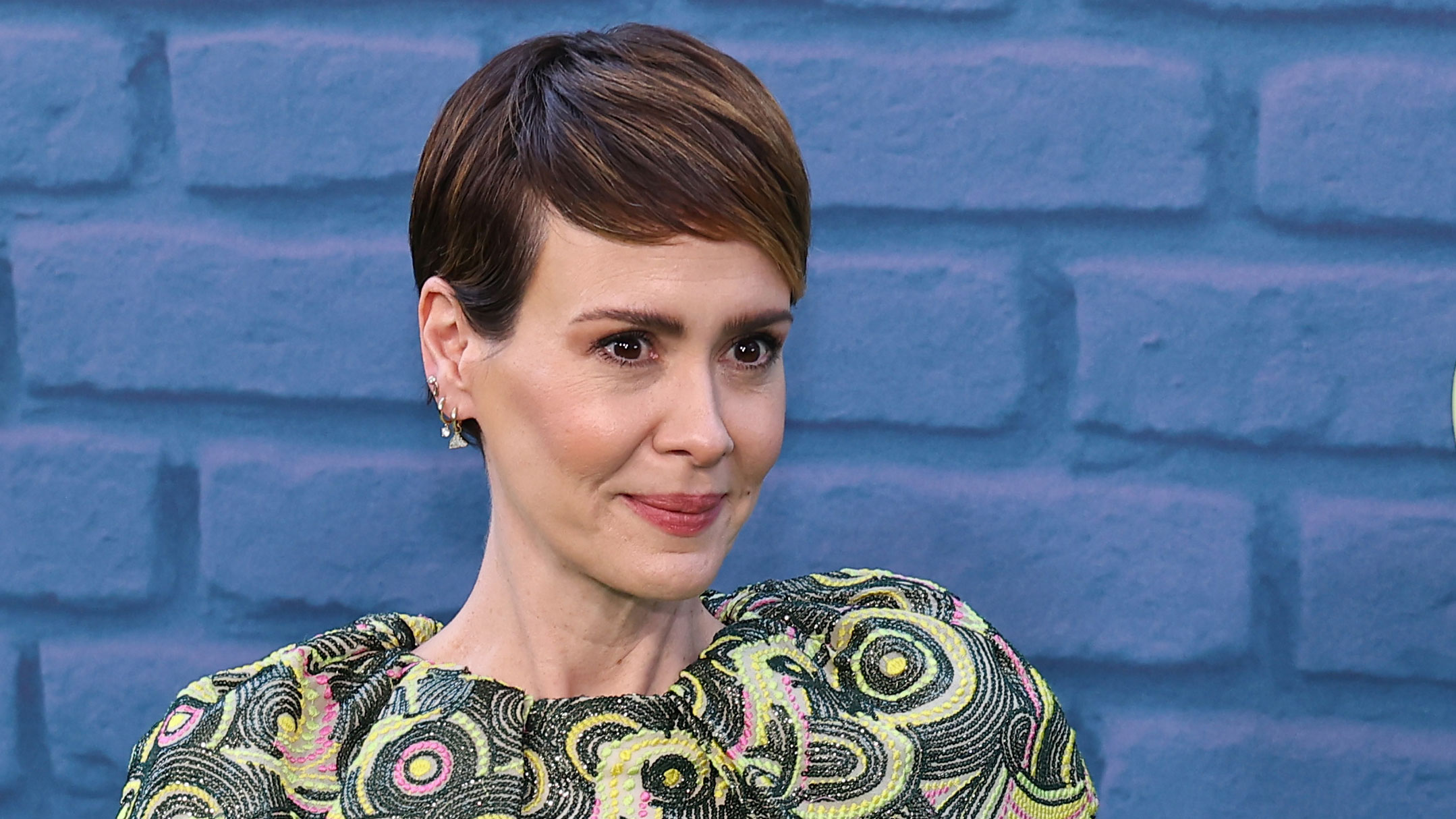
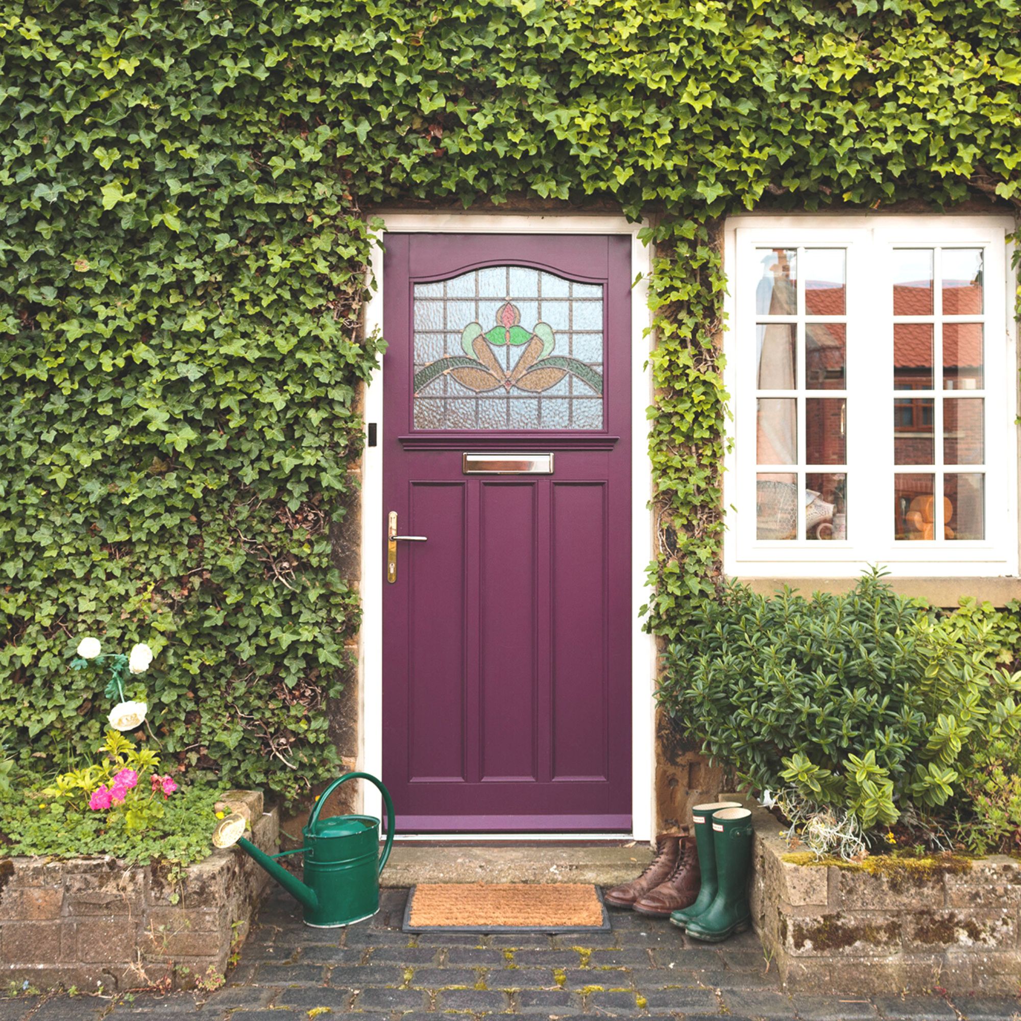
Vivid violets, royal purples, and berry shades are a daring choice, but used in welcoming spaces, such as actor Sarah Paulson's porch, purple room ideas can feel rich, and elegant, and make you feel happier at home, say color experts and designers.
Decorating with purple is a wonderful way to craft an inviting, friendly energy and is great for creating a relaxed feel within a home. However, in a conversation with Architectural Digest, designer Amy Kehoe spoke of the risk of such a dark color scheme: 'Because the home is so contained and small in scale, it makes certain risks feel less risky. Purple paint... might not work splashed over large surfaces, but they feel just right in this space.'
Kehoe hinted that it's Paulson's joyful enthusiasm for life and design that paved the way for such an exciting, jewel-box color scheme.
‘Associated with sociability and open-mindedness, it helps make people feel at ease – perfect for communal areas. Purple also has a slight feminine edge, which reinforces the feeling of comfortability.’
There are many colors that work well with purple, but it depends on the pigment of the tone, explains Ruth Mottershead, creative director at Little Greene:
‘When selecting a complementary shade, consider the undertones and opt for neutrals with a pink or lilac undertone for a harmonious finish.’ ‘Deep purples work well with grays, as well as deep blues and pinks,’ adds fabric designer Sarah Hardaker.
‘Where a more warm-toned purple is used, pair with fawns and creams, or contrast with a touch of olive green. Purple is a lovely rich color and perhaps more ambiguous than pinks, with the underlying blue tone enabling it to sit well with other blues, too.’
Historically, purple is also a color that we link to with spiritual awareness and reflection, which is why it is favored by those seeking to create a refuge from the world. More notably, purple has been used by the wealthy, and those high office in the Church for centuries. Its elite status stemmed from the rarity and cost of the dye.
'Often associated with royalty and tradition, deep purple is perfect for adding drama and character to a room,' suggests Helen Shaw, director of Benjamin Moore. 'Saturated shades envelop a room, so consider introducing the rich hue into a space that benefits from natural light to create an intriguing interplay of light and dark.'