
Beyond the Alphabet is a weekly column that focuses on the tech world both inside and out of the confines of Mountain View.
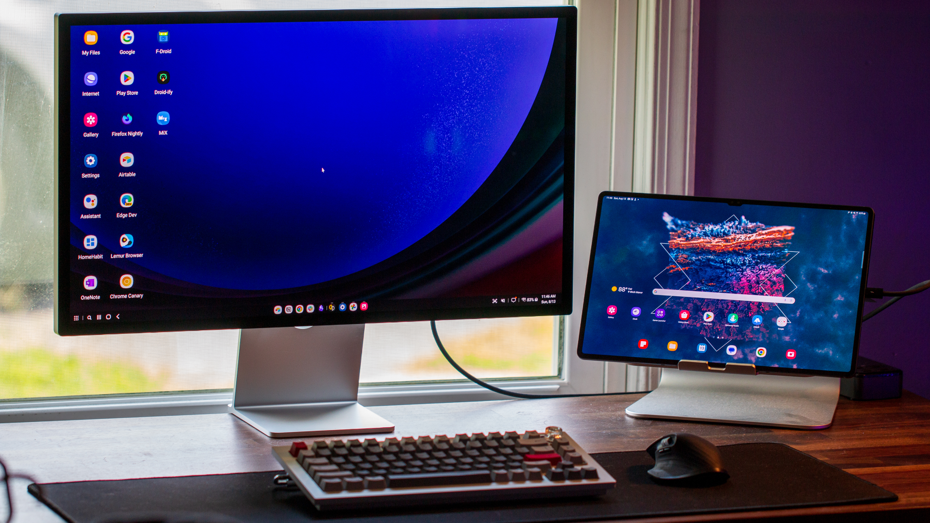
When it comes to tablets and foldables, it's tough to argue against the idea that Samsung is offering the best experience. Samsung's "everything but the kitchen sink" approach is finally paying off in a big way now that we're out of the dark days of TouchWiz. And while the company continues to improve the software, Samsung DeX remains a key selling point for those who want a truly "all-in-one" device, which is why I think it should be the default on tablets.
DeX flies under the radar, as it's almost never mentioned whenever a new flagship device is unveiled. However, changes and improvements are regularly made in an effort to let you turn your device into a portable computer.
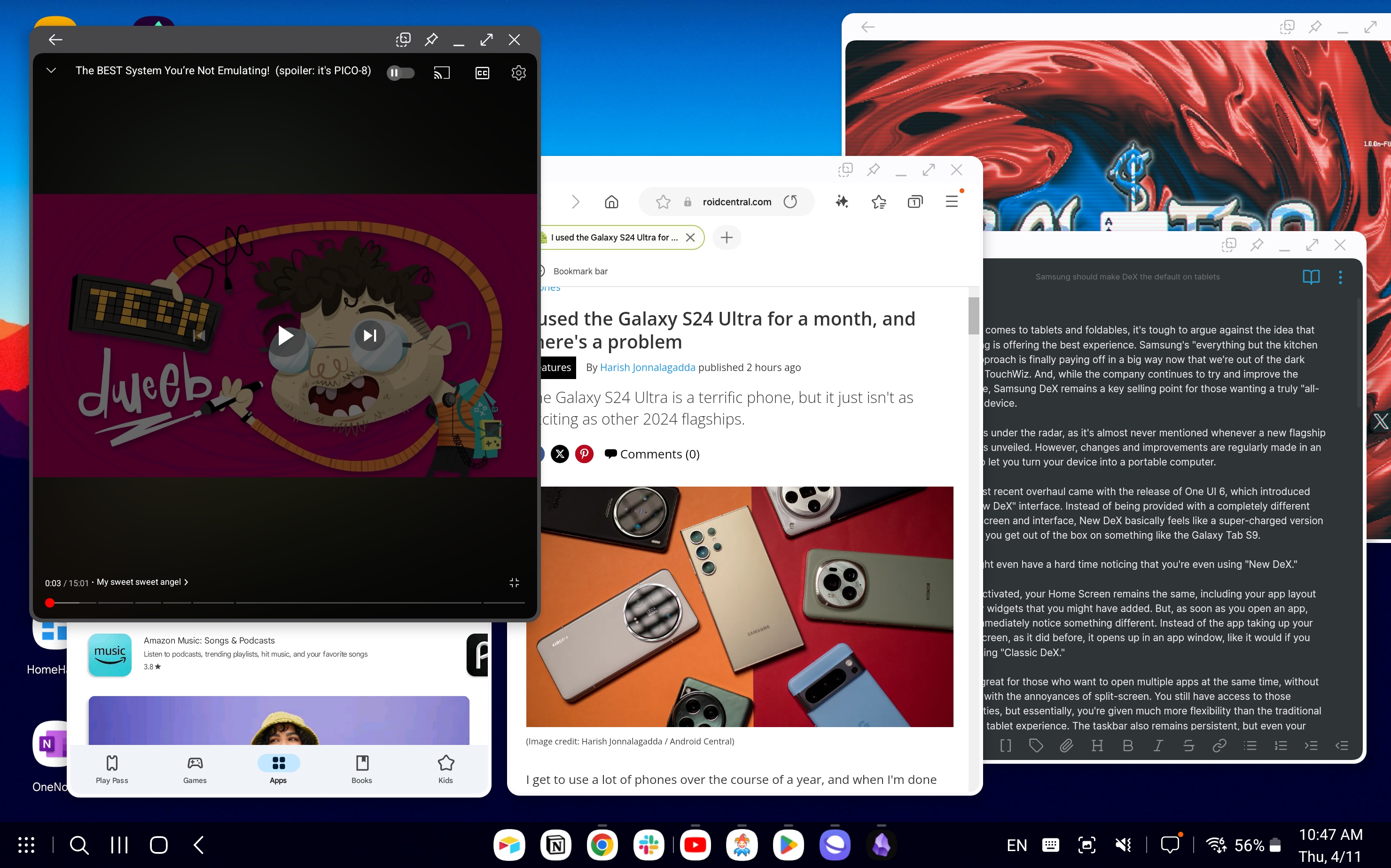
The most recent overhaul came with the release of One UI 6, which introduced the "New DeX" interface. Instead of being provided with a completely different Home Screen and interface, New DeX basically feels like a super-charged version of what you get out of the box on something like the Galaxy Tab S9.
You might even have a hard time noticing that you're even using "New DeX."
When activated, your Home Screen remains the same, including your app layout and any widgets that you might have added. But, as soon as you open an app, you'll immediately notice something different. Instead of the app taking up your entire screen, as it did before, it opens up in an app window, like it would if you were using "Classic DeX."
This is great for those who want to open multiple apps at the same time without dealing with the annoyances of split-screen. You still have access to those capabilities, but essentially, you're given much more flexibility than the traditional Android tablet experience. The taskbar also remains persistent, but even your notifications and Quick Settings toggles are available just by swiping down.

What I'm hoping for is that Samsung will introduce this "New DeX" as the default interface on new tablets and maybe even foldables like the upcoming Galaxy Z Fold 6. It combines the best of both worlds, giving us the ability to use widgets on the Home Screen while making it easy to open multiple apps in their own separate windows. Then, Samsung can ditch the "New" and "Classic" monikers while still giving us access to both.
Unfortunately, I don't think this is what's actually going to happen. Instead, I'm of the mindset that Samsung is going to end up ditching the DeX that we've all come to know and love over the years. The "New DeX" will just become "DeX," while the stock launcher experience will remain unchanged.
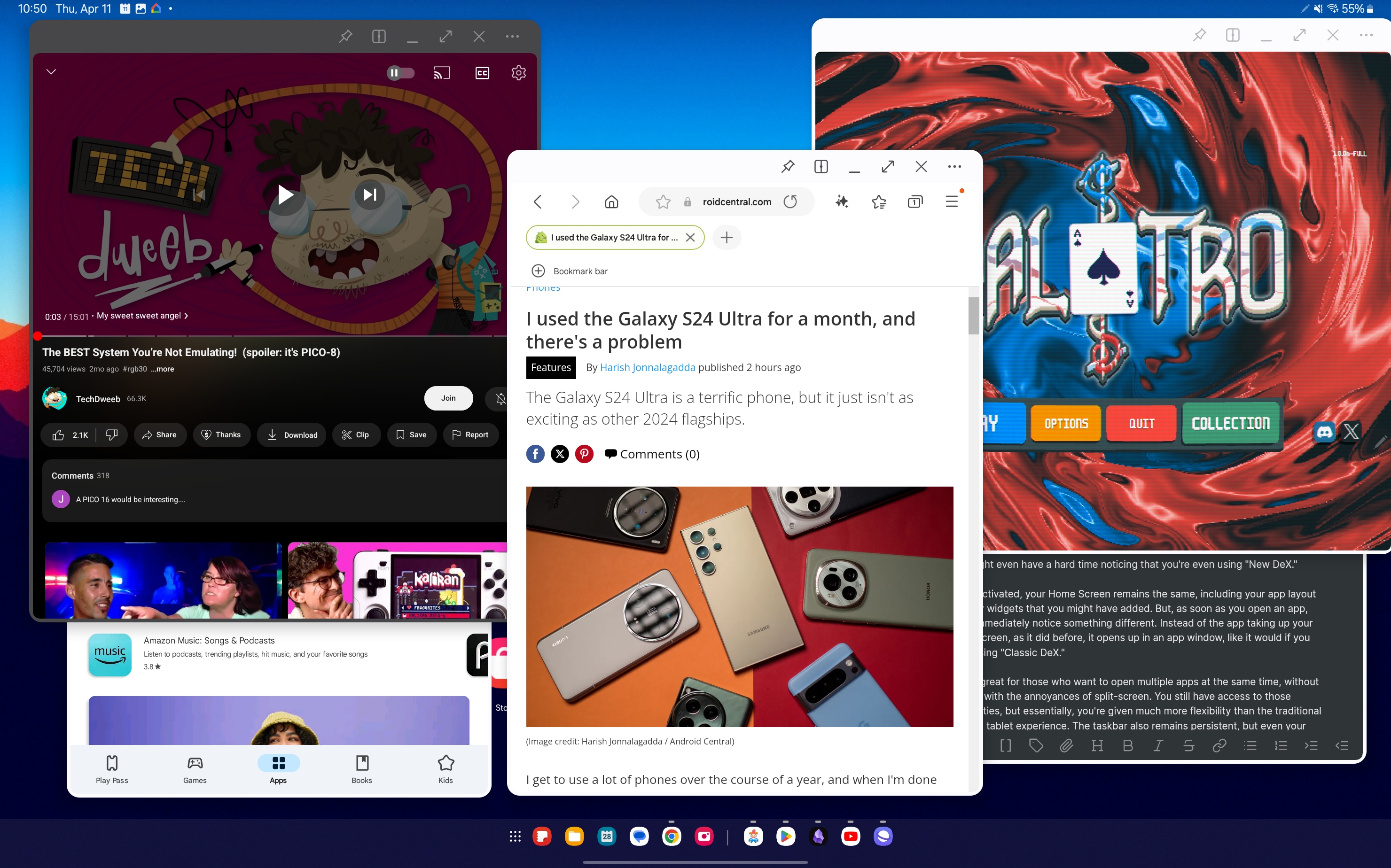
If you're a fan of the "Classic DeX" interface, then you might be a bit concerned that it's going away. Thankfully, that's not the case, at least for the time being. Samsung makes it possible to switch from "New" to "Classic," but you'll have to do a little bit of digging.
This New DeX experience also doesn't replicate a desktop experience as well, especially if you connect your tablet to an external monitor. For one, the only display settings option is to choose between "Mirror tablet screen" or "Use screens separately." Even if you choose the latter, New DeX doesn't scale the display properly, meaning that you're often left with black bars on either side.
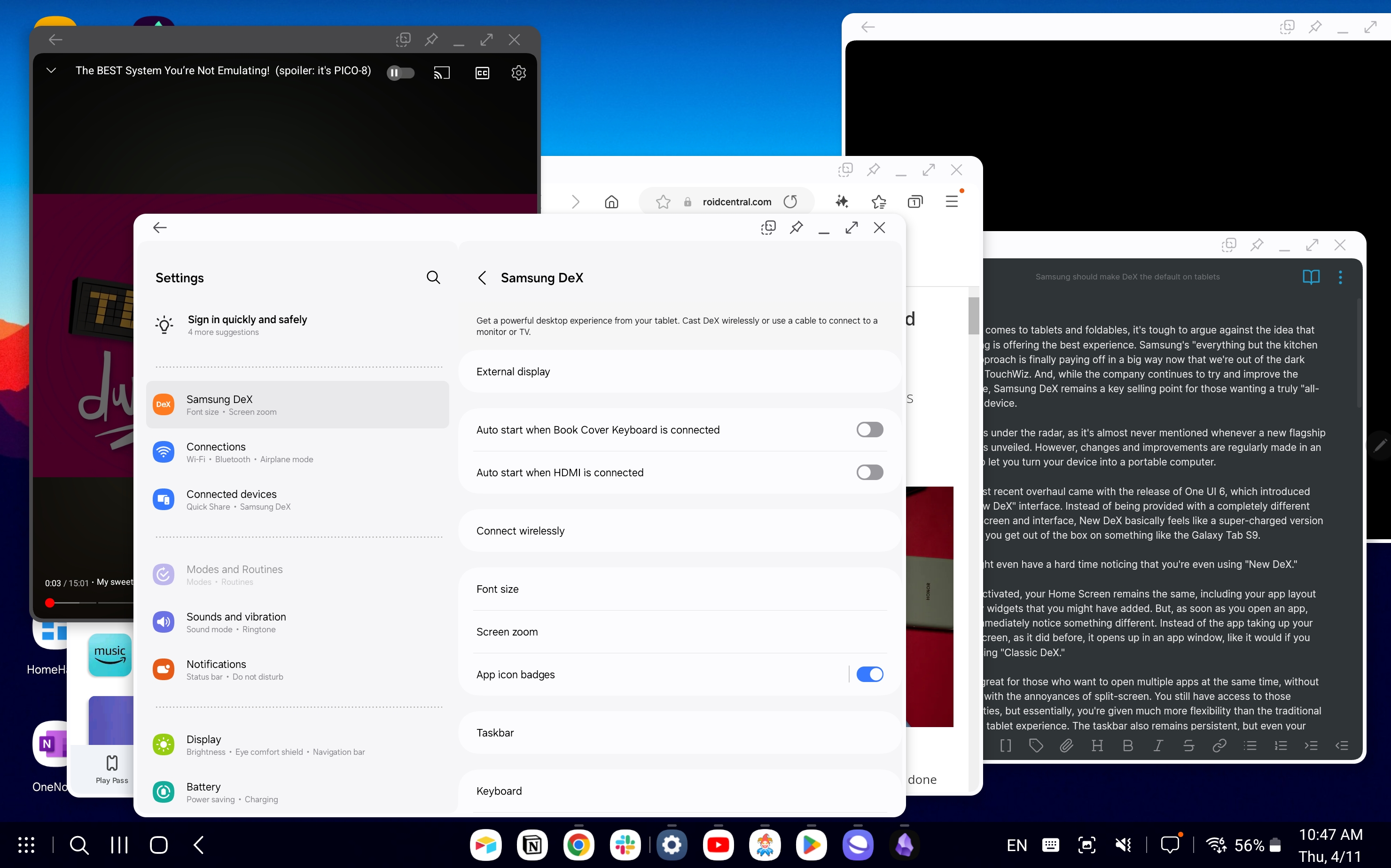
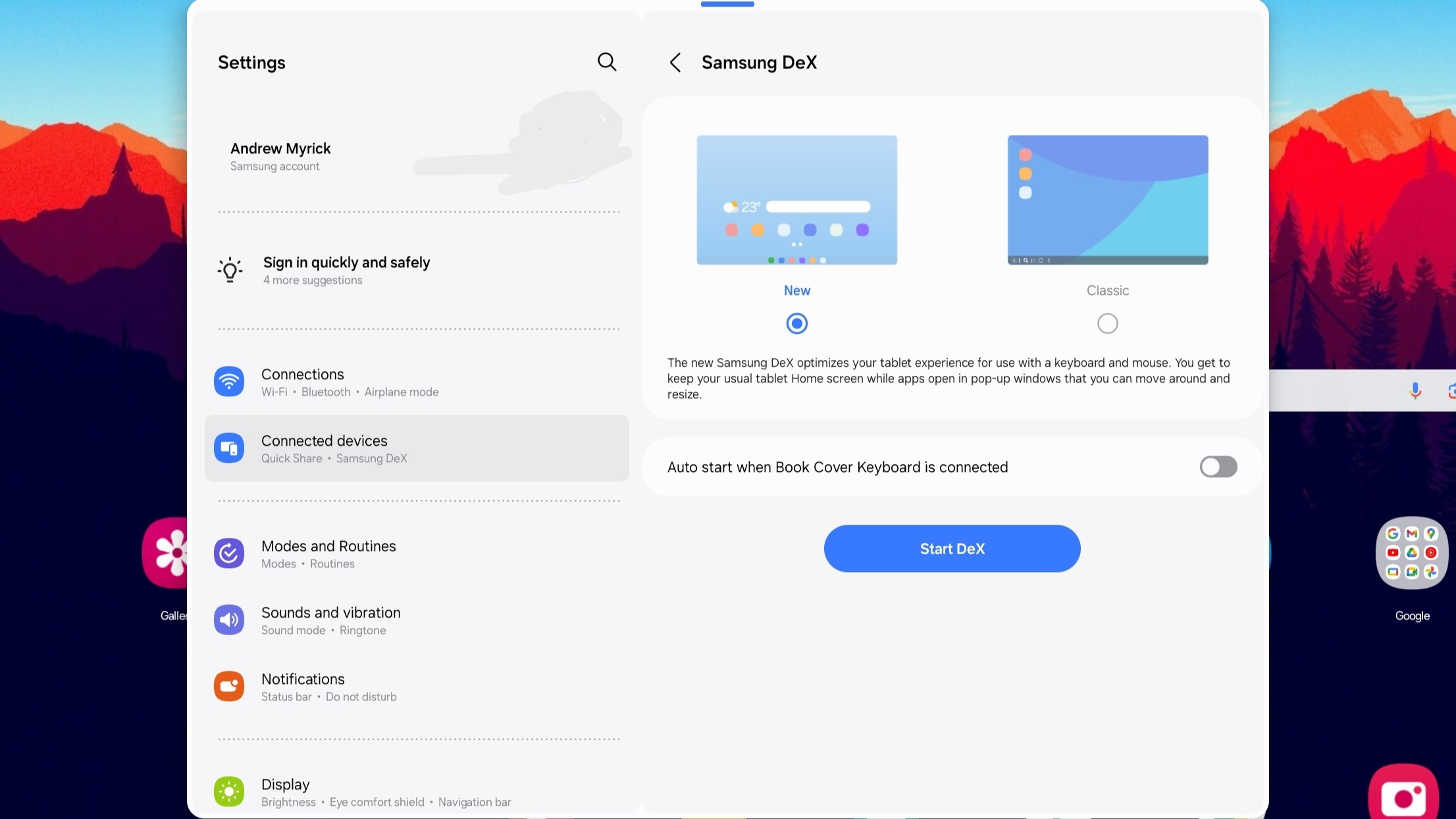
By in large, this just automatically enables the "Multi window for all apps" feature that's already available in the Labs section of the Settings app. There are a few other minor differences, such as the taskbar being able to hold more than four recently used apps. But, it's not really something that I would describe as being part of the "DeX" experience.
You might be asking yourself, "Would Samsung actually ditch "Classic DeX?" Well, the answer is quite simple. Yes, because it likes to make money. Samsung already sells its own lineup of laptops, and if you buy a tablet that basically does the same thing as a laptop but has better battery life, it loses out on potential sales. This is especially true of the Galaxy Tab S9 Ultra with its 14.6-inch AMOLED display, and when paired with the Book Cover Keyboard, it is about as close as it gets to having an Android-powered Surface competitor.
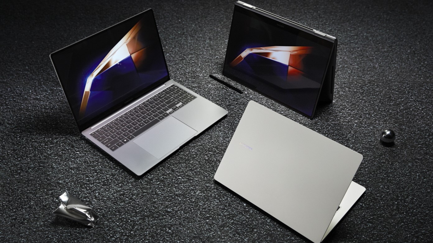
Samsung's Galaxy Book 4 360 is probably the closest comparison to make, as it's a 2-in-1 laptop with a touchscreen display. Pricing starts at $1,099 for the Intel Core 5 model, paired with 8GB of RAM and a 512GB SSD. There's also the Core 7 variant, priced at $1,349, but that bumps the RAM up to 16GB and comes with either 512GB or 1TB of storage.
The Galaxy Tab S9 Ultra, on the other hand, starts at $1,199 with 256GB of storage, maxing out with 1TB for $1,619. Then, you're looking at another $350 for the Book Cover Keyboard, so on the surface, the Book 4 360 is a better deal. But that's only part of the story, as the Book 4 360 falls short of the Tab S9 Ultra in a few ways.
For one, while the screen is larger, it's also limited to a 1080p resolution and is capped at a 60Hz refresh rate. Meanwhile, the Tab S9 Ultra is equipped with a smaller display, making it better for portability, along with offering a better viewing and gaming experience thanks to the AMOLED panel and 120Hz refresh rate. Not to mention that the battery on your Galaxy Tab S9 Ultra will last for days, whereas the Book 4 360 might make it through a day, maybe two.
The Galaxy Tab S9 Ultra might be expensive, but it's still a better value than some of Samsung's best laptops.
I wish I could tell you what the future holds and that Samsung will leave Classic DeX alone, aside from introducing new features. Sadly, I don't have a crystal ball and have no clue what Samsung's long-term plans are with New DeX.
But there's a reason why I barely ever recommend anything other than a Samsung tablet to those who don't want an iPad. That's because the majority of Android tablets are a mixed bag of disappointment. Whether it's because they lack polish, aren't updated very often, or are just downright bad. Unless something dramatic happens, Galaxy Tabs will remain my go-to recommendation, even if "Classic DeX" is removed, but it will be much tougher.
Samsung, please don't ruin a good thing, even if your analytics show that DeX isn't used by the vast majority of the user base.


