My first smartwatch was the original Samsung Galaxy Gear. I have fond memories of feeling like I was Dick Tracy, capturing Instagram photos from my wrist, or even taking a call while I was driving. It felt like the future had just wrapped itself around my wrist in every way but one: the square design.
Fast forward to just a few months later and Motorola blew everyone's minds with the Moto 360, a round smartwatch that looked like a real watch and, yet, still packed in smart features. Instead of the stop-gap square watch — which looked like a phone strapped to my wrist — Motorola delivered what felt like the actual future in such a short amount of time.
Now, after a decade of using the beautiful round form factor, rumor says that Samsung wants to go back to square one, and that's the biggest mistake the company could ever make with its smartwatch brand.
Rectangles aren't for your wrist

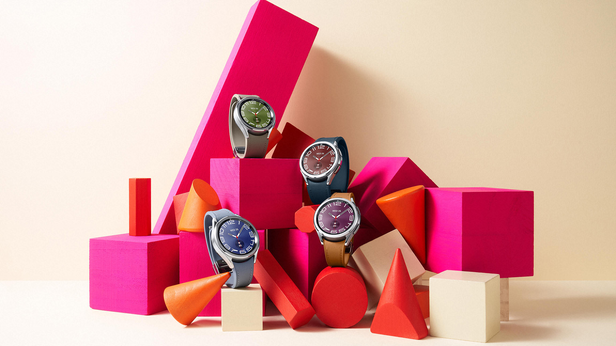
The first Galaxy Gear — and the rest of the Android Wear lineup — were all square because they had to be. No company had yet mass-manufactured a round display yet, so putting a square on your wrist was a stop-gap measure until someone did.
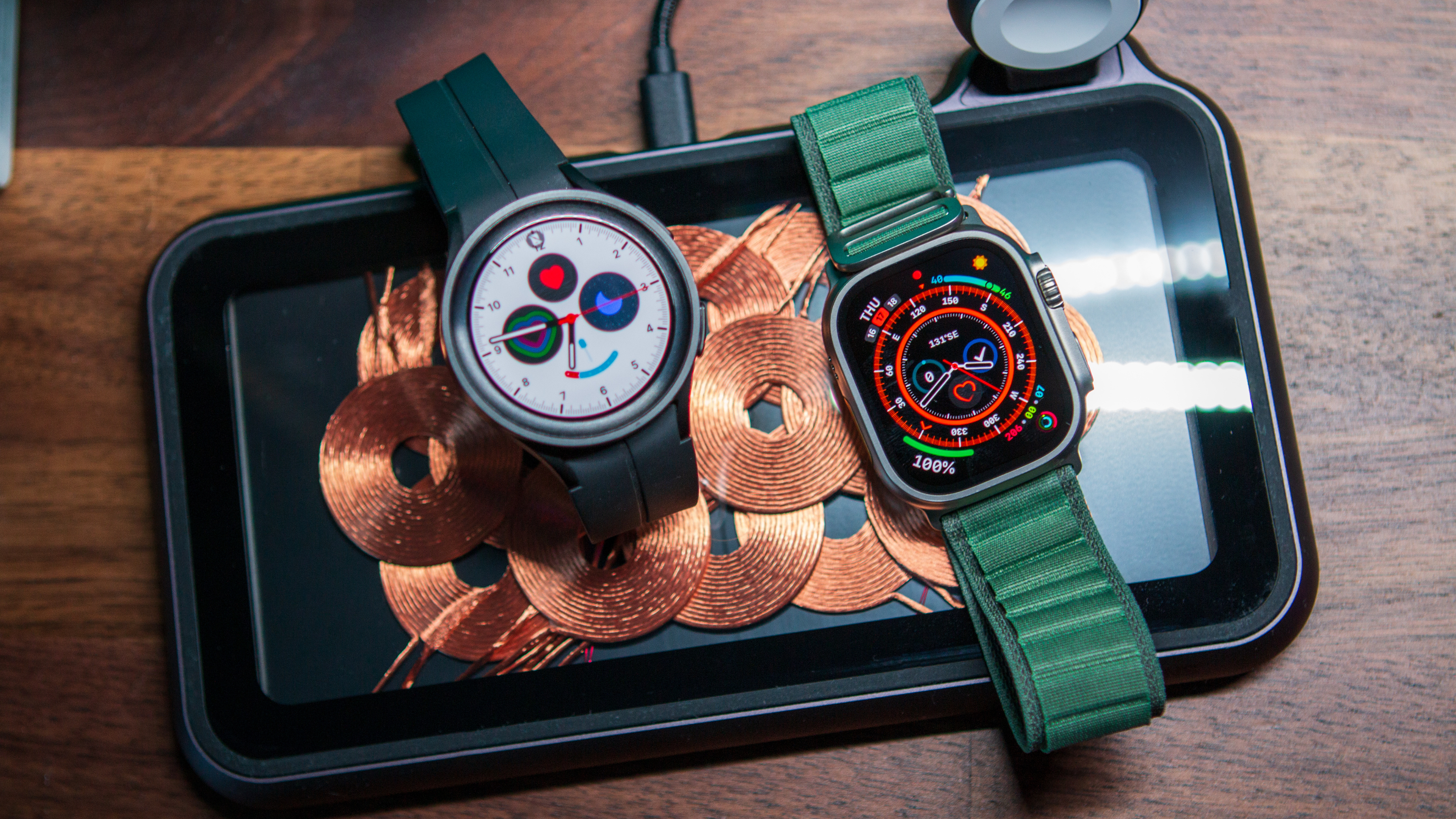
However, when the original Apple Watch launched, the response from the Apple fanboy press was all too predictable. While Android watches were already on their way to moving to a circular design en masse, Apple's new square was suddenly "beautiful and elegant," mainly because it curved the glass around the edges.
But it still had one big design flaw: it was square, and that made it look like a computer on your wrist, not a watch.
Square watches look like computers on your wrist, not watches.
Unsurprisingly, all of the good-looking watch faces were round, fitting awkwardly on the watch's square display. Some will say this is an advantage because you can put complications in each corner — the term for small widgets that let you quickly access information like heart rate or the weather — but Wear OS watches over the years have proven that those fit just fine in a circular watch face, too.
Many have pointed out that most of the information presented on a smartwatch comes in the form of squares — messages and keyboards, mainly — but, again, circular smartwatches have proven over the years that this isn't an issue and have designed around this potential pitfall in clever ways.
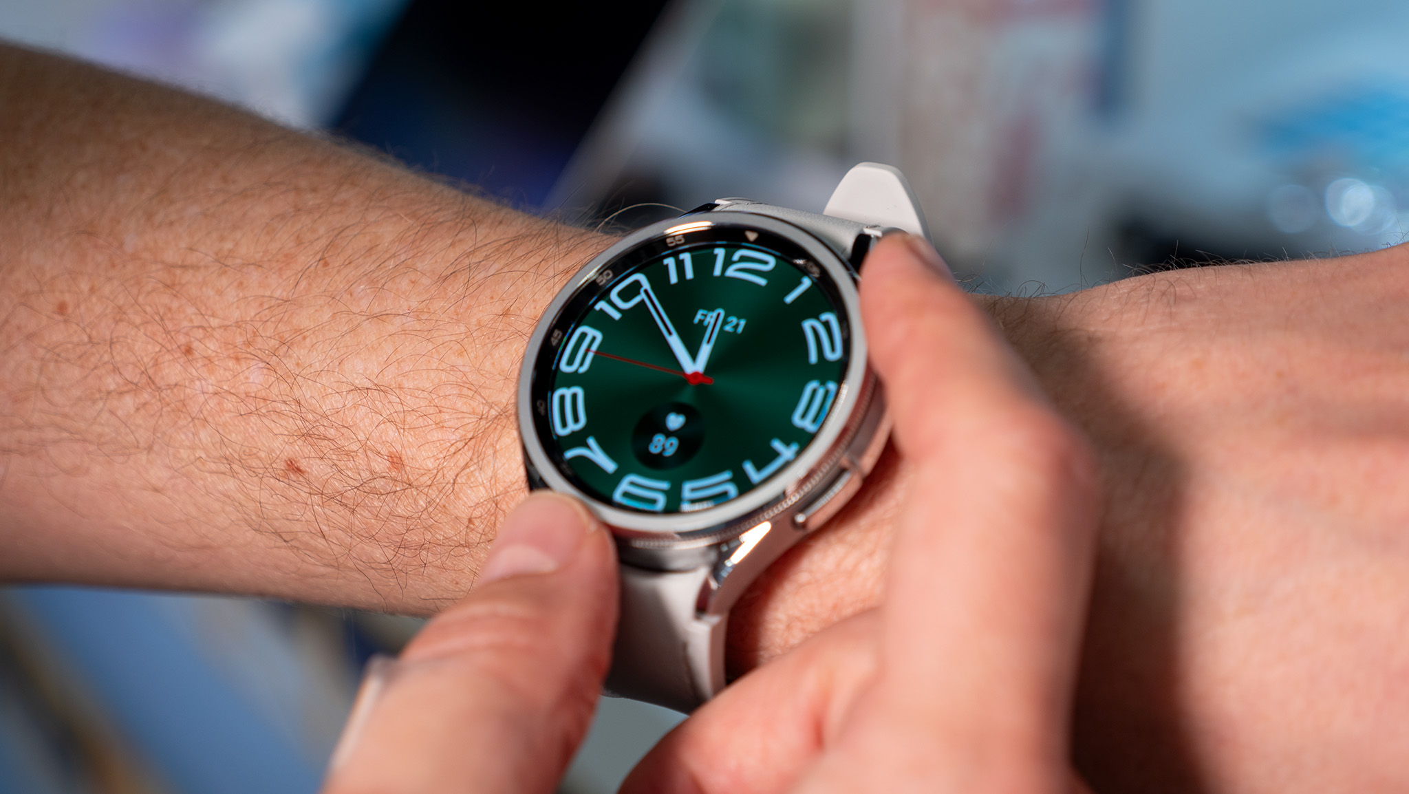
In fact, none other than Samsung came up with the most brilliant way to navigate on a circular smartwatch: the rotating bezel. Samsung's entire UI was designed around using this bezel, and it felt as natural to navigate with as the touch wheel did on the original iPod.

But, for some strange reason, Samsung seems to like getting rid of the things people enjoy most about their smartwatches. The Galaxy Watch 4 introduced the first mainline model without this rotating bezel, and the Galaxy Watch 5 did away with it completely.
It's no surprise that Samsung brought it back with the Galaxy Watch 6 after much backlash from fans, but only on the larger classic model. Now, with the company apparently "enthusiastically" considering a square watch, I wonder why the company would want to relive history and anger its fans all over again.
Samsung users don't want to look or feel like Apple users, and I highly doubt most Samsung fans would be happy with an all-square Galaxy Watch future.
Samsung took heat for killing the rotating bezel, and now it wants to anger its fans all over again.
The shape of what's on your wrist is, obviously, a personal choice. Watches and the myriad of different styles available are all designed to help uniquely represent you and your personality. The problem is that smartwatch manufacturers haven't historically offered much in the way of different design choices.
The best Android smartwatches are almost all circular, a design choice that's as much about providing something "real" or "futuristic" as it is to look exactly the opposite of the only shape Apple provides its users. A scant few fitness-focused watches from Fitbit, Amazfit, and some other smaller brands are square, but Android customers have spoken loud and clear: round is right.
The Apple Watch isn't good because of its form, it's good because of its function.
If Samsung wants to add a square smartwatch to its lineup — perhaps a Galaxy Watch 8 Square Edition or something equally terribly named — that would be just fine. But for Samsung to consider going back to a square watch when it abandoned that stopgap measure is madness.
If the company is serious about listening to its users and not repeating mistakes of the past, it'll offer more than just one design. Round and square would be great and would offer users a real choice.
To completely abandon a design trait that has made its products the most popular Android smartwatches for a decade is a foolish mistake that Samsung simply shouldn't make.
The Apple Watch isn't good because of its shape; it's good because of its function. If Samsung wants to blindly copy Apple for any reason, it should start there.


