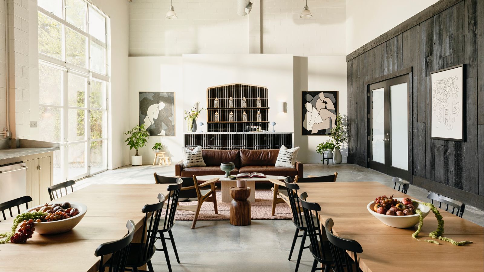
Ryan Reynolds' Maximum Effort company has perhaps found the impossibly perfect balance between work and play. In its own words, the film production and digital marketing company creates 'TV series, content, ads, and cocktails for the personal amusement' of the Hollywood actor – so when it came to the office, the design ethos was, unsurprisingly, just as lighthearted.
'The ethos followed Maximum Effort’s brand ethos of bringing people together,' begins Michelle Toney, the principal of Studio Paul Toney and co-founder of Morrow Soft Goods, responsible for leading the project. The designer sat down with H&G to open the doors to the space – located in a stand-alone 1930s Art Deco building in Santa Monica.
'This came to life through multiple seating and working arrangements to ensure all different types of work could flow from the space: long tables for gathering, movable desks for solo work, couches for brainstorms, and private offices for calls and meetings. The company and Ryan Reynolds himself are also known for being down-to-earth, and so we knew we had to highlight Room & Board’s sustainably sourced products throughout the space.'
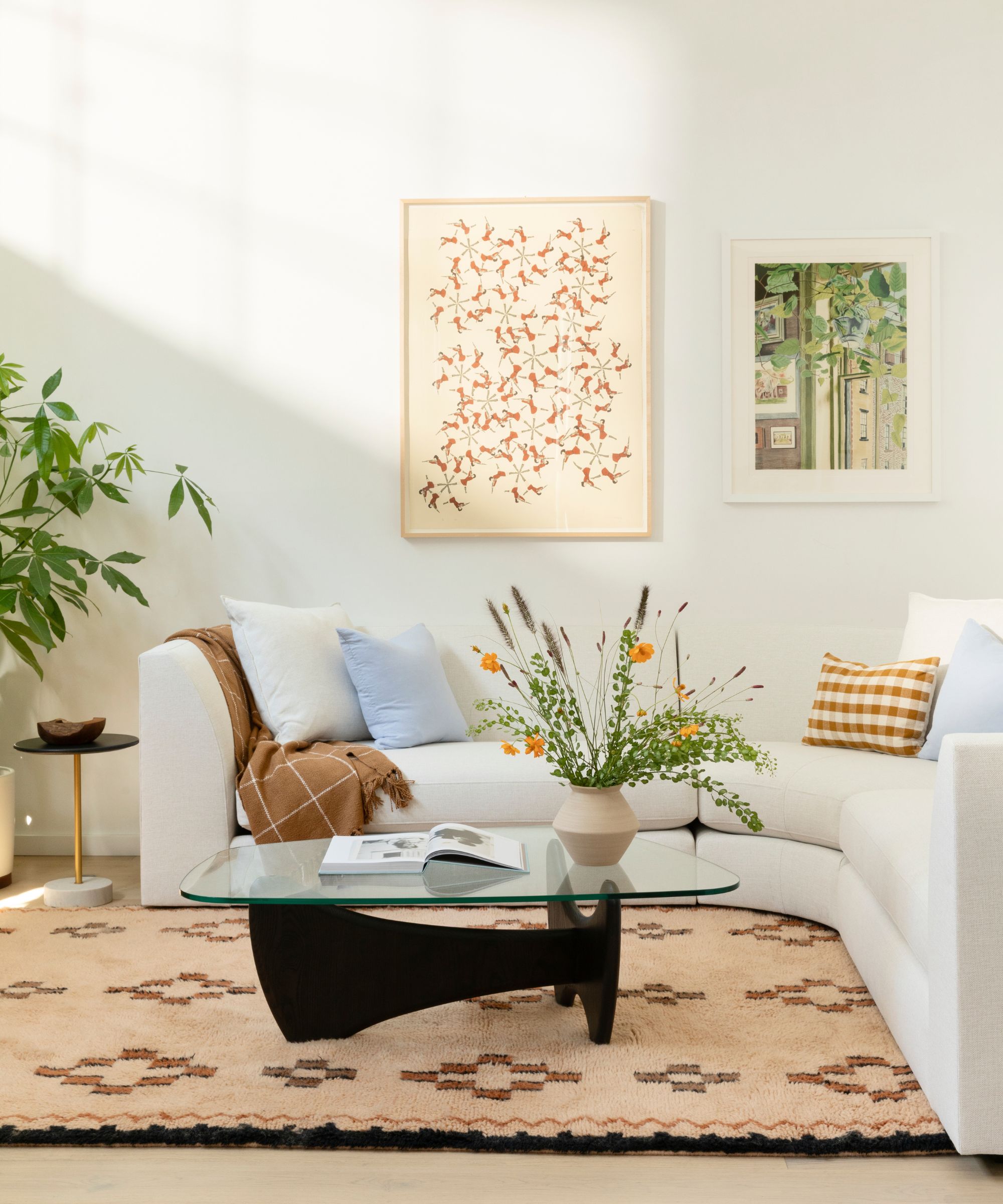
As hinted, Reynolds and co-founder George Dewey manage Maximum Effort as a place where celebrating creativity comes as standard. It's a place where, Reynolds hopes, workers want to be – instead of a place where they feel they simply should go. For Toney, this set the space apart from other offices she had worked on in the past.
'It was a very different task because there was a conscious effort towards bringing a company together – and all the benefits of socializing, brainstorming, celebrating, creativity, etc. that comes with that, vs. simply an office,' she says.
'It was important that the space would be a place people wanted to be, not where they felt they had to be. We helped bring this sentiment to life by using a mix of pieces meant for an office and a home to achieve an office with some real warmth to it.
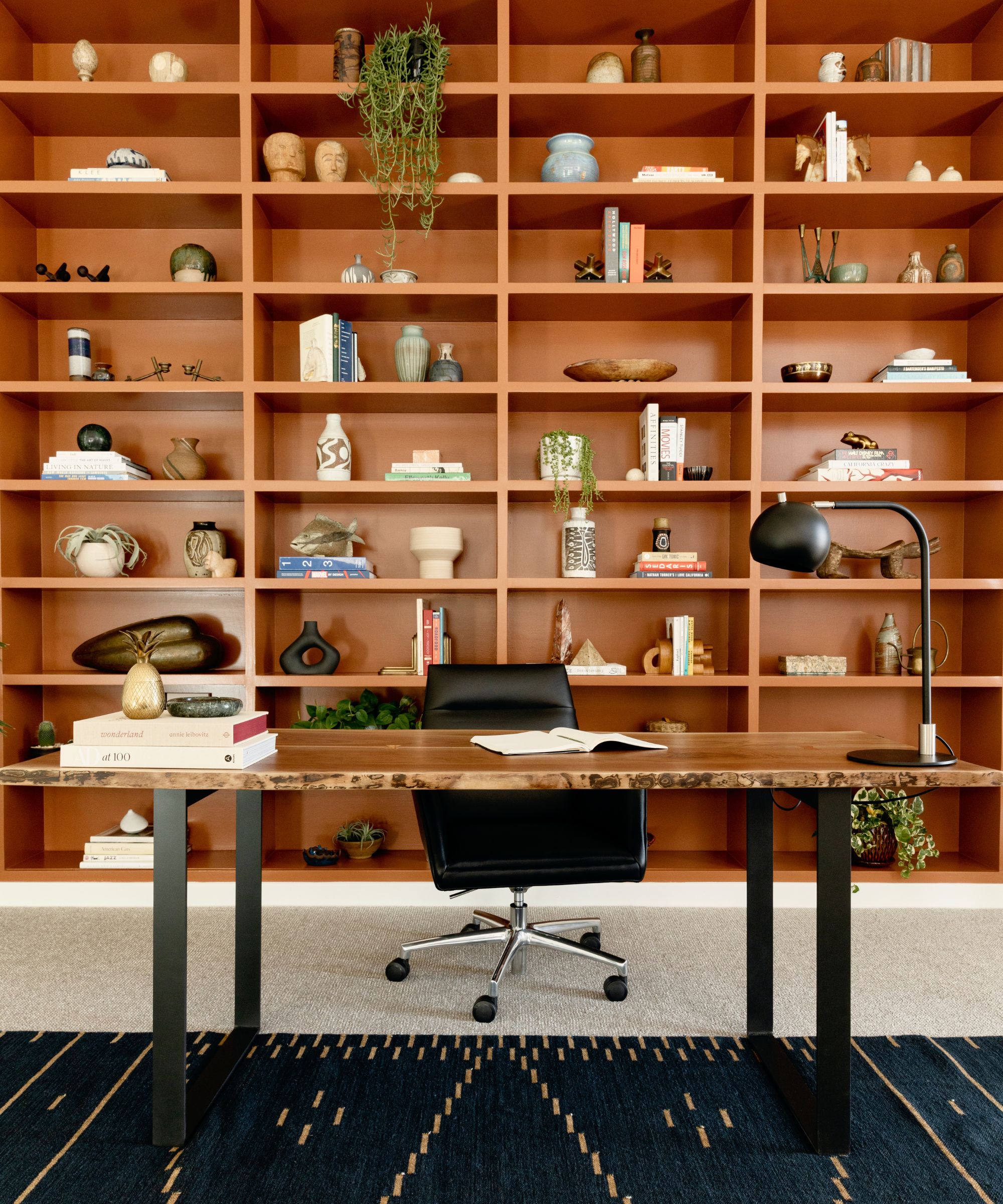
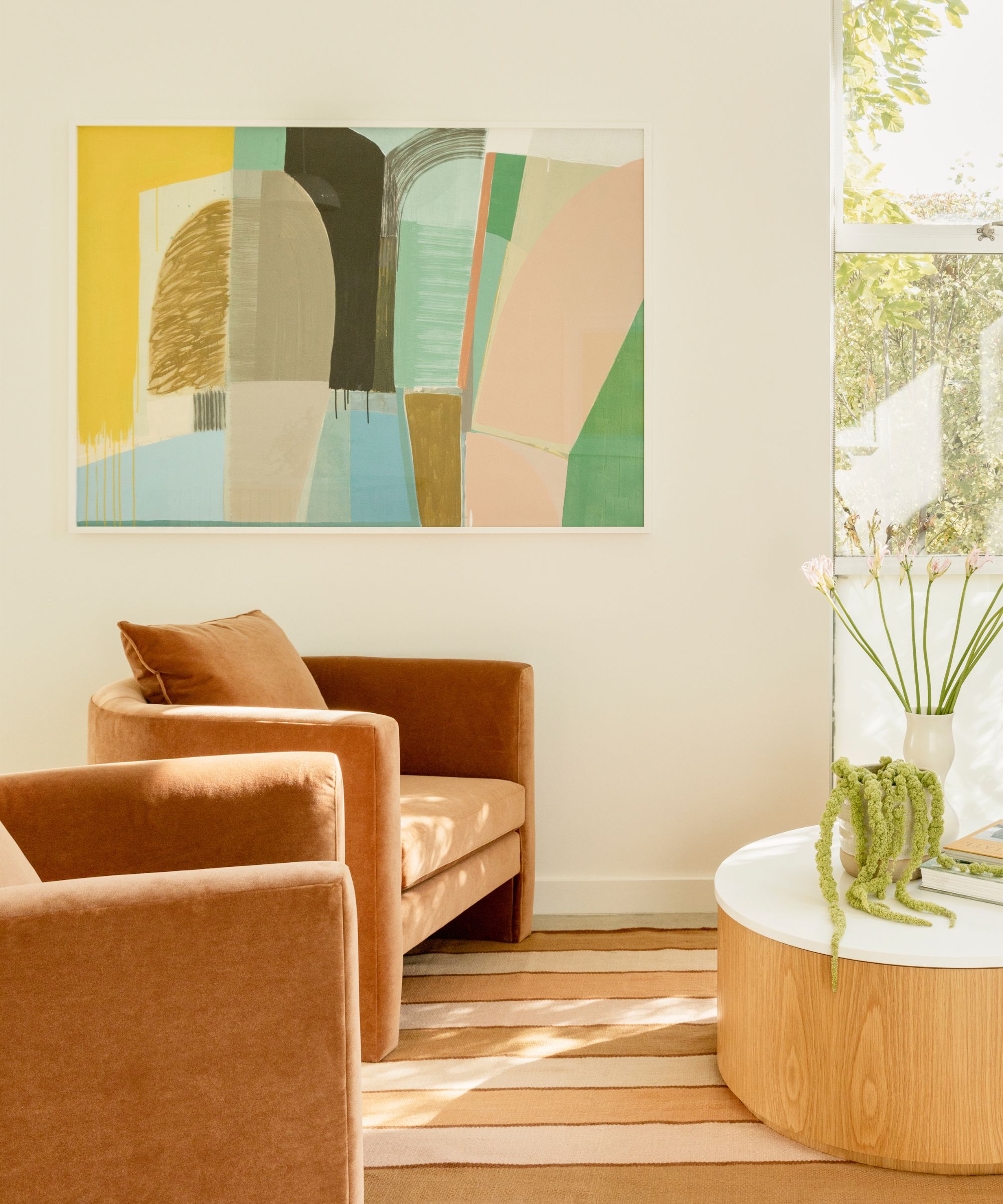
The office color palette also sets the space aside from conventions. Though decorating with neutrals is certainly not out of the ordinary, Toney complements the tones further through her strategically hued furniture.
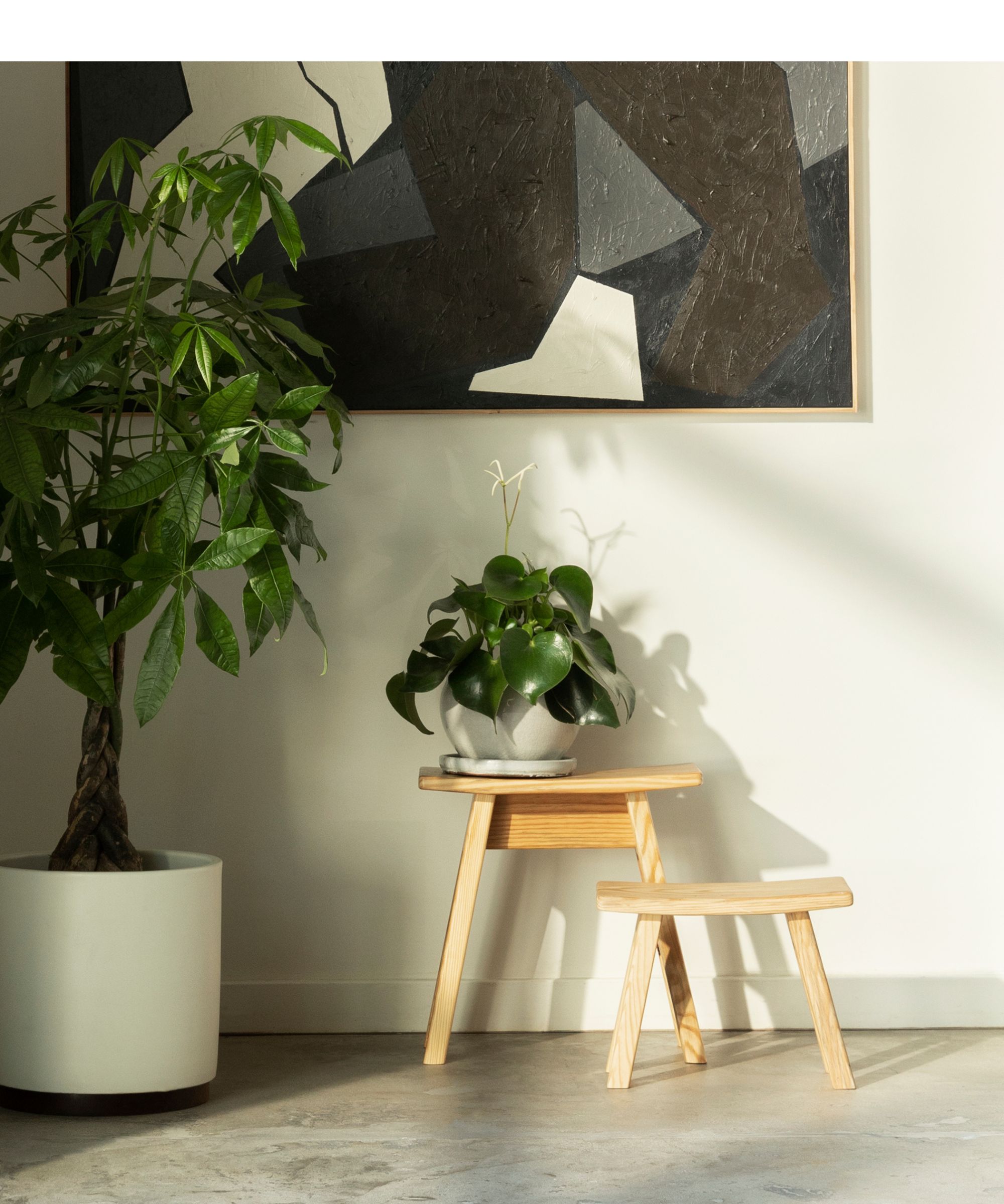
'I always think of colors in pairs. I like to pair something that is grounding, darker, and richer with something more vibrant. In this case, the natural woods from Room and Board really brought their own depth to play off of,' she explains. Arguably, nowhere combines this quite like the reception (seen above), where Toney sought to create a dream first impression. It also happens to be her favorite corner, and we can see why.
'My favorite corner is all of the colors and textures and art coming together in the sunny reception area. I think it creates a welcoming and positive energy for the space.' The best part? This color trick can translate to our entryways and home offices beyond California. 'For a domestic space, I think this applies the same, and I would also add layers and mixing textures help to complete a space and bring dimension.'
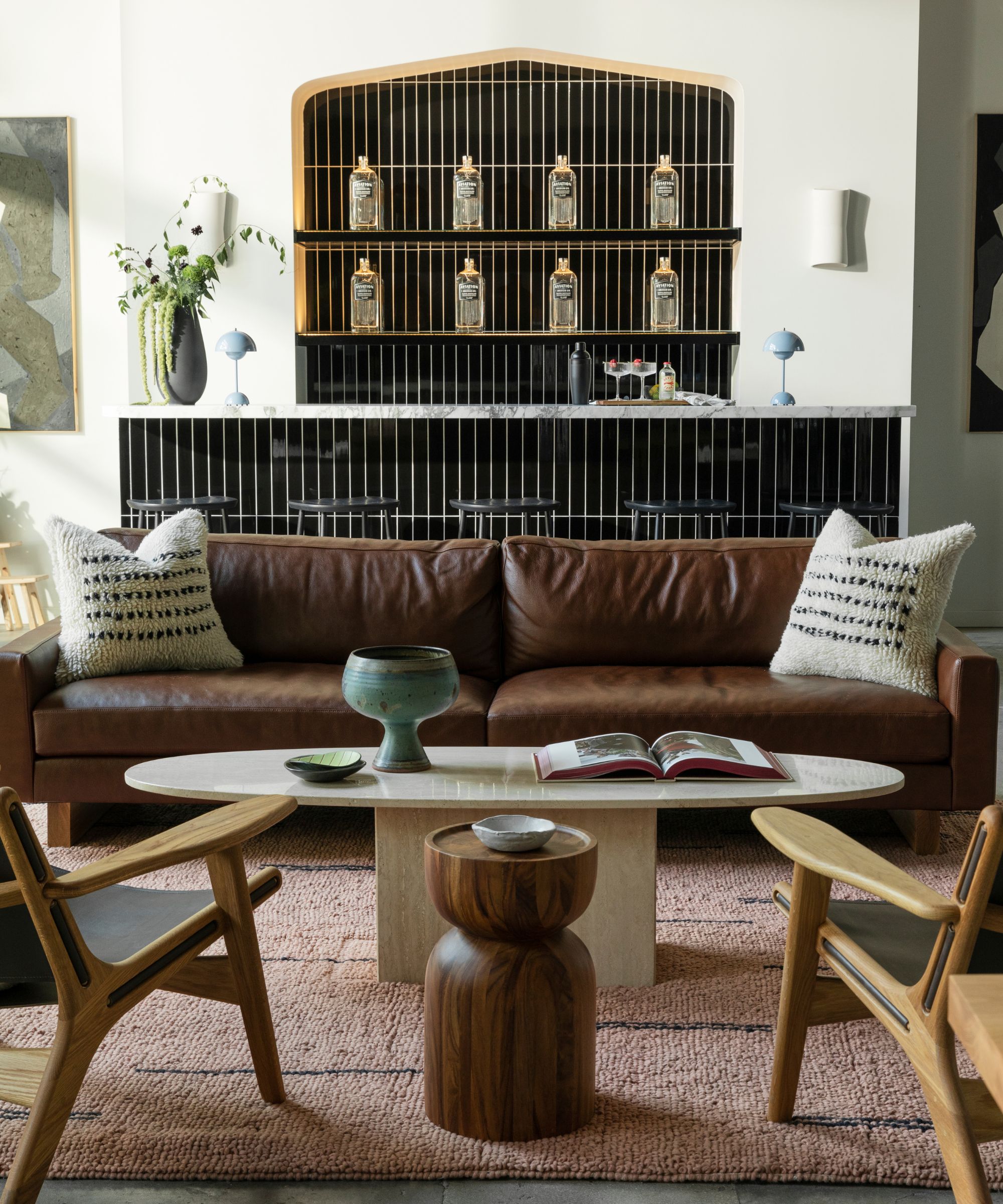
The reception and desk areas already strike a balance between work, but nothing epitomizes it quite like the bar area.
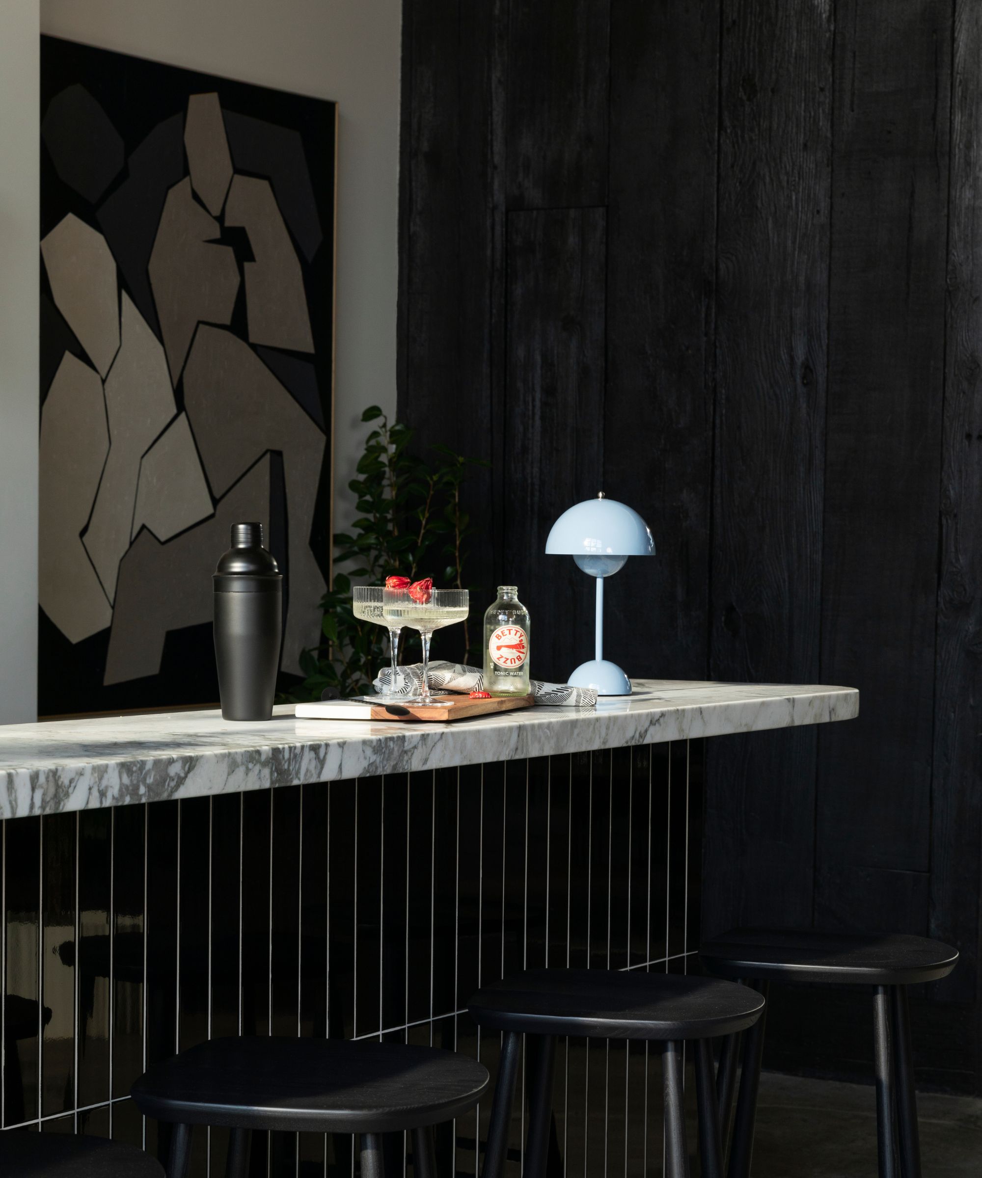
'I love the bar! It’s nice to have a beautiful visual anchor in such a large-scale flexible space, and in this case, it’s quite functional and fun as well,' Toney says. Of course, it's kitted out Reynolds’s Aviation Gin, the label that influenced the bar's design. However, we couldn't help but notice how the bar is also kitted out with Betty Booze, a nod to Ryan Reynolds' wife, actress Blake Lively, who founded the company on the premise that drink should be held to the same tasteful standards as the foods we consume. We'll raise a glass to that.
Shop the look
As Toney explains, Room & Board and her brand, Morrow Soft Goods, are responsible for the beautiful pieces around the space. We can shop the exact pieces below (spoiler: they look just as chic beyond the office).
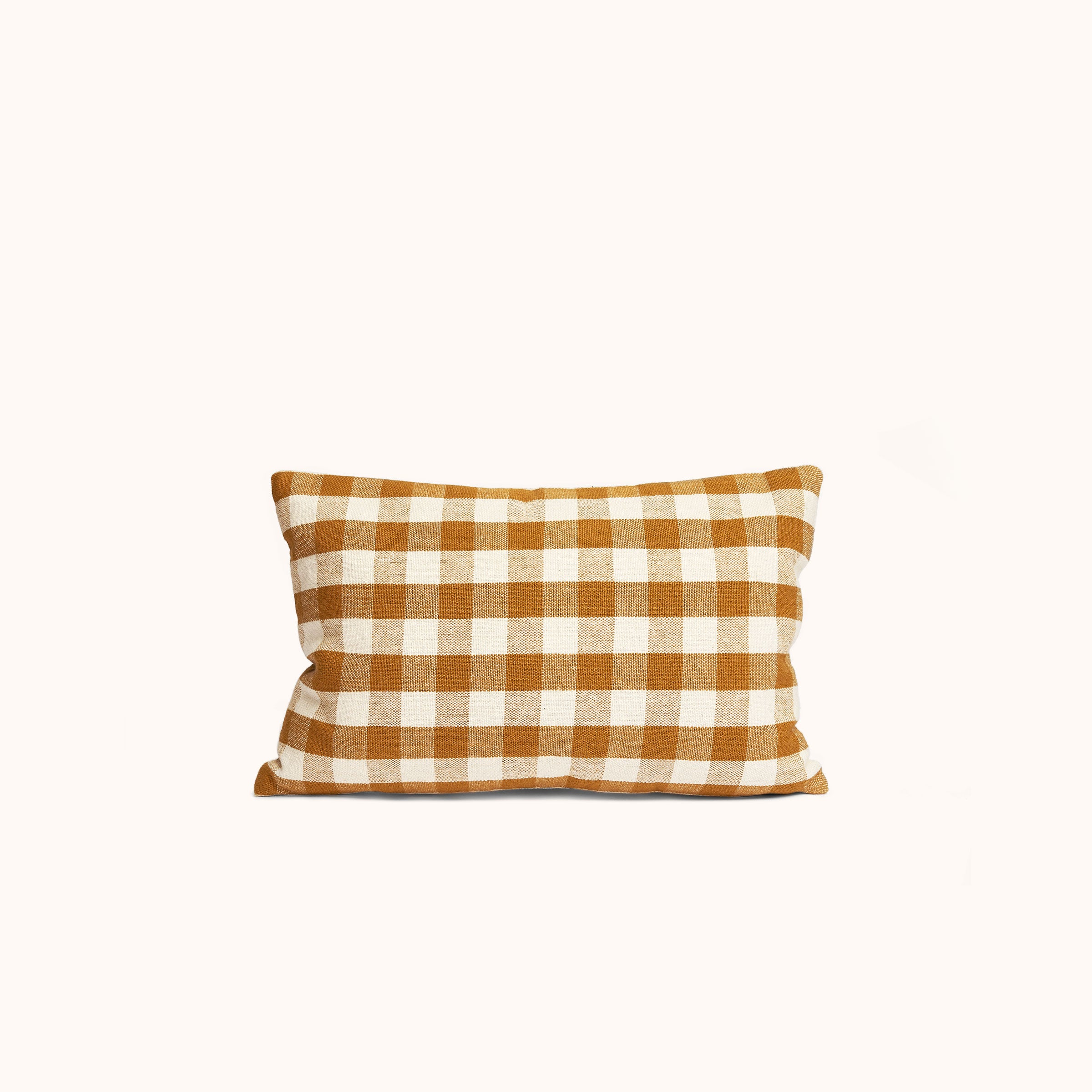
This lumbar pillow in classic gingham is a sophisticated way to bring a warm, rich, golden color and timeless pattern to any sofa, accent chair, or bed.
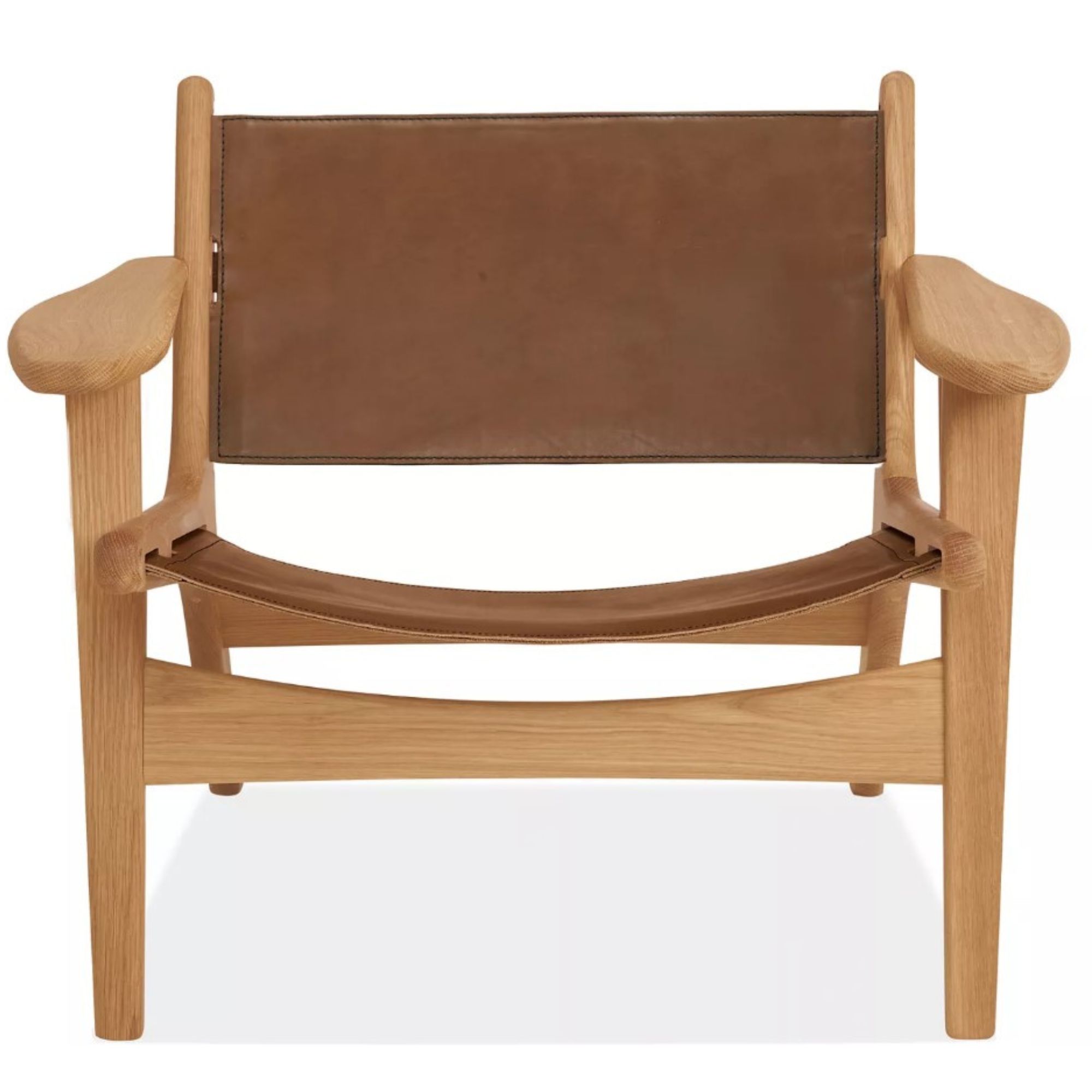
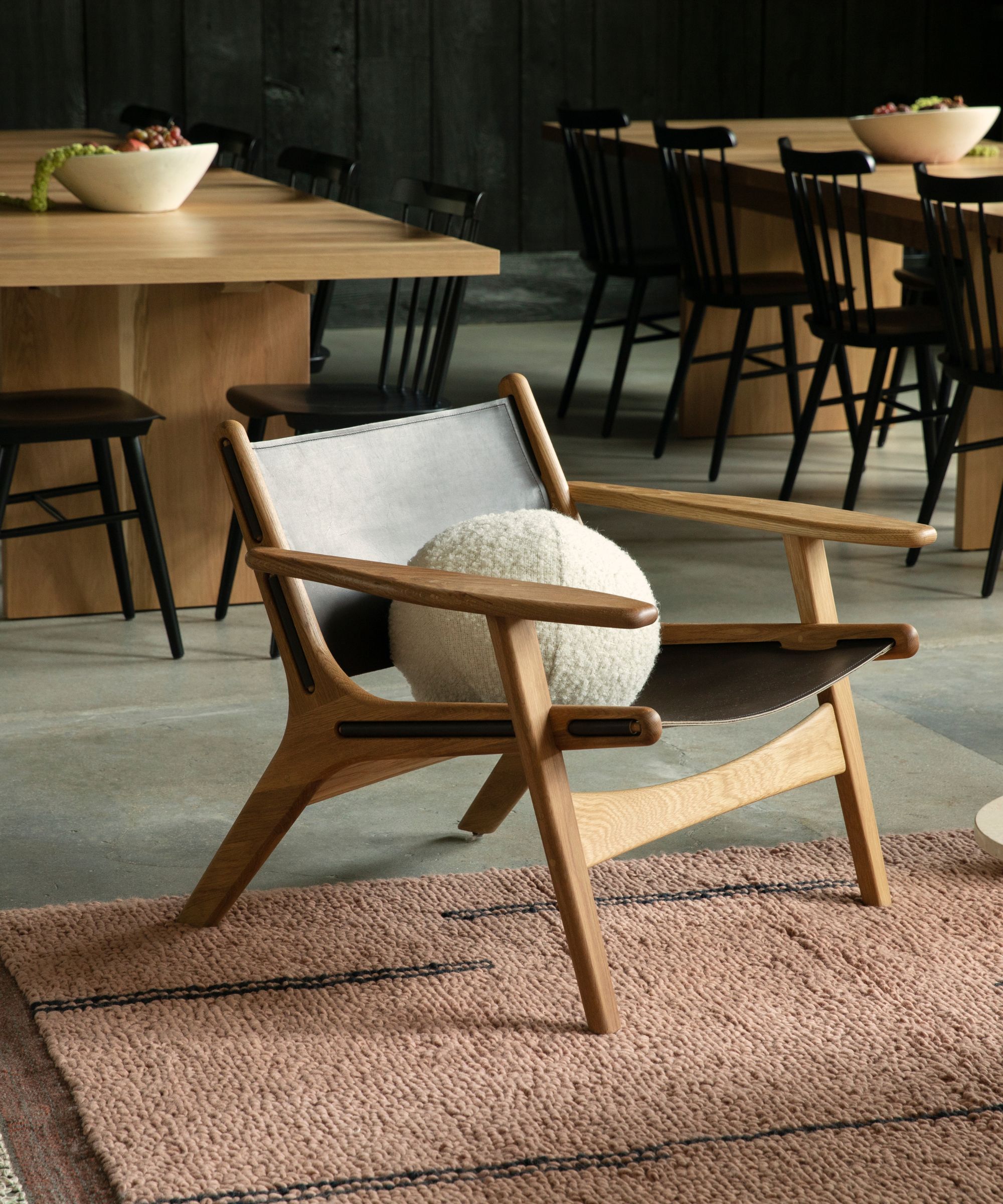
Built in Vermont, from U.S.-sourced solid wood, this durable yet ultra-stylish chair is perfect for lounging. It looks perfect in a home bar (inspired by Reynolds), but truthfully, it can make a statement anywhere.
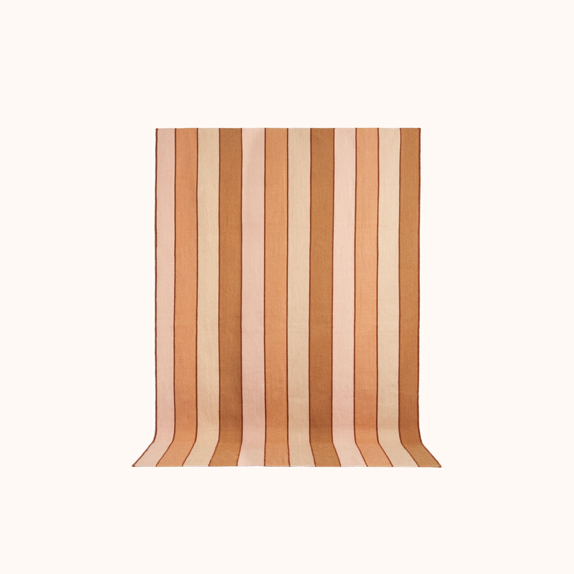
This handwoven flatweave rug exhibits gorgeous wide stripes in a mix of warm pinks, peaches, and browns. It's the ultimate talking point in every living room, office or entryway.


