
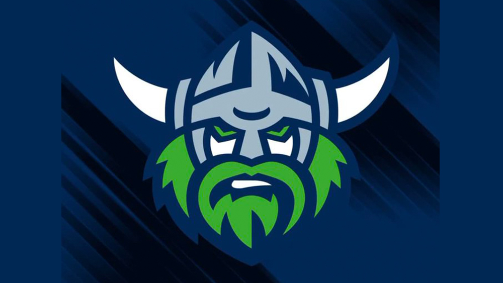
Logo redesigns for sports teams are almost always going to leave some people unhappy, and the new design for the Australian rugby league team the Canberra Raiders is proving to be no exception. The change might seem subtle in comparison to many logo redesigns we see, but fans are so incensed that they've started a petition to have the revamp reversed.
At first glance, the Raiders' new logo may look similar to the design the team has sported for the past four years, featuring the same fearsome Viking. However, the lines have been simplified for a much cleaner design that some fans say looks immature. Can you spot all the differences between the two versions? (See our pick of the best sports logos for more sporting design inspiration).




