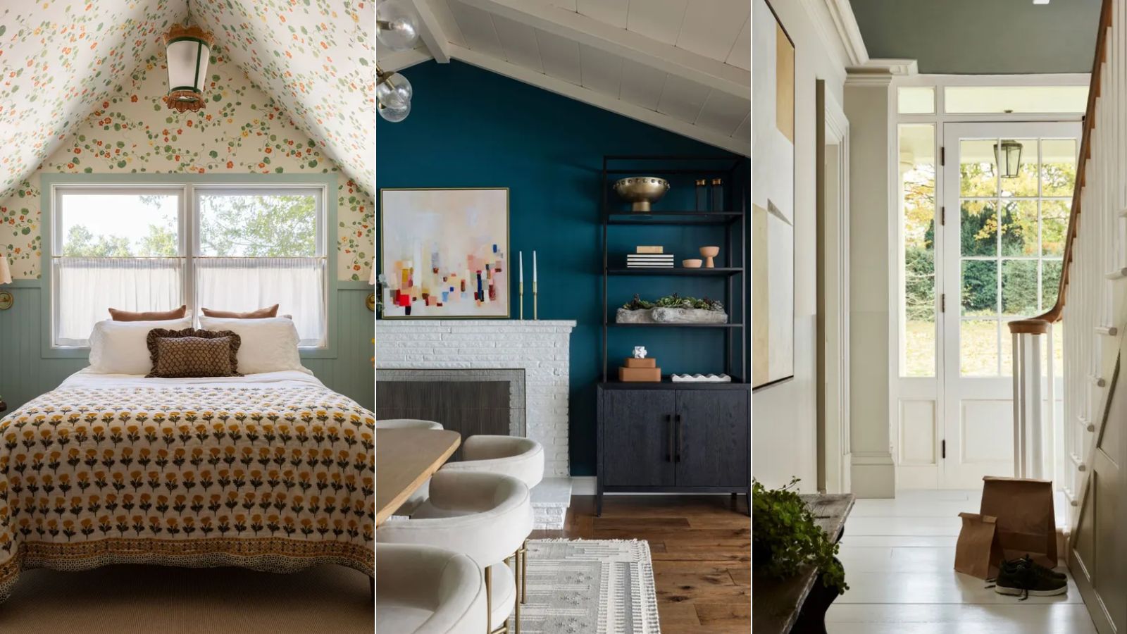
When embarking on decorating any room of your home, choosing a color scheme is one of the most important elements. Whether in kitchens or bedrooms; bathrooms or living rooms, each room should be carefully considered to ensure a color scheme that not only looks great but sets the right mood.
That said, we know how overwhelming the color-selection process can be. From classic neutral hues to much richer, statement-making shades – whether it be through paint ideas or kitchen cabinet colors – room color ideas are often a long and complex process.
And so, to help you make sense of color schemes for your own home, we've turned to the expertise of designers and color specialists who share their top tips and favorite color ideas for each room below. Read on to gain the knowledge needed to create balanced and stylish color schemes throughout your home.
Living room color ideas
Whether used for entertaining guests or to unwind at the end of each day, living rooms are often one of the most frequented spaces in the home. When deciding on your living room color ideas, you can go as bold or pared-back as you like depending on your interior design style and the mood you wish to create. Whichever you choose, the expert tips below will ensure a harmonious living room color scheme.
1. Combine blue and green
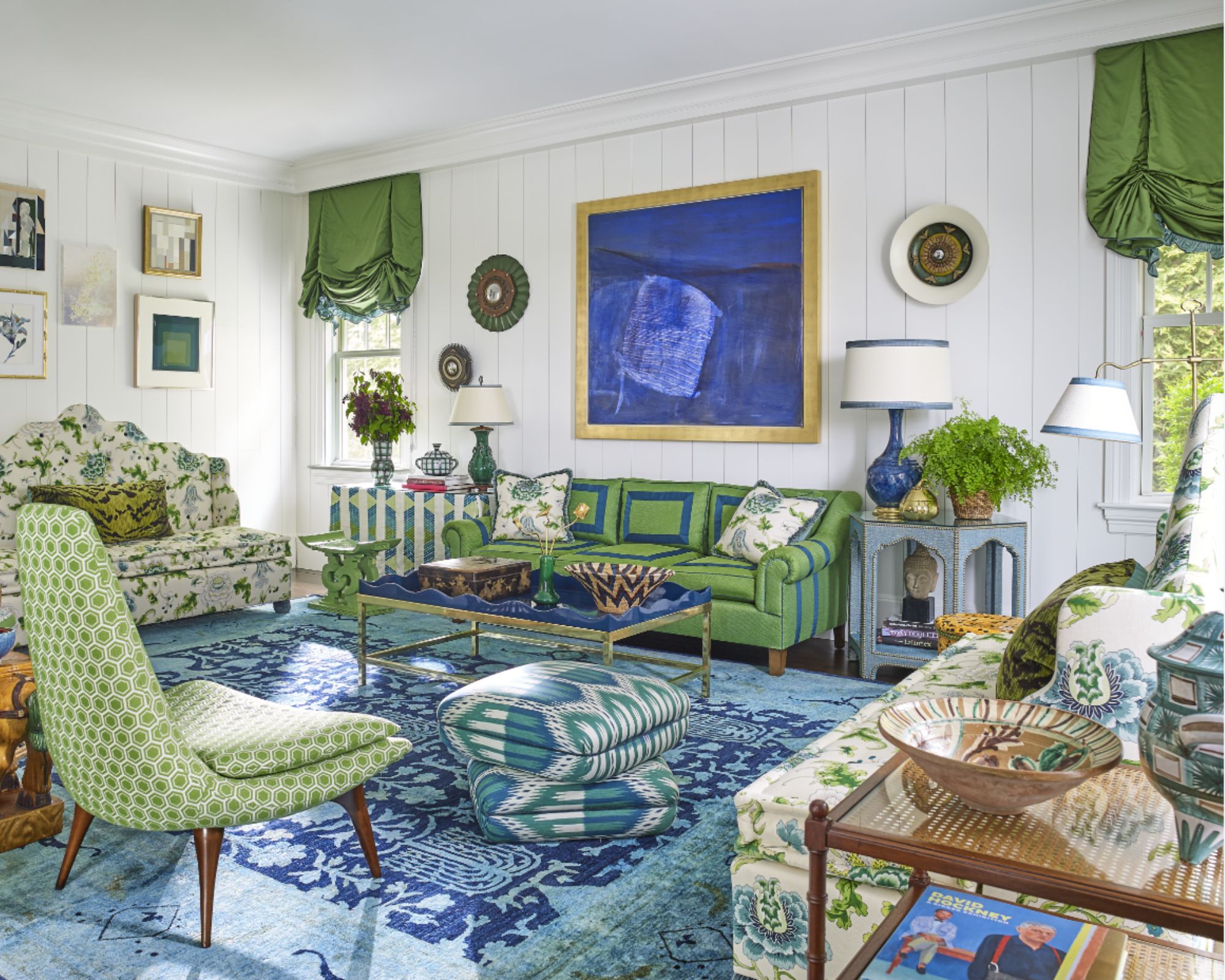
Turning to nature's colors is a great place to start when choosing a color scheme. Here, blue and green are used liberally to create a visually exciting and lively space through furniture and decor against the living room's white walls.
'Blues and greens are some of my favorite colors from nature,' says interior designer Alex Papachristidis. 'The client loved these colors as well. We started the room with the beautiful Indian Died Rug and the Brunschwig & Fils floral. Adding vintage and custom-made pieces to the room to create a colorful magical atmosphere in this Hampton home.'
2. Let upholstery or wallpaper inspire the color palette
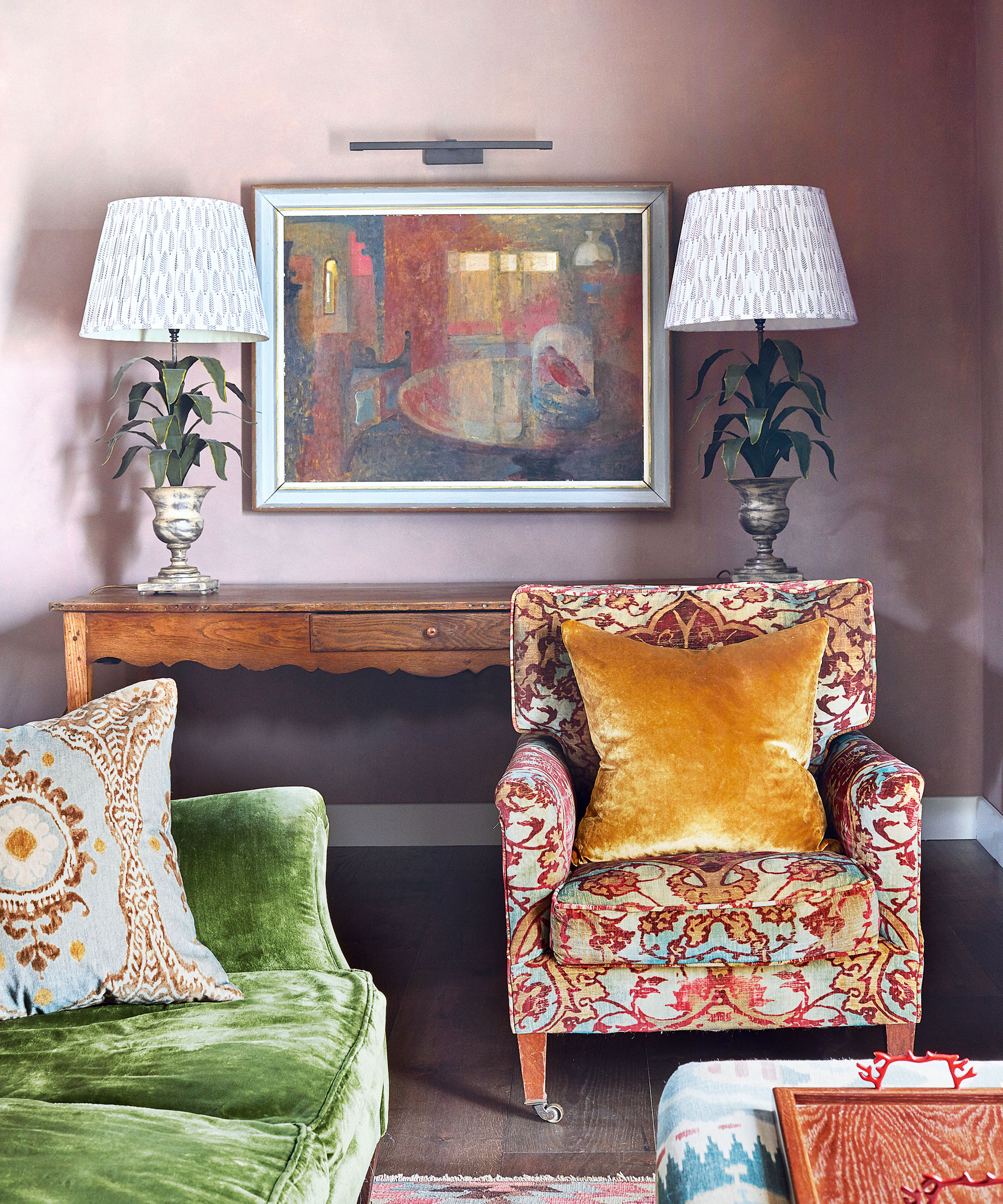
One approach to introduce color confidently to a living room is to choose a small secondary color detail in a patterned fabric design and use this as the inspiration for solid fields of complementary paint color, recommends Genevieve Bennett, head of design at Liberty Fabrics. 'It helps provide a perfect canvas for the fabrics which is both surprising and liveable and allows you to introduce bold rich colors to a scheme.'
Textile and wallpaper designer Neisha Crosland says another way to sew a room together is to pick out the strongest (or the darkest) color from the wallpaper pattern and use it on the woodwork in a room. 'That could be on the doors, cornicing, window frames, wardrobes, or radiators – it’s a clever decorating tip that I like to use,' she says.
3. Use antique rugs as a starting point for a color scheme
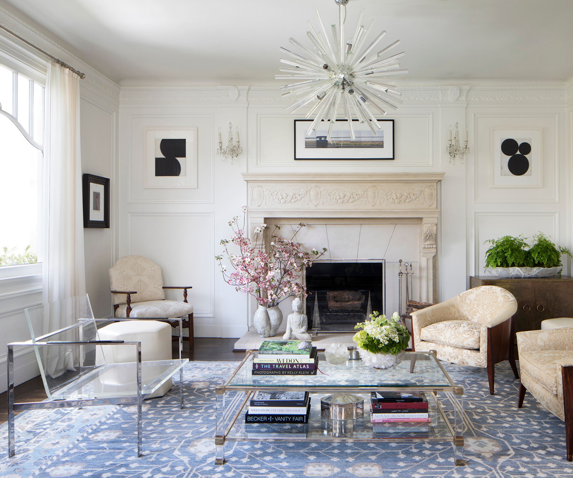
You can introduce living room color ideas by mixing patterns and prints in interior design – especially when decorating with rugs as a starting point. 'I often start from antique carpets and pick up the colors I would like to introduce more dominantly,' says Henriette von Stockhausen, creative director of interior design studio VSP Interiors.
'I’m not one for using too many colors or patterns in my designs so I choose carefully: if I use a pattern on the walls through wallpaper, I tend to choose a plain-ish curtain fabric and bring a pop of color with trimming and fringes. It all has to feel like a natural progression – not too designed or forced – and more like an interior that has evolved over time and through collected pieces. Also, antique fabric colors are more faded and sit softer within and next to each other.'
4. Add color with art
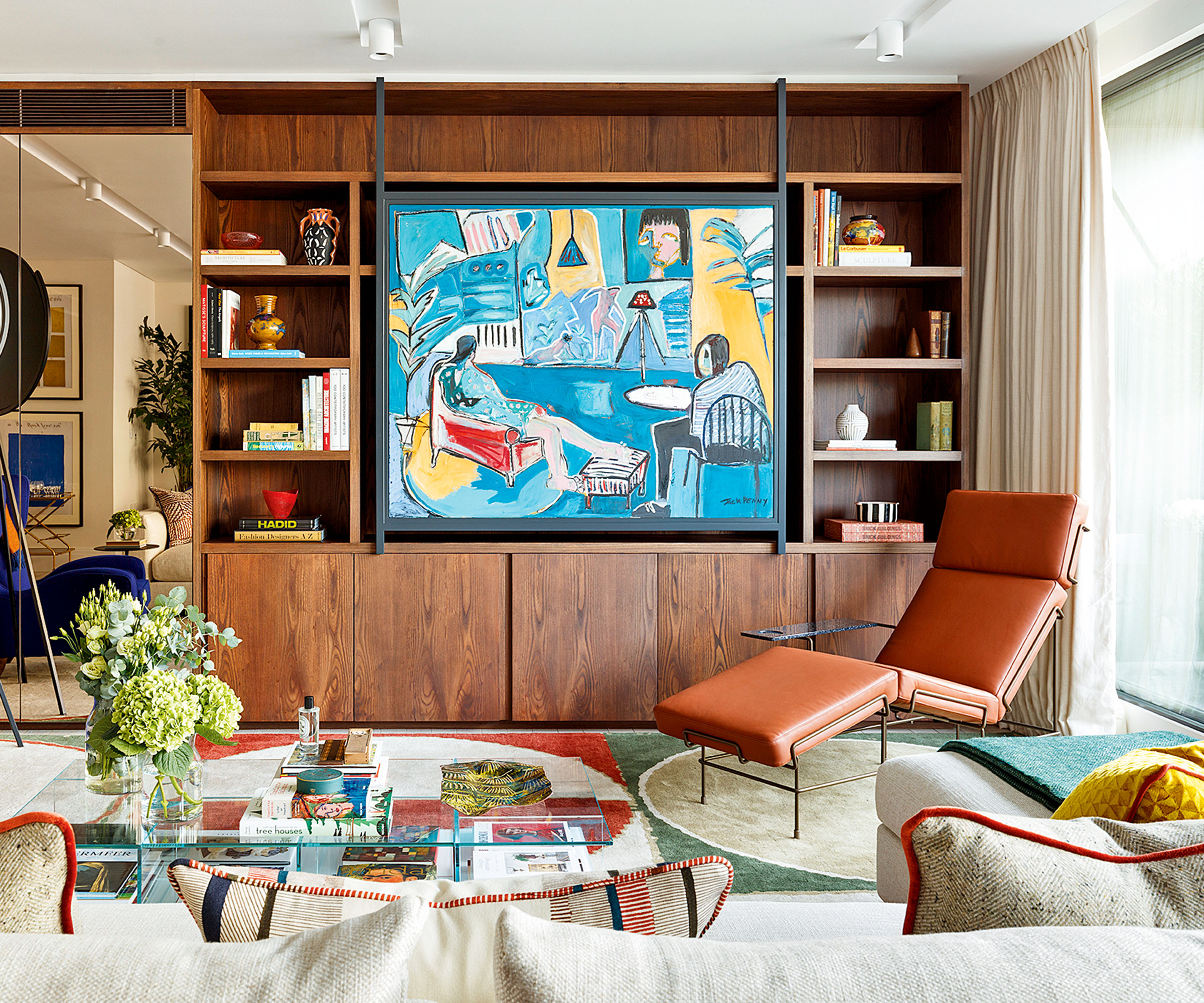
Decorating with art is another way to add bold color. A favorite painting can be a good inspiration and art is always the starting point for any scheme by Sophie Ashby of Studio Ashby who is known for her dynamic designs that feature colors inspired by her South African roots.
'Ideally, we would work from a client’s own collection. From that, we can then begin to build a color palette and design references,' says Sophie. 'In a new build, I like to go with all-white walls and curtains and put color into the middle of the room with art and textiles. While in a period house, I might go for a strong color on the wall picked out by a white ceiling and skirtings.'
5. Ensure balance with the 60-30-10 rule
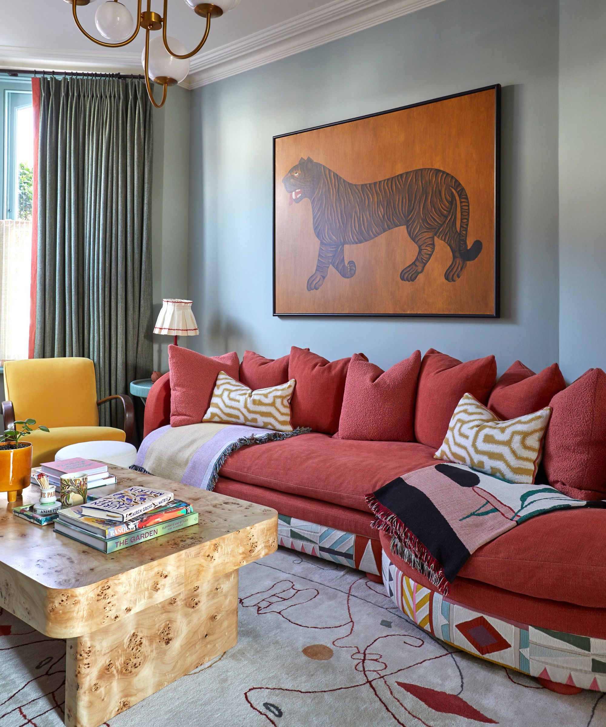
The 60-30-10 rule is often used by designers when working with color. When used in a living room, this simple rule can help ensure a balanced look throughout. 'This is a classic color rule that helps create a cohesive color palette,' says interior designer Nicholas Kaiko.
This rule is all about basing a scheme around three colors, and using them each in varying amounts, as Nicholas explains below:
'60% is your dominant color, often neutral tones, covering large areas like walls; 30% is your secondary color and could be furniture or drapes; 10% is your accent color, found in decorative accessories and artwork.'
6. Embrace color theory
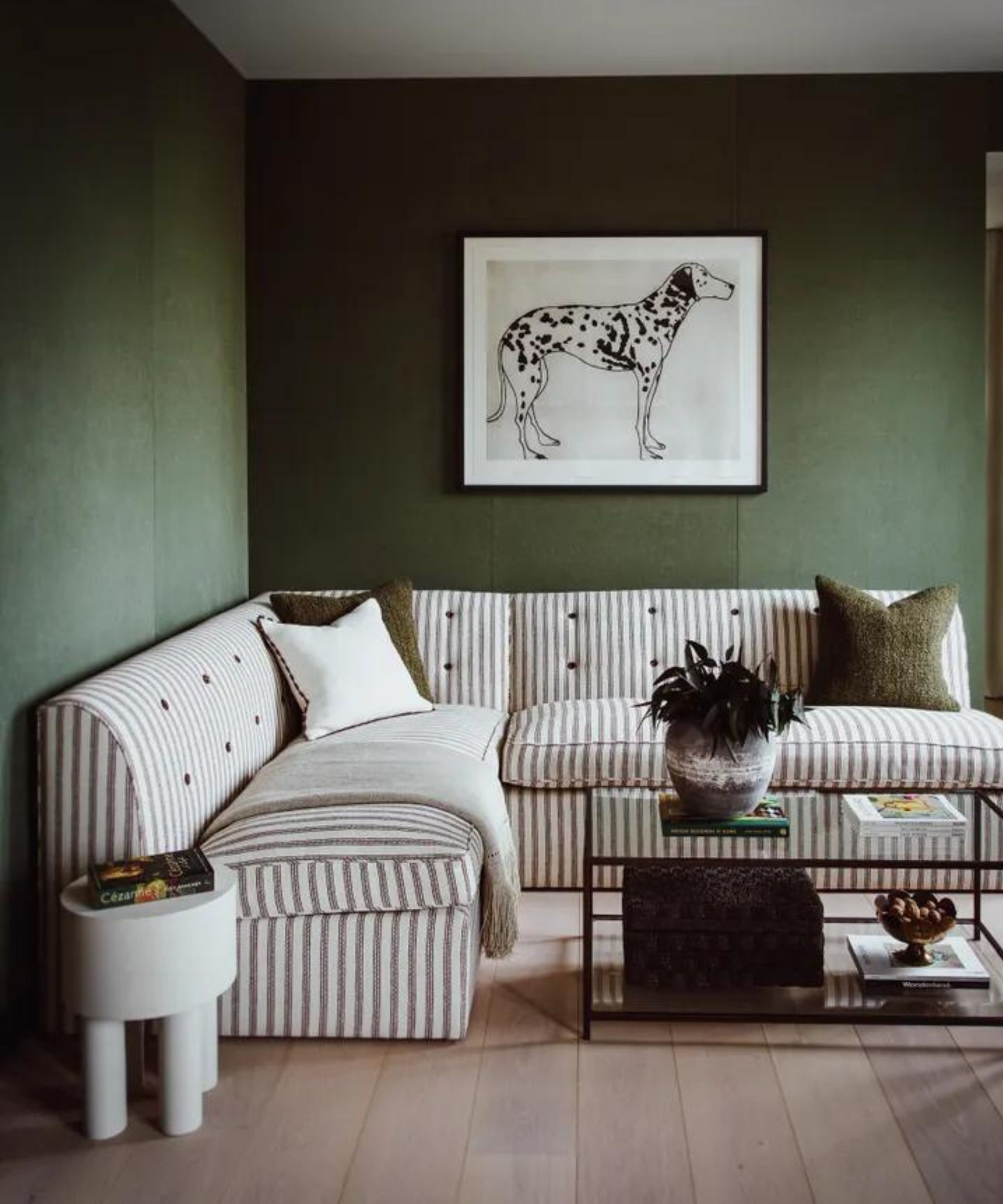
When choosing colors for your living room, color theory can be used to set the right mood in addition to adding visual appeal. Below, Patrick O’Donnell, brand ambassador for Farrow & Ball, explains some of the basics:
Blue is 'often considered a restful and sympathetic color, so a paler blue is ideal for a bedroom, but I’d err towards darker blue shades for the home office, living room, or for kitchen color ideas.'
Green 'is the perfect color family to deliver calm and serenity and therefore has the flexibility to be applied in every room throughout the home.'
'White represents purity, innocence, and new beginnings, as well as cleanliness and clarity. It can be used everywhere in the home but is very successful in the bathroom and any room where you want to create order and with little distraction.'
7. Use contrasting colors to create impact
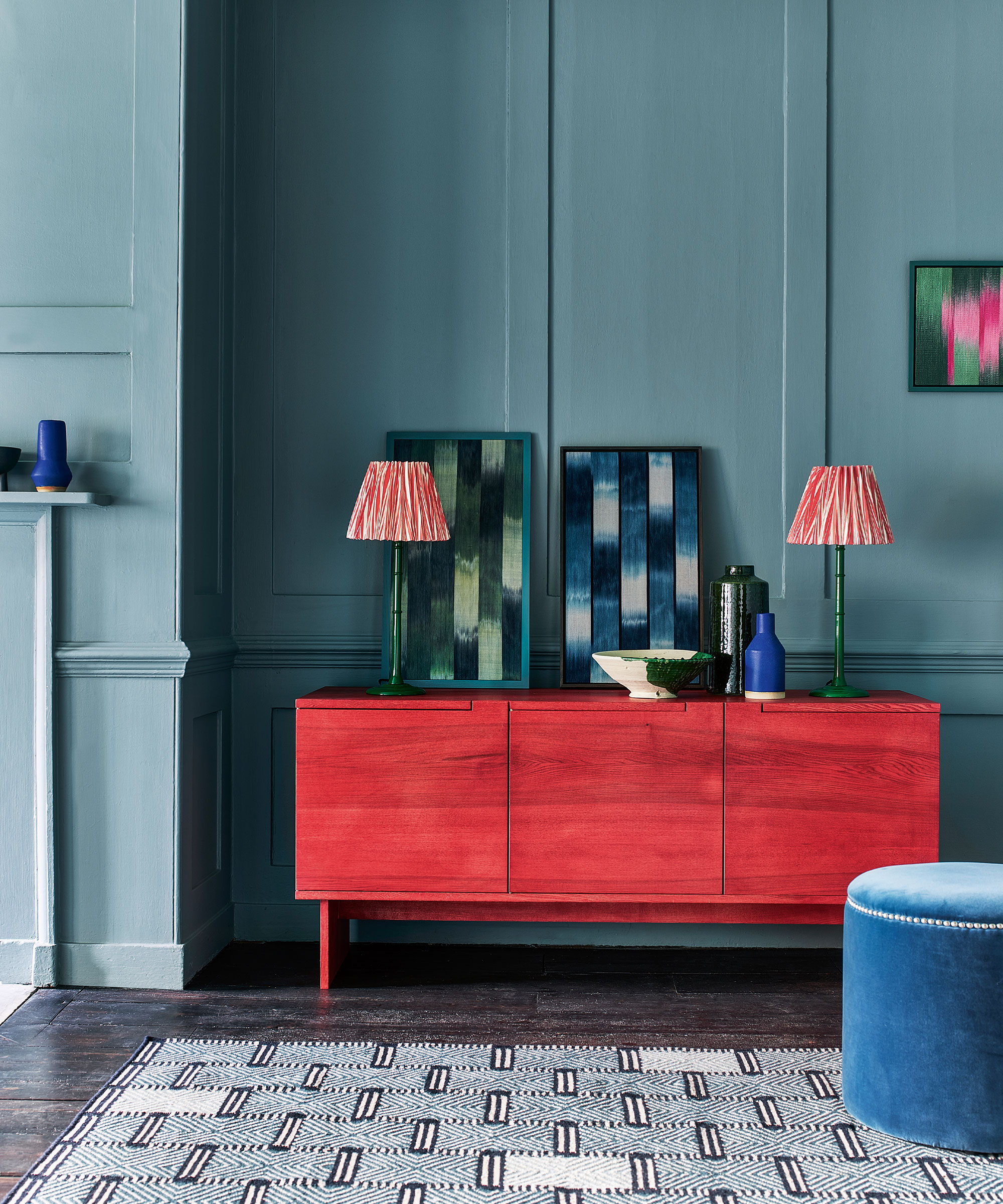
Interior designers also talk about another element that needs to come into play when introducing colorful room ideas: contrast. As a result, don’t be tempted to lean on an analogous color scheme – those that sit side-by-side on the color wheel – the result will be broadly harmonious but might lack vitality.
Equally, a complementary color scheme will result in maximum contrast but will need to be softened by decorating with neutrals. 'Don’t forget you can introduce techniques such as color blocking to create unusual or tonal combinations,' adds Patrick.
'Clashing colors can really make my heart sing,' says interior designer Rachel Chudley. 'Getting the color right in a room is an amazing balance because it’s those last-minute touches that can really set things off. What I like to do is just when everything’s looking really harmonious and perfect, throw in a little rogue element of chaos, like adding a little yellow silk blind in space with no other yellow. If it’s too perfect, a space can feel claustrophobic in its designed-ness, so having a couple of rogue elements like that spices things up, and also helps a house feel like a home.'
8. Base room colors around what you can't change
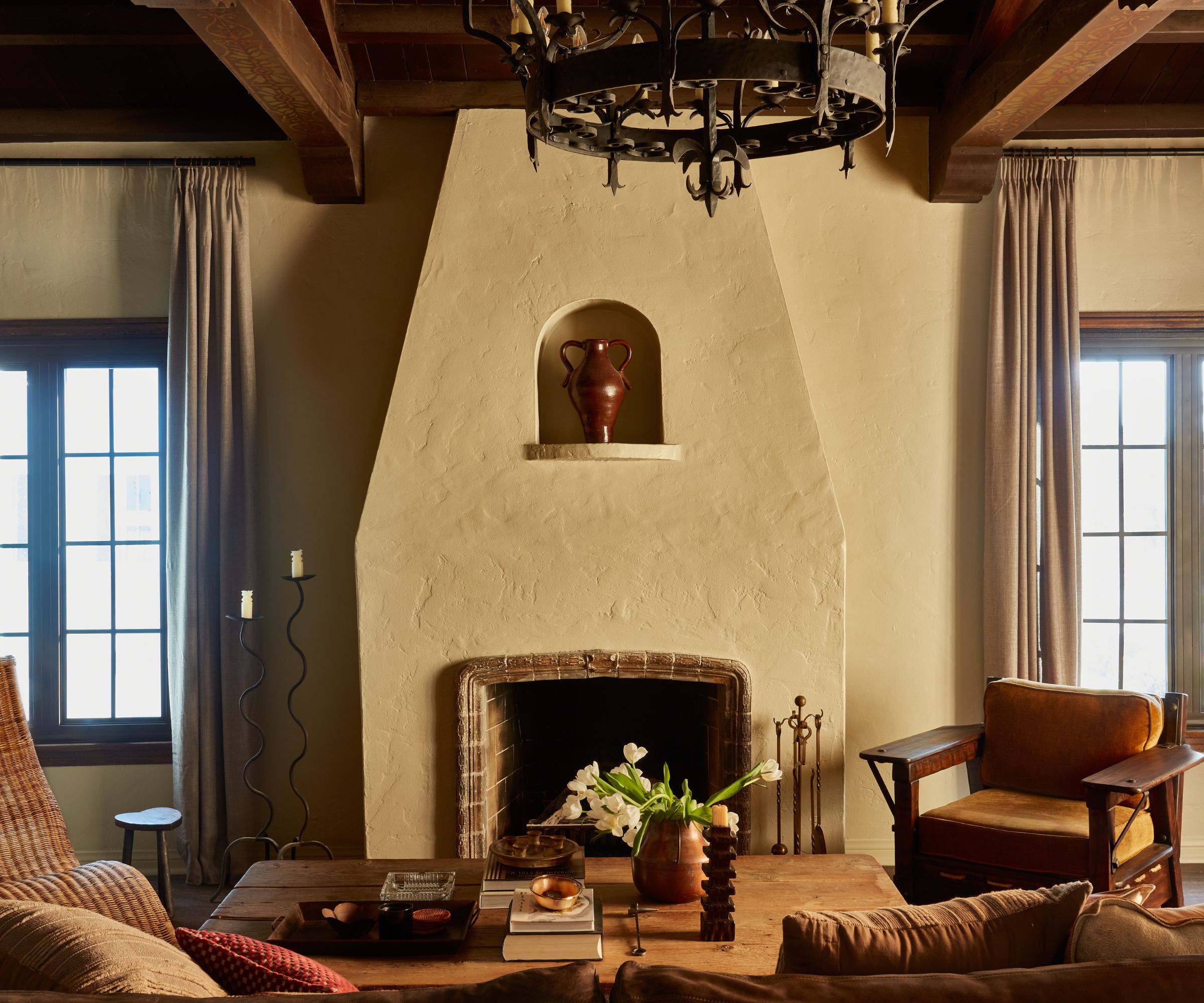
Another way to take the first step with your living room color scheme is to begin with what is already decided or what you can’t change, recommends interior designer and natural paint specialist Edward Bulmer.
'It might be a wood floor or an old fireplace, for example. Then base your tonal choices on the color of these elements – effectively, warm or cool. If you get the tonality right first, you will then have a wide variety of colors that will work and so choice comes down to personal preference or other elements of your scheme – like fabrics.'
'A further consideration that can help is the weight of the color,' continues Edward Bulmer. 'One can get a sense of the weight of elements in the room visually and it helps to try and balance them, for instance, an old oak dresser will look better with a mid, rather than a light, tone.'
Kitchen color ideas
While kitchens were once utilitarian spaces that reflected a palette of safe neutrals, the heart of the home is the perfect place to let creativity flow with an exciting display of colors, as reflected by the latest kitchen color trends.
Of course, you should keep in mind longevity with curating your kitchen color ideas since redecorating can be a costly endeavor, but as long as your color choices align with your style, there's no need to play it too safe.
9. Go for teal in a dining area
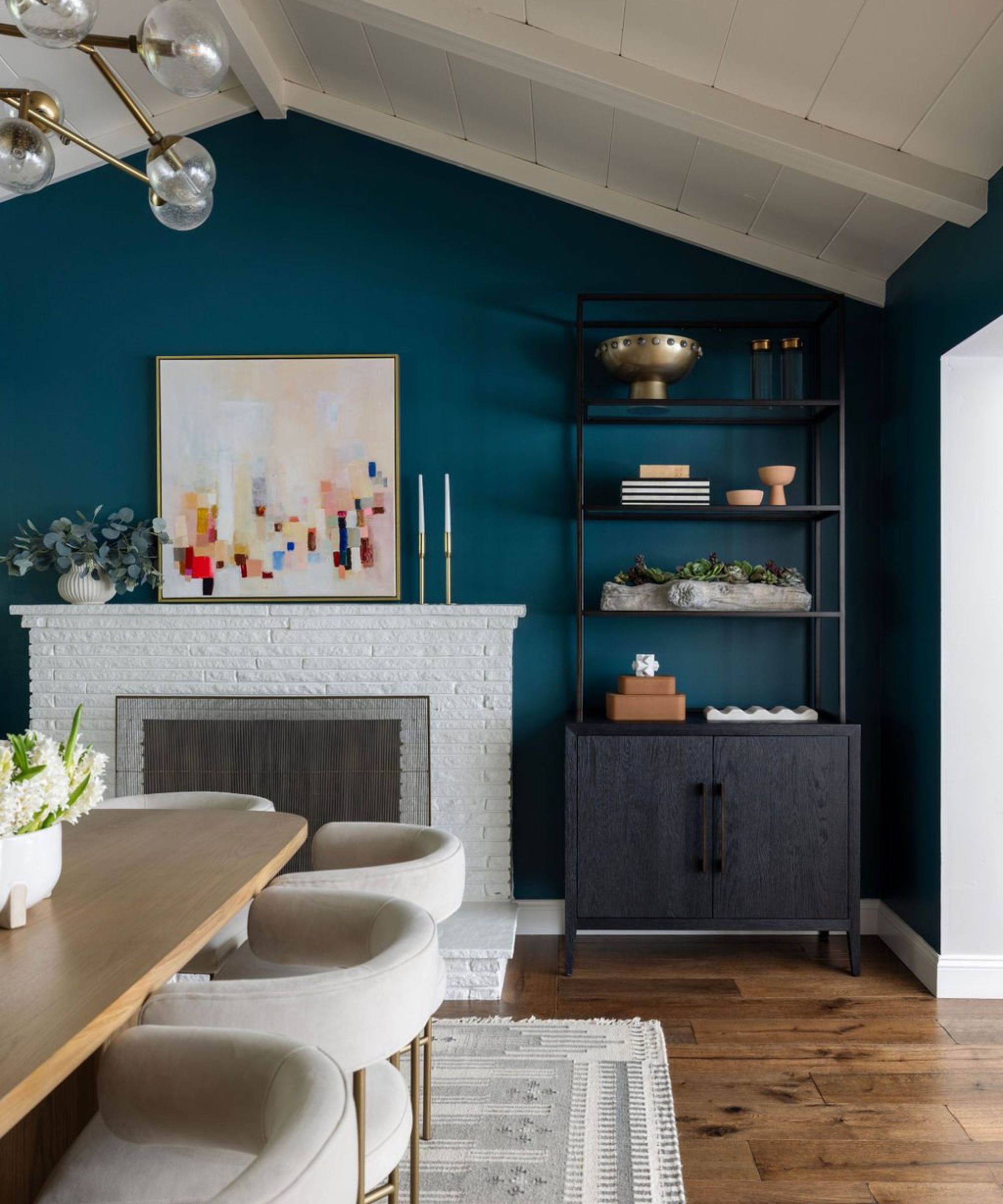
If your kitchen doubles as your dining space, it's a great opportunity to create a cozy and inviting feel with rich colors like teal. These colors are known to create more of a warm and homey environment in place of bright whites that can appear clinical.
'These walls were originally a light pale gray, along with the rest of the house,' explains Lindsay Saccullo of Lindsay Saccullo Interiors. 'We have accents of teal throughout the home (the client's favorite color), so we decided to color drench the dining room for a moodier feel (Benjamin Moore Dark Teal). The best part about this colorful dining room is the art which serves as the perfect warm balance to the cool teal walls, along with positive/negative space for balance.'
10. Be inspired by the 'new neutrals'
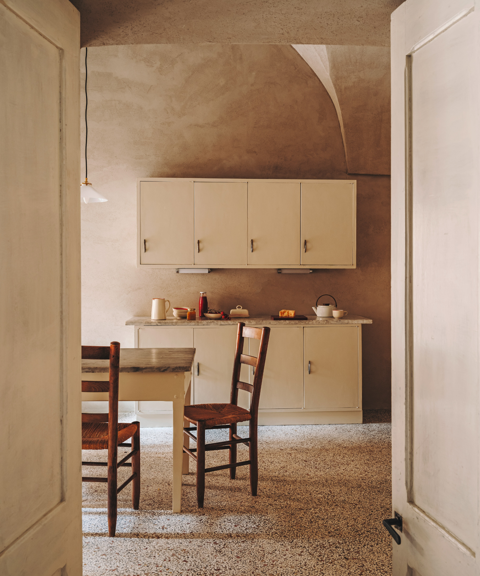
While cool-toned whites and grays can appear harsh and uninspiring in kitchens, that's not to say you shouldn't decorate with neutrals. A carefully considered palette of warm neutral paints can give your kitchen a timeless finish with enough warmth to feel inviting.
Many decorators agree that new neutrals are largely inspired by colors emanating from the natural world, which help us to feel grounded in our homes. 'They also comprise ivory base notes and a scattering of additional tones including rust, pink, beige, mustard, and burnt orange,' says Charu Gandhi, founder and director of Elicyon.
'Not to be confused with cold and bland palettes, new neutrals are warm by nature,' she adds. 'Typically matte in finish, they have the ability to flex, and so it’s possible for them to suit any home, be it traditional or contemporary – in fact, their elasticity is the reason we’re calling them "new".'
For a warmer, cozier aesthetic, consider a red-based neutral such as Wimborne White or Dimity by Farrow & Ball, recommends Louise Wicksteed, design director at Sims Hilditch.
11. Pick a white with a matching undertone
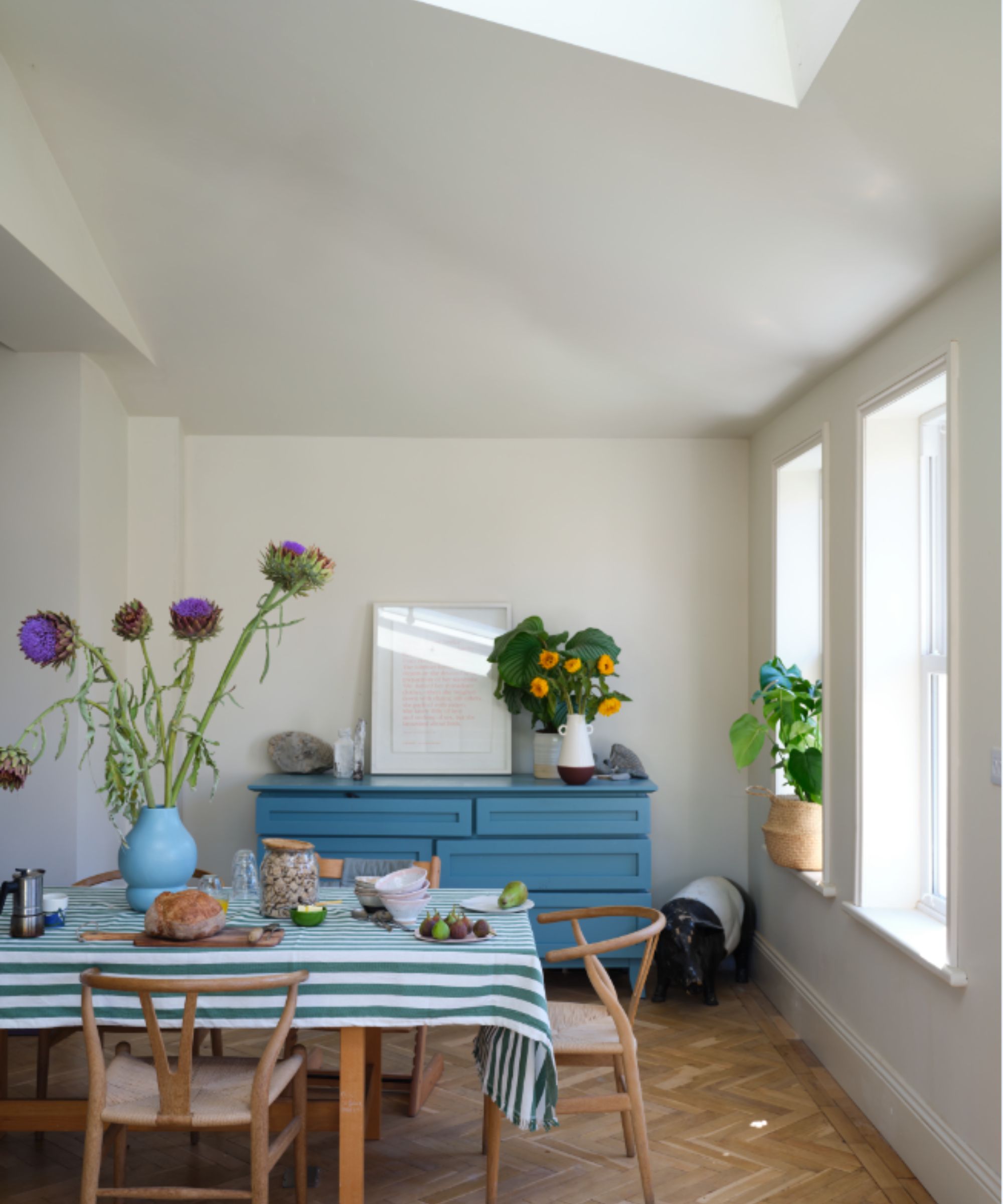
For a light and airy kitchen, keep the walls fresh with white paint but make sure you incorporate plenty of pops of color through decor.
To ensure a cohesive look throughout the space, select a white paint with an undertone in the same shade as your accents, recommends the architect and designer Natalia Miyar of Natalia Miyar Atelier.
'There are many different shades of white: my personal favorites are warm white with pink or yellow undertones used with accent colors in the same tones such as burnt orange, red, or pink.'
12. Factor in daylight
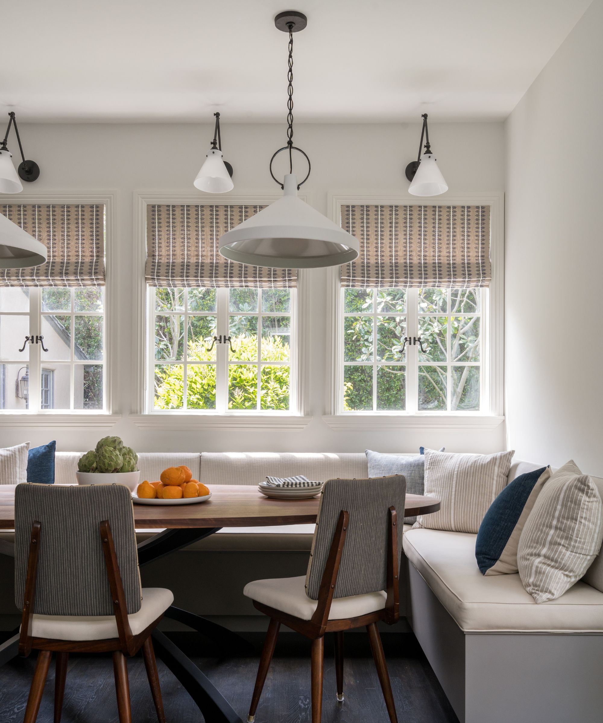
Another key factor is light, and the best way to address this is by considering the aspect of your kitchen. 'As a general rule, to lighten up a north-facing room, avoid anything with a green or gray base – or don’t fight it and paint it dark which creates a cozy and cocooning feel,' says Patrick.
Meanwhile, using soft, pale tones is a great way to maximize the feeling of light and space in a south-facing kitchen. Light in west-facing spaces is cooler in the morning and brighter in the afternoon so warm tones will work well while light blues and greens can have a calming effect on east-facing rooms.
13. Decorate with strong colors
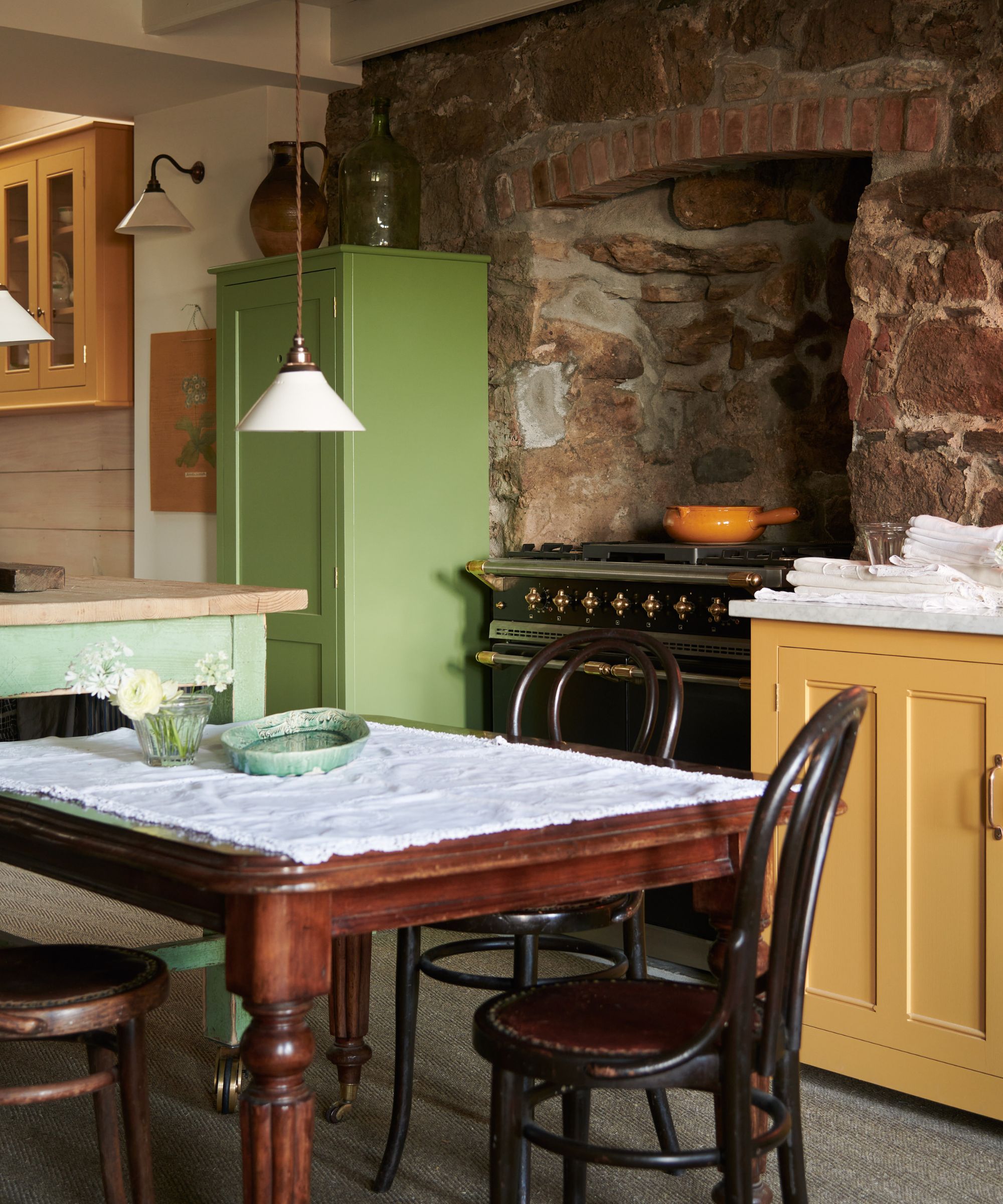
Paint ideas are the perfect way to transform a kitchen quickly and easily, adding personality and character to create an inspired interior, says Ruth Mottershead, creative director of Little Greene.
'Bold, vivid hues and lively tones work well in rooms that are made for entertaining or see a lot of activity, such as kitchens. A pop of bright, rich contrasting color is a great way to add impact and an element of surprise to an otherwise muted scheme. Alternatively, bold colors are also a great option for spaces with a lot of natural light and can be used in much bigger proportions without being "too much”.'
14. Create surprise with color in the kitchen
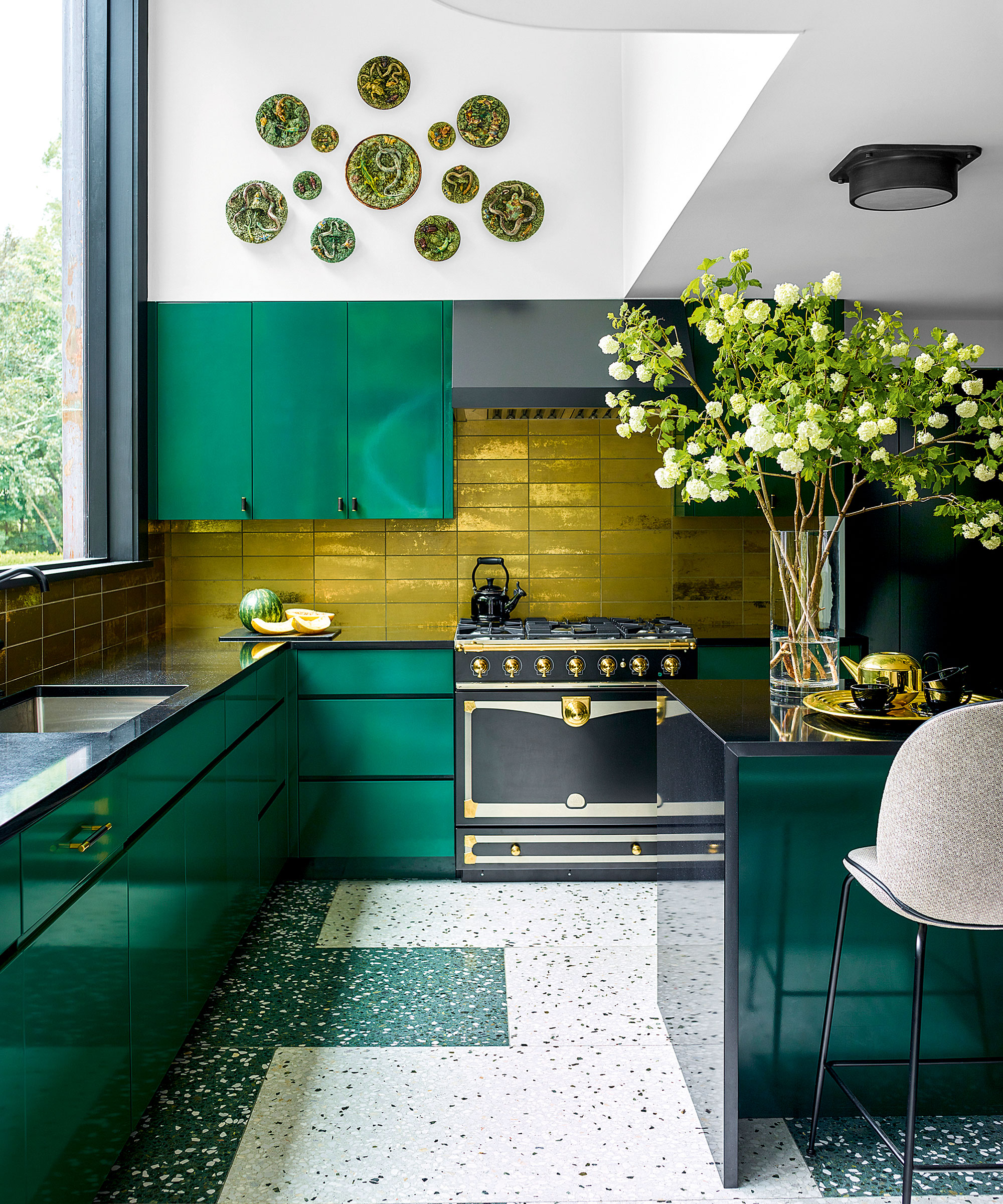
Kitchen color ideas are a relatively new concept. Historically, says Edward Bulmer, the considerations taken into account were that the materials used were fire-proof, serviceable, sturdy, and washable.
But as more and more begin to embrace bolder tones, the best bet for those who want to follow suit is to consider the light and volume of the space, says designer Louisa Greville Williams. 'If the kitchen is a very large space, we might use a patterned wallpaper and then contrast, rather than match, with a paint color. We think kitchens should be just as decorative as the rest of the house, even though it has a utilitarian use, especially as we all live in our kitchens more than ever so we should enjoy them.'
15. Work with effective color combinations
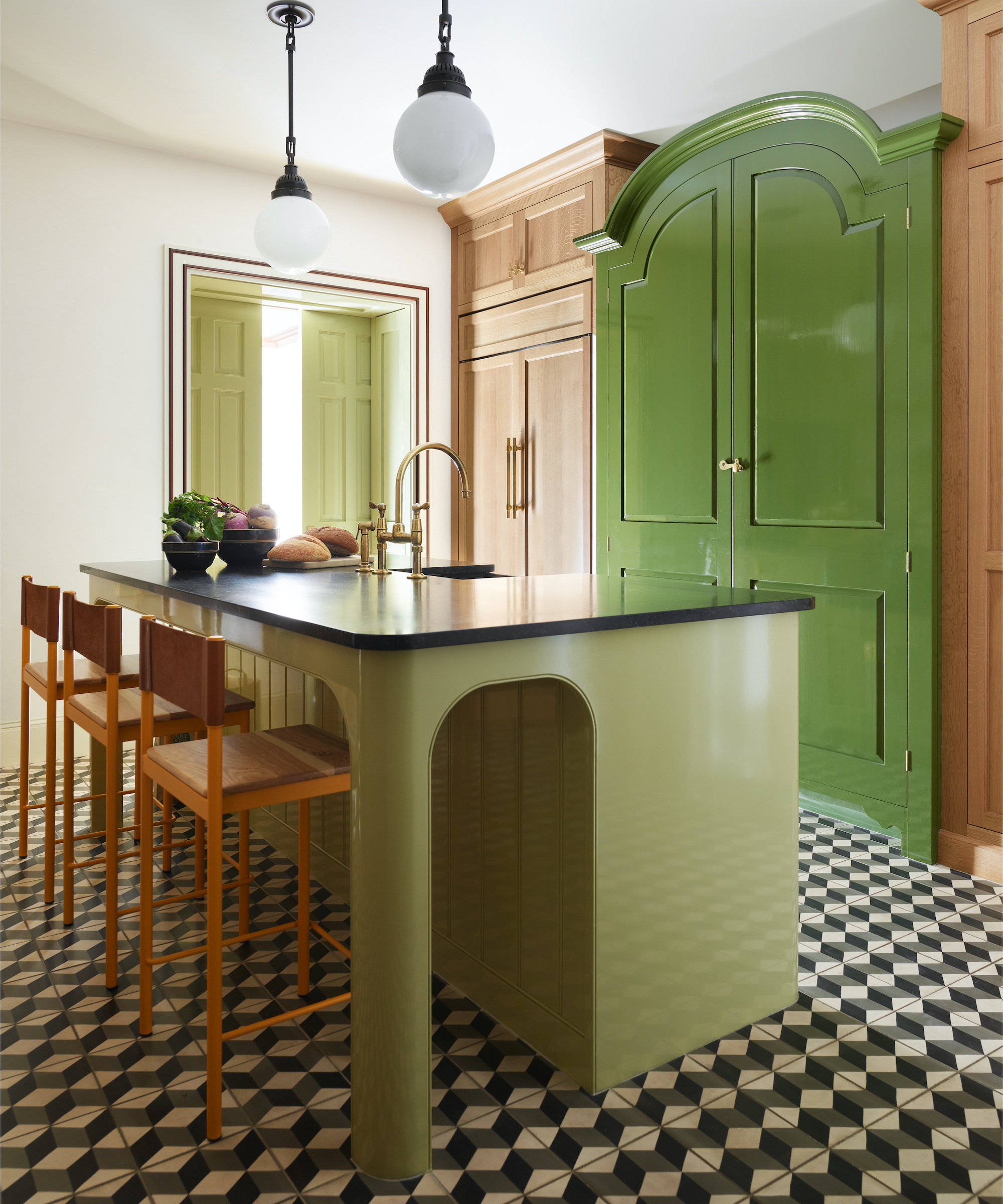
It is helpful to bear in mind that colors never need to match, color combinations for kitchens just need to work together.
'Choose colors that come from the same tonal family or have the same depth of color, even if they are different ends of the spectrum, this will help them work together,' says Nicole Salvesen, co-founder of Salvesen Graham. 'Also choose bolder colors such as rich greens and yellows and raspberry reds as they can be easier to work with, rather than paler candy colors that can sometimes come across as insipid if they aren’t quite right.'
Bedroom color ideas
For most of us, bedrooms are spaces we tend to embrace the most calming colors to aid with rest and relaxation. That said, bedroom color ideas can take on a bolder form if you're looking to make a design statement in your sleep space or guest room.
Below, design experts share their tips to help you create a stylish bedroom color scheme while maintaining liveability.
16. Decide on a hero highlight color
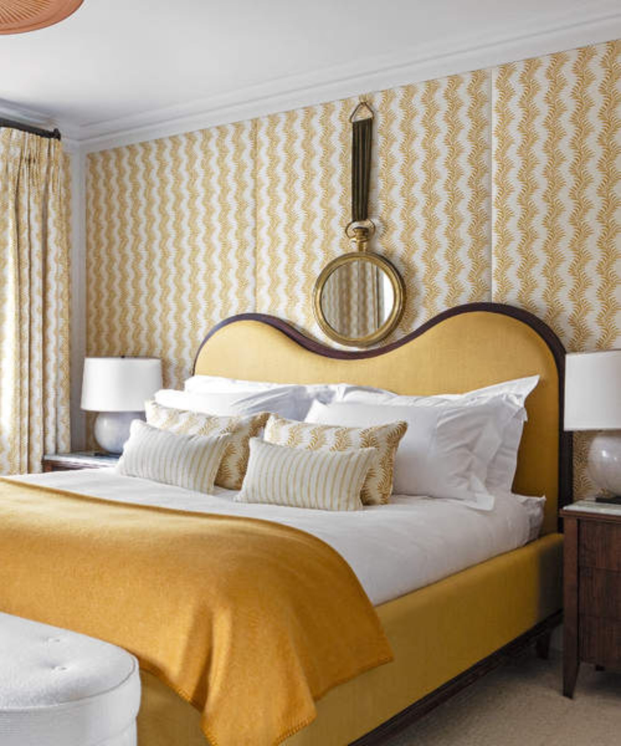
A vital consideration is about balance – perhaps particularly in a bedroom environment where the aim is to create somewhere restful. To do this, says designer and decorator Birdie Fortescue, be sure to have a single highlight color – or a hero design if it’s a pattern – and layer it with others in smaller scale or quieter styles to ensure there is focus on the highlight tones.
'Florals and geometrics, combined with the correct balance of scale and color, work together to great effect. I’m particularly fond of a trellis design. It is so versatile; a classic motif like this helps to anchor a scheme.'
17. Steer clear of white with neutral schemes
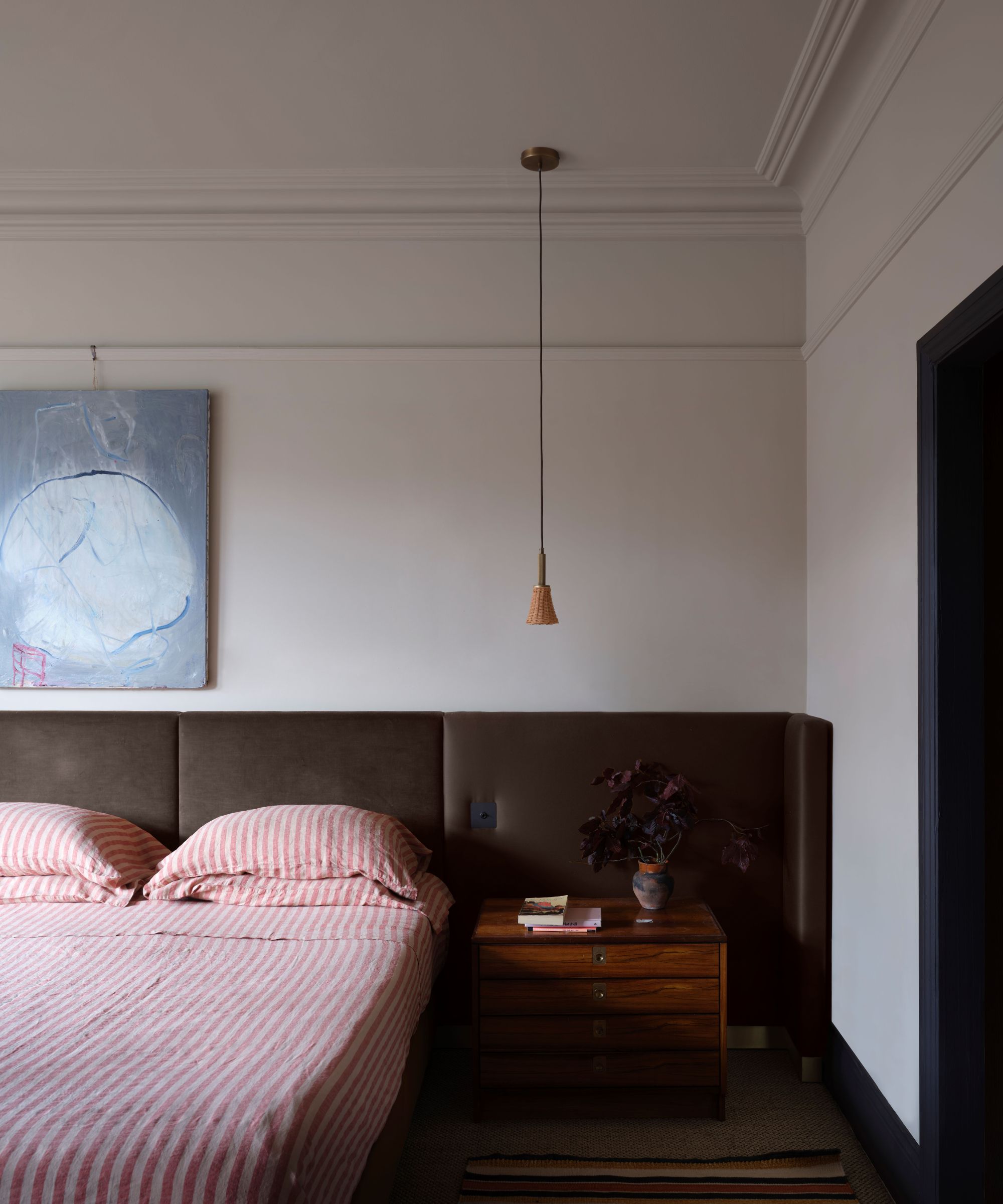
Even when working with neutrals, color choices need to be site-specific, adds interior decorator Rachel Chudley. 'We think that pale biscuits or very light pinks are ideal for south-facing rooms which have plenty of light – not only do they filter the light beautifully, but they also add to a feeling of calm and relaxation, perfect for a bedroom environment.'
'When working with neutrals, my only rule is to steer clear of white walls,' continues Rachel. 'They work well in galleries for the very reason that they create a blank canvas which is perfect for focusing on one piece of art, uninterrupted by anything. However, in a living space, you need a touch of color to add a bit more depth and reflect the light around the room.'
18. Use a natural palette to allow accessories to shine
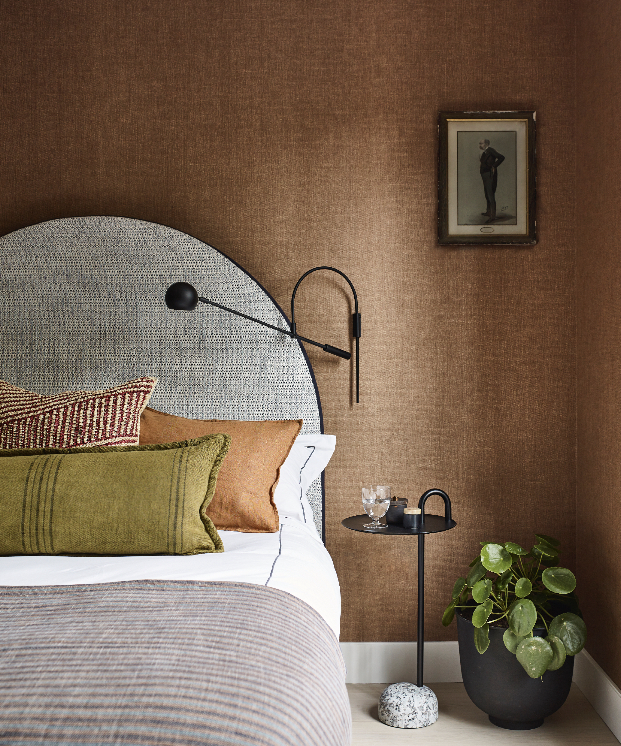
Subtle nuances of color are why James Thurstan Waterworth, founder of Thurstan, favors neutral colors in his schemes because they create a soft springboard from which antiques, art, and other embellishments are able to sing.
'You can then build out from here with tactile surfaces, patterned textiles, eclectic furnishings and more modern flourishes to create layers of interest, whilst still allowing all the individual elements of the interior to breathe. I gravitate toward natural palettes, and materials too, as for me they bring a certain timelessness and longevity to design.'
19. Create a cozy bedroom with dark brown
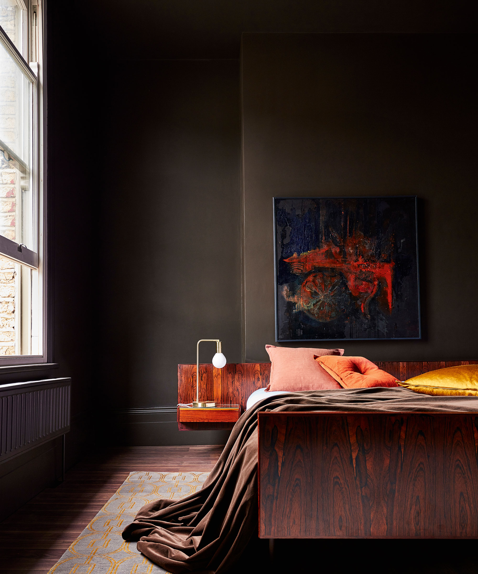
When choosing the color scheme for a relaxing bedroom, embracing on-trend chocolate brown is an expert-approved choice. One of the best colors for dark rooms, decorating with brown creates a cozy and cocooning feel while its warm tones make it a more livable color than other dark shades.
'Brown represents the earth and can provide a cozy, warm, and assured space when used in the bedroom,' says Tash Bradley, Head of Interior Design at Lick. 'Brown allows you to comfortably fall asleep in a space that feels safe and supportive.'
20. Create a calming scheme with green
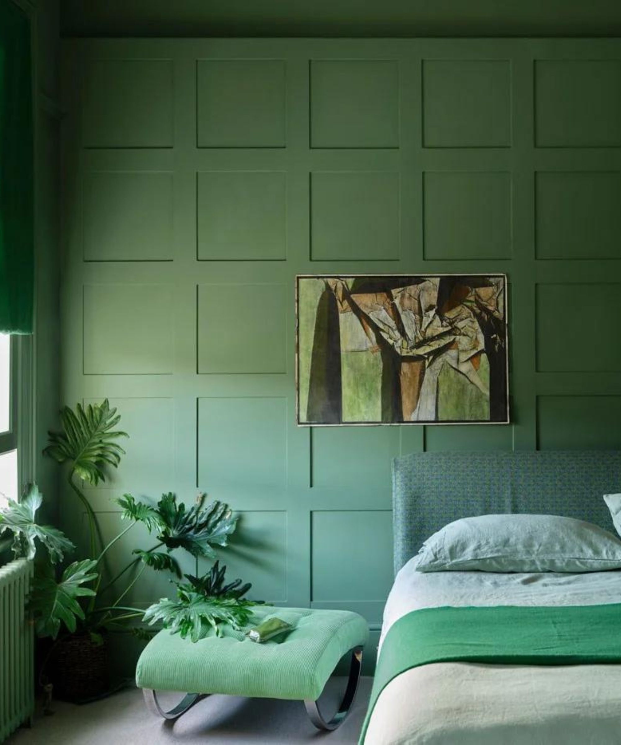
'Green is the ‘ultimate’ color group that color psychologists always suggest creates a calm atmosphere,' says Farrow & Ball's Patrick O'Donnell. 'Look to mid-greens and something a little more nuanced, almost drab, as this will feel incredibly restful and make a wonderful choice for a bedroom. Our classic French Gray would work well.'
Sage green is another example of a flattering and calming shade for decorating with green, as Lick's Tash Bradley explains: 'People are often drawn to sage green as it’s the color of the outdoors, which has the relaxing and wonderful effects of being surrounded by nature. Green 02 is a lovely, earthy, rich green. It is a deeper, sage green that looks great in any room.'
21. Make a statement with yellow
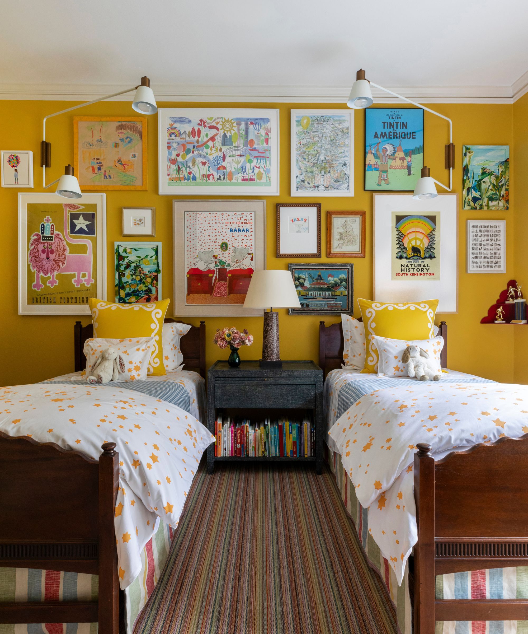
While calming colors are amongst the most popular in bedrooms, you can also reach for brighter, statement-making hues for a playful scheme. Vibrant colors such as yellow can work especially well in children's bedrooms or guest bedrooms for a less traditional approach.
'Color play is an exciting way to infuse personality into a space,' says designer Catherine Olasky of Catherine Olasky, Ltd. 'In this bedroom, Farrow & Ball Babouche serves as the focal point, adding warmth while maintaining an energetic ambiance.'
22. Create a complementary color palette
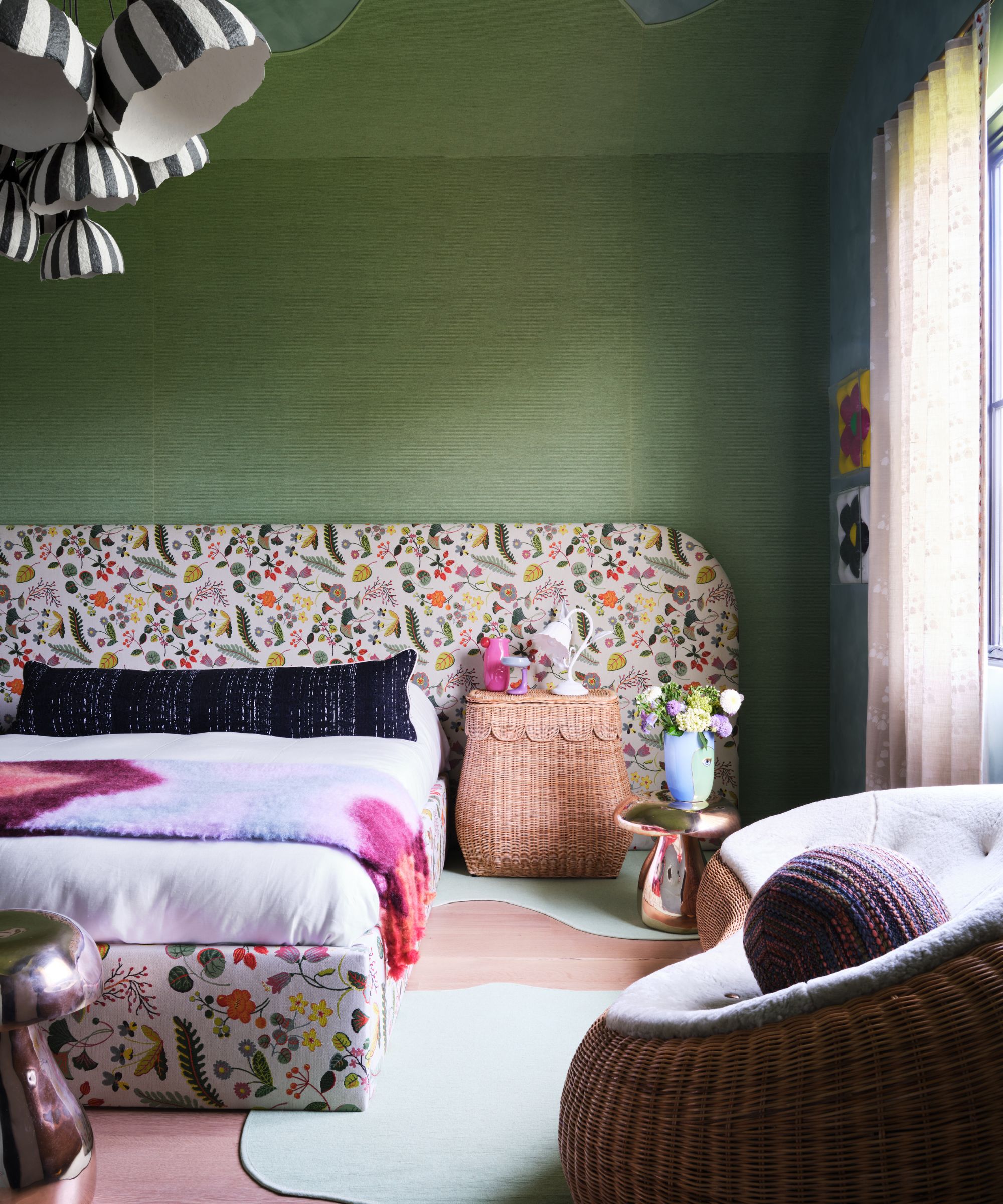
Another way to add impact to your bedroom color scheme while ensuring a cohesive finish is to embrace complementary colors – those that sit opposite one another on the color wheel.
'In this bedroom, I began with an overall green color palette, adding accents of florals, purples, and other vibrant layers to tie the room together,' explains Sarah Tract, founder and interior designer at Sarah Tract Interiors. 'This color palette works in this space because it embraces its inherently funky vibe throughout. By embracing its funkiness, it invites the whimsical essence of the room to shine through, really showcasing the layers of colors, textures, and patterns used.'
23. Decorate with pink
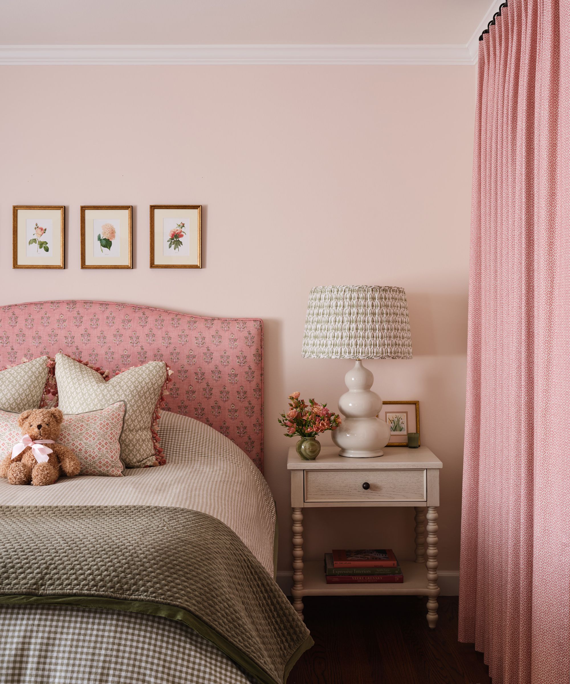
Decorating with pink feels especially fitting for bedrooms – a warm and cozy color that oozes comfort. Below, designer Sara Arntz of Arntz Interiors explains why pink made the perfect color choice for this bedroom's design:
'The client wanted to update her daughter's bedroom after she left for college. She still wanted to keep it very feminine but make it slightly more sophisticated than the teenage room it was before. With a deep love for pink and florals, we proposed going fully pink with the walls and headboard, adding in some green and sweet florals to soften the pink-drenched room.'
24. Let wallpaper inspire the bedroom color scheme
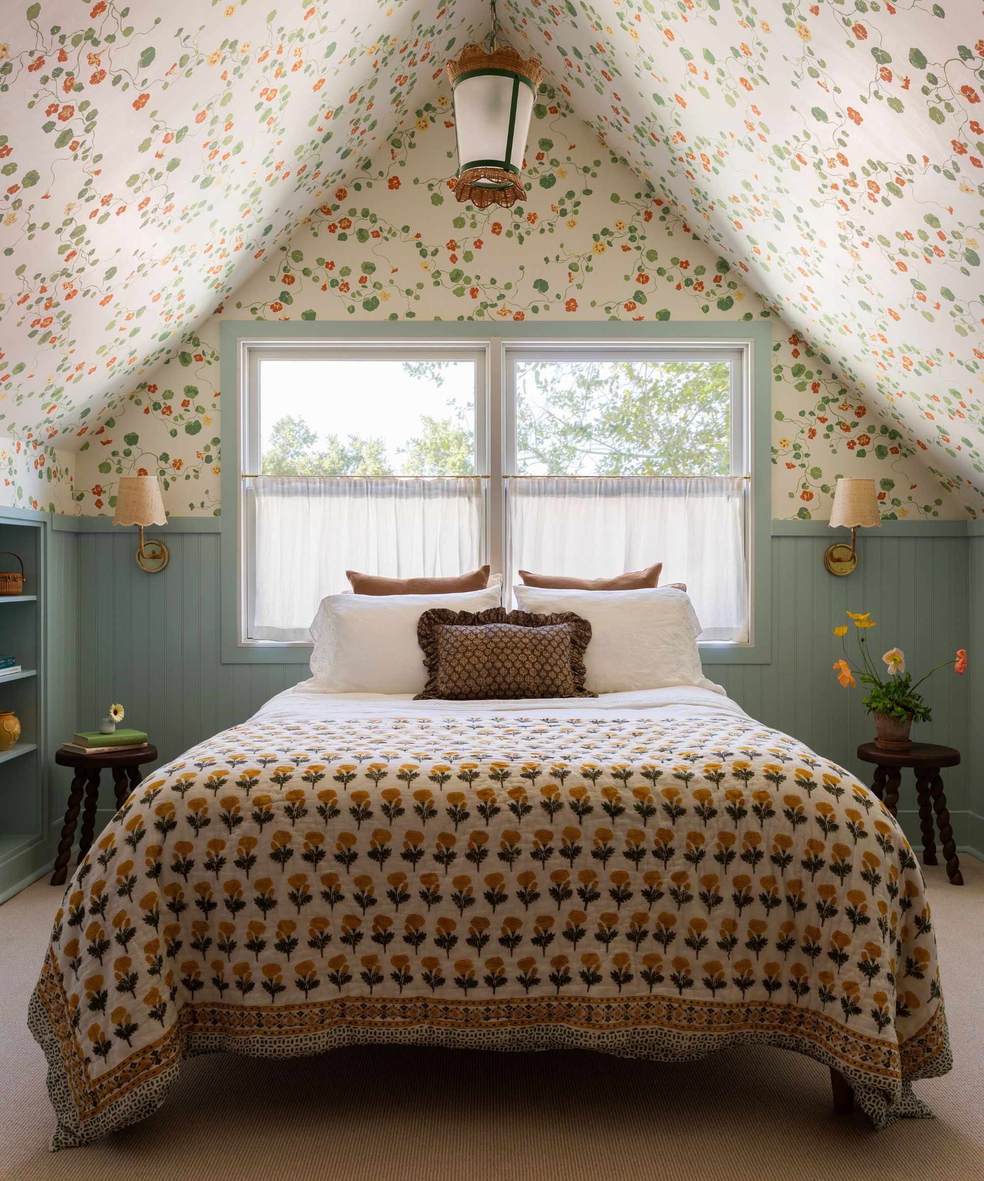
Decorating with wallpaper in a bedroom is a great way to elevate the room with texture and interest. Here, designer Jamie Zehner of JZ Interior Design shares how the color scheme of this calming bedroom was chosen to complement the prominent wallpaper:
'We leaned into the owners' (and our own) love of English-inspired country homes, utilizing a bold patterned wallpaper with a coordinating paint color in one room and another bold patterned wallpaper with an unexpected color in another room. These felt playful while also being vibrant and sophisticated. The green brought a grounding, calming energy, while the bold floral pattern added personality and playfulness. The color scheme worked because the tones complemented each other, and we balanced the drama with neutral accents in the bedding, furniture, and decor to prevent the space from feeling overwhelming.'
25. Create a timeless bedroom with blue
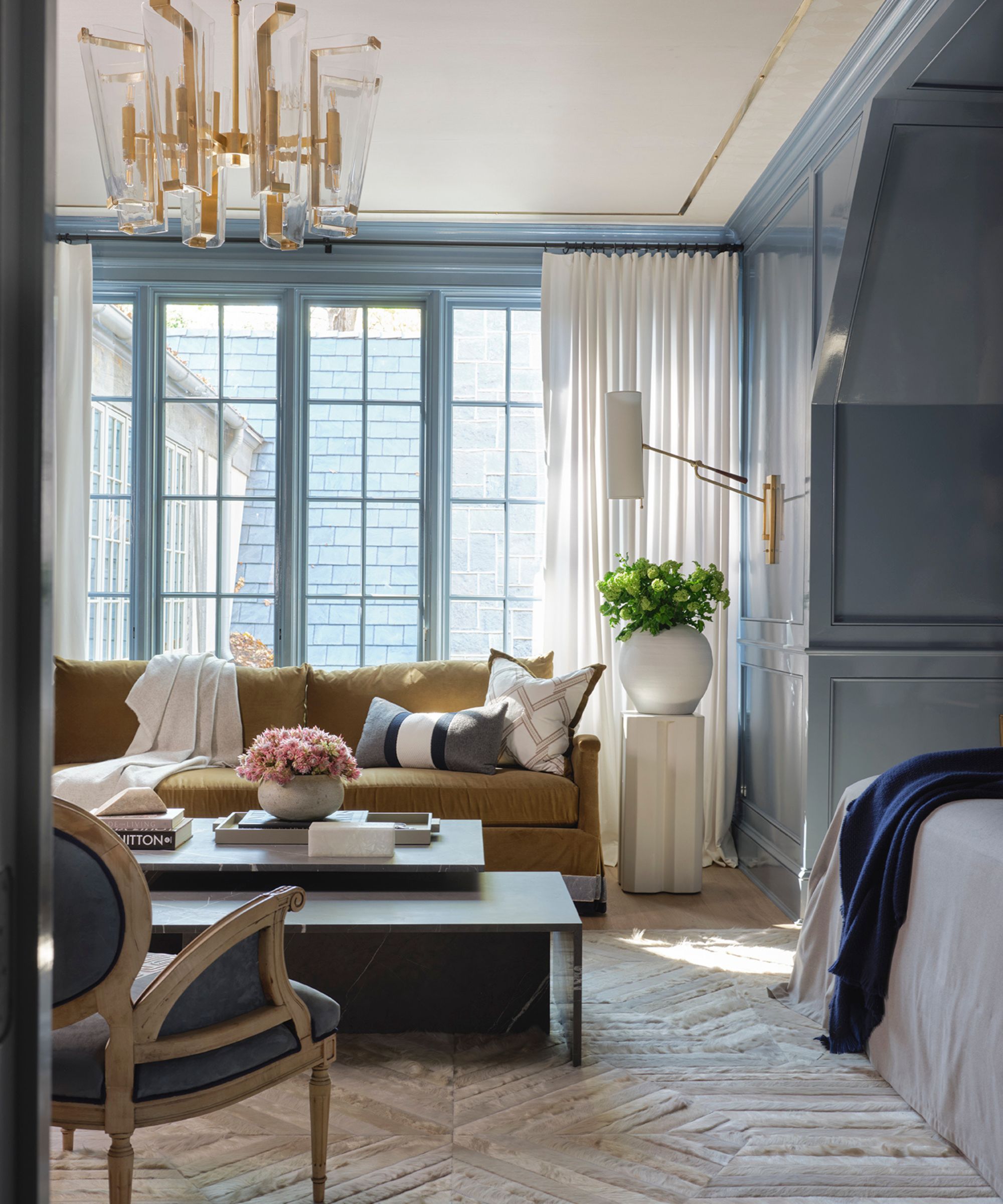
If you want to add more color to your room than a palette of neutrals offers but don't want to go too bold, soft blue paints make a fitting choice. Take inspiration from this sophisticated and timeless bedroom that features blue walls with warm accents throughout.
'For this guest room, we aimed to evoke a sense of calm and relaxation by combining a glossy robin's egg blue with rich navy and gold accents,' says designer Brynn Olson. 'The gold sofa adds an unexpected yet harmonious touch, as the hue complements blue on the color wheel, making the space feel perfectly balanced.'
Bathroom color ideas
Bathrooms aren't always places that see an experimental approach to decor, but in 2025, there's plenty of reason to give these utilitarian spaces a healthy dose of color. From rich paint colors to statement wallcoverings, experts share below some of the most stylish bathroom color ideas.
26. Introduce color in unexpected places
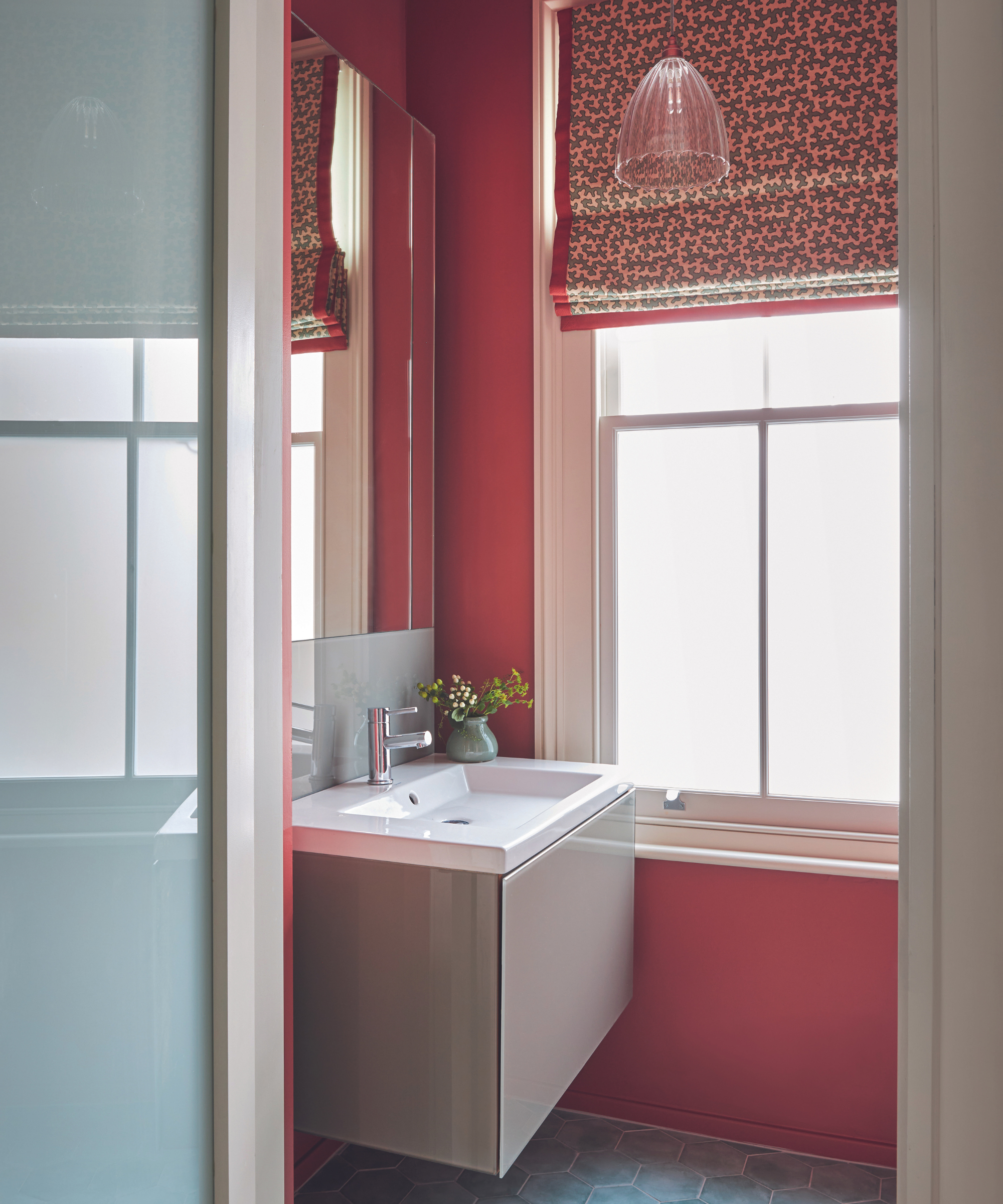
Why not reach for your favorite color for your bathroom color scheme? While some hues may be too bold for the main living spaces, bathrooms can often handle an unexpected wall color, as interior decorator Cortney Bishop explains below:
'Consider applying a lively hue to a bathroom vanity or painting your interior doors or trim with a contrasting color that makes your walls stand out even more. The transition and break in color will be more welcoming than you might think when transitioning between rooms.'
27. Add vibrancy with orange
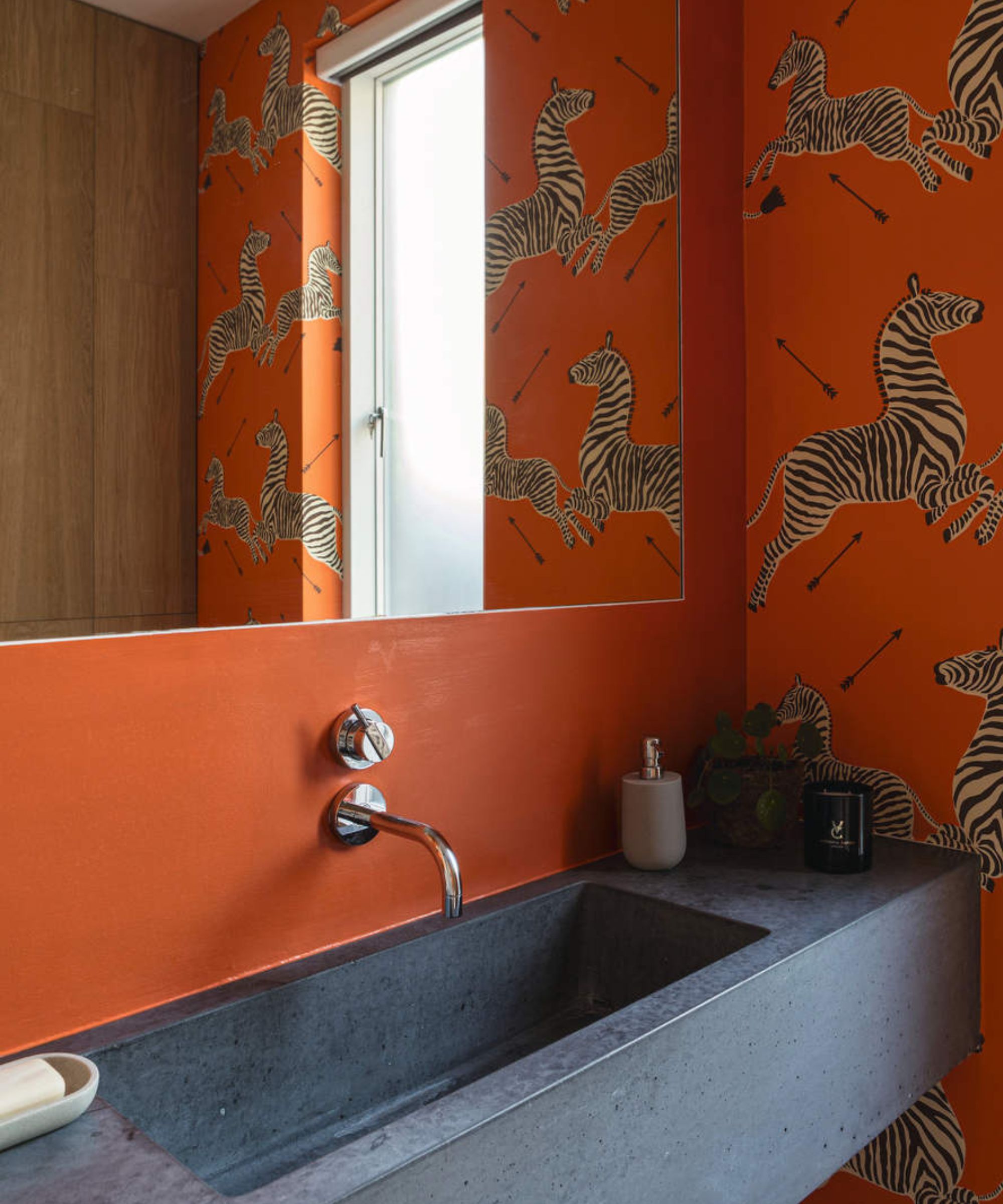
Give your bathroom an update that is filled with joy and optimism by decorating with orange. Choose a paint color that is rich in earthy pigments as they give an exceptional depth of color and life to any scheme.
Orange can make an especially good choice for powder rooms that typically have a small footprint. While neutral tones can fail to inspire, a bright orange paint or wallcovering will create a playful look.
28. Replace neutrals with pink
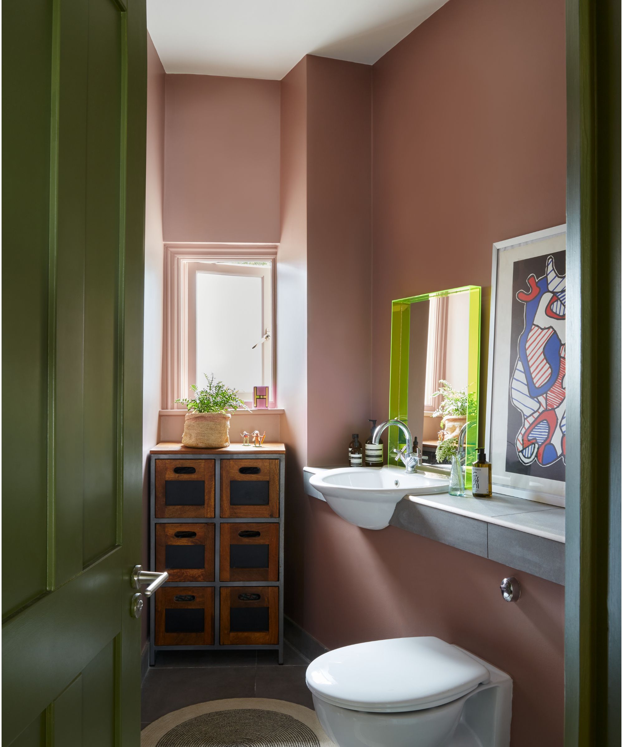
So often, bathrooms feel clinical with white paints that fail to add depth. If you want to maintain the calming appeal of neutrals, why not explore plaster pink paints that will add much more interest?
'Pink is playful and unexpected, so much more interesting than white,' says interior designer Nadia Watts. 'Pink in the bathroom brings a certain nostalgia, it’s reminiscent of times past and with that brings a feeling of comfort and warmth. Earthy pinks work almost as a neutral, they work seamlessly with a huge array of other colors.'
29. Go for cobalt blue
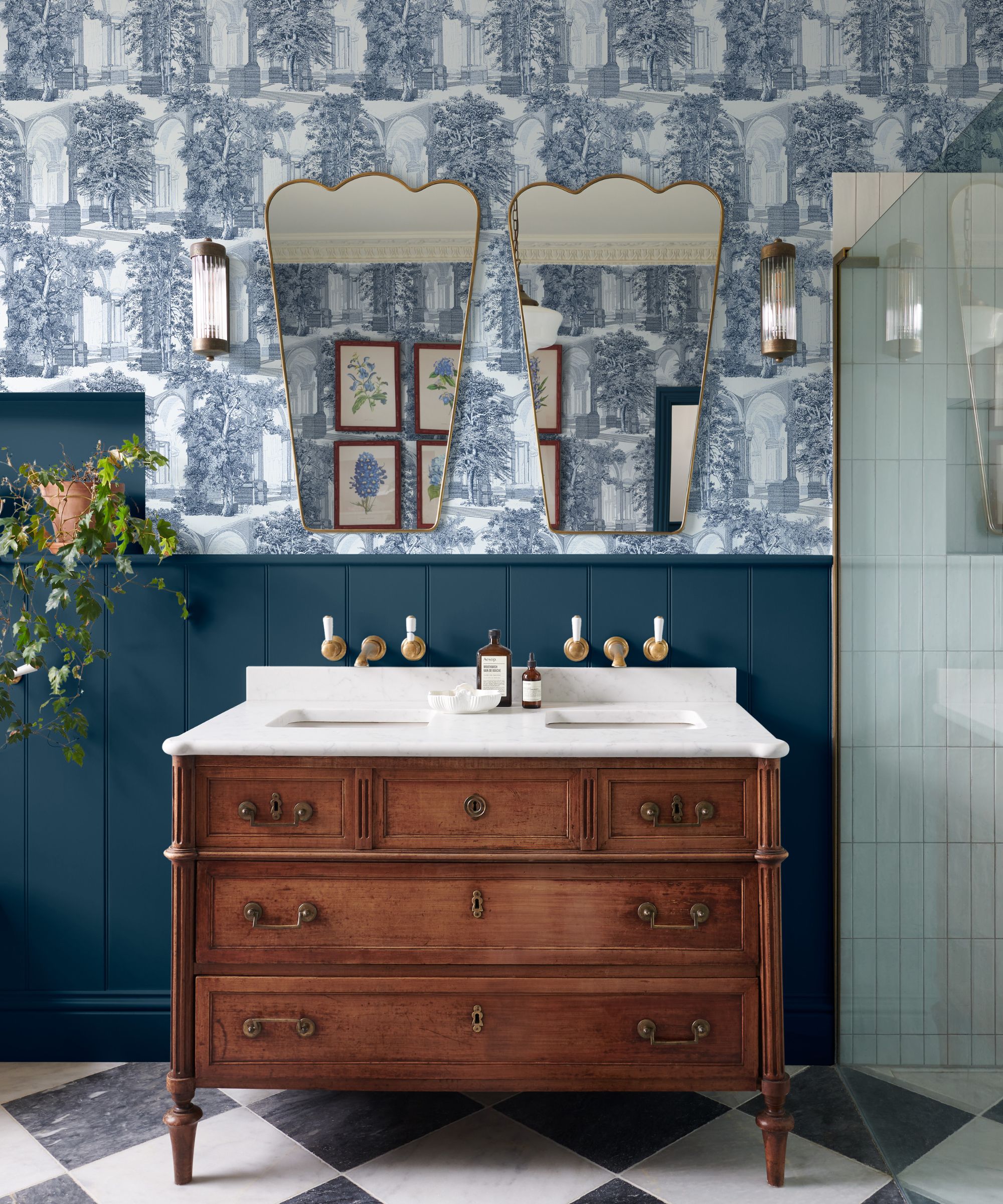
Cobalt blue is a stylish color choice for bathrooms, adding depth and elegance while feeling fresh and natural world-inspired.
'Cobalt works well with sustainable design choices, such as eco-friendly materials like reclaimed wood or recycled glass, making it modern and environmentally conscious,' says interior designer Swati Goorha. 'This versatility, combined with its bold yet calming effect, makes cobalt blue an ideal choice for a bathroom in 2025, adding style and sophistication while fostering a serene atmosphere.'
30. Decorate with wallpaper
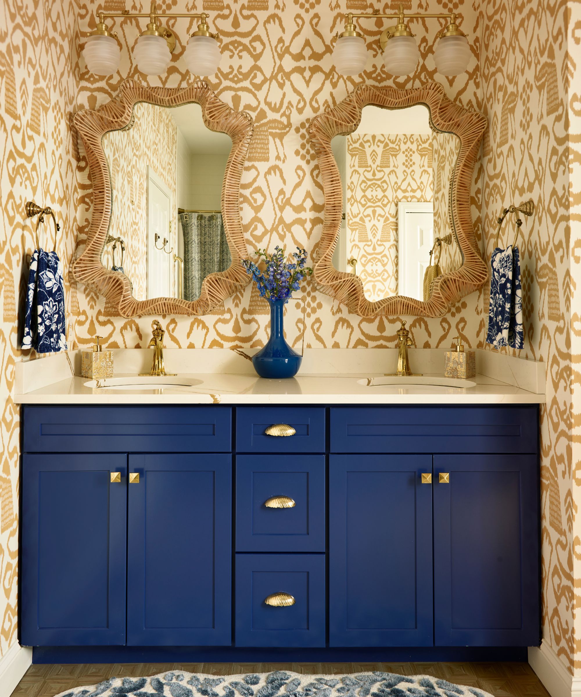
Incorporating color into your bathroom doesn't have to mean painting the walls, but decorating with wallpaper too. Whether you want to go for a maximalist design with bold hues or something more neutral, wallpaper adds plenty of interest to this utilitarian space.
'We are loving the use of wallcoverings in bathrooms! For smaller powder rooms, a vibrant print with a pop of color is a welcome surprise to guests. For full baths, we love a textural material with a simplistic, earthy feel or a cool blue paint for a spa-like effect,' say Susan Hayward and Jillian Hayward Schaible of Hayward Design House.
31. Add rich colors through tiles
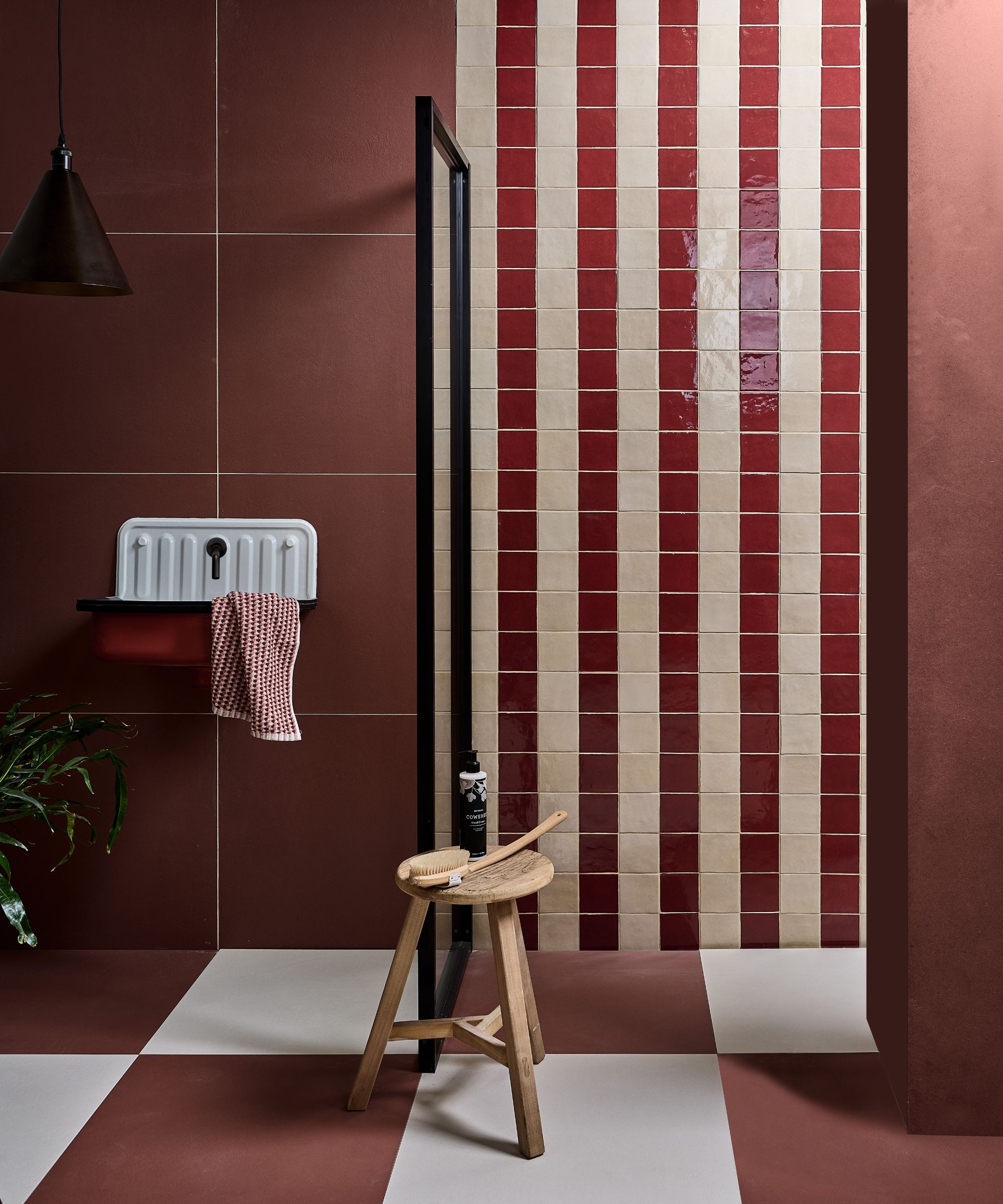
Another way to add color to your bathroom is through tile trends. Below, Katibelle Sharkey, creative director at BAS Stone explains that rich, vintage-inspired colors are an on-trend way to go for 2025:
'Inspired by the resurgence of Art Deco in interiors, we’re noticing a demand for rich, vintage-inspired colors for our clients’ 2025 projects. When it comes to stone selection, designers are gravitating towards reds, burgundies and bluish greens swirled with warm yellow coloring.'
Entryway color ideas
Entryway color ideas are just as important as any other room in the home. The first room guests see upon entering your home, it's worthwhile creating a color scheme that feels welcoming and reflects your decorating style. From light and airy entryways that favor decorating with neutrals to bolder schemes, the ideas below give this small space plenty of interest.
32. Create a calming entryway with green
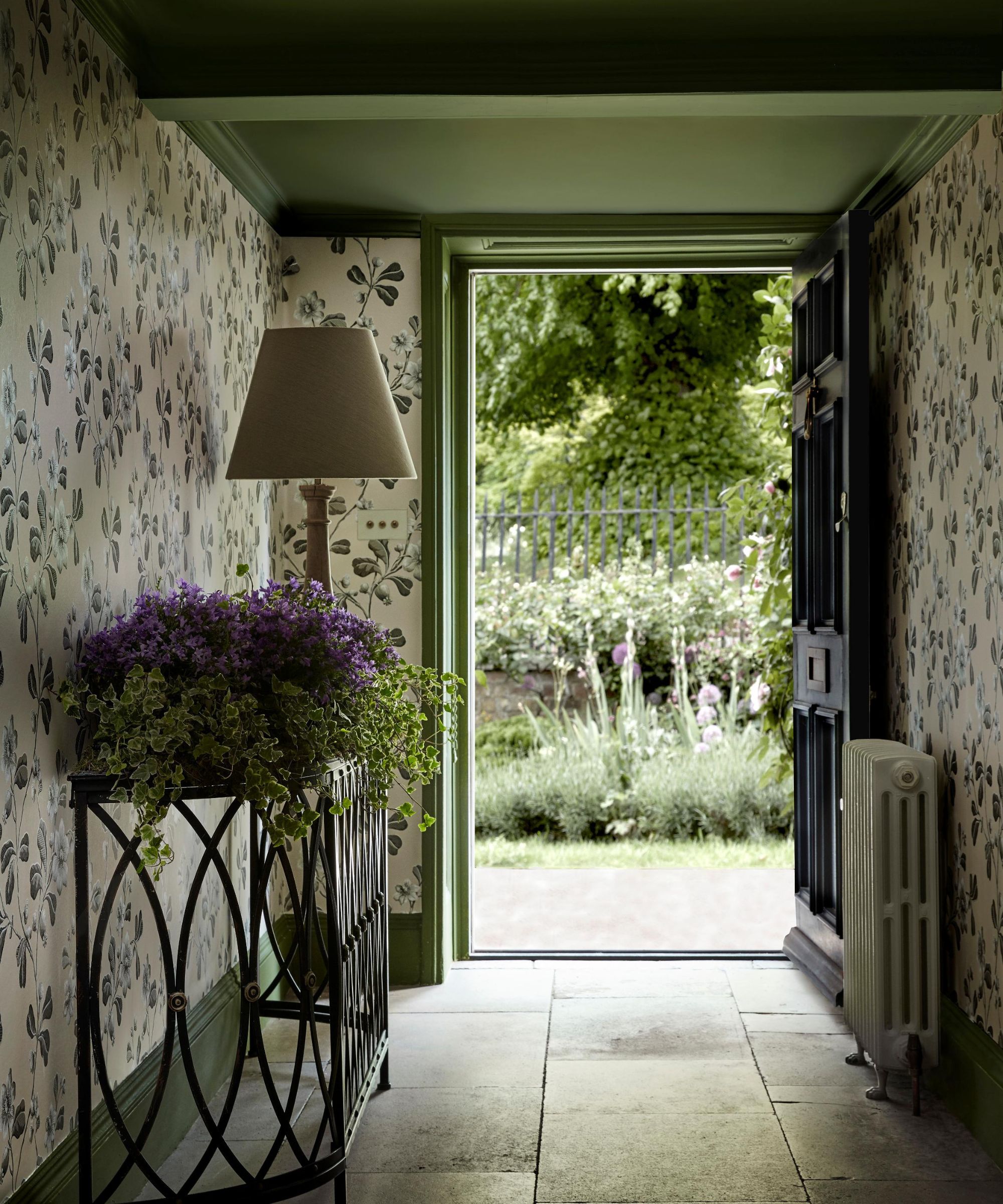
If you're looking to add interest and a pop of color to your entryway, take inspiration from this green entryway that features Little Greene's Broadwick St wallpaper in Mono, complete with the ceiling and woodwork painted with Little Greene's Jewel Beetle.
Not only is green a timeless color to use in an entryway, but it also boasts a calming quality that can help set the right mood for your home. Here, it also ties together nicely with the lush greenery in the garden.
33. Go for a dark blue paint
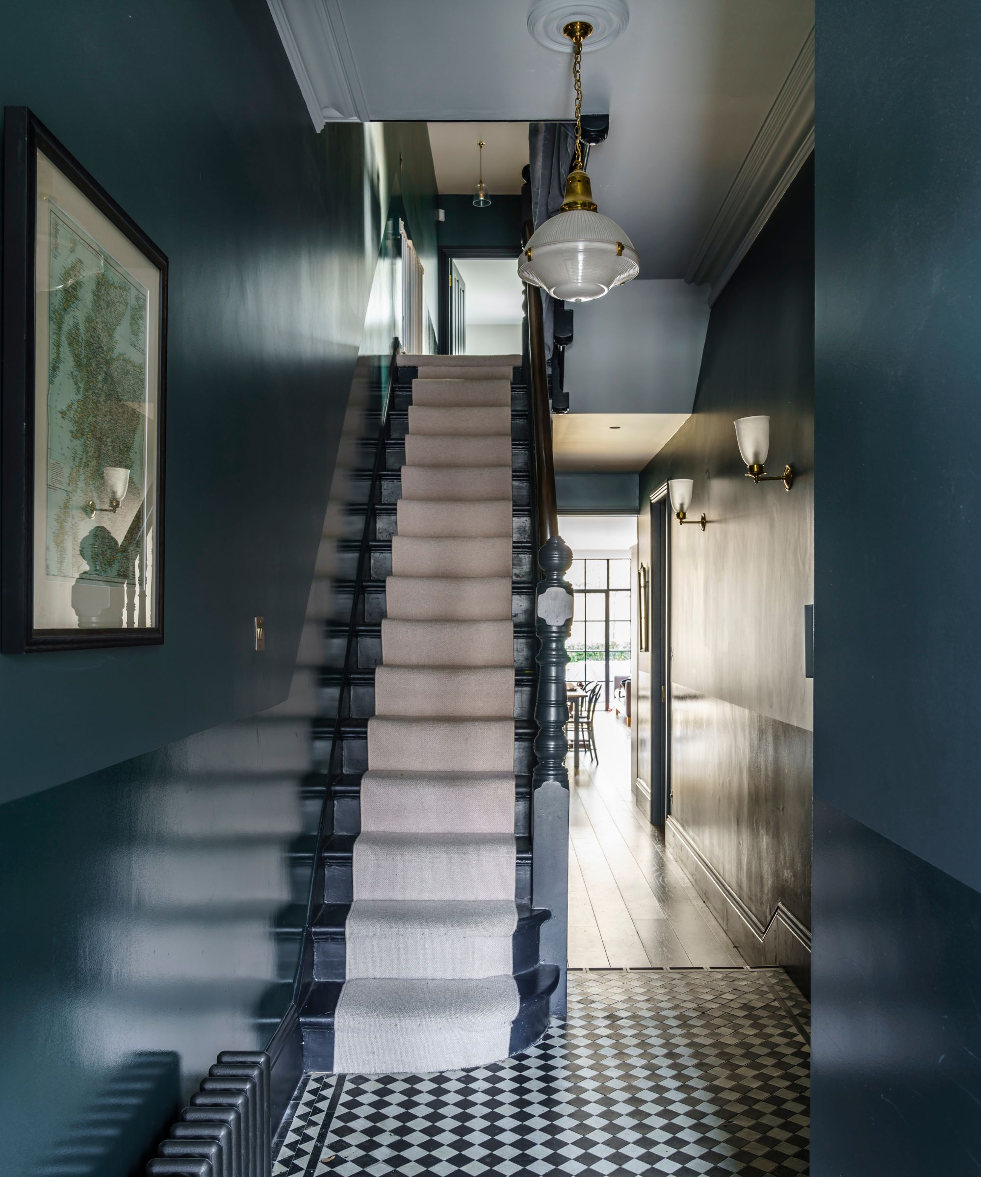
Decorating with dark paints can be well suited to entryways. Since these rooms are often small with fairly limited levels of natural light, leaning into the darkness with a dark color scheme can result in a cozy, moody feel.
One such dark paint to consider is Farrow & Ball's Inchyra Blue which was used here with different paint finishes to add interest. 'Inchyra Blue is a bold color, down at the darker end of the color spectrum. Try pairing it with Wimborne White which shares the same blue/green characteristics,' suggests Patrick O'Donnell.
34. Keep things classic with neutrals
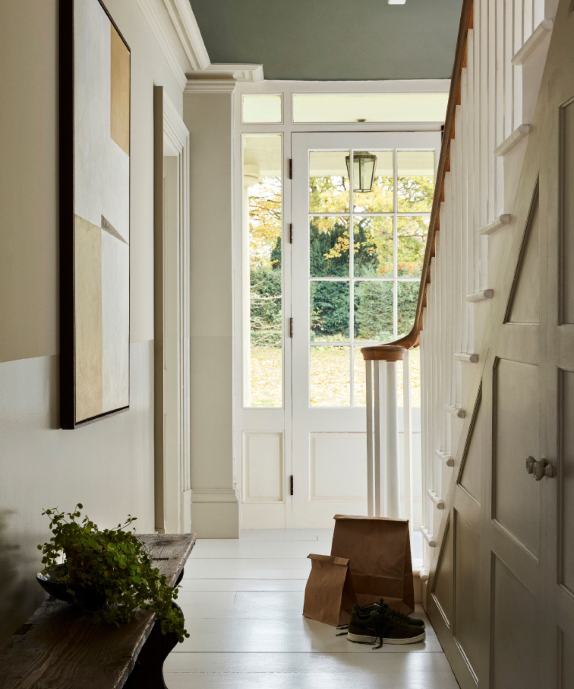
You can't go wrong with a neutral color scheme if your entryway benefits from ample amounts of natural light. Classic and calming, there's much to love about a neutral entryway, but choosing the right neutral paints is key. Instead of pure white paints that can appear stark or even clinical, turn to warm white paints or earthy neutrals such as beige tones and taupes. These can help add subtle warmth and depth to your home's entrance while maintaining that much-loved light and airy look.
35. Make a statement with red
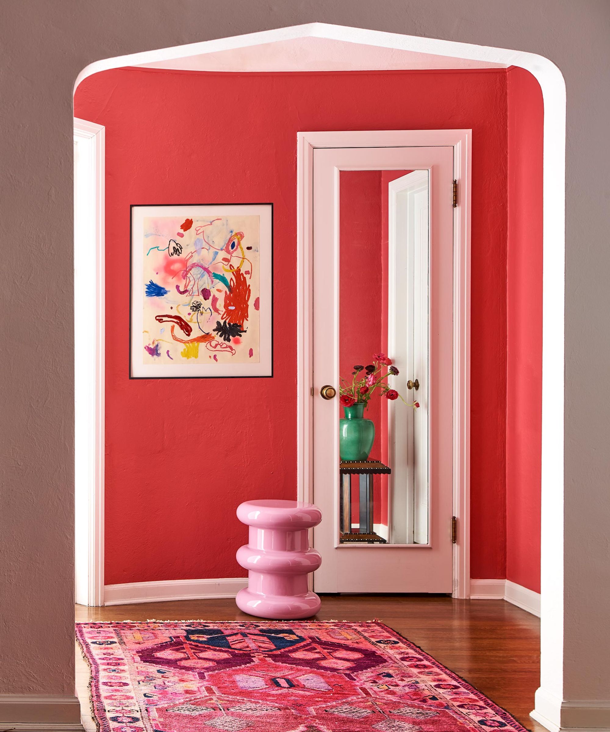
If you prefer bold color schemes that feel vibrant and uplifting, entryways are one of the best places to go all out with color, setting a lasting impression for the rest of your home. Of all the bold paints to choose from, red is undoubtedly one of the most daring, such as Benjamin Moore's Raspberry Glaze which designer Nadia Watts used here.
'It’s the perfect pop of color as you enter the home and makes the white woodwork pop. Raspberry Glaze is one of those happy colors, it brings joy. The entry is the perfect place to use a happy color, bringing fun and playfulness to whoever enters your home. With its undertones of pink and purple, it’s the perfect red and makes for a bold backdrop for modern art and accessories.'
From neutral color schemes to bold and bright rooms, there are room color ideas to suit all interior design styles. Whichever room you're decorating, go for the colors that you're naturally most drawn to for a scheme that has longevity beyond the latest color trends.


