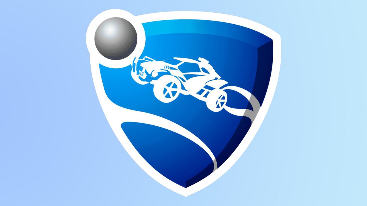
For many brands, dropping a new logo is a big deal. Not only does it take months to perfect your design, but once it drops, you've got a sea of opinionated fans to impress. If you're worried about a frosty reception, why not take a leaf out of Rocket League's book and create a new logo so subtle that fans are scratching their heads trying to spot the difference?
There's no formula for creating the best logos, but when a design revamp is in order, you'd typically expect to see a slight difference. The irony-filled 'announcement' from NIP Rocket League quickly divided fans as they scrambled to look for any change in design, but it seems no one could agree.