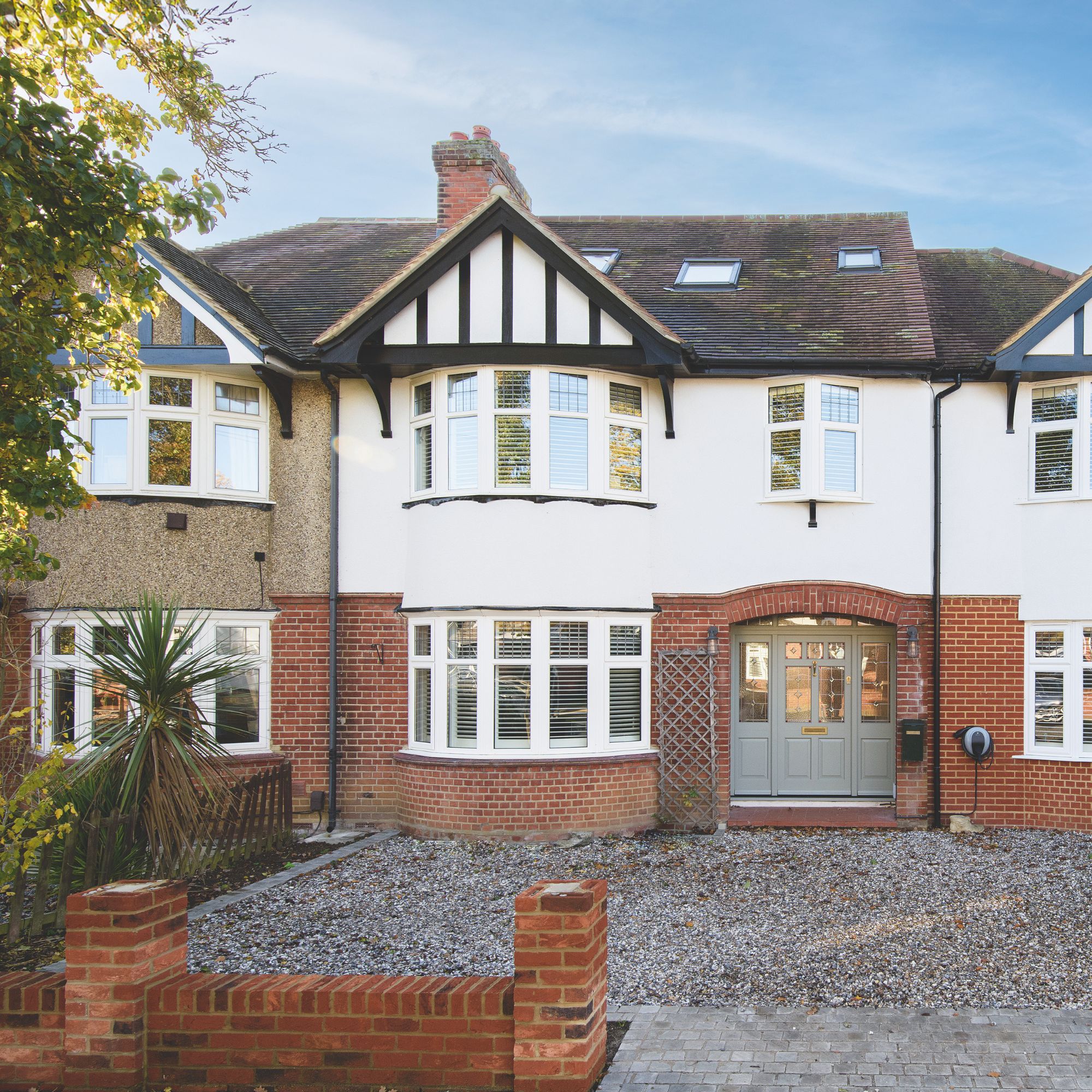
Jenny and Sam weren’t looking for a project, but while on the hunt for their next home, they spotted this 1930s semi, split into two independent dwellings, and decided to draw on Jenny’s eye for design to turn it back into one beautiful family home.
The dream location
‘To be honest, if this place had come up on any other street we wouldn’t have gone for it as it needed so much work. The right half was converted into a self-contained annex with its own internal front door and separate staircase, so we knew it would be a big project to return it to one single house. But we loved the location, the house still retained some period features and we could see it had the bones to become a stunning family home,’ says Jenny.
Creating the perfect layout
Originally, we couldn’t access the top floor of the main house through the annexe so we lost a box room to create a doorway into the master bedroom. And since we were doing so much work it made sense to go into the loft at the same time to add a guest bedroom and office.
Kitchen-diner

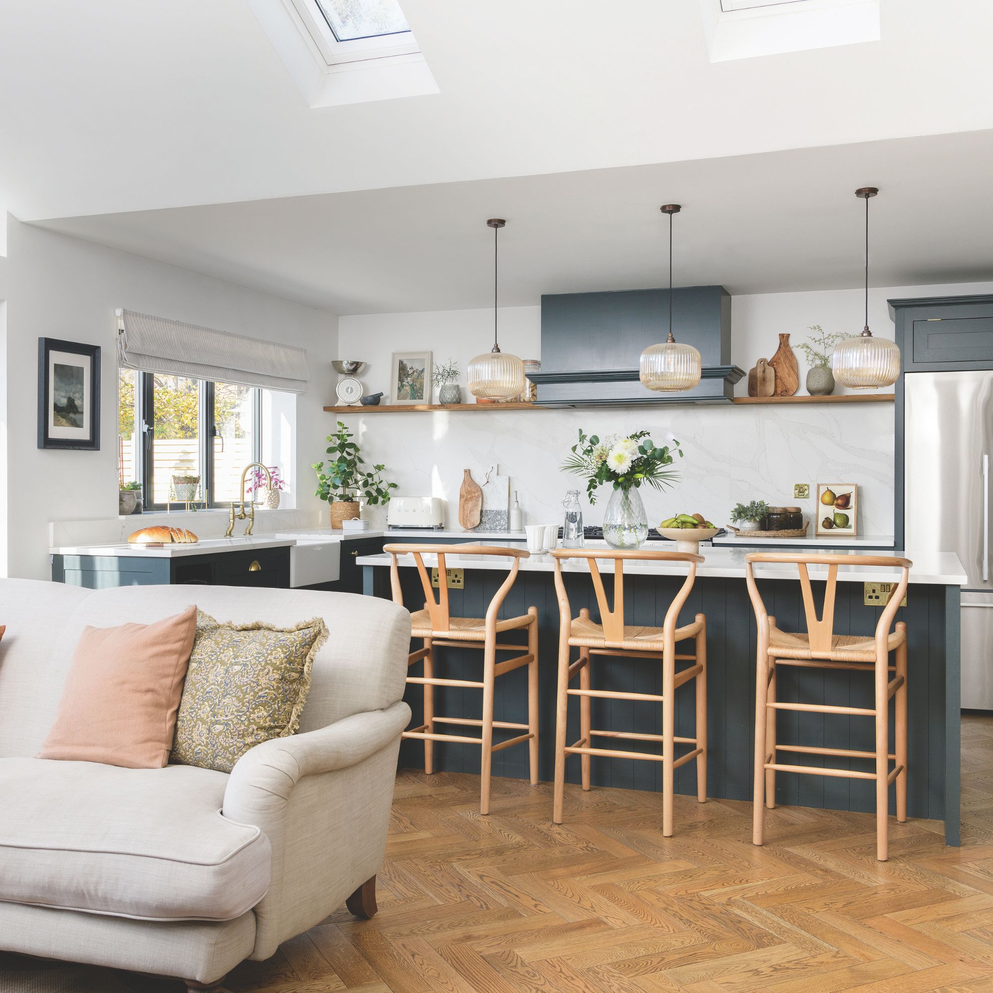
‘We wanted to reclaim the beautiful symmetry of the house, starting by removing the annexe staircase, but our plan was also to extend the back of the house to create a generous, relaxed family kitchen-diner as I knew, from how we used our previous home, we’d spend most of our time there,' says Jenny.
Having researched kitchen extension ideas, Jenny opted to extend the existing space by three metres. 'Once the builders started taking down the internal walls we decided to move into a rental for three months, but of course, the work took longer than expected so to save money we moved in with my mum for another three months.'
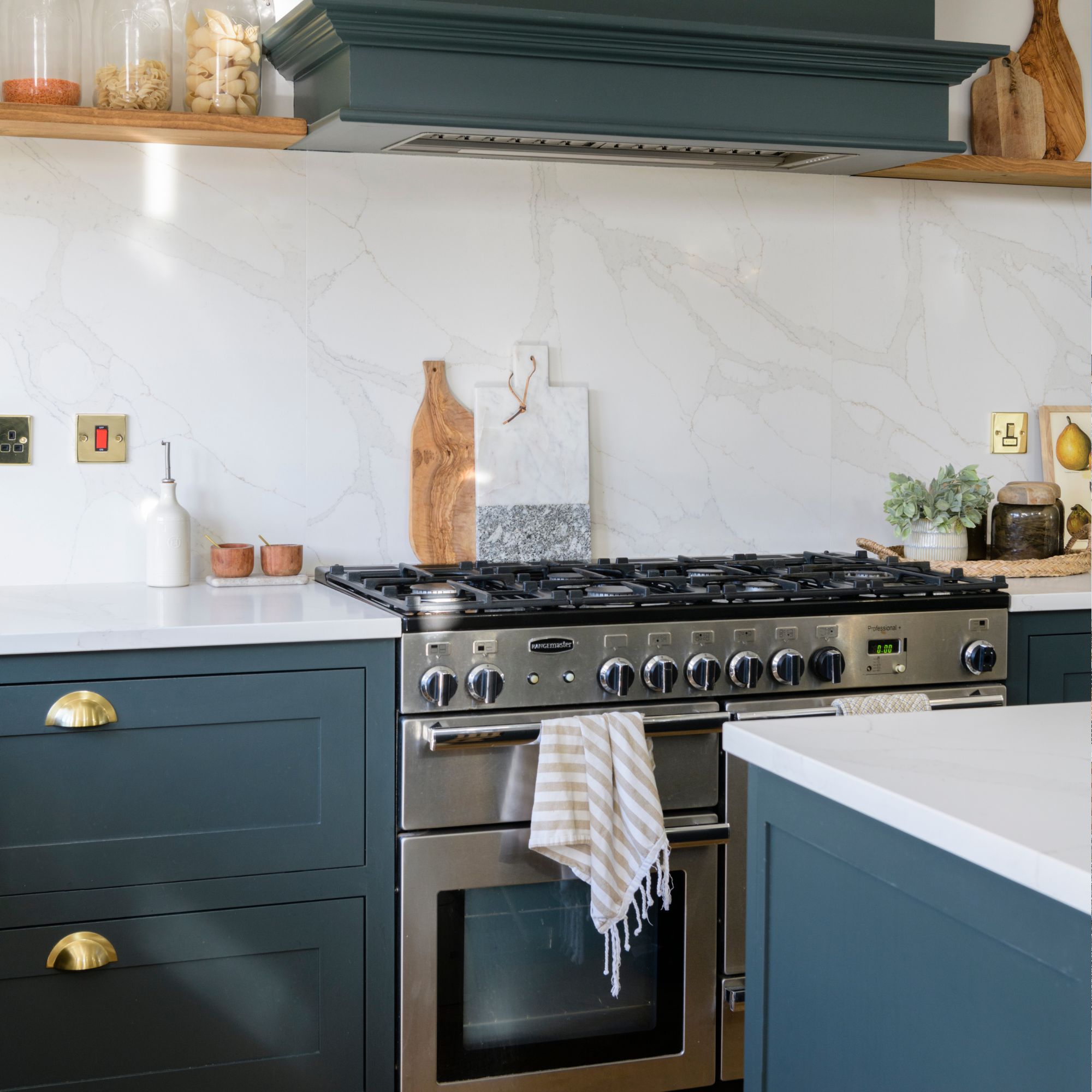
‘The downstairs extension works really well, transitioning from a fully functioning family-friendly kitchen-diner in the day to a sophisticated entertaining space in the evening. It’s sometimes hard to imagine how there could have been another separate home in here, and although it’s been a labour of love, returning this house to its former glory has been worth the effort,' says Jenny.
'I love the look of the splashback extending up the wall and how the wooden shelves, antique brass hardware and amber pendants add warmth.’
Living room
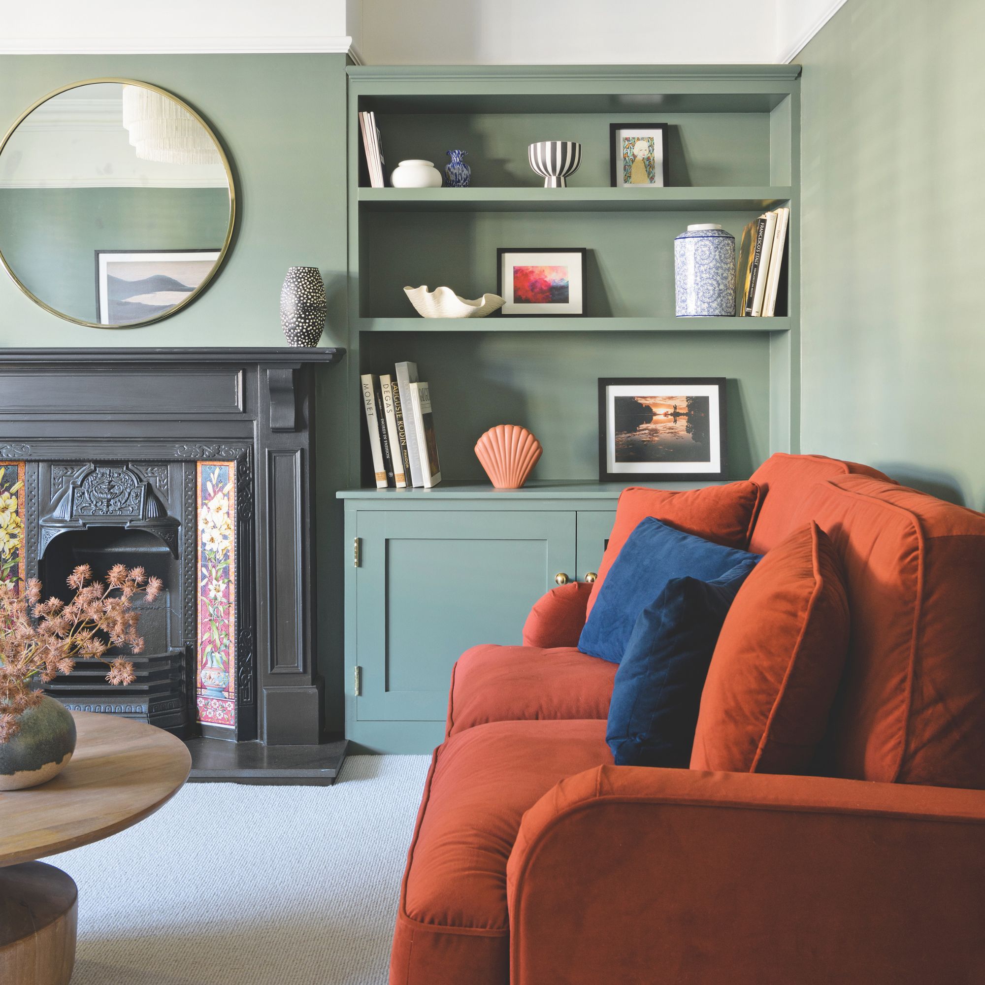
Jenny and Sam reinstated the chimney breast and installed the fireplace giving the living room a must-needed focal point and incorporating valuable storage. Painting the picture rail and above in a lighter shade than the walls below creates a cosy feeling in the room.
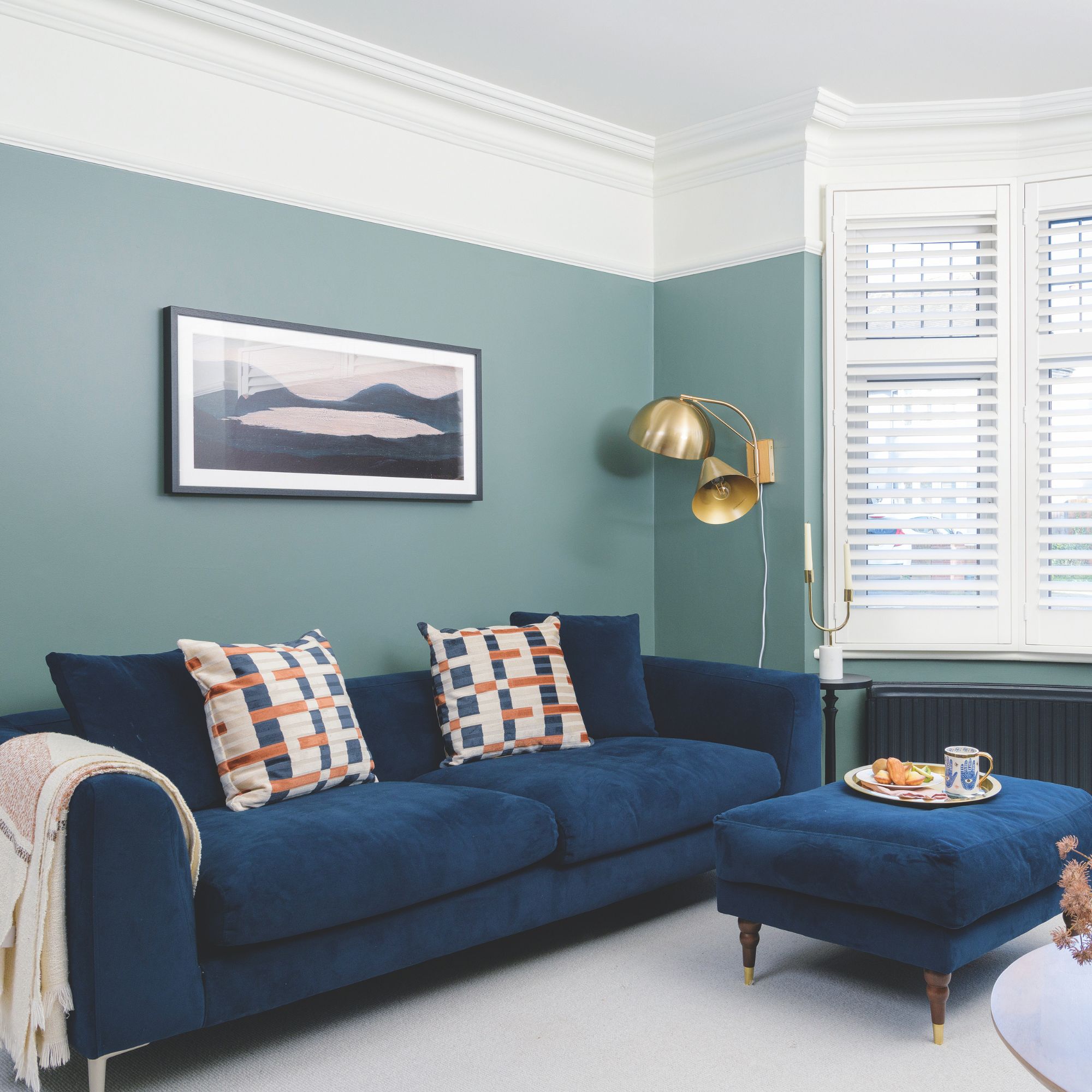
‘I always start a scheme with a calming colour, but I wanted to elevate the living room so chose the dark blue velvet sofa and gold lamp to ground the look while adding a luxurious feel,' says Jenny.
‘I have three style rules that I’ve used throughout the house; I start with a neutral base, sit that with darker tones and then add wooden accessories to inject depth and warmth. I don’t want to have too much colour on the walls and prefer a pared-back look, but I like to bring in interest using bold furniture to give each room its own personality, which I update with accessories and artwork.’
Dining room
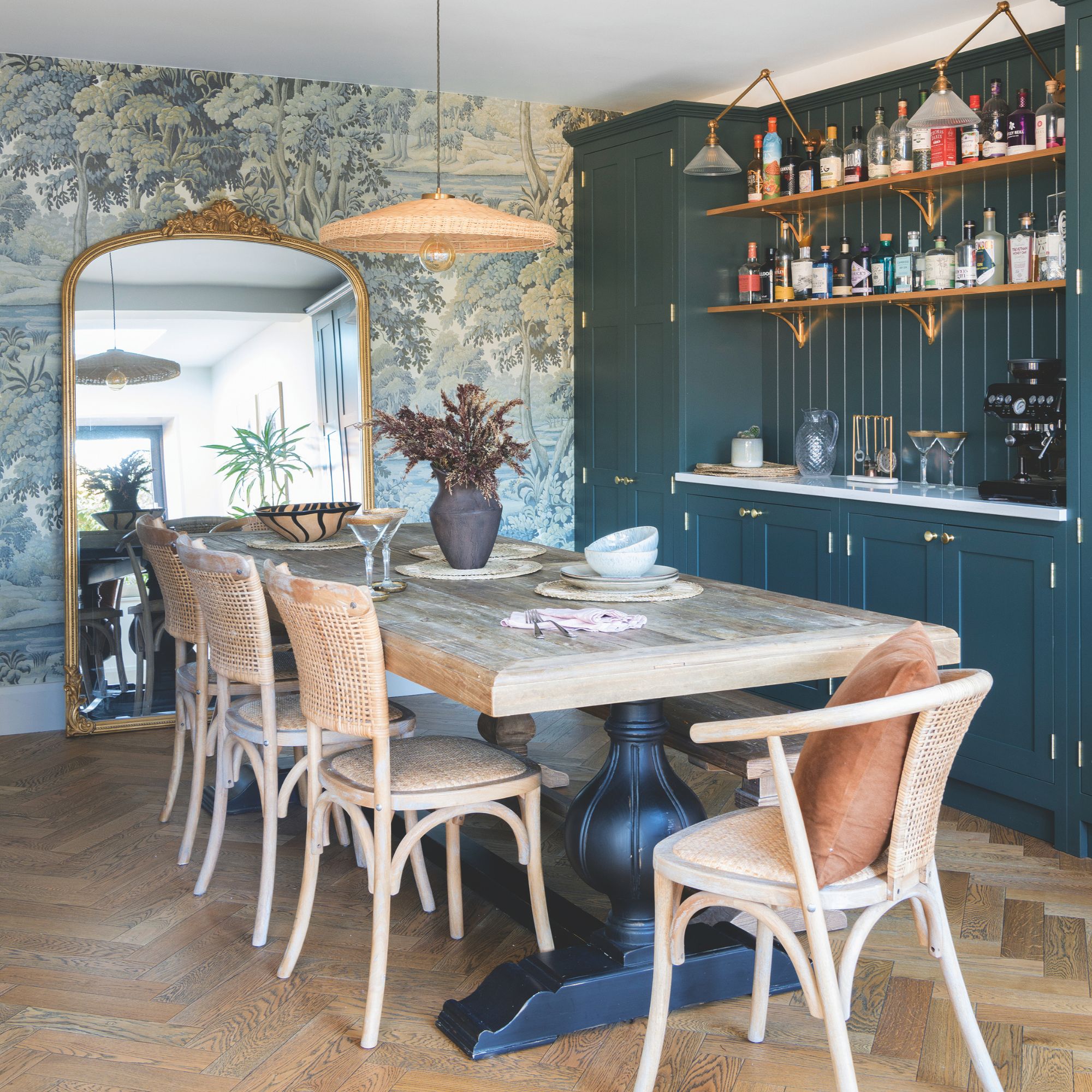
This small dining room is brimming with character thanks to the built-in home bar. Not only is this a fun addition, but it can also add value to a property.
‘We put the dining table rather than the TV in this nook so I can see the children from the kitchen. We use it if we have people over, but we tend to sit around the island or in the snug day-to-day,' says Jenny.
Bedroom
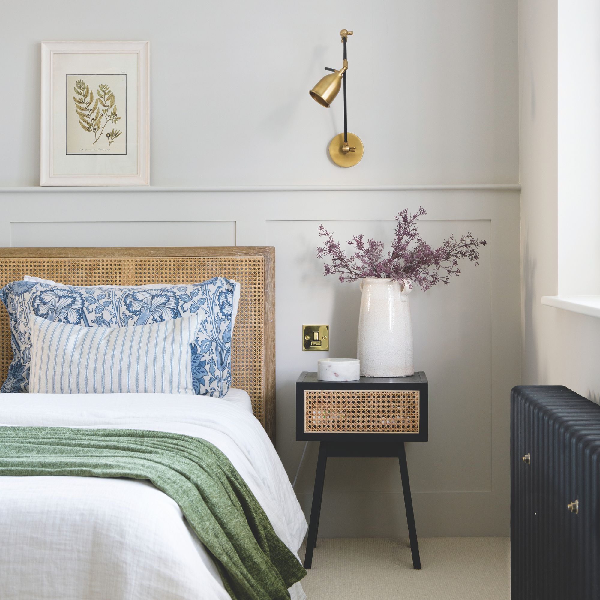
The main bedroom was designed to radiate peace – creating the perfect cosy bedroom to relax after a busy day. ‘The rattan furniture and gold lamp add the texture and warmth the muted scheme needed, while a gentle pop of pattern brings interest to this simple corner,' explains Jenny.
Bathroom
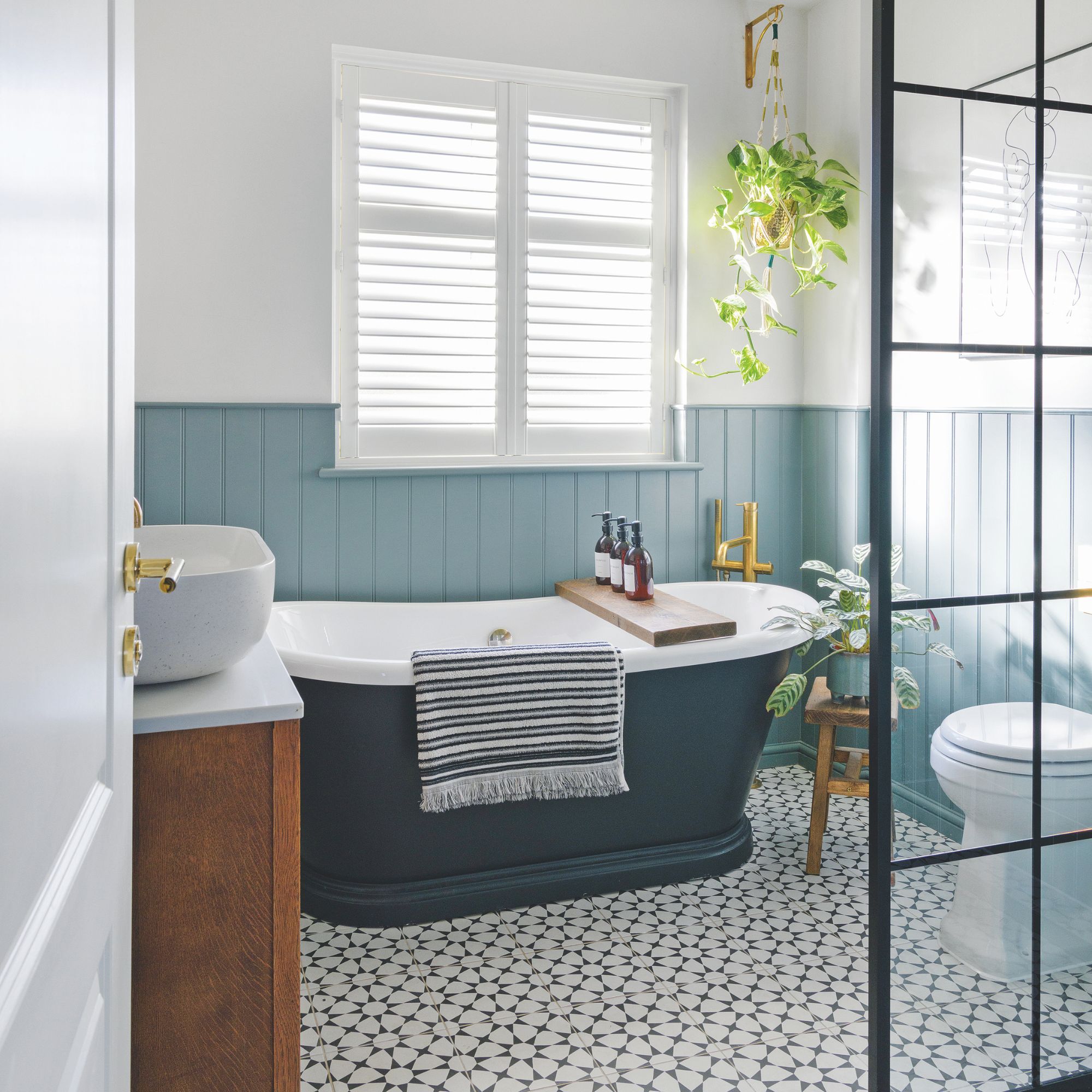
As with all good bathroom plans, layout is key. ‘The freestanding bath is the focus of the room, positioned under the window, and although the space is small, by forgoing a tray and choosing a wet-room-style shower idea, I managed to fit it all in,' says Jenny. ‘The fixtures and fittings look luxe, but the vanity, from a chest of drawers, gives the natural element I love.’
Child's bedroom
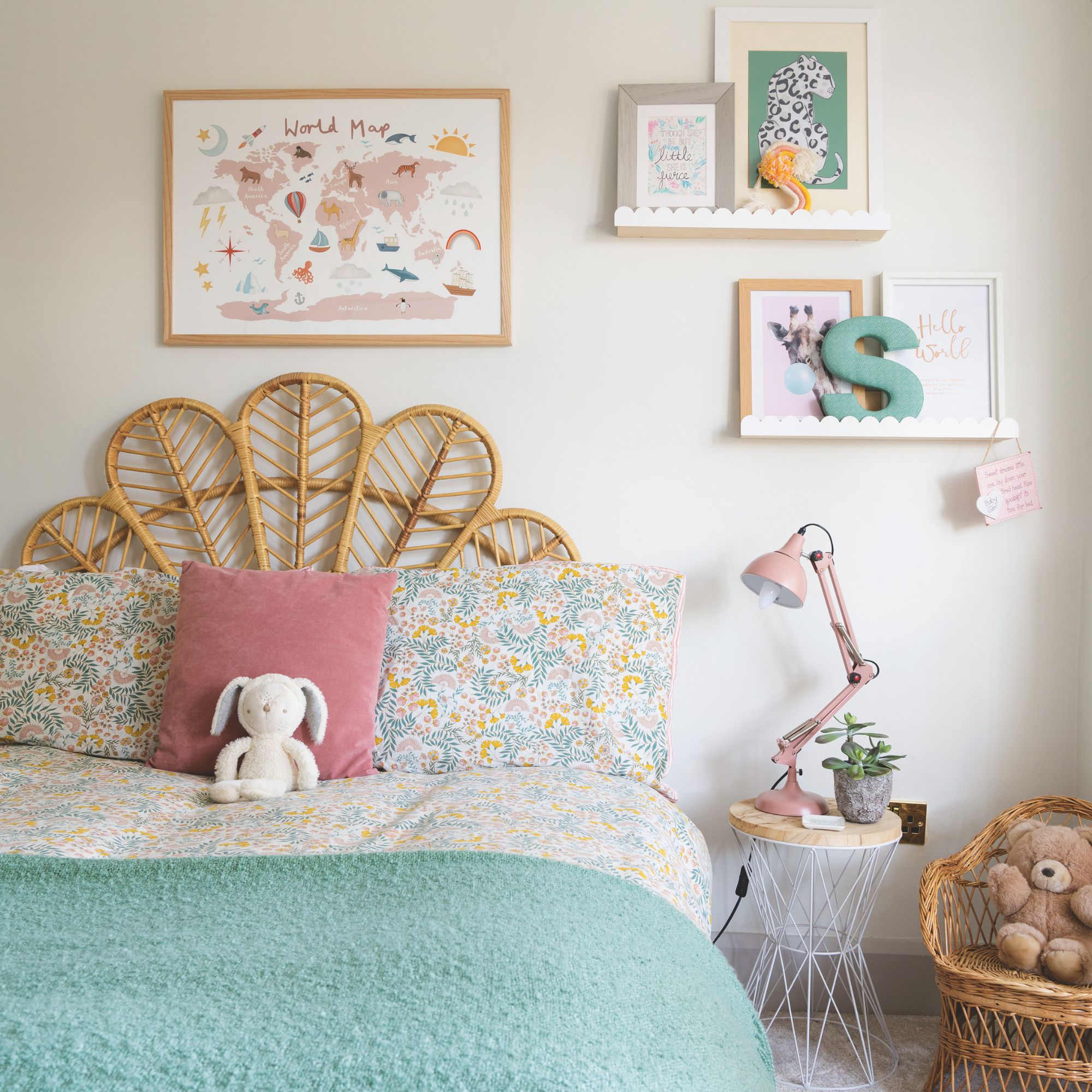
Children's bedroom ideas provide the perfect opportunity to be creative, as seen with this decorative girls' bedroom. ‘I wanted this room to be fun and playful, as our daughter Sylvie loves animals, so this mural design was a real find as it perfectly encapsulates her style,' says Jenny. ‘A petal-shaped headboard and the scallop shelves combined with pink and green bring a softness and a playful touch.’


