Choosing colour is fraught with difficulty, even if you have a strong sense of your own style. So many factors are at play: the orientation of the room, the colours you already have on flooring and furniture, how to combine colours successfully so that the finished look is cohesive instead of conflicting.
The stakes can be high because who has the time or money to paint a room twice over? Get it wrong – or even a little bit off – and you’re going to have to live with it every day. No wonder, then, that the majority of us err on the cautious side with white, grey and beige instead of being braver with colour combinations.
However, there are formulas to follow and interior designers have been through the annoying trial-and-error process for us so we can learn from their mistakes and pass off their colour-confident combos as our own!
Colour rules interior designers swear by
We asked six interior designers about the principles that guide them in every project to create a playbook to follow when you’re choosing colour for your home. This is what they told us…
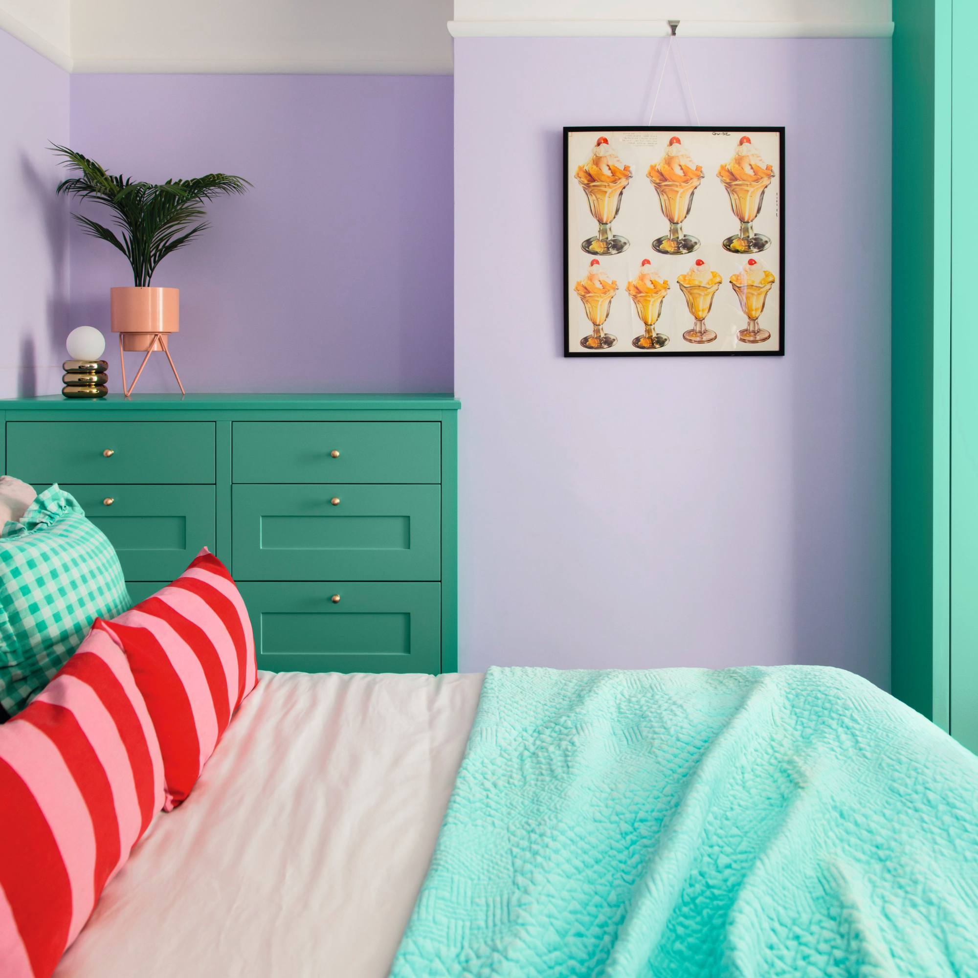
Rule 1: Stick to three colours
One of, if not the most, famous colour rules is the 60-30-10 rule.
‘This is a guiding principle for creating balanced and visually pleasing colour schemes,' explains interior designer Athina Bluff. 'Interior designers rely on it to simplify colour selection and achieve a cohesive look. By limiting your palette to three core colours, you can ensure elements won't clash and the space feels harmonious.
‘This rule typically involves a dominant colour (60%) for walls or large furniture, a secondary colour (30%) for areas like curtains or rugs, and an accent colour (10%) for pops of vibrancy in artwork or accessories.’
‘While three colours may feel constricting, you can use different tones and hues from within these three colours to make it feel more diverse.’
Using a colour wheel makes it easy to choose your combination of colours: for bold contrasts, choose colours on the opposite sides; for gentler schemes pick adjoining colours or shades of one colour.
Rule 2: Test dark colours before you put them on walls
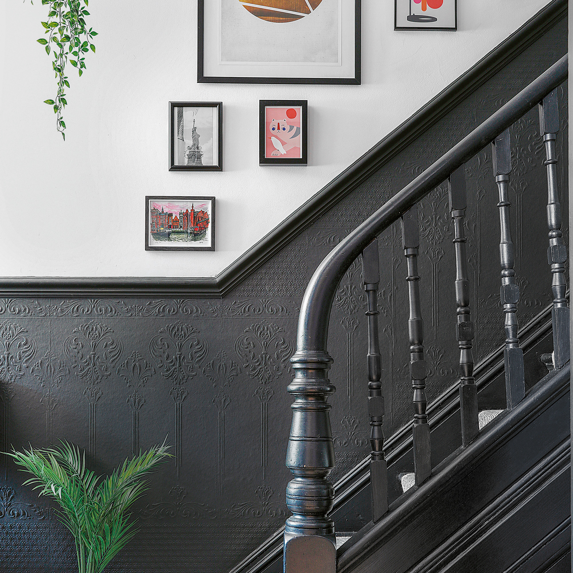
‘Please please please don’t lock the colour in (especially if you’re going dark) before you’ve painted the largest area you can first,' begs designer Abigail Ahern. 'The swatch card is not a good enough reference point. You need to paint at least half a wall before taking the plunge fully. One, it always looks darker and two, you need the light to hit it to see whether you love it or not!
‘One more tip: always, I repeat, always paint a wall with two coats of the colour before deciding whether you like it or not. I hated every colour in my home with the first coat – you need two before making any decision.’
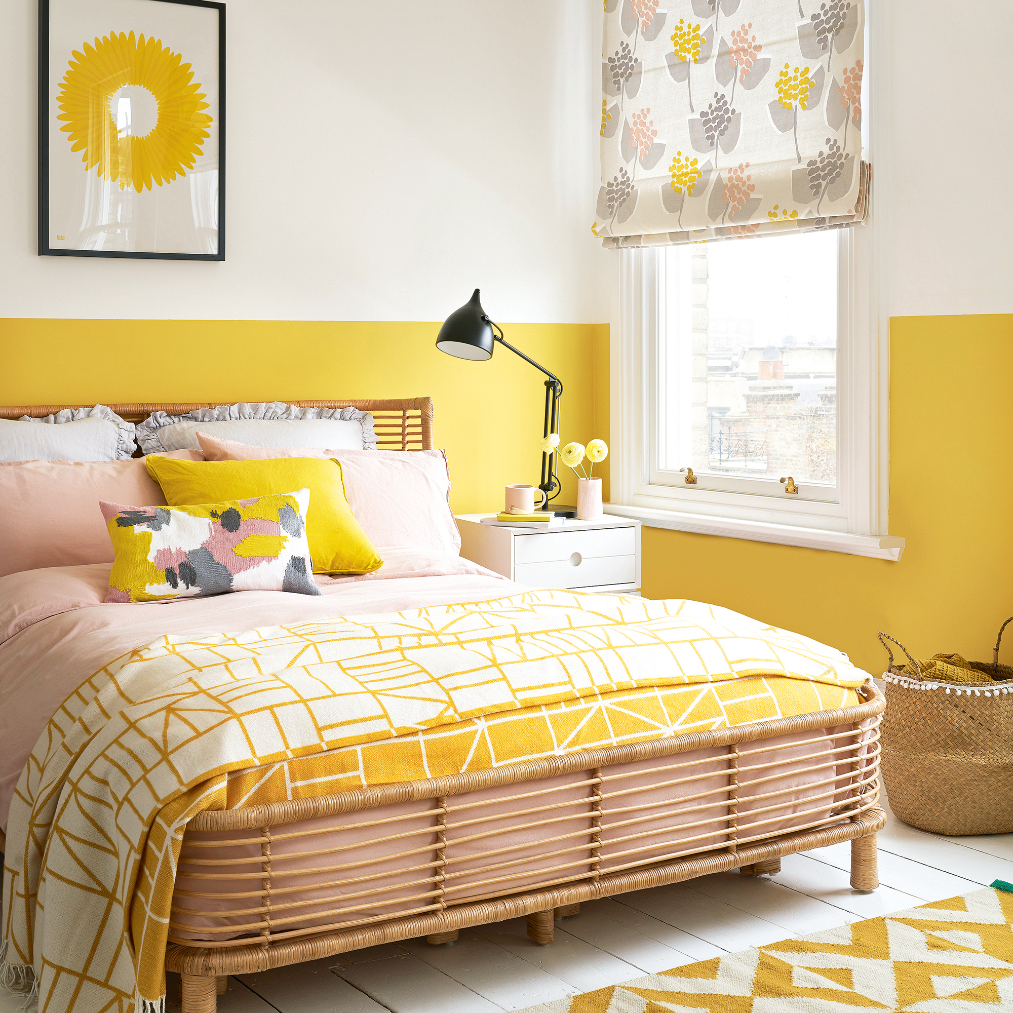
Rule 3: Always add an accent colour
‘All colour schemes are improved by accents – the final touches of colour that add an element of surprise, and bring rooms to life,' explains Abigail. 'There are no fixed rules when it comes to choosing these; just take care with the amount of colour you use and where you use it. As fab as that bright orange might look on a pillow, it may not feel quite so amazing on four walls because the impact will be so much stronger.’
Accents can be bright – even fluoro – but they don’t have to be. In a bold scheme, choose an accent that’s adjoining or opposite your wall colour on the colour wheel for contrast. In a subtle scheme, go for the darkest or lightest tone of the colour on your walls for gentler impact.
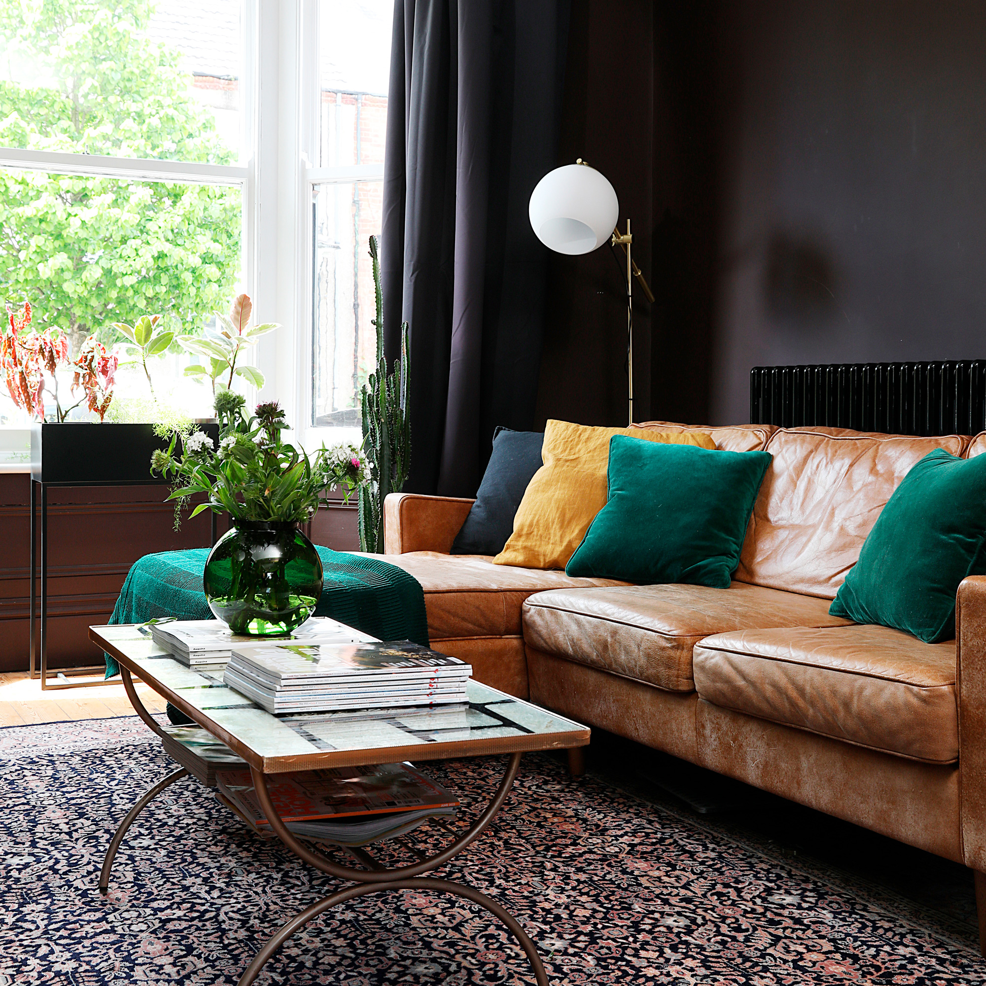
Rule 4: Add energy by creating contrasts
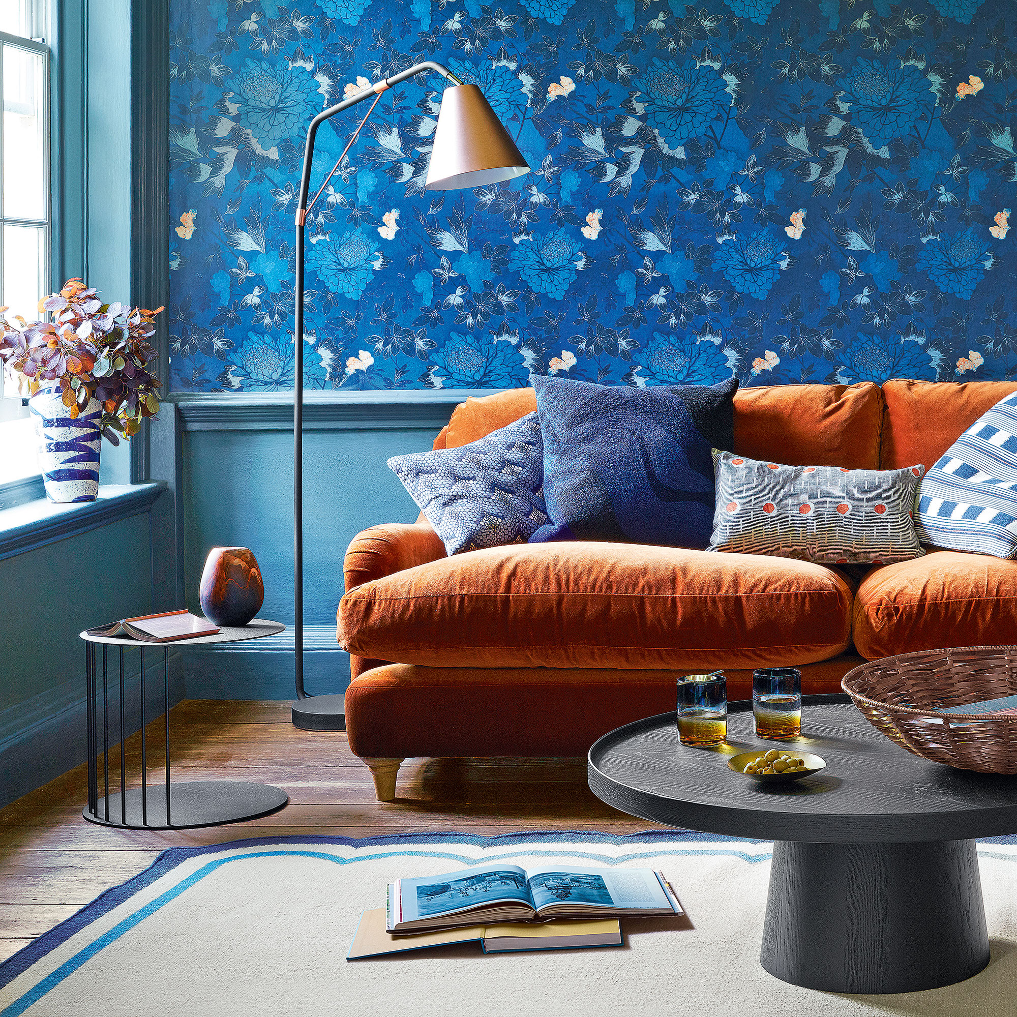
‘Pairing colours that sit opposite each other on the colour wheel creates visual tension that immediately draws the eye, adding drama and personality,' explains interior designer Eloise Pfeiffer. 'It can also be used to highlight architectural features and focal points in the room that enhance its depth and dimension.’
If you have a softer approach to colour choice, this is how to adapt the trick: ‘For those who prefer a more neutral aesthetic, we focus less on colour contrast and more on contrasting materials and textures,’ continues Eloise. ‘This approach can still achieve a dynaming, engaging look with the interplay of different surfaces, finishes and materials.’
Rule 5: Keep it calm with harmonious tones
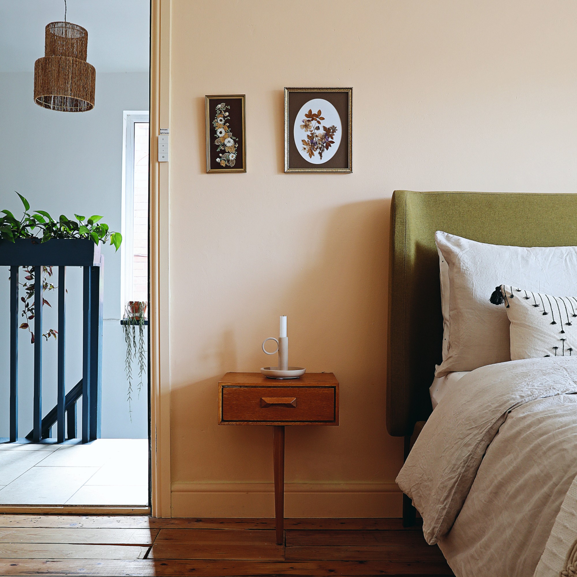
‘I love using harmonious colours (colours that sit next to each other on the colour wheel) when designing a space,' says interior designer Anna Maria Stoltman. ‘This is the easiest way to achieve a balanced, cohesive, and relaxed atmosphere. This type of colour scheme looks best when a mix of warm and cool tones, as well as different shades, are used to add depth and interest. It is the simplest recipe for creating a comfortable and easy-to-live-in space.’
'Using harmonious colours like shades of blue and green, or varieties of warm earth tones, creates a soothing and cohesive look that’s easy on the eyes and promotes tranquillity, wellbeing and flow.’
Rule 6: Get the lighting right for your colour scheme
Be guided by the orientation of your room when choosing colours. In simple terms, spaces that get a lot of light can handle deeper and cooler tones; light-starved spaces need lighter, warmer ones. If your room is half and half – either east or west facing, then choose colours depending on whether you use it most when it’s getting light or not.
Your artificial lighting should be chosen to work with your colour scheme. ‘I always use a mix of ambient, and accent lighting to highlight different textures and create a cosy atmosphere,' says interior designer Poonam Shah. 'I find that warm coloured bulbs work best in highlighting more natural, warm tones, whereas cool white bulbs work best on cooler tones such as cool greys.’
Rule 7: Define the mood you want to create
‘It's really vital to decide the mood you want to create when choosing colours for your rooms,' advises Kelly Collins, interior designer and head of creative at furniture company Swyft. 'When you design a space you decide what's going to happen in the area, and which atmosphere you'd like to create.'
'For example, when painting a bedroom you need to choose colours which compliment the relaxing mood you want to create, and don't evoke an energetic emotion. ‘Dopamine decorating’ is a great example of using colours that make you feel relaxed and happy around your home.’
So, what colour for which mood?
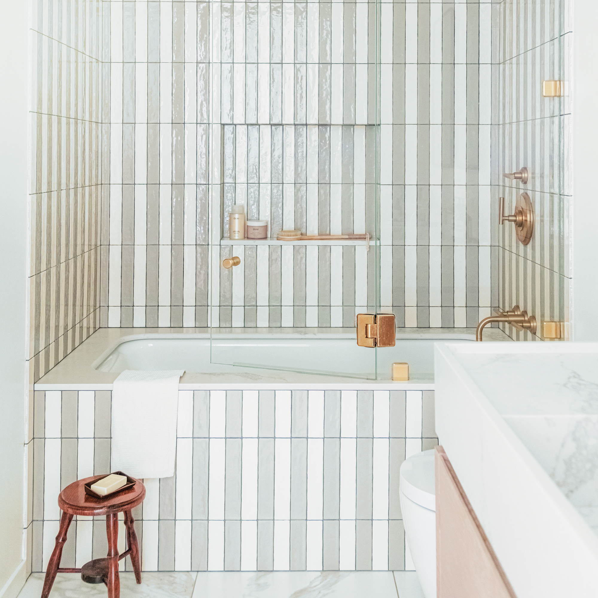
‘This depends on which room you're decorating,' explains Kelly. 'In the kitchen I like to go for blues, creams and even citrus colours (oranges/reds) as they're known to stimulate appetite. In the bathroom, flattering colours including peaches and neutrals are ideal as people use the mirror to get ready so I'd avoid anything too bright and extreme.'
'In a bedroom I'd go for natural colours that remind you of calming nature scenes or perhaps a caramel which gives a subtle warming, cocooning feel. In offices, yellow/greens are known to help you focus and avoid distractions so these can be very beneficial.’
FAQs
What are the rules for colour in interior design?
Essentially, it’s all about you, your needs and your personal response to different hues. Eloise Pfeiffer expands, ‘Whether that’s bold and vibrant or serene, neutral and contemporary, by thoughtfully considering who you are, you can create a dynamic space that resonates emotionally.’