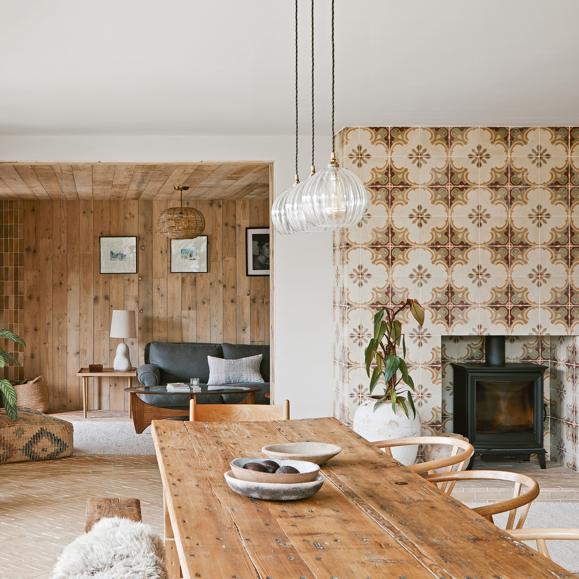
Originally two early 19th century workers’ cottages in Yorkshire, now transformed into a single home, Lee Thornley, founder of Bert & May, lives here his partner, Phil Brocklebank and their children, Lyla and Iris.
'Although the cottages had already been joined and extended into one home,' explains Lee, 'it was still a house of two halves, with two staircases, two kitchens and a muddle of small rooms.'
'Despite being over 3,000 square feet, it felt pokey,' he recalls. 'We knew it had potential, but it needed to be fully remodelled to create more open, family-orientated spaces, so we removed internal walls and rejigged the upstairs into four en-suite bedrooms, going into the eaves to create as much space as possible.'
The couple transformed the space using reclaimed materials and furniture wherever possible. 'We chose reclaimed wherever we could,' explains Lee. 'There’s handmade terracotta on the floor in the kitchen, reclaimed elm boards throughout the rest of the downstairs and a reclaimed oak floor upstairs.'
'Reclaimed materials bring a timeless quality'
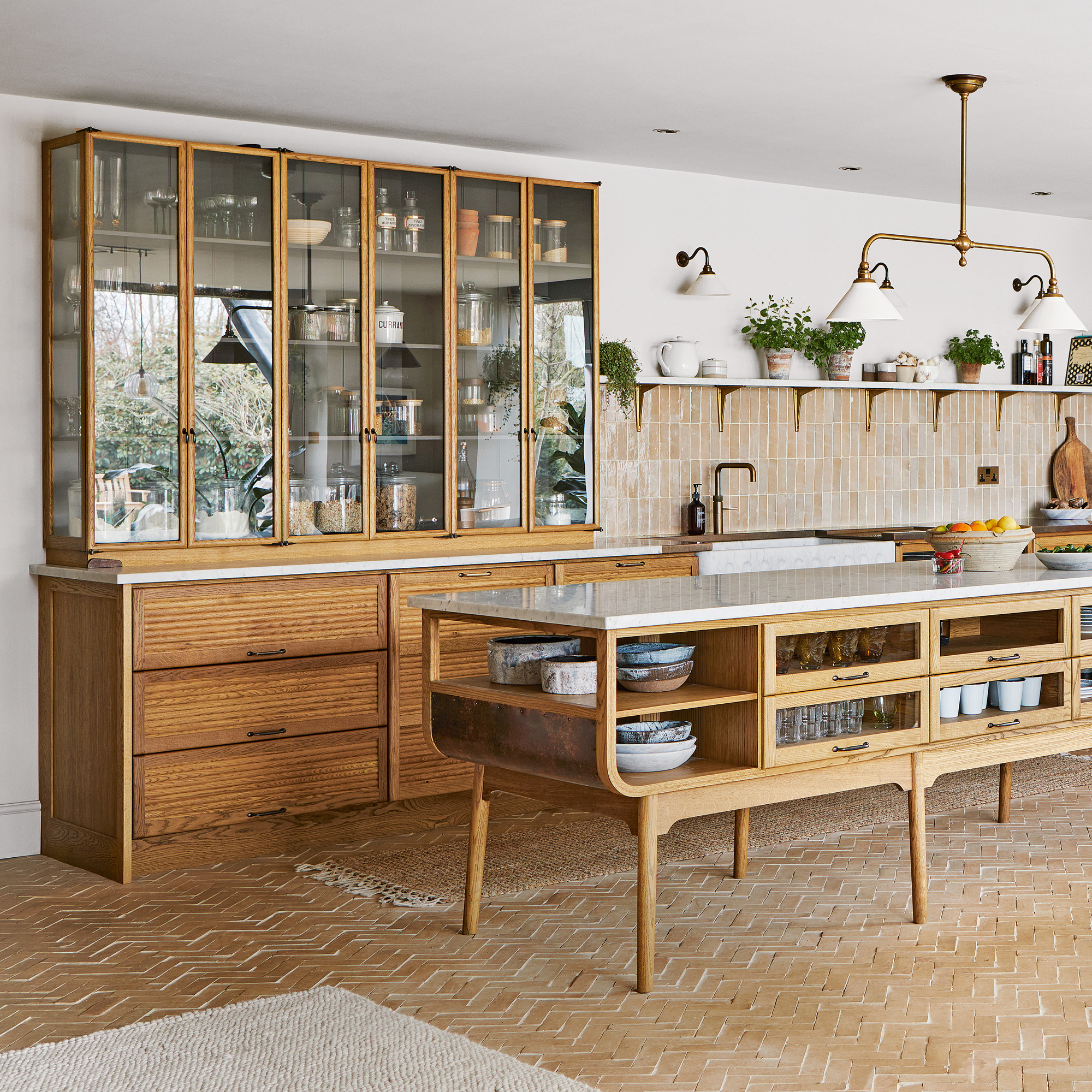
'A mid-century vibe injects warmth,' explains Lee, 'and we like kitchen furniture that has a nostalgic, slightly seventies aesthetic, with warm wood, gentle curves and slim, glazed storage.'
'The unpainted oak cupboards have been finished with a coat of tinted oil which means we can easily repair any scrapes and scratches. The island went through scores of different design possibilities, and then we decided to customise it even further by extending it to ten feet, so it would look at home in the extra-large, open-plan kitchen.'
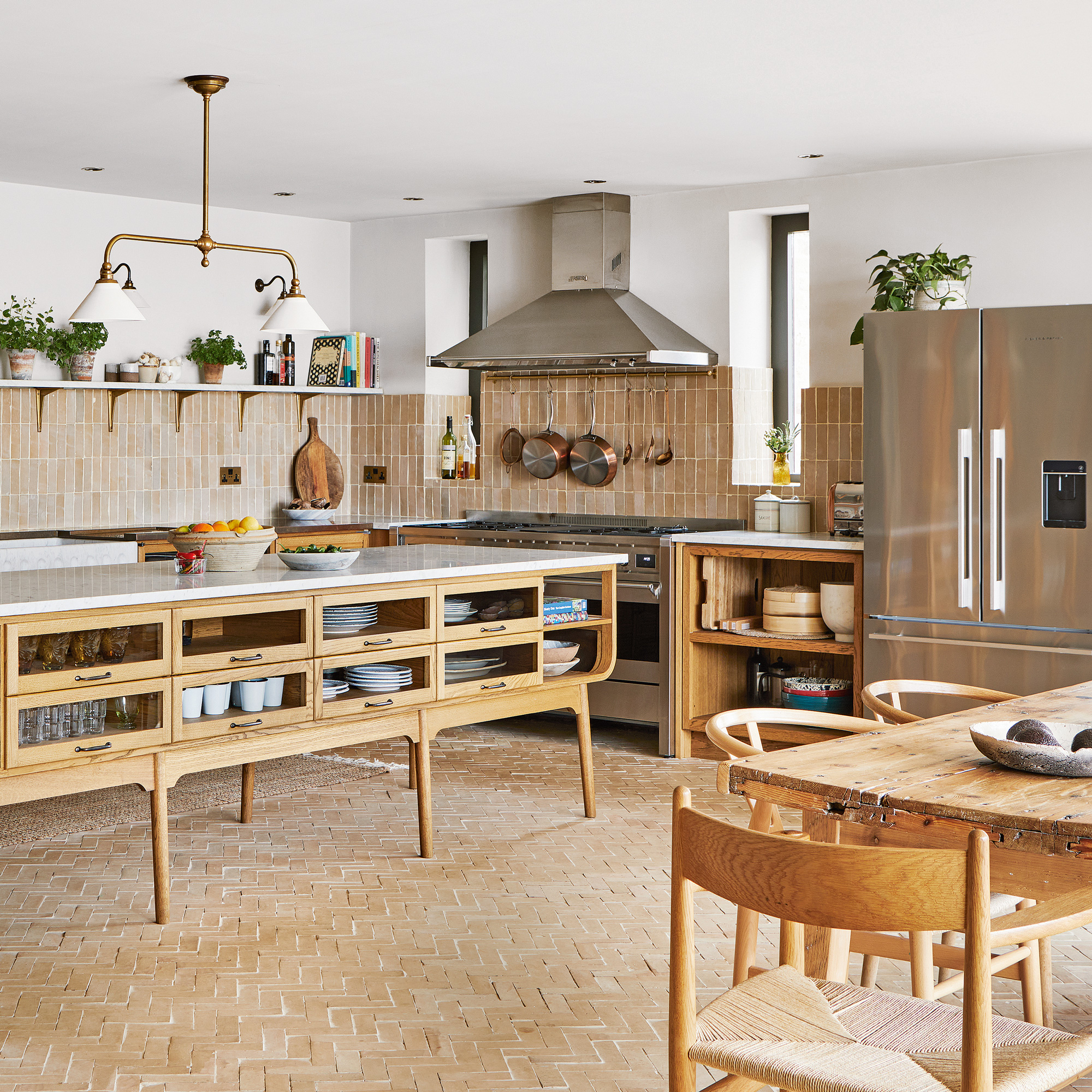
This ethos of reclaiming and reusing furniture and materials carries throughout the house. 'The dining table is made from ancient Spanish shutters battened together,' says Lee. 'Even the bath is a restored antique!'
'The house is stylish and homely'
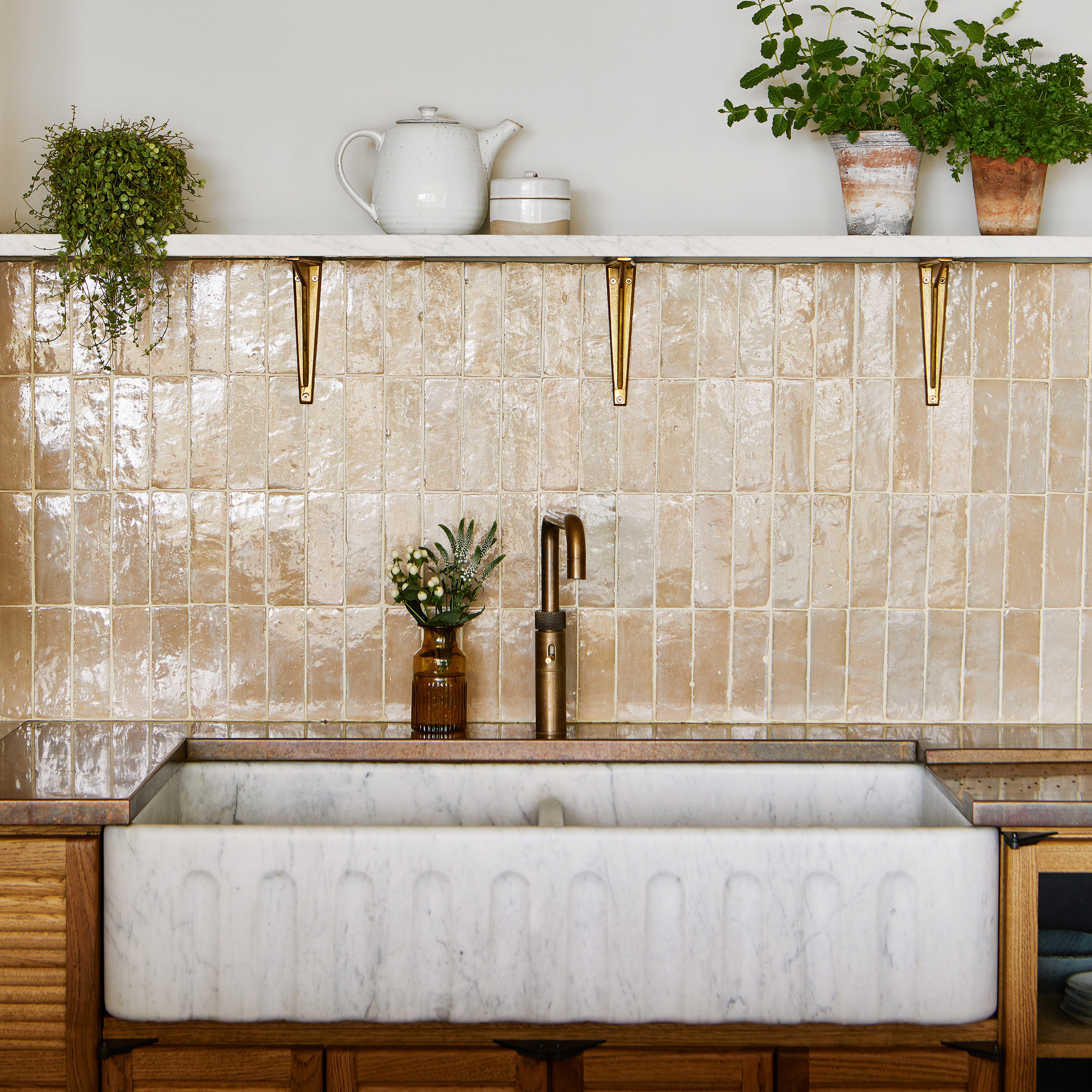
‘Phil and I disagreed over the tile choice for the kitchen splashback,' recalls Lee. He wanted a graphic style - our Bert & May tile called Rio, but I reasoned that a sandy-coloured Zellige would be timeless. I won that one, but the Rio tiles have ended up around the kitchen fireplace.'
‘Reinstated features revive character’
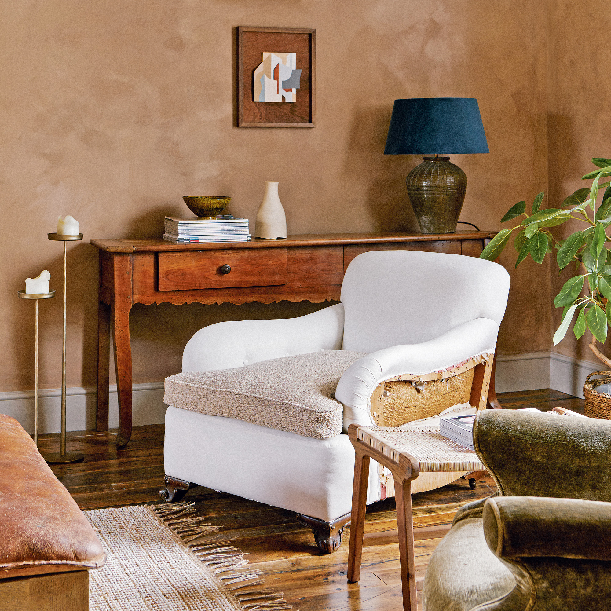
'When we bought the property, all the charm and character had been concealed,' explains Lee. 'In the sitting room, false ceilings covered the original beams, and fireplaces and stained glass windows we didn’t even know were there had been boxed in.'
'We poured a lot of time into exposing what we hoped were the beautiful bones beneath, removing everything we possibly could, without the house falling down, while respecting the original craftspeople that built it.'
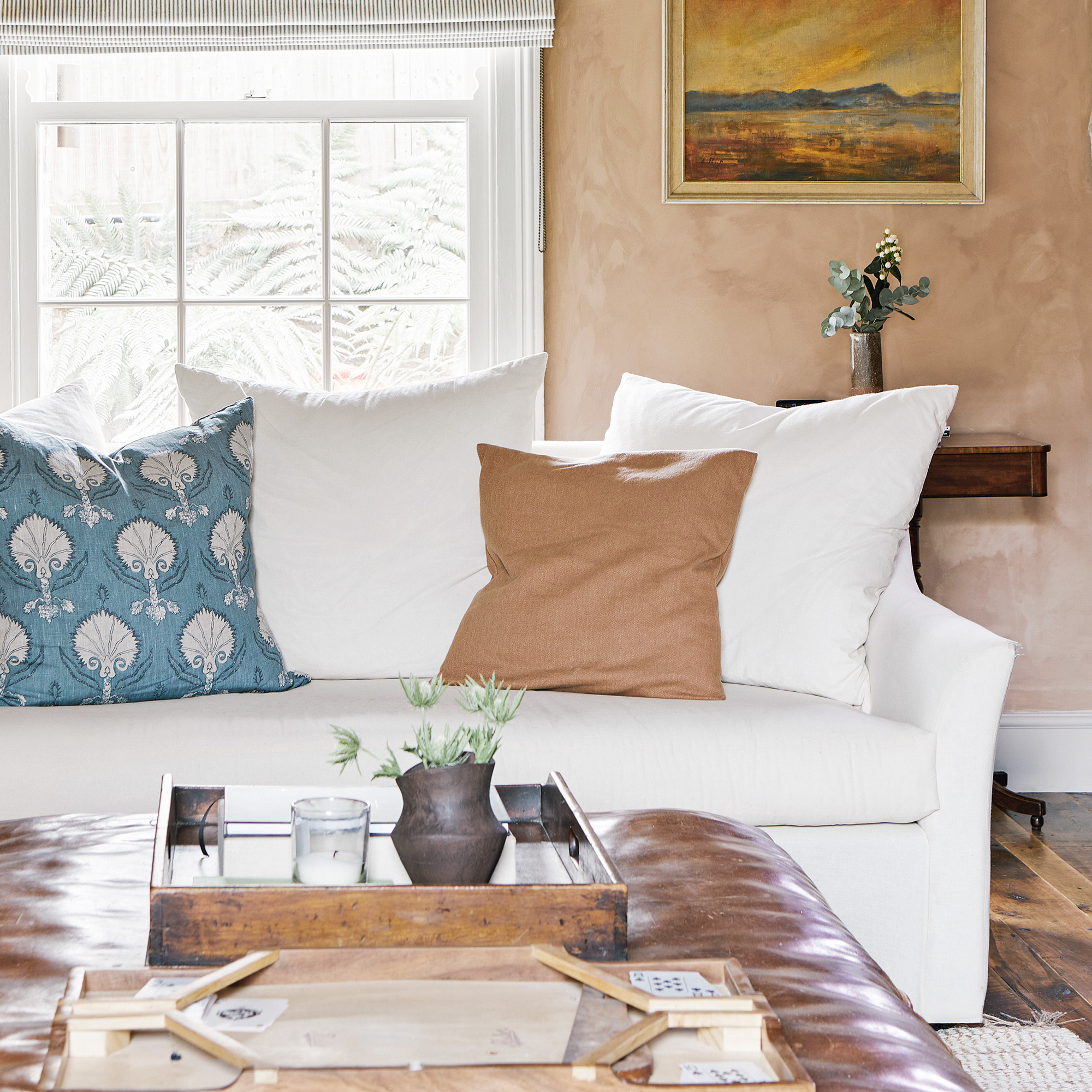
'The sitting room is a comfortable, family space,' says Lee, 'where we’ve used antique furnishings to add warmth and character.'
'To avoid a "vanilla" look, where everything is similar in look or age,' says Lee, 'we’ve contrasted an antique bookcase and console tables with a modern sofa and outsize leather coffee table, which as a whole creates a more eclectic, vintage living room, and a satisfying space to relax in.'
'Decorative tiles can be works of art’

'The Rio tiles make the chimney breast look like a piece of art,' says Lee. 'The tiles are of no practical use; they’re simply a statement of beauty.’
A knocked through, timber-clad snug area is open-plan to the main kitchen/dining space, promoting an easy sense of flow in the main living areas. 'The snug, a proper family room where we snuggle up for movie nights, is clad in salvaged timber,' says Lee.
'An earthy palette merges inside and out’
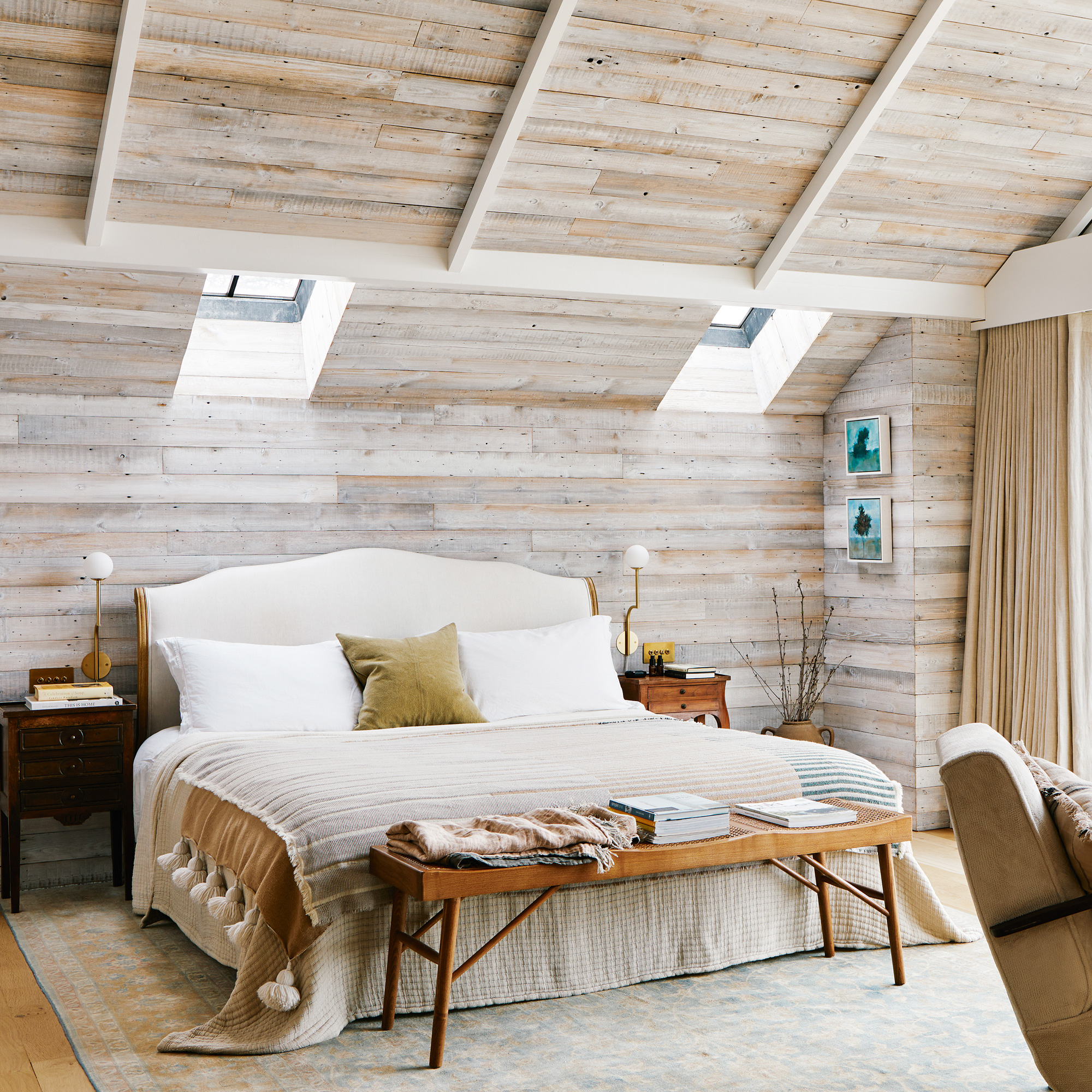
'We turned what was the sitting room into the main bedroom suite, with a freestanding bathtub in the bedroom, ' explains Lee. 'The palette of earthy tones set against natural terracotta, lime wash and real wood creates a fluid dialogue between the inside and outside.'
A warm, textured rug situated beneath the bed not only adds comfort underfoot, but cleverly demarcates the space in a large bedroom.
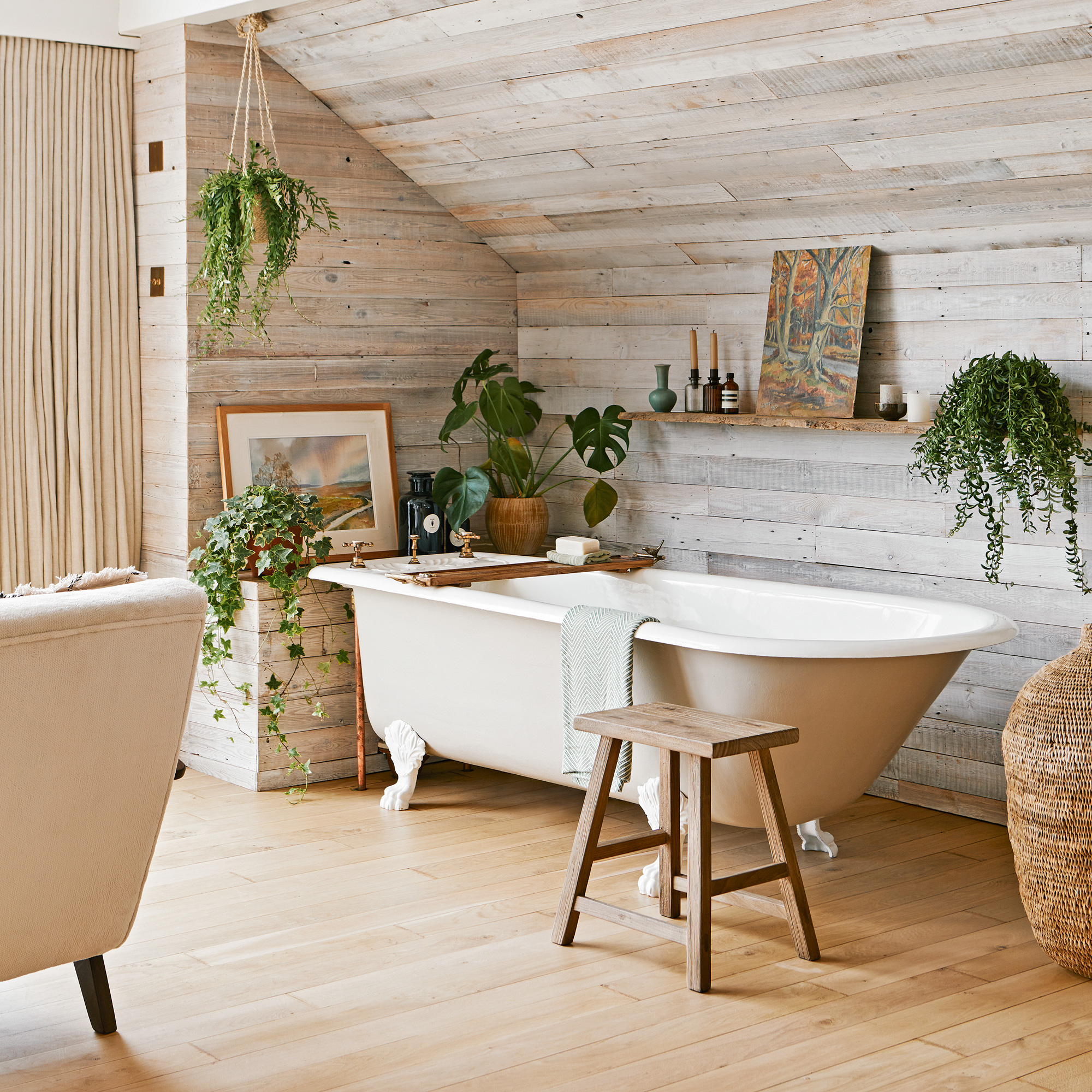
'The room has been clad in reclaimed whitewashed timber, and feels cabin-like and cosy,' says Lee. 'It’s such a sanctuary now, and there’s a lovely panoramic view overlooking the garden.'
'Unexpected elements pack a punch'
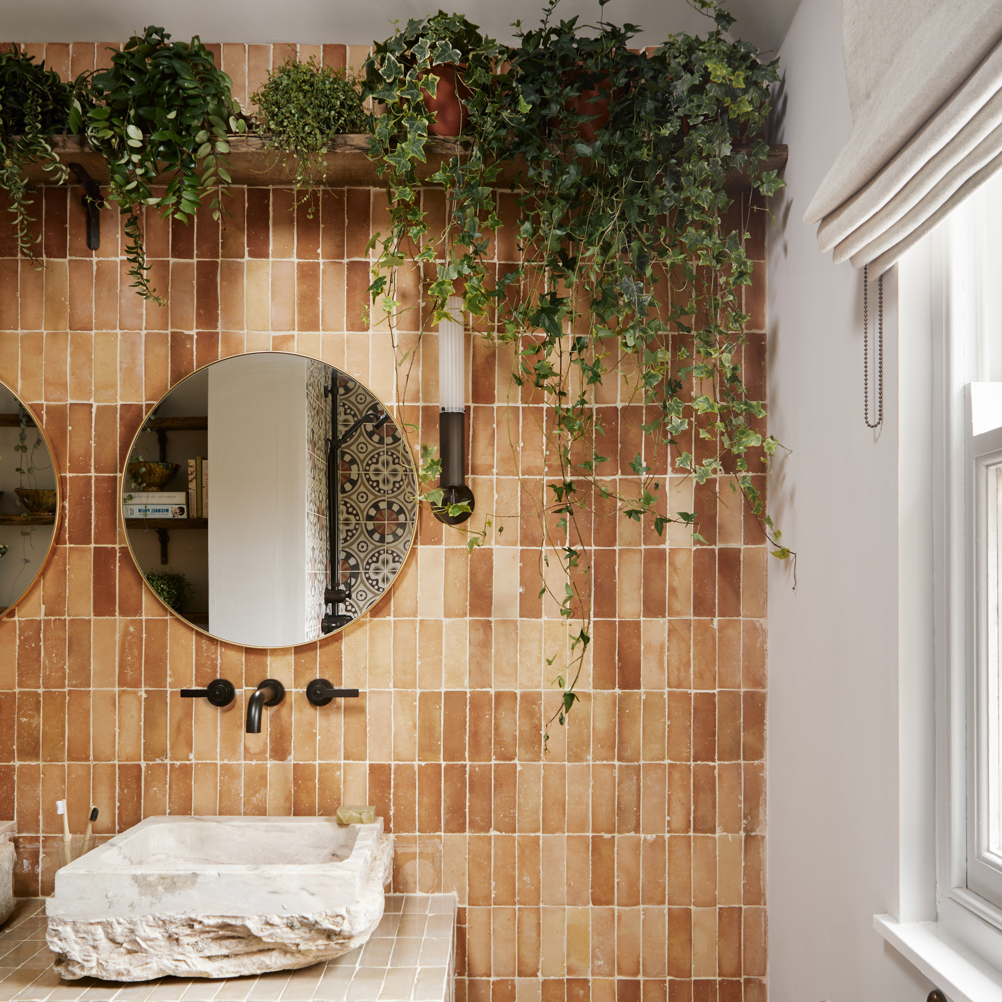
'It’s fun to make a statement now and then,' says Lee, 'and in this bathroom the abundance of greenery cascading down from a high shelf, crammed with potted plants, brings nature indoors, and always elicits an "ooh" from guests.'
'Good quality light fittings enhance a scheme'
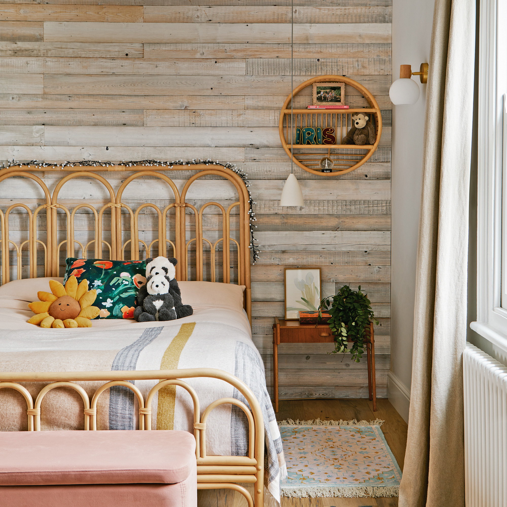
'I don’t go for big central light showstoppers,' says Lee. 'I prefer things that are simple and obviously well-made from good materials, like these in Lyla’s room.'
'Instead of choosing a single lighting style throughout, I prefer to mix things up by buying from one or two places that have a good variety, but are curated enough so that whatever you’ve chosen, it’s all going to work together.'
Get the look
Available in two sizes and in clear or opaline glass, this classic pendant shade adds a classic edge without drawing focus in a space.
With a design that was based on a reclaimed tile from southern Spain, this beautfully patterned cement tile can be used in high traffic areas on on walls, floors and even outdoors.
This classic French-style bed comes in double, king and super king sizes and upholstered in your choice of 139 fabrics for a truly bespoke look.
Also available in Teal, Rust and Grey, this handy bedroom storage ottoman is the perfect spot to store extra bedding (or toys).


