
The striking, monochromatic US Embassy in Oslo, which opened in 1959, was one of only three buildings in Europe by Finnish American architect Eero Saarinen. As a result of increasing security concerns from the end of the 1990s onwards, fences, bollards and armed guards were gradually installed around the building, rendering it fortress-like and impenetrable. This was the polar opposite of the original intention, explains Jonas Norsted of architecture practice Atelier Oslo, who worked alongside another Oslo-based firm, LundHagem, on the building’s restoration and extension.
Modernist US embassy in Oslo restored
'As well as being an embassy, it was initially also conceived as a “cultural house” open to all,' he says. 'It had a public library with American literature and jazz and rock’n’roll records, an auditorium for film screenings and an exhibition hall. It even had a canteen for office workers that was also open to the public. This is where I had my first hamburger ever, back in the 1980s.'
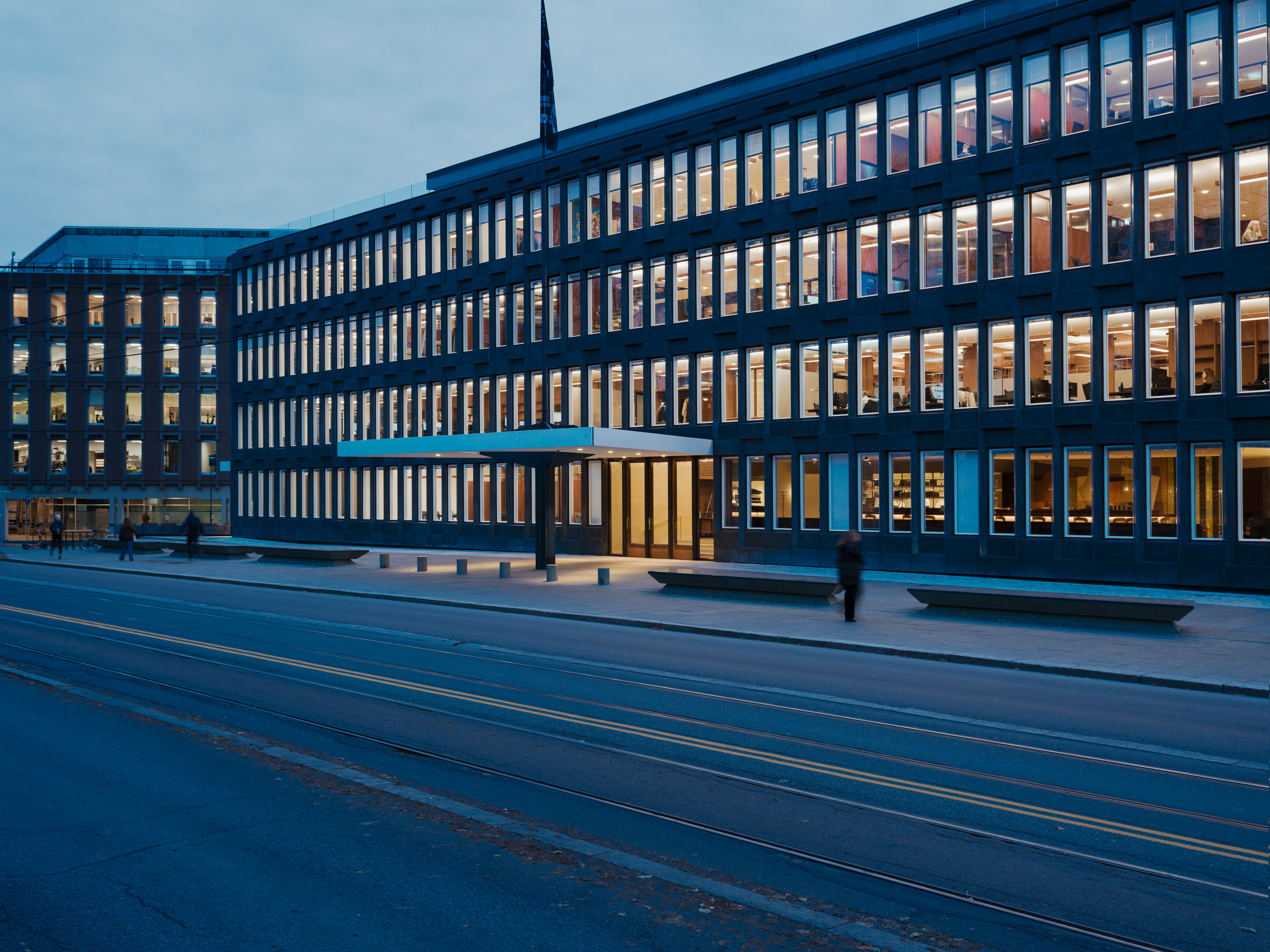
After moving the embassy out, the US government sold the building in 2017 to Norwegian real estate developer Fredensborg, and it was immediately placed under stringent historic preservation orders. From outside, the former embassy stands out for its triangular shape, unusual geometries and rich but subtle detailing. 'The black and white play off one another,' says Norsted, adding that 'Saarinen likened the facade to a gentleman wearing a tuxedo.'
Indeed, the contrast between the pre-cast black concrete and labradorite on the exterior (made of a single relentlessly repeated module with an in-and-out pattern), and the 577 recessed white windows, make for a handsome and somewhat iridescent building that appears to oscillate as the light changes and moves across it during the day and night. Contrary to the trend at the time, the façade was not just aesthetic but also load-bearing, says Norsted, helping support the weight of the building. An interesting extra detail is the fact that the 12m x 9m steel and concrete canopy over the main central entrance, the only entrance facing the Royal Palace, was designed by Cesar Pelli, an intern in Saarinen’s firm at the time.
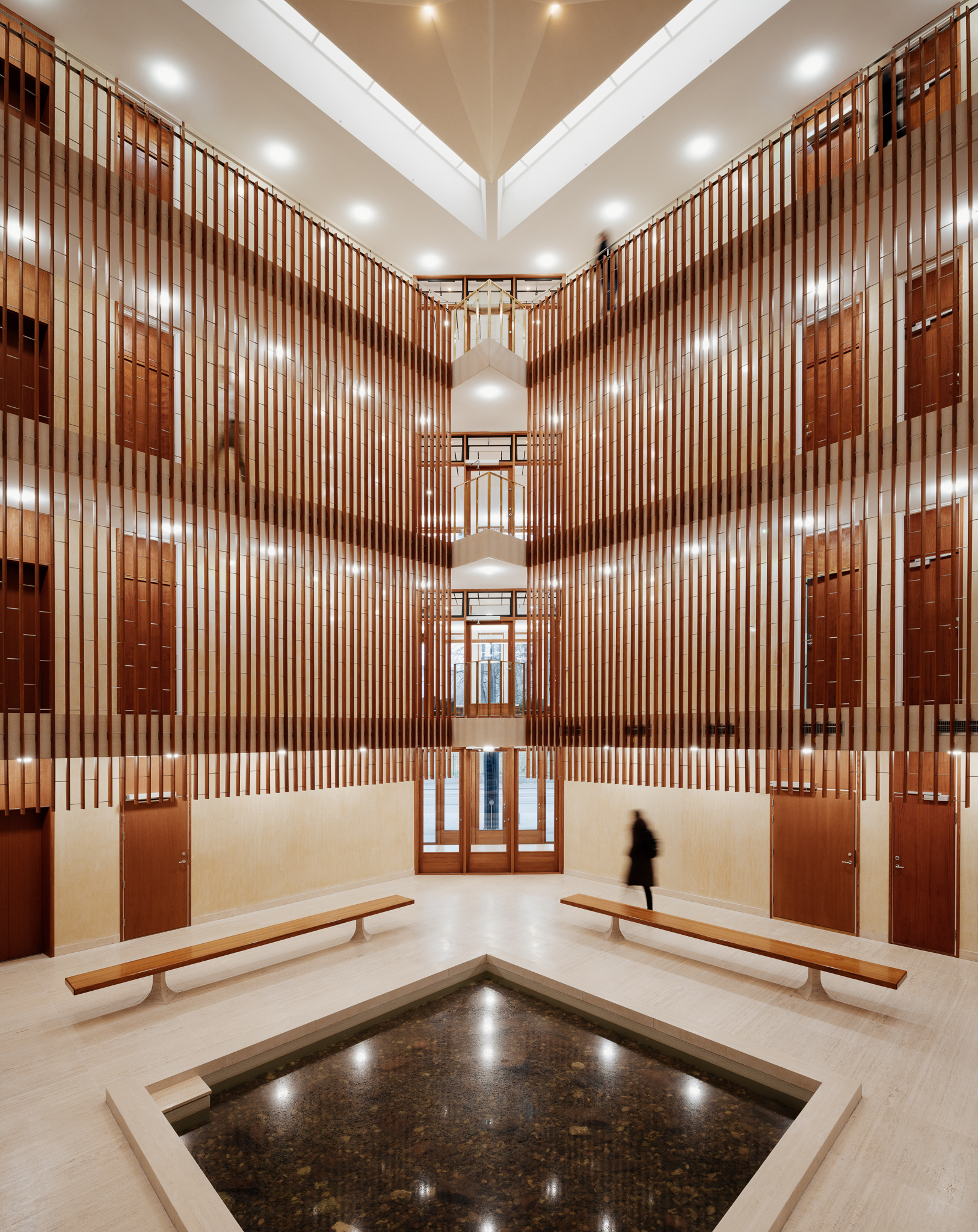
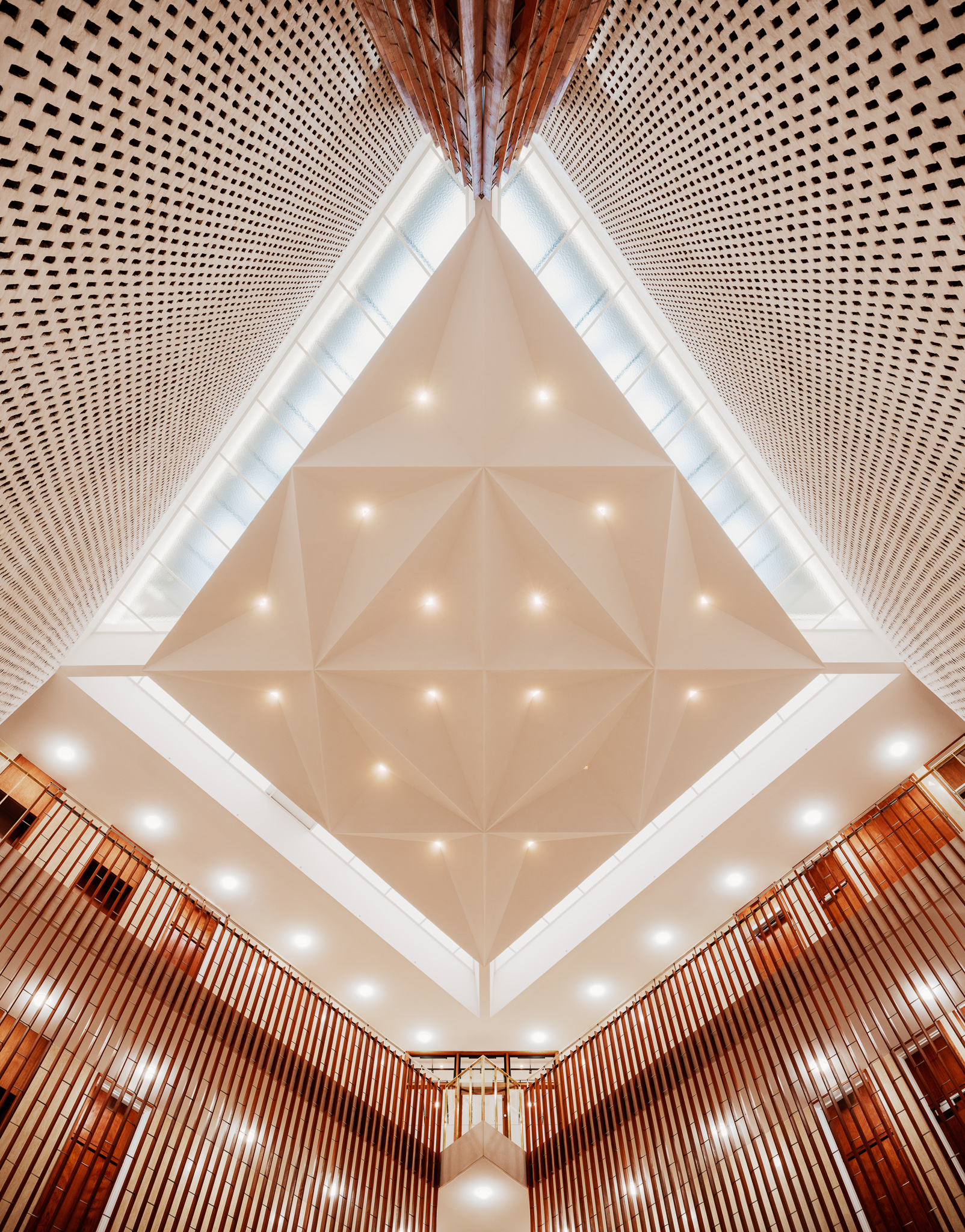
The contrast between the austere, dark and powerful exteriors and the bright and airy interiors is also notable and deliberate. The central entrance leads through a travertine marble-clad lobby to a diamond-shaped atrium replete with koi pond that spans the four main floors and is topped by a reconstructed suspended faceted concrete and plaster ceiling featuring triangular patterns and framed by glazing.

Two of this central court’s walls are built out of white-painted brick, creating a grill pattern, while the other two feature sleek and sophisticated vertical teak ribs that extend from the second to the fourth floors. These 900m of teak slats, and the other 16,000m (or 16 km) of original teak window strips, frames and sills were meticulously restored, sanded and painted or oiled for the restoration.
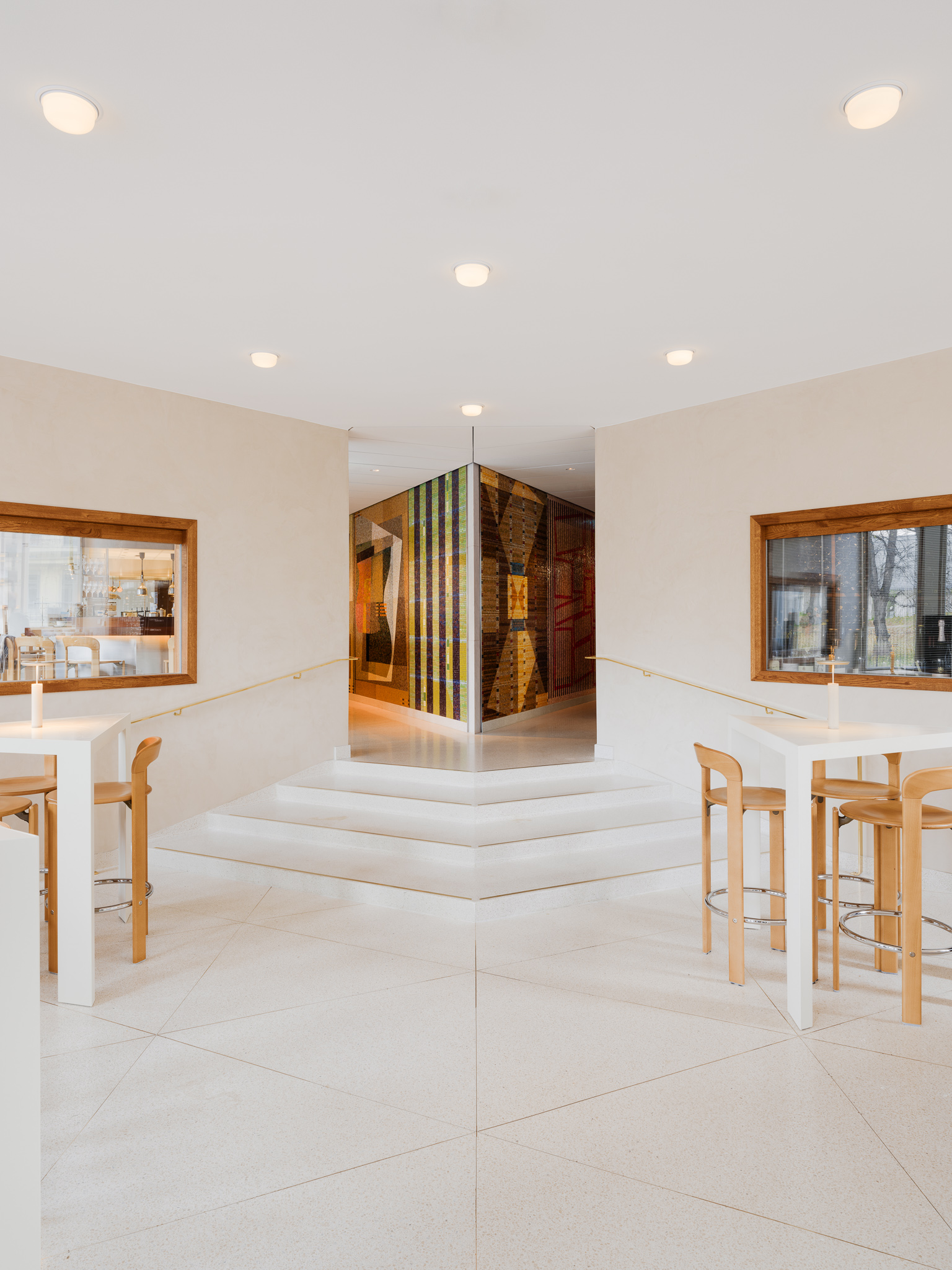
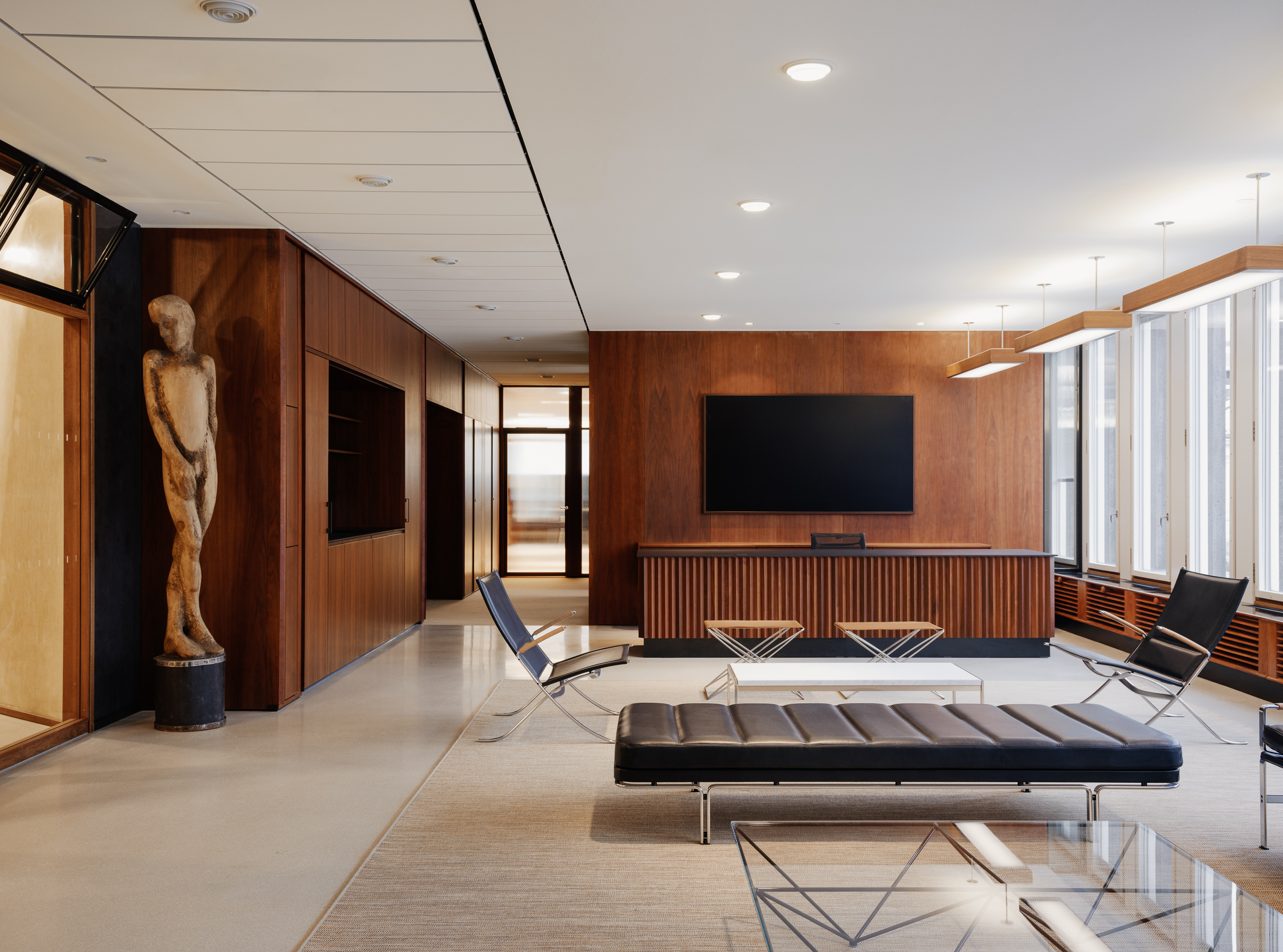
'When we started the work, the building was in quite bad shape, both technically and in terms of materials and there was little of the original atmosphere left,' says Norsted. 'We studied old drawings and photos to recreate the architectural quality and atmosphere the building used to have and all the new additions were made to fit in with the old. Almost 80 per cent of the interiors are new but reconstructed from old photos or historic references from that period.'
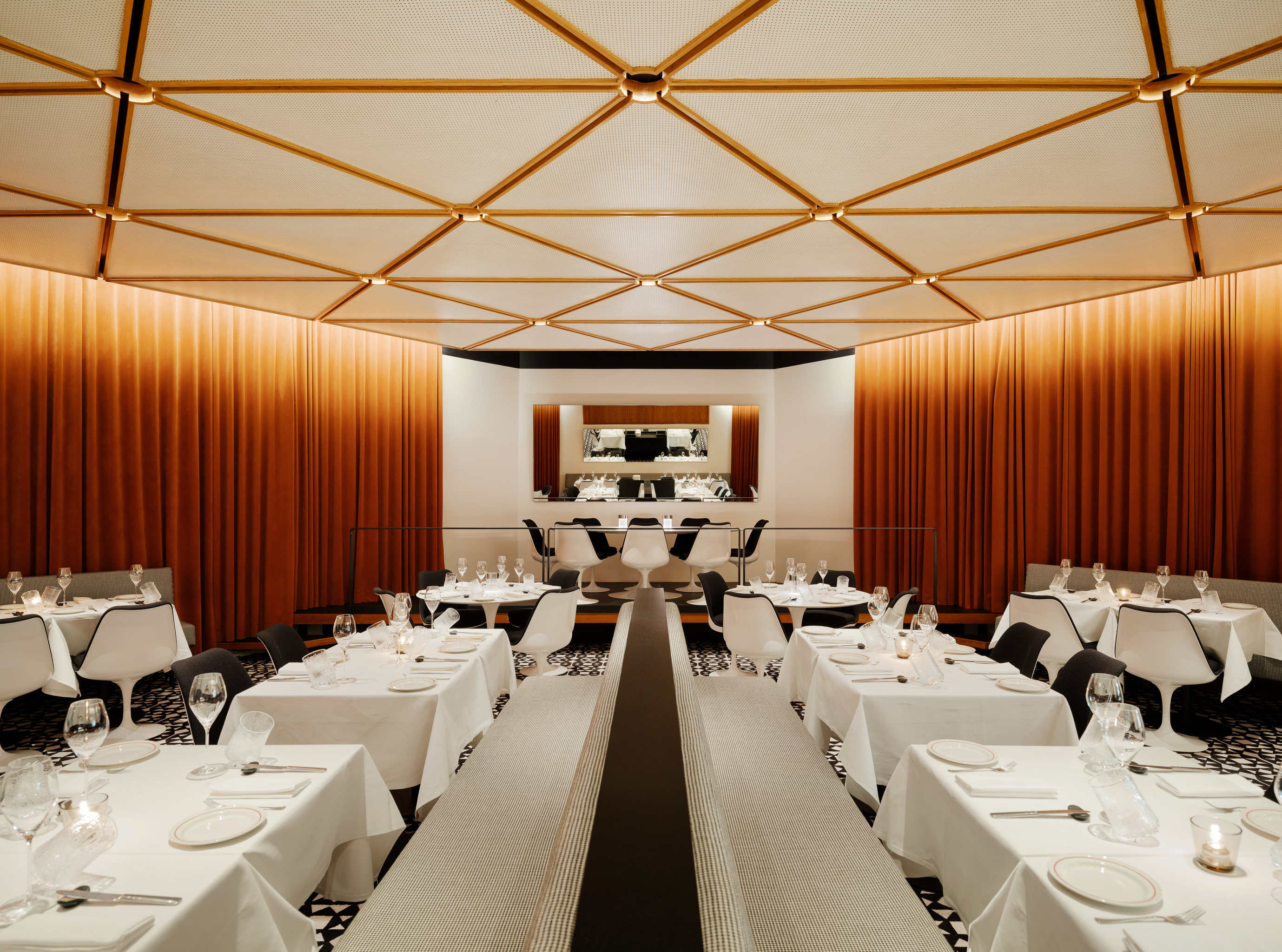
One totally new and contemporary insertion is a large glass mosaic by Australian artist Diena Georgetti in the ground floor wine bar and café, which like the other dining spaces was designed by interior architects Paulsen & Nilsen.
More significant insertions and changes to the building are a new rooftop bar and restaurant with a 360-degree terrace built on what was used as the technical floor, and a massive new 14m-deep basement. These two gestures combined have allowed the building to extend its floor space by 60 per cent and its capacity tenfold, and the building now houses three floors of office space used by its owner, Fredensborg, as well as SOS Children’s Villages and Amnesty International, three restaurants and an events and meeting space and state-of-the-art fitness centre below ground.

Creating the basement section involved excavating 16,500 cubic metres of rock and stone and installing 256 steel piles say the architects. The air intake was moved away from the building and doubles up as two light atriums bringing daylight into the new basement floors. Remarkably, this major extension did not alter the building's external appearance. But this wasn’t just important for listing and aesthetic reasons, says Norsted, it was as if the building demanded it. 'The building itself has such a strong character and geometry that each time we tried to “invent” something new, it appeared really out of place. So we always had to go with the building’s logic and not against it.'


