reMarkable 2: Two-minute review
It was launched back in March 2020, but the reMarkable 2 is still one heck of an e-paper tablet. So I’m not surprised that the company hasn’t bothered to release a third iteration of this popular device, instead improving on the second-gen model via firmware updates.
When we updated our original review from 2020 in August 2022, the reMarkable 2 was already a vastly improved tablet over the original model and had features that didn’t exist when the second generation launched – like Google Drive, Dropbox and OneDrive integration, a document drawer, screen sharing, and notes for PDFs and ebooks. In December 2022, reMarkable rolled out version 3.0 of its firmware which, since then, has made the second-generation tablet even more, well, remarkable – prompting us to update the review again.
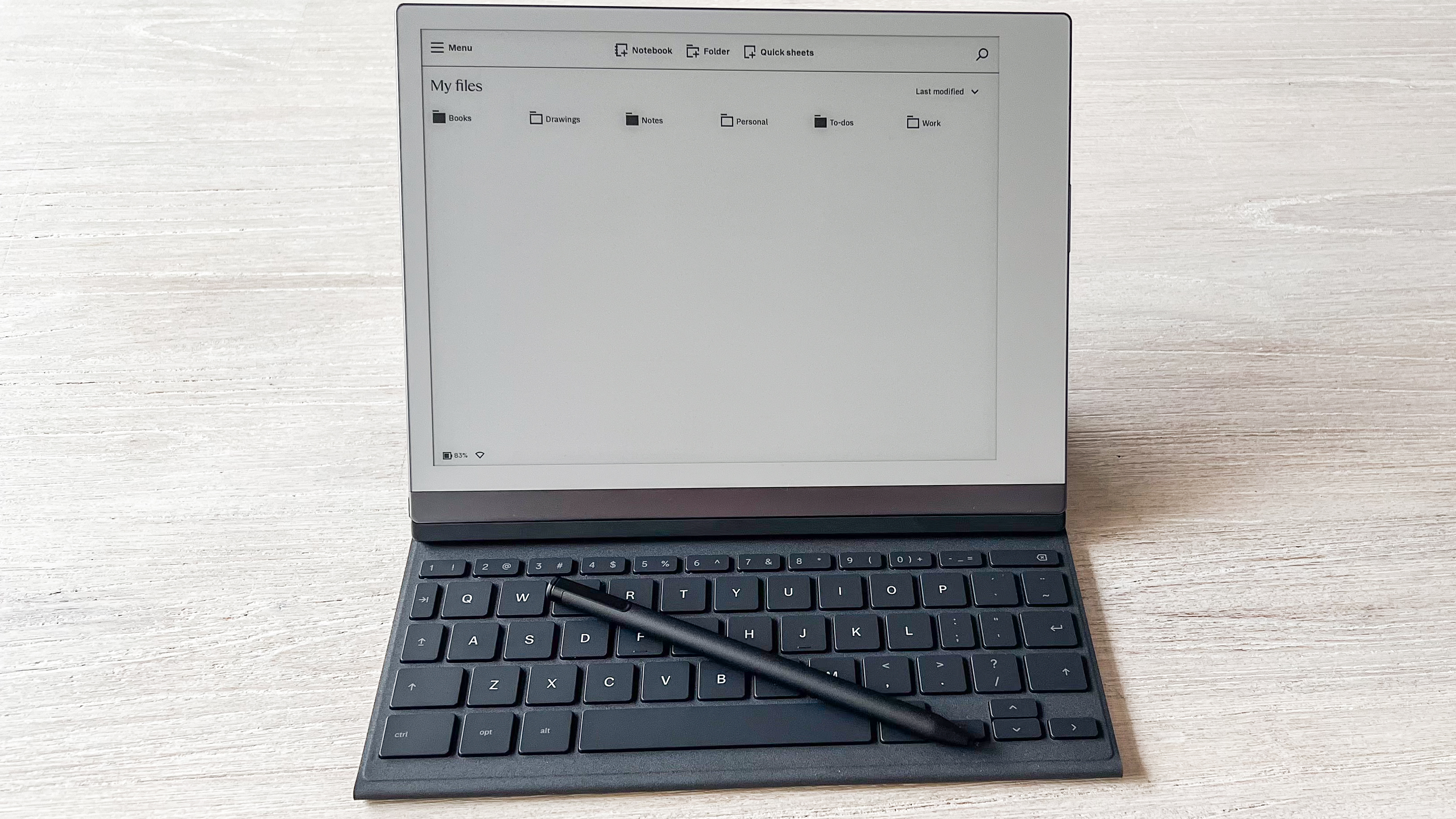
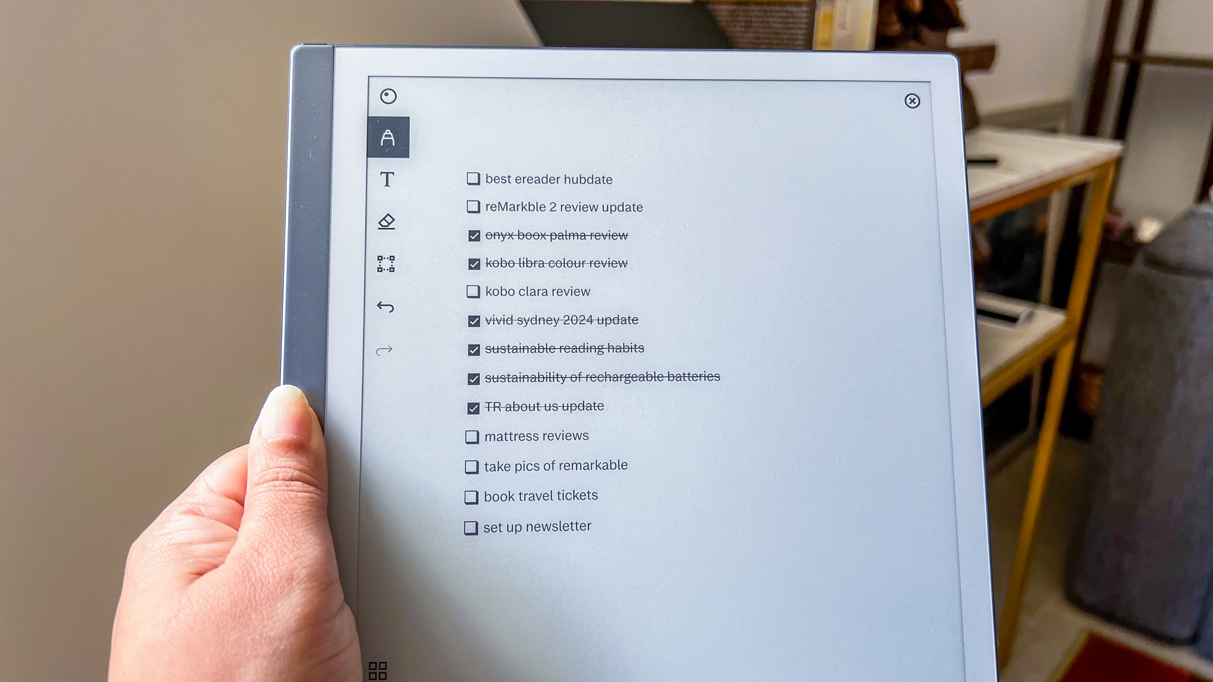
At its heart, it’s still the same device we fell in love with – designed for creating and syncing your ideas to the cloud so you can access them no matter where you are. All the features that got added to it over the years makes it hands-down the best note-taking tablet money can buy. Some of the newer features I’m particularly fond of include the handwriting-to-text conversion software, the checkboxes on todo lists that strikethrough tasks automatically, and support for the Type Folio that was announced in March 2023. This last accessory, in fact, makes the reMarkable 2 a fantastic E Ink laptop, complete with keyboard shortcuts, although the lack of a browser on the tablet limits its use.
The eraser on top of the Marker Plus stylus is also now more precise, and I think it’s the best e-paper tablet for signing documents, with absolutely no input lag. This is also what makes the reMarkable 2 a great digital sketch pad.
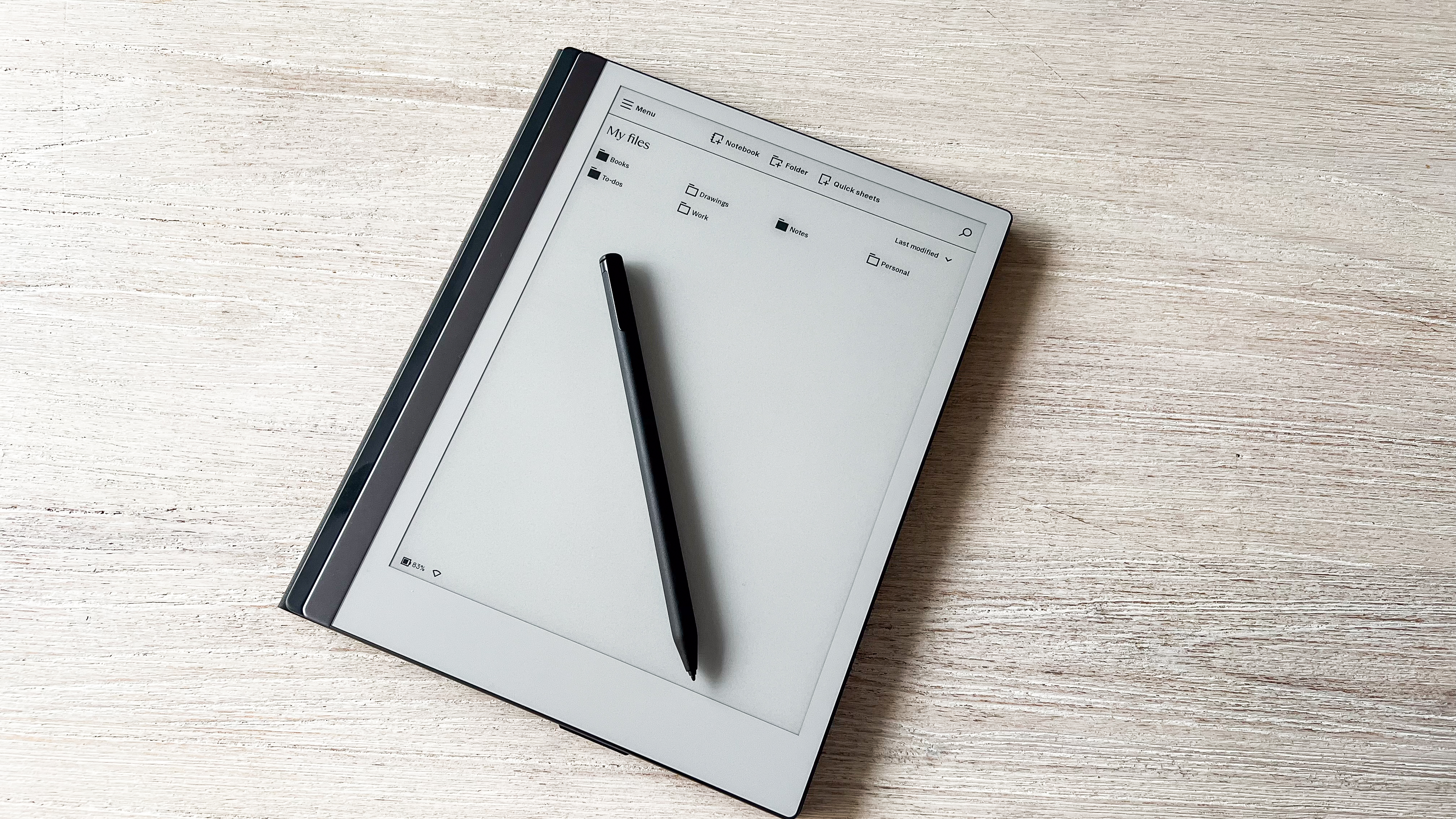
It’s also the most good-looking 10-inch tablet I’ve tested, arguably the thinnest too. The silver-grey trim on one bezel of the metal chassis and the barely-there power button make it look really sleek and premium. I also appreciate the little pads to protect the rear panel. And the matte finish on the rear camoflages most of the fingerprint smudges.
Without a bookstore or access to other applications, that’s essentially all the reMarkable 2 is good for and in its single-minded note-taking functionality, it excels. However, it takes time and patience to discover all the useful features. reMarkable has guides and tutorials online and on the device and they don’t even begin to scratch the surface.
What really sets its back is the lack of frontlighting for the screen, which means you can’t use it to read before bed with the lights off – something I love to do and am disappointed that the reMarkable 2 won’t allow for it.
It’s also an expensive device, especially when you take into account the cost of the accessories, including the replacement pen nibs – putting it out of reach of many users.
reMarkable 2 review: price and availability
- Announced March 2020
- Launch price of $399 / £399 / AU$679 for the tablet + pen bundle
- List price of $299 / AU$499 tablet only; sold as bundle for £379 in the UK
When the reMarkable 2 launched back in 2020, it was only available directly from the company as part of a bundle that also got you a Marker (as the stylus is called).
Now you can purchase the tablet on its own directly from the company in some markets – it’s $279 in the US and AU$469 in Australia. The pens will set you back $79 / AU$119 for the Marker and $129 / AU$199 for the Marker Plus, the latter featuring a matte finish and an eraser on the top.
For the UK, however, reMarkable is still listing bundles only, with the Marker bundle setting you back £379 and the Marker Plus bundle costing £419. In the US and Australia, the bundles cost upwards of $378 / AU$618, depending on which pen you choose. Add in a folio and that price increases.
The good news is that the reMarkable works with other capacitive styli, so you can buy just the tablet and find a cheaper pen for it but the Markers are part of what makes the writing experience the best there is.
At this price, the tablet will be a hard sell for some – it’s more expensive than the entry-level iPad, for instance, which offers vastly more functionality through its color screen, App Store access and full multimedia support. Given the Amazon Kindle Scribe and the Kobo Elipsa 2E feature not just note-taking, but also access to bookstores on a front-lit screen, they offer more value than the reMarkable 2 at their respective prices of $339 / £329 / AU$549 and $399.99 / £349.99 / AU$629.95. They have more onboard storage too.
But for artists and note-takers, the ReMarkable 2 is a unique and focused experience worth considering – it doesn’t do as much as Apple’s tablet by a long shot, but what it does do it does incredibly well.
• Value score: 3 / 5
reMarkable 2 review: specs
reMarkable 2 review: design and display
- Sleek, minimalist design
- Only 4.7mm thickness
- Screen lacks lights
There was a time when the reMarkable tablet would have been a novelty, one of the first note-taking e-paper tablets to make it to market. Not so any longer with competition from Amazon, Kobo and Onyx. Despite that, the design of the reMarkable 2 is still arguably the best, making it one of the most beautiful e-paper tablets on the market with a minimalist aesthetic.
Measuring 187 x 246 x 4.7 mm, it’s still the world’s thinnest tablet and tips the scales at 403.5g, which is 30g lighter than the Amazon Kindle Scribe, although a smidge heavier than the Kobo Elipsa 2E that weighs in at 390g. You wouldn’t be able to tell the difference in real-world use though, with the white bezels and the dark silver edge of its aluminum frame giving it an airier feel over its clunkier-looking Kobo counterpart. The Kindle Scribe also sports a metal chassis and yet looks a touch bland compared to the reMarkable 2, which really does exude some serious oomph in the looks department.
The move to an aluminum frame from plastic in the original reMarkable is particularly handy, as it lets the reMarkable 2 make use of magnetic accessories, such as snap-on covers, as well as the more recent keyboard folio.
The rear panel features four tiny, slightly-raised rubber feet that stop the tablet slipping when writing on a table. A small power button sits on the top-left edge, while a USB-C port mars the bottom left corner.
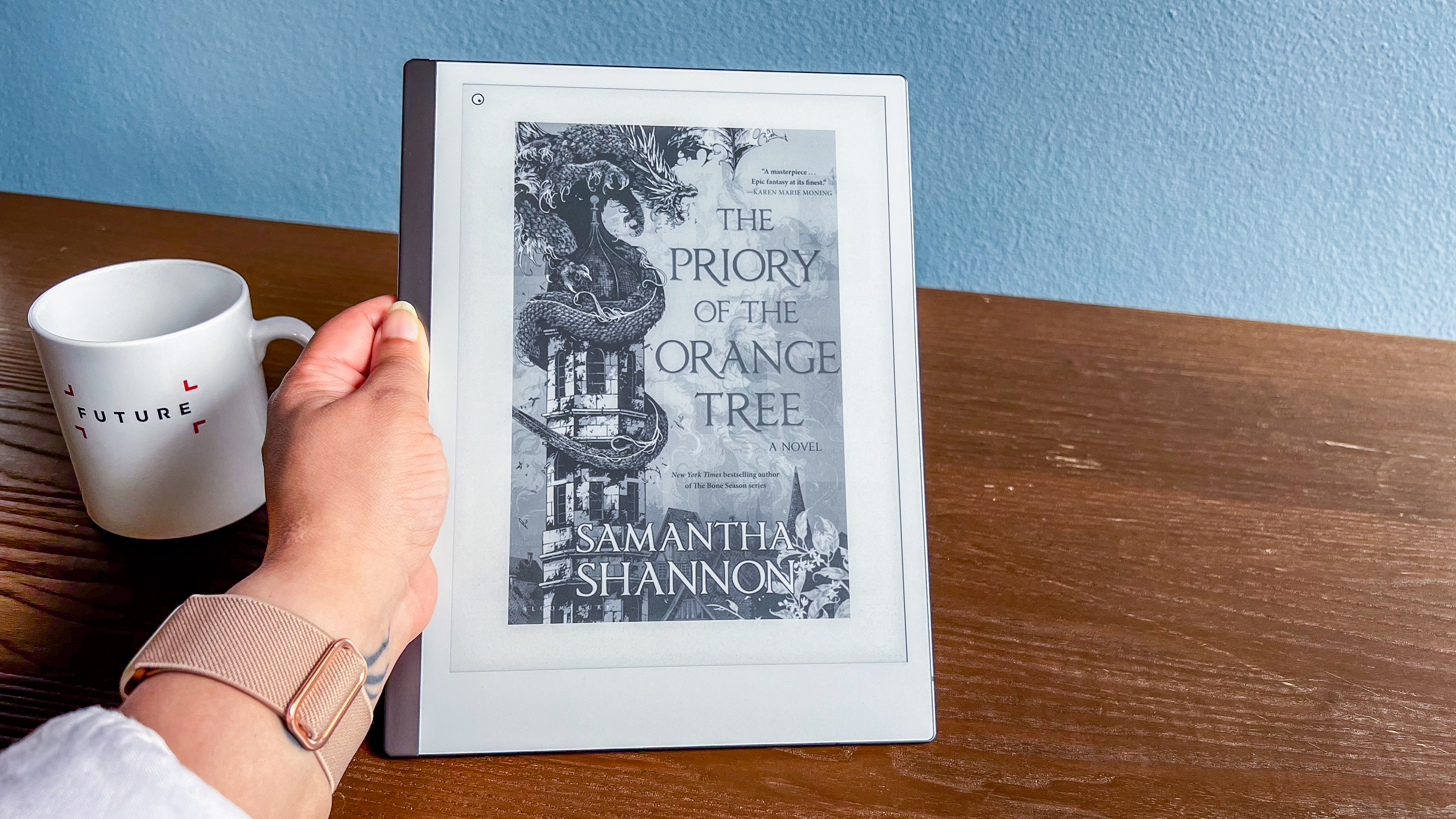
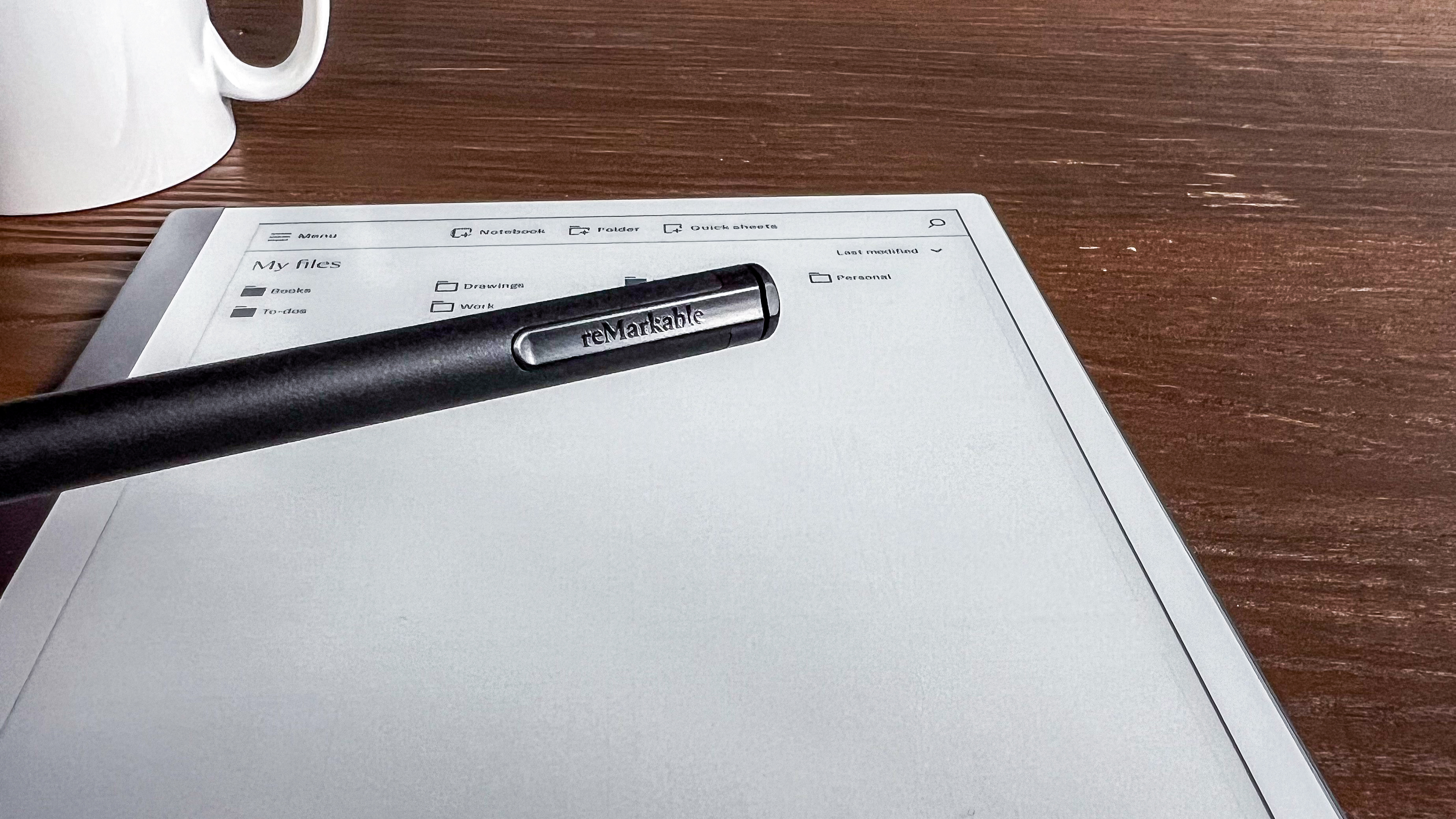
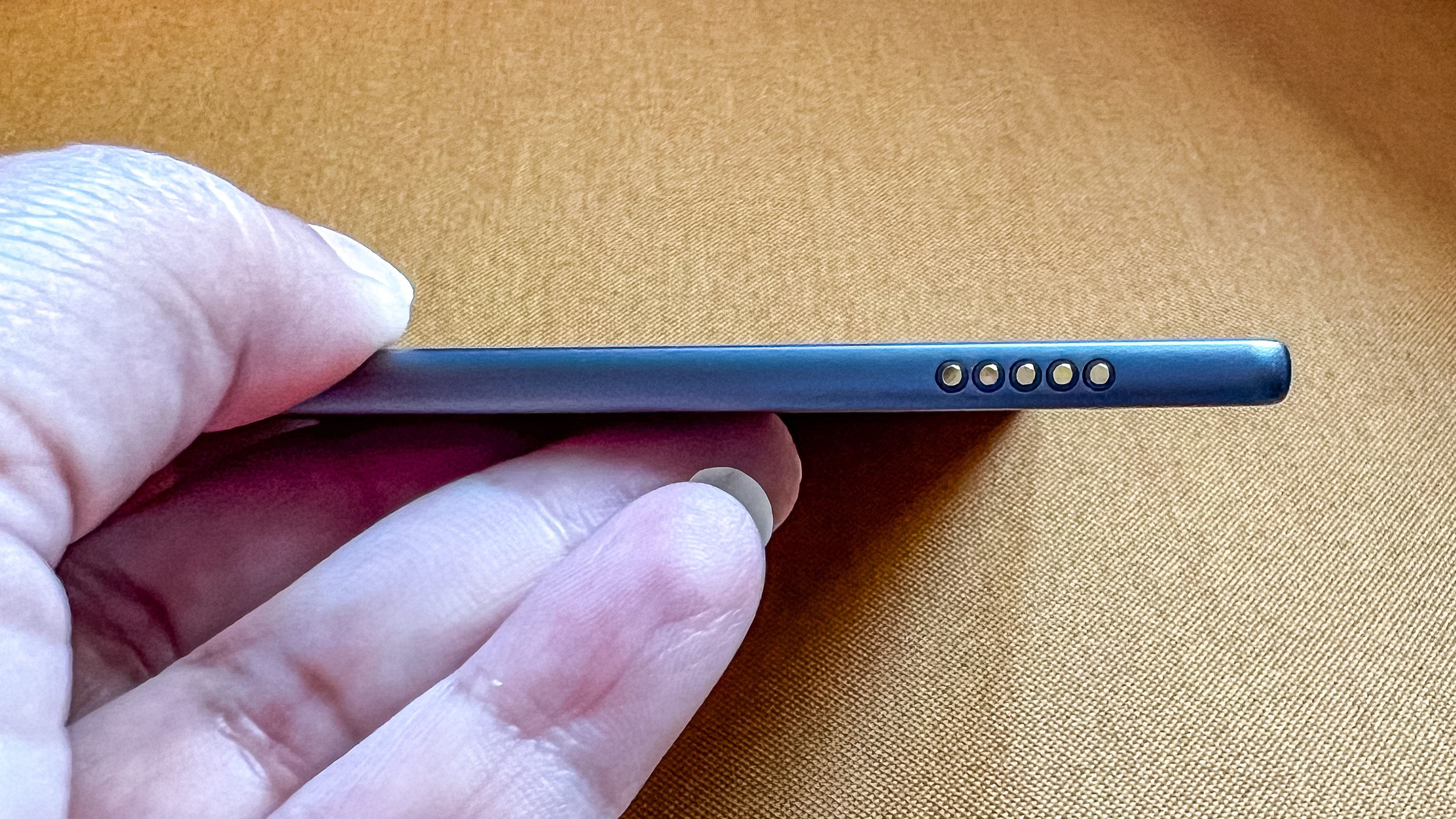

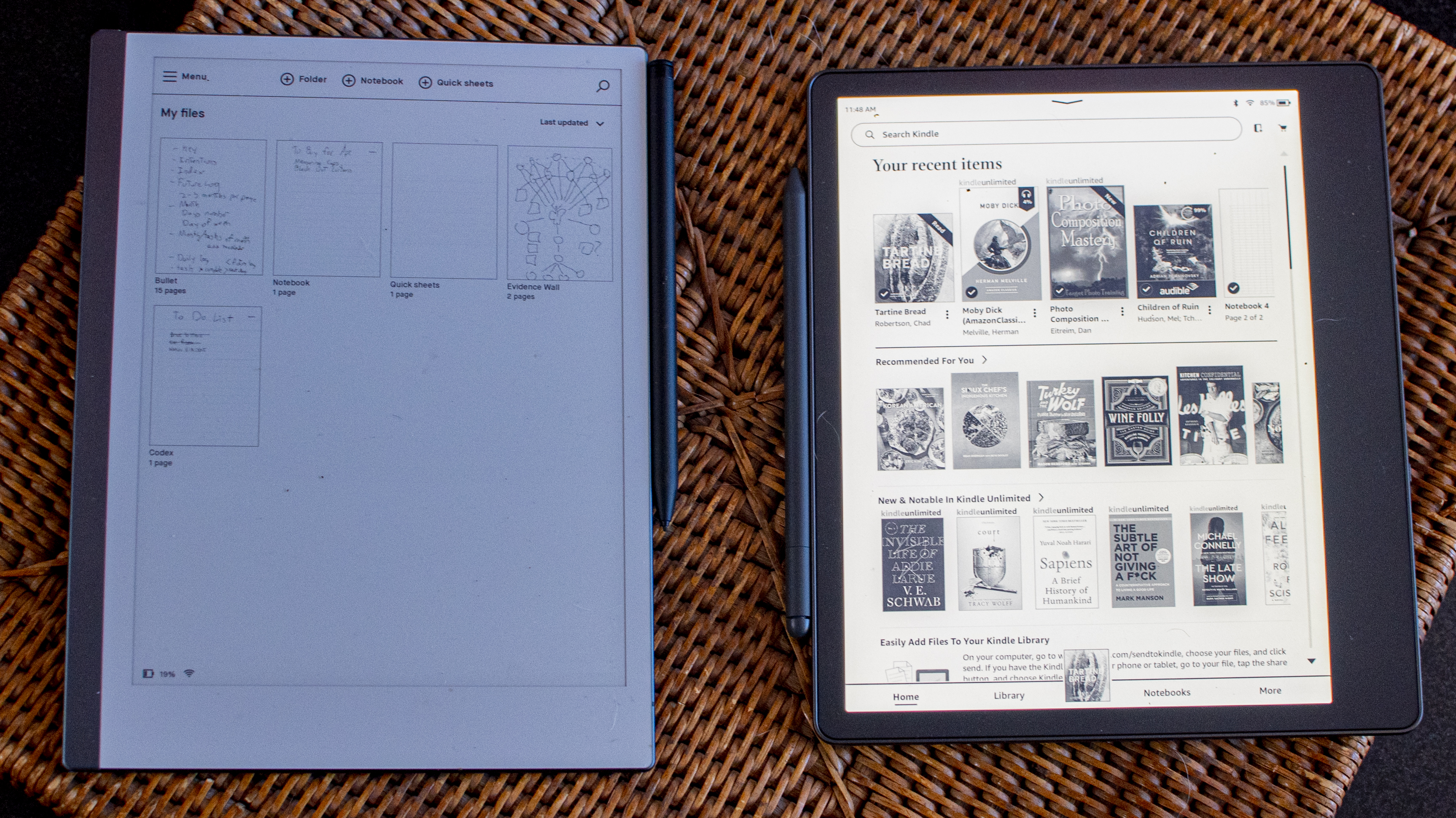
The flush screen is a 10.3-inch modified monochrome E Ink Carta display that reMarkable calls Canvas. It’s been optimized specifically for stylus input. With a 226ppi resolution, it’s decently sharp, although it now looks a little lackluster alongside the Kindle Scribe’s 300ppi E Ink Carta 1200 display. Still, it’s easy on the eye, with just enough friction to make you believe you could be writing on paper.
Where the reMarkable tablet disappoints is in the lack of lighting for the screen – there are no LEDs here, so you can’t use this in the dark like you can other e-ink tablets.
A stylus called a Marker is included if you buy a bundle and it magnetically secures to the right edge or on the top of the right bezel. It’s very finely textured to provide some grip and the more expensive Marker Plus includes an eraser on the top. Both pens are of a comfortable thickness and length, and superbly weighted for longer writing sessions. However, like a real pen, their tips don’t last forever. Though each pack comes with 10 replacements, you’ll need to change them out after three to seven weeks of use according to reMarkable’s website, or longer if you aren't constantly writing – but it's an additional cost that could soon add up.
• Design & display score: 4 / 5
reMarkable 2 review: Software and user interface
- Minimalist UX
- Useful tools available to enhance note taking
- Handy smartphone and desktop software
The reMarkable 2 has a near-singular purpose – to make writing on a digital device enjoyable and it pulls that off in great fashion. And its user interface reflects that singular purpose.
The Linux-based Codex operating system kicks off with a quick tutorial that has you set up a reMarkable account for cloud document syncing, and walks you through some quick tips on how to use the tablet, and then you hit the home screen.
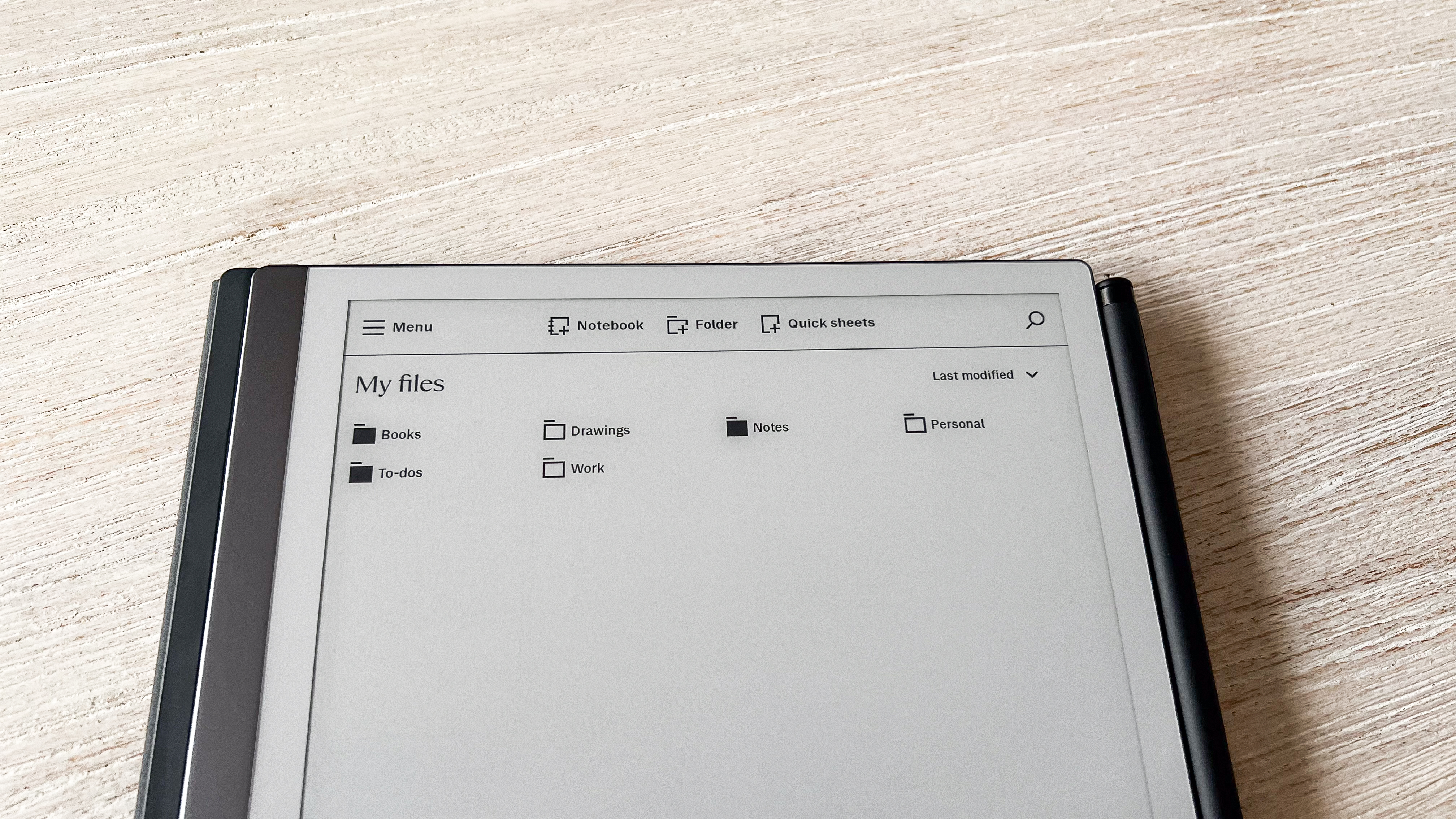
It’s here where a grid of your documents is shown, which can be organized into folders, as well as letting you start off new Notebooks (which auto-populates with as many pages as you need) or a Quick Sheet which lets you quickly start jotting away in an instant.
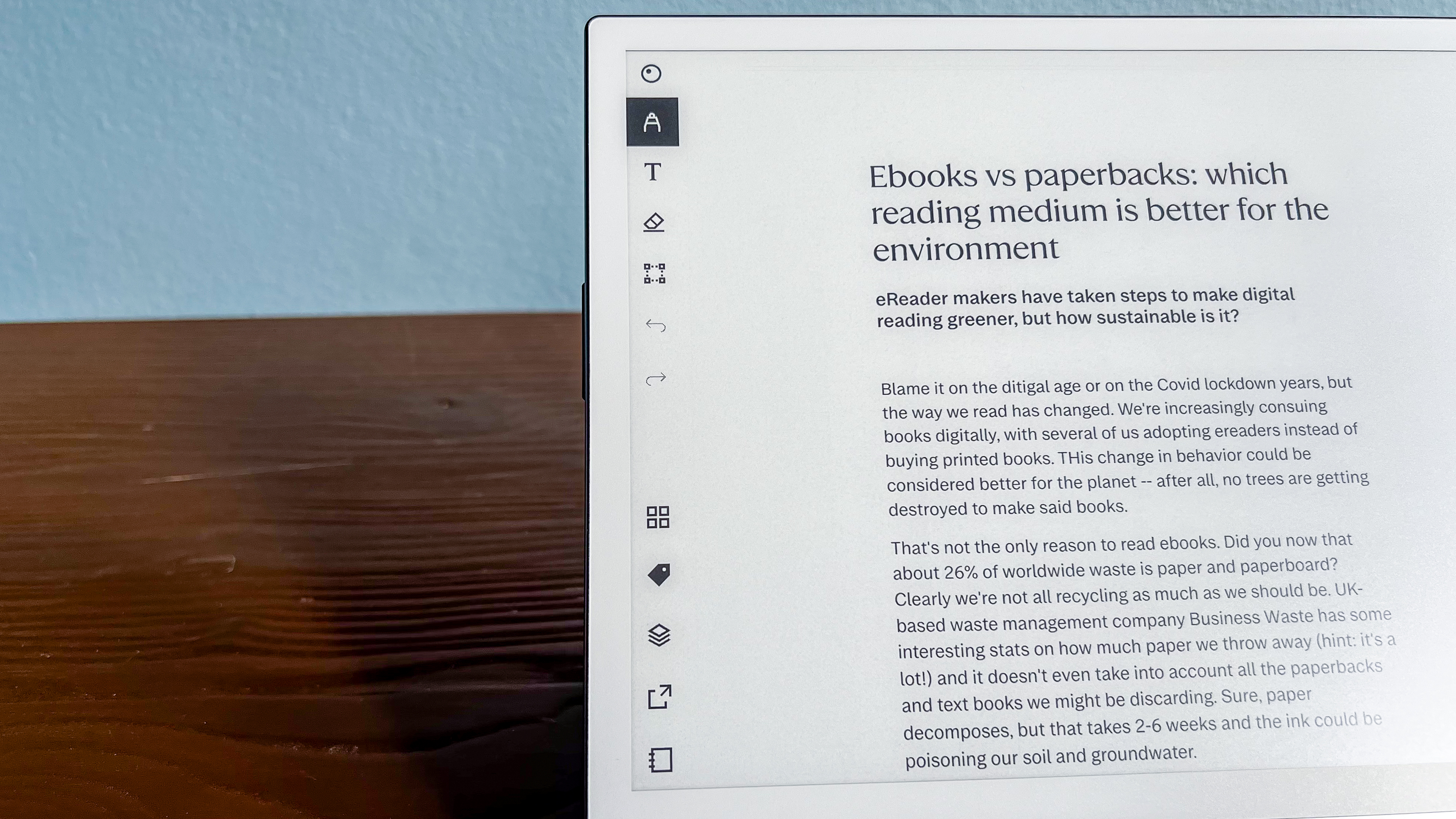
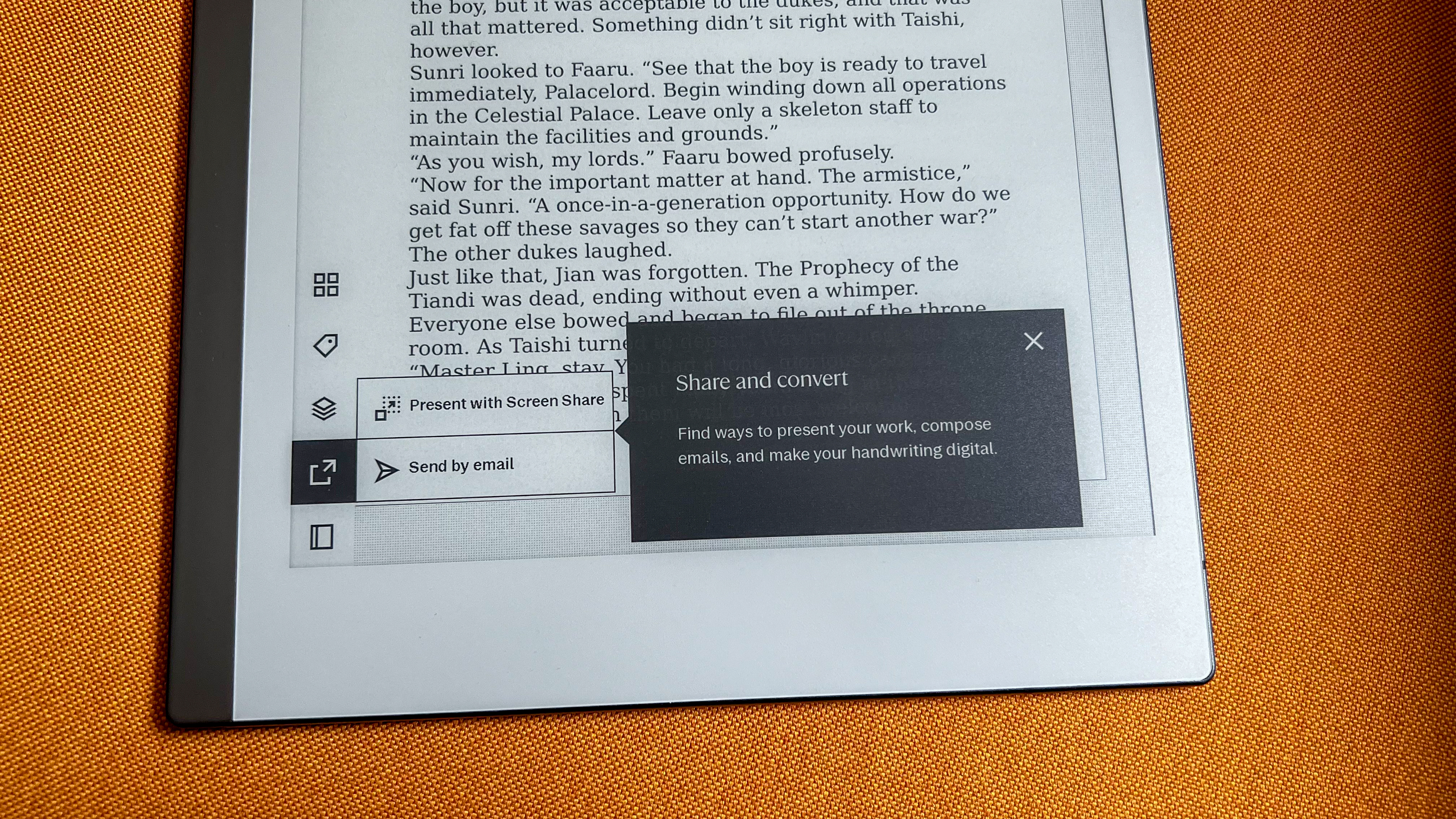
All pages can start either blank, or have one of 35 preset page templates applied to them, ranging from storyboards to perspective grids, week planners and simple lined, margined pages. You’re then able to scribble all over them, add layers and more, with multiple pen types and sizes ranging from charcoal-effect pencils to paint-brush strokes at your disposal. As you’d find with a computer drawing application, there are buttons to zoom in to fine details, make area selections and undo or redo stay line strokes. It’s a great, well-featured drawing experience.
Perhaps even more impressive though is the experience when you start writing. The reMarkable 2 supports and recognizes 33 languages, and can not only identify block letters, but cursive input too. This means that it can read and interpret your scratchy handwriting, and convert it into a text document that you can email for editing in a word processor later. It’s not perfect, and the clearer your handwriting and grammatical marks the better. It was able to recognize my handwriting well, and it can handle some spidery scrawls, but I think Kobo’s handwriting recognition is superior.
Annoyingly, however, the handwriting-to-text function is only supported on the tablet, meaning you’ll have to decipher your scribbles manually if you’re viewing them on the mobile or desktop interface.
These apps speedily sync with your tablet, and are available on iOS, Android, Mac and PC. Though they don’t support any handwriting entry themselves, they otherwise more or less mirror the tablet interface, with the addition of being able to import and export files to and from the tablet wirelessly.
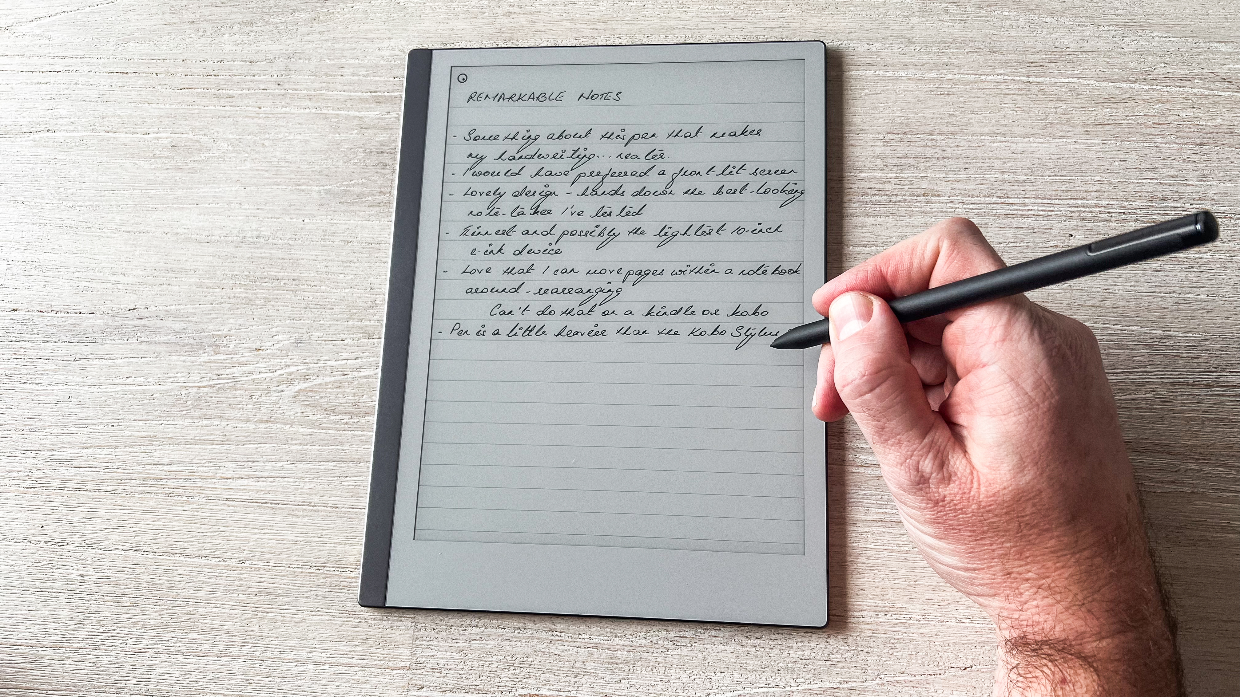
Anything you make using the reMarkable 2 can be shared over a Wi-Fi connection, with the tablet supporting both 2.4GHz and 5GHz standards. While you can email documents directly from the tablet, you’re likely going to find the reMarkable mobile and desktop software more useful.
There are a heck of a lot of features that need a little delving into. For example, there's a Checklist feature that automatically strikesthrough an item you've finished when you select it, but figuring out how that works is not immediately clear. That said, reMarkable does have handy guides you can use to get started comfortably.
However, the reMarkable 2, like its predecessor, remains at its weakest as an e-reader. Though there are no complaints about the legibility of the screen, its feature set (beyond the novelty of being able to mark up a book) is limited – there’s no ebook store, so titles will have to be sideloaded using the accompanying apps. There are no bookmarking features, no dictionary definitions, nor any quick ways to jump back and forth between particular pages aside from scrolling through them as a list. Yes, you can read a novel on the reMarkable 2, and its large screen size will make it comfortable to do so – just don’t expect the mod cons you’d get from, say, an Amazon Kindle or a Kobo.
With no book store to tap into, it’s the apps that let you send eBooks and documents to your device too. But you’re limited to just ePUB and PDF file types – anything else will need to be converted prior to sending, which is a pain considering the prevalence of .doc file types in the workplace.
The reMarkable does support a Chrome Extension however, which will let you easily convert and send articles to your device for reading – a welcome, efficient way of getting new content onto your device.
• Software & user interface score: 4 / 5
reMarkable 2 review: Performance
- Near-instant pen input
- Works very well with keyboard folio
- Good battery life
The reMarkable 2 excels in helping you go completely paperless when it comes to note-taking, whether it’s using the Marker pens or the optional keyboard folio. It’s a speedy interface overall, with even complex PDF files opening and ready to browse quickly.
The Markers are pressure sensitive and can work on a 50º angle for shading for those who want to get creative. There’s just enough friction here to make you believe you’re writing or sketching on paper.
Strokes are accurately inputted to the finest detail, and the lag between your movements being relayed on the screen is nearly nonexistent. That’s thanks to the combination of the 1.2GHz dual-core ARM processor under the hood and the 1GB of LPDDR3 SDRAM (or system memory if you’re wondering what all those letters mean) – these may not seem like much but, for just reading and note-taking, that’s plenty.
Even the Marker Plus’ eraser works a treat, although I found the Kindle Scribe’s Pen and the Kobo Stylus 2 to be a teensy bit more precise, but that’s me nitpicking.
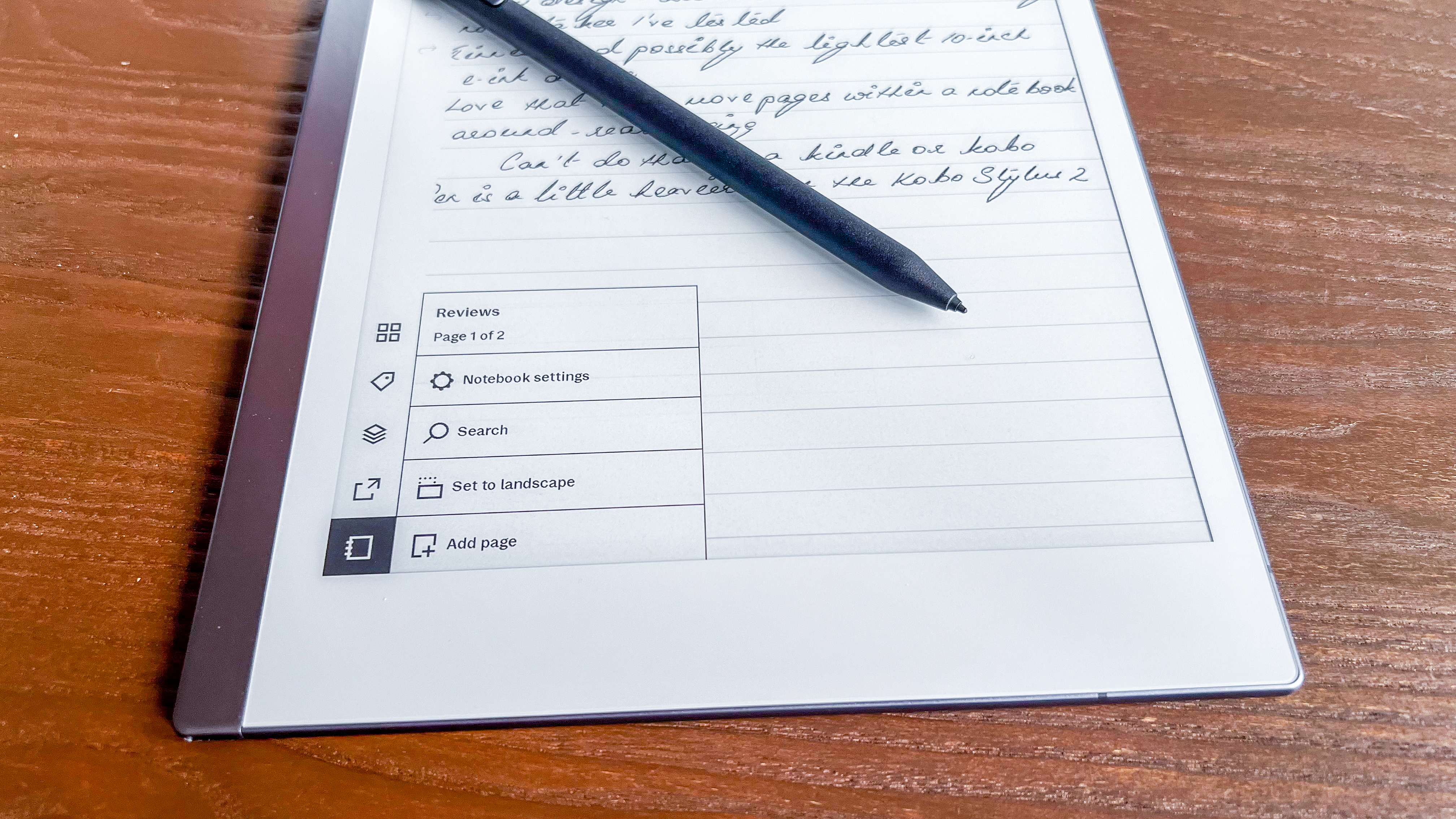
While writing on the reMarkable is a wonderful experience, reading isn’t as pleasurable. The roundabout way to sideload ebooks is the first thing that put me off using it as an ereader, but the lack of a light is my biggest complaint with this tablet. Moreover, there is no tap-to-turn page function on the reMarkable, you need to swipe, which isn’t the easiest of gestures if you’re trying to use the 10.3-inch tablet in one hand. There aren’t very many customization options for reading either, which really goes to show the reMarkable 2 was made specifically for writing.
8GB of internal storage is good for about 100,000 pages of notes, while USB-C charging of the 3,000mAh battery can give up to two weeks of usage between charges, based on two straight hours of use per day with Wi-Fi connection over a five-day working week.
• Performance score: 4 / 5
Should I buy the reMarkable 2?
Buy it if...
Don't buy it if...
Also consider
If our reMarkable 2 review hasn’t sold you on the product, then consider the two other options listed below. We’ve also included a table comparing their respectives specs and prices alongside the reMarkable 2.
How I tested the reMarkarble 2
- Used over a period of about 6 weeks for approximately 30 minutes to an hour each day
- Made all my work-related notes on its during the testing period
- Also typed an article using the optional keyboard folio

Given the reMarkable 2 is more a writing tablet than an ereader, I used it extensively to jot down notes while at work and at home. It was where I listed article ideas and also typed out an entire one that discussed the sustainability of ebooks vs paperbacks.
I did also sideload some ebooks in the EPUB format via the desktop interface, but the lack of a front-lit screen prevented me from using the reMarkable 2 as a reading tablet. I did spend about 45 minutes over my entire testing period using it as such though.
To test all the writing features, I created tags to search and filter my notes and articles and emailed documents to myself. I also used it to sign a work-related PDF document that I was able to email back to my work account.
