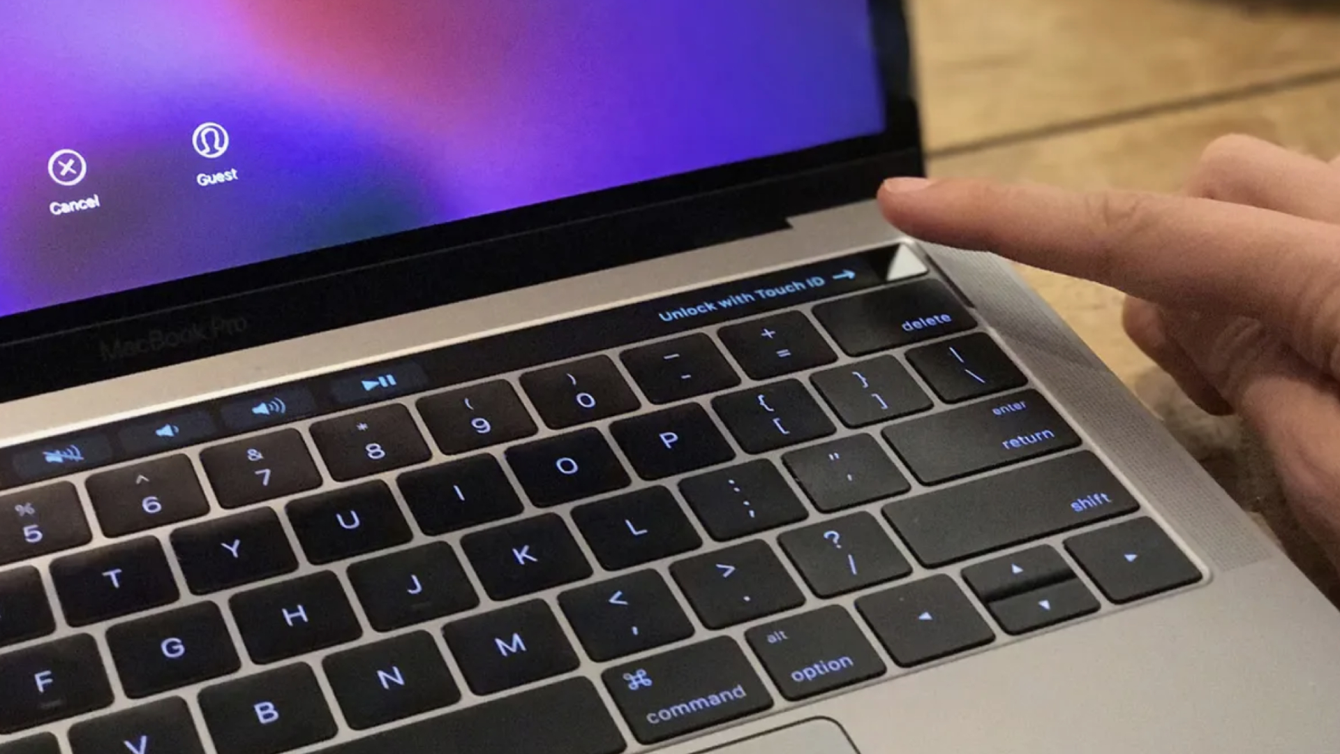
Back in 2016, Apple announced a 16-inch MacBook Pro with an OLED strip that replaced the Function Row keys at the top of its keyboard. This Touch Bar would change its functionality depending on the apps you were using. Emojis would appear, suggested words popped into view, and even controls for brightness and volume swam up for easy access. The potential was great — with the right developer support, complex shortcuts, and tools could be mapped to the Touch Bar, making power users of novices. And then it died.
The Touch Bar is widely considered a failure, a rare cutting-edge flop from Apple's shop. Was there a lack of support? A missing killer app? This was innovative and cool — so why did it fail, and where did it go?
Fast-forward to 2024, and I can’t help but feel that Touch Bar still has a place. With this in mind, here are three ways that it could come back in a more helpful way.
Apple Watch
Apple has a support document for those with Touch Bar MacBooks on using the strip in Pages, Apple's word-processing app. It explains how you can change the formatting, such as text alignment, colors, and more. It’s a useful feature that saves you from having to go to a different part of the Pages window to change formatting.
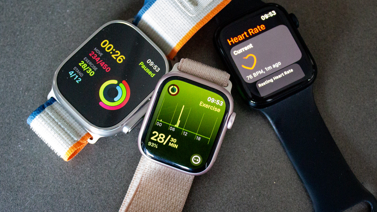
What if some of these functions moved to the Apple Watch? Imagine the scene — as you type, you want to boldface a word. You raise your wrist, and, using Apple’s AI technologies, the Watch suggests doing just that. One tap later, and the word has changed. Going further, Mail could benefit from this — the Watch could prompt you to add recipients to an email that you may have forgotten about. Or in Xcode, Apple’s developer app, the Watch could suggest lines of code as you build out your project.
Some may think that it could be awkward, having the function of the Touch Bar moved to your wrist — but in fact, it’s the same process as your hand reaching for the OLED strip near your MacBook’s display.
Apple Vision Pro keyboard
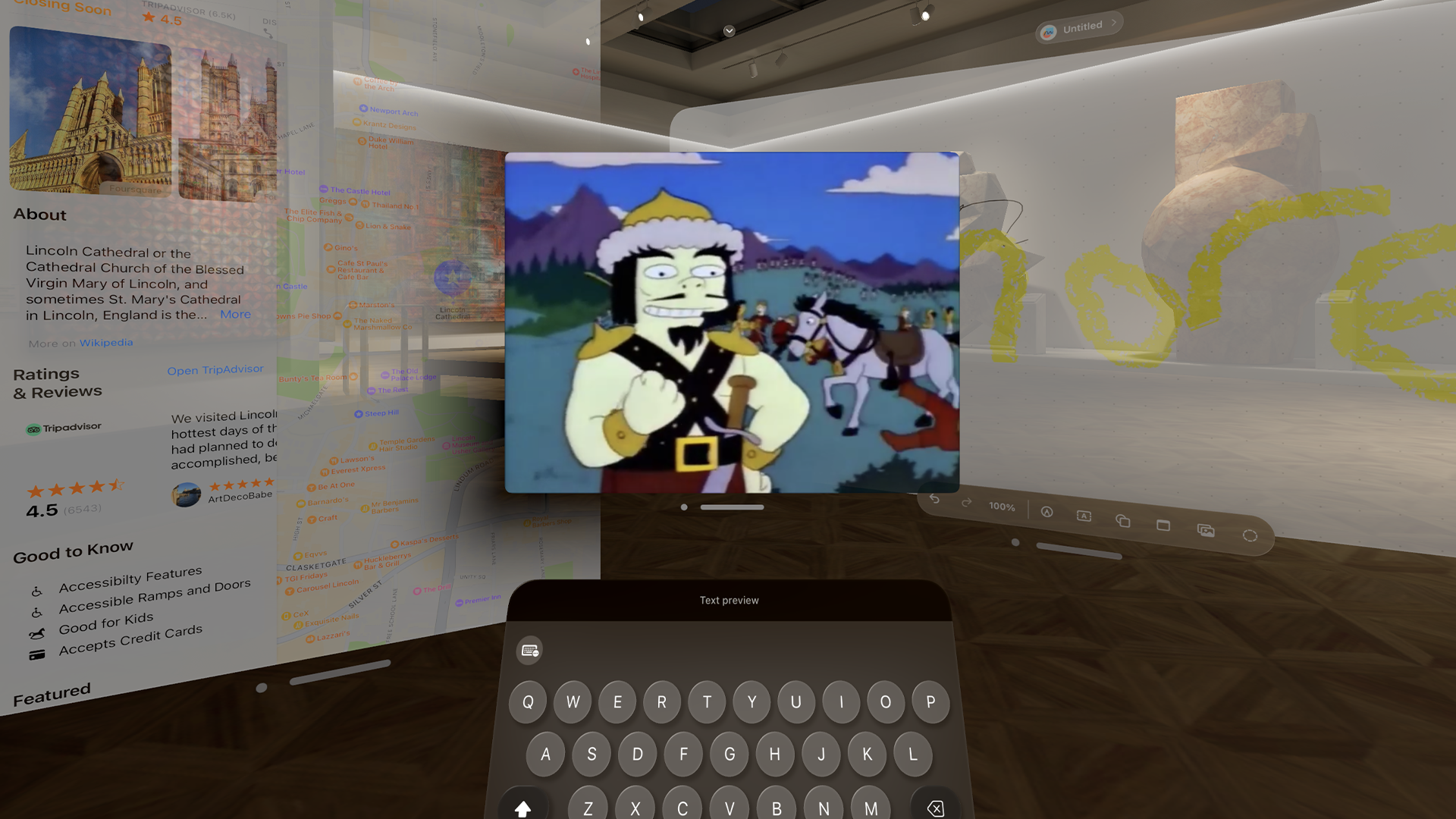
Apple Vision Pro is all about spatial computing, augmented reality tools in visionOS works that work in the world around you. We’ve seen it a bunch of times in Apple’s videos, such as using the headset during a flight.
Several Vision Pro reviews have noted how cumbersome its virtual keyboard is. Trying to touch-type in a spatial environment is always going to be a strange experience, but perhaps this is where Touch Bar can come in handy as a 'virtual Touch Bar', placed on top of the Vision Pro's keyboard.
Much like how the Touch Bar was placed above the MacBook Pro's keyboard, it could adapt to different apps as you work in your spatial environment. Helpful suggestions could appear when using Pages for instance, or there could be some quick-access controls lifted from Control Center on this strip as well.
The solution I suggested for the Apple Watch could also work here for Vision Pro but in a bigger way. Thanks to visionOS, it could tell that you’re looking at an Apple Watch Series 9 for instance, and the ‘Touch Bar app’ could expand beyond the wearable’s 45mm display on your wrist — letting you choose more suggestions as you work with a variety of apps.
In addition, if you’re watching an Apple TV Plus series like For All Mankind, a Touch Bar menu could appear when you look away from the content being played. This could include a toggle for subtitles, playing the next episode, commentary tracks, and more.
Wildcard wish - A return on the M4 MacBook Pro
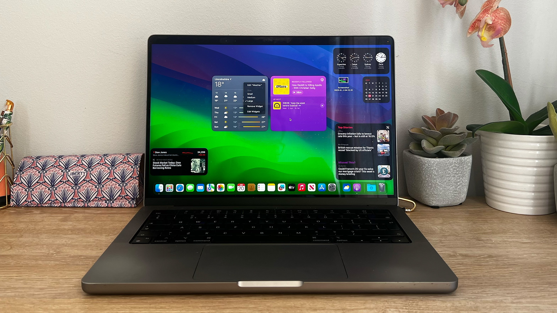
Stay with me here. I’d love to see the Touch Bar come back in an upcoming MacBook Pro, where it replaces the Touch ID and volume buttons on the keyboard. That’s enough space for features such as a spell-checker when writing a report and for quick controls, including changing the volume. Touch ID could stick around, but with a notch already in the MacBook Pro’s display, perhaps we could finally see Face ID come to the laptop instead.
Finally, I should mention that Touch Bar was always a fantastic use case for accessibility on the Mac. Over at Forbes, Steven Aquino explained why the feature benefited him and other users — such as being a hardware alternative to accessing Shortcuts and Sticky Keys. Bringing Touch Bar back, even in this smaller capacity, would help many users with accessibility needs.
Granted, I can’t see Touch Bar ever returning — Apple has clearly moved on. Yet I believe that there’s still potential for the OLED strip. Its usefulness in Accessibility and Shortcuts, as well as how it can expand to Apple Vision Pro and Apple Watch, only makes me wonder if Apple scrapped it too soon.
