Rebrand Revisited is a new series examining the brand redesigns that divided opinion, and asking whether history has been kinder to them than the comments section.
10 years ago, Instagram did something that, judging by the initial response at least, amounted to heresy. It unceremoniously killed off its beloved retro camera icon, with its brown leather, rainbow stripe and skeuomorphic charm, and replaced it with a flat, neon gradient glyph. The internet, somewhat predictably, lost its collective mind. But how has the rebrand fared a decade later?
The short answer is, incredibly well. The logo is still there for a start. Not only that, but it's arguably now one of the most recognisable app icons, if not one of the best logos, on the planet. In a world of lightning-fast social media backlashes, we've seen a number of brands reverse course on their redesigns over the last few years. But here's an example other brands could learn from.
Before: The polaroid years
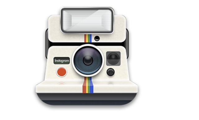
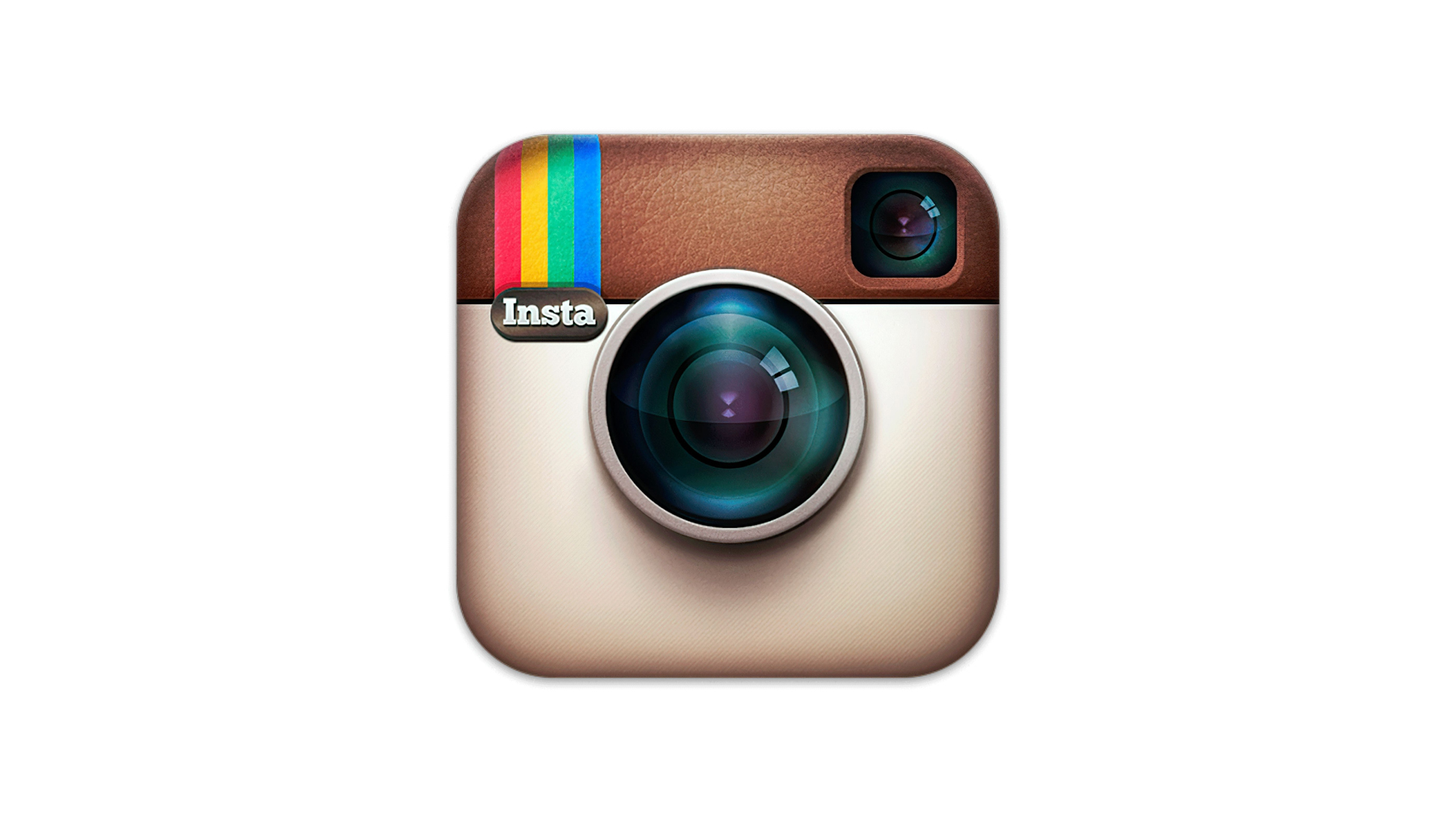
When Instagram launched in 2010, its logo was pure skeuomorphism. Designed by co-founder Kevin Systrom, the original icon resembled a vintage Polaroid camera, complete with lens reflections and textured details. It spoke directly to the app’s early promise: nostalgic, square photos with retro filters. This was a time when the app's biggest rivals weren't TikTok or Snapchat, but other retro photo filter apps like Hipstamatic.
There was nothing unusual about Instagram's look in the early 2010s – Apple's iOS design language was all about realistic textures, with app icons representing real, physical objects. And this made sense during the early days of smartphones, when an app icon needed to spell out what it actually did.
But Apple made a sharp U-turn on skeuomorphism in 2013 with the release of iOS 7, starting a years-long embracing of minimal, flat design across the entire tech industry. And Instagram joined the party three years later.
The gradient cometh
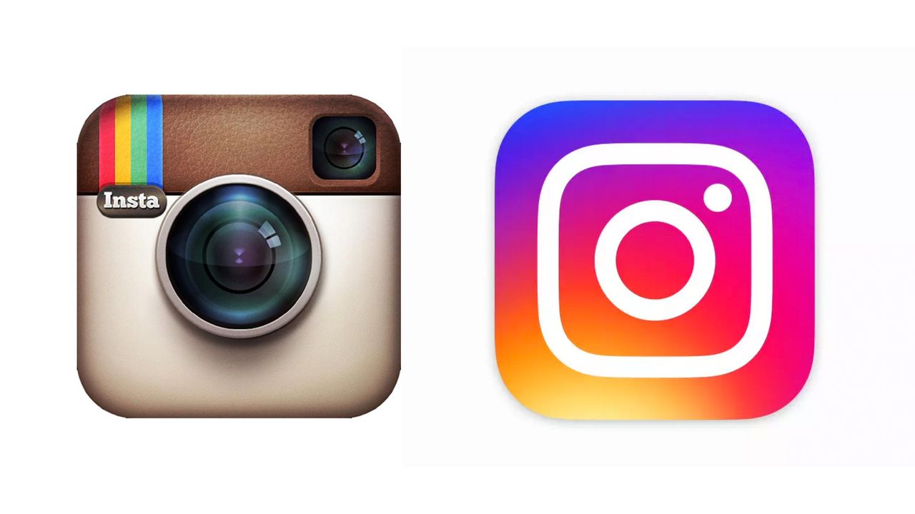
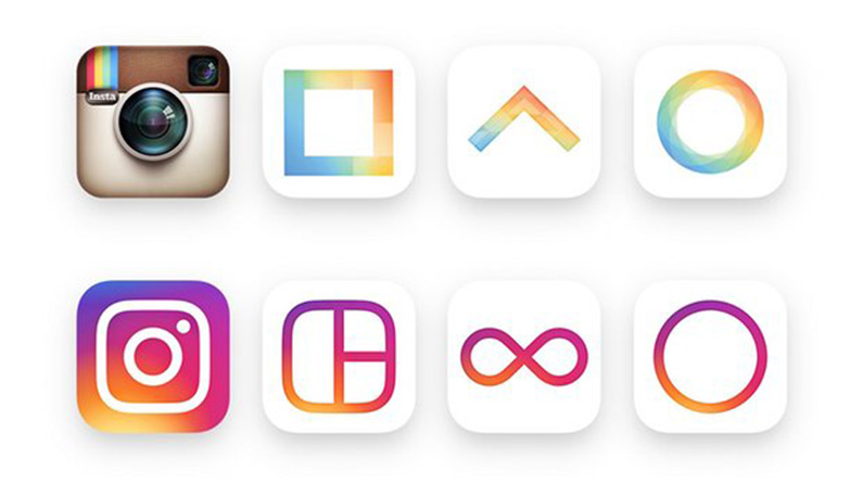
On May 11 2016, Instagram revealed a comprehensive new look. At its heart was the new logo, which stripped the polaroid camera down to its most basic geometry: a rounded square, a circle, and a dot. In place of the textured detailing came a bold gradient blending pink, purple and orange.
"Our updated look reflects how vibrant and diverse your storytelling has become," Instagram announced at the time. "Inspired by the previous app icon, the new one represents a simpler camera and the rainbow lives on in gradient form."
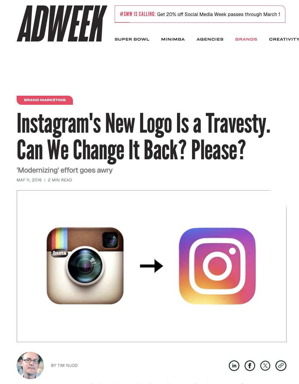
The logo is so ubiquitous now that it's hard to imagine the backlash it received. The New York Times dubbed the response "The great Instagram logo freakout of 2016". Adweek called the new logo "a travesty". The Guardian said the old polaroid was "murdered, and chalk was drawn around its body".
Many weren't used to the bright colours, with one tweet describing the logo as a "rejected Starburst flavour". But the colour was arguably what made the design stand out. In 2016, 'flat design' didn't mean 'colourful'. The movement began as a sea of monochrome icons and sans serif wordmarks. Instagram was one of the first brands to make minimalism fun, and it took a while to get used to.
What came next
Fast-forward ten years, and the success of Instagram's 2016 rebrand is clear. The best logos are a lesson in longevity, and while a single decade is nothing compared with the Apple logos of this world, it's telling that Instagram's branding still feels fresh – unlike that of its parent brand, whose 'Meta' rebrand is already looking outdated after just a few years.
Instagram itself may not feel fresher than ever, thanks to its questionable pivots to video and attempts to emulate TikTok in recent years, but there can be no denying the power of its branding. Some Gen Z users won't even be able to remember the previous logo – for many, the gradient is Instagram.
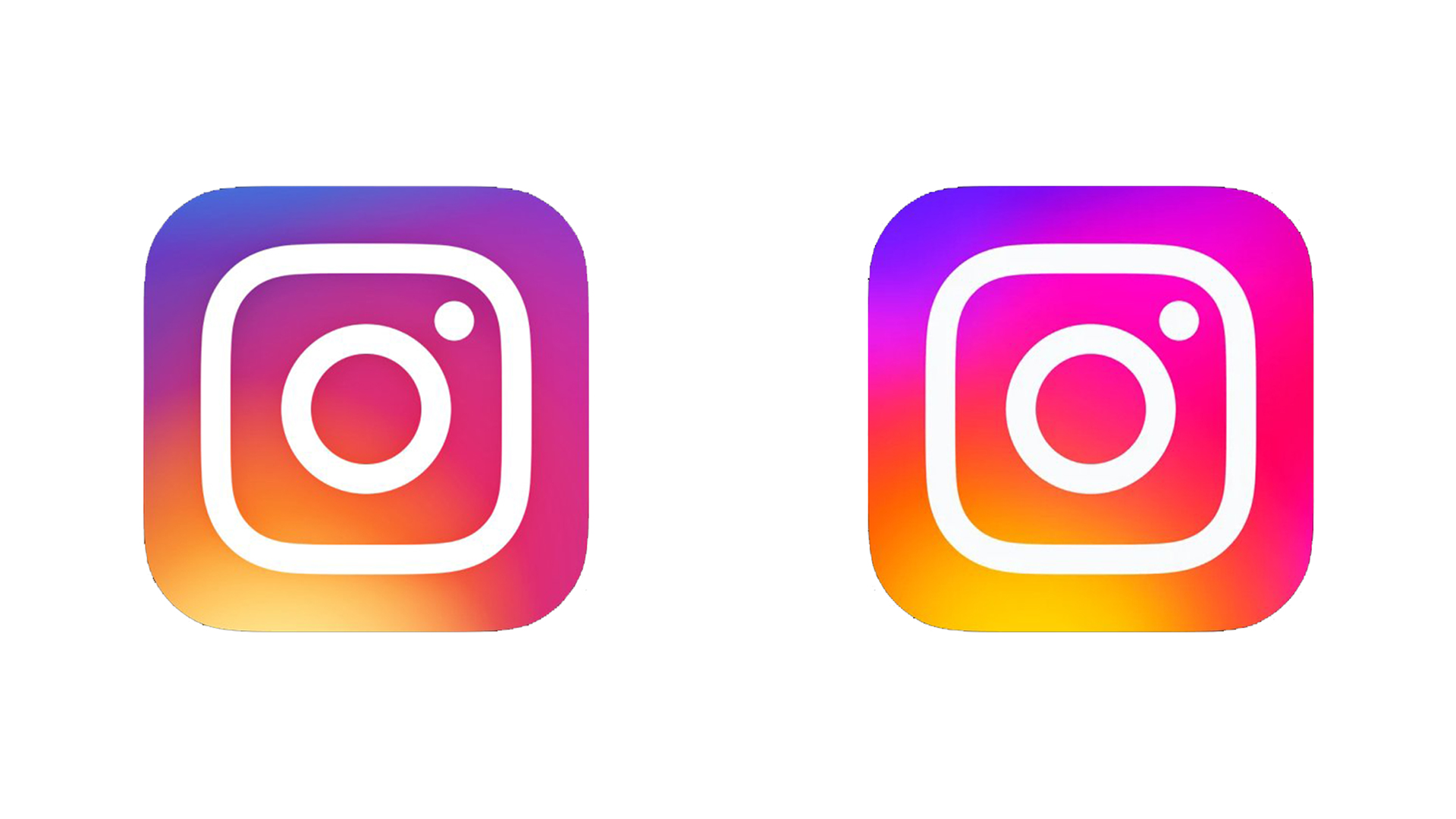
Instagram has tweaked its identity over the last year, brightening its gradient and revealing a new custom typeface in 2022. But if anything, there lies the ultimate proof of that 2016 rebrand's success. Six years later, Instagram opted not to move away from that look, but instead double down on it, bringing "more vibrancy with more depth of color to our gradient, designed to feel illuminated rather than one-dimensional."
The gradient might have been mocked ten years ago, but over time it has become foundational to the Instagram brand as a whole.