
Only 12 other nations have a World Cup history dating back as far as the United States men’s national team, which competed at the first-ever World Cup in Uruguay in 1930.
Fast forward 96 years, the USMNT is set to host the tournament for the second time (the first time in 1994), this time with co-hosts and neighbors, Canada and Mexico. While the country has yet to make it back to the semifinal, as it did in that inaugural showcase, there is plenty of hope for a Cinderella run at this summer’s 48-team competition.
Here, Sports Illustrated ranks every World Cup kit in USMNT history, right from the start.
21. 1930 World Cup
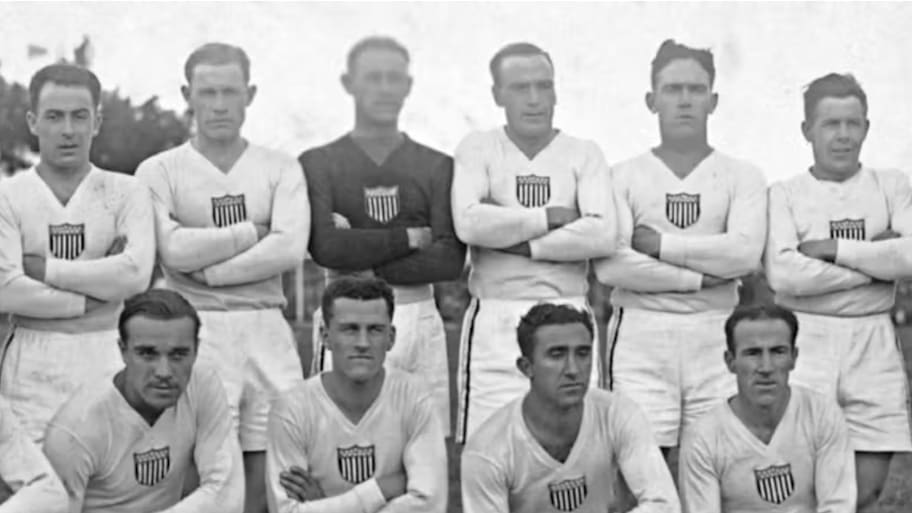
The USMNT was one of 13 teams invited to play in the first-ever World Cup in 1930 and sported a simple white cotton shirt on their way to a third-place finish following a semifinal loss to Argentina.
The shirt included a stars-and-stripes badge in the colors of the American flag and marked the first-ever World Cup kit the U.S. had.
20. 1934 World Cup
The 1934 World Cup only featured a knockout round, and the USMNT fell 7–1 to Italy in their first and only game of the tournament. They wore a blue shirt with the crest in the middle. You can catch a bit of that game and a glimpse at the kits here.
19. 1950 World Cup
Born on this day in 1927, Walter Bahr helped the #USMNT to its historic upset over England in the 1950 World Cup 🇺🇸 pic.twitter.com/ROpze13bqZ
— U.S. Soccer Men's National Team (@USMNT) April 1, 2023
Returning to the World Cup after World War II, the USMNT introduced kit design to the tournament for the first time, adding the letters “U-S-A” to the jersey and a sash. It also marked the first time the crest moved to the left chest.
For nostalgia's sake, the USMNT beat England in what is still heralded as one of the most significant upsets of all time.
18. 2022 World Cup Home

Center crests were an unfortunate trend of the early 2020s, and any kit from the 2022 Qatar World Cup brings back memories of watching games right after the COVID-19 pandemic. The players didn’t like this one, and the USMNT fell out of the tournament in the round of 16 without a true iconic moment, leaving it relatively forgettable.
17. 1990 World Cup Home
We see it at nearly every World Cup—the team that isn’t on a manufacturer’s timeline to qualify ends up in the tournament and is required to scramble to find kits. When the USMNT returned to the World Cup for the first time in 40 years at Italia 90, the minimal design and center crests on both the home and away kits gave the kits a bit of an underwhelming look.
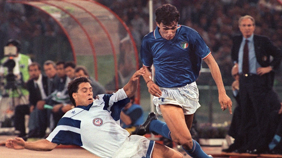
16. 1990 World Cup Away
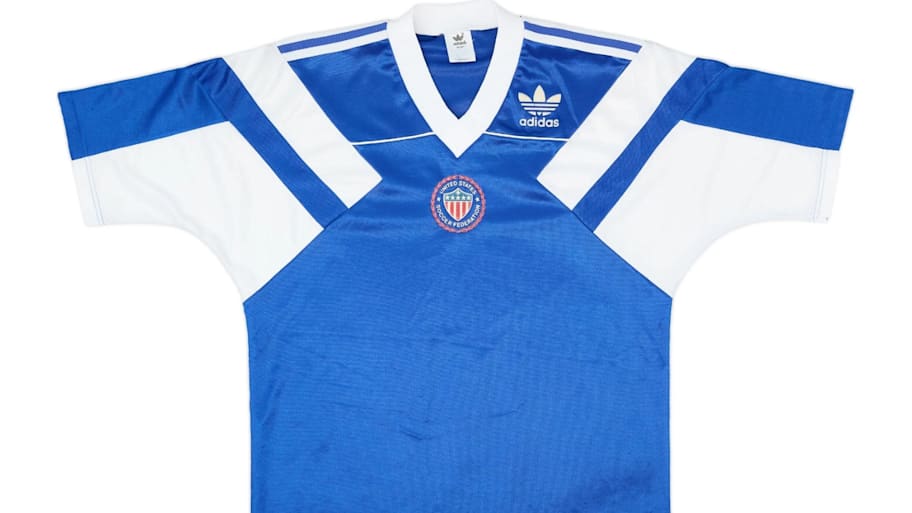
While the 1990 World Cup home kit was relatively plain, the away kit was right out of American sit-com entertainment at the time. A regular teamwear template from adidas, the center crest’s details made it barely legible, and the blue didn't match the color of the American flag. Yet, it did show a bit of modernity, with no front number, as was common for nearly every team—including the rival Canadians at the time.
15. 2022 World Cup Away
One of the least-liked kits from USMNT players at the time, the 2022 World Cup away kit set the stage for the originality and punch of the 2026 kits. For that, we have to respect it. Yet it featured a maligned center crest and a Nike teamwear template that mirrored those of several other nations at the tournament, including England in the group stage.
14. 2010 World Cup Home

A plain white t-shirt with blue trim, the memories of this kit are far better than the jersey ever was. While there is a very slight grey sash across the front, it would have been far improved if it had been the navy of the home kit or some other popping color. Instead, it remained a relatively plain look, but it remains nostalgic after Landon Donovan wore it to beat Algeria in the final moments and secure a spot in the round of 16.
13. 1998 World Cup Away
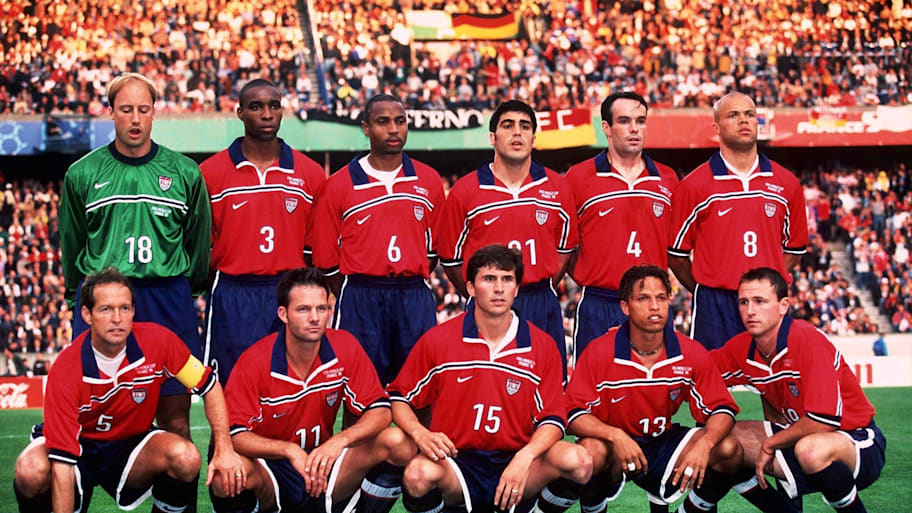
Fresh off some of the best kits from the 1994 World Cup on home soil, made by adidas, the switch to Nike brought some interesting interpretations of what a U.S. jersey should look like. This one featured a rare red base for the USMNT, as well as a collar and thin stripe to give it a slight improvement—even if the stripe made the too-small crest look awkward.
12. 1998 World Cup Home
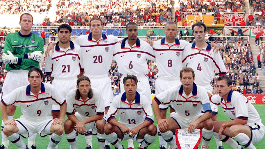
The 1998 World Cup home kit was a near-color reversal of the away kit, with the white version featuring a split red-and-blue stripe, though it still had the same issues with the crest size and placement. For a team still searching for their international identity in the game, it wasn’t bad, but it wasn’t too memorable either.
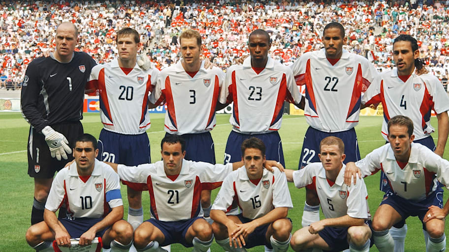
11. 1994 World Cup Home
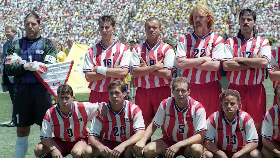
A primary inspiration for the 2026 home kit, the first jersey to take on the stripes from the American flag certainly stood out as it graced fields across the United States in the first U.S.-hosted World Cup tournament. It’s historic.
Yet, the team only wore it once, and the vertical wavy stripes were a little jarring to the eye, especially considering they came up against Brazil’s clean, iconic yellow-and-blue kit in the round of 16. It would have been cool if some of the best moments from the 1994 tournament had come in that kit, so nostalgia could play a bigger role. Maybe that’s what 2026’s edition is for?
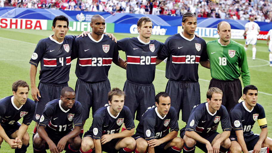
10. 2002 World Cup Away

The 2002 World Cup away kit was a simple Nike shirt with no red and just white as a secondary color. Without the logo, it likely could belong to any team at the World Cup, or back in the U.S., to any high school or college team. It was clean, but not identifying or exciting.
9. 2006 World Cup Home

Some of the first iconic moments from the Clint Dempsey and Landon Donovan era came in this white look, featuring a vertical red-and-blue stripe and a massive crest, at the 2006 World Cup in Germany.
The mixed red and blue stripe highlighted the crest, as did its size and golden outline. If the 1994 World Cup brought the brash Americana to the jersey, this brought pure American class and was a sign that the USMNT had truly arrived on the global soccer stage.
8. 2006 World Cup Away
It wasn’t a football or hockey jersey, but the navy kit with the thick red stripe was awesome. The red stripe centered the massive numbers, making the larger crest work as well. It was a jersey that was quintessentially American, but also looked fresh and classy for the tournament in Germany.
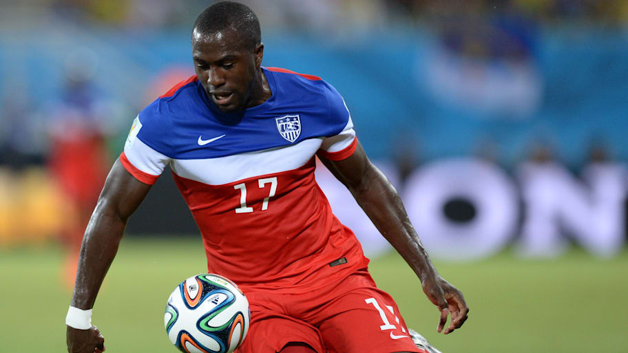
7. 2014 World Cup Home

The collar makes this jersey, as do the memories. While a clean white shirt may not illicit many rave reviews, the bold number in the front, a larger-than-average crest and the slight red trim throughout made this one memorable.
Making it even better is the memory of Jermaine Jones’s long-distance goal against Cristiano Ronaldo’s Portugal in the knockout stages. Still, it wasn’t even their best kit at the tournament—we’ll get to that shortly.
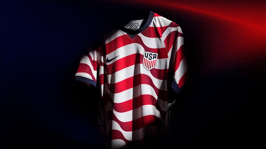
6. 2026 World Cup Away Kit
The newest away kit, the deep navy blue with monochromatic stars, is a minimalistic touch on what could have been a much more aggressive look. The design will likely fall short of the home kit's iconic measure, but it’s a strong and sleek look that no other country can pull off, even if it’s not quite as outstanding as the soon-to-be-shown 1994 denim kit that inspired it.
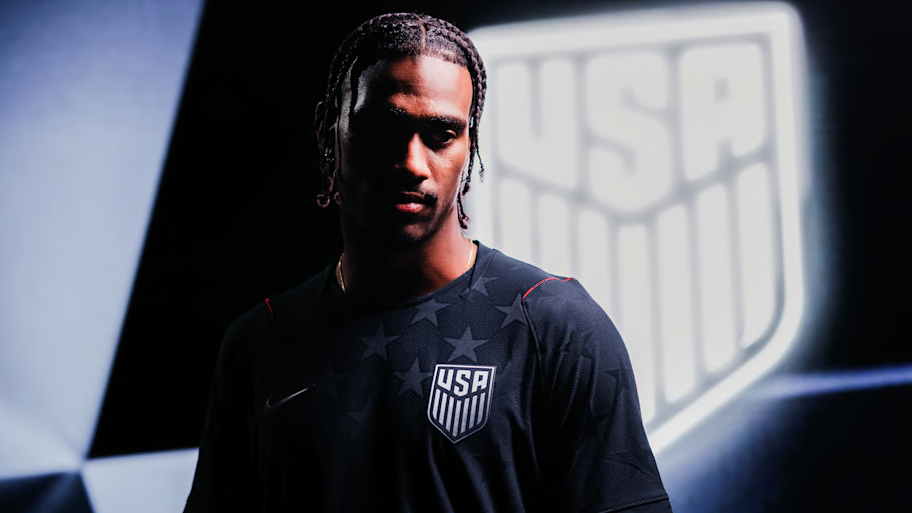
5. 2026 World Cup Home Kit
A perfect modernization of the 1994 World Cup home kit, Nike hit an absolute home run on the primary look for the 2026 World Cup. After the 2022 tournament failed to display much Americana, this one does it perfectly, and the horizontal stripes make for a much less jarring viewing experience than its vertical 1994 counterpart.
Now, the country awaits iconic moments to spark long-lasting memories for the kit this summer.
4. 2002 World Cup Home
Who doesn’t love early 2000s and Y2K fashion? The armpit trim defined nearly every Nike team at the 2002 World Cup, with the USMNT wearing red and blue side panels and a red-trimmed collar. The crest was big, which was good, and the wins against Portugal and Mexico on the way to the quarterfinals gave it a big nostalgia boost as well. It’s not the most intricate design, but hopefully every soccer hipster in the U.S. has it by this point.
3. 2014 World Cup Away
Popsicles are a sweet treat on a warm summer day, and the “Bomp Pop” kit was, too, seemingly inspired by the classic American summer snack. It felt like a real U.S. jersey that no other nation could replicate, and its blocky style stood out amid an otherwise underwhelming tournament in the kit category.
While red hasn’t quite worked many times, it offered a strong presence here. It also has a strong nostalgia factor, as it was the strip the U.S. wore when John Brooks scored a dramatic 86th-minute winning header to beat Ghana 2–1 to open the tournament.
2. 2010 World Cup Away

The 2010 World Cup home kit saw the USMNT embrace the navy blue from the flag and add a stripe that had been missing for several years. The sash, a classic feature of the late 2000s, took center stage when the LA Galaxy made the look famous after signing David Beckham to a deal that would forever change American soccer.
1. 1994 World Cup Away
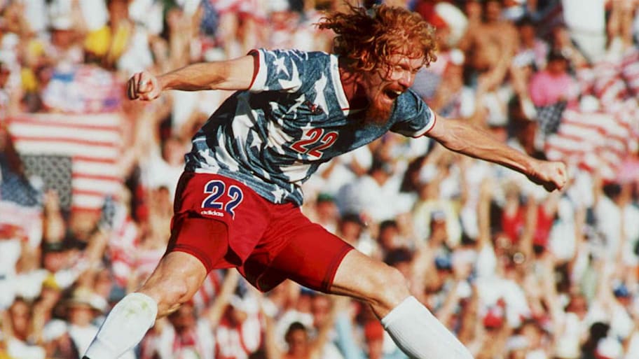
This feels unanimous. It’s just so darn iconic! The 1994 away kit was so good that adidas has re-released it ahead of the 2026 tournament, even though the revamped look can’t feature the U.S. Soccer crest, given the German manufacturer is no longer the team’s official outfitter.
The washed-denim look with red trim stands out as the most American look U.S. Soccer has ever had, while the red shorts and—well, loud hairstyles of the mid-90s—helped to elevate its place within American sporting culture.
Nike was never going to replicate their competitor’s look when designing the 2026 kits, but it stands as the best USMNT World Cup kit by a wide margin.
READ THE LATEST USMNT NEWS, ANALYSIS AND INSIGHT FROM SI FC
- Is FIFA Allowed to Move Iran’s 2026 World Cup Games to Mexico?
- Full 2028 Olympics Soccer Schedule: Matches Everywhere, Not Just in L.A.
- Every USMNT Finish at the World Cup: Tournament by Tournament Breakdown
- USMNT Official March Roster: Pulisic, McKennie Among Players to Face Belgium, Portugal
This article was originally published on www.si.com as Ranking Every USMNT World Cup Kit From 1930 to 2026.