Football clubs never used to have badges on the front of their shirts, let alone sponsors. Now, the very DNA of an institution is woven into the fabric of your team (we're talking about the crest here, not the generic betting company logo on the front of the top).
As with everything else in football, different sides went in different directions. Some opted for their city's coat of arms or something vaguely similar, while others went for a circle with one distinctive symbol in the centre. Others have gone wildcard – including initials, birds, former players, hats, lions, weapons or a mixture of the lot.
Each of the 92 has something rather distinctive if nothing else. So let's rattle through the good, the bad and the ugly of the Premier League and Football League…
92. Burton Albion
Burton-on-Trent is known for its beer industry – but did the football club have to incorporate that quite so literally into their badge? Oh well, at least the big fella should be hard to shrug off the ball.
91. Hull City
If you’ve never come across the book Crap Taxidermy, go and look it up – because that’s where Hull’s badge belongs (and that’s before we got onto the fur pattern that’s more leopard than tiger).
90. Fulham
You’d think one of the basics of designing a badge would be to align it so people can read the letters without having to crook their neck at a muscle-straining angle, wouldn’t you? Fulham apparently didn’t think that.
89. Cheltenham Town
What do you see: a heavily stylised robin? Or a giant red fish about to gobble up a considerably smaller red fish? Cheltenham’s badge is supposed to depict the former, but we prefer the alternative interpretation.
88. MK Dons
OK, so it’s hard for your badge to ooze tradition when you were only founded 18 years ago, but could MK Dons not have come up with something better than a cheap bottle opener?
87. Cambridge United
You probably know that the film The Football Factory is not about a football-shaped factory – but Cambridge’s crest shows us what that might look like. Do you think they could have made the club initials a bit bigger, though…?
86. Sheffield Wednesday
Why is the owl fluttering its eyelashes? And why are its eyes at a 90-degree angle in the first place? And why are they shaped like a human’s eyes?! It’s a right hoot is Sheffield Wednesday’s badge.
85. Birmingham City
It’s a unique badge – we’ll give Birmingham that – but did anyone bother to double-check the design against a map of the world? Don’t use this one for your geography homework, kids.
84. Lincoln City
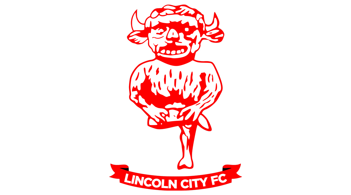
“Aaagh, my shin!” Unfortunately for fans of visual comedy, that’s not a tricky winger hobbling in agony after being cynically scythed down; it’s the famous Lincoln Imp grotesque from the city’s cathedral.
83. West Ham United
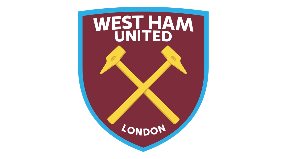
Did you know that the shape of West Ham’s badge is based on the bow of HMS Warrior, one of the first two armour-plated, iron-hulled warships ever built? Us neither – but yeah, don’t go calling it a shield.
82. Northampton Town
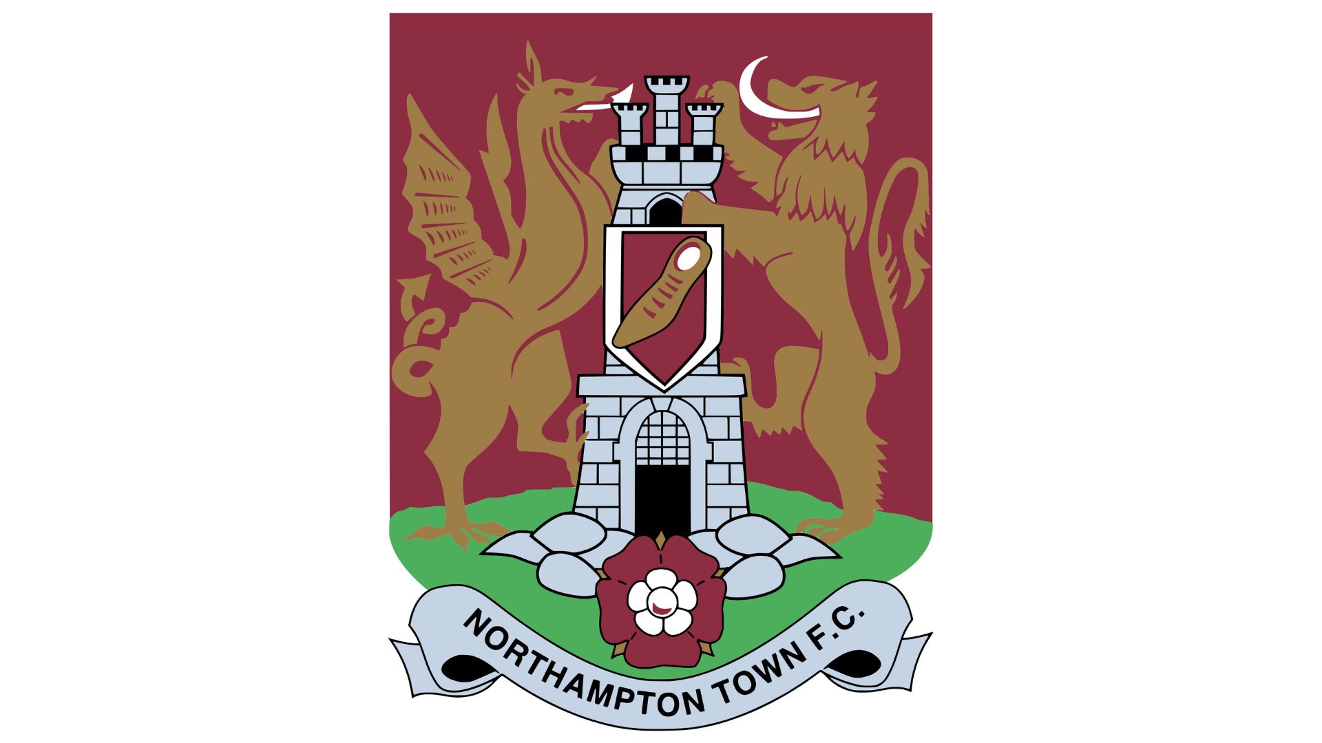
Those gigantic lions are anything but intimidating, while the leather brogue - honouring the city's shoemaking history - is a nice link to their nickname of The Cobblers. Shame it looks awful just slapped on top of the castle like that.
81. Cardiff City
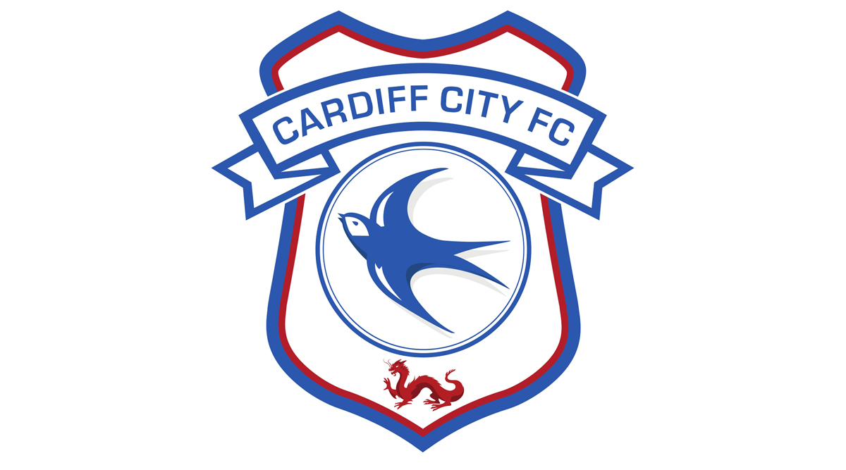
It’s no surprise Cardiff’s badge features a dragon – but you’ll notice that’s no Welsh dragon; it’s an oriental one, as per the wishes of owner Vincent Tan (who previously sparked outrage by changing the club’s colours from blue to red).
80. Bristol City
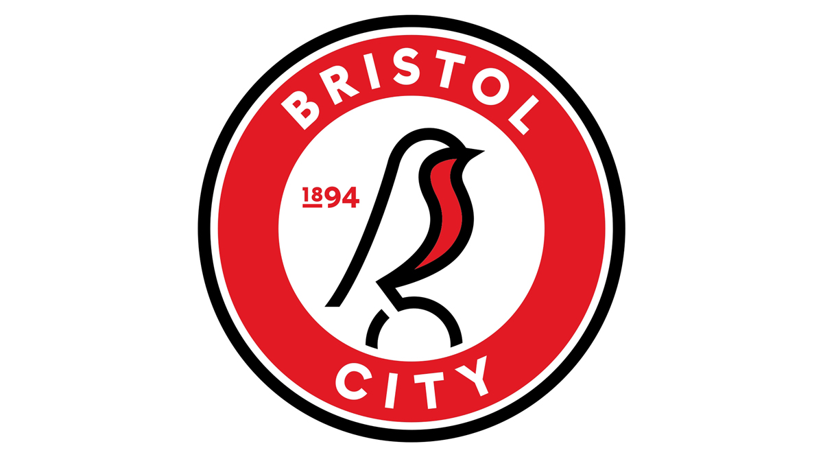
That’s meant to be a robin – but look closely and it resembles one of those fortune-telling fish impaled on a rod. And what’s with underlining the first half of the club’s foundation year? Is there a 1994 Bristol City?
79. Brentford
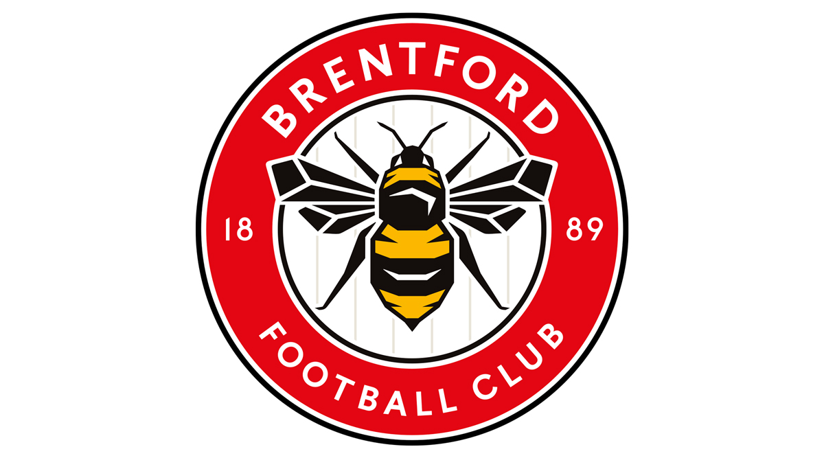
One of the newer members of the roundel rabble, Brentford swapped two bees and a beehive for one monstrous bee and… the bee helmet from the Nic Cage remake of ‘The Wicker Man’? A bit gruesome.
78. Colchester United
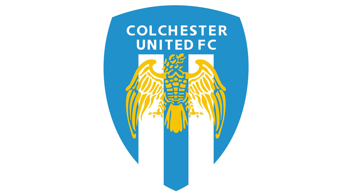
Colchester was the first capital of Roman Britain, so it makes perfect sense that the U's' crest bears the aquila symbol; it’s just a shame the eagle resembles a hastily cobbled together mosaic.
77. Millwall
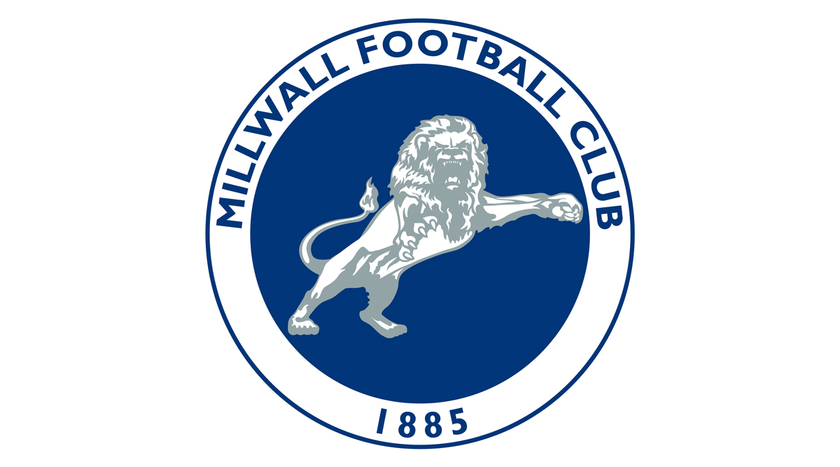
Either Millwall’s leaping lion is thoroughly up for a scrap – or it wants to give you a great big hug and just has a funny way of showing it. Can anyone really say for sure?
76. Walsall
Oh, look, another identikit circular badge with an animal on it. Use your imagination and it could be a giant swift blocking a solar eclipse – but we wish more clubs would use their own imagination in the first place.
75. Crawley Town
A diamond expelling fighter jets, another badge within the badge and – hold up – is that Man United mascot Fred the Red? There’s just too much going on here; time to simplify, Crawley!
74. Wycombe Wanderers
Buckinghamshire’s county emblem has a somewhat confusing history, but Wycombe seemingly didn’t get the memo on one key detail: the swan is supposed to be in the chains, not the other way round…
73. Stoke City
The fonts on the club’s name and foundation date are quite cool, but there’s really nothing spectacular about Stoke’s current badge – a stark contrast to their previous crests, all of which featured local symbology prominently.
72. Newport County
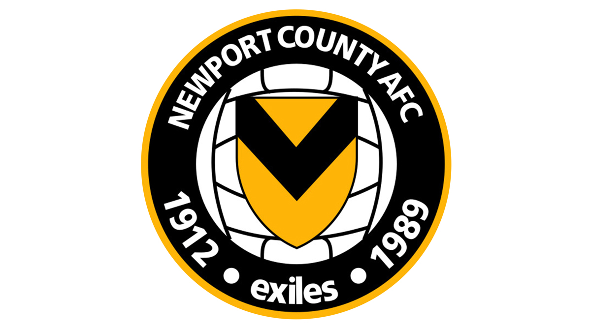
Reformed after going out of business, Newport are the only club in the 92 whose badge displays two foundation dates. As for that shield, do the South Wales outfit have a little-known jousting department…?
71. Stevenage
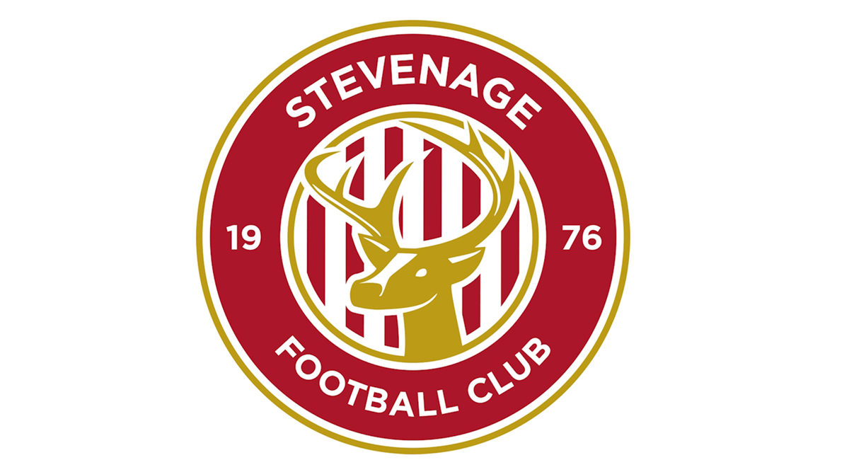
It’s the Hertfordshire hart, but the focal point of Stevenage’s badge could just as easily be a giraffe wearing a pair of novelty antlers. And is this not basically Brentford’s crest rehashed?
70. Bromley
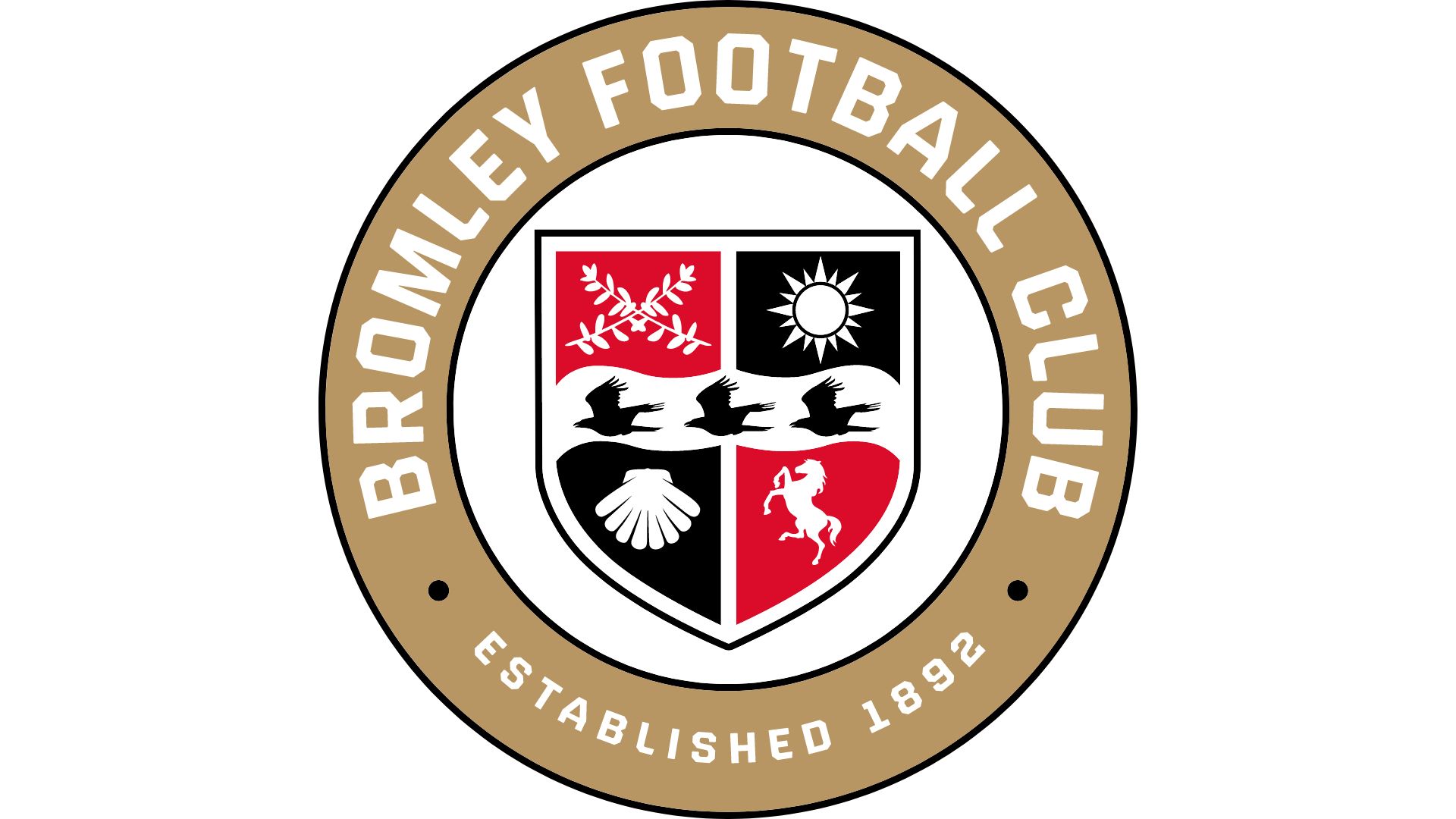
A shield placed within a roundel isn't the best option clubs can opt for, but Bromley have made it work better with the gold outer circle providing a good contrast to the black and red centre shield. There, you'll find three ravens in the centre.
69. Stockport County
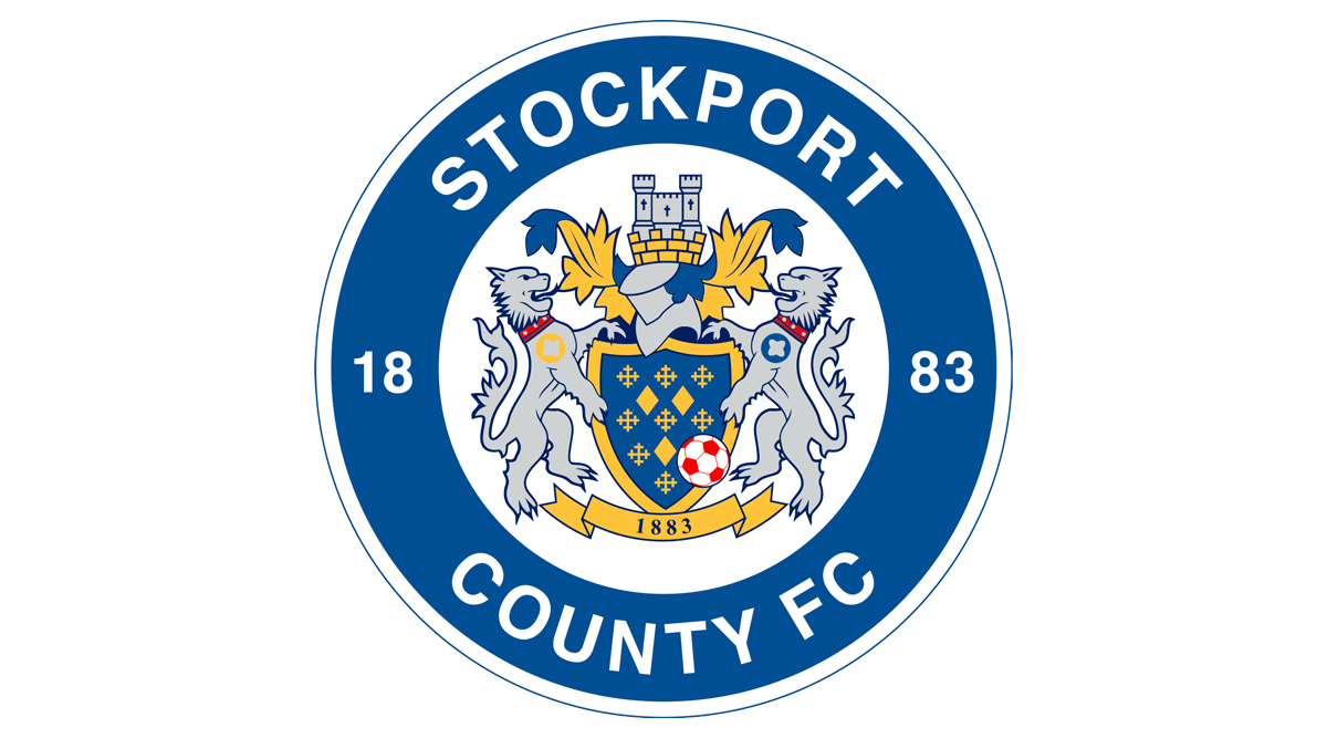
Like fellow League Two Greater Manchester outfit Rochdale, Stockport made the decision to roundel-ify their traditional coat of arms badge. And can anyone honestly say it looks better like that?
68. Reading
Once home to famed biscuit-makers Huntley & Palmers, Reading was affectionately known as ‘Biscuit Town’ – and, while it looks more decorative, we reckon this badge could be repurposed to serve the tea-accompanying treats.
67. Chesterfield
Without the colourful church spire cutting through this crest, then Chesterfield would be looking at a lot lower on this list. Thankfully it's there, and is a nice hint towards the club's Spireites nickname.
66. Middlesbrough
When Middlesbrough switched things up in 2007 and replaced their circular badge with a shield, it had the (presumably) unintended effect of turning it into a pub sign. (Is the lion on fire, by the way?)
65. Salford City
Following their takeover of the club in 2014, the Class of ‘92 set about rebranding Salford – and part of that seems to have involved replacing their old badge with a lion inspired by the Emperor from Star Wars.
64. Burnley
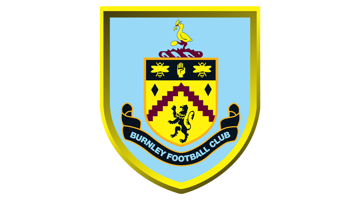
"Hi Burnley, it's your badge designers. So we've got a few ideas: what about a shield? A lion? Some kind of bird? Or maybe some bees… a hand? Otherwise, you can have some kind of weird bird thing. Or you can have some stairs on there… or a ribbon. What do you think?"
"Yep, all of that sounds great, ta."
63. Rotherham United
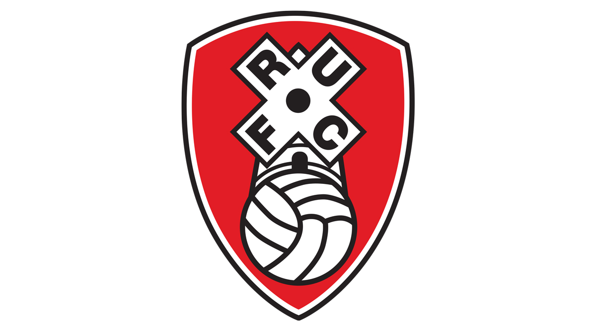
Have you ever seen a windmill give birth to a traditional leather football? No? Well, you’ve obviously never studied the badge of Rotherham (the Millers) closely enough. It’s a miracle!
62. Wigan Athletic
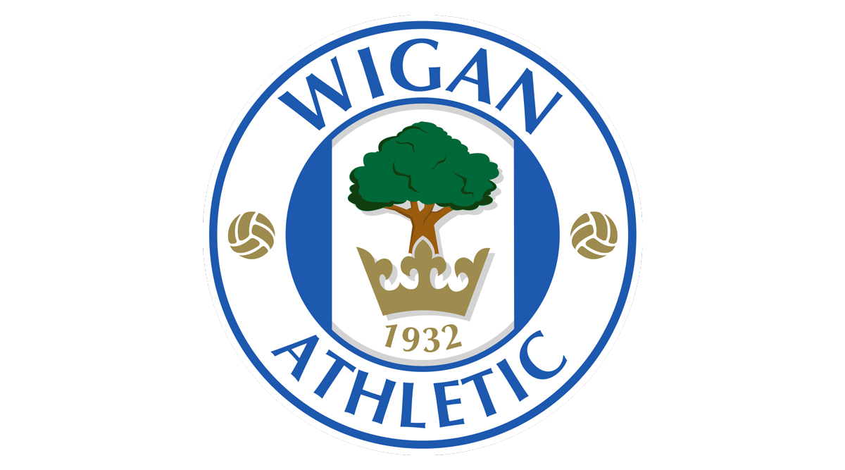
A popular design among Latics fans, Wigan’s ‘Tree and Crown’ crest was brought back in 2008. What kind of tree is that? A mountain ash – known locally as… a ‘Wiggin Tree’. You can’t beat a good badge backstory.
61. QPR
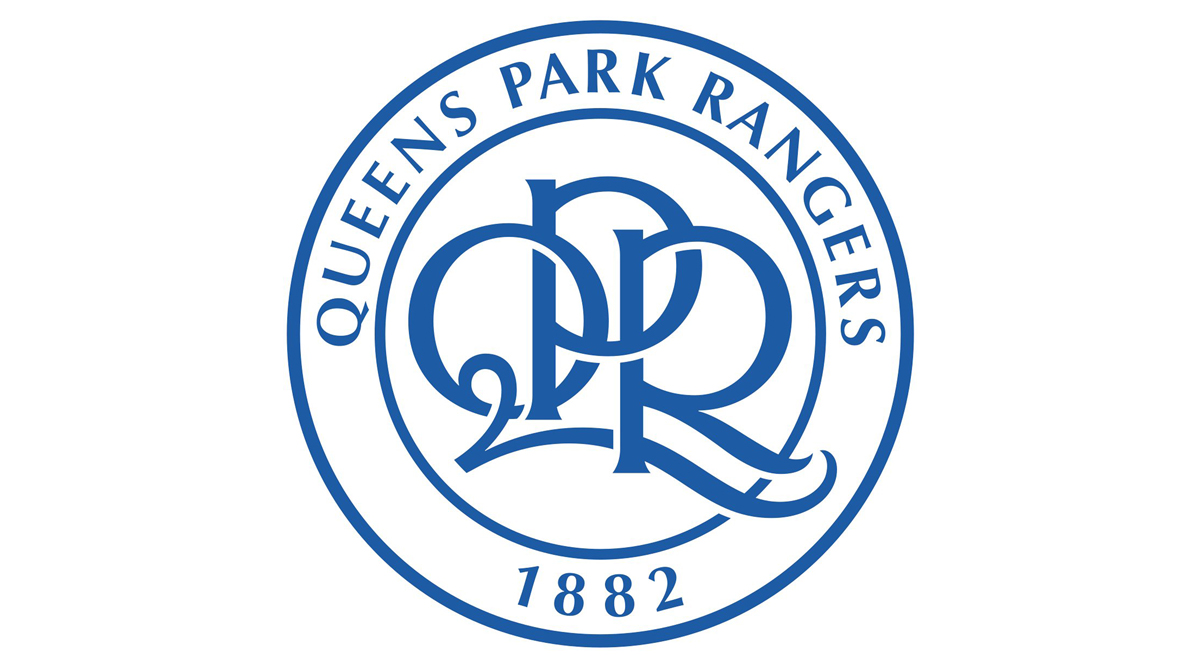
QPR’s foundation year is clearly displayed at the bottom of their badge, but – and we can’t tell whether this is by design or not – it actually appears again, within the club initials. Pretty cool, huh?
60. Leicester City
Look, it’s not our place to tell the club who wrote football’s greatest-ever underdog story how to do anything, but can we just politely point out one thing…? Foxes are not yellow!
59. Peterborough United
There two Biblical references on Peterborough’s badge, adapted from the Cambridgeshire town’s coat of arms: the keys to heaven and the ‘Upon this rock’ motto (Saint Peter was the metaphorical ‘rock’ upon which Jesus built his church).
58. Shrewsbury Town
It’s too bad Shrewsbury no longer play on the banks of the River Severn: those lions look parched. Still, at least they haven’t come home to find they’ve been burgled like the poor sod on the Shropshire club’s previous crest.
57. Crewe Alexandra
Sure, the outline shape could be a bit less ‘Microsoft Word speech bubble’, but Crewe’s crest strikes a decent balance between modern and traditional. All in all, a solid effort.
56. Brighton & Hove Albion
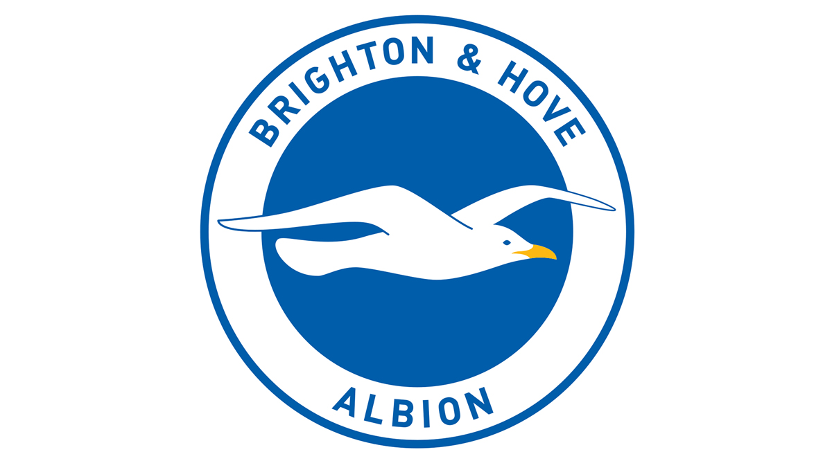
Is it possible to oversimplify a badge? Brighton’s crest would suggest that the answer to that is very much ‘Yes’. Even the seagull looks bored; could they not at least have added one of the city’s three piers?
55. Harrogate Town
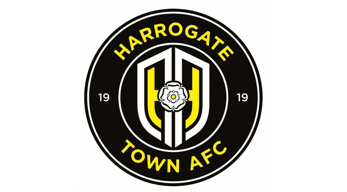
There’s a certain hypnotising quality to Harrogate’s badge, at the centre of which stands… a double door to another dimension? In any case, it’s distinctive enough to avoid being forgotten as just another roundel.
54. Accrington Stanley
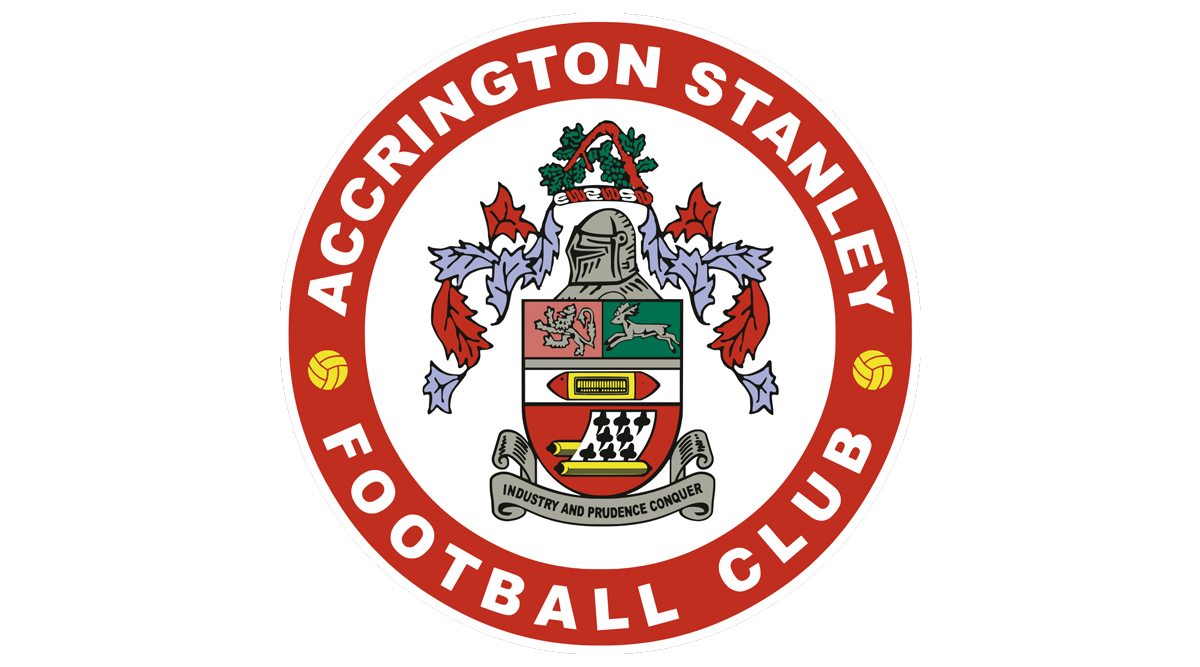
No, that’s not a harmonica in the middle; it’s a cotton shuttle. And no, that’s also not the eight of clubs underneath; those black shapes are acorns, recalling the town’s original name of Akerenton. Very nice.
53. Exeter City
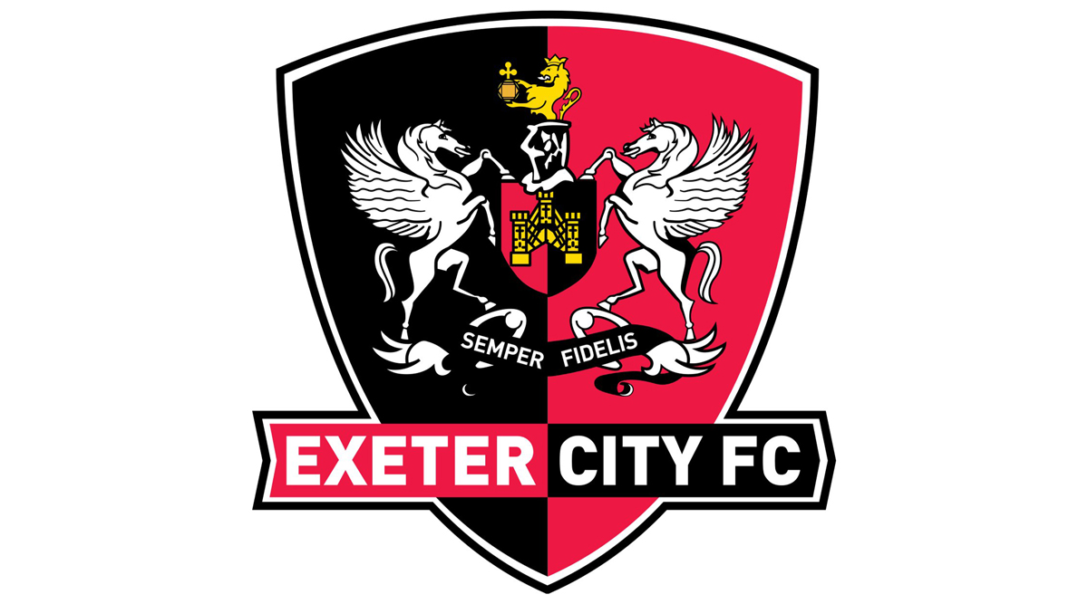
Exeter appear to have cloned ancient Greek equine icon Pegasus to give a degree of symmetry to their crest – which also features *checks notes* a lion rising from a knight's helmet, presenting an ornate jar of honey?
52. Fleetwood Town
Fleetwood’s fishing industry was largely destroyed by the 1960s Cod Wars, but the Lancashire town’s football club aren’t going to forget its proud history: that’s one heck of an anchor.
51. Oxford United
Quite clearly, that’s an ox – but something magical happens when you flip Oxford’s badge upside down: it’s an angry crab… Or an owl perched on a massive croissant… Let your imagination run wild!
50. Aston Villa
They didn’t change much, but, aside from dropping the famous ‘Prepared’ motto, Aston Villa made one key alteration when updating their badge in 2016: they gave the lion some much-needed claws.
49. Grimsby Town
Grimsby was once home to the world’s largest fishing port, so it makes total sense that the Mariners (who actually play in neighbouring Cleethorpes) celebrate that heritage on their badge – which is shaped like a ship’s hull. Clever.
48. Portsmouth
Portsmouth used to make do with the instantly identifiable moon and crescent – and that still appears on their shirts, but Pompey’s powers that be went and inducted the club into the circular squad by unveiling a commercial-friendly roundel in 2018.
47. Mansfield Town
Have you ever wondered what prominent-chinned trailblazer Jimmy Hill would have looked like if he’d been a stag? What do you mean ‘No’? Well, Mansfield’s badge has the answer anyway.
46. Charlton Athletic
Charlton cottoned onto circular badges before they were cool (or, given their ubiquity these days, while they were cool); used almost continuously since 1968, this is one of the oldest crests in English football.
45. Sheffield United
Sheffield is the Steel City – and those are two serious-looking blades on the badge of … the Blades. While not adopted until 1977, the crest was designed by club legend Jimmy Hagan 20 years earlier.
44. Gillingham
We’re not sure what the horse has done to end up behind bars, but it should be released immediately for having an insanely cool mane (tilt your head to the right).
43. Morecambe
Have you ever tried your shrimp served with freshly cut roses? Well, that seems to be what’s on the menu up on the Lancashire coast. It makes a change from chicken Balti pie…
42. Bristol Rovers
Managers can sometimes have trouble getting their message across – but how many of them have thought about outsourcing training to a sword-wielding pirate like the shadowy seafarer dominating Bristol Rovers’ crest?
41. Tottenham Hotspur
Tottenham’s badge has been subjected to the meme treatment plenty in the past, reduced to a chicken trying to balance on a beach ball – which is a bit harsh, because that’s quite clearly a football.
40. Plymouth Argyle
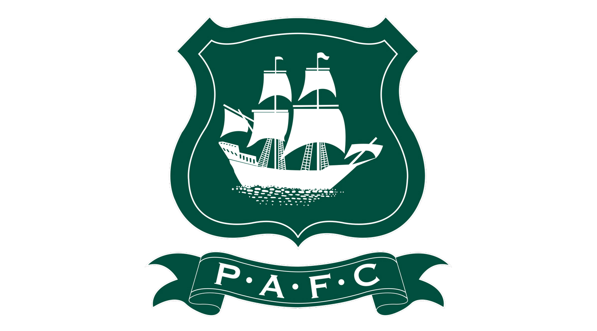
Plymouth’s ‘Pilgrims’ nickname comes from the fact the Devon city was the Mayflower’s last port of call before leaving England for the New World. Obviously, that’s the mayflower on their crest – although that doesn’t look much like sea beneath it.
39. Doncaster Rovers
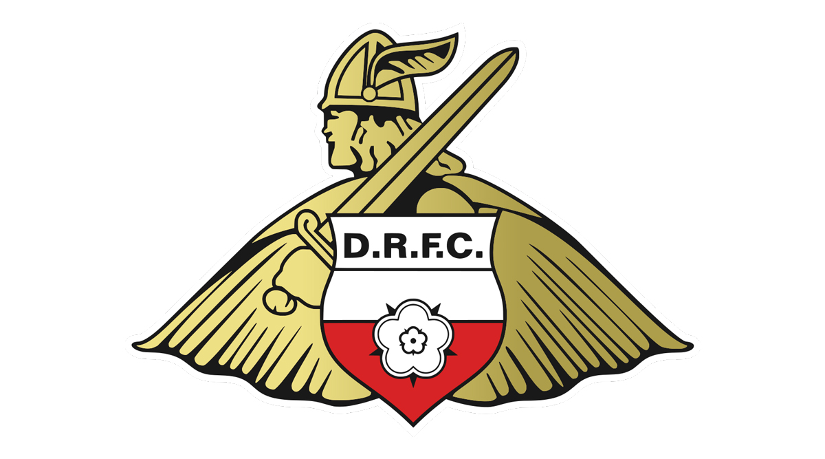
Doncaster is a Roman town, so you could be forgiven for thinking that’s a Roman centurion, but look closer and you’ll see it’s, in fact, a Viking – a nod to the fact the longship-sailing Scandinavians also settled in the area.
38. Bradford City
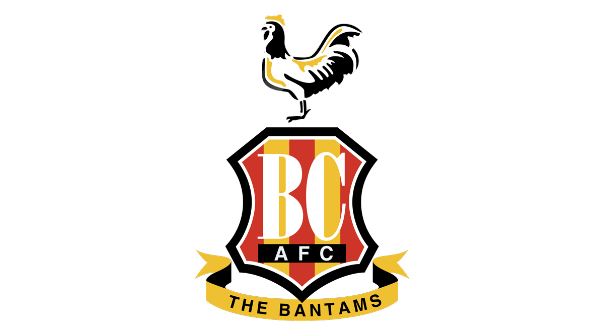
Bradford’s shirt colours of claret and amber, a unique combination among the 92, will always make them stand out – but in case that wasn’t enough, they can also boast a levitating bantam (not a regular chicken) on their badge.
37. Watford
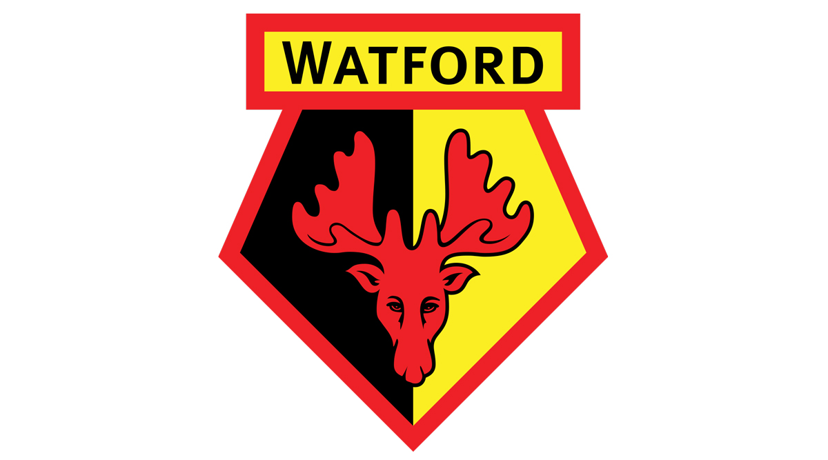
It’s undergone a few stages of evolution, but Watford’s crest has followed the same broad design – centred on the Hertfordshire Hart – since 1978. And it’s a good 'un, but it’s not a patch on their badge from 1974 to 1977…
36. West Bromwich Albion
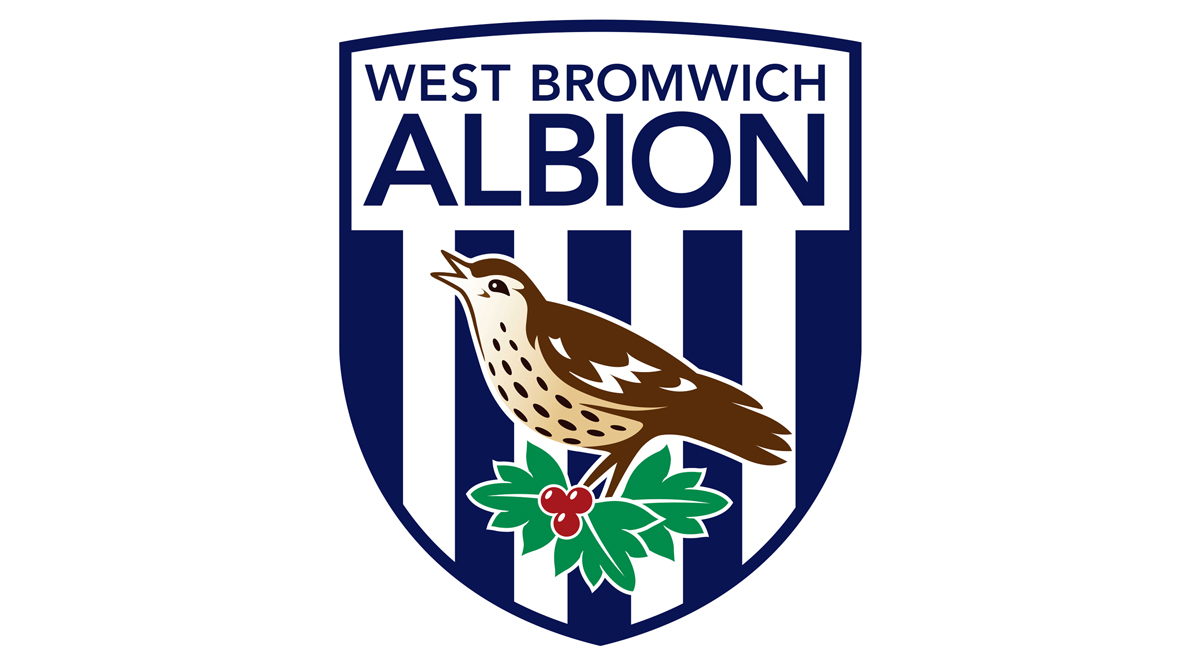
West Brom refreshed their badge in 2006 and did a pretty good job with it, adding the club’s name for the first time and keeping the hawthorn branch-perching thrush (who looks absolutely delighted, it must be said).
35. Leyton Orient
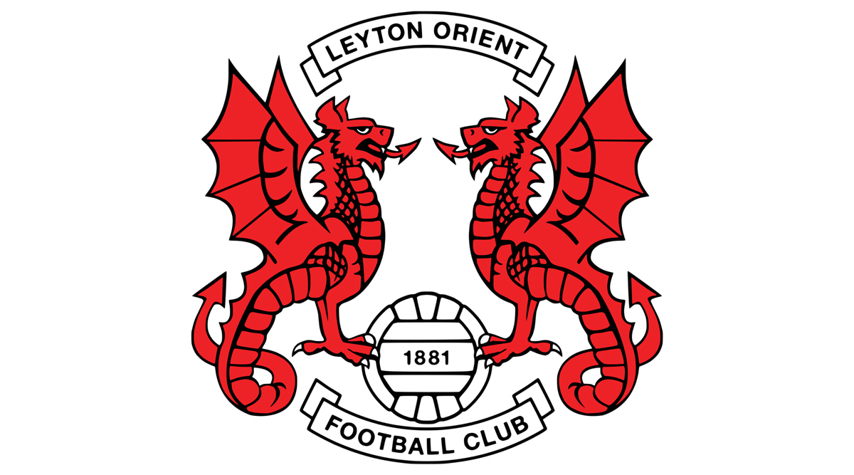
There are three Welsh clubs in the 92, but none of their badges look as Welsh as Leyton Orient’s. Only, those red creatures aren’t dragons; they’re wyverns – two-legged dragons as seen on the City of London coat of arms.
34. Carlisle United
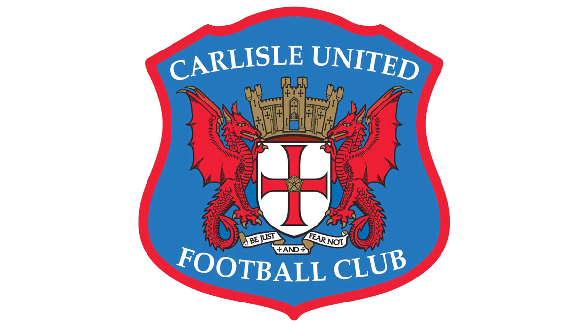
Carlisle’s badge-dwelling wyverns appear to have a much tougher job on their, er, claws than Orient’s, trying to stop the Cumbrian town’s castle from collapsing. Hang on in there, guys!
33. Manchester City
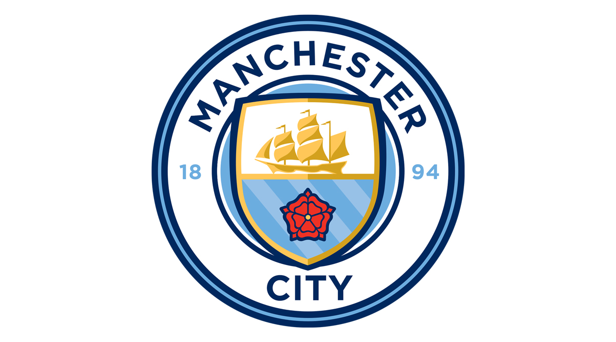
It would be easy to label City’s badge generic, but the five-time Premier League champions’ crest since 2016 is a modern take on a design first used in the 70s (and it’s quite aesthetically-pleasing, to be fair).
32. Swindon Town
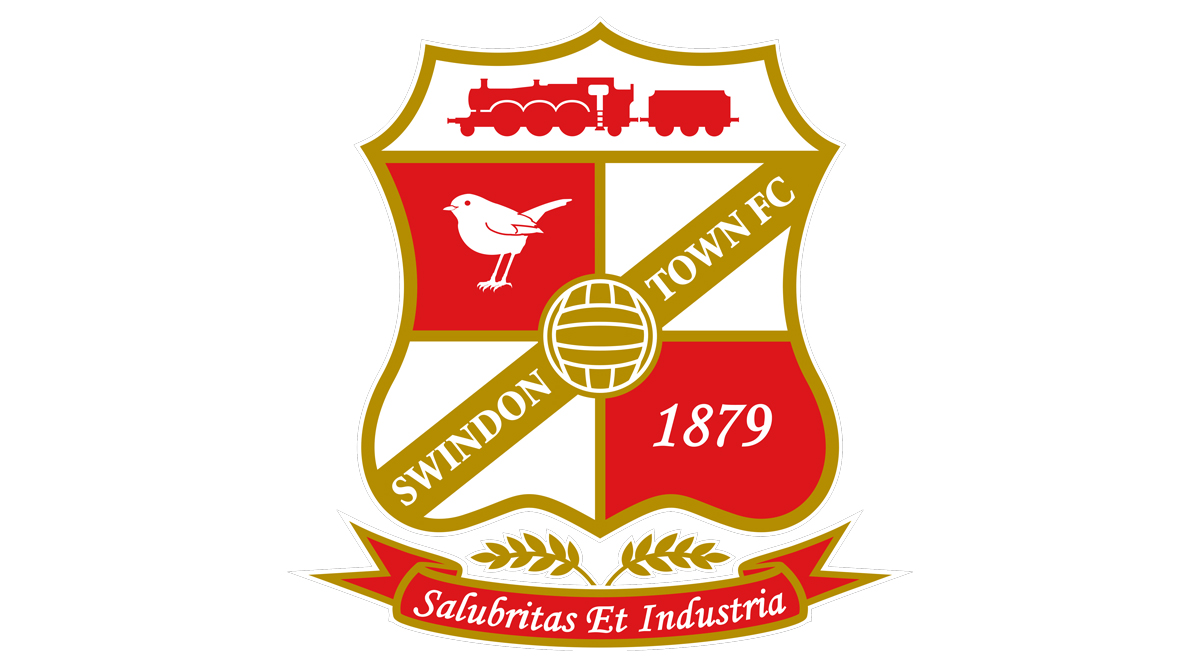
Seeing as the town is entwined with the history of the Great Western Railway, it’s only right that a steam locomotive takes pride of place on Swindon’s gilded crest – which overwhelmingly won a supporters vote in 2007.
31. Preston North End
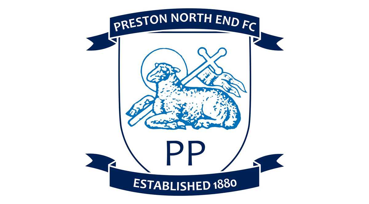
A symbol visible throughout Preston, the lamb on this famous old club’s badge represents seventh century bishop St. Wilfrid – the patron saint of the Lancashire city. And ‘PP’? ‘Princeps Pacis’ – Latin for ‘Prince of Peace’. Divine.
30. Everton
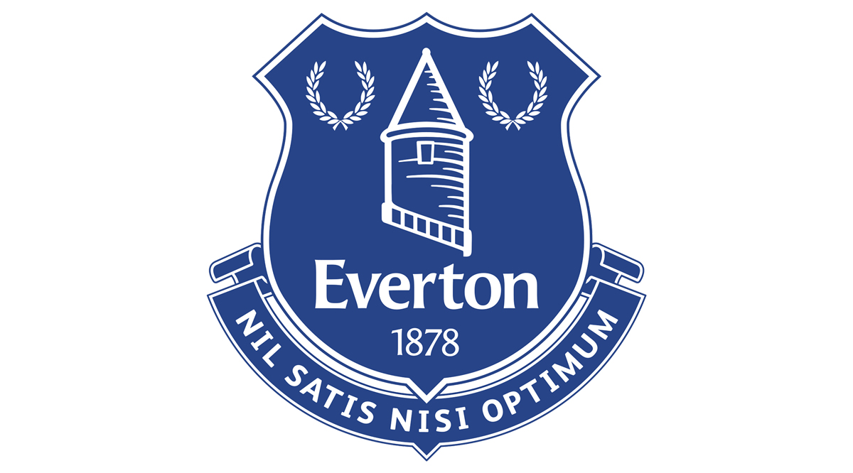
A fairytale castle tower? Nope, that’s Everton landmark Prince Rupert’s Tower – an 18th-century prison used as an overnight lock-up for local drunks. First appearing on the badge back in 1938, it’s become indelibly associated with the Toffees’ identity.
29. AFC Wimbledon
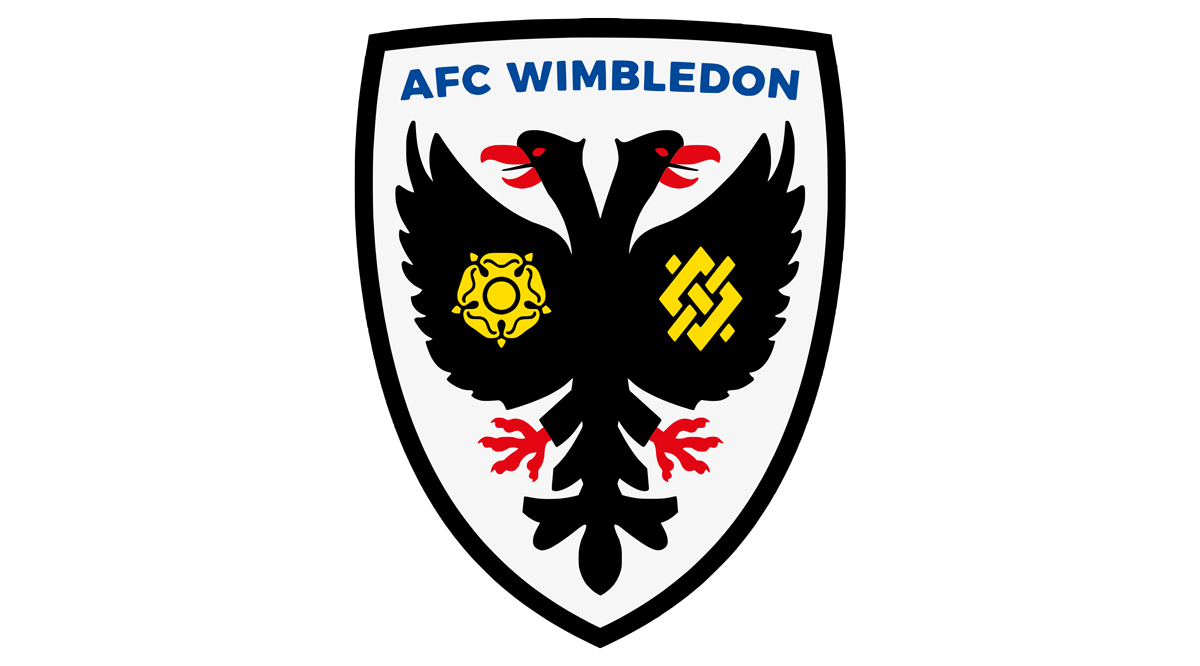
They’re a phoenix club, but AFC Wimbledon’s crest centres on a different bird: the double-headed eagle, a symbol associated with Julius Caesar – who legend has it once camped on Wimbledon Common.
28. Chelsea
Chelsea are proof that circular crests don’t have to be generic and uninspiring. In a nod to the badge they used from 1953 to 1986, the Blues restored the regardant heraldic lion for this 2005 redesign.
27. Arsenal
Twenty years old this year, Arsenal’s ‘new’ badge has truly stood the test of time (although the fact that it adorned the shirts of the 2003/04 ‘Invincibles’ will have played a fairly big part in that…).
26. Blackpool
OK, so it makes some of the elements a bit indistinguishable, but there’s a lovely hand-painted vibe to Blackpool’s suitably tangerine-infused crest – the tower-boasting Lancashire beach resort’s coat of arms.
25. Coventry City
A dove and phoenix fighting for a ball stuck under an elephant who’s volunteering for the Red Cross while carrying three giant pepper mills? Coventry’s crest is pure chaos and we’re all here for it.
24. Southampton
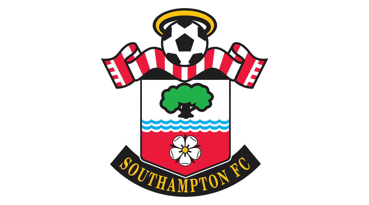
Teeming with local symbolism, Southampton’s suitably saintly crest is a subtly modified version of the 1970s competition-winning design by fan Rolland Parris. More badges could do with a scarf, we reckon.
23. Crystal Palace
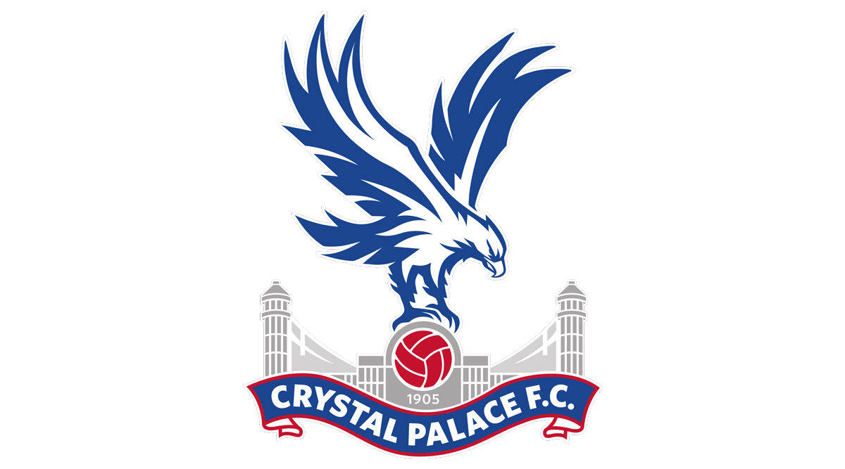
The great glass structure from which the area takes its name burned down in 1936, but the football club’s crest appears to depict its destruction by giant eagle instead – which would have been even more dramatic, to be fair.
22. Port Vale
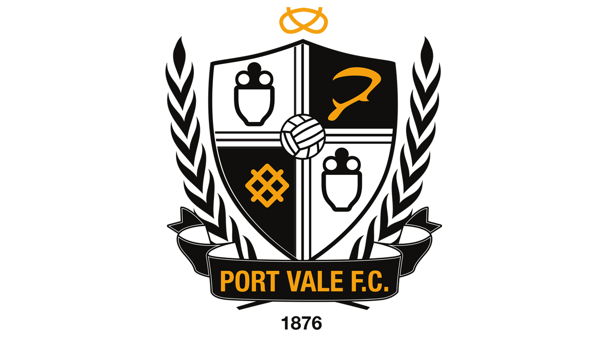
Their arch-rivals may use the ‘Potters’ nickname, but Port Vale’s badge actually references Stoke-on-Trent’s famous industry (and specifically ceramic tycoon Josiah Wedgwood, who was born and died in the Staffordshire city).
21. Norwich City
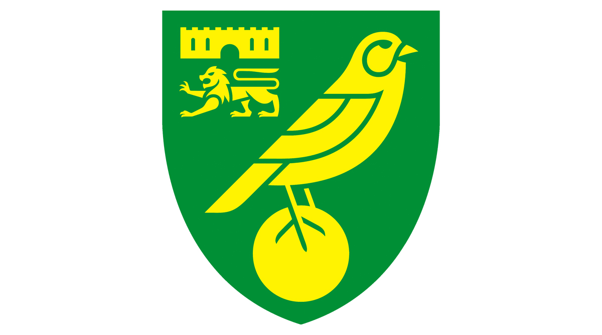
Norwich have given their badge a streamlined new look for the 2022-23 season – and it looks great, but we’d be lying if we said we didn’t miss the Bart Simpson lookalike lion from the previous version.
20. Bournemouth
Bournemouth are the only club in the 92 with an ex-player on their crest. The combed-haired fella heading the ball is legendary striker Dick Dowsett, who played a key role in shaping the Cherries’ modern identity as commercial manager.
19. Huddersfield Town
Huddersfield’s crest honours the club’s history and local area in various ways – but we’re obsessed with one feature: the stern-looking Yorkshire terrier who is absolutely not going to give you your ball back.
18. Leeds United
The football-emblazoned White Rose of York is the standout feature of a simple, classy badge which hasn’t changed for over 20 years (although Leeds almost wrecked it by proposing THIS in 2018).
17. Swansea City
It’s a myth that swans can break your arm – but you won’t catch us messing with the majestic beast which dominates Swansea’s updated badge; it’s already conquered castle, for goodness sake!
16. Sunderland
Featuring local landmarks the Penshaw Monument and Wearmouth Bridge, Sunderland’s current crest was launched to coincide with the opening of the Stadium of Light in 1997 – and it’s stood the test of time!
15. Tranmere Rovers
Tranmere went retro with their kit for the 2021/22 season – which meant going retro with their badge, too. It's remained ever since, with the club preferring the colourful option and little battleship-emblazoned football in reference to Birkenhead’s shipbuilding industry.
14. Bolton Wanderers
Clean and modern (even though the circular arrangement of ‘BWFC’ first appeared in 1975), Bolton’s badge is instantly recognisable – and since the previously unravelled ribbon was re-tied in 2013, it’s looked back to its striking best.
13. Ipswich Town
Have you ever seen a horse look more like it’s about to score a solo wonder-goal? That’s not any old horse either; it’s a Suffolk Punch, described by designer John Gammage as “a noble animal, well-suited to dominate [the badge]”.
12. Notts County
If any club deserves to include their founding year on their club crest, then it's most definitely Notts County. The oldest professional football team in the world, 1862 sits proud and loud in the centre of the badge - and why shouldn't it? The magpies perched atop the ball are a nice touch, while the iconic black and white stripes look classy.
11. Derby County
All manner of animals appear on the crests of Premier League and EFL clubs, including rather a lot of lions – but we still reckon that Derby’s typically pugnacious-looking ram is the meanest of the lot. No words needed.
10. Wrexham
Quintessentially Welsh, this is just a subtly brilliant crest. The obvious hints to Wales: the red dragons and colour choices are both great, but it's the meaning behind the upper section that has truly caught our attention.
Featuring the feathers of the Prince of Wales, Wrexham needed permission from Buckingham Palace to use them, while the 'Ich Dein' writing means 'I serve' in German - though this has also been attributed to 'Eich Dyn' in old Welsh, which means 'Your Man'. Clever, and thus a top-ten finish for Wrexham. llongyfarchiadau!
9. Luton Town
It’s common to see badges topped off with a medieval knight’s helmet, less so a boater hat – but hat-making is Luton heritage, and that terrific touch complements the modified version of the Bedfordshire town’s crest beautifully.
8. Blackburn Rovers
Comprising one heck of a Red Rose of Lancaster nestled in what looks like a presentation box embossed with the club’s Latin motto, this is certainly a badge worthy of Premier League champions.
7. Manchester United
Manchester United haven’t significantly revamped their badge since 1973, when they added the synonymous red devil – and why would they when it’s surely the most instantly recognisable crest in the world game?
6. Liverpool
Liverpool’s shirt carries a minimalistic version, but the club’s full badge is quite beautiful – incorporating Anfield’s Shankly Gates, and two eternal flames to forever honour the victims of the Hillsborough tragedy.
5. Newcastle United
A black-and-white-striped shield supported by two rather robust seahorses, topped off with a flag-plating lion popping out of a turret, Newcastle’s glorious crest is one of the most distinctive ever to grace the Premier League.
4. Barnsley
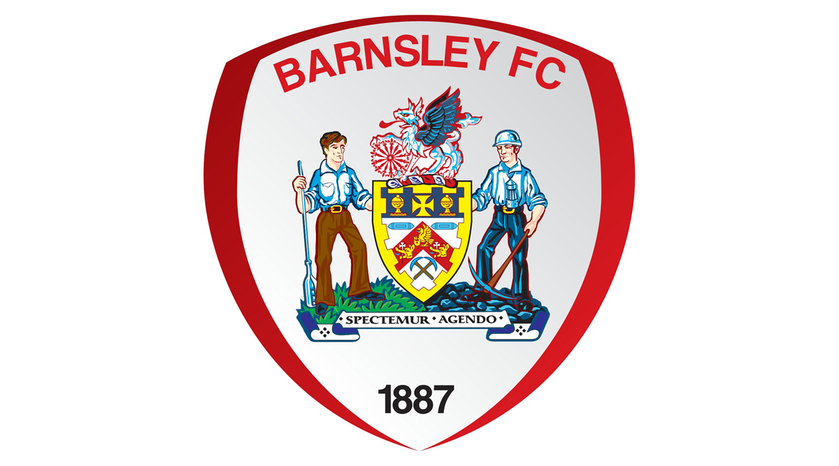
The glassblower and miner look like they’ve done a mighty fine job crafting the badge within a badge on Barnsley’s crest. Hopefully, that incongruous-looking dragon isn’t about to reduce it to ash.
3. Barrow
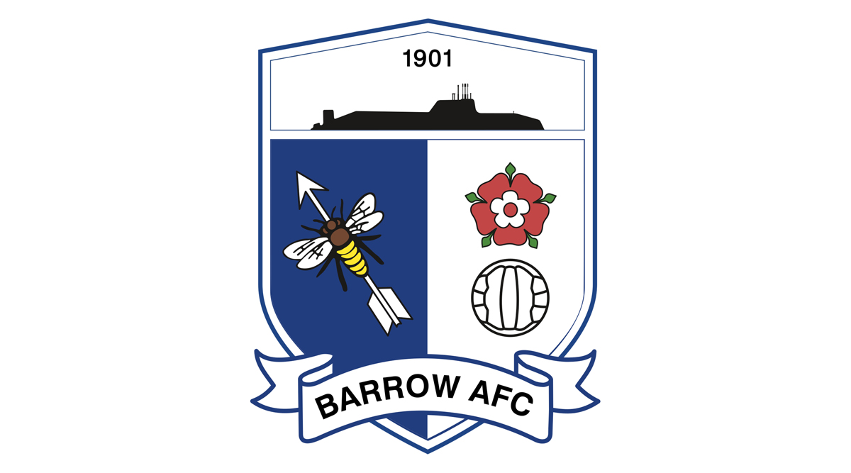
Can you spot the pun on Barrow’s badge? Well, there’s a bee… on an arrow… You’ve got it now, haven’t you? The submarine, meanwhile, represents the Cumbria town’s shipbuilding heritage. Splendid.
2. Wolverhampton Wanderers
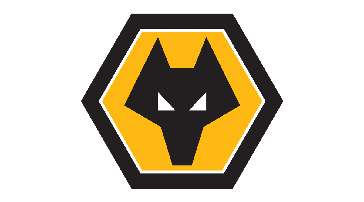
Wolves are the only Premier League club whose badge doesn’t contain any letters. And it doesn’t need to; this is an enduringly iconic design that leaves you in no doubt as to whose shirt it adorns.
1. Nottingham Forest
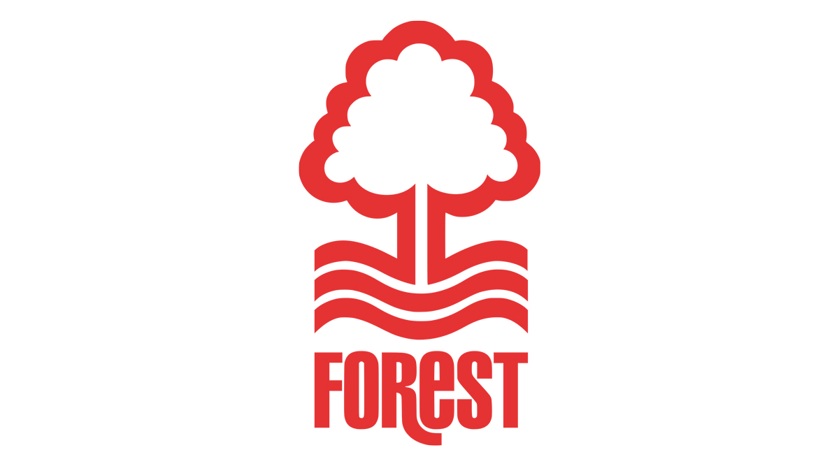
The tree; the font; the general funkiness… Exciting and utterly iconic in its simplicity, Forest’s badge is stunning proof that sometimes, less really is more. There’s a reason it’s barely been touched since its introduction almost 50 years ago. Art.
