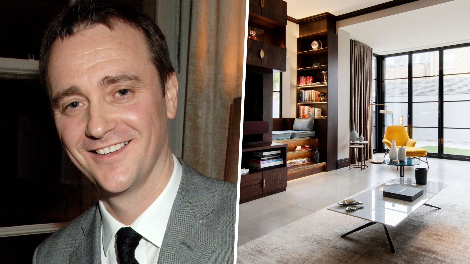
Michelin-star-winning Chef Jason Atherton is known for his award-winning restaurants around the world. Thus, the redesign of his home needed to balance his creativity and adventurousness with his busy family life. The result is a masterful equilibrium between modern glamor and cozy, lived-in style.
Atherton instinctively knew there was no one to execute his modern decorating vision like Dale Atkinson, frequent collaborator and founder of Rosendale Design. Atkinson tells Homes & Gardens: 'The design process was actually quite smooth as I have worked with Jason and his wife, Irha, for many years so we have a great synergy. Over the years, I have designed a considerable number of his restaurants in the UK and abroad, so I understand what he is after and what he likes. I was very humbled when I was asked to design their family home as that, to me, shows the greatest trust.'
He continues: 'We started the process by making a mood board and material palettes for each room and then streamlining ideas. We also produced a few realistic 3D renders, so they knew exactly what the spaces would look like, which tends to give the clients confidence as they can see what it looks like ahead of building it.'
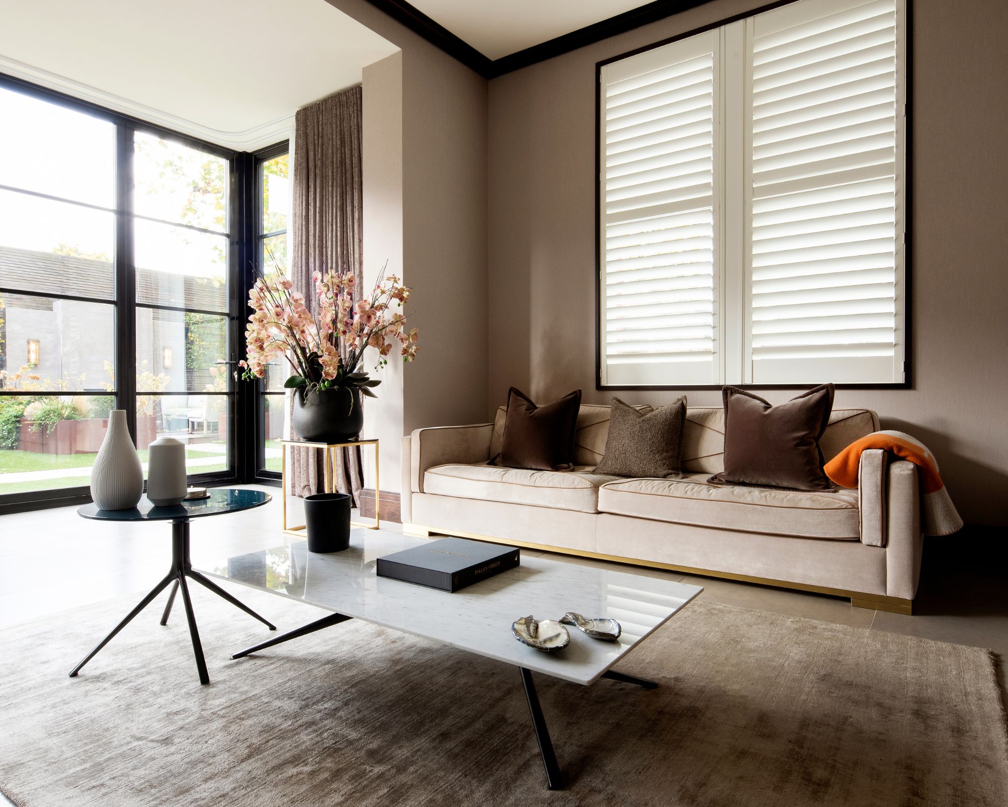
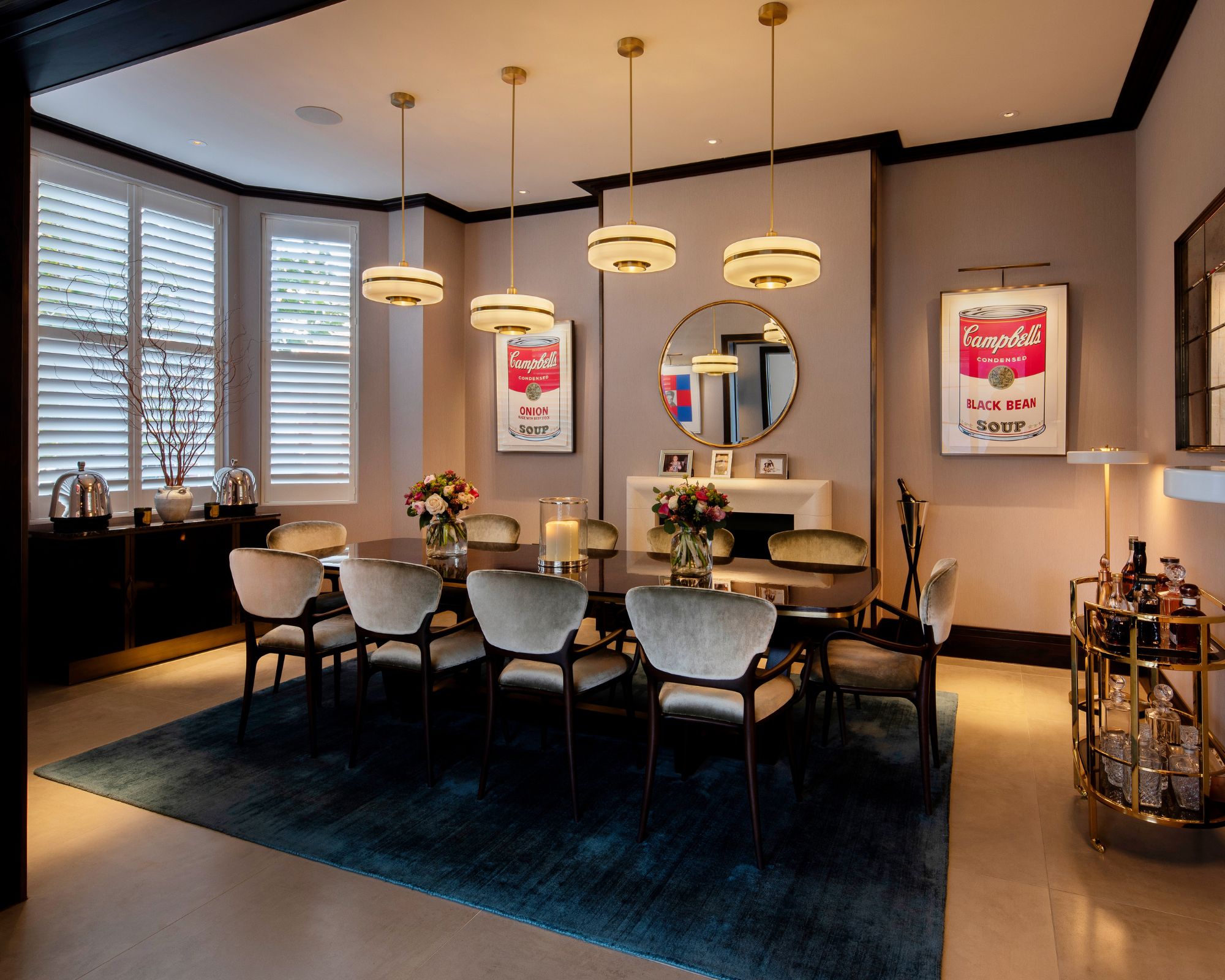
When asked about the interior design style of the space, Atkinson says: 'The best way I can describe the style is Timeless Contemporary but with a sympathetic eye on the existing architecture.' He says that the upgrades he made to the space were about bringing Atherton's family's personality and flair into the home. Atkinson states: 'It was originally done by a local developer; however, it was very bland and safe. Essentially, it was a procession of white lifeless boxes. Between the architecture and the family’s extensive art collection I sought to create a bridge, bringing both together.'
Obviously, since Atherton is a professional chef, the kitchen design was of utmost importance in this home. 'Not only did it need to match the existing standards of a Michelin-starred chef, but it also needed to function as space in which the family could congregate and bond,' says Atkinson. 'This area was very much seen as the beating heart of the house so we installed a large booth style bench around the dining table so one can linger and spend time relaxing. It worked well as the 3 girls quite happily congregate and Jason and Irha can spend time with them.'
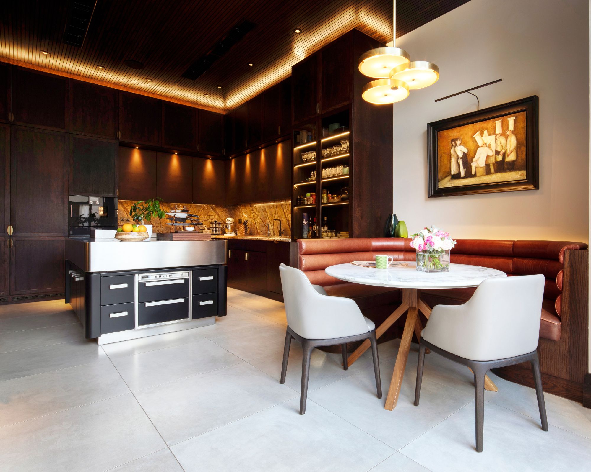
The most stand out feature? Atherton's specially chosen kitchen island. Atkinson says, 'Jason did add one main flourish, he wanted a professional grade Molteni- France island unit that weighed close to a ton, so we had to have the floor beams strengthened.'
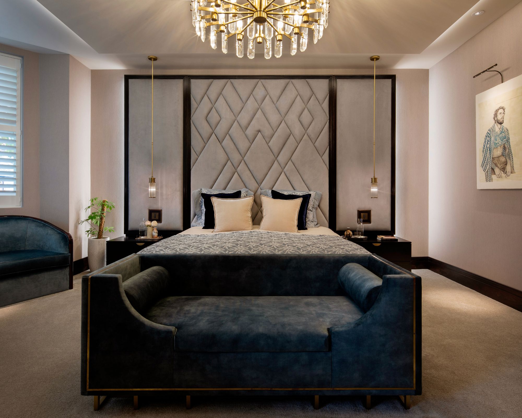
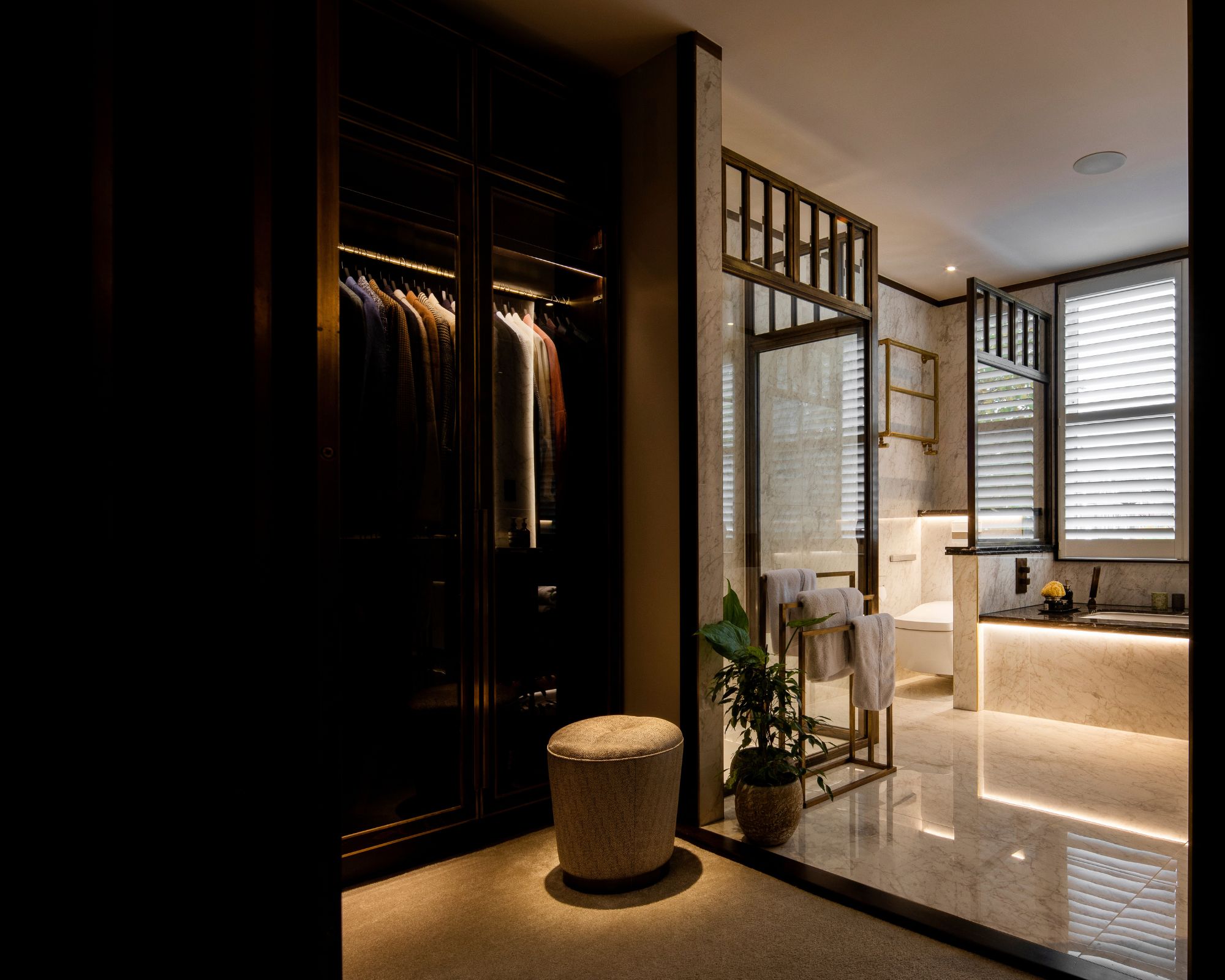
The artful balance of glamor and lived-in feel is carefully achieved through expertly decorating with neutrals. 'Throughout the house we used a calm colour palette but one that could flow from space to space. This was premeditated as we wanted to let the artwork, furniture and accessories pop and give the various spaces a sense of energy and character,' Atkinson tells H&G.
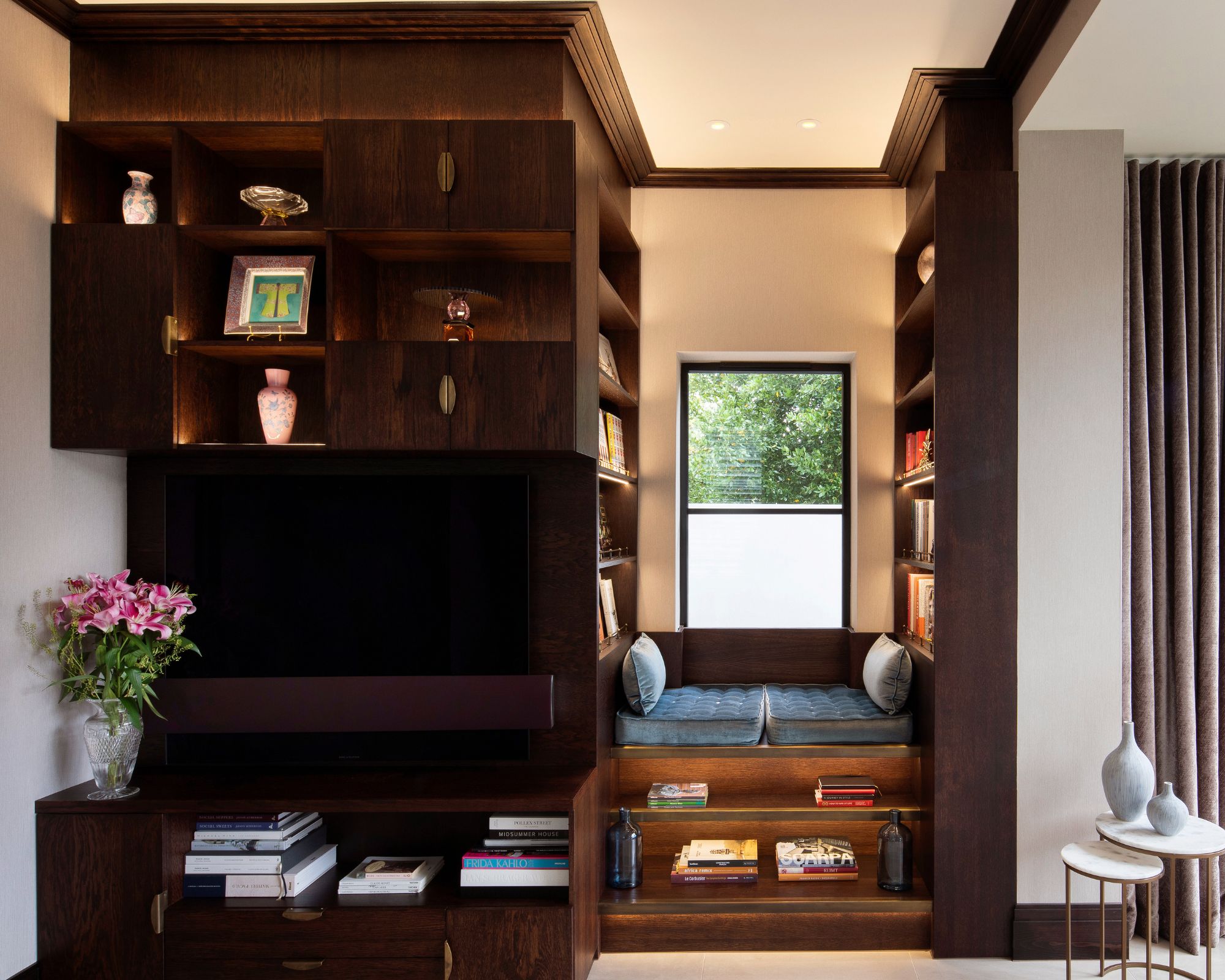
This calming palette is especially highlighted by warming architectural elements, like this charming reading nook. Though there is a focus on contemporary finishes, Atkinson's design doesn't make the pitfall of turning a modern home too cold.
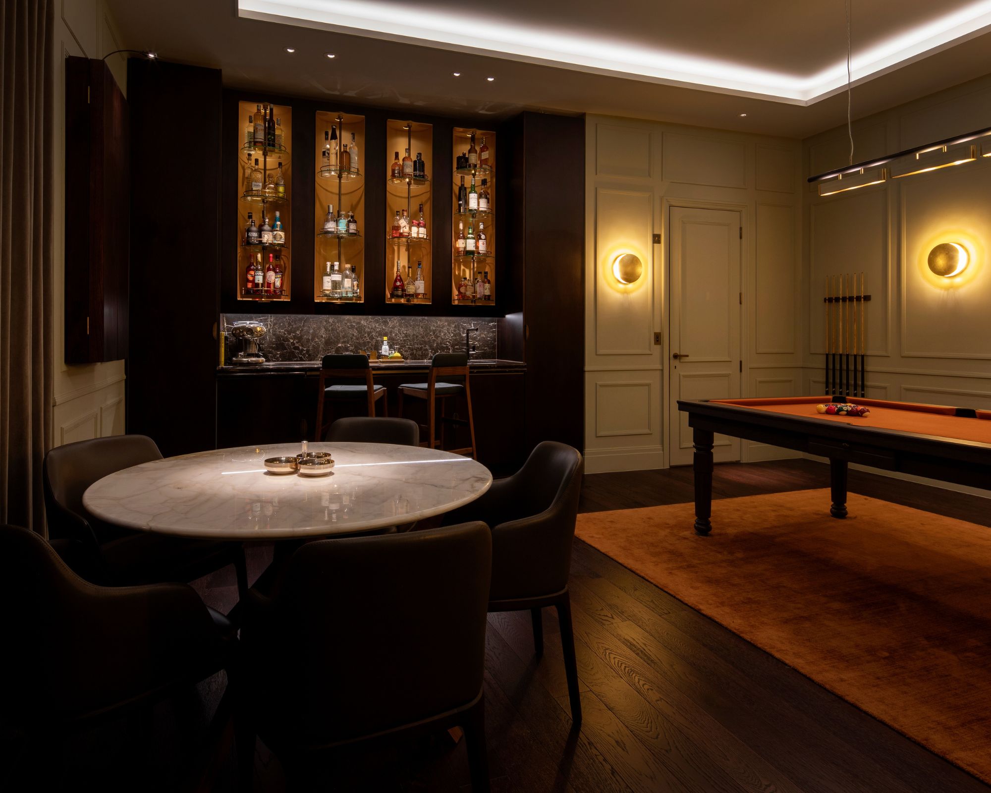
However, the commitment to cohesion didn't stop Atkinson from bringing fun and whimsy into the design. He states: 'One room where we did break away from the calm palettes was Irha’s dressing room, where we used pink as the main color and employed some De Gournay wallpaper in her Powder Room which really helps to elevate the space.'

Shop The Look
Recreate the scheme with an artful combination of modern touches and classic furnishings. This edit is inspired by Atherton's living room idea featuring a gorgeous clean-lined sofa from CB2, grounding chocolate brown pillows from Wayfair, and these rounded silver candlesticks from NET-A-PORTER to add a modern edge.
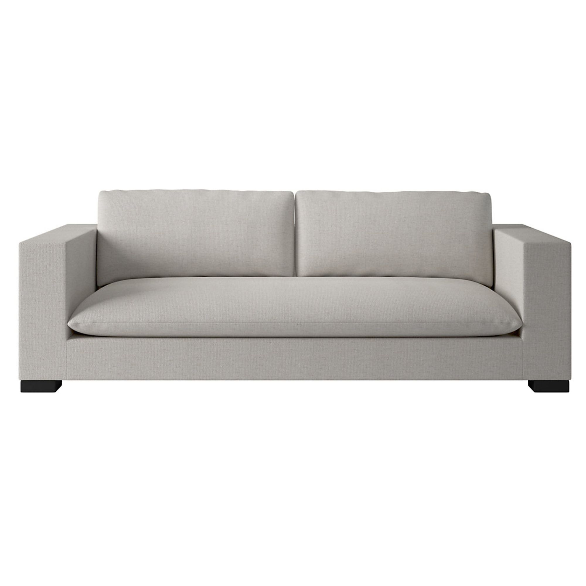
This stylish gray sofa has clean lines and a cool color for an exceptionally modern feel
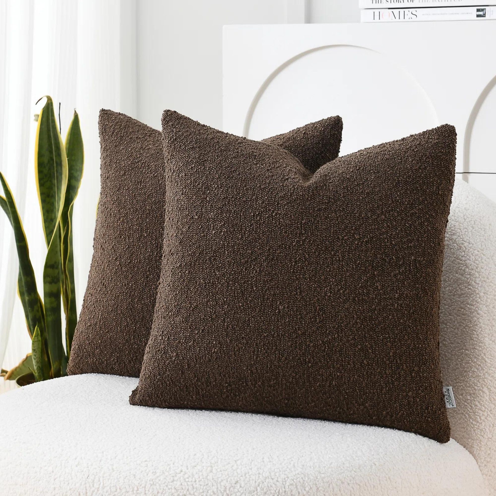
This set of 2 chocolate colored throw pillows brings texture to a neutral color scheme
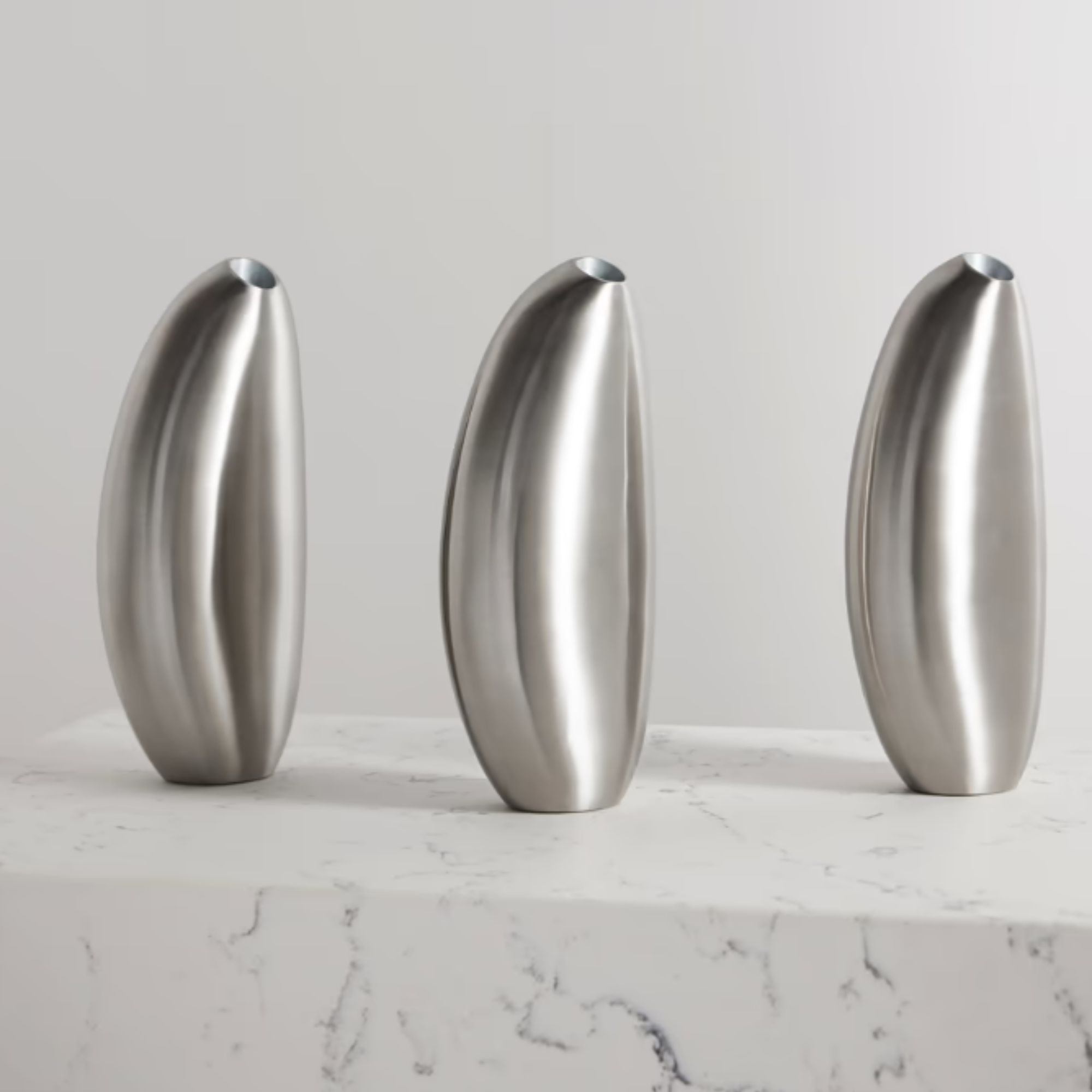
These stylish rounded candlesticks add an instant atmosphere of contemporary luxury to any space
If you are hoping to recreate the scheme, start with a focus on cohesion. What are elements of color, shape, or pattern that you can repeat in ever space in your home? This idea is called the 'Red Thread Theory' and it's about creating a seamless connection between different spaces in the house. The beautiful thing about this technique is that it can be used in any home, no matter the style.
Beautiful homes like Jason Atherton's are a reminder that any style can be timeless with the right attention to detail.


