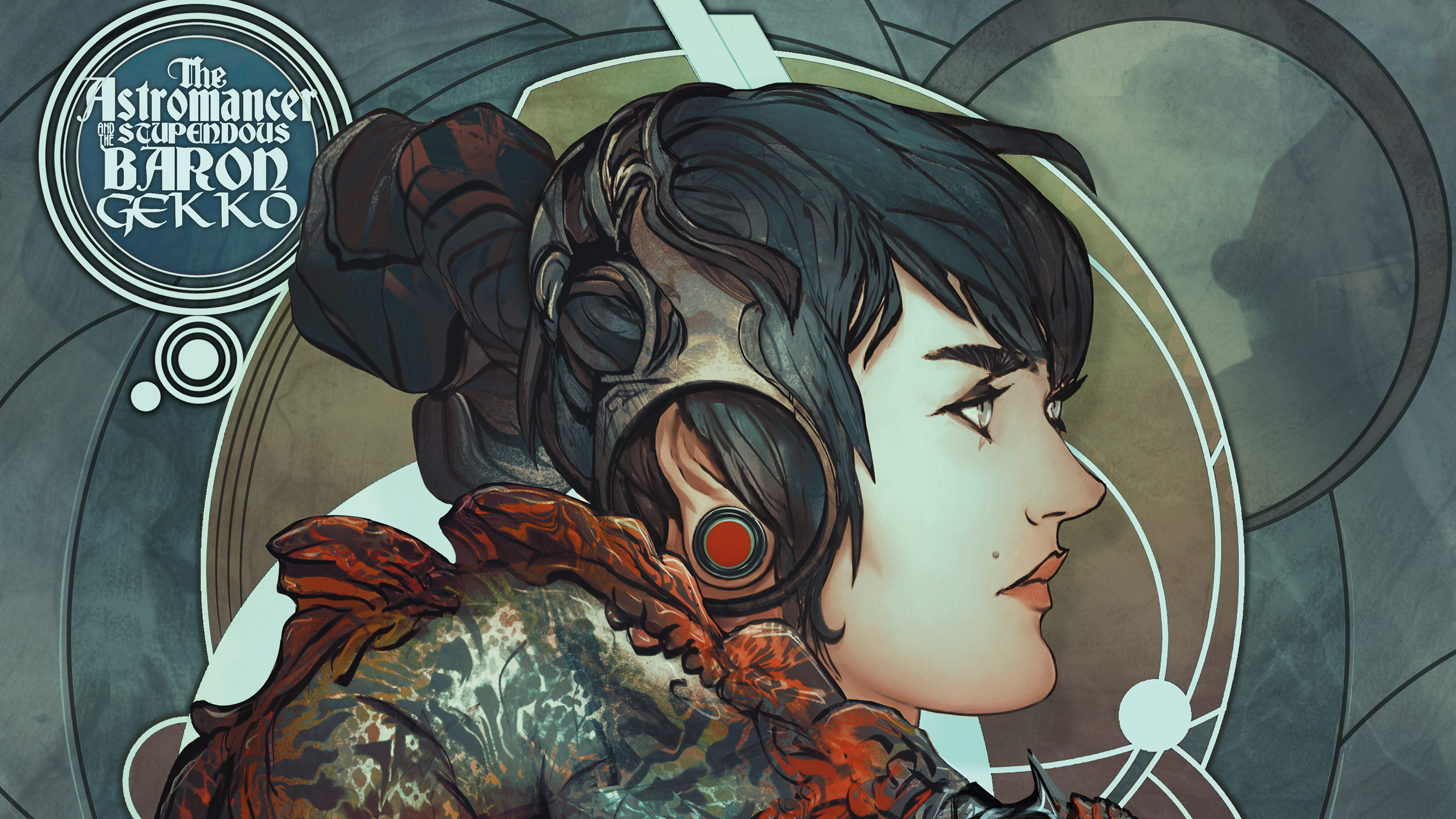
In this Procreate character design workshop, I'm going to share one of the things that inspires me the most about being an illustrator. It's the possibility of embedding every fibre, every pixel of your artwork with a sense of narrative that’s happening right below the surface of the canvas – conveying an underlying story, just as if you’re capturing a moment in a storyline that’s already in motion.
Sure, we can do this with sequential art, like comics, but I do love the story-oriented approach of creating an illustration that’s a vertical slice of an ongoing narrative – without the ‘before’ and the ‘after’, just a glimpse that will entice our imagination.
What we’re doing in this workshop is exactly that: creating a scene with compelling characters that will make us ask questions, and lead us to inspiring places. I feel that asking questions is more interesting than answering them, at least in the context we’re dealing with here, so our goal will be to develop a piece that will inspire others to pursue those answers their own way, through their own sensibility lenses.
I’m doing this workshop illustration using Procreate for the iPad Pro, one of the best drawing apps for iPad. But I’m making sure you can apply any of these fundamental ideas using whatever support you’re familiar with. This guide is more about the subjective creative process, not so much the drawing and painting foundations. If you're still on the hunt for your artistic tools, check out our guides to the best iPads for drawing and the best drawing tablets.
So grab your pencils or brushes, our story starts now.
Procreate character design: how to get started
01. Develop the concept
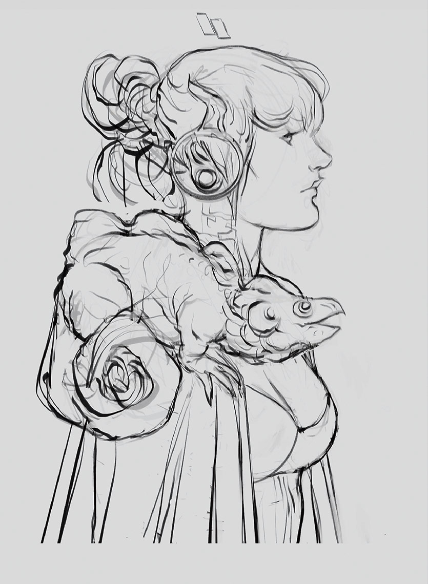
This is where the fun begins! I start sketching possible ideas and compositions that might help me come up with a mini universe, where my characters will inhabit. I want something that feels like alchemy-meets-astronomy, in the form of a sorceress-type character (and her familiar). I find a sketch I like, and move on.
02. Lay down the sketch
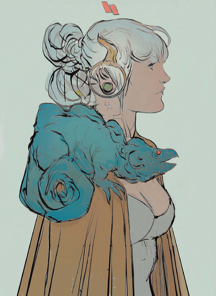
Based on the (incredibly loose) first sketch, I start to develop that idea into something less abstract. I know I have this character and some sort of creature as the companion, but here’s when I start thinking about the storyline I want to convey through the piece.
03. Set the mood
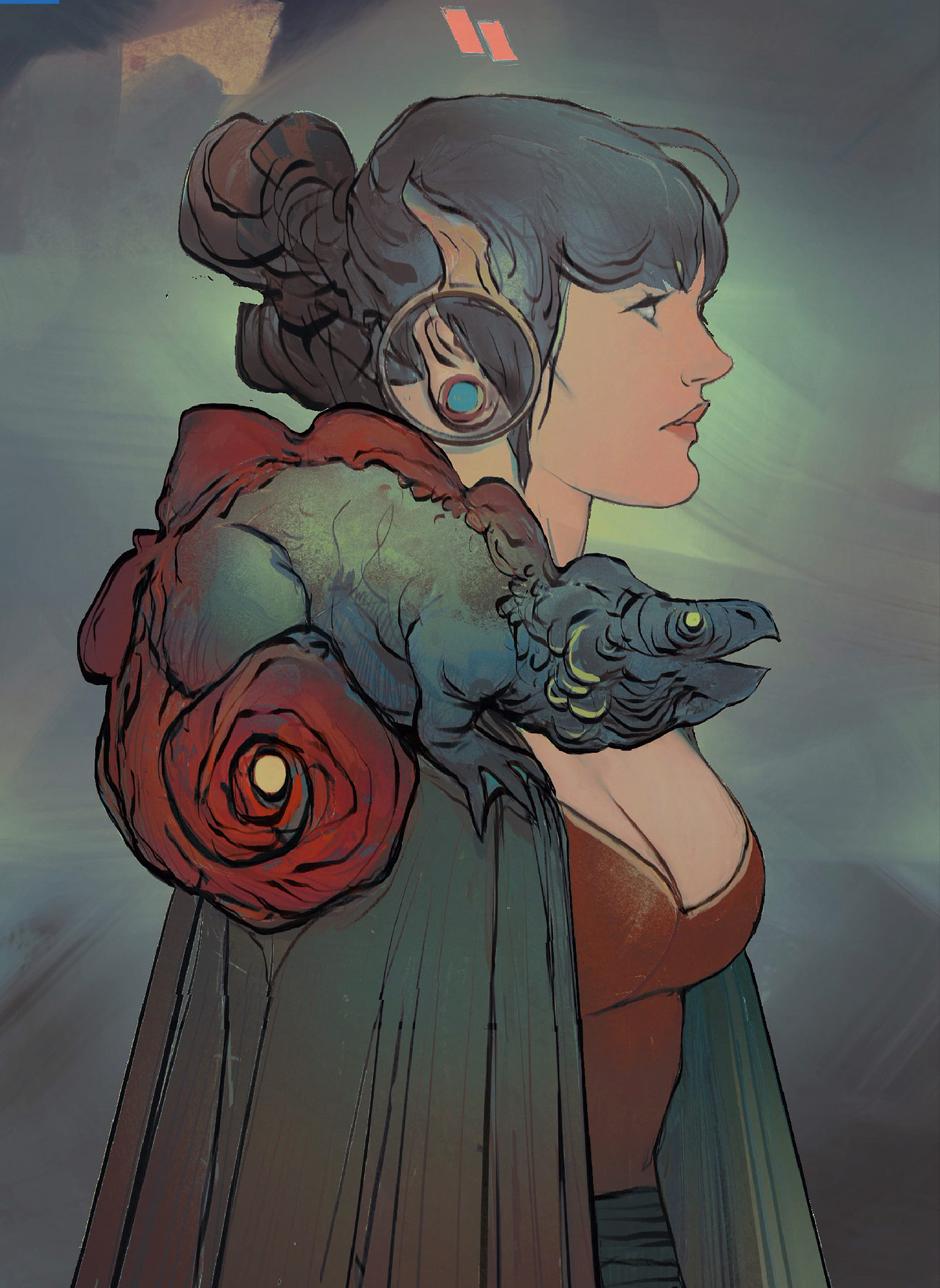
Before I even set definitive designs and composition, I usually start laying down some very basic colours. This helps me to better shape the mood I’m looking for, and that will inform my decisions along the way, allowing the idea to breathe and flow freely as I paint. It’s a living process for me, always, as this allows me to do whatever the image ‘asks’ me.
04. Consider the intentions
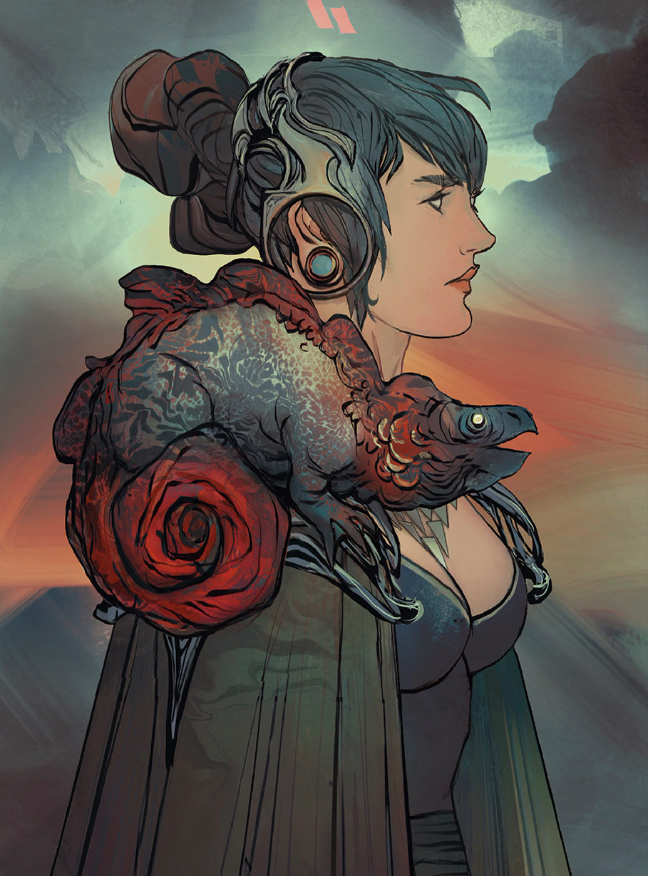
At this stage, I’m starting to understand what the illustration will be about, based on the constant brainstorming that occurs in parallel to the drawing process. I have an idea that will require some sort of fancy costume design, so I start playing around with the head piece and the shoulder piece, over which the lizard friend rests upon.
05. Support your friends
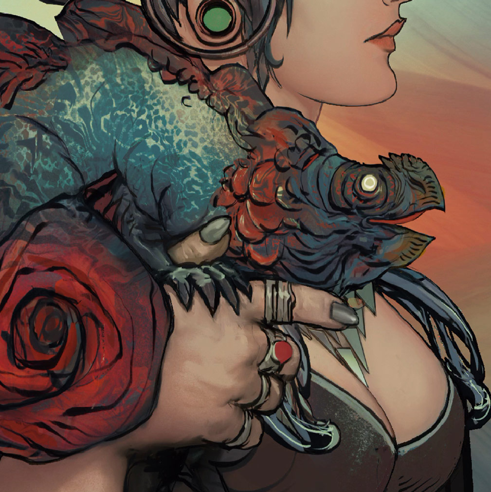
At this stage I hadn’t precisely finalised what this character will be (maybe a warrior, or a sorceress?) and so with regards to her pose, I had kept my options in the open until now. I think that she might be someone important, but so is her alien reptile friend. So I give the little guy a resting support with her arm, as if he’s just as interested in whatever she’s looking at.
06. Add graphic elements
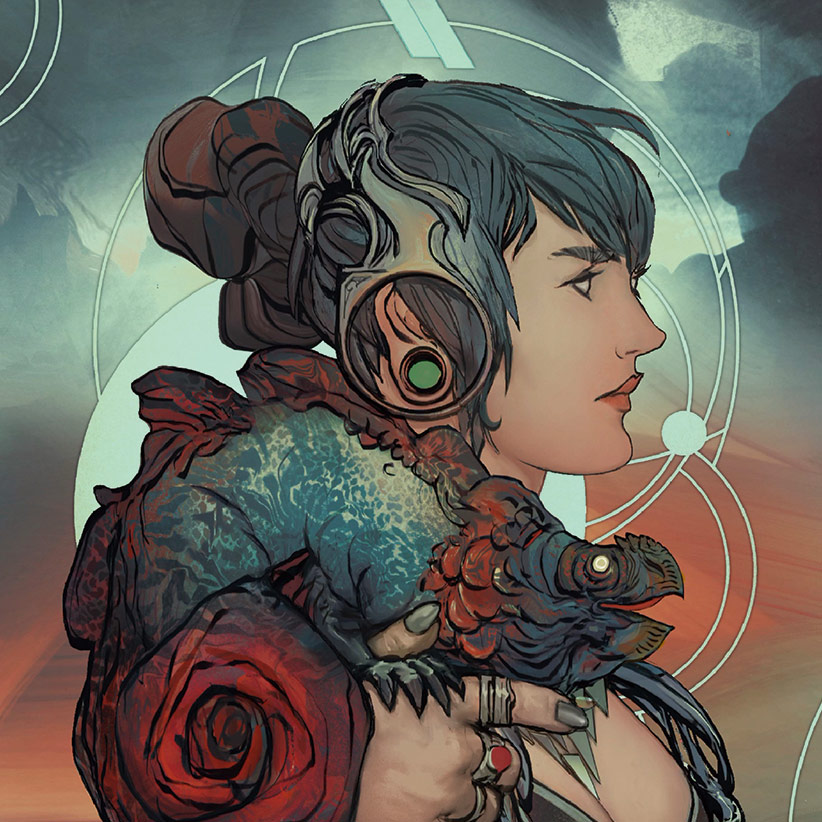
I’m not sure, at this stage, if I’ll add an actual background, so I had to question: what and why? I then think of an element that will bring some spice to the fantasy vs sci-fi mood I’m creating: a deconstructed version of a halo, in a non-figurative way. This will juxtapose the character’s silhouette in two ways, by adding an interesting element in the background and also balancing the composition.
07. Technology or sorcery?
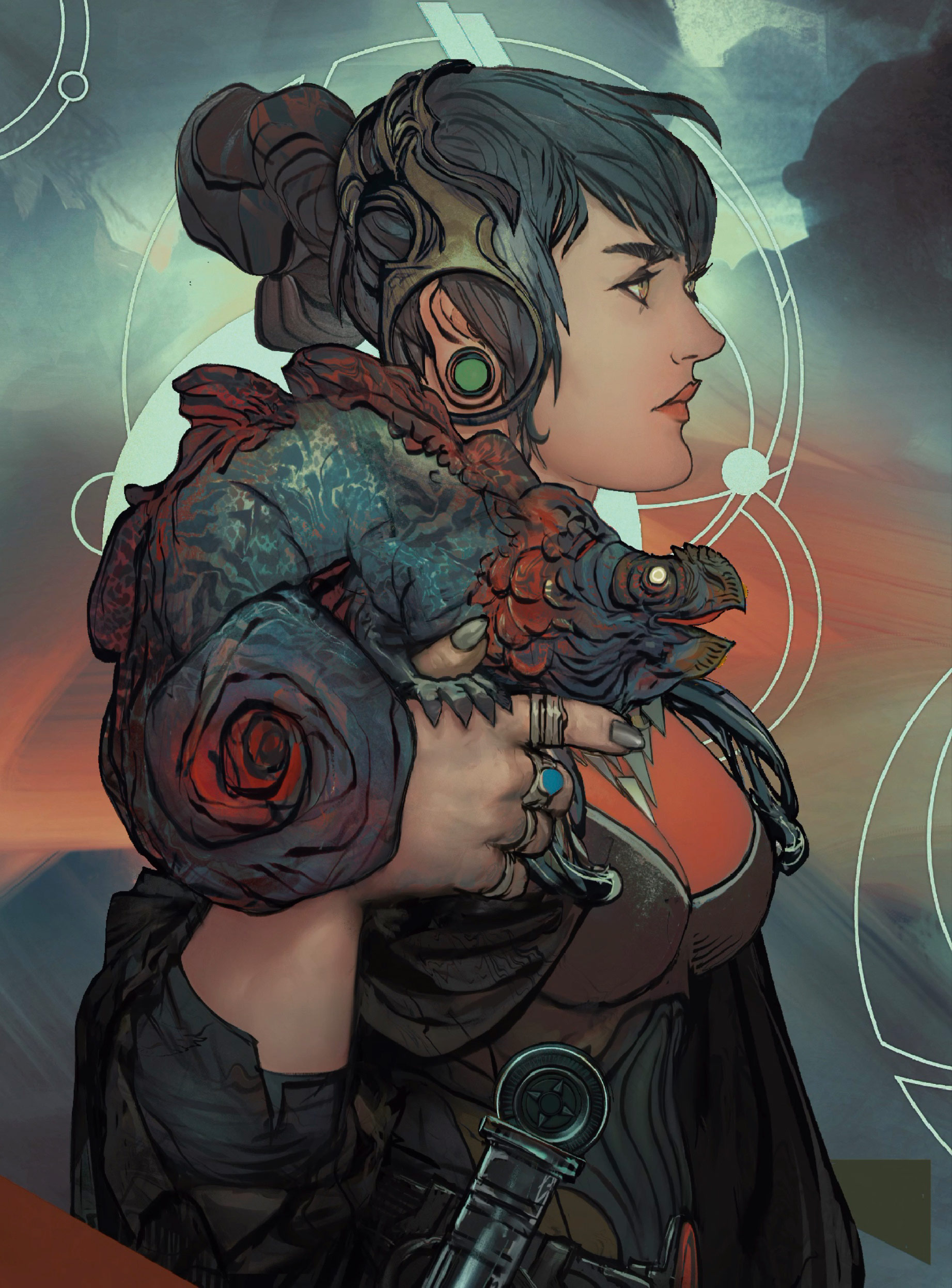
I’ve figured that she’s some sort of sorceress, maybe dealing with fringe science that borders on magic, so my design decisions will now support that scenario. I start adding accessories and costume details that will reflect the nature of this character, even if just through suggestions and visual cues. It’s now an otherworldly setting, perhaps a hyper futuristic world where magic and science are indistinguishable.
08. Book cover-esque
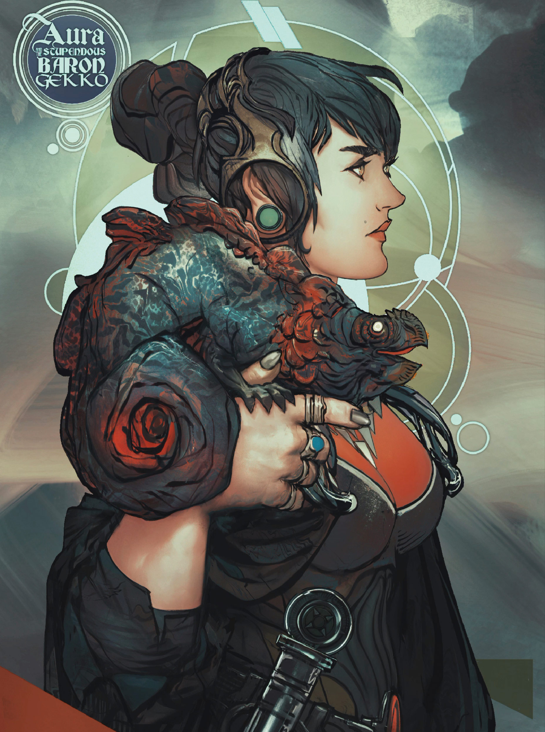
This is a still image, not a dynamic scene, much like a book cover would be… and then it hits me: how about turning this into some sort of poster or cover? Maybe for the imaginary book where this story is happening? I like this. The ‘halo’ becomes a subjective element now, taking the development of the concept even further, encasing the characters.
09. Baron what?
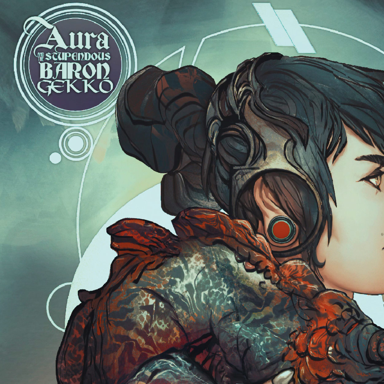
As you may have spotted, the characters now have names! For now, I’ll call her Aura and her companion becomes… the stupendous Baron Gekko. Why is he a baron, what is happening? These are some of the questions I want you to make, when you see the illustration and read the little title seal.
10. Solidifying the (visual) backstory
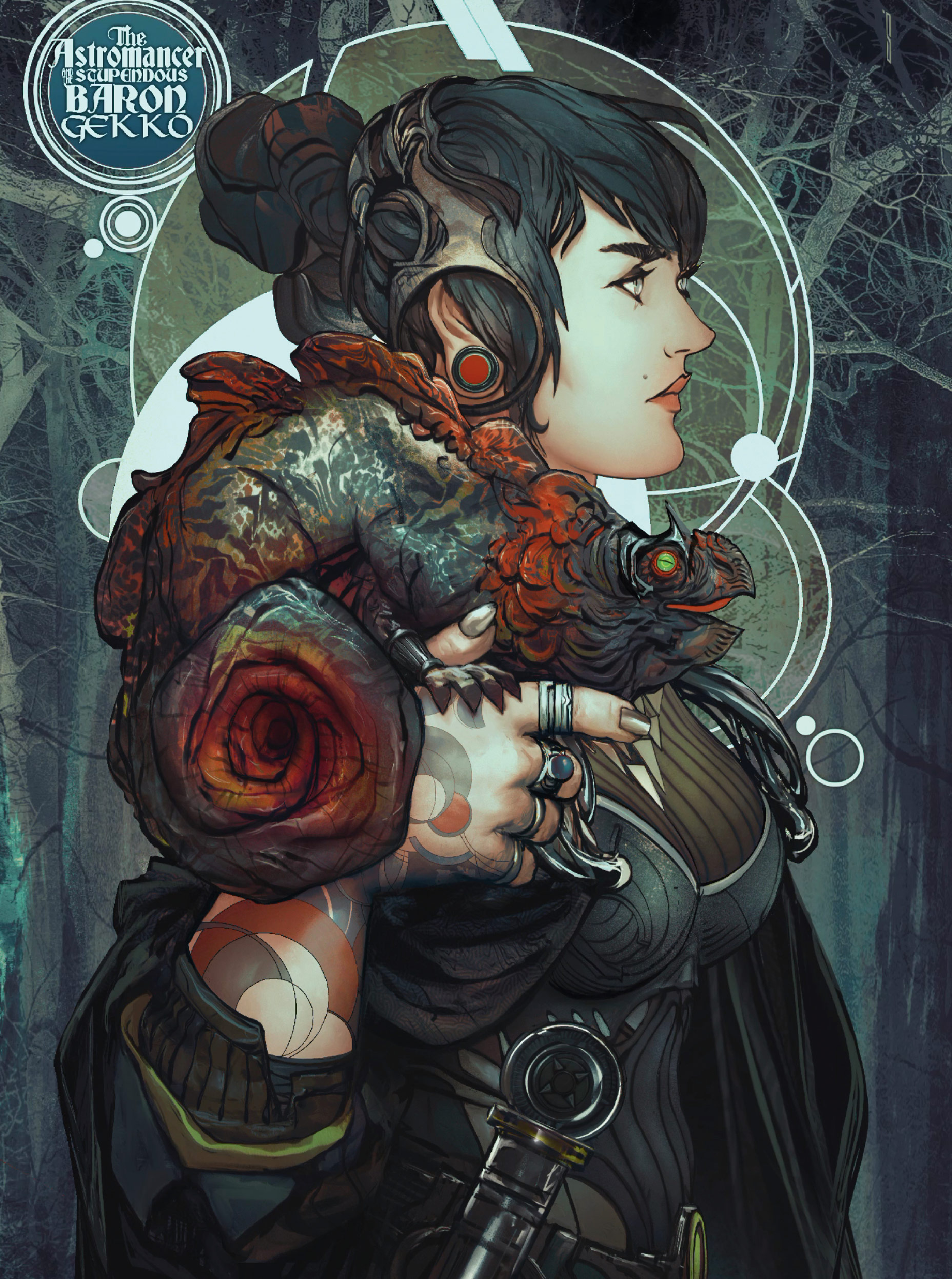
I’ve figured that Aura should be a special kind of ‘supernatural scientist’, something that might merge the fantasy atmosphere with the sci-fi undertones I’ve been tweaking so far. I change her title to “The Astromancer”, which in this specific context I’m creating, would be an alchemical scientist and occultist figure that relies on the observation of the universe as a divination method. I add tattoos that resemble maps and charts, maybe related to the technologies she uses for her craft.
11. What about that background?
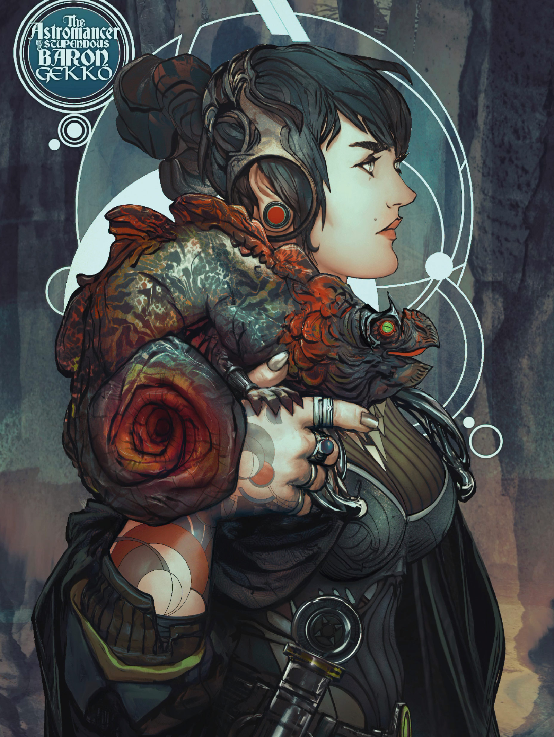
I create a rich textural surface that resonates with magic, with the suggestions of woods and all the earthy tones, but then realise it might not fit the sci-fi-esque narrative. So, I scrap the background and start over. These changes are an integral part of my creative process, and help me to achieve (usually) more interesting ideas in the end, than if I just stuck with what I had in the beginning.
12. Narrative considerations
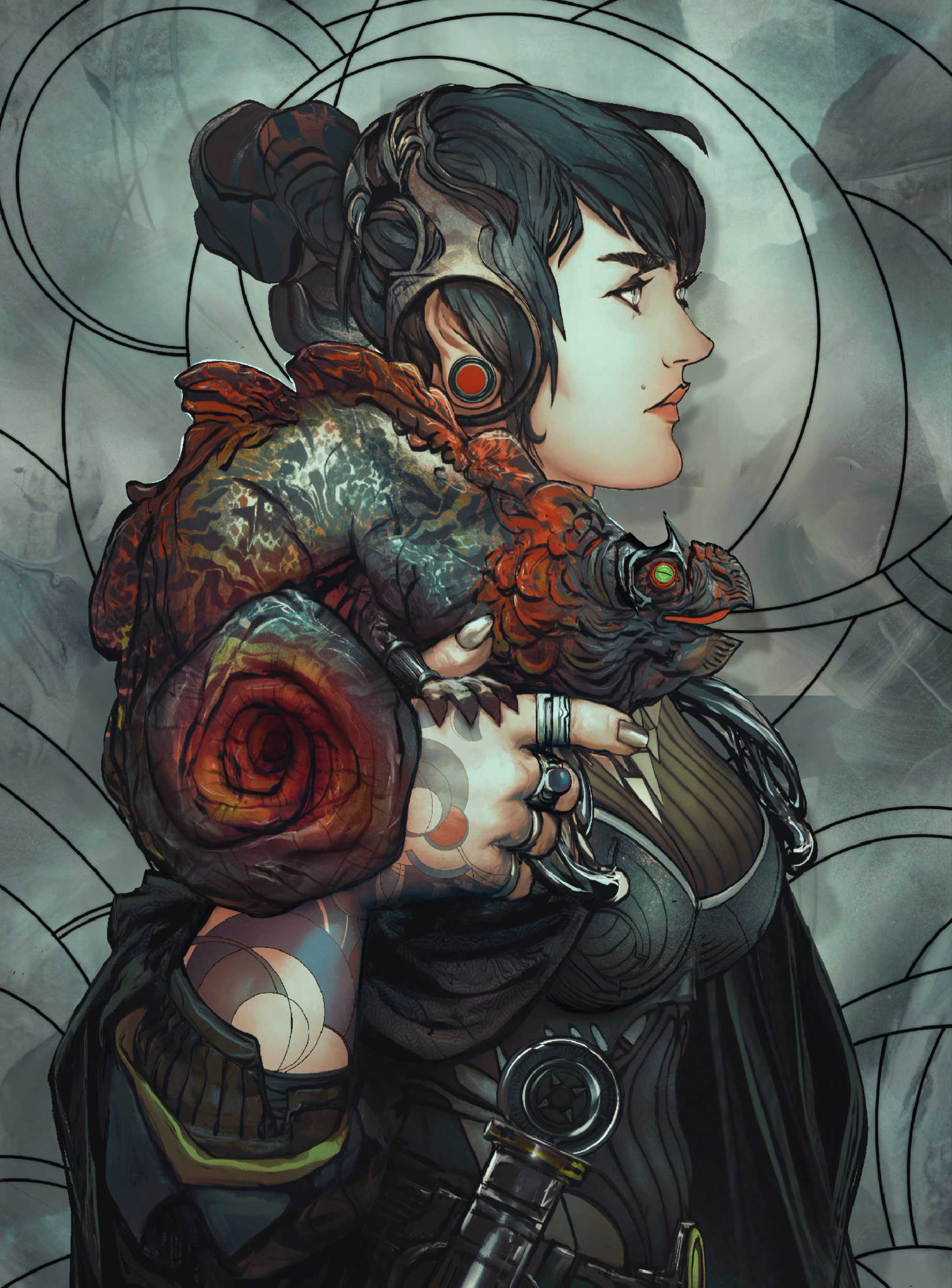
Thinking about her astro-related tattoos, I realise the background should reflect that, and push this fantasy scene a bit further into the sci-fi direction, changing the balance of the whole concept. I design the rings on a separate layer, and then start to apply and adjust it to the panel or wall behind her, almost like this is the place where her science magic happens.
13. Finish up the details
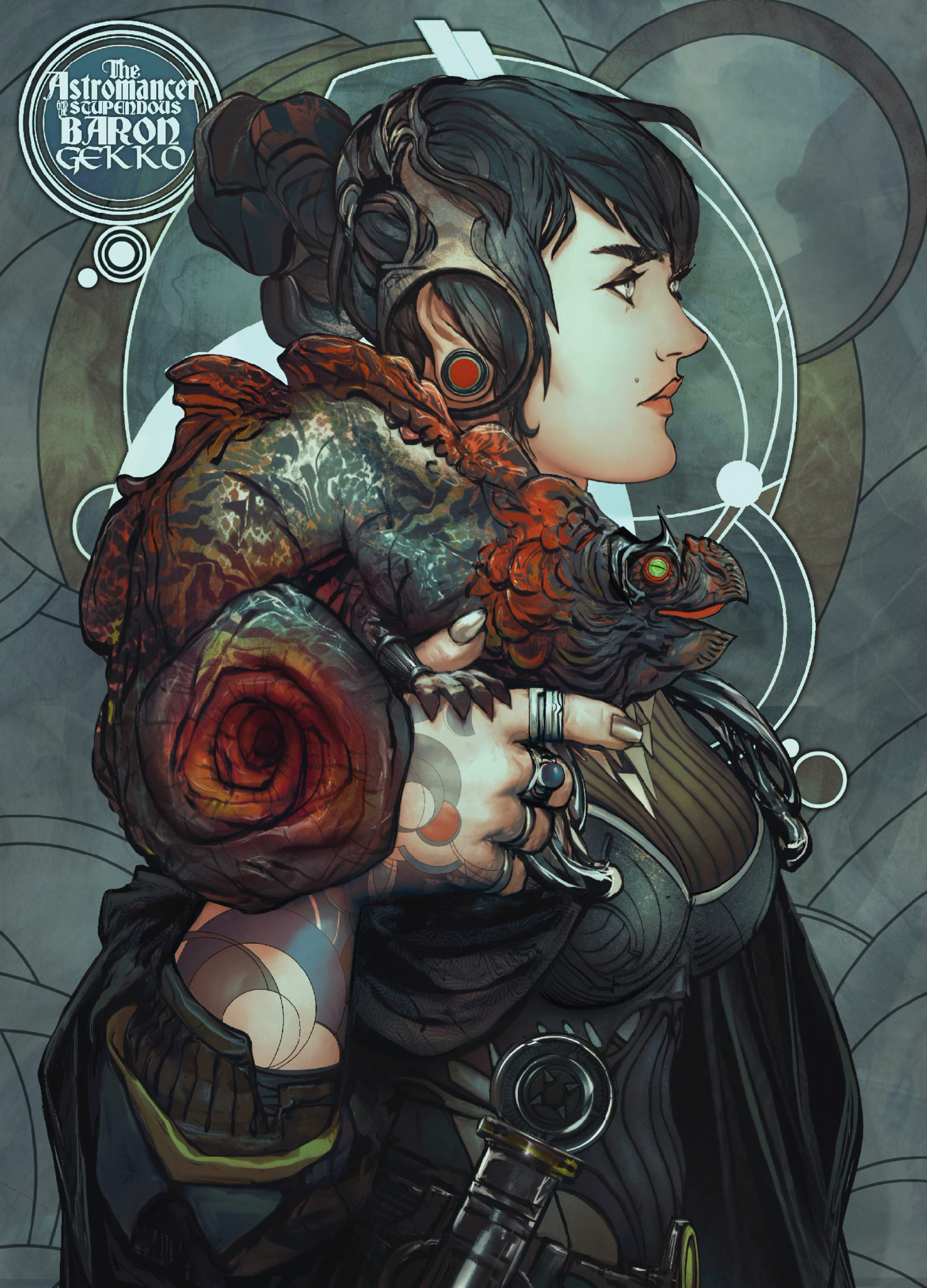
I work on her sleeve tattoos and overall costume, to make them match the astrophysical/mystical wall behind her a little more. Making the ‘halo’ structure integrated with the wall gives me exactly what I needed, and now all the little details and decisions will be made to reflect the nature of the character even more.
14. Final touches
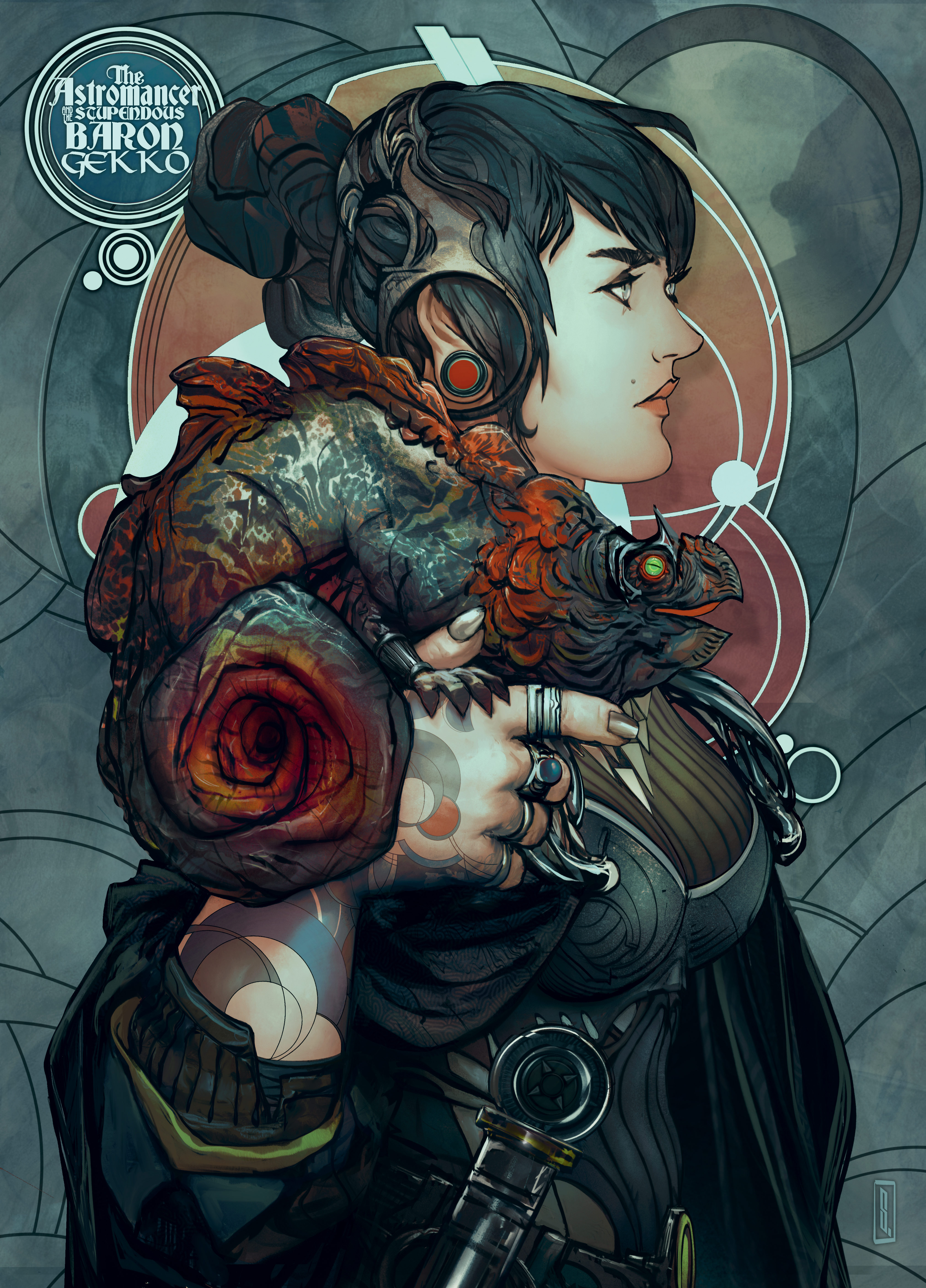
Now it’s a matter of nitpicking the last details, adjusting colours and fine-tuning until the illustration is finished. Knowing when to stop is a completely subjective and personal thing, and with that said, I hope this workshop will help you to achieve your own storytelling-driven illustrations, and inspire others.
This content originally appeared in ImagineFX. Subscribe to ImagineFX at MagazinesDirect.


