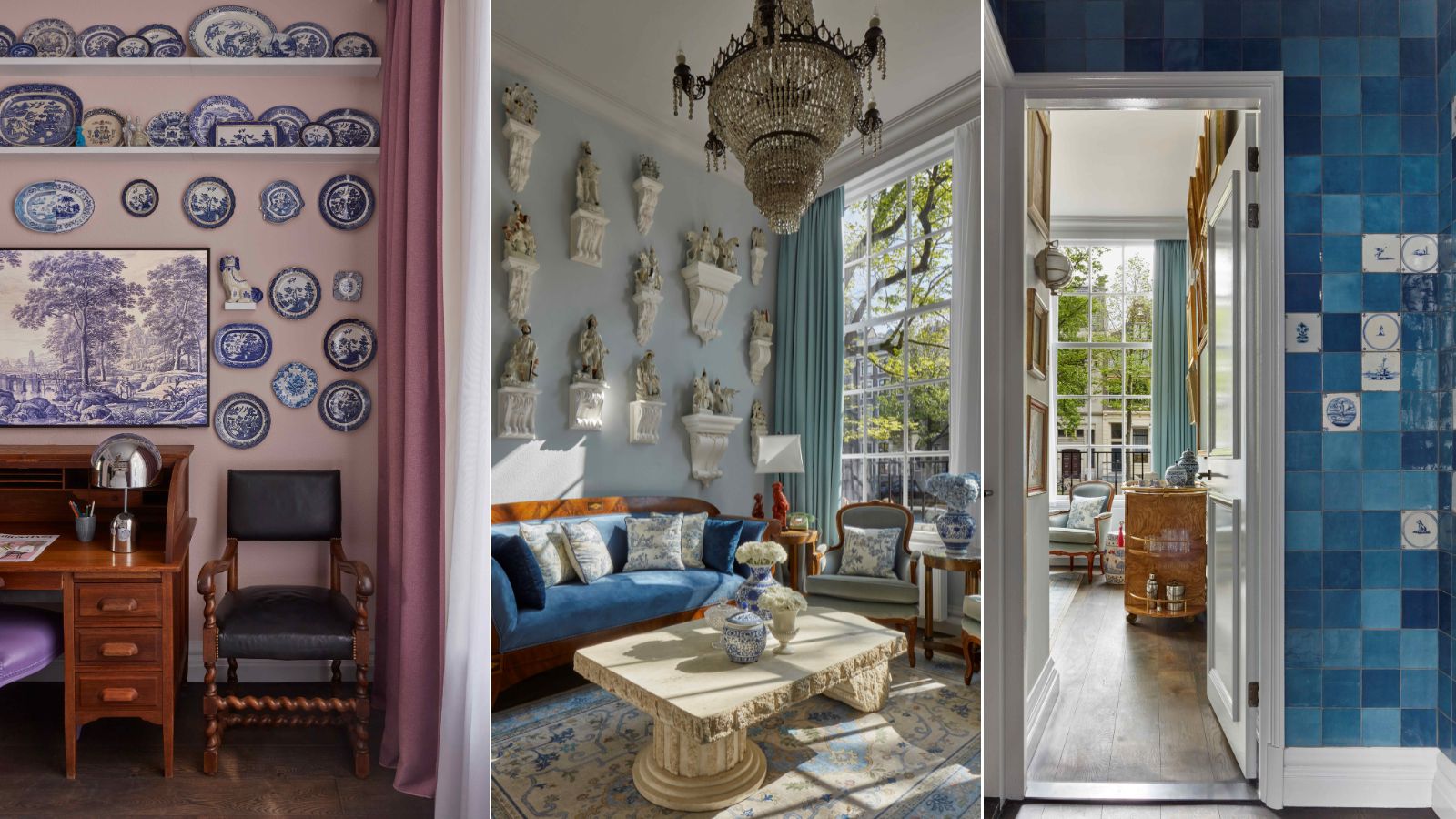
Interior design is at its best when it tells a story. Combining color, texture, pattern, and considered placement, a home should have personality, and take visitors on an unforgettable journey.
While there's nothing like home (or the completely bespoke story you've curated there), hotel rooms present an opportunity to step out of your shell and experience something entirely new.
Each of the Collector's Suites at Pulitzer Amsterdam is a masterclass in narrative design in its own right. From flowers to books, and antiques to art, the curated suites showcase collectors' prized possessions at every turn. And the Porcelain Collector's Suite, an ode to the Netherlands' porcelain-heavy history, is a triumph.
Jacu Strauss, creative director of the Lore Group and the mind behind Pulitzer Amsterdam's design, recently sat down with H&G to explore the ins and outs of this collector's haven. Here, he shares how he and the team sourced and decorated with antiques for the space, what went into choosing its soothing color scheme, and how he finds a tasteful blend of old and new in all of his designs.
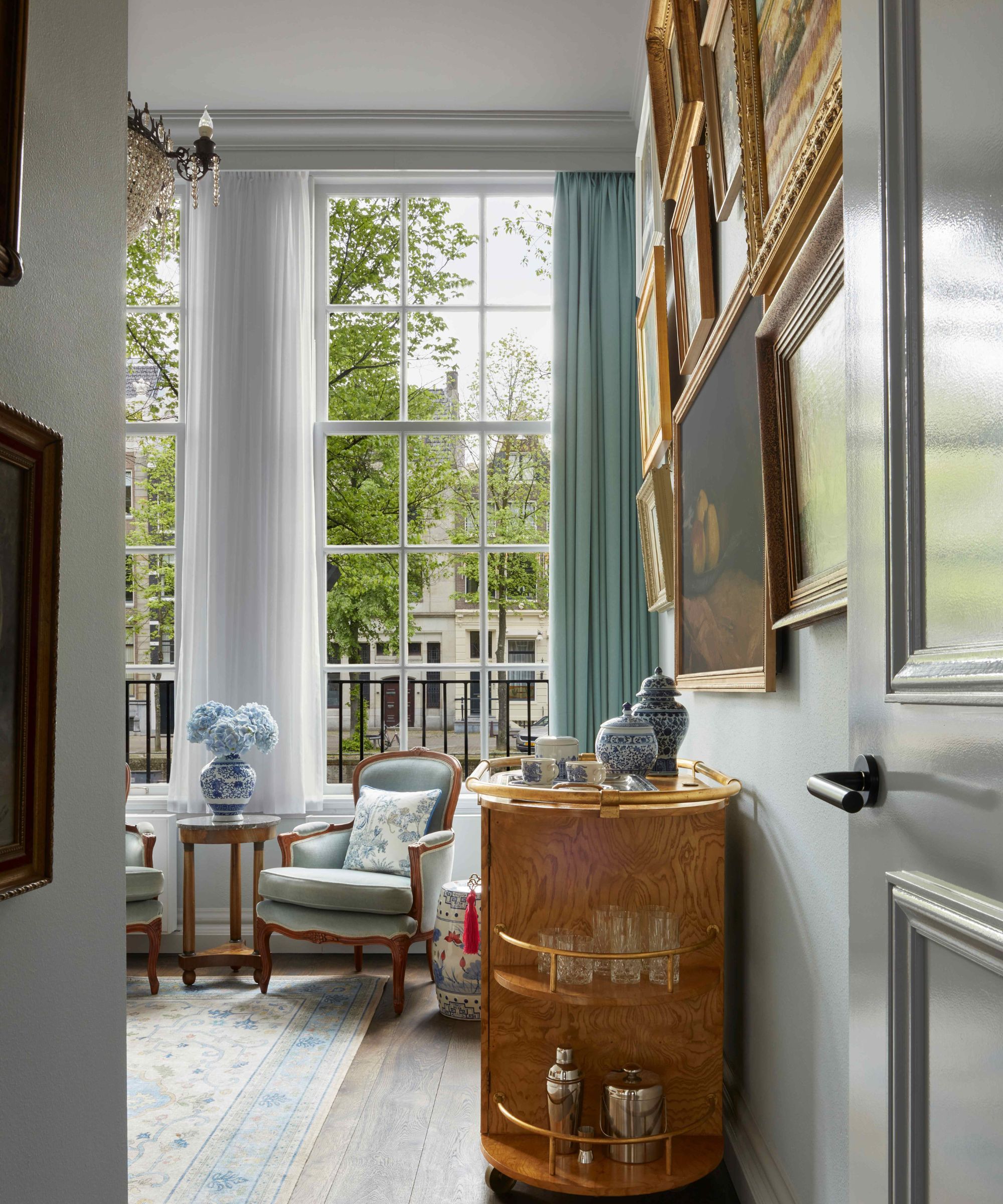
'This suite is located in one of the 25 golden age canal houses that forms part of the Pulitzer hotel, on the grand Keizergracht Canal,' says Jacu. 'Situated on the ground floor with direct access to the canalside, it is in more of a discreet building, which gives this suite a more of a secluded feel.'
Including the Porcelain Collector's Suite, the Flower Collector's Suite, the Book Collector's Suite, the Antique Collector's Suite, and the Art Collector's Suite, this group of getaways packs design expertise and easy access to Amsterdam's iconic canals. The porcelain suite in particular feels high-end and elegant, hosting a wide array of characterful antiques. With a relatively small square footage, it feels both cozy and expansive at once.
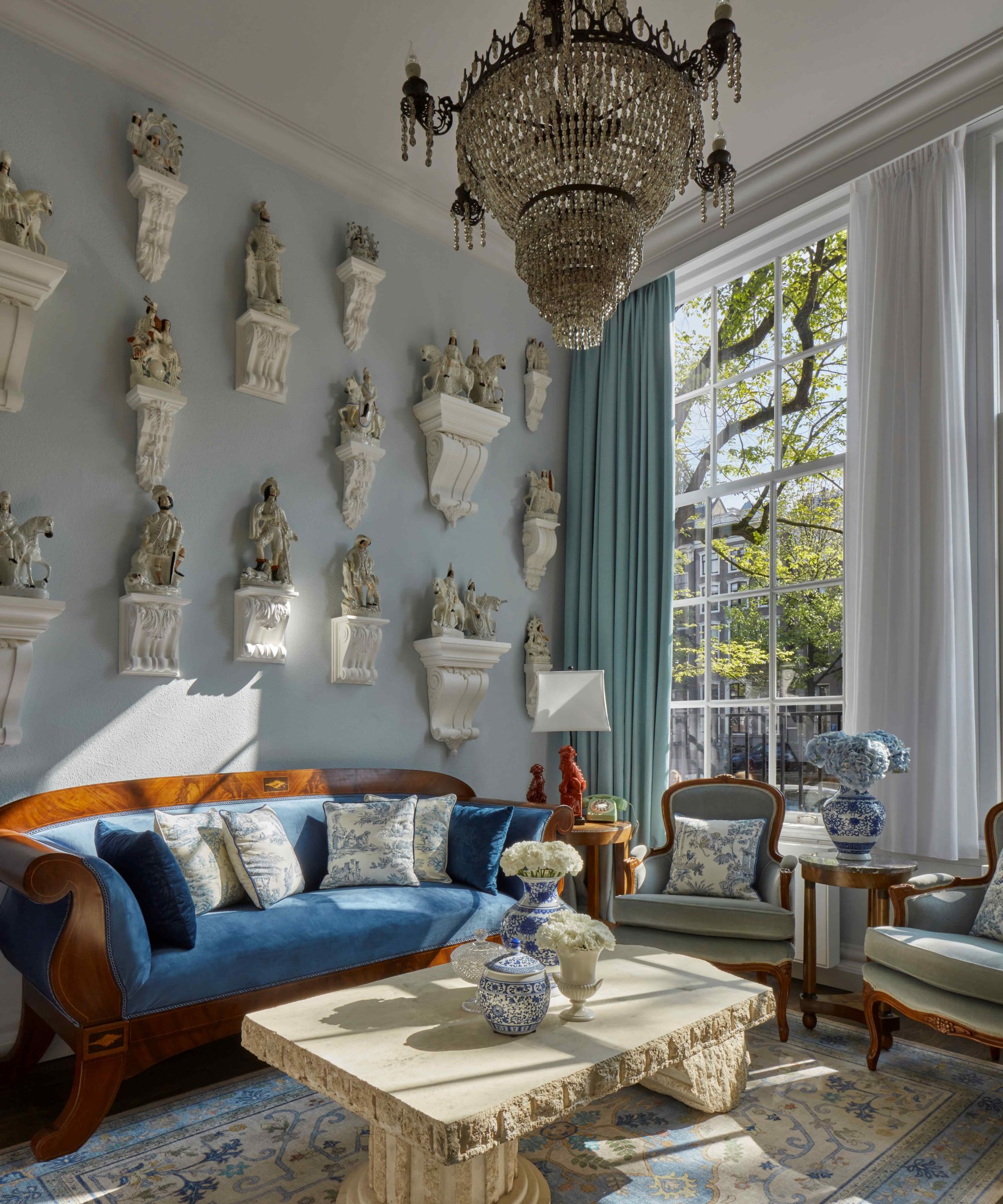
'The Netherlands has a very rich history of porcelain, both locally and internationally, which is still celebrated to this day, so it felt natural to design the interior around this theme,' Jacu explains. 'It also allowed my team and I to go porcelain hunting. We hand-picked all the pieces from various places, which was a delight.'
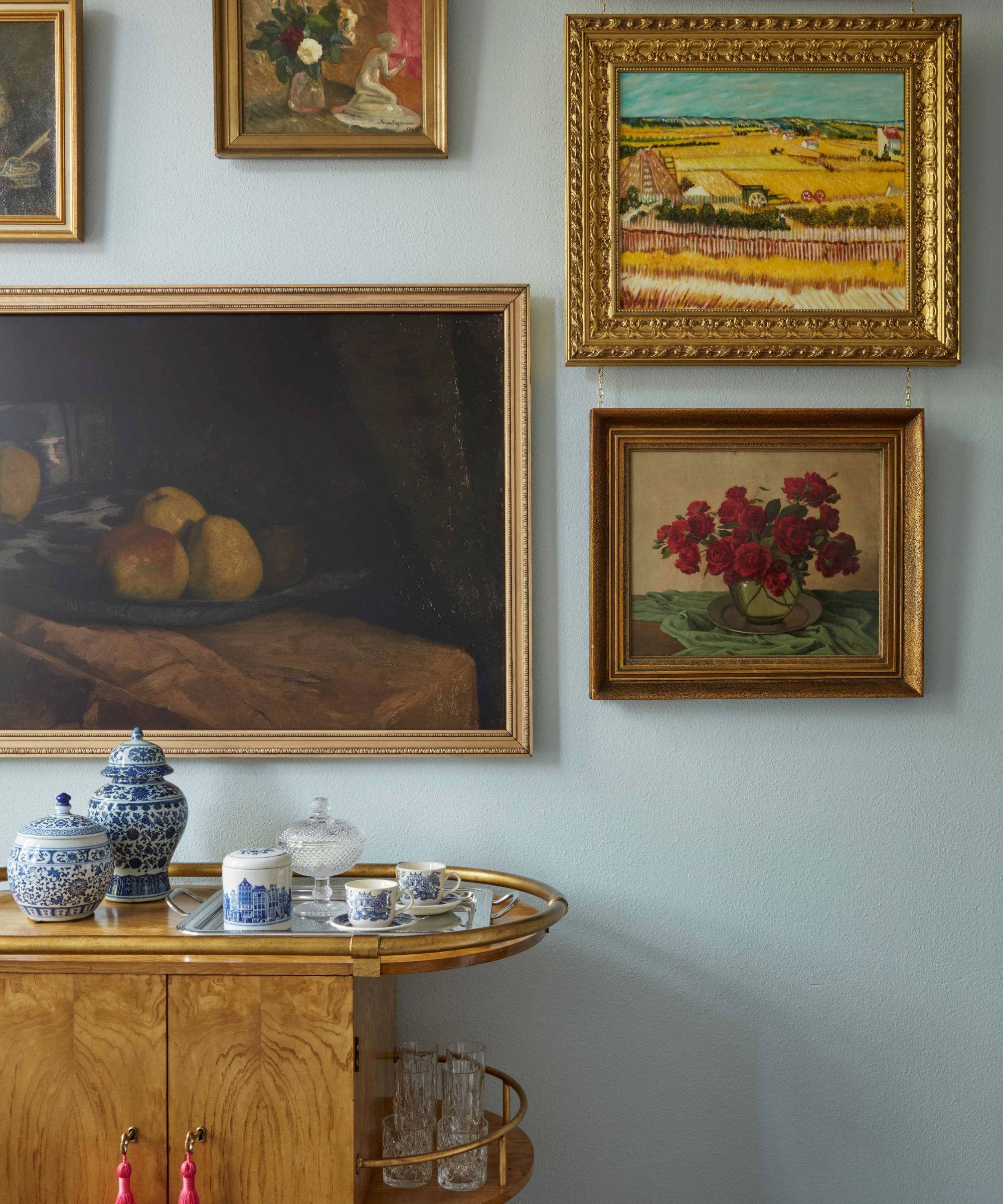
Each room of the hotel suite packs plenty of porcelain, plus complementary design details. While the lounge area features blue and white porcelain vases, marble figurines across an accent wall, and a matching rug and throw pillows, porcelain plates, and fabrics make their way through the rest of the space. Jacu says he wanted the space to feel warm and inviting, too – a hotel room shouldn't feel like a museum, after all.
'The result feels like a proper collection for our fantasy porcelain collecting resident who might have collected it all on their travels,' he continues. 'Rather than it feeling like a showroom or exhibition, the suite feels like a home. Most of the pieces you see are antique, but some are modern interpretations and examples of something that existed. It creates a cohesiveness throughout the themes of all the other collector’s suites too.'
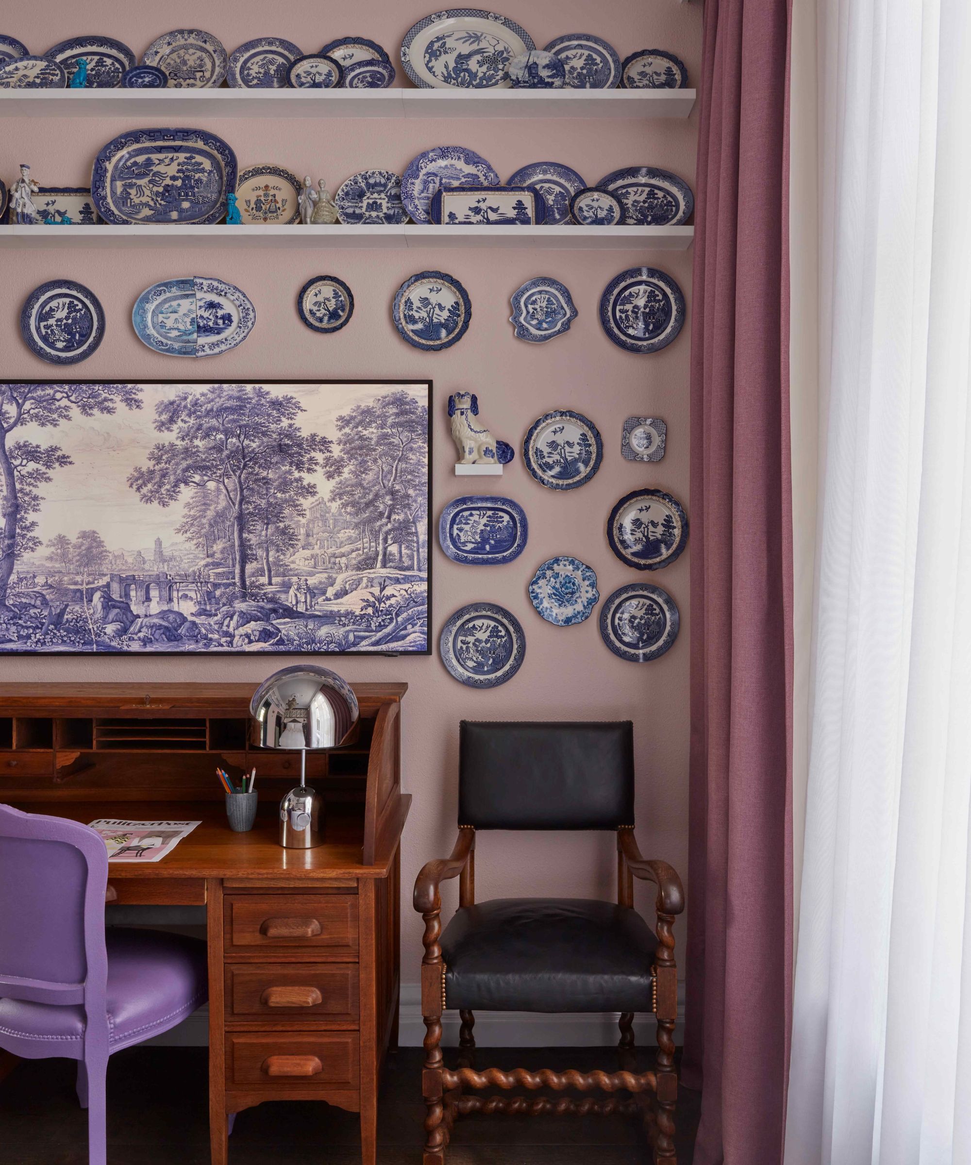
'It is a bit like playing cupid with matchmaking, sometimes you just know when something will work together,' says Jacu. 'With a strong initial theme, it is then easy to judge if something will complement the story or not. What helps me is being openminded and always making sure there is enough charm and character, and sometimes a bit of a sense of humor.'
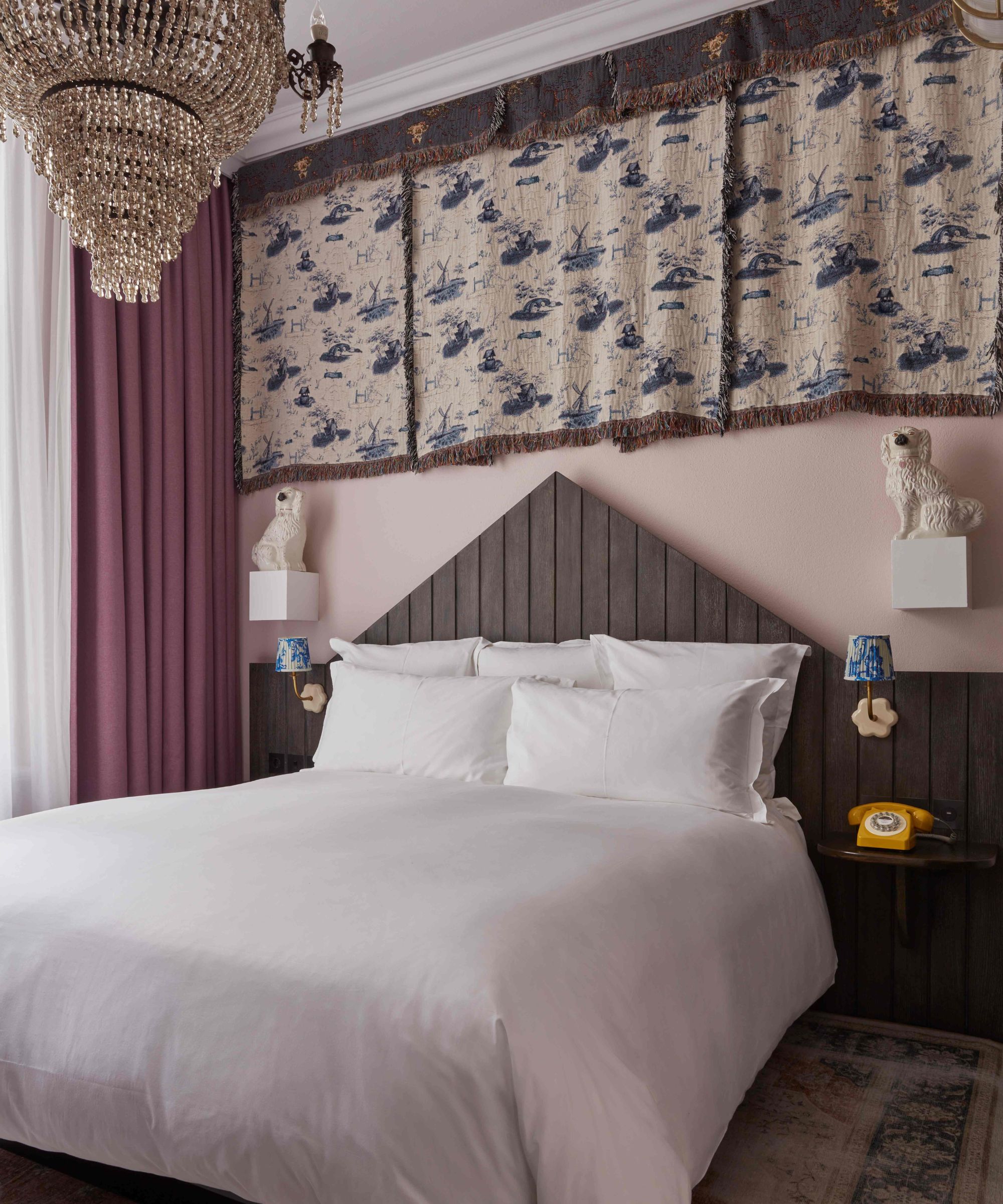
An all-porcelain suite wouldn't work without a bit of quirkiness and fun to go along with it, and this mindset can be seen throughout the space. A yellow rotary phone by the bedside, a bright purple desk chair, and dog-shaped sculptures watching over the bedroom ensure the overall look isn't stuffy or exclusive. It's high-end with a human twist.
'The approach to design should never be too serious and if you have fun selecting items that you feel a connection to, you will create a collection of pieces that have personal meaning. Personality is key in this instance,' Jacu says.
The Porcelain Suite's color scheme is soft and soothing, a welcome partner for the sleek, elegant material that inspired its name. With a barely-there blue in the lounge and a light pink base for the bedroom, the space feels calm and considered despite being packed to the brim with unique finds. Jacu says the suite's theme led naturally to this whimsical scheme.
'Our Collector’s suites are a curated collection in themselves, so I carefully considered how their color schemes would look together,' says Jacu. 'I usually choose a base palette and then an accent palette, but being bold with single tones makes it easier to find complementary items. This approach provides structure and discipline when it comes to styling and selecting furniture.'
'For the porcelain suite we opted for almost powdery tones in light blue and light pinks,' he continues. 'This choice allowed for the porcelain items on display to stand out but be complemented by the base palettes too. The collections on display become the heroes in the rooms.'
Sourcing vintage pieces and styling antique furniture isn't always straightforward, and tends to take some time. But Jacu says the story of this space helped the process run a bit more smoothly. By blending statement-making focal points with pared-back staples, the team landed on a coordinated scheme.
'Since this is a one-off suite, I was able to find unique pieces to work with the theme,' he says. 'It takes a bit of practice, but once we agreed the story and general aesthetic, most of the sourcing became logical.'
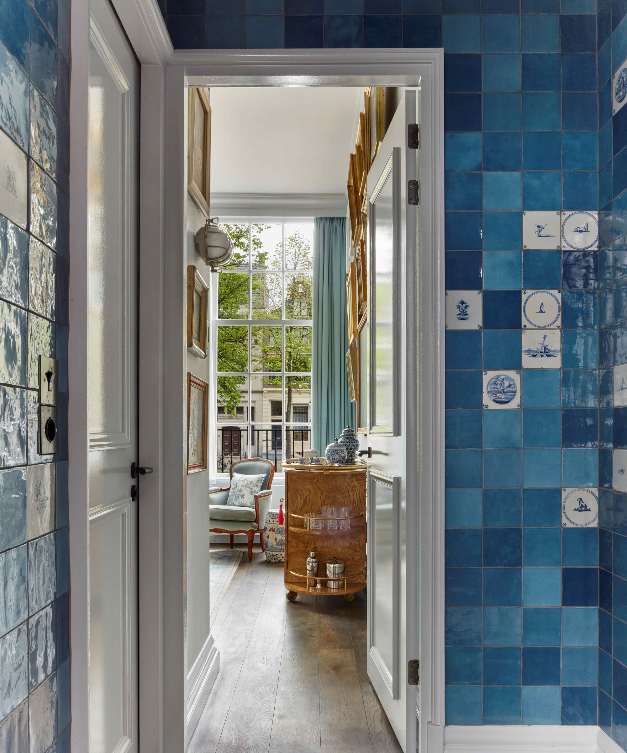
'Some of the initial challenges were working with the spatial constraints of the rooms. Traditionally, the ground floor of these Golden Age Amsterdam Canal Buildings have incredibly tall ceilings, but the buildings themselves are quite narrow,' he says. 'For this reason, we focused on filling the wall space in a variety of ways. For example, the Statues on Corbels in the living room and the plate racks with willow plates in the bedroom'
By drawing the eye upward and embracing the suite's height, Jacu found more space for characterful antiques and created a design scheme that truly fits the space. Each detail is carefully considered, threading the space's theme into every nook and cranny. 'Above the bed, we have three woven tapestries with traditional Dutch delft themes,' he says. 'Tapestries are a bit of an unsung hero in interiors, but I love using them as artworks that can add instant softness to an interior.'
Making countless antique pieces feel fresh and exciting is no easy feat, but this suite puts Amsterdam's rich history on full display. Even with the city's stunning canals just outside, it's hard to picture rushing out of this well-designed oasis.


