Disney-Pixar has unveiled a whole host of new films at this year's D23 expo – the ultimate event for Disney fans across the globe. While there are plenty of fresh upcoming releases, we also saw some classics set to make a grand return, from Toy Story 5 to The Incredibles 3.
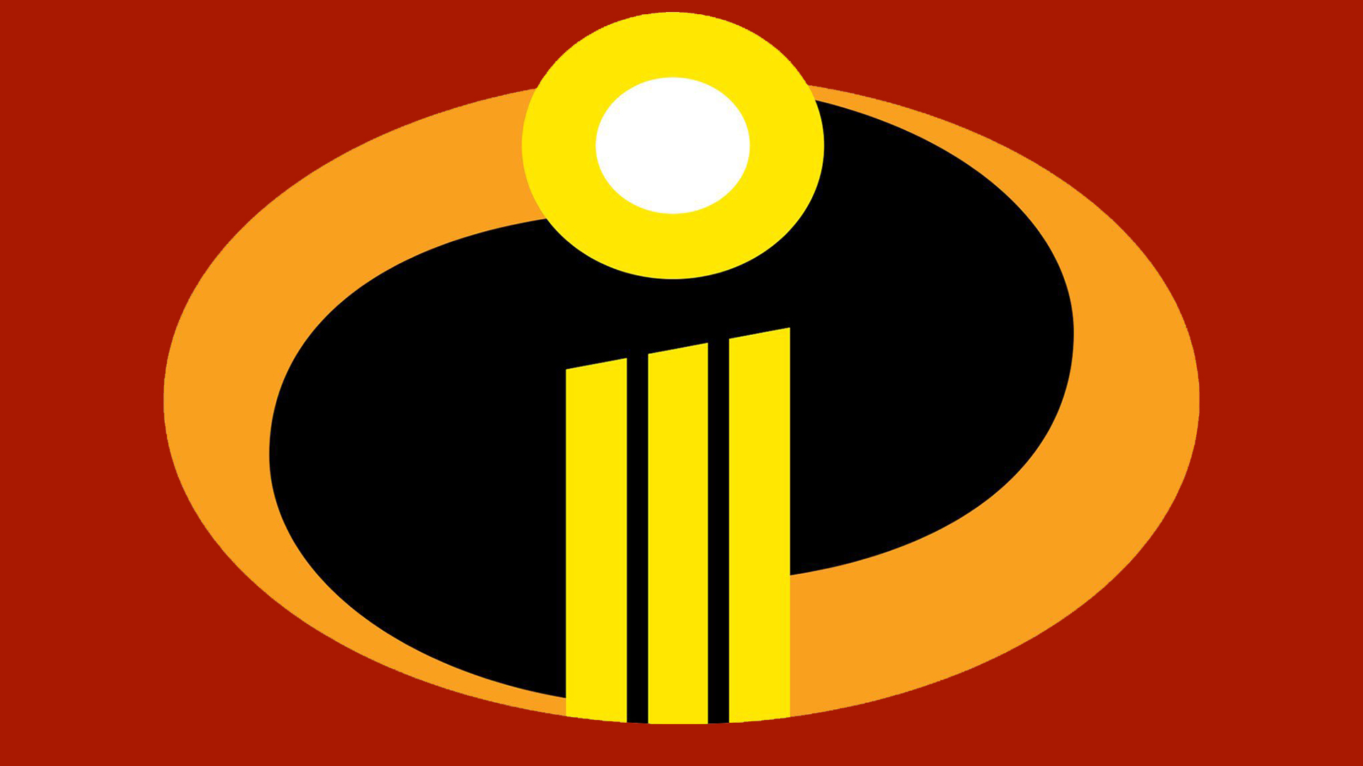
Typically my weary Gen Z heart can't take another unnecessary childhood-ruining sequel, but the latest Incredibles film has won me over with one simple feature – that ultra-satisfying logo. I wouldn't say it's one of the best movie logos of all time but the harmonious design is certainly enough to quell my frustration at Disney-Pixar's onslaught of movie sequels.
Official logo for ‘INCREDIBLES 3’Coming soon to theaters. pic.twitter.com/ITxzxgBz8MAugust 10, 2024
Fans of the original 2004 Incredibles film will likely remember the dynamic oval-shaped logo design featuring a simple "i" motif in the centre, designed to emulate a traditional superhero emblem. The latest logo has remained practically unchanged, with a slightly lighter orange colour palette and clever splicing of the letter "i" into three descending vertical lines. Is it a little basic? Yes. Is it effective? Absolutely.
While I'm a fan of this iteration of the logo, I share the sentiment of YouTuber Joe Brennan, who tweeted "They’re gonna have to call it at 3 there’s no way you’re getting a four out of that logo." Frankly, I don't see the logo with an 'IV' having quite the same visual harmony, but that didn't stop creatives on the r/graphic_design subreddit from trying their hand at designing a potential fourth instalment logo – the results were suitably chaotic.
Comment from r/graphic_design
Comment from r/graphic_design
For more logo news, check out DC Comics' 'new logo' that's the welcome return of a classic. If you're after some more design inspiration, take a look at the best movie poster designs of 2024 (so far).


