At the end of last year, Pinterest declared Cool Blue - a soft, icy shade of blue - as its colour of the year for 2026. But, if you were looking for more colour inspo then look no further as Pinterest has announced the rest of its colour palette for 2026 – a selection of 5 shades (including Cool Blue) that are set to define this year, and it holds some surprises.
Some of the shades are confirmation of the 2026 colour trends I’ve seen coming through from other paint brands and homeware collections. But there are some wild cards in the most-searched colours, especially the brighter tones like Wasabi and Persimmon.
‘The Pinterest colour palette of the year feels very in tune with how people are approaching their homes right now, using colour not just for impact, but to shape how a space feels,’ says Holly Lamont, founder and creative director of interior design studio Holla Design.
‘It’s a lively palette, but what I love is how considered it is, balancing richer, grounding tones with lighter, more optimistic shades that bring energy. This palette really encourages people to experiment with colour in a way that feels achievable.’
But Emma Deterding, founder and creative director of Kelling Designs, advises to only incorporate these and any other trending colours into your home only if you really love them as doing so just for the sake of it can really date your home.
‘Trend-led palettes like Pinterest's annual colour forecasts are created to capture a cultural moment as opposed to enduring for the long-term. While these forecasts are great for inspiration or introducing seasonal accents, relying too heavily on them risks creating design schemes that will date very fast. In interior design especially, these 'trending' shades can tie a space to a specific year or season, quickly making them feel dated and tired as the trends evolve and move on.’
Let’s meet Pinterest’s chosen shades for 2026 and see how to incorporate them into your home.
Cool Blue
Pinterest is not the only one naming blue as its colour of the year – Dulux named not one but three different shades of blue as its colours of the year for 2026 among others. And blue is the biggest home decor trend as far as colour is concerned.
Cool Blue was inspired by Pinterest searches for terms like ‘cool blue’ rising by 85% and ‘glacier aesthetic’ increasing by 35%. It’s a cool-toned, light shade of blue. And Holly of Holla Design is a fan – especially when paired with one of the other colours in the palette, Plum Noir.
‘I’m naturally drawn to burgundies and blues, so Plum Noir and Cool Blue really stand out to me,’ she says. ‘It’s a combination we’re seeing more and more, with deeper tones adding warmth and depth, while cooler blues keep things feeling fresh and calm, a pairing that feels set to carry through into 2026.’
A light blue like this is the perfect shade to cover your walls with - it's no coincidence blue living room ideas are among the most popular.
Habitat's stylish Hendricks is among our top-rated, best sofas - and it looks particularly chic in this soft blue shade. And it can currently be yours with 30% off if you use the code SOFA30 at checkout.
Addison Ross' bobbin wireless lamps have been a huge hit ever since launching last year. And this pale blue colourway is one of my absolute favourites.
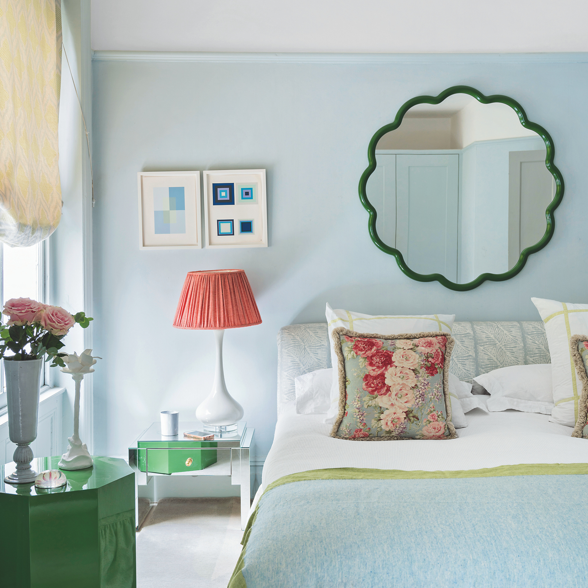
Plum Noir
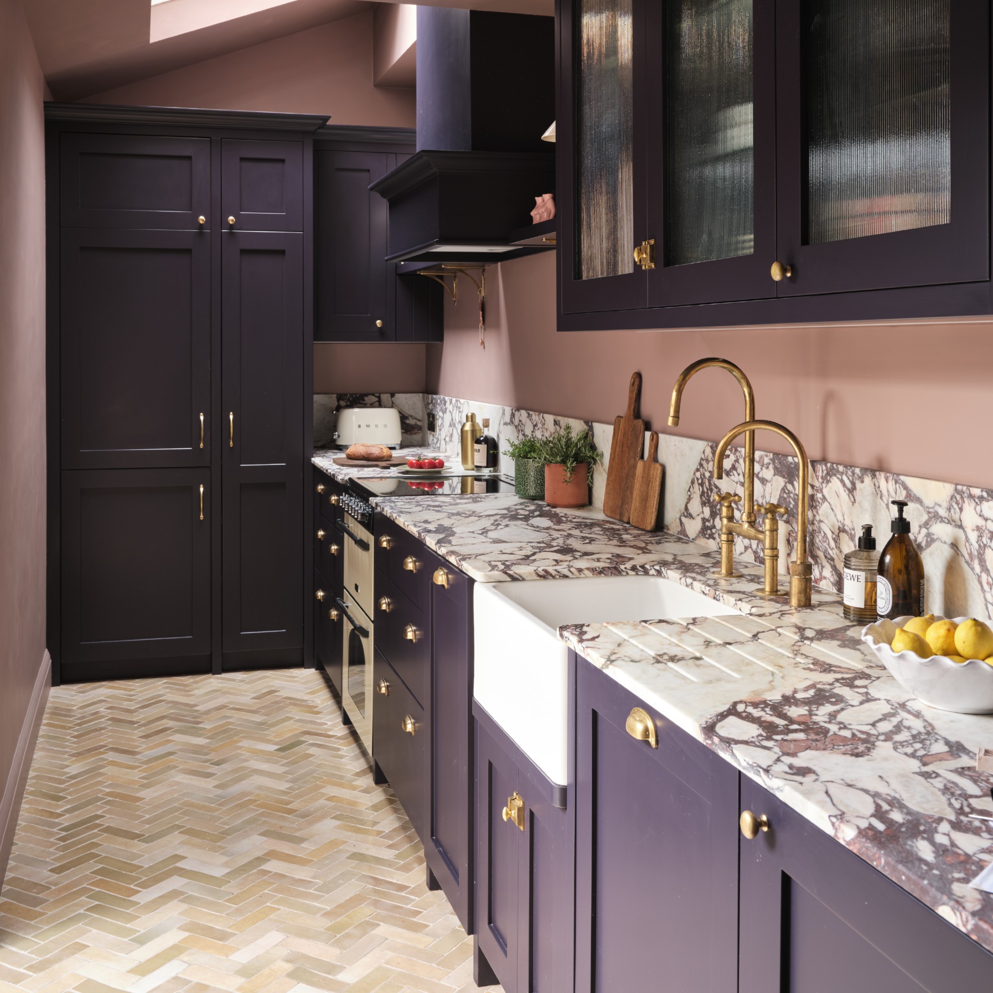
Last year was all about Cherry Red which was the shade that Pinterest named its 2025 colour of the year. And while dark cherry reds, burgundies, maroons and damson reds are not going anywhere this year, I’ve also seen this appetite for dark, moody tones expand to purples, including rich plum and aubergine shades.
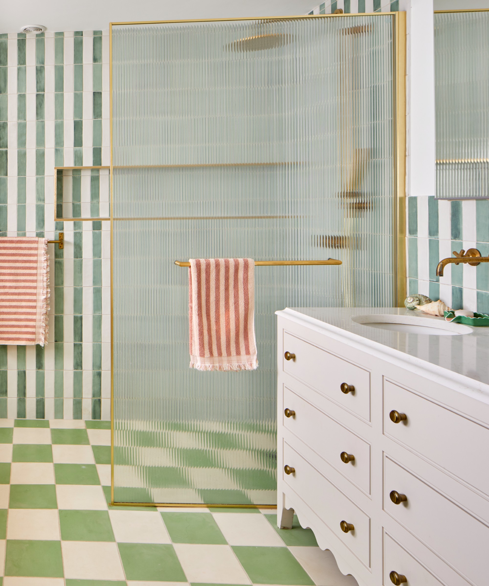
And that’s something that Pinterest has also noticed as searches for ‘dark plum’ has risen by 220% and ‘deep burgundy’ searches have increased by 230%. And while Plum Noir looks great on singular home accessories, it really shines on kitchen cabinetry as seen in the image above where the cabinets were painted in Farrow & Ball’s Paean Black shade.
‘Earthier shades like Plum Noir and Jade work beautifully on larger elements such as kitchen cabinetry or built-in joinery, where they can add richness and a sense of permanence,’ Holly at Holla Design says.
Sofa.com is not only one of the best places to buy a sofa - the brand also has a great range of accent and armchairs like the stylish Quinn. And it looks particularly sophisticated in this damson velvet.
For the first time ever, Little Greene chose a colour of the year. And it's this 'timeless plum aubergine' as the brand describes it.
But you can also incorporate this deep shade with smaller accents like this chic table lamp from Laura Ashley. I particularly love the folk-style pattern on the ceramic base and the pleated fabric shade.
Jade
Is it just me or does the Jade shade look a whole lot like some of the lighter sage green shades people have been favouring the last few years? You can hardly go wrong with green, especially a muted, nature-inspired tone like this one – and according to Pinterest, this green is going to replace other green trends like pistachio and matcha.
This is a very versatile green shade and can be used anywhere from kitchen cabinetry - as Holly already mentioned - to bathroom tiling as seen above.
This shade of green looks particularly great paired with off-white as seen on this gingham bed linen set. And with gingham bedding trending, I think this is the perfect marriage.
A muted green shade like this one is another great paint idea, much like the soft blue - whether that's for the walls or your kitchen cabinetry.
Since jade is in fact a stone and the mood board for the Jade colour trend features green-tone stone finishes, it's only right to include a piece like this green marble side table here. Especially since Dunelm is one of the best places to get budget marble from.
Persimmon
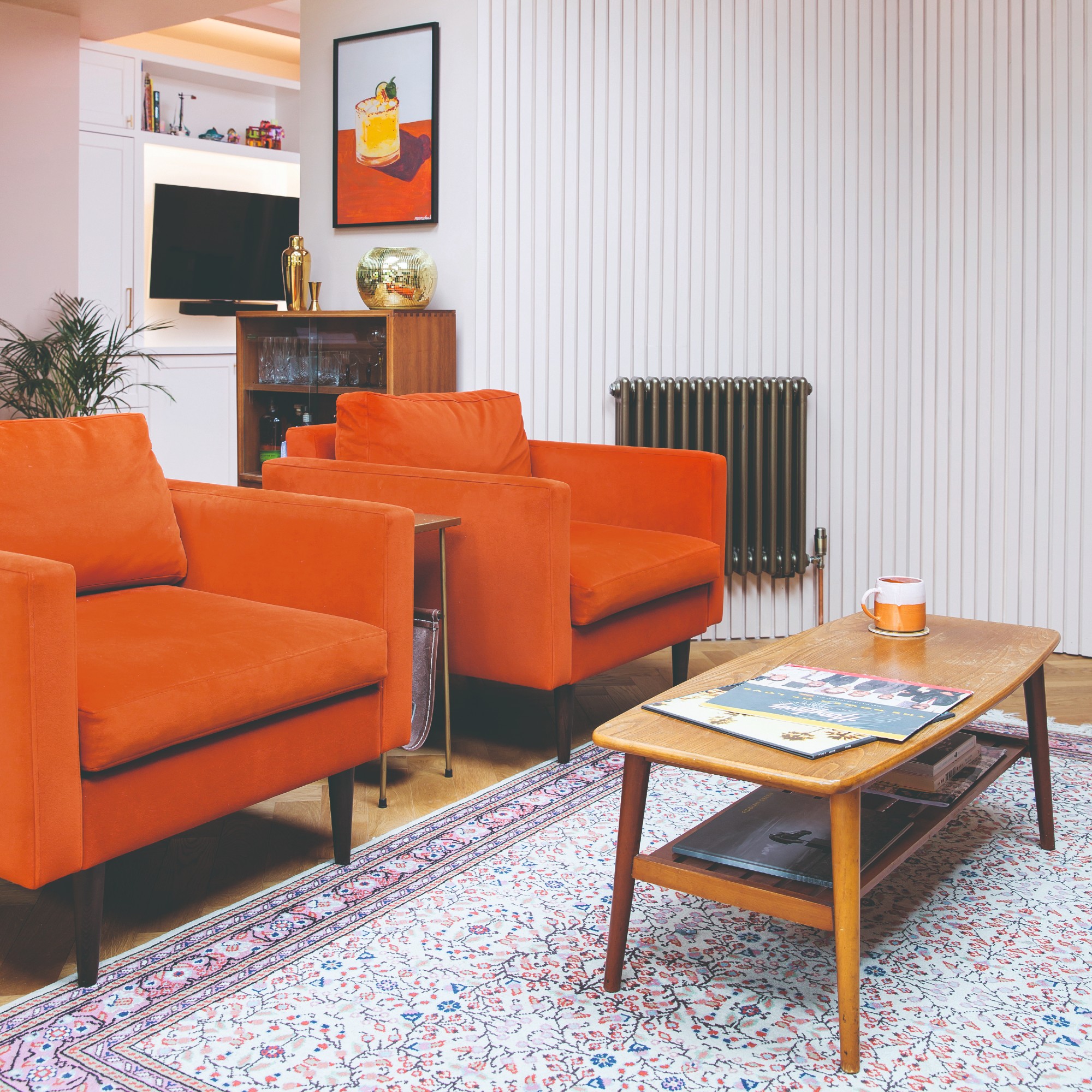
Persimmon is where things get a little heated. Described as part orange and part red, this is a bold orange hue inspired by searches for ‘persimmon aesthetic’ rising by 100% and ‘orange colour combo’ being up by 75%.
Because it’s such a vibrant shade, it’s best used in smaller doses in the form of accessories like lighting, cushions or tableware.
But if you’re after a more timeless alternative that you can also use on larger surface areas, Emma at Kelling Designs has the answer, ‘Terracotta and rust tones have become a staple in interiors, offering a warming and earthy alternative to Persimmon.’
Going for an orange glass lamp like this Habitat one is something I highly recommend as it will provide a beautiful warm glow, as well as retro 1970s-style vibes.
A striped orange and white cup with a matching saucer was included on the Persimmon Pinterest mood board, and it inspired me. Now I really want this one!
This statement design from Ruggable has been one of my favourites ever since it came out. It is leaning more towards earthy orange shades than the bold and bright Persimmon but that's not a bad thing at all - in fact, that's what makes it more timeless.
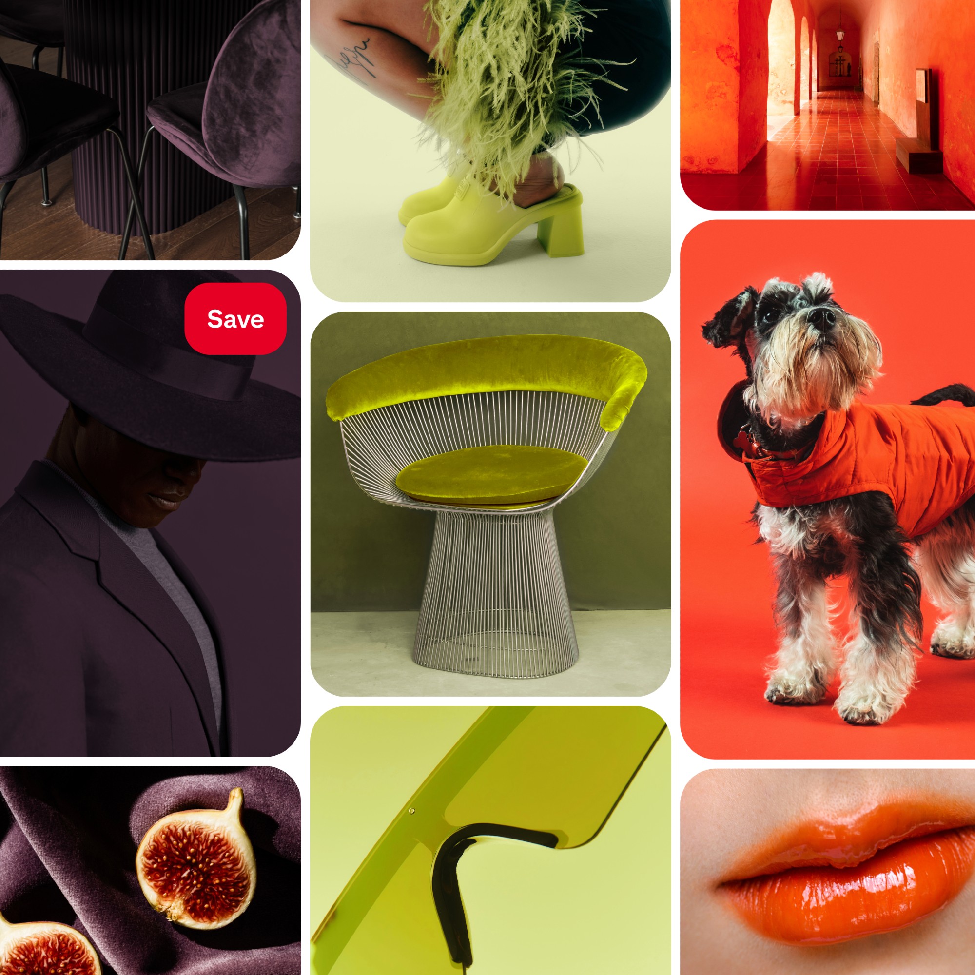
Wasabi
Wasabi can also be described as lime green or chartreuse – but calling it Wasabi certainly sounds more fun. It’s an electric shade of green with a yellow undertone. Searches show that interest in ‘chartreuse green’ has increased by 175% but it’s best to keep this bright colour to accessories only.
‘Brighter colours such as Persimmon and Wasabi are ideal for softer, more flexible layers; cushions, lampshades or accent details,’ Holly at Holla Design recommends.
Danish design brand HAY makes some beautiful yet simple lighting. And the glass Parade table lamp with its clean lines is the perfect example. It comes in different colourways including this vibrant green.
This wasabi dipping dish from Oliver Bonas is a more literal and playful take on the trend but one that I'm certainly here for. Especially given it's just £6.50!
As demonstrated on this chic cushion design, chartreuse green pairs beautifully with pale pink. And the grid design and velvet material further elevate this design.
While it’s recommended to use these shades with consideration for the long run, there are so many different ways you can incorporate them into your home in just a small way as a quick update. ‘Whether through paint, upholstery or soft furnishings, these shades can be layered gradually to create spaces that feel personal, uplifting and thoughtfully designed as we move into the year ahead,’ Holly at Holla Design concludes.