I've always been fascinated by how branding varies from country to country. As a kid even short hops across from the UK to Europe would reveal brands that looked familiar but exotic, often with slightly different products, names logo designs and packaging.
Today the world is more globalised and many brands have adopted global identities, but regional differences still require changes in brand assets. That's given birth to the phenomenon of 'glocalization'. And it can be striking how subtle some of the differences are when it comes to a massive global brand like McDonald's. The TikTok below provides an interesting example (it could be one of the best McDonald's adverts). Can you spot all the differences?
@marketingmeetup ♬ original sound - The Marketing Meetup
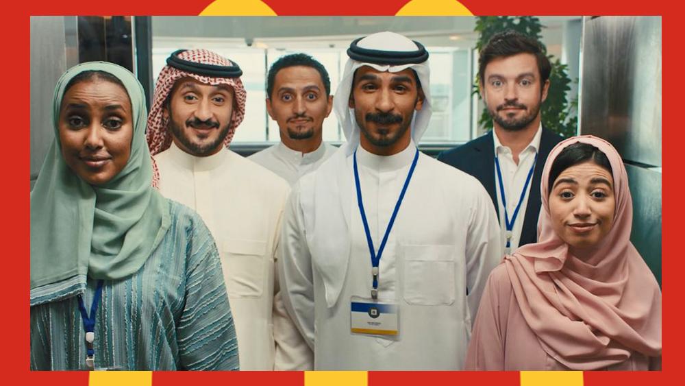
The video compares how McDonald's adapted its UK 'raise your arches' eyebrows advert for a different market. The original ad (top) was created by Leo Burnett London and directed by Edgar Wright of Shaun of the Dead fame. The adaptation below was made by Publicis Groupe Middle East's Studio M for the Gulf Cooperation region, which includes countries such as the United Arab Emirates, Bahrain and Qatar.
The Gulf adaptation, directed by Remy Cayluela and produced by Tango Productions Dubai, is an almost shot-for-shot remake of the advert. The blocking and even the colours of actors' clothing are incredibly similar: most notably the powder pink and blue of the two female leads and the McDonald’s red and yellow of the office manager.
The few tweaks revolve around local clothing (people love the way the ad for the Gulf market switches a hair flip to a headscarf flip) and nods to a Gulf office environment, such as an escalator instead of a staircase and the replacement of the mailman with an IT guy and the janitor with a security guard.
Hessa told LBB Online that the inclusion of "proactive local security" was a local reference that would resonate with viewers and help the advent feel more relevant and authentic.
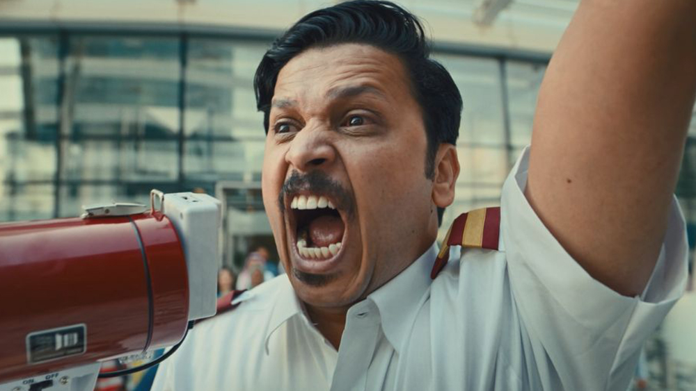
However, it's interesting that the colour grading also seems to be different, with the British ad going for more neutral tones while the adaptation looks warmer and slightly more saturated. Also, the actors in the adaptation seem more excited, making the British ad look restrained in comparison. It would be interesting to know if that was intentional.
It's also interesting that many people commenting on TikTok prefer the adaptation. Some see a potential solution for world peace. "You know what would be cool? Is after the first ad being on in its region for a while they flipped them and everyone realised how similar we all are," one person commented.
We've seen several hot campaigns from McDonald's this summer, including a new McDonald's eyebrows advert in the UK and a global As Featured In campaign, which celebrates McDonald's appearances in film and TV.
