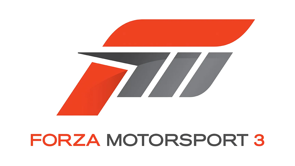
The best logos are usually simple and easy to interpret, but people love a design with an Easter egg buried in it. Details like the arrow in the FedEx logo seem obvious when you see them but go unnoticed by many people for years. The logo design for the Xbox 360 game Forza Motorsport 3 is the latest example surprising people over on Redit.
It's perhaps not quite up there with the Wipeout logo in terms of classic video game graphic design, but the design cleverly combined elements to represent several concepts. But it's continued use has disappointed some fans (see our pick of the best gaming logos for more inspiration).
The simple yet superb logo from Forza Motorsport 3 from r/DesignPorn
The Forza Motorsport logo design was introduced for the third installment in the series in 2009. It includes an 'F' from the franchise's name shaped in a way to represent a race track, and it also incorporates what looks like a car tyre that can be interpreted as an 'M' for Motorsport and as the roman numeral III.
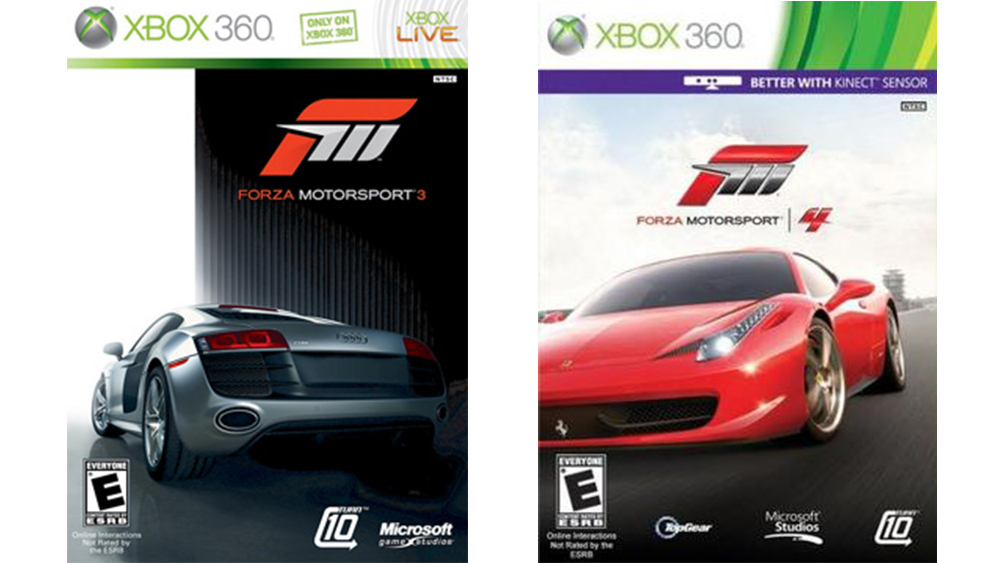
But some fans are only just noticing the multiple interpretations, and some think Turn 10 Studios missed a trick when it went on to keep the same logo design for the next five games in the franchise: Forza Motorport 4 all the way through to Forza Motorsport 2023.

"For FM3, it was very clever, but sticking to the same logo for subsequent ones…," one person lamented on Reddit. "They screwed it because the Forza 5 games still only have 3 tire segments," someone else added. "I was hoping for a Gillette razor situation where they keep adding segments whenever a new series is released".
Some see the potential difficulty in that, however. "For FM3 the M and the 3 match nicely. But if you start making the M represent game edition, it might stop being an M," someone wrote. Perhaps The FM3 logo was just too good to be able to follow up on in a completely coherent way, but the design still serves as an instantly recognisable mark for the series.
For more gems, see our pick of some of the best logo Easter eggs.


