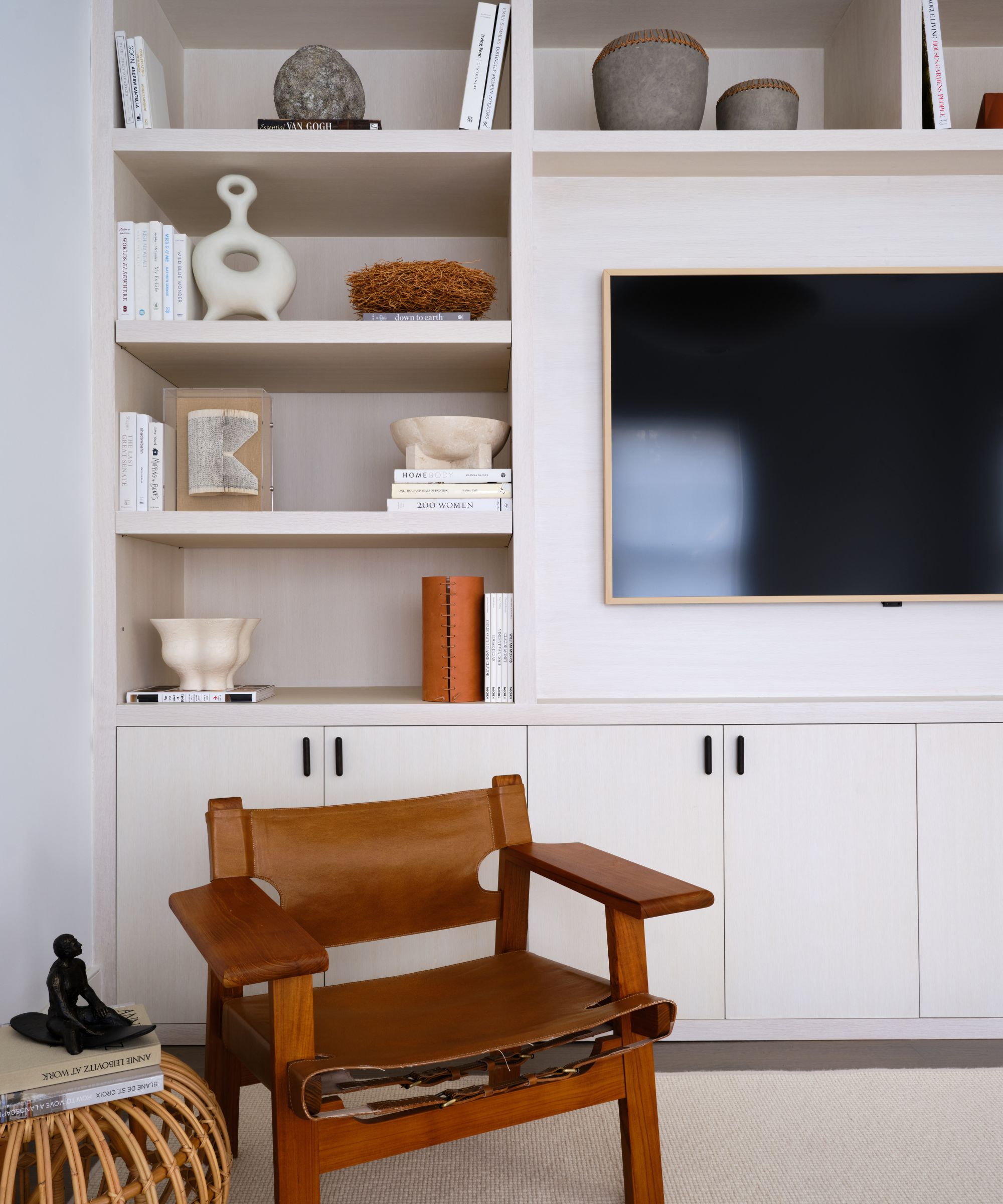
When styling bookshelves, it's certainly not uncommon to dedicate every inch of space to our favorite hardbacks. We're only doing what the name suggests, after all. However, while books will always deserve a place on our shelves, designers are increasingly urging us to interrupt our collection with other accessories or, better yet, empty space. Thankfully for us, Paul Wesley has demonstrated a perfect example of how it's done.
Naturally, The Vampire Diaries actor has used his tall, open living room shelving to store books, bowls, and ornaments – but, most crucially, he's kept some space free. The result feels personal yet uncluttered and well-curated – and even though it's simple to do, it's something that's often overlooked.
'The most common mistake people make when organizing their bookshelf is packing all of their books in without any space. A little bit of negative space makes them look better; about a quarter of the space on the shelf should be filled with other items,' says Dan Mazzarini, the principal and creative director at BHDM.
Instead of over-filling our shelves, Mazzarini recommends filling our shelves with other unique items, whether we choose sculptures and ceramics like Wesley or decorating with antiques or precious heirlooms.
'I recommend using beautiful bookends, ceramics, or other gifts you want to display to add some variety and dimension. If you have so many books that you have no choice but to fill your shelves, color-coding them gives the best effect,' he says.
Plus, Mazzarini is not exclusive in his teaching. Anna Tatsioni, the lead interior designer and architect at Decorilla, similarly encourages us to follow Wesley's example – emphasizing the importance of both empty space and decorative objects beyond our favorite books.
'Bookshelves are becoming more of a thing in interior design. A lot of my clients include them in their home renovation projects, and they treat them as a key element of the aesthetic. Some of the tips that I use myself when styling bookshelves include leaving empty spaces,' Tatsioni comments.
'I’m saying this because sometimes people take a bookshelf’s job too seriously. Of course, we want to have our favorite books there, but it’s also a space to add decorative pieces that will make it look even better. And having it full of books that it’s even hard to take one out is just not the right way to do it.'

Alongside leaving empty space, Tatsioni encourages us to think about the curated accessories we should include.
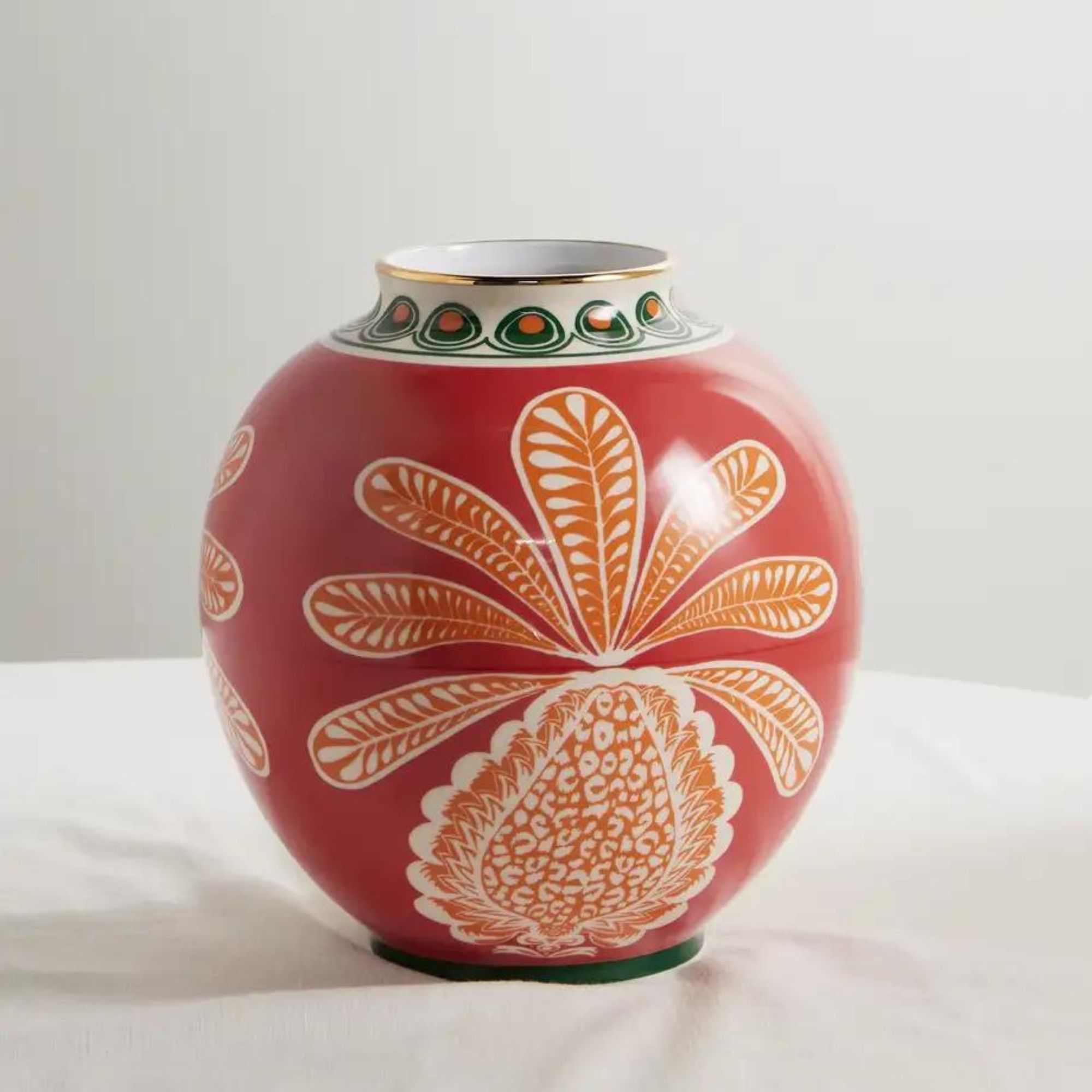
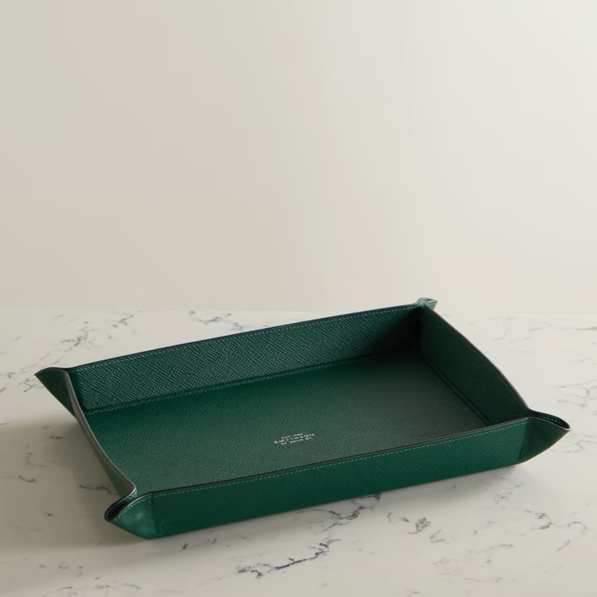
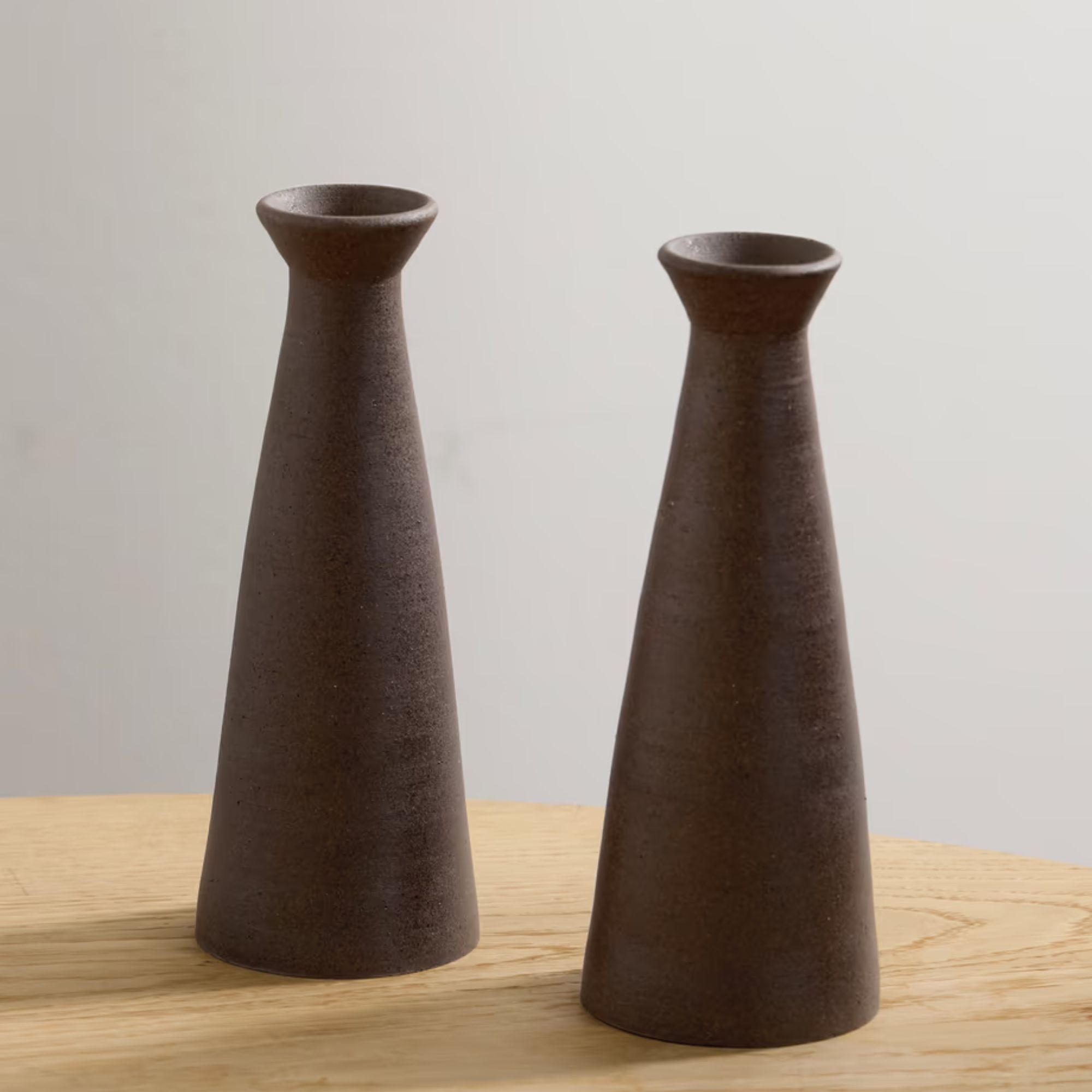
'When styling a bookcase, adding decorative items is a must. It is what changes the bookshelf’s aesthetic. For example, you can include candles. They come in different shapes and sizes, and there are really beautiful ones to choose from. I personally like the soy wax ones; they also come in sculptures, which adds that extra personal touch,' she says. For a beautiful starting point, we also love these items from Net-A-Porter, designed to work on every type of bookshelf – in every type of home.

La DoubleJ enlisted the help of historic Verona-based porcelain maker Ancap to craft this statement pineapple-patterned vase.

Sized to hold our most beloved jewels, this lightweight, hard-wearing, and artfully folded tray is almost as beautiful as the items it holds.

These candle holders will bring a boutique ambiance to any shelf. They're handmade from dark-brown ceramic with a unique finish.
'Pictures also work great; just make sure you choose the right size and frame. Lastly, greenery is a fantastic way to add vibrancy and life to the bookshelf, and if you mix all of them together, it is even better.'


