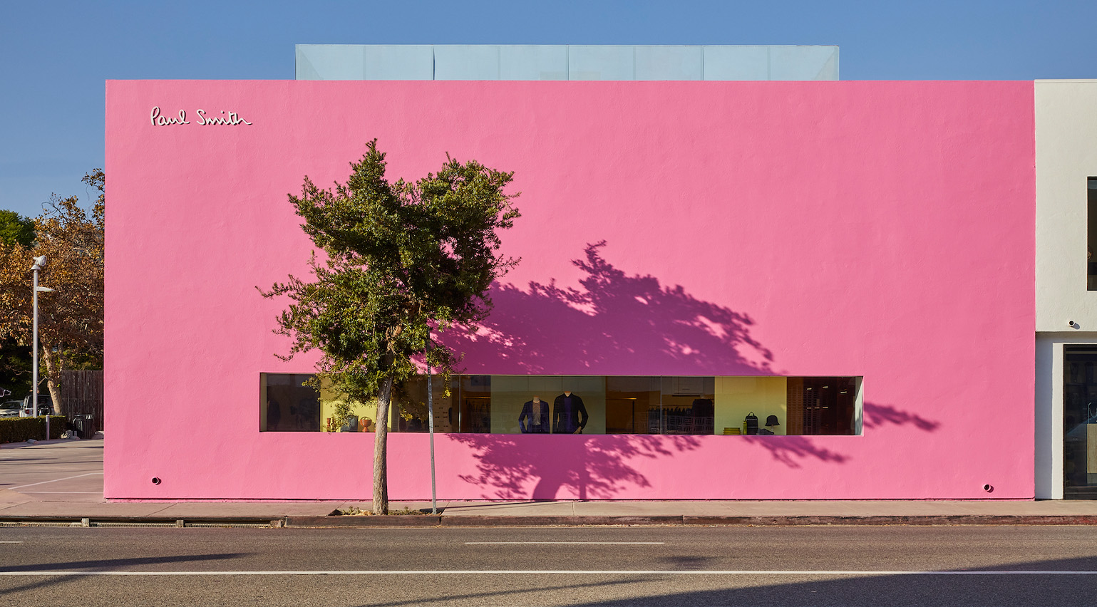
Inspired by the liberated colour palette of Luis Barragán, Paul Smith’s Los Angeles address is known for its monolithic pink façade which – against the near-perennial blue skies of California – has become one of the city’s most photographed spots (such is its ubiquity as an Instagram backdrop, its comes with its own #pinkwall hashtag).
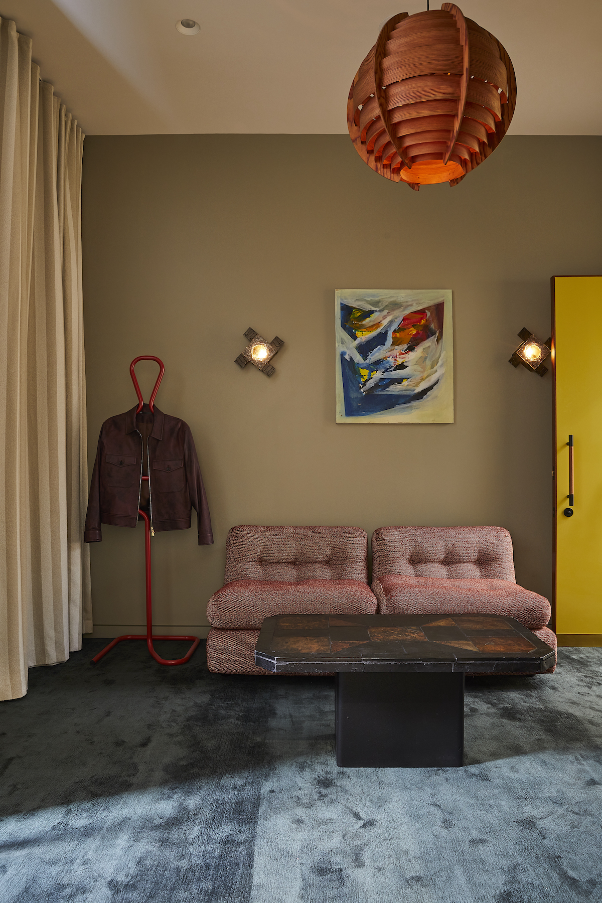
The store first opened its doors in 2005, and nearly two decades on, the designer has drafted Standard Architecture to give the unique location a ‘facelift’. Reimagining the interior with a carefully curated selection of objects and furniture, the re-do also involves the addition of a new VIP lounge with its own dedicated entranceway. As for what stays the same, fear not, the pink exterior remains.
Colour theory: Paul Smith reopens pink Melrose store
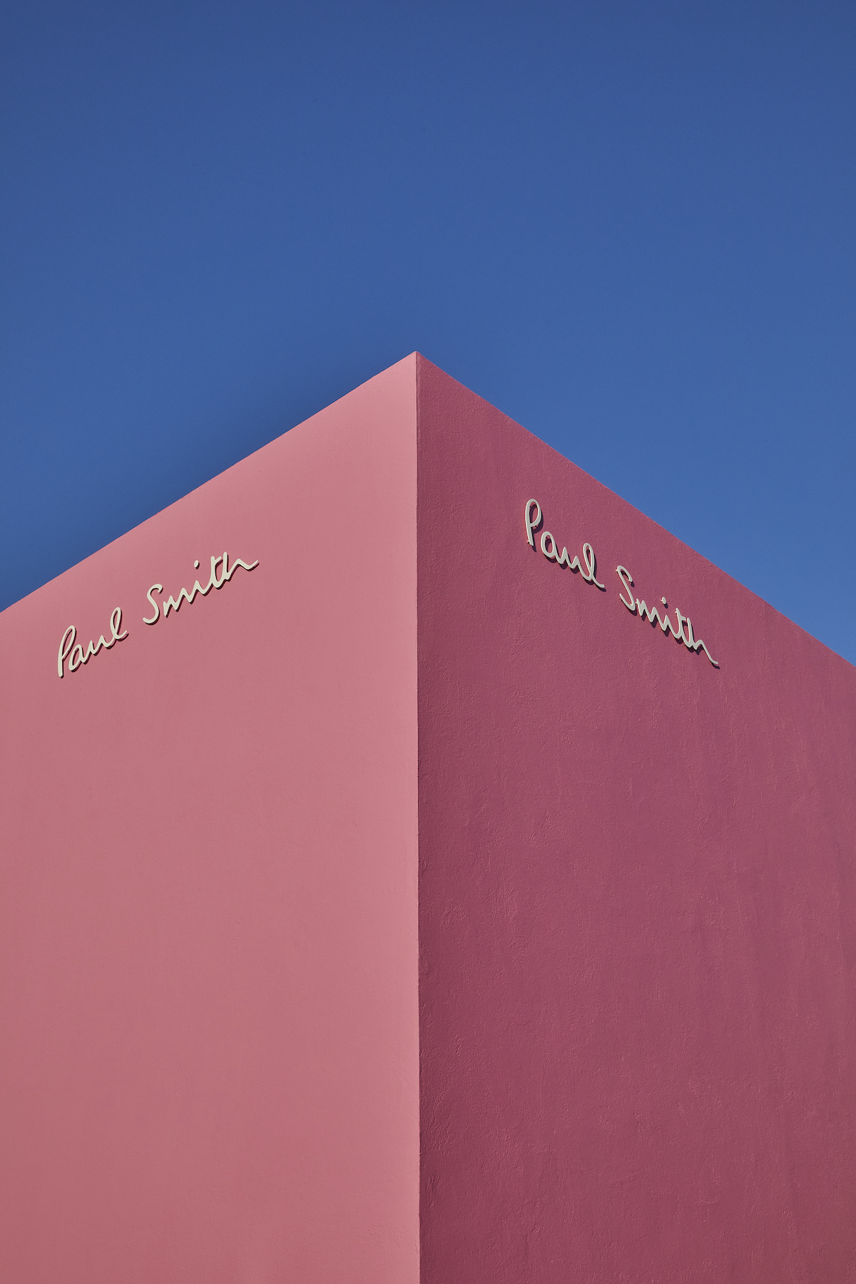
‘Our inspiration for this redesign came from the experimental architecture that shaped the LA landscape around the middle of the 20th century,’ says Smith. ‘The new shop layout features a comprehensive redesign with multi-purpose, adaptable spaces, sculptural shelving, and a blend of custom and vintage furniture.’
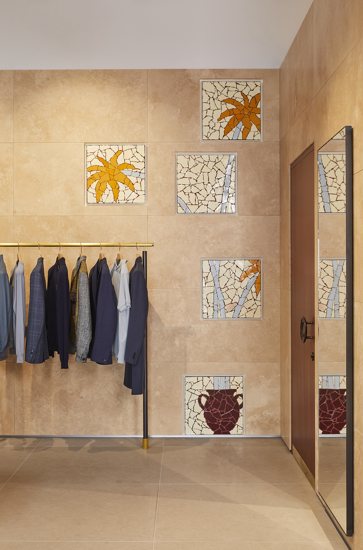
Standard Architecture, meanwhile, said it wanted to make the interior a more ‘cohesive’ experience for customers, one that moves seamlessly between menswear, womenswear and the brand’s homeware offerings. Partition walls, in warm stone-coloured tones, gently divide the space, while amphitheatre-style tiered displays show off the brand’s accessories offering.
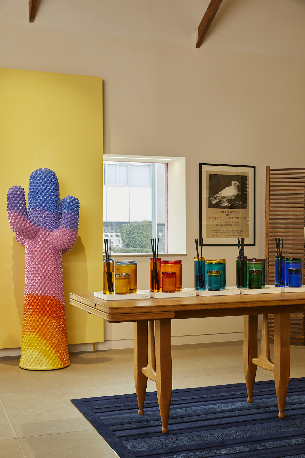
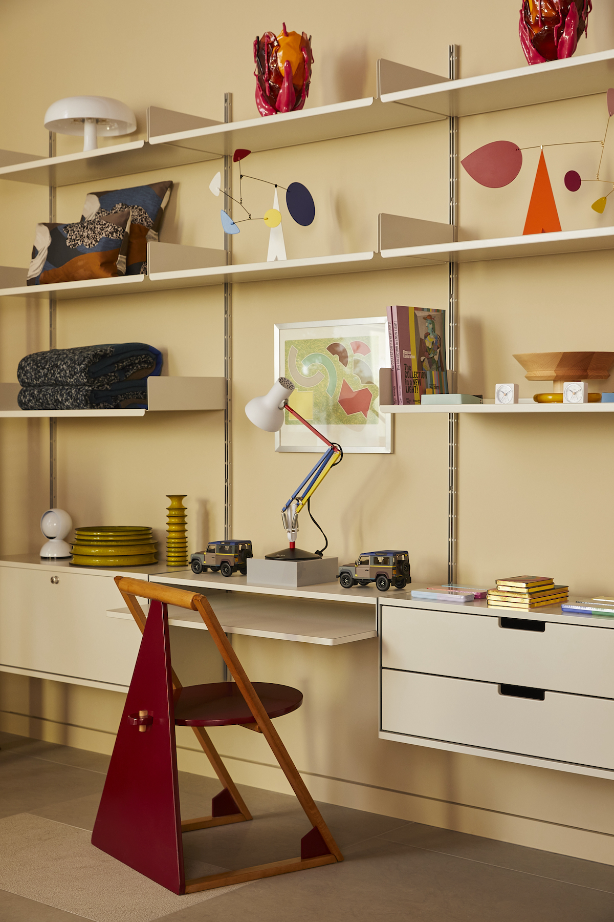
As in all of Smith’s spaces, the designer’s eclectic eye – which often includes icons of design and furniture – defines the objects that populate the interior, here spanning both vintage objects and artworks, as well as custom-made creations. A new ‘sunrise’ version of the Gufram Cactus – an icon of 1970s design – also appears. Smith collaborated with Standard Architecture on all elements of the space.
A vivid use of colour also runs throughout, in typical Paul Smith style – from mosaic artworks to modular shelving stacked high with brightly hued model cars, mobiles and lamps. Together, it is a reinvigorated vision for one of the world’s most memorable stores.
The reinvigorated Paul Smith at 8221 Melrose Avenue, Los Angeles is open now.
