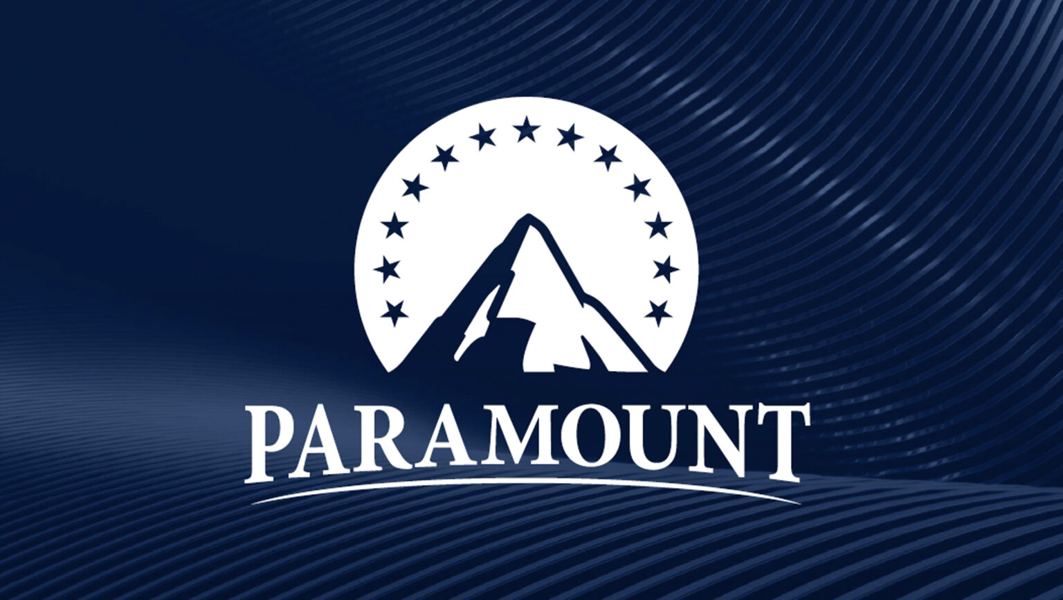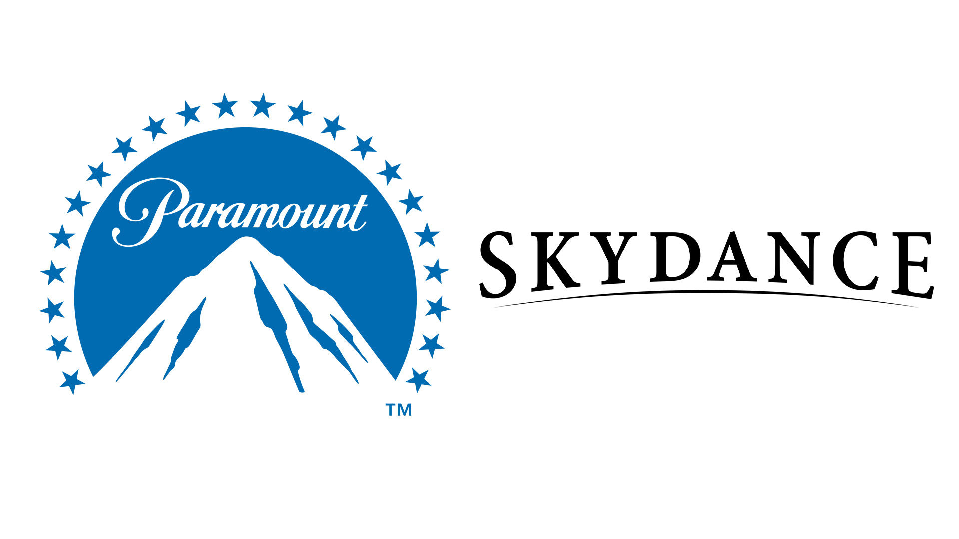
The Paramount logo has been an iconic emblem in the film studio sphere since the early 20th century and naturally, most of us have become quite accustomed to the design. In an unexpected (and frankly unappreciated) move the legendary studio has teased a new logo design, blending its classic identity with its new acquisitor company, Skydance Media.
As one of the most iconic entertainment logos in the film industry, it's natural that any alteration to the classic design is going to ruffle some feathers. In a flat reimagining of the classic design, the prospective new Paramount logo is a tepid reinvention, signalling a new and uncertain era for the studio.

Revealing the new design during an investor's call, the logo blends the distinct brand identities to signify their union. The new design maintains many of Paramount's iconic logo features such as the mountain and star motif, replacing the classic cursive font with a more corporate, clean typeface to emulate the Skydance logo. The result is a somewhat characterless design that strips Paramounts strong identity of its unique appeal.
Inverting its blue and white colour palette, the proposed logo redesign is overwhelmed by the conventional corporate navy shade, which only intensifies the plain practicality of the new serif font. Stripping the hidden meaning of Paramount's typical twenty-two star banner motif, the understated thirteen-star design has a clean but arguably less nuanced effect. It's worth noting that the potential design isn't yet official and with the new logo already facing backlash, it's unclear whether it's here to stay.

For more logo news, check out the latest Starbucks logo feud that brewed up a fresh legal battle between the coffee connoisseur and a New York-based dispensary. If you're after some design inspiration, take a look at the best logos of all time to see what it takes to make a legendary logo.


