Something about the start of spring and the color pink goes hand in hand. It's found in the sunsets of longer evenings, blooms on cherry tree branches, and in the wildflowers that sprout up all over our gardens. In interior design, pink is having a serious comeback — we're seeing subtle pops and peaceful, steadying variations that feel calming, and not at all saccharine. And nowhere is that more evident than Farrow & Ball's pink paint collection.
Decorating with pink in contemporary interiors is about muted tones and interesting undertones — a color that goes with almost everything, but adds flair. Across the 19 pink paint colors in Farrow & Ball's selection, there's everything from faded terracotta and rosy beiges to bright blushes and darker, purple-toned pinks. Basically, there's room to go as maximalist or as minimalist as you wish.
So, as the spring season settles in, maybe you're looking for a pink paint to brighten up your home. I asked interior designers to share the Farrow & Ball pink paint shades they are loving and using currently in interiors, and these are the three colors they swear by.
1. Farrow & Ball's Peignoir
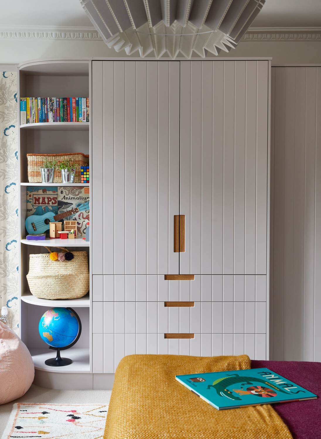
The first pink paint to know is Farrow & Ball's Peignoir. Upon first glance, it looks more off-white than pink, but that's the genius of this color. It's one of Farrow & Ball's best neutral shades, but still brings a little personality to the table.
"Peignoir sits beautifully between pink and neutral, with a muted gray undertone that prevents it from feeling overly sweet or sugary," explains Pringle & Pringle founder, Sophie Pringle. It has a quiet sophistication, offering a softer, more liveable take on pink that works especially well in layered interior design schemes.
It's particularly lovely as a pink bedroom color, where its softness creates a calm, restful atmosphere. "We recently used it in a girls' bedroom; however, it also works well in spaces that need a gentle lift — adding warmth without overwhelming the scheme, making it a great choice for both lighter and slightly moodier rooms," says Sophie.
For the bedroom pictured above, Peignoir was used on the wardrobe joinery and woodwork, "to draw out the pink-gray tones within the wallpaper," explains Sophie. As you can see, it makes a great accent on cabinetry or trim, but could also be used more generously for a subtle color-drenched effect.
2. Farrow & Ball's Folly Pink
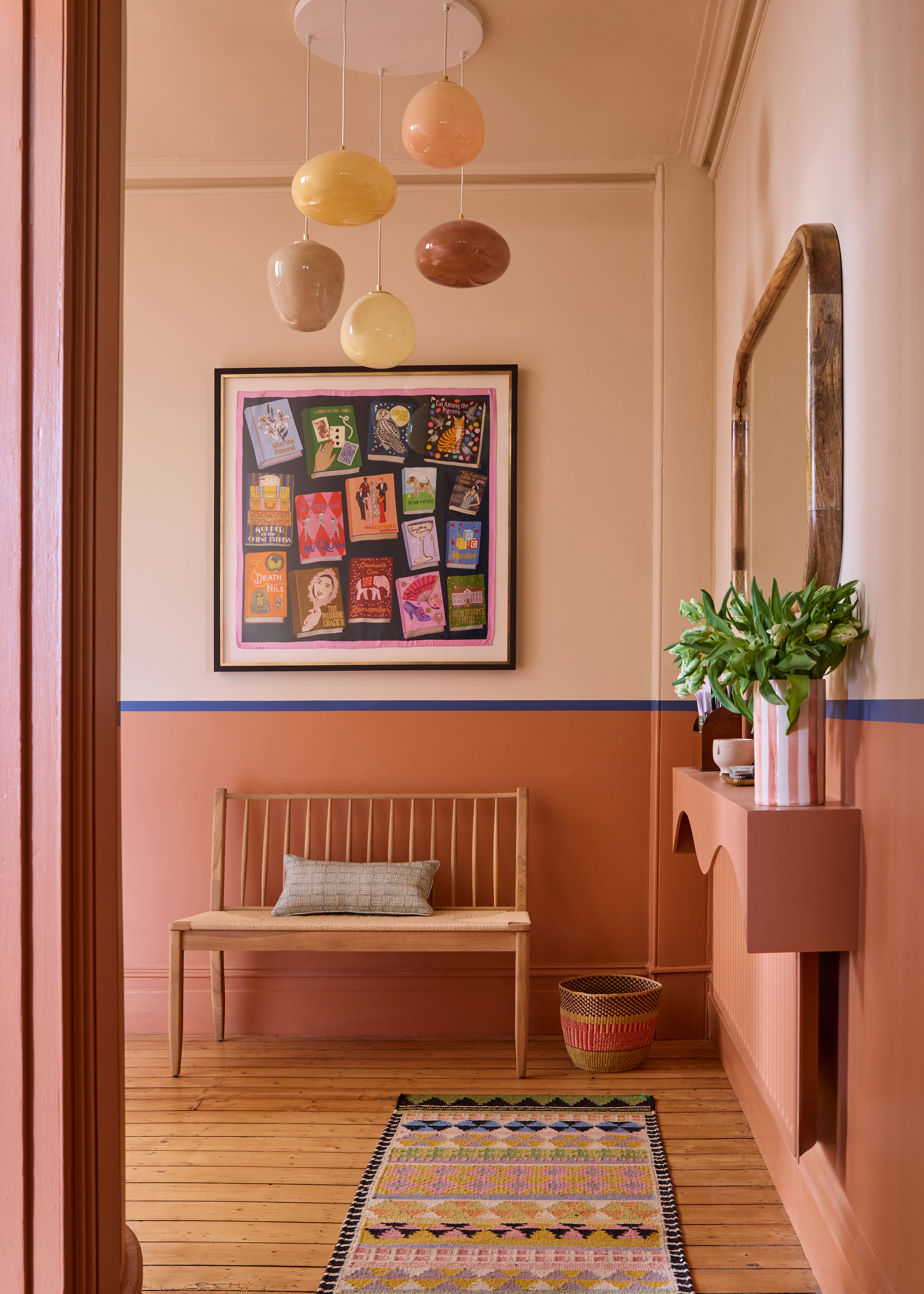
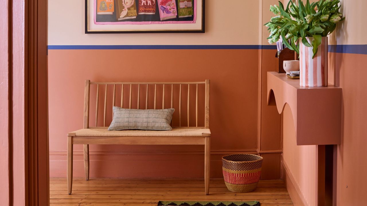
On the other hand, Farrow & Ball's Folly Pink is for those who crave something a little bolder. "This is a gorgeous soft terracotta pink which has no saccharine quality to it whatsoever, but all the warmth and calmness of pink," explains interior designer Laura Stephens. The terracotta tones make it feel more grounded, while still bringing that joyful color to the forefront.
Laura says that the best way to use this color is as a soft but impactful accent. "It's best for architectural details and ceiling paint colors," she adds. It provides that pop that's effective when balanced with softer tones or contrasting colors — plus, there are plenty of colors that go with terracotta.
"We've used it as a secondary paint color (seen above) over three stories of hallways and landings at half height, which gave just the right amount of color without feeling overwhelming," she adds. The natural tones make the color blocking technique feel more contemporary.
"I've also used it on a bedroom ceiling with neutral walls to 'bring down' a tall ceiling whilst adding a serene feel to the space," she adds.
3. Farrow & Ball's Tailor Tack
And lastly, Farrow & Ball's Tailor Tack is a pink paint color that blends true pink tones with subtle softness. "I love this shade of Farrow & Ball pink paint as it is very light and delicate, but strong in character," says Studio Raymond founder and interior designer Carina Raymond.
That mix of character and gentleness makes Tailor Tack quite versatile. "I have used it in a sunny kitchen, dining, and open plan lounge area that gets lots of natural light, but it could also be used in a hallway or bedroom," Carina says. Think of this shade as a subtle color in rooms where you'd naturally reach for a neutral like white.
"It works well in rooms that get lots of natural light (if you are looking for paint colors in south-facing rooms), as the light reflects really nicely off it, and it has enough contrast juxtaposed with creams and whites," she adds. But it "looks especially good on walls, ceiling, and joinery, and juxtaposed with bronze metallic finishes, and reds and blues," Carina adds.
It's official, pink trends are getting more neutral and more popular in modern interior design. Will you be trying any of these designer favorite Farrow & Ball pink paint shades?
For more design tips, be sure to subscribe to the Livingetc newsletter.