McDonald's recently laid its claim to having inspired one of the most ubiquitous icons in UI. In a 20-minute mockumentary, detectives determine the Big Mac to be the inspiration for the hamburger menu that appears at the top of many website and apps.
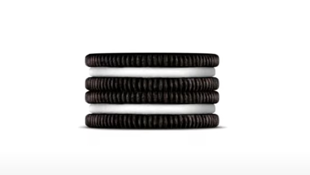
Not so fast, Oreo says. The Mondelez International brand reckons the hamburger menu isn't a burger at all, but two Oreo cookies stacked on top of each other. Tenuous? Sure, but just go with it: it could save you $1 off a packet of biscuits.
The ubiquitous app 'menu' symbol featuring three horizontal lines was created in the 1980s and is named after the food item it abstractly resembles. But a new campaign by VML aims to install a different version of the story, naming the icon The Oreo Menu. In a bid to get the alternative moniker to stick it's offering a prize to anyone who goes to its website and types in a category title that they found in a hamburger – I mean Oreo – menu. Basically, type in 'Home' or ‘About Us’ at the OreoMenu.com, and you can claim $1 off a packet of cookies.
Anyone else want to stake a claim? A macaron brand? Mr Kipling Angel Slices? I see a whole new potential area for sponsorship opportunities here. Apps could sell naming rights for their app menus. I mean, it would be only slightly more ridiculous than the Visa Cash App RB Formula One Team.


