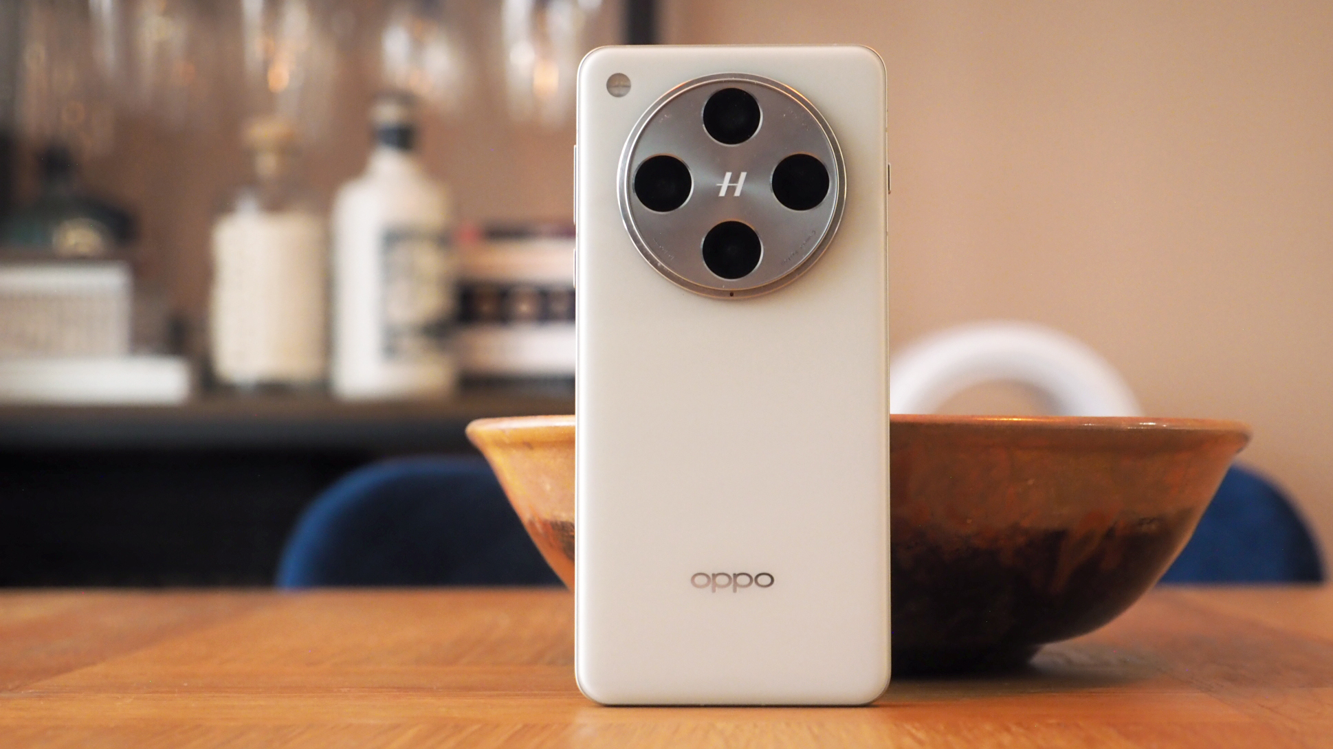
It was at the beginning of this year when Oppo revealed one of the best-ever camera phones. Although for most of us that didn't matter – as the Find X7 Ultra didn't launch worldwide and there's been an Oppo-sized hole ever since.
Fortunately things are back to good now, with the new Oppo Find X8 Pro heading up the company's latest range – and zero surprise, given the week-by-week drip-feed 'teases' of the new phone in advance of that – aiming to be one of the best Android phones of today.
But just how can the Find X8 Pro lure punters away from the obvious Samsung and Apple alternatives? It's got some standout features, from the latest battery tech, to an alternative flagship processor, four 50-megapixel cameras, and a design that stands apart from the norm. So is this new Pro the way to go?
Oppo Find X8 Pro: Price & Availability
I've spent over two weeks using the Find X8 Pro as my own – and only learnt the price half a day before this review went live. The handset is priced in sync with its predecessor, at £1049 in the UK.
Oppo typically reveals pricing information at its global launches only – but I couldn't attend this one due to the best Black Friday deals needing my attention instead. I've queried regionalisation and relevant pricing in both the USA and Australia – and will update this review accordingly.
Oppo Find X8 Pro review: What's New?
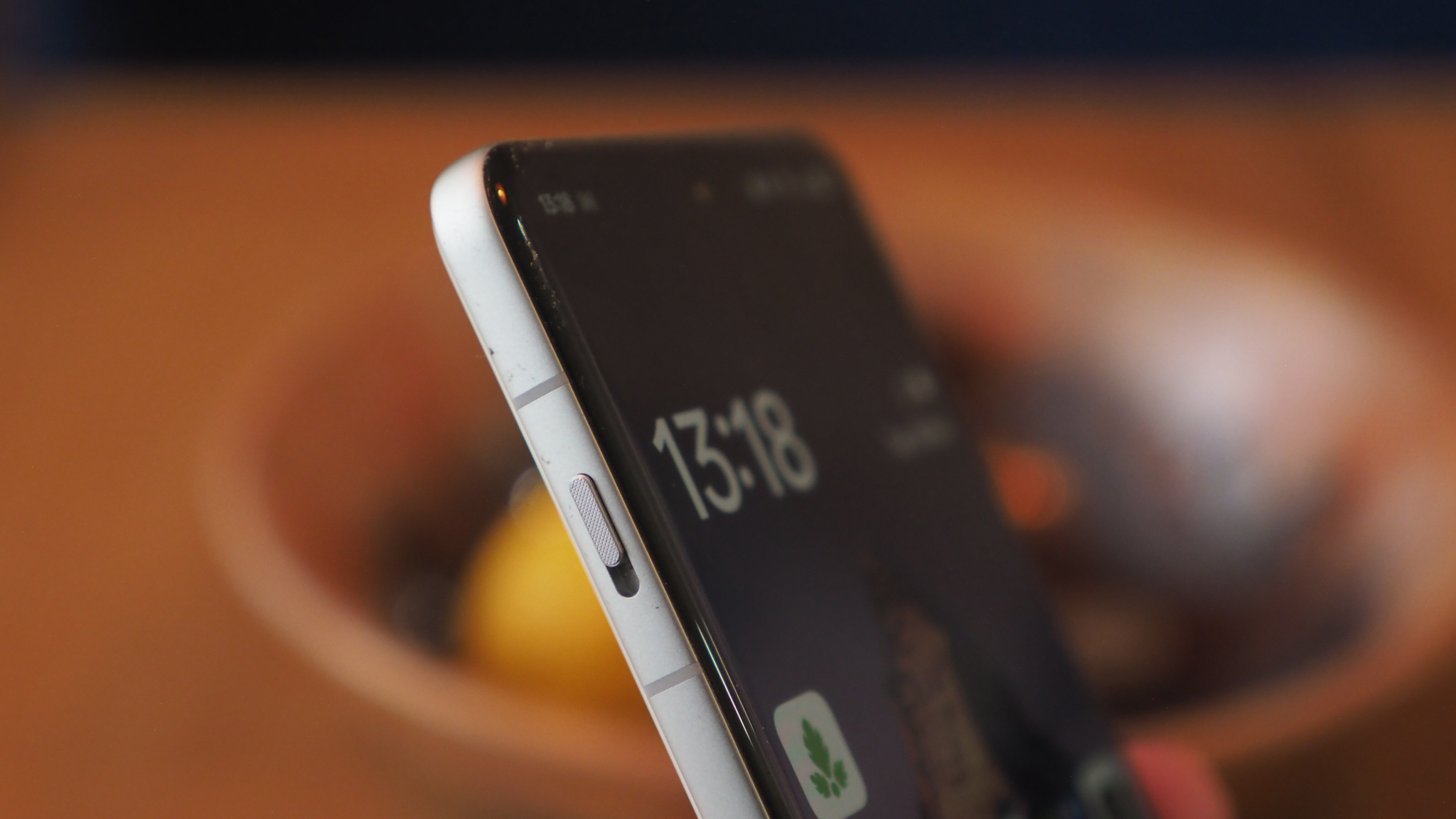
In a way the Find X8 Pro is all-new, because despite the X7 Ultra's existence, its lack of presence in most markets meant it wasn't on many peoples' radars anyway. Furthermore, the Pro doesn't directly compare to the Ultra because they're different grades with slightly different target markets – which makes me think that an Ultra variant could be announced in the near future. But that's nothing but rumour for now.
That puts the Find X8 Pro more directly in comparison to its 2023 predecessor, the Find X6 Pro (which, again, was a China-only release – it's the previous Find X5 Pro which did make land on a wider scale). The newer handset does bring an updated design, featuring a new Pearly White finish option – altogether different from the tan faux leather of before – and the camera unit, still co-developed in collaboration with Hasselblad, is more consistent in its per-lens presentation.
Visually the Find X6 Pro and Find X8 Pro aren't miles apart, though, with the newer model uprating the innards with more battery (now silicon-carbon, not lithium-ion), more processing power (opting for MediaTek's Dimensity 9400 over Qualcomm's would-be Snapdragon 8 Elite) and more screen brightness from a new and marginally different display (that's actually lower in pixel density).
Oppo Find X8 Pro review: Design & Display
- 6.78-inch 'ProXDR' OLED display, 4500 nits peak brightness
- 1264x2780 resolution, 120Hz refresh rate (LTPO so variable)
- Pearly White or Space Black finish options
- 162.3 x 76.7 x 8.2mm / 215g
- New 'Quick Button'
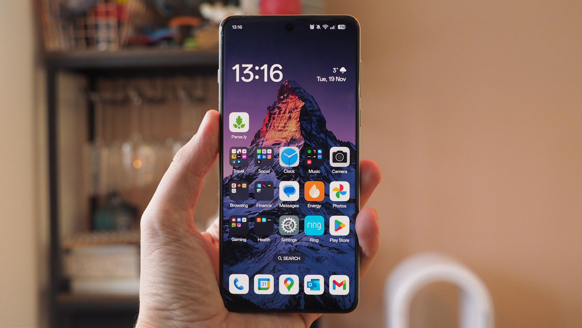
If you're looking for one of the best phones and the iPhone 16 Pro is on your mind then, well, a quick glance around the Oppo Find X8 Pro and I reckon it's one of the more iPhone-like Android competitors out there. Maybe that's just because it has a new Quick Button (much like Apple's Camera Control button) for camera controls – not that I've used it much, as its position is wildly questionable to me.
The design has some really nice touches though, plus some that I think will be more divisive. The subtle screen curvature sees the display's content look almost 'elevated' beyond the panel – as a spec that might read as 'more bezel', but in person it looks great, which is the more important part. It makes for a super-comfortable hold, too, which is easily taken for granted – it's rare that phone-makers have sharp-edged designs these days, but the Oppo feels great.
I've been impressed by the display overall, although by default its colour palette is fairly muted compared to the current norm – something that's quickly adjusted by selecting the Vivid option within settings. OnePlus has the same with its handsets, such as the latest Open Apex Edition – which I mention as BBK Electronics owns both brands, so there are some similarities – and some people will prefer the Natural look, that's fair to say.
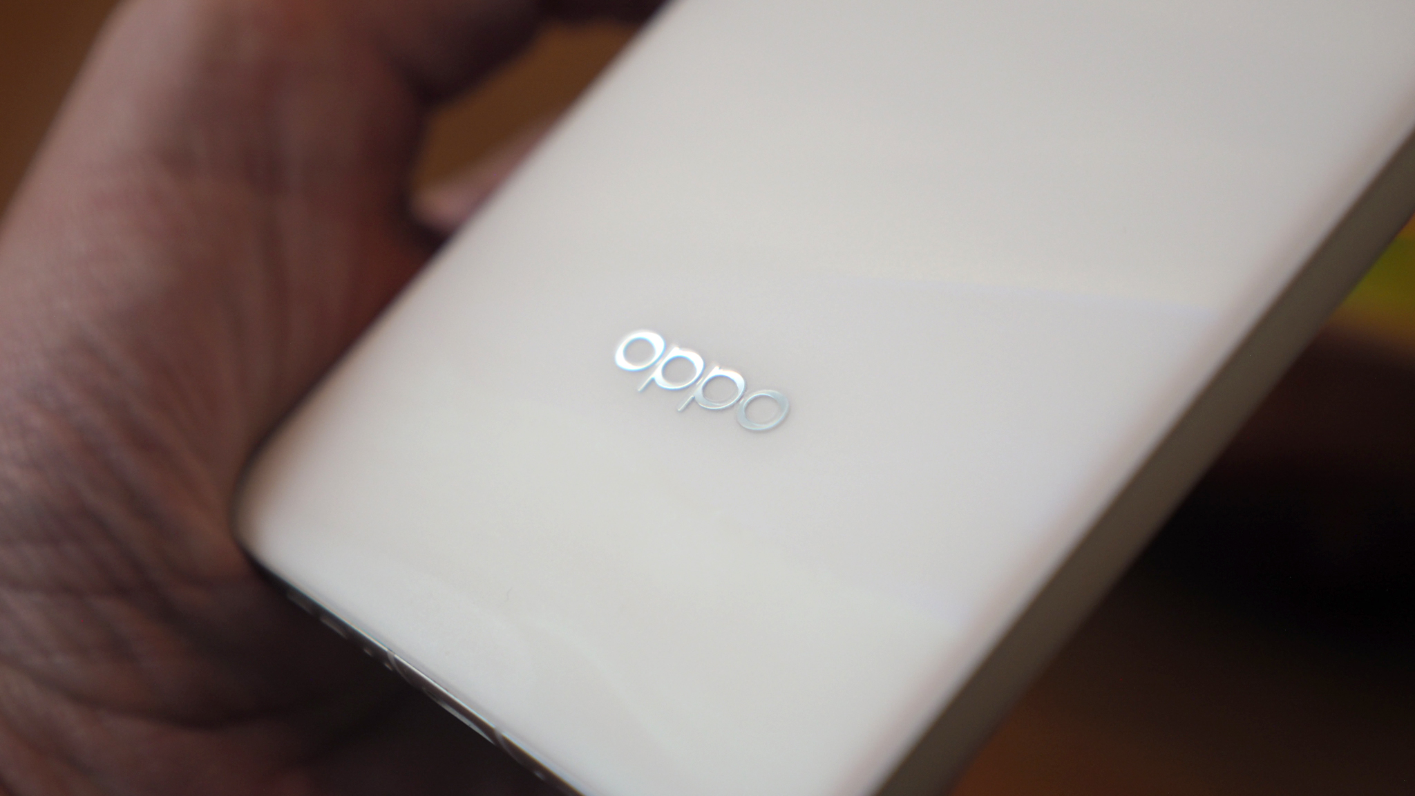
It's more around the back where I think the Find X8 Pro is going to be more divisive. The Pearly White finish – with each device showing a unique pearlescent finish – is less straight-up white than my photos may suggest. There's that 'inside-a-shell'-like fluorescence, a little blue reflective hint about it – and that's why I suspect the Space Black finish will be the more popular for Western audiences. But each to their own.
It'd be hard to not mention the camera bump, too, as it's certainly a dominant protruding circular-shaped design. It actually protrudes far less than the X7 Ultra's version, however, based on customer feedback – so while it might look large, it's diminished. Besides, it's necessary to squeeze such good-quality camera componentry inside – and this is part and parcel for most phone cameras now.
Oppo Find X8 Pro review: Performance & Battery
- MediaTek Dimensity 9400 processor
- 12/16GB RAM depending on config
- Extra 4-12GB RAM from storage
- 256GB/512GB/1TB configs
- 5910mAh silicon-carbon battery
- 80W wired, 50W wireless charging
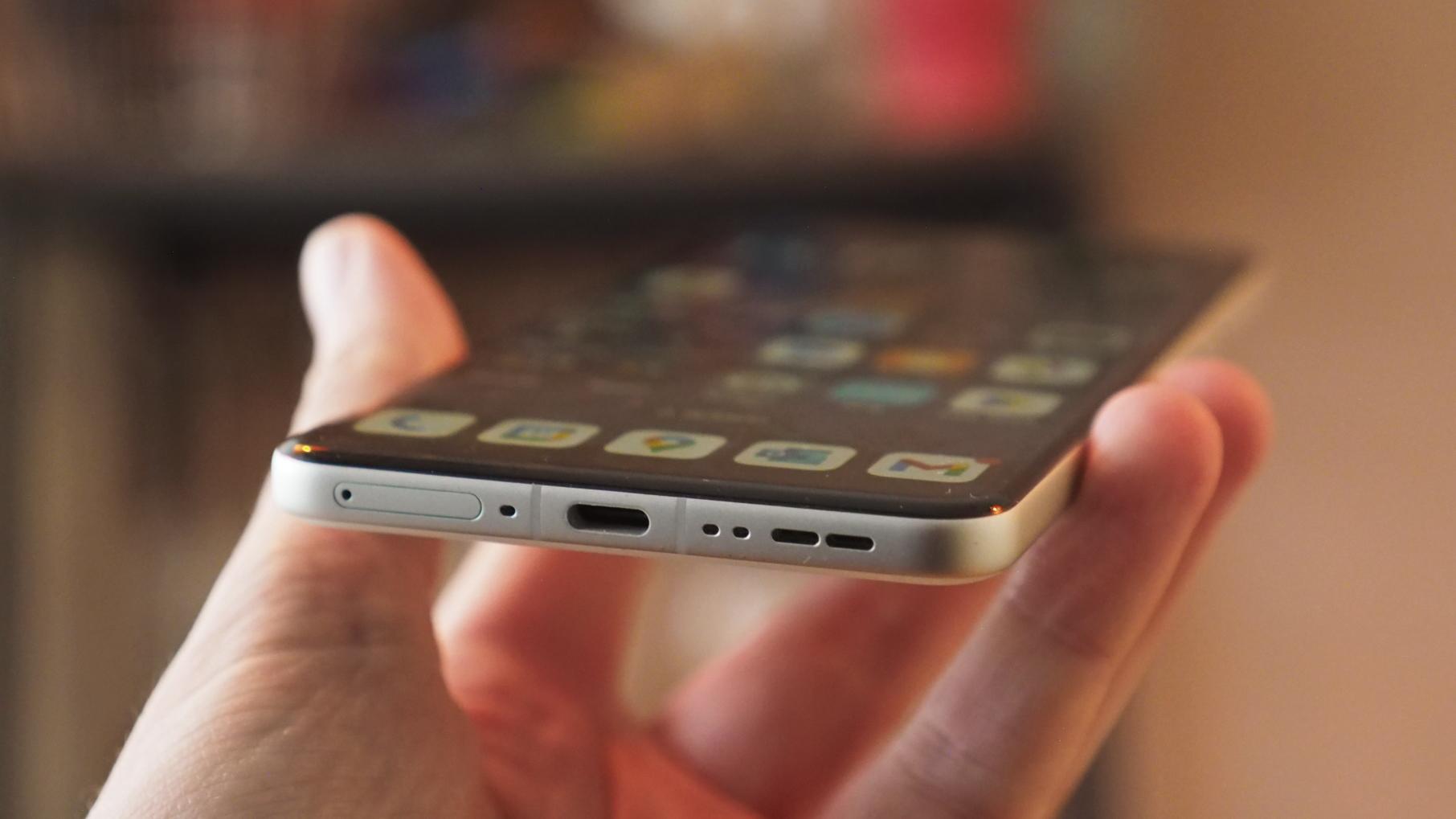
When I first received the Find X8 Pro it did present a few curiosities which have since been ironed out via updates – Secure Environment being the main hiccup in disrupting some app use – but its ColorOS 15 software is the latest in a well-established line-up (which OnePlus users will recognise it as OxygenOS) and has plenty of competitive features. The latest sees Google's Gemini app and Circle to Search added – keeping it competitive against the Samsung Galaxy S24 Ultra and Google Pixel 9 Pro XL.
The software does sometimes require a little more attention than some, with many app permissions off by default, while a dual app store is the same kind of unwanted double-up you'll find with the likes of Honor phones. Regular 'clean up' prompts – which I've asked it to cease – persist to niggle. But I'm nitpicking, really, as it's minor stuff.
The real win with the Find X8 Pro is two-fold: the performance is stellar and the battery life is mighty impressive. The latter has taken a little time to settle in, but as I've been using this phone for over two weeks now, I'm beyond content with the kind of life-per-charge that it offers.
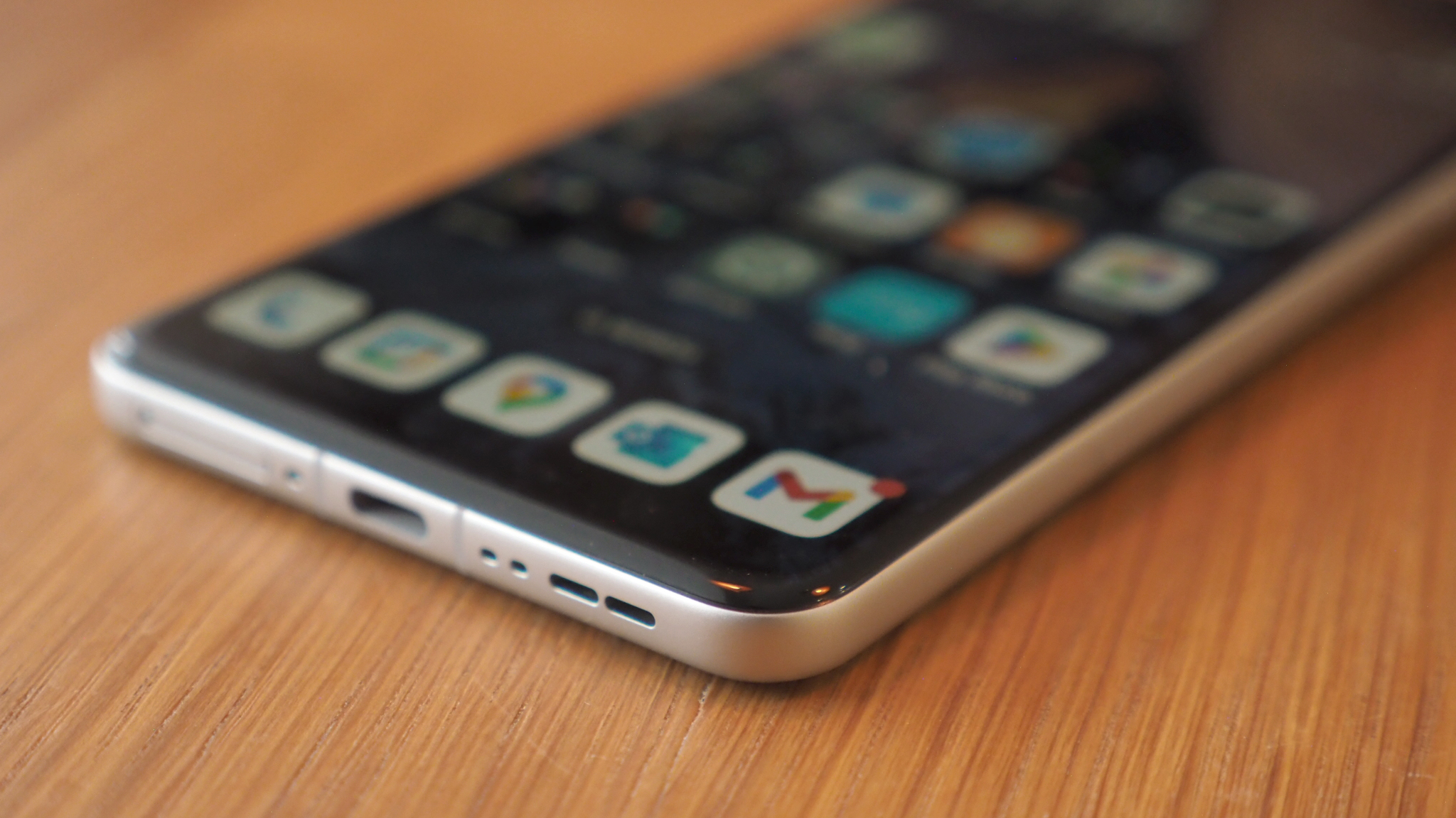
A look at the spec and it's no major surprise to see why, though: the silicon-carbon battery brings the benefit of greater density, meaning more capacity without additional physical mass. Inside the Find X8 Pro is a 5910mAh, which is around 20% more than you'll find in most flagship competitors. Or, put it this way: it's got 65% more capacity than the iPhone 16 Pro's battery.
Software is a bit part of that battery winning, of course, which in part will explain why some permissions are off by default, idle apps can be put to sleep and so forth. But you'll not notice troubles with your most-used apps, so it really doesn't matter. Furthermore the Oppo software isn't overzealous when it comes to auto-brightness adjustment, nor really does it enforce that you go low brightness by default – the battery still lasts and lasts when the screen is bright.
For example, as I write this review, the phone has been unplugged from the wall for 12 hours. Tuesdays are my early start days, so I've been up since 05:30 and it's happily provided Bluetooth whilst at the gym, an hour of gaming before the working day started, and plenty of Gmail, Slack and WhatsApp interactions. The screen has been on for 7 of those 12 hours – yet there's still 62% remaining in the tank.
MediaTek's Dimensity 9400 is no performance slouch either. It benchmarks at a similar scale to Qualcomm's Snapdragon 8 Elite – it wins some, it loses some, depending on the test – but you won't even need to think about it as this is super-powerful stuff. It's good to see MediaTek's ongoing adoption in wider handsets – and if you're unfamiliar with the chip-maker then no need to worry about it being below the required grade.
Oppo Find X8 Pro review: Cameras
- Wide-angle: 15mm equiv, 50MP, ISOCELL JN5 sensor, f/2.0 aperture
- Main: 23mm equiv, 50MP, LYT808, f/1.6, optical stabilisation (OIS)
- Zoom (3x): 73mm equiv, 50MP, IMX882, f/2.6, OIS
- Zoom (6x): 135mm equiv, 50MP, IMX858, f/4.3, OIS
- 7fps burst at 50MP, buffer pipeline to 200 images
- Hasselbald Portrait Mode
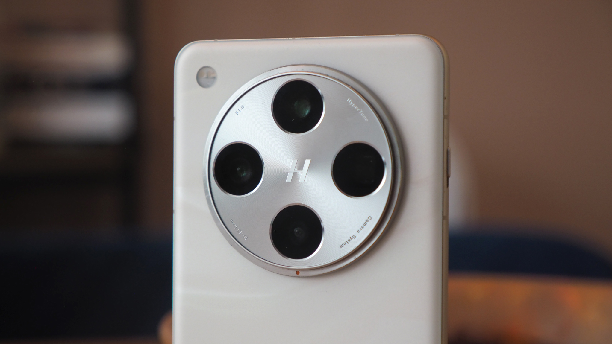
As you can see from my photo of the cameras in the above image, the Find X8 Pro's housing is a bit of a unit. This circular emblem format is the current trend from many Eastern makers, as you'll see from the likes of Huawei, OnePlus, previously Honor, and so forth. It looks fine – especially in the context of Apple's now-accepted higgledy-piggledy design format – but, again, I think it'll be another aspect of the design dividing opinion.
I'm in the camp of wanting the best cameras on board though. And the Find X8 Pro has four 50-megapixel sensors, with equivalent 15mm wide-angle, 23mm main, 73mm optical zoom and 135mm periscope zoom attached. That provides a broad range of shooting potential right in your pocket, with some decent sensors used too – although nothing as physically large as in the previous Ultra handset.
While it's possible to use the Quick Button as a slider to adjust zoom, I just find its position far too inset into the phone's design when in landscape orientation – and it's certainly not setup for vertical shooting, which is what most people do these days. I'd criticise the iPhone 16 Pro's indented one just as much, though, as it suffers the same problems. Not that this button is an essential, as I've found shooting from within the app perfectly acceptable.


Given the array of sensors, it's great to see that Oppo and Hasselblad's ongoing partnership reaps the rewards of being consistent. Whether jumping between focal lengths, pinching to zoom, or using the Quick Button as a slider, the results look like they came from the same camera – which is more than can be said for plenty of competitors.
The quality is largely decent, as you'd expect from 50-megapixel cameras, with oversampling going on to reduce output (9MP by default in 16:9, 12.6MP in the 4:3 format) for increased sharpness and dynamic range. Oppo's system uses multiple frames for high dynamic range (HDR), too, which I've found can be a little hyper-realistic in the typical grey skies of the UK – it's dependent on the shot, but some can look a little 'fake'.
Otherwise the precision of colour, the ability to shoot handheld at night with ease, and the deft hand at exposure make for a really solid camera experience. With the likes of Samsung and Google clear competition – and arguably with better computational photography features from AI additions – I think the Oppo easily stands out on its own for the across the board resolution and processing highs.
Oppo Find X8 Pro review: Verdict
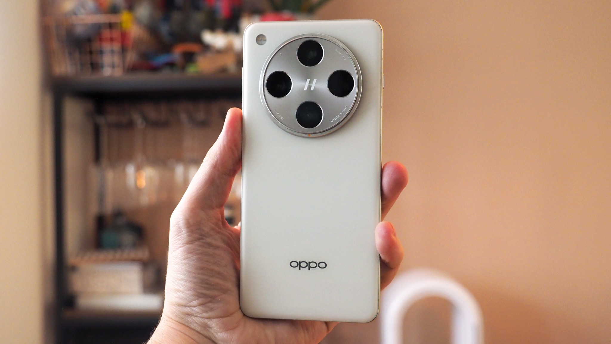
Oppo is back with a bang in the Find X8 Pro! Although you can read that in both directions: I think the battery life per charge, general flagship performance and camera consistency is superb; but some software double-ups, a divisive design and poorly-placed Quick Button control aren't going to attract all prospective buyers looking for an Android flagship.
There's no doubt that the Oppo Find X8 Pro is every bit the flagship, though, and in my more-than-a-fortnight of use I've become accustomed to battery life that'll knock its competition into submission and a popping display that needn't be dialled down in brightness for sake of longevity. It's those kinds of wins that'll make moving into my next review phone more of a chore – and why the Oppo will stand out where it counts for certain users.
Also consider
While I was hoping the Find X8 Pro would hit a sub-four-figure asking price, it's £1049 day one price tag is in line with its 2022 predecessor. For that kind of money there's no shortage of competition, that's for sure: the Google Pixel 9 Pro XL arrived at £1,099 – although you'll now find it for less – and would be the most direct pure Android opposition. Go smaller, with the non-XL version, and you'll spend even less.


