Dragon Quest is unarguably one of the most important video franchises in history, a seminal series that has influenced decades of RPG design. Unfortunately, some of the earlier titles haven’t aged that well, a fact Square Enix is clearly addressing with the full-fledged remake of Dragon Quest 3. After going hands-on with the remake, it’s abundantly clear Square Enix has honed its HD-2D art style to a dangerous sheen, while providing a wealth of improvements and additions that’ll make one of the most important RPGs ever made feel better than ever.
Originally released in 1988 on the NES, Dragon Quest III introduced so many of the systems that would come to define not just the series but RPGs as a whole. This was the first Dragon Quest game to introduce a class system, it drastically upped the size and open-endedness of the world, and it crafted a compelling narrative that tied directly into the first two games. The third game serves as a prequel to Dragon Quest I and II and also has ties to the most recent entry, Dragon Quest 11.

It’s been more than a decade since the last time I had played Dragon Quest 3, but jumping into the remake gave me a massive wave of nostalgia like I was returning to my childhood home, but it was now transformed into a two-story mansion.
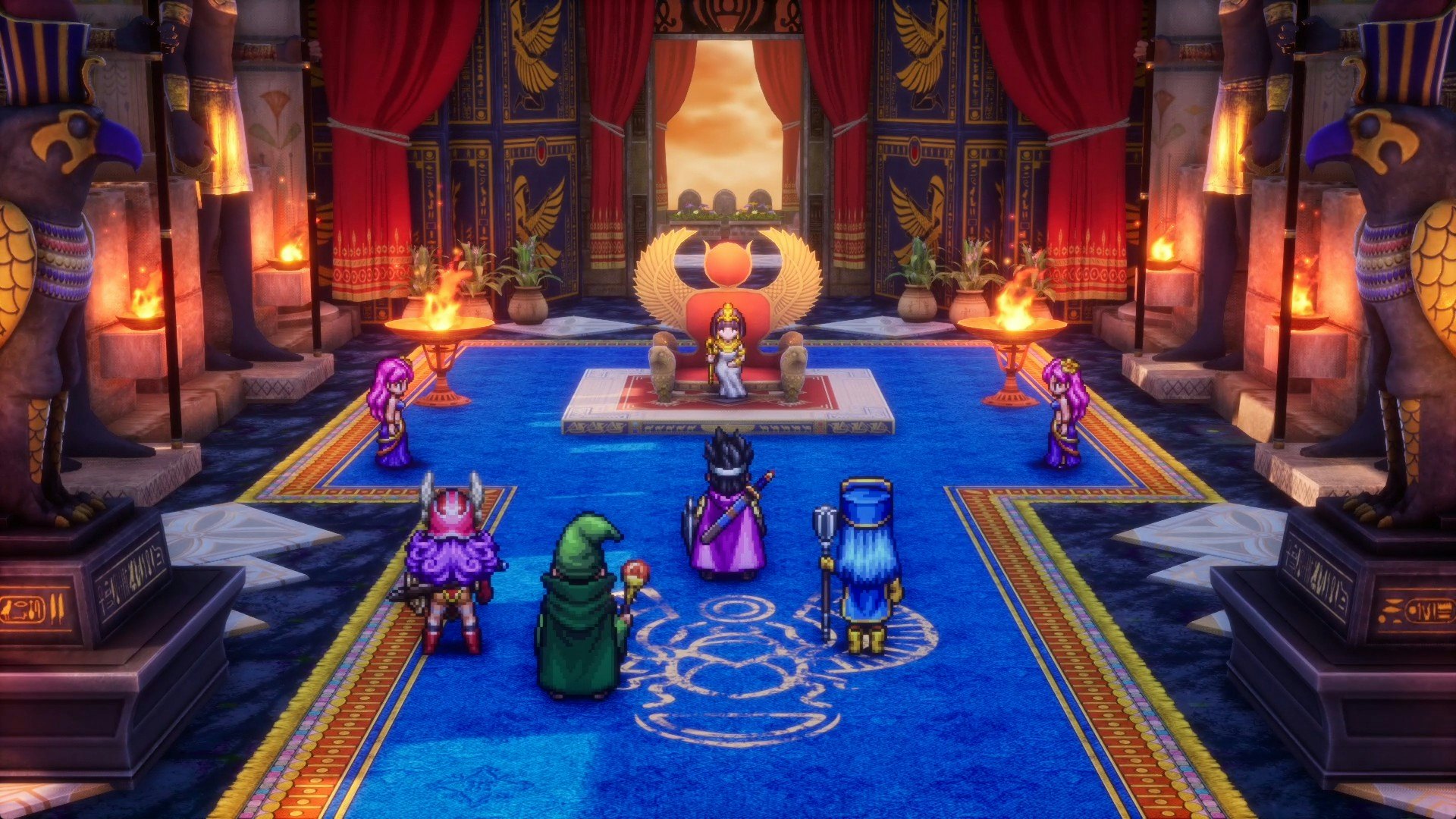
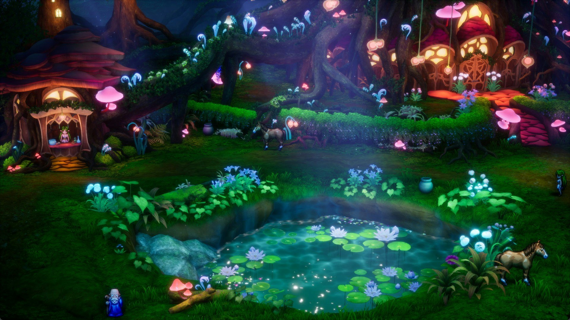
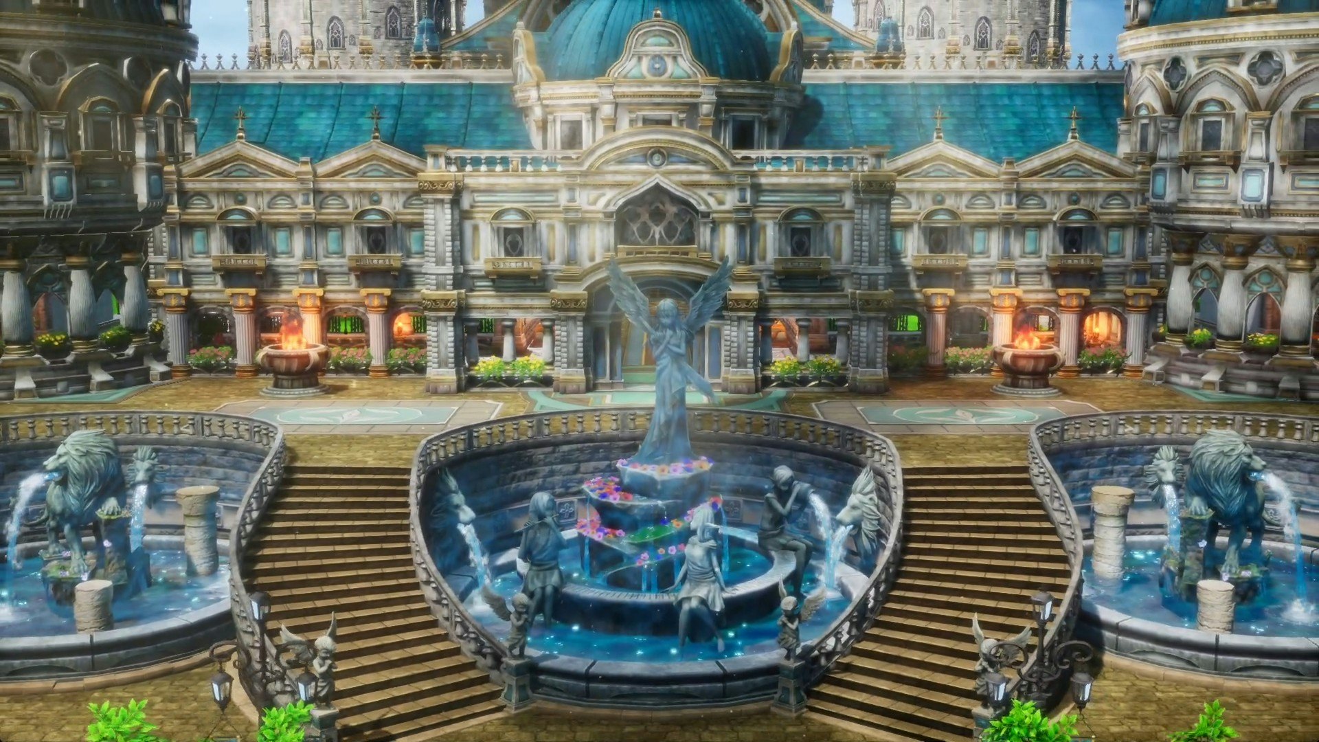
The art style is, of course, the most obvious change, but also the most striking. Octopath Traveler and Triangle Strategy made great use of the HD-2D style, but Dragon Quest 3 easily feels like the next evolution. Every element, at any given time, feels like it pops right off the screen. The sprite work in the remake is great, but it’s the environments that really look fantastic.
Wind blows through tufts of grass and trees, dust particles lazily float through musty dungeons, and every town features lavishly detailed architecture. The amount of detail that’s been crammed into Dragon Quest 3’s visuals is incredible, but it still manages to strike that chord of feeling nostalgic and familiar, yet fresh and different, all at once. According to Square Enix, this remake is co-developed by Team Asano and Artdink, both of which worked on Triangle Strategy. The collaboration has clearly worked wonders and allowed the teams to push HD-2D to a new limit, one that I’m not sure can be topped.
While the visual upgrade is the primary attraction, the other surprise of my hands-on demo was the handful of smart choices made to make Dragon Quest 3 feel more streamlined.

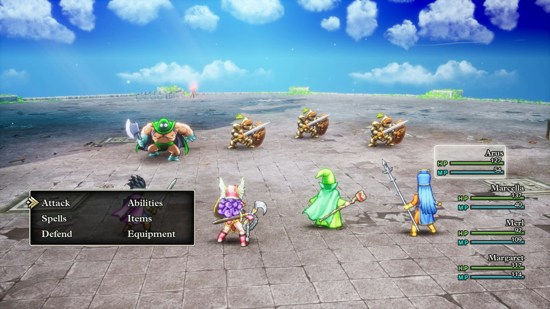
Tutorials are included to help ease new players into Dragon Quest 3’s systems and ideas, taking out some of the obtuse design of the original that required experimentation. Battles now have three different speeds and can be played entirely on auto-battle if you just want to keep things moving. Points important to the story are now highlighted on your world map but still only provide a vague hint of what to do, preserving the game’s sense of mystery and exploration.
Similar to later games, you can also save directly by visiting churches, and the game has an auto-save too. Everything in this remake just feels deliberately tuned to simply make Dragon Quest 3 more fun to play. There are even other elements of the presentation that have been drummed up. There’s added voice acting for major characters and story events, and the soundtrack has been completely updated with a sweeping orchestral score.

Interestingly, however, all of these improvements aren’t the only changes coming. During our demo session, Square Enix noted that the remake will have all of the original game’s classes, including Joker, and a brand new one. On top of that, the core story will be “expanded” under the supervision of series director Yuji Horii. Unfortunately, we don’t currently have an idea of how the additional story updates will work, but it’s interesting that changes are happening at all, especially with Dragon Quest 12 still somewhere on the horizon.
All these decades later, Dragon Quest 3 remains one of the best entries in the renowned franchise. Playing nearly an hour of the remake left me yearning for more, inspiring me to boot up a new save of the original game. It’s fantastic seeing the HD-2D style being put to use in a series that has an established aesthetic and art style. If anything, it’s a case for how versatile HD-2D is as an art style, and how Square Enix would be wise to already be eyeing other classics for the same treatment.


